



Describing paint colors as warm or cool can be very confusing. We all know blue is a cool color and red is a warm color, so why is ultramarine blue labeled a warm blue? And why is alizarin crimson typically considered a cool red? Let’s dive into it.
Primary Color
We’ve all known since childhood that red, yellow and blue are the three primary colors. From these, all other colors can be mixed. The primary colors cannot be mixed from any other colors. These three hues are the foundation of all color theory.
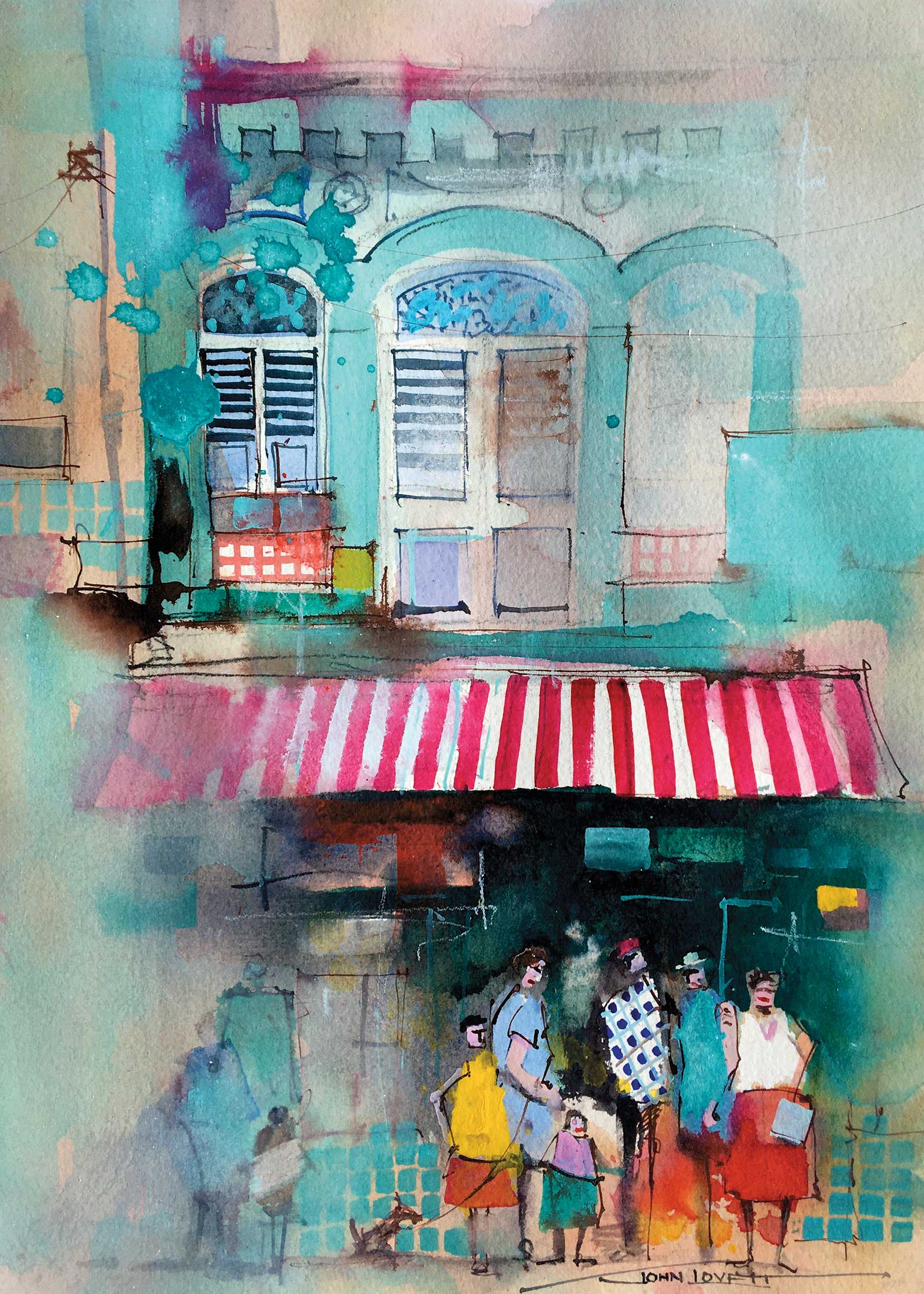
This painting is mainly cool colors with a smaller region of contrasting warms. To keep the colors interesting there are both warm and cool blues (ultramarine and phthalo) and warm and cool reds (cadmium and alizarin). It is well worth experimenting with shifts in color temperature. It’s a subtle way to put life and interest into your work.
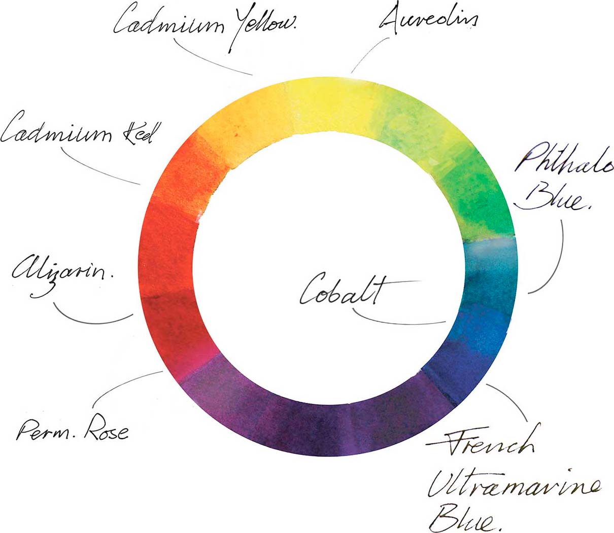
Ultramarine Blue
Compared to other blues, ultramarine blue is more influenced by red. Other blues such as phthalo blue, Prussian blue or cerulean, are influenced more by the green side of the color spectrum and are referred to as cool blues. They contain yellow. Cobalt blue is the closest to a pure primary blue and does not lean towards either red or green.
Alizarin Crimson
A similar confusion arises when we describe alizarin crimson as a cool red. Although alizarin crimson is a red, and we know reds are warm colors, it sits on the blue side of the reds so is referred to as a cool red. Cadmium red is also a red but it sits on the yellow side of the reds, so is known as a warm red.
Yellow
Yellows suffer the same confusion. We have warm yellows and cool yellows depending on whether they lean towards red or green. Cadmium yellow and aureolin are both yellows, but cadmium is influenced more by red so is a warm yellow. Aureolin is influenced more by green and is referred to as a cool yellow.
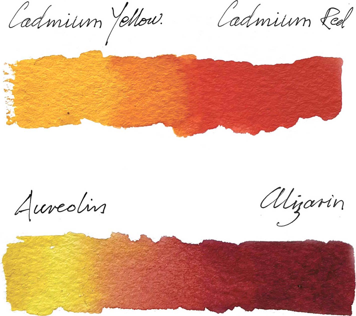
All this theory is very interesting, but where it has a practical application is when we need to mix clean, saturated colors. If we need to mix a pure orange with no tainting from its complementary (blue) we need to use pigments not containing blue. Aureolin is a yellow that leans towards green, so contains traces of blue. Cadmium yellow leans towards red, so has no blue in it. Likewise, alizarin crimson leans towards violet, so contains blue and would make a dull, compound orange. Cadmium red has no blue in it as it is closer to the yellow side of the spectrum so mixed with cadmium yellow would make a pure, saturated orange.
In this gradient, we can see the difference between a warm and cool pair of red and yellow pigments. The warm pair (cadmium yellow and cadmium red) produce a clean saturated orange. The cool pair (aureolin and alizarin crimson) both contain blue and produce a dirty compound orange leaning towards a brown.
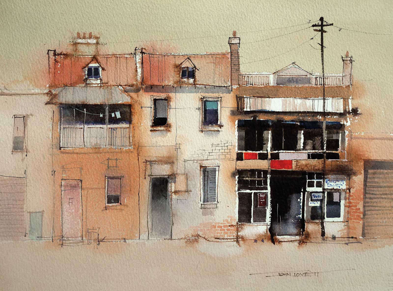
Apart from a few small patches of blue, this painting is all warm, compound colors. Keeping most of the warms slightly cool and desaturated allowed me to insert a couple of strong, saturated cadmium red rectangles that draw the eye to the focal area. Scattered patches of cool blue/greens and the contrast between strong darks and white paper also reinforce the importance of the focal area.
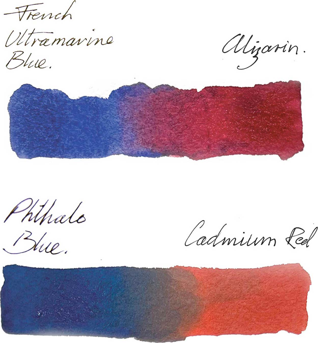
For a clean, saturated violet we need a warm blue (ultramarine blue) and a cool red (alizarin crimson) to avoid tainting the mixture with yellow. When we use a cool blue (phthalo blue) and a warm red (cadmium red) we end up with a dirty brown.
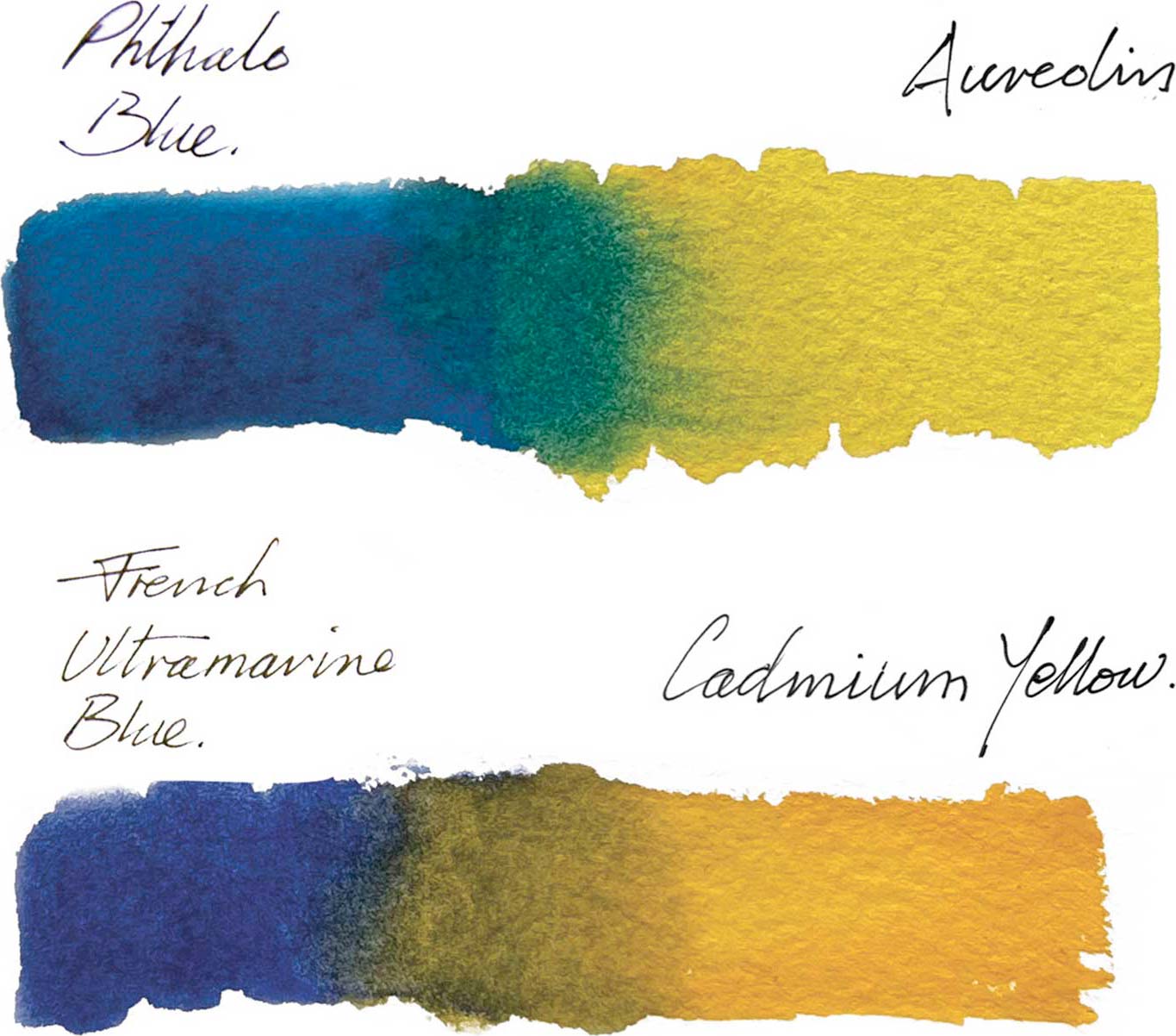
Mixing green with a cool blue and cool yellow (phthalo blue and aureolin) gives us a clean, saturated green. Using a warm blue and a warm yellow (ultramarine blue and cadmium yellow) we get a dirty khaki green. The moral of the story is this: if you want clean, saturated secondary colors, use versions of the primaries closest to them on the color wheel. If you are after muted, compound colors you will need the three primary colors present in the mixture. —