



In between portrait commissions and deadlines, I enjoy painting the produce from my garden. I grow many things specifically with painting in mind. I patiently waited several years for my King Billy plum tree to bear fruit, and this year it finally produced seven gorgeous powder blue plums—my very first crop.
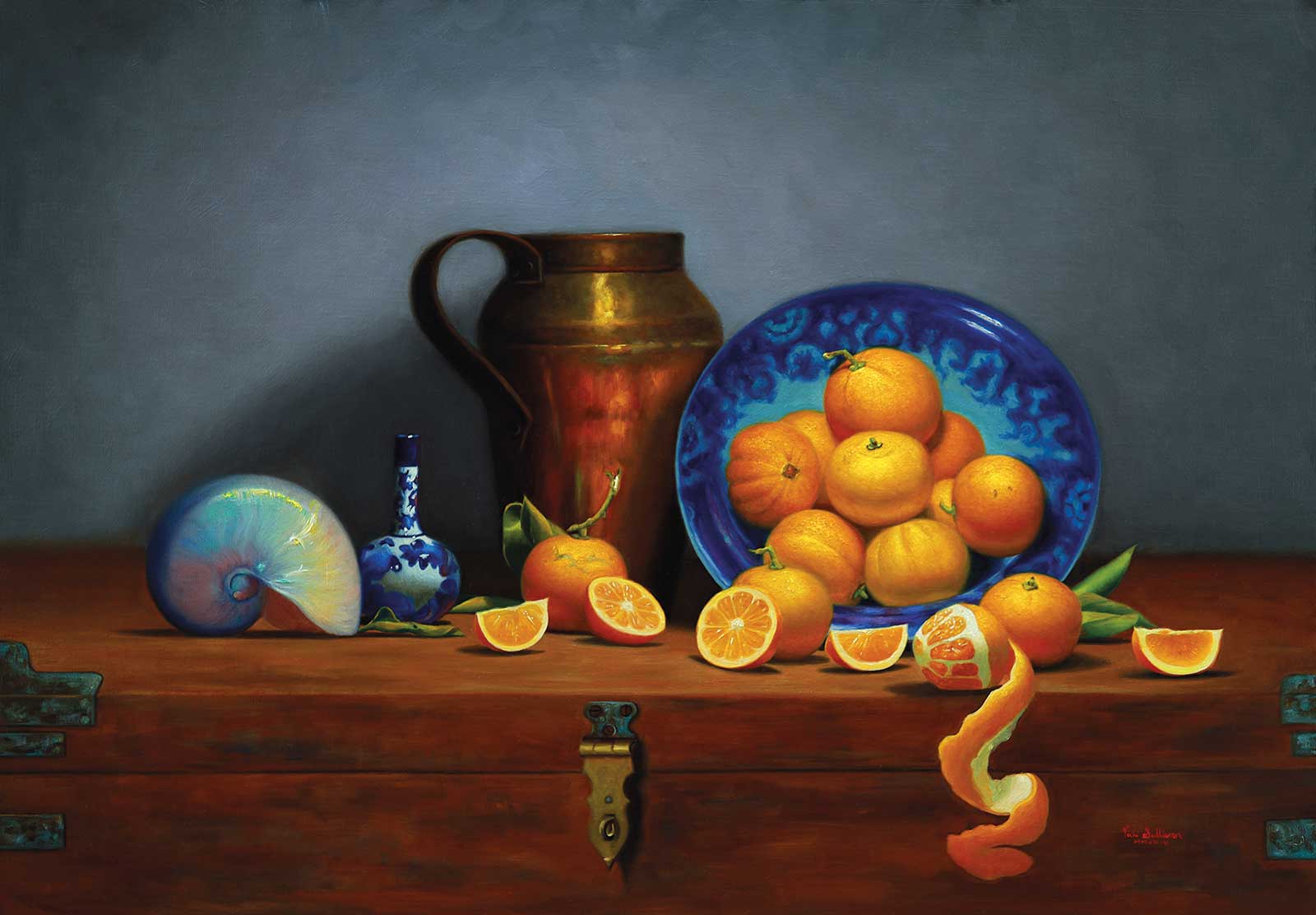
Oranges with French Copper Jug, oil on linen, 23½ x 30" (60 x 76 cm)
I watched them grow and checked on them regularly, determined to pick them at exactly the right moment of “peak blue,” just before they softened, and especially, before the birds or possums found them.
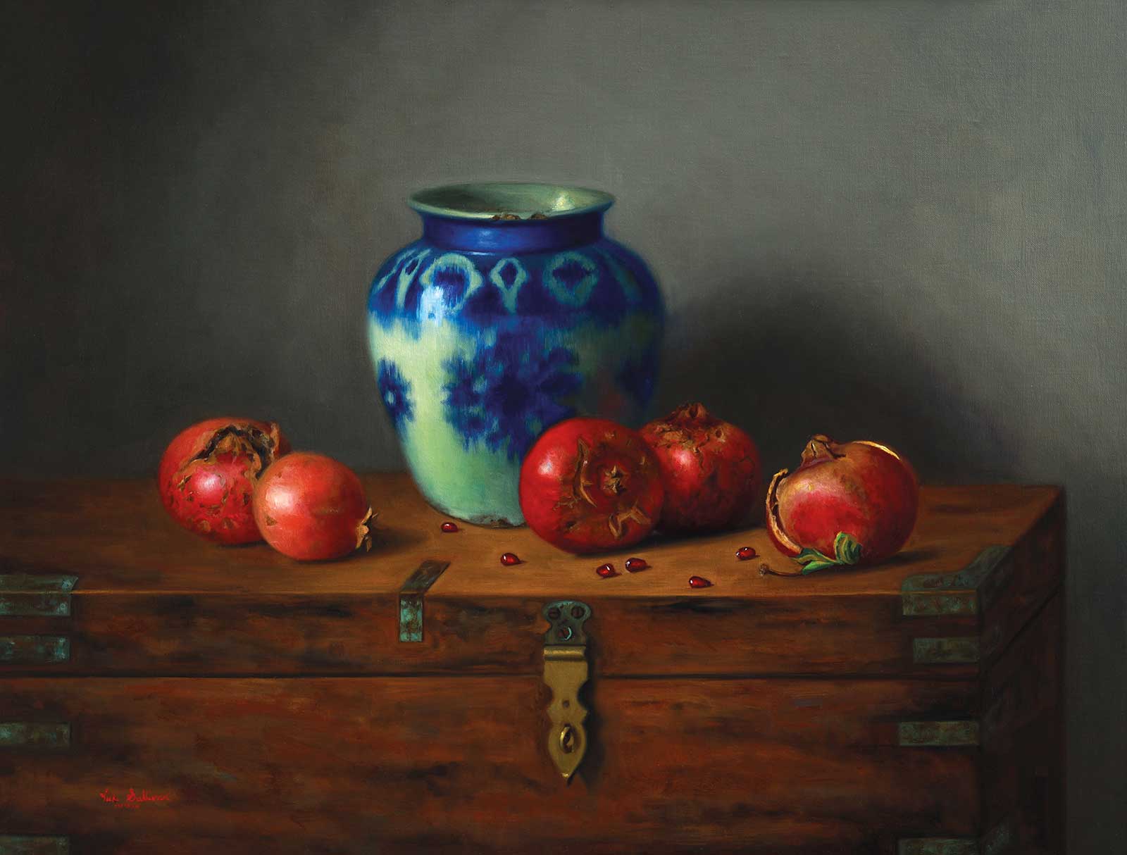
Pomegranates with Blue & White Persian Vase, oil on linen, 23½ x 19½" (60 x 50 cm)
The powdery blue color is truly lovely, and I spent quite some time thinking about which other fruit and objects to include in this still life. I am naturally drawn to calming blues and blue-and-white ceramics, and over the years I’ve built up a collection specifically for still life painting. With only seven King Billy plums to work with, I decided to visit my favorite fruit shop to find some different fruit to complete the composition. I chose some purple-red plums, and since it is still summer here, I also bought one of my other favorite subjects to paint: cherries. There are several cherry orchards not far from where I live, so I usually paint at least one cherry still life each year.
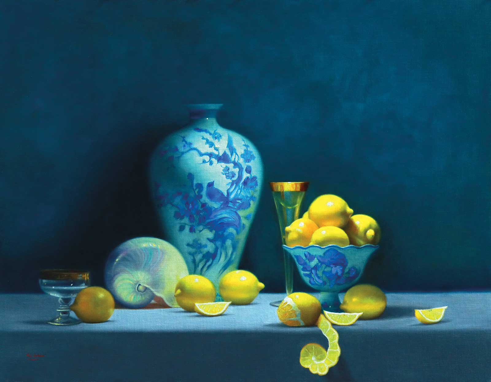
Citrus Celebration, oil on linen, 27½ x 36¼" (70 x 92 cm)
I tried out several large vases in my setup and eventually chose a plain cream pot with a metal rim, which I paired with a blue-and-white ceramic bowl to set off and harmonize with the blue plums.
My Art in the Making King Billy Plums with Cherries
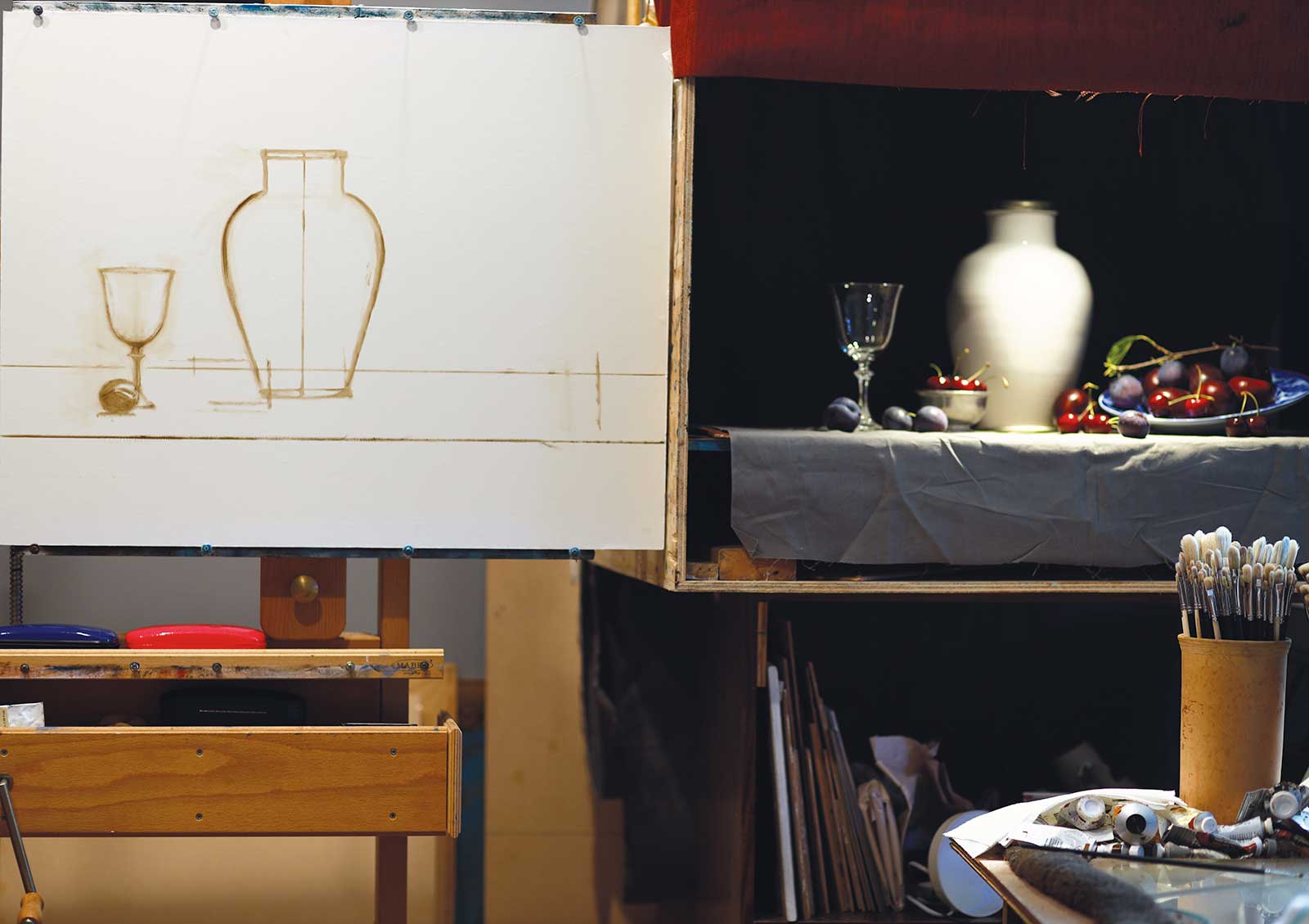 Stage 1
Stage 1 Lighting and Composition
My first step is to set up the lighting and composition. I move the light around, trying different positions to test what is most pleasing, but in this setup the light is mostly overhead. I used an off-white Moroccan pot as a foil for the more colorful plums and cherries. I decided to wrap my design around the blue King Billy plums as my color key. I then added some red plums and fresh cherries. I arranged them in a loose triangular composition, moving the objects around while considering how the eye travels through a painting. I like to vary the groupings of fruit and objects to keep the composition lively and engaging. I then mark out the table surface and the position of the pot on my linen, usually placing it slightly off-center. Most of the compositional decisions happen at this stage, with the objects arranged in real life.
 Stage 2
Stage 2 Block-in
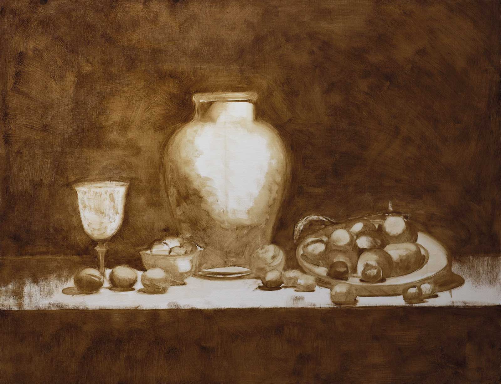
I am using sight-size to block in my placements. To do this, I place masking tape on the floor in the middle of the setup and the linen board several feet back to mark my foot position so that I can make sure I measure my drawing from the same position. Using raw umber with a thin bristle brush, I sketch the outlines, the shadow shapes and placement of the bowl of fruit and the wine glass. I aim for a loose but reasonably accurate arrangement of the objects in the setup. I keep the paint thin and the edges soft, as hard edges are almost impossible to adjust once the paint has dried.
 Stage 3
Stage 3 Overall Form
Using raw umber and a bristle brush, I continue working on the placement and shadow shapes to establish the form of everything in the composition. I continue keeping the edges soft so they could be adjusted later without leaving hard marks. Using a set square, I mark in the background horizon and the front plane of the table. I left the wine glass until later, as I needed to buy some red wine for the set up. I then let the underpainting dry overnight. If the fruit is easy to move, I sometimes refrigerate it to keep it fresh longer, but in this case it was tricky, so I left the setup in place until morning.
 Stage 4
Stage 4 The Fruit
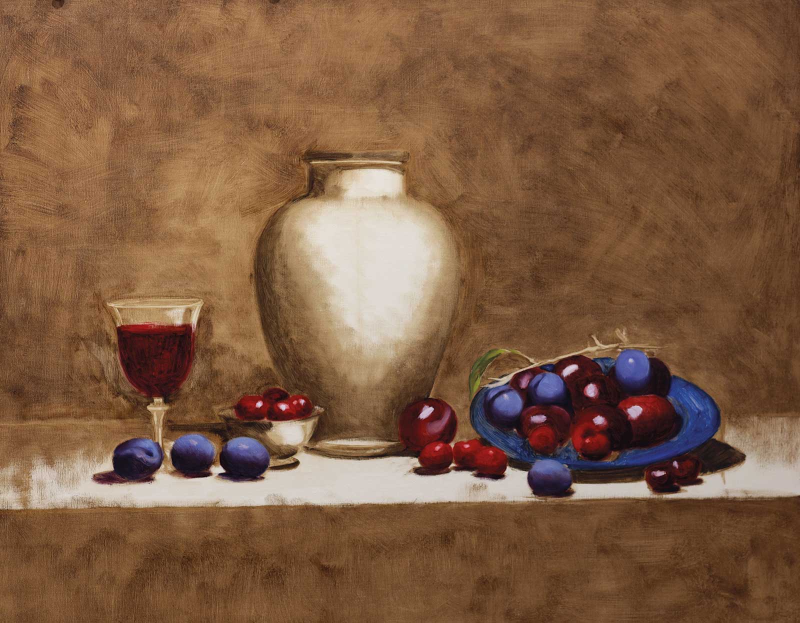
Because the fruit deteriorates first, I tackle it at the beginning. I use alizarin crimson and a little permanent mauve for the shadows on the red plums and cherries, with cadmium red in the lighter areas. For the King Billy plums, I block in permanent mauve mixed with ultramarine blue on the shadow side and king’s blue on the light side. I then put a little solvent on a rag and rub back the areas where the highlights will sit. Finally, I loosely scrub in ultramarine for the blue-and-white china bowl.
 Stage 5
Stage 5 Starting the Vase
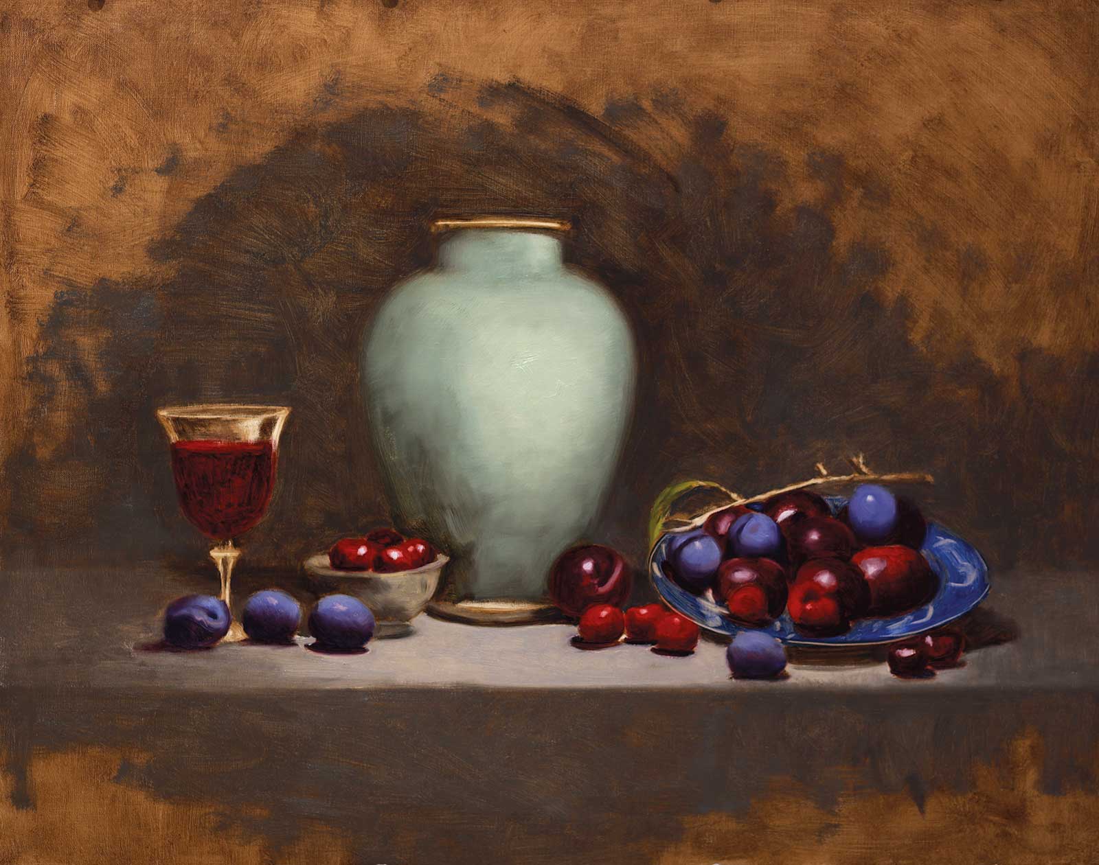
I begin to paint in the local color of the vase, keeping in mind the fall of light and shadow shapes. I use a mixture of raw umber and viridian with white for the shadow areas, thinking about the form of the vase at all times because the shadow shapes help describe the form. For the lighter areas I use cobalt turquoise, a touch of yellow ochre pale and titanium white, blending it with some of the shadow color as the form turns away from the light. I also scrub in the local color of the pewter bowl which the cherries sit in. Then I add some background color, which I mix with some raw umber, cobalt blue and a little ivory black and titanium white around everything I have painted while everything is wet.
 Stage 6
Stage 6 Refining the Fruit
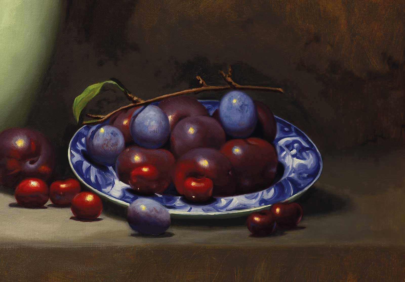
I then begin to refine the fruit, starting with the fruit in the bowl. I am carefully observing the shape and form of each piece of fruit, making sure the shadow and lighter shapes are describing each piece of fruit as I am seeing it, keeping edges soft and refining the highlight positions on each plum and cherry. Another thing I begin to address are areas of reflected light on the fruit. I also loosely paint in some of the white areas of the bowl.
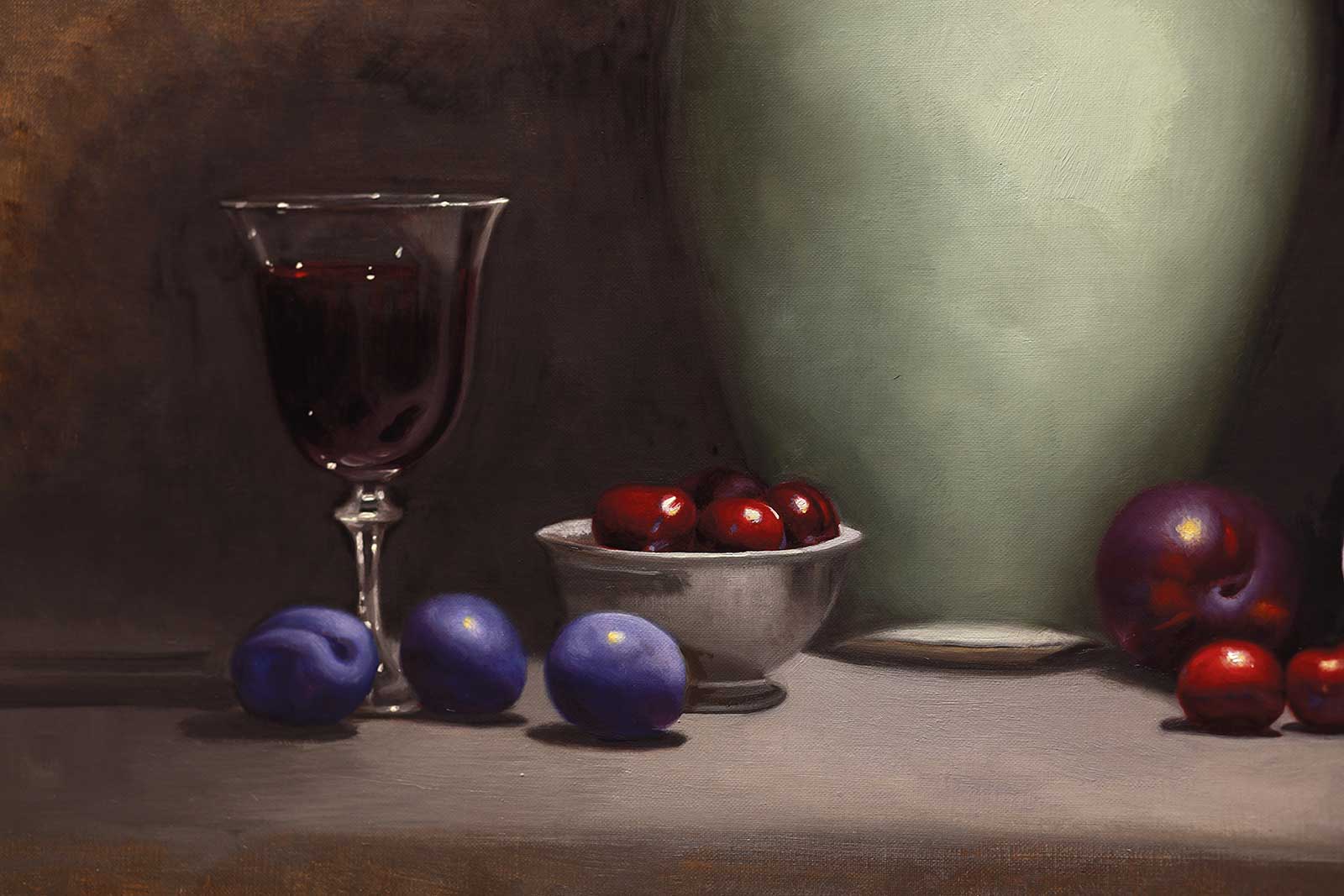 Stage 7
Stage 7 Left Side
I move to the left of my board and refine the plums near the wine glass and the cherries in the bowl, then I tackle the wine glass, which I have filled with red wine because it harmonizes nicely with the red and blue plums. I use permanent mauve and alizarin for the shadows and lighter red areas and some of the background color, which is a gray mixed from raw umber and some ivory black with cobalt blue and white for the gray areas. Then, I mix a little spec of cadmium yellow pale into titanium white for the sparkles and highlights on the glass. The tiny spec of cadmium red pale really makes it pop and look like wine.
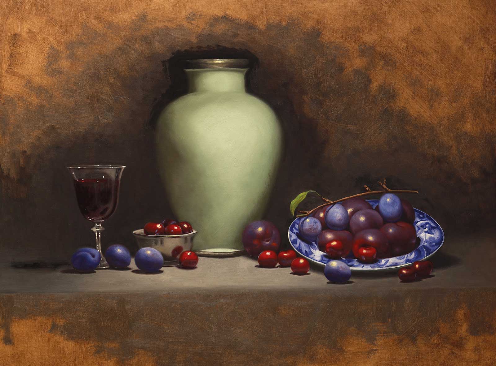 Stage 8
Stage 8 The Form of the Vase
When the fruit is finished I am ready to tackle the big form modeling of the large vase, refining the shadow and light shapes to make it turn in space. This means thinking about shadows, light shapes and highlights to make it appear as if the sides recede and the light areas at the front of the vase come forward. I also need to consider the fall of light as the light is overhead. The bottom of the vase is turning away from the light except at the very bottom near the metal rim on the base. The base shape and top metal rim need adjusting to show the curve of the rims, both horizontally and to show the highlights coming forward. I also paint in a thin background around all my fruit shapes, bowl and vase while the paint is still wet.
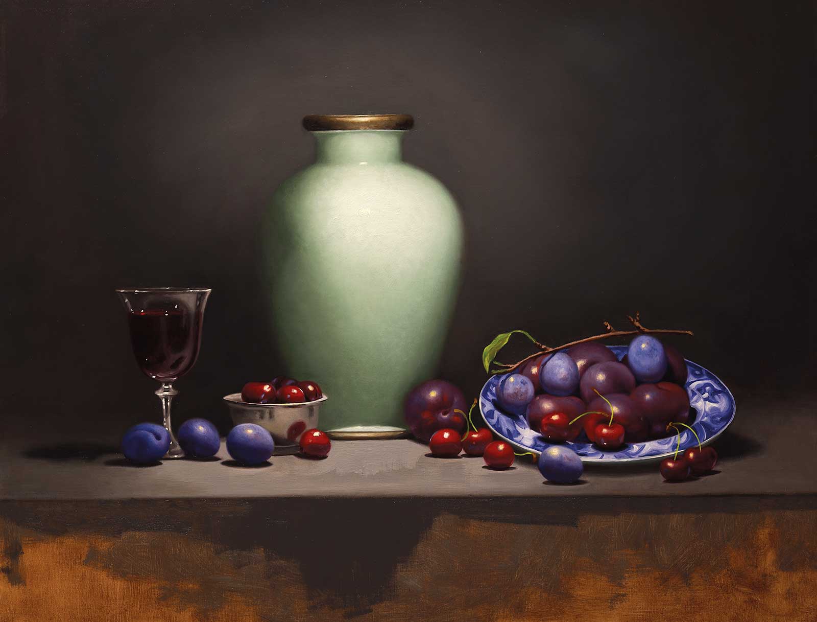 Stage 9
Stage 9 Plum and Cherry Stems
I now add the stems of the cherries and plums with a very fine rigger brush. I mix up some oily cadmium yellow pale with a speck of turquoise, aiming to replicate the character of each stem with one careful line. I like to mimic the movement of each brushstroke before I actually touch the brush to the linen. It is good to do this when everything else is dry because if you don’t like the resulting brushstroke, you can easily wipe it off and do it again. I add a little end on each stem using transparent oxide brown where the stem has come off the tree. I also add in more of the background to get an idea where I want that to have some lighter glow around the vase.
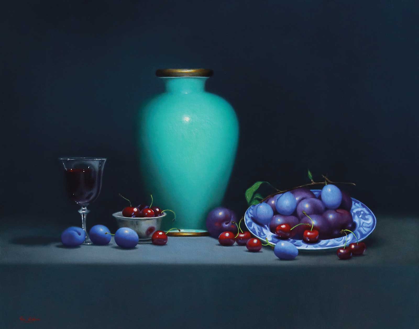 Stage 10
Step 10 Finished Artwork
King Billy Plums with Cherries, oil on linen, 23½ x 30" (60 x 76 cm)
I begin to refine the background, filling in all the front plane of the table and unifying the vase, as well as going back in to soften the shadows under the fruit. Also, I have begun to get the vase into a better form and added some slightly warm highlights, which I make with titanium white and a speck of cadmium yellow pale. This helps the highlight stand out because the lights in the vase are cool, and the slightly warm highlight looks lighter because it is warm against cool. At this very last stage, I also decided to glaze the pot with a more saturated turquoise color, which was already there but not as strong. I like the way the turquoise set off the blue purple of the plums. It is also my favorite color, and I am biased towards it. So in the final image you will see the pot is quite a bit more green/blue. I kept all my tonal values relevant but just changed the hue using turquoise and some viridian.
About the artist
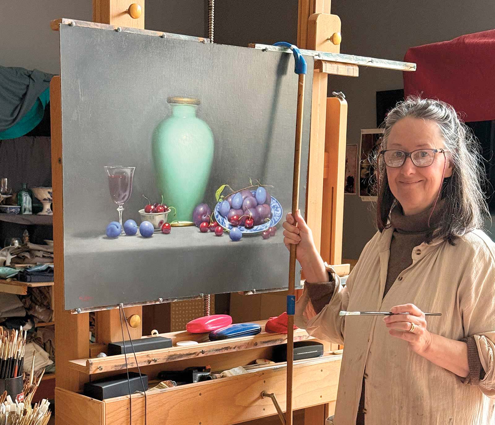 Vicki Sullivan
Vicki Sullivan is an award-winning Australian realist painter whose practice bridges the timeless beauty of Renaissance traditions with a modern sensibility. Based on the Mornington Peninsula in Victoria, Australia, she draws inspiration from the natural surroundings of the Southern Ocean and Port Phillip Bay.
Recognized as an Art Renewal Center (ARC) Living Master, Sullivan’s work is celebrated internationally for its technical brilliance and emotional depth. Her oil paintings are held in both public and private collections in Australia and abroad, including the Collection of the Art Renewal Center, the permanent collection of the State Library of New South Wales and several universities.
Sullivan has exhibited widely at prestigious venues such as the European Museum of Modern Art in Barcelona and Sotheby’s in New York, as well as many national and international portrait exhibitions. Her portraits and figurative works often explore the beauty and complexity of the human spirit, balancing realism with a poetic sensibility. Trained at the Angel Academy of Art in Florence, Italy, Sullivan’s practice reflects a dedication to craftsmanship, light and layered narrative. Her paintings continue to resonate with audiences worldwide, offering a window into both personal and universal stories.
Contact at
vickisullivan.com