



In my paintings, I draw inspiration from the great masters of portraiture such as Rembrandt, Peter Paul Rubens and Anthony Van Dyck, but my true north star has always been John Singer Sargent. I remain continually in awe of his ability to create the impression of virtuosic effortlessness, even though I know how tirelessly he worked to achieve that sense of spontaneity. In fact, Sargent is said to have scraped down a painting dozens of times in pursuit of the desired effect.
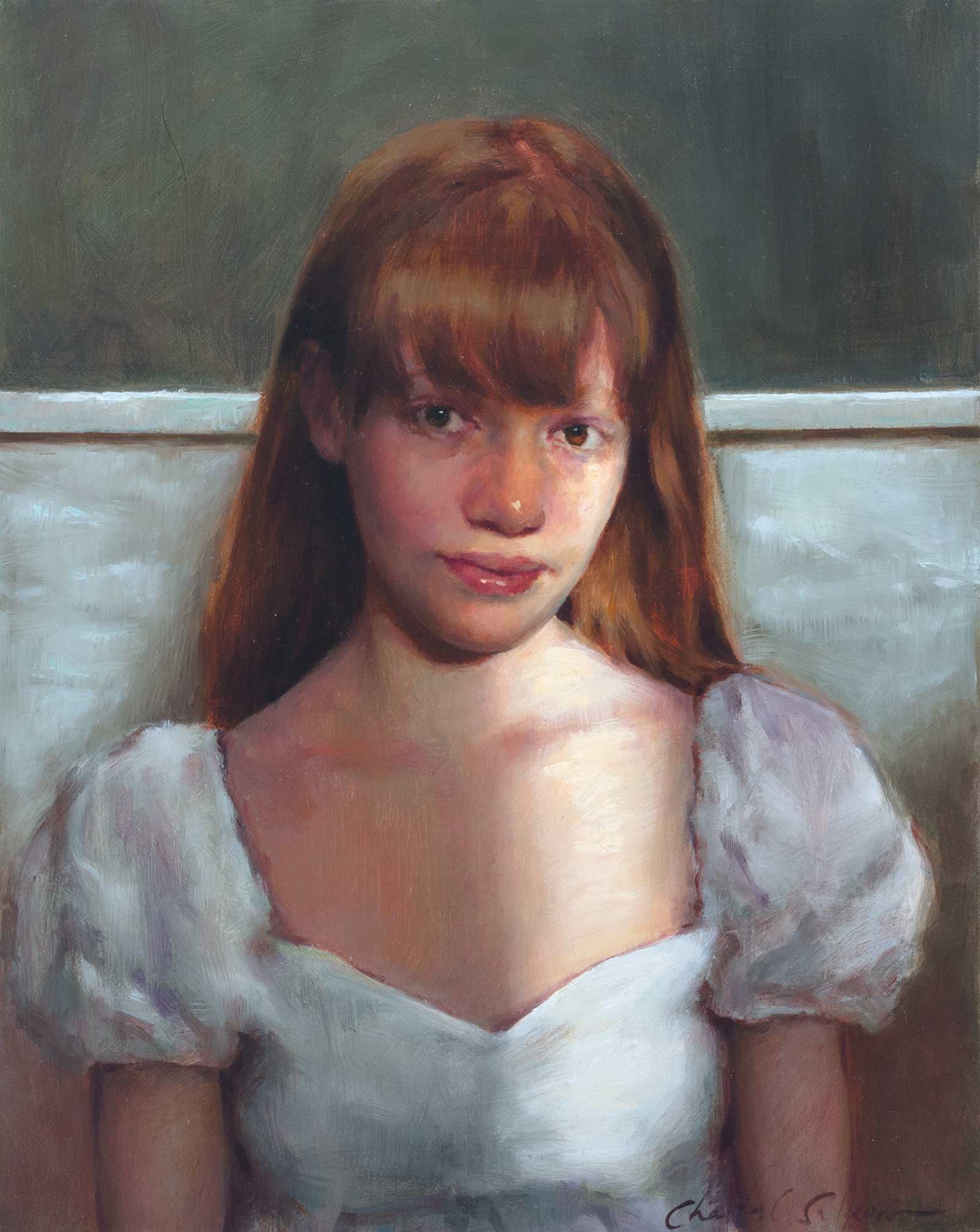
Chiara, oil on panel, 10 x 8” (25 x 20 cm)
With this in mind, a central question in my own work is how to sustain the feeling of freshness and excitement present at the beginning of a painting, even through its final strokes. Because it is all too easy for a painting to become overworked or to grow stiff over time, my aim is to find ways to preserve that initial vitality throughout an extended process.
While I always aim to stay spontaneous, whether working indirectly in layers or alla prima, a constant in my process is my palette. I learned to paint using a “controlled palette” approach, which prioritizes value first, and then color. As a student, this meant mixing nine value strings for each color and working only within matching values. Although I’ve moved away from this level of structure, the approach provided an invaluable foundation for learning to paint form.
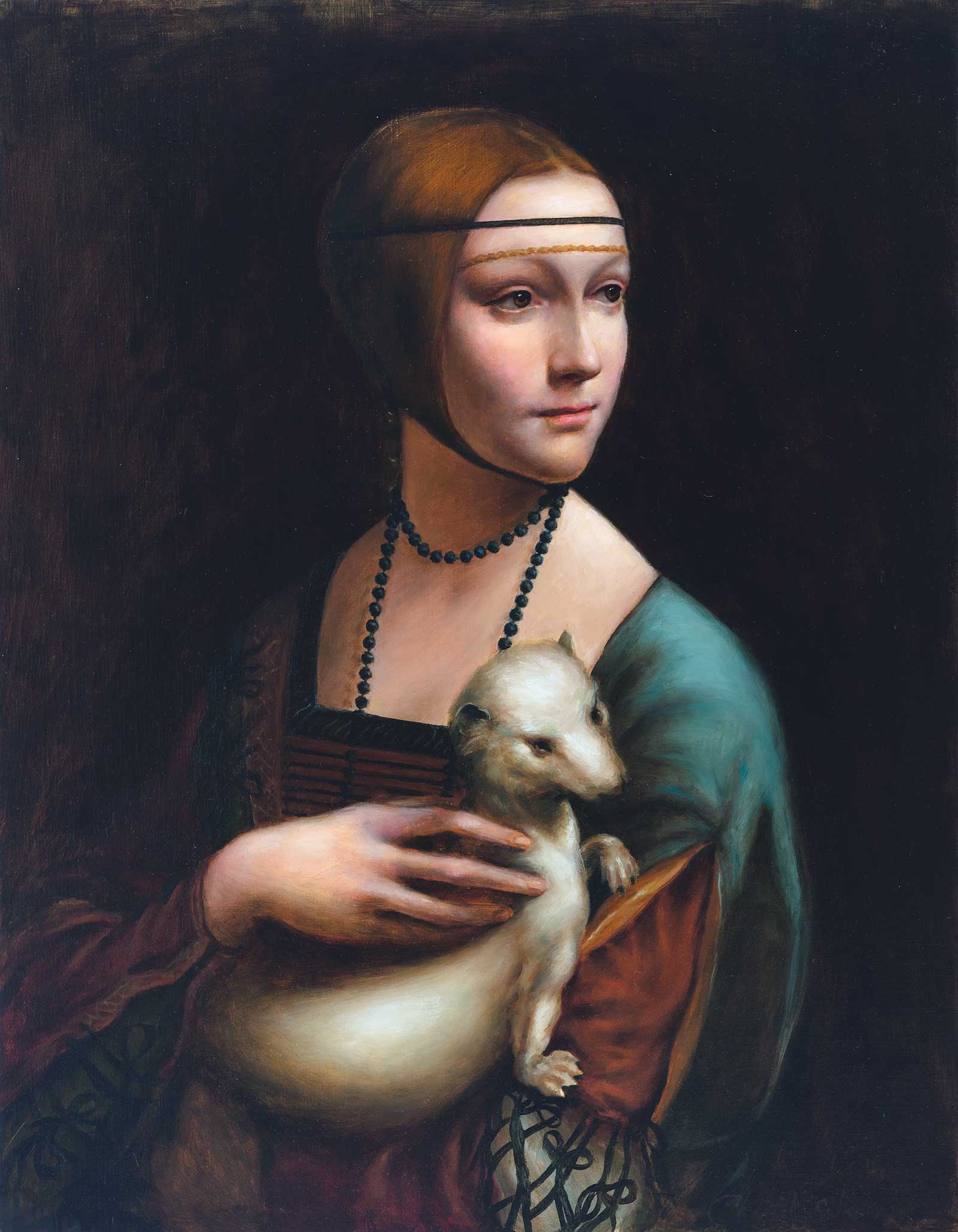
Mastercopy after Leonardo da Vinci, Lady With an Ermine, oil on panel, 18 x 14” (45 x 35 cm)
Today I still premix a value string for base flesh tones, and sometimes for other areas of a painting, to keep my thinking organized. I always prioritize value in my work, but I aim to maintain a vibrant sense of color at the same time. For me, a structured palette creates the freedom to focus on other essential elements, such as drawing, paint handling, brushwork and above all, preserving the spirit of spontaneous energy.
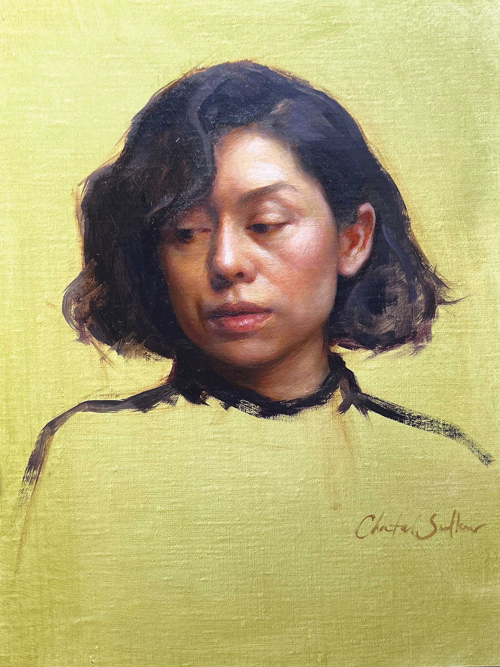
Portrait of Monica, oil on panel, 12 x 9” (30 x 22 cm)
In the following examples, I demonstrate my process in working on two different kinds of paintings: one, completed over a number of sessions, and the second, a one-day alla prima portrait. In both, I focus on being intentional in my execution in pursuit of creating results that would translate the enthusiasm that inspired me to paint them.
My Art in the Making In the Green Room
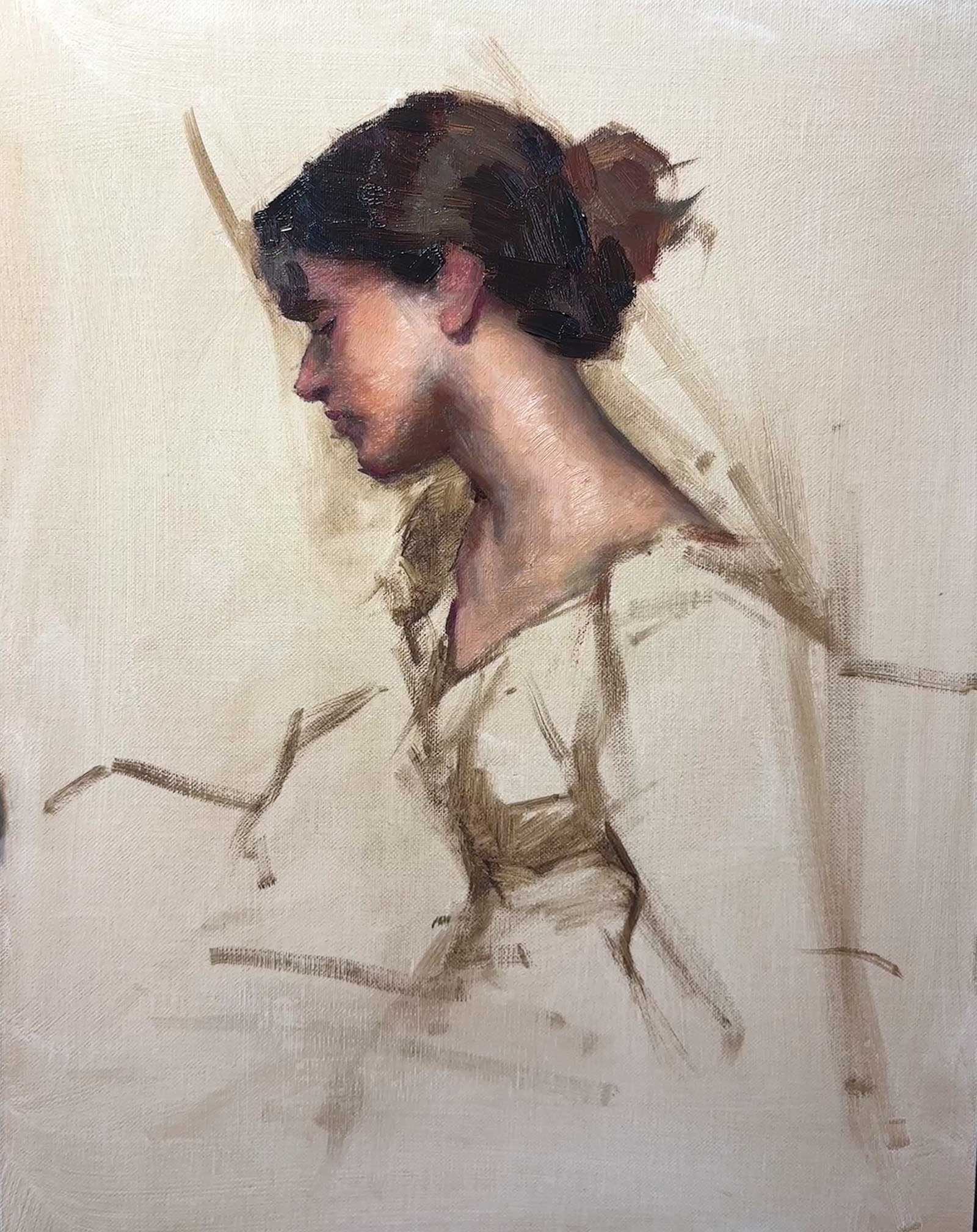 stage 1
Stage 1 Beginning With a Sense of Movement
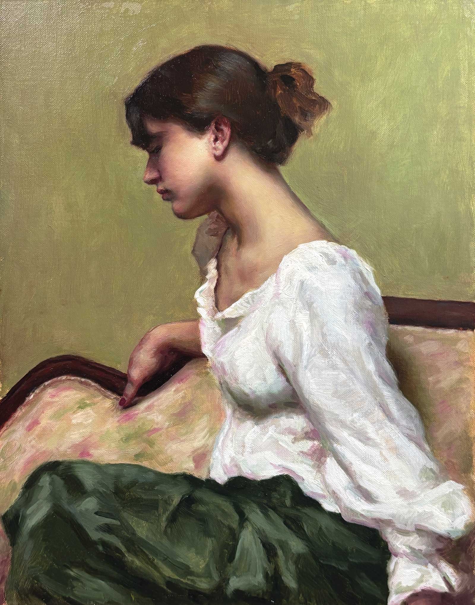
In The Green Room was completed over a series of sessions using reference photography, though I combined multiple photographs to achieve the result I wanted. I began by drawing directly on the panel with my brush in raw umber on a surface toned with a Gamsol wash of the same color. From the start, I focused on expressing the principal movement of the pose, which sweeps diagonally across the painting from the upper left to the lower right. This movement begins with the attitude of the model’s head, flows through the line of her neck and continues down through her arm. At this early stage in the process, so much could still shift considerably, so I wanted to keep it as open as possible; I quickly started laying in the colors for the face, head and neck.
WHAT THE ARTIST USED
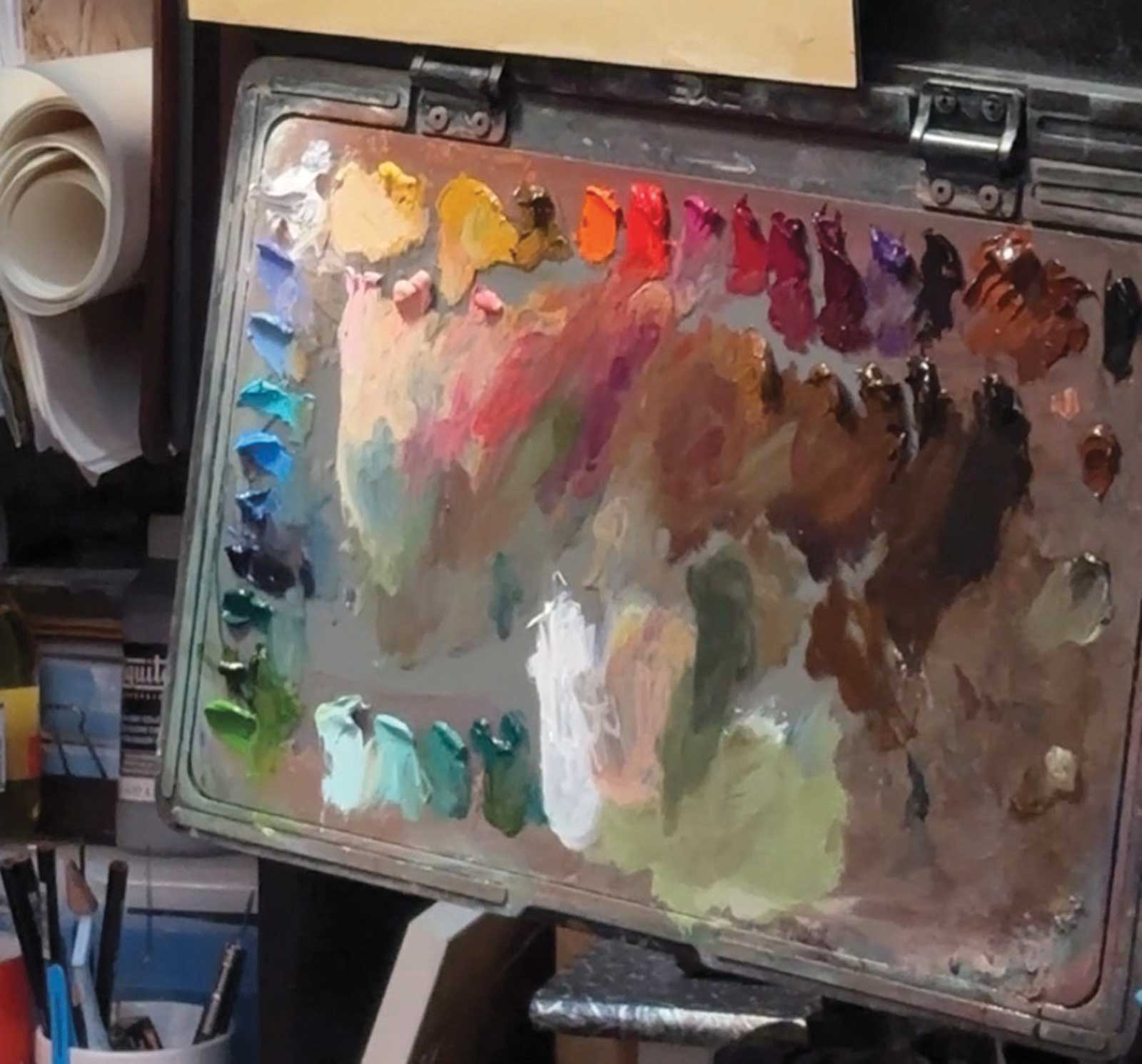 For In the Green Room
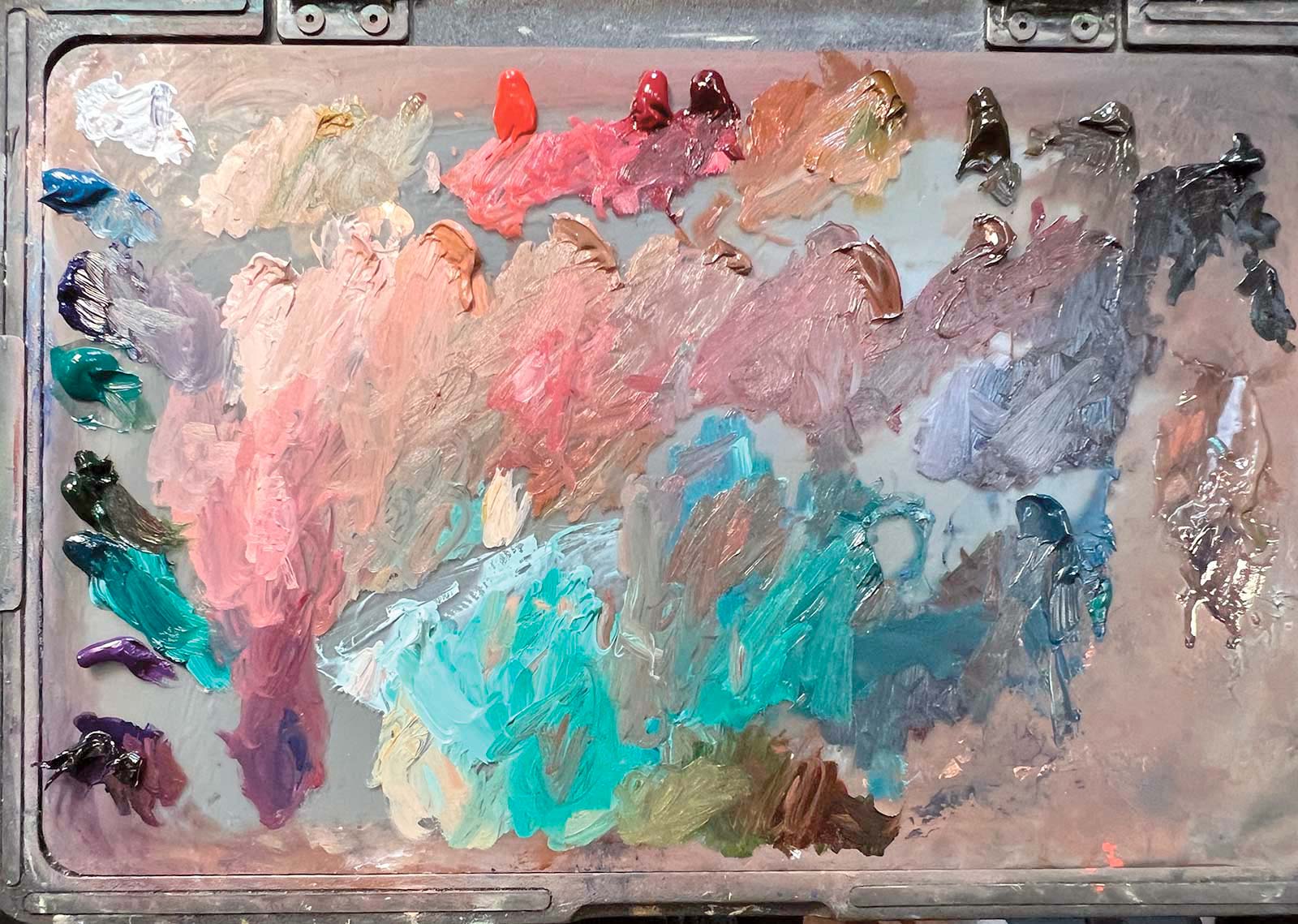
For Teal
Michael Harding Oils
Titanium and cremnitz white, Naples yellow dark, Yellow ochre, Scarlet lake, Manganese violet, Indigo, Ultramarine blue, Raw umber, Ivory black, Pale violet, Oxide of chromium green, Viridian
M. Graham Oils
Cerulean blue, Transparent iron oxide red
Sennelier Oils
Turquoise light
Old Holland Oils
Cadmium yellow medium, Naples yellow extra, Alizarin lake extra, Warm gray light, Brilliant yellow light, Neutral tint
Gamblin Oils
Sap green, Cobalt blue
Rembrandt Oils
Carmine, Burnt sienna
Vasari Oils
Ruby violet
Holbein Oils
Rose violet
Winsor & Newton Oils
Cadmium orange
Brushes & Co. Brushes
Eclipse long filberts and rounds, sizes 0-6, Evergreen long flats and extra long flats, sizes 2,4, Series 2065 extra long filberts, sizes 0-6, Series 279 long flats and long filberts, sizes 2-8
Silver Brushes
Grand Prix extra long filberts, sizes 2-6
Additional Materials
Natural Pigments Oleogel, Michael Harding Miracle Medium, Gamblin solvent-free gel, Gamsol, Artefex 411 Oleopanel, Raymar L64C linen panel
 stage 2
Stage 2 From the Background to the Blouse
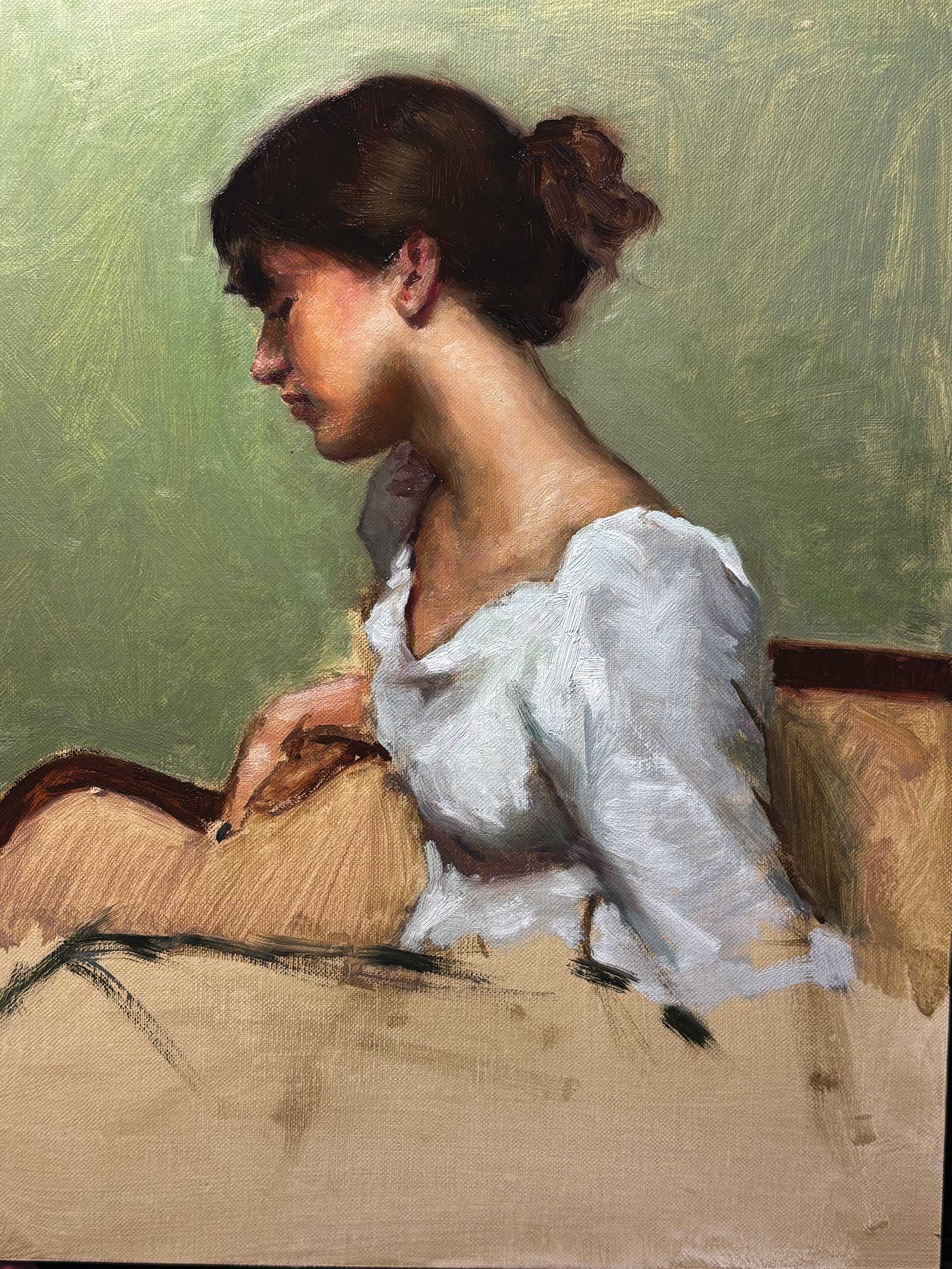
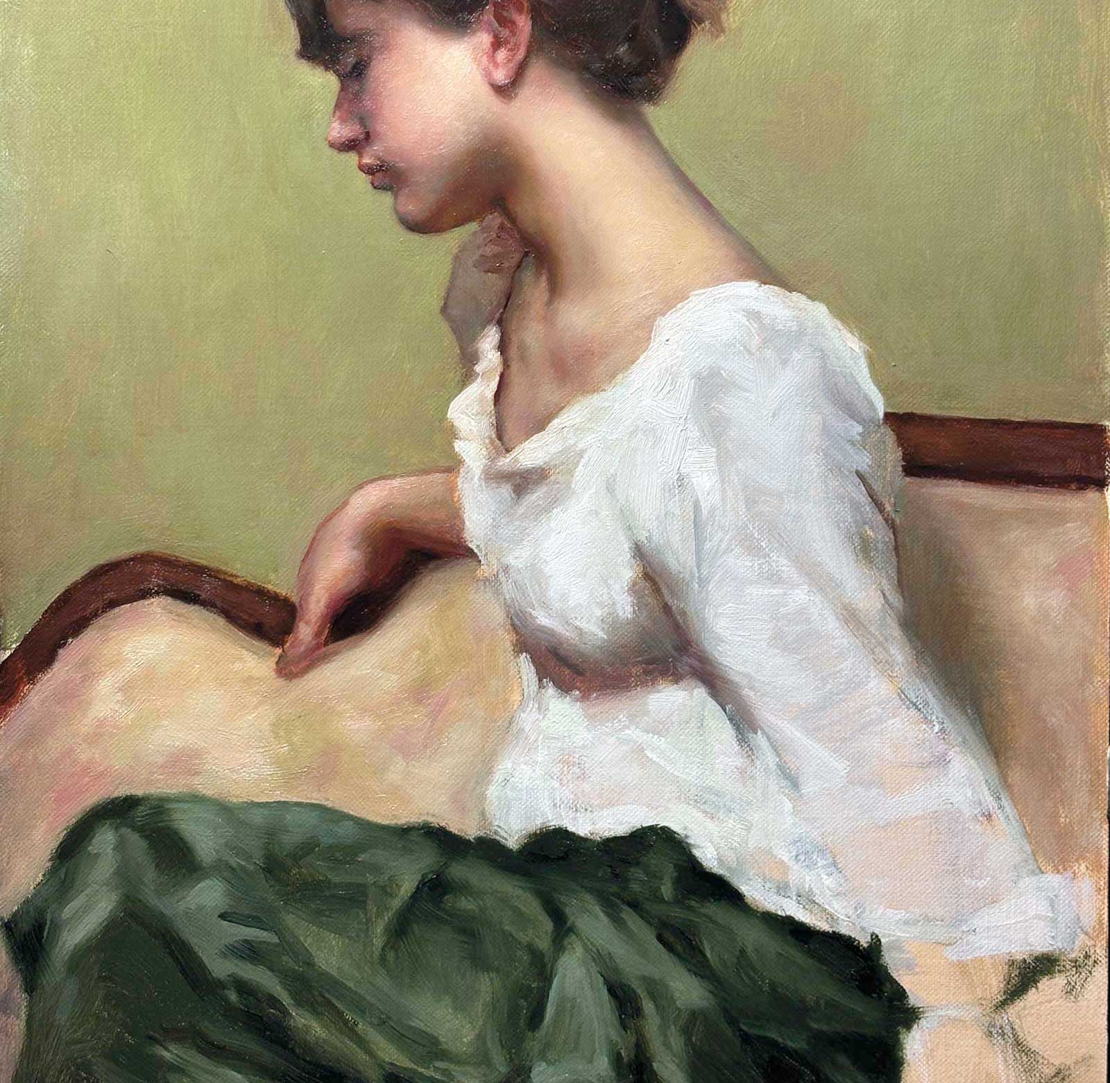
I then refined the drawing of the features more precisely, scrubbed in the background, indicated the hand and moved on to the white blouse. Of course, white is never simply white, it reflects the colors around it. Because the background was green and the skirt would be green as well, I introduced a pale, neutral gray-green into the shadows on the sleeve. This mixture was made from titanium white, raw umber, a touch of ultramarine blue and sap green, the same green used in the background. For the shadow beneath the breast, I balanced warmer notes with a darker version of the gray-green neutral, keeping in mind that the area would receive reflected color from the skirt. In the lighter passages of the blouse, I painted titanium white directly into the shadow areas and gradually built toward the lightest lights with thicker applications of paint. At the same time, I marked the top edge of the skirt with a dark green note and established the curving horizontal of the couch frame.
 stage 3
Stage 3 Expressing White Fabric With Impasto
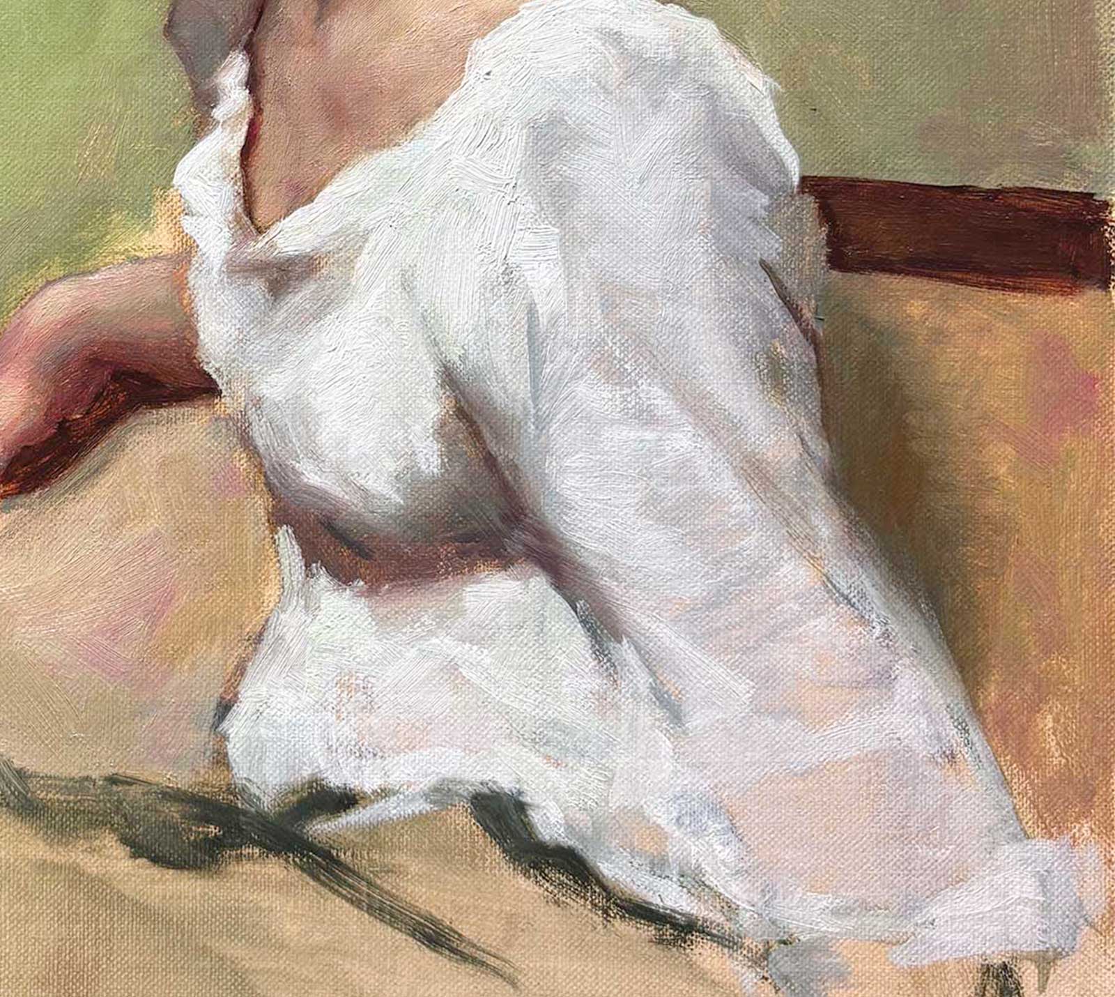
Session 2: In the second painting session, I painted the couch in a wash of pink and yellow, and I gave more form to the hand using colors harmonious with the upholstery. I also continued building the lightest areas of the blouse, laying the paint in sculpturally to suggest volume while thinking of Sargent’s use of impasto in his paintings with similar passages of white fabric. The photograph I was working from cut the arm off at an awkward point, so I referred to additional photos that showed more of the arm and skirt. I had not yet decided how to resolve the lower right corner of the painting, so I kept the paint there relatively transparent, both to suggest the translucency of the fabric and to leave my options open.
 stage 4
Stage 4 Refining the Features
I then returned to the face, concentrating on the delicacy of the profile and the rounded form of the cheek. In particular, I wanted to bring out the subtlety of the cheek overlapping the nose and mouth. I also refined the ear, the neck and the upper chest just above the neckline of the blouse.
Painting White Fabric with Impasto
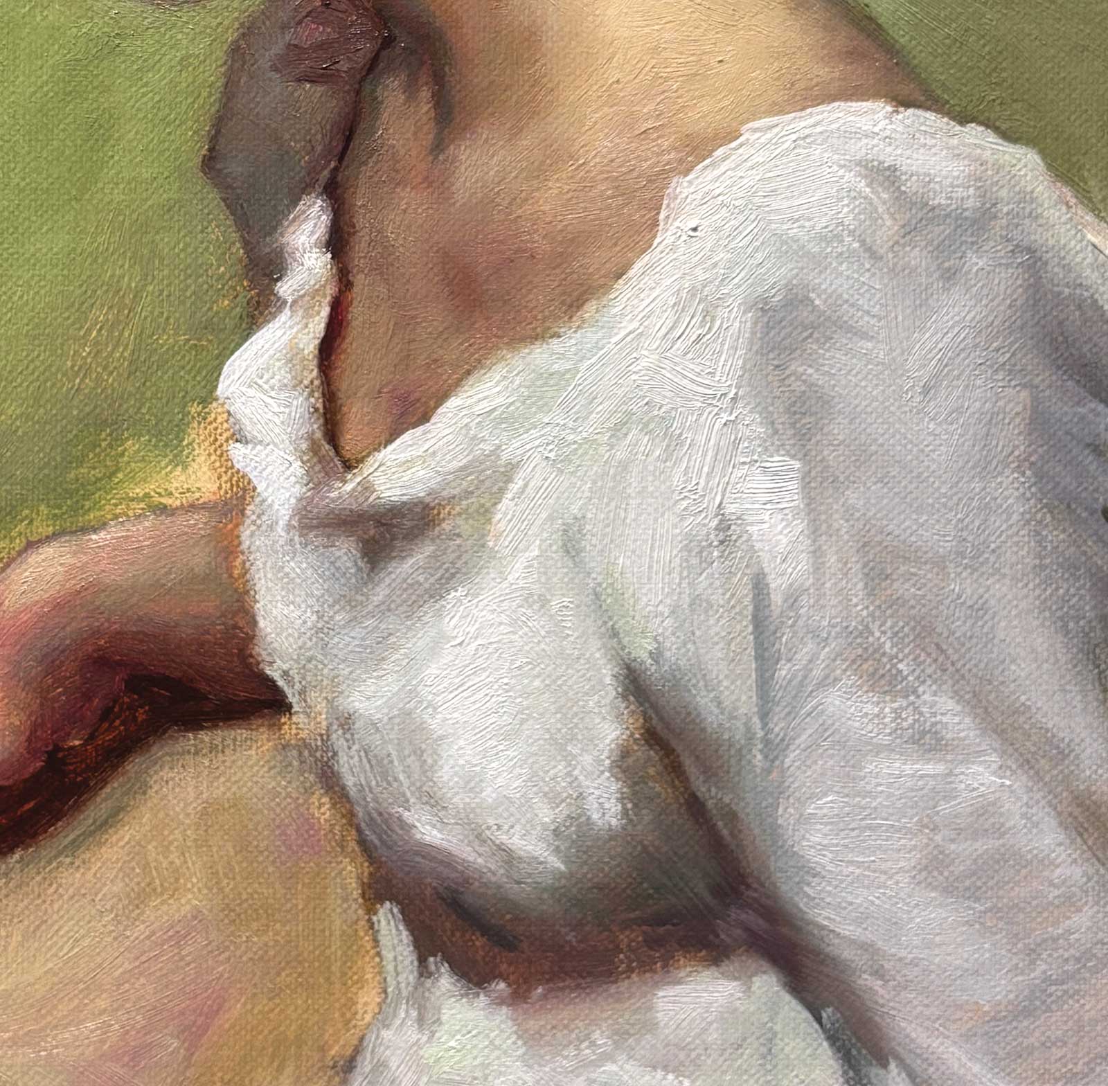
I painted the shoulder, sleeve and neckline of the blouse with thick, layered applications of titanium white, deliberately avoiding any blending of the brushstrokes for as long as possible. I had recently seen a Sargent painting with a similarly bold handling of white fabric, and I wanted the blouse to feel completely distinct from the texture of the skin.
 stage 5
Stage 5 Painting the Skirt and Unifying Through Color
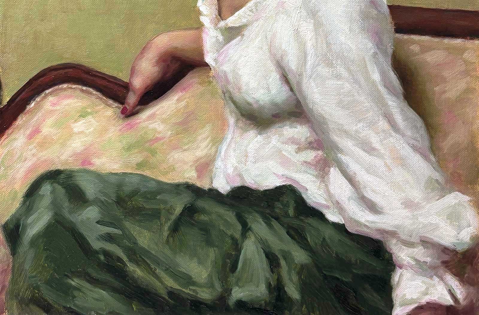
In the third session, I pushed the color of the couch fabric, restated the drawing of the hand and the couch frame and painted the dark green satin skirt. I also began building form, luminosity and color in the face with glazes. I repainted the background, introducing elements of the model’s skin tones into the green to introduce warmth and unify the painting.
 stage 6
Stage 6 Resolving the Sleeve and Moving Towards a Finish
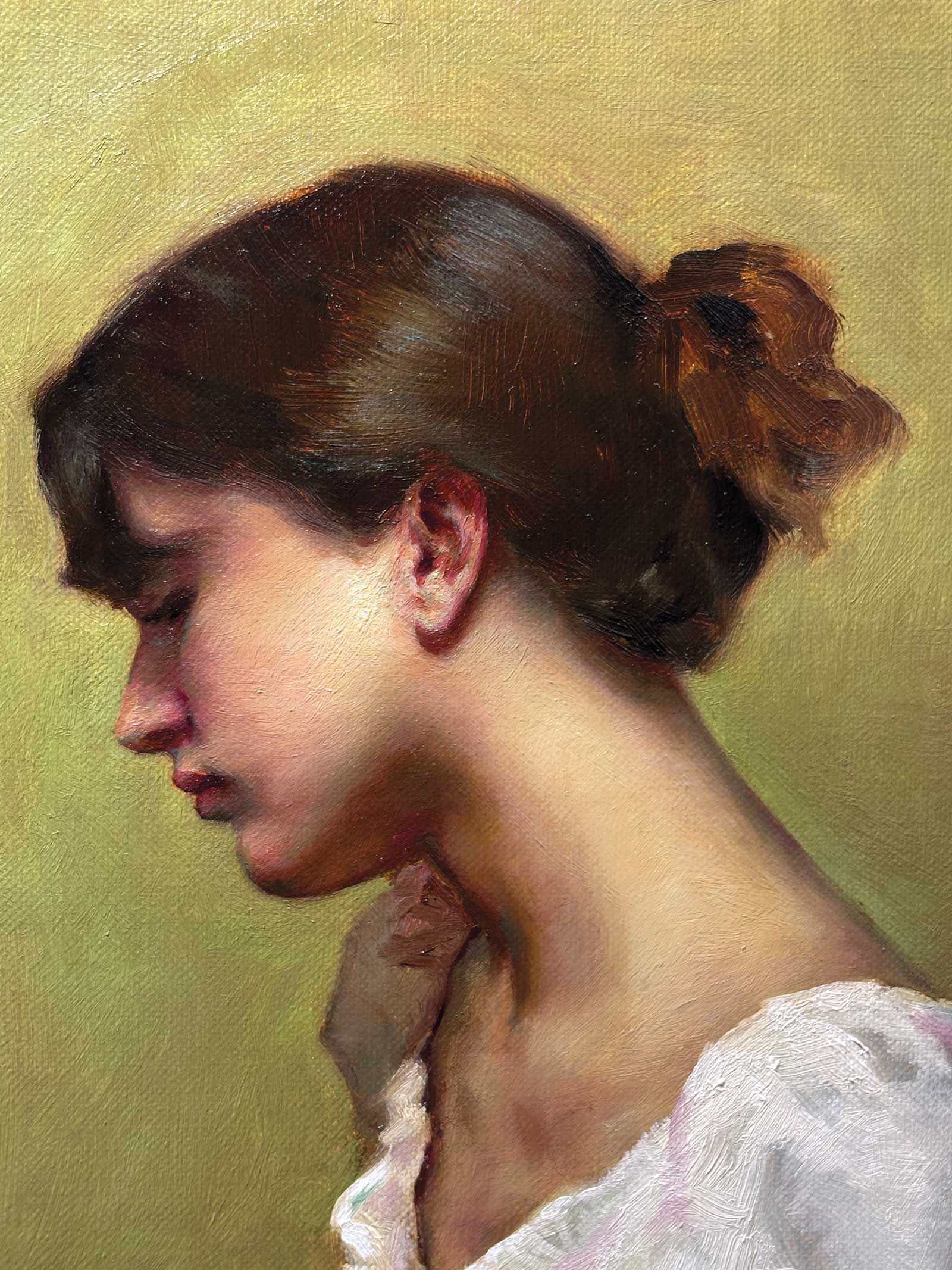
Session four: I settled on the final design for the sleeve, resolving the lower right corner of the composition. With that area established, I began bringing the rest of the painting to a finish. I added more texture to the couch upholstery, clarified the details of the wooden couch frame and brought the hand to a higher level of finish, including the red, manicured thumbnail. I also refined the blouse, introducing pink notes from the couch into the shadows of the white fabric.
 stage 7
Stage 7 Final Touches
Finally, I spent additional time glazing and refining the face and features, balancing cool and warm tones while building the shimmer of light along the side of the face and the secondary lights that spill down the neck. I also added cool highlights to the hair, which I had kept deliberately simple throughout the process with transparent dark passages. This can all be seen in the final painting.
 stage 8
Stage 8 Finished Artwork
In the Green Room, oil on panel, 14 x 11” (35 x 27 cm)
My Art in the Making Teal
 stage 1
Stage 1 Drawing, Plus establishing the hair
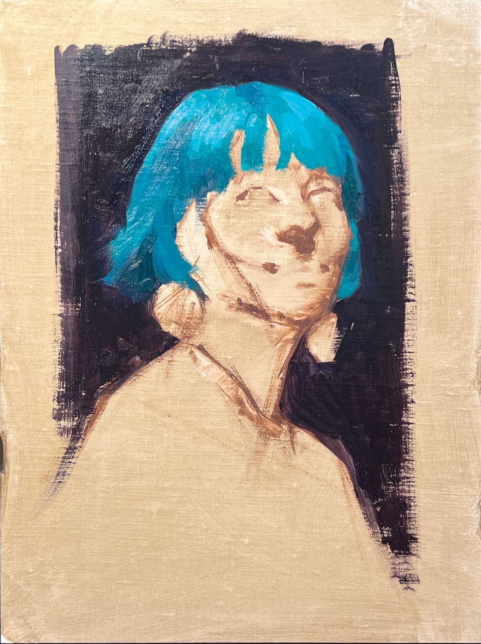
Teal was a spontaneous alla prima painting completed in a single session. I began with a quick brush drawing in raw umber using Gamblin’s solvent-free gel medium. The model’s hair was an extraordinarily striking shade of green, and I knew it would be the key element of the painting. For that reason, I used phthalo green, which is not usually on my palette, and laid in the hair and background first. I kept the background as a vertical vignette. I didn’t want the dark tone to overtake the painting, but I knew the contrast would help set off the brilliance of the hair.
 stage 2
Stage 2 Laying in the Face
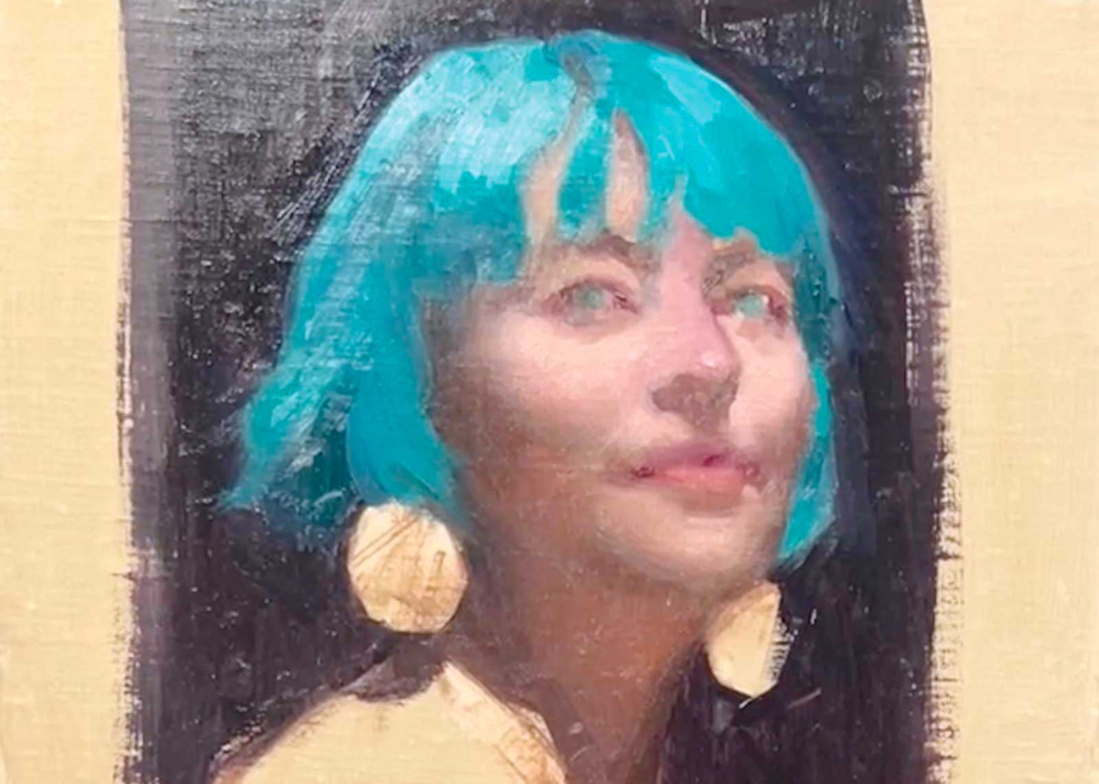
Next, I blocked in the face and introduced the green of the hair into the deepest shadow areas, including the terminator edges where the form turns toward the light, and especially within the eyes. Carrying the green throughout the painting helped unify the picture as a whole. Unity of color is something I am always thinking about when painting a portrait. If a contrasting cool color appears elsewhere in the painting, whether in the background, clothing, or hair, I like to integrate touches of it into the warm tones of the skin.
 stage 3
Stage 3 Accents
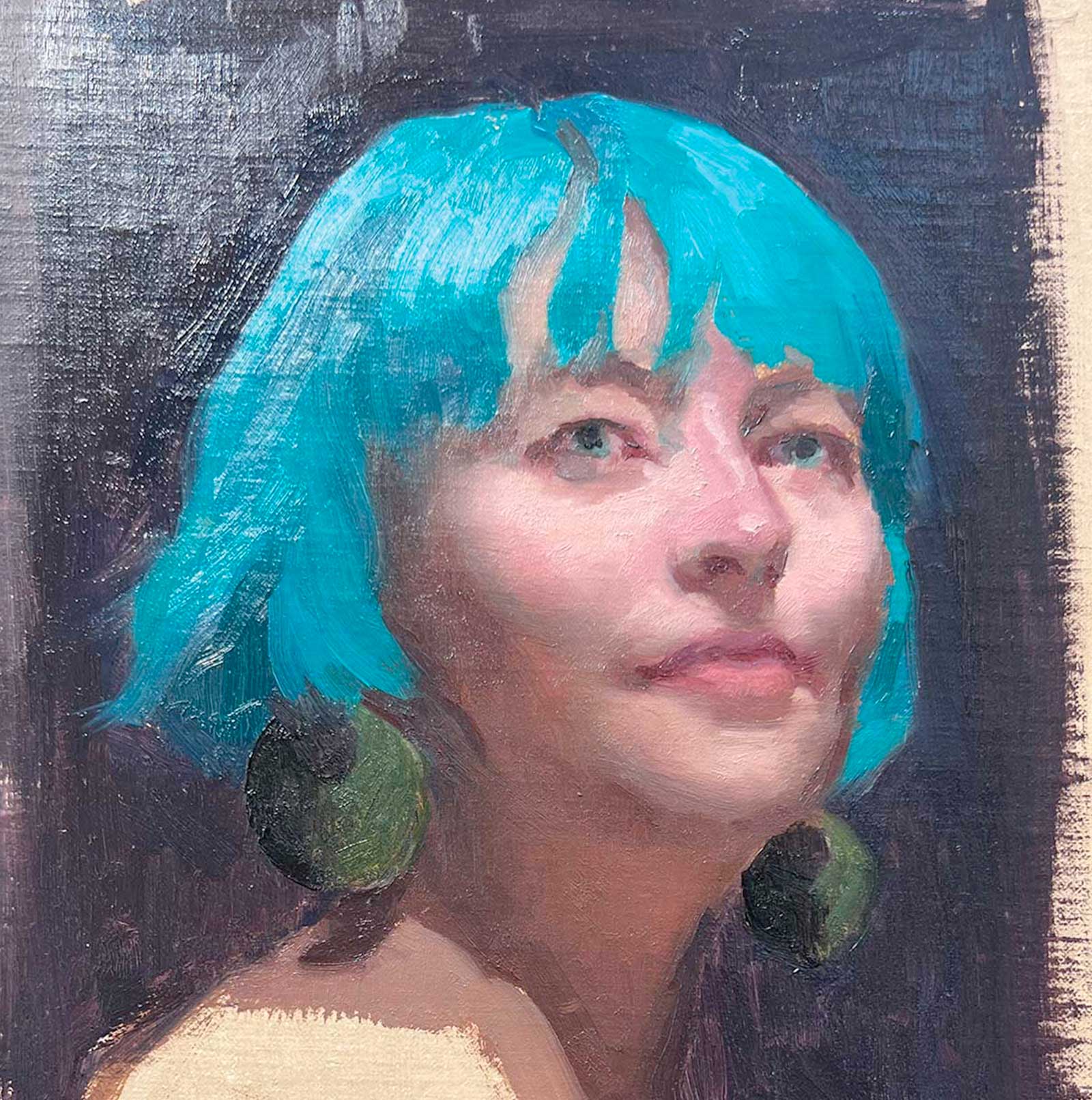
I established the pupils and the upward direction of the gaze, then painted the earrings. Their warmer yellow-green tone created an engaging warm-cool contrast with the phthalo green of the hair. I also restated the boundaries of the shadows and delineated the jawline, which helped the chin project from the neck, an area I wanted to keep simple and uncomplicated.
Painting light effects
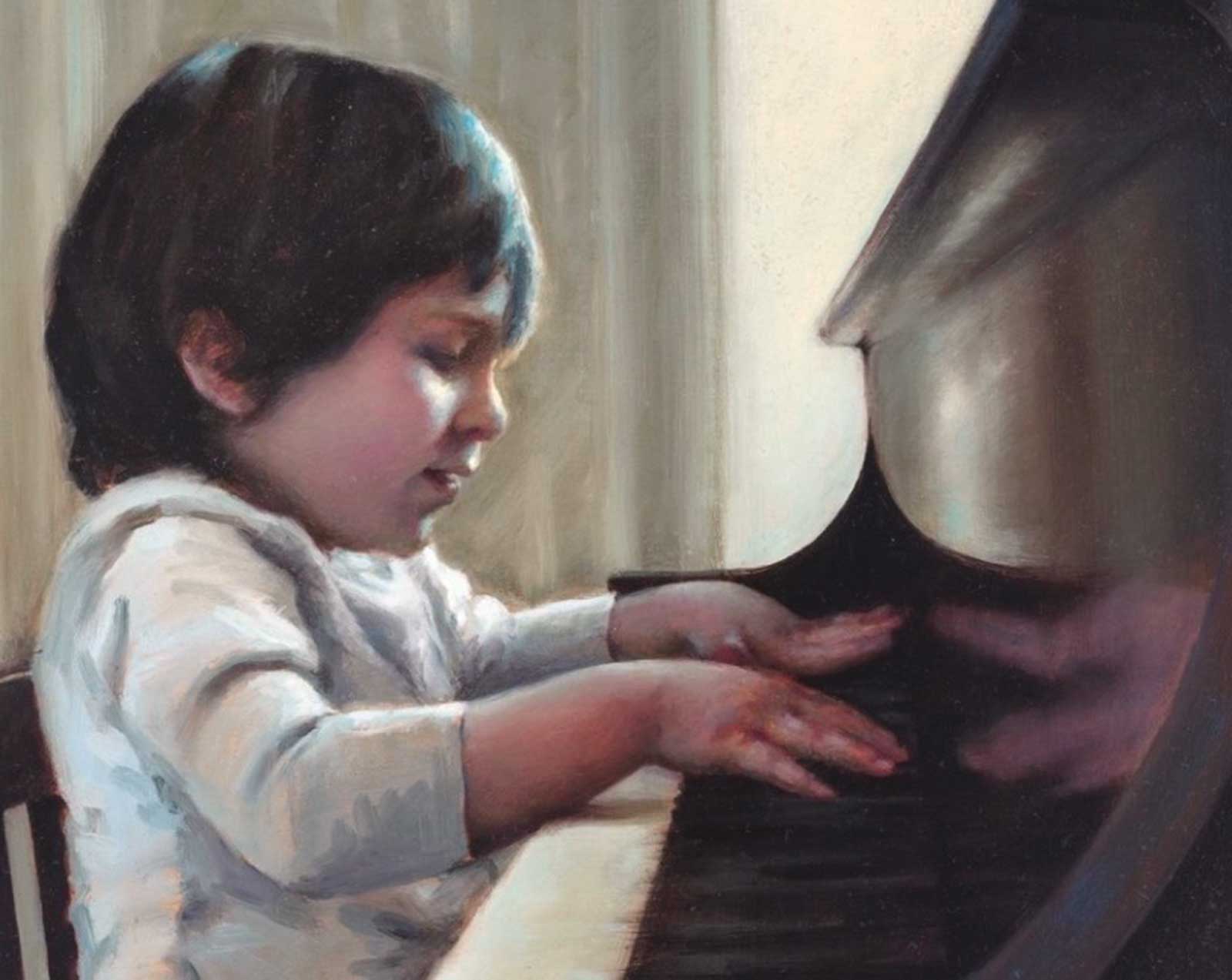
One of my favorite things to paint is striking light effects. In this detail of my painting of my son at the piano when he was 2, I was captivated by the reflection of his hands on the polished dark wood, as well as the cool blue light streaming through the window and illuminating the edge of his dark hair.
 stage 4
Stage 4 Integrating Green Throughout
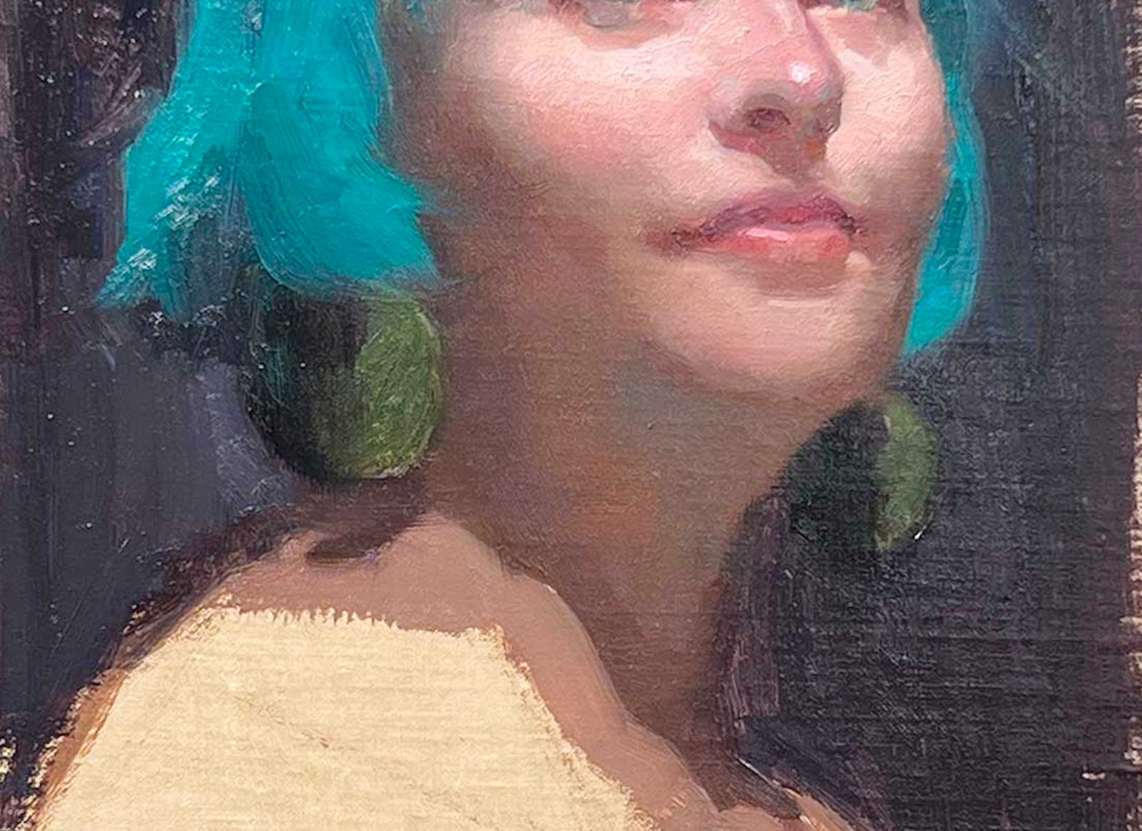
I brought the green of the hair into the reflected lights under the chin and on the neck. I considered adding more information into the shadow on the neck but decided that keeping this area simple would make a stronger, more unified statement. I softened transitions and concentrated on emphasizing the roundness and warmth of the cheeks.
 stage 5
Stage 5 Finishing the Shirt, Refining Transitions
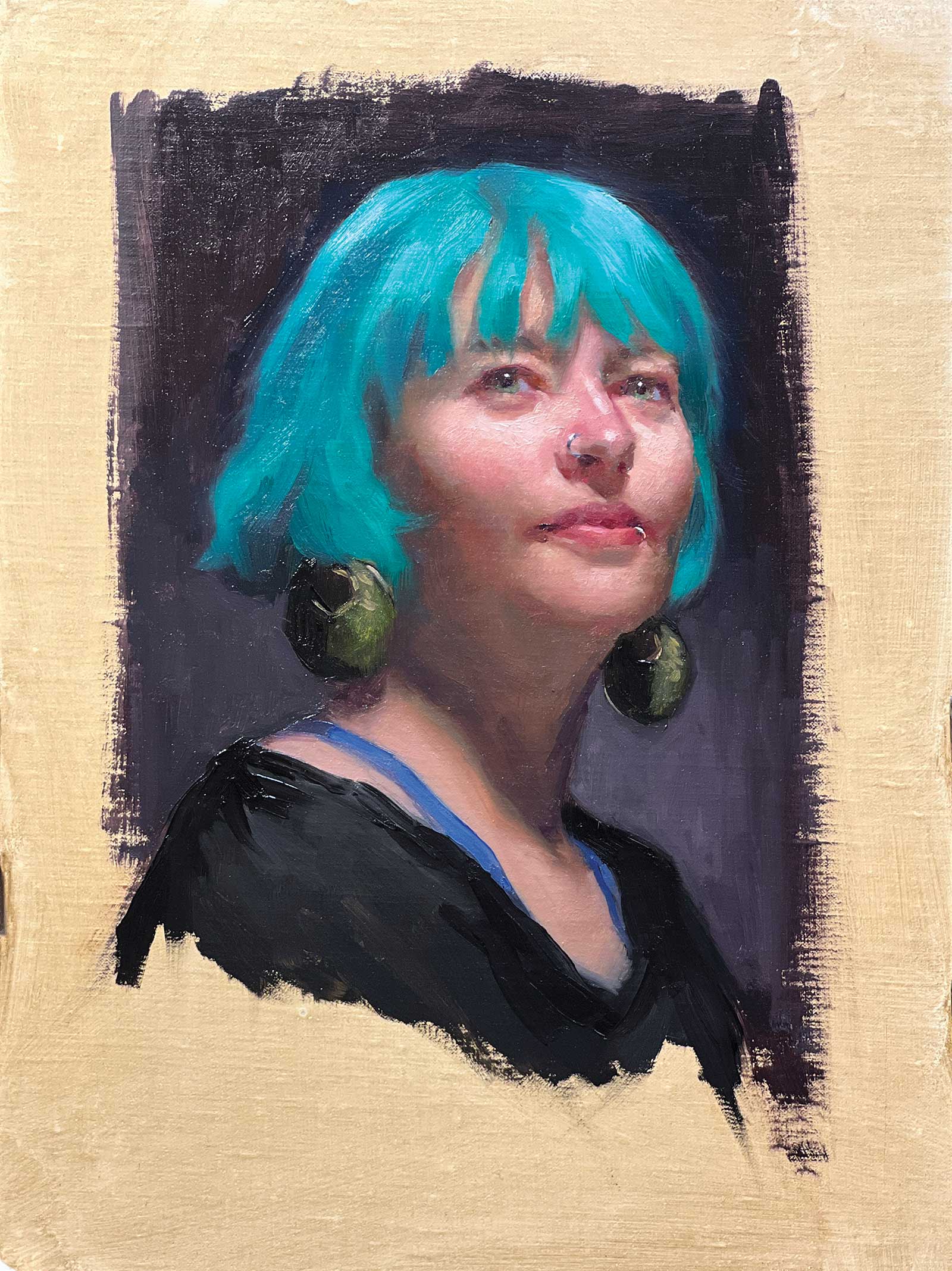
Teal, oil on panel, 12 x 9” (30 x 22 cm)
In the final stage, I added the blue straps and black shirt, and painted the sparkling yellow-green highlights and deep darks in the earrings. I also placed subtle accents at the corners of the mouth, the nostrils, and in the eyes, and painted the nose and lip rings. Shadows cast by the bangs were added last. I decided it was best to stop and look at the painting the next day. When I did, I knew she was finished!
About the artist
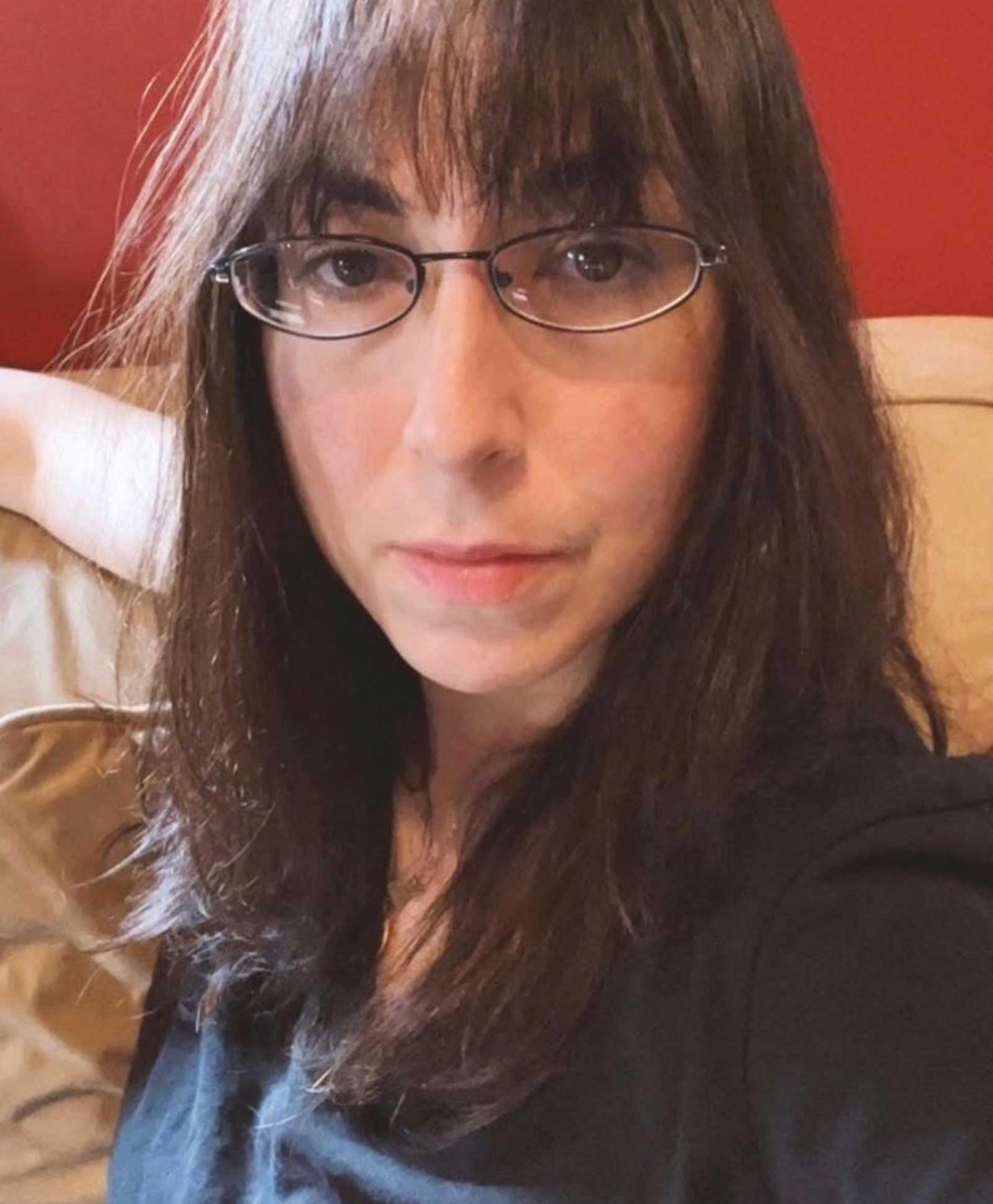 Chantal Sulkow
Chantal Sulkow is a lifelong New Yorker whose artistic journey has been shaped by a deep commitment to classical techniques and a love of the human face and form. She earned a BFA in illustration from the School of Visual Arts, painted master copies on site at the Metropolitan Museum, and also studied in the part-time program at Grand Central Atelier. Sulkow’s work has been featured in and won awards in a number of prestigious juried exhibitions with organizations including AAPL, IGOR and NOAPS. She was the recipient of the Portrait Society of America’s 2024 Edward Jonas Grant, as well as having won both Best in Show and Peoples’ Choice Awards at AAPL’s 2025 Realism on the Hudson Small Works Juried Exhibition.
Sulkow’s work is rooted in her fascination not only with capturing likeness but also with revealing the energy and spirit that lie beyond the surface. In her portraits, she seeks to communicate the joy and beauty she finds in the act of seeing and portraying the human face.
Sulkow is self-represented and accepts commissions for family and professional portraits, posthumous portraits and animal portraits. She also specializes in reproductions of masterworks ranging from Leonardo da Vinci and Vermeer to John Singer Sargent.
Contact at
chantalsulkow.com