



Grand Prize is a four-page editorial feature in American Art Collector magazine
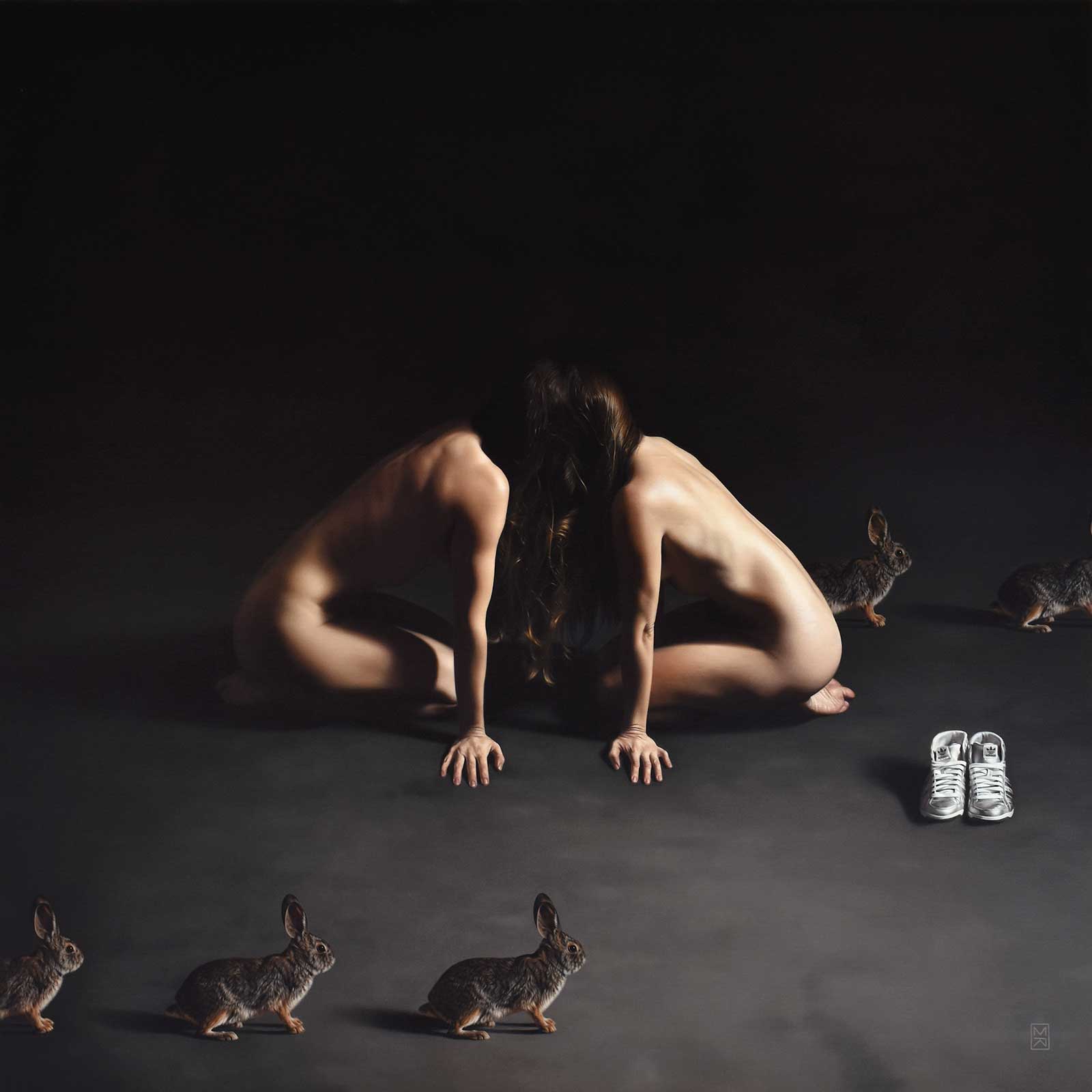 August Again, oil, 24 x 24" (60 x 60 cm)
Megan Elizabeth Read
Virginia, USA
Highly Sensitive
The art of Megan Elizabeth Read is poignant and deeply emotional. Grounded in realism, her figurative paintings, often delicate nudes, convey a masterful sense of light, value and physical form while capturing something far deeper beneath the surface.
“One of the main themes that runs through my work generally is the idea of who we are versus who we want to be. Or in certain cases, just the myriad versions of ourselves that exist, and the conflict and dissonance, sometimes simply the complexity, of existing in that state,” she says. “I also think about constructed identities a lot and the garishness of the world we create around us and in ourselves (both in myself and others) in contrast with the natural state of the world and all the small things that I truly find precious.”
She continues, “Because I am a highly sensitive person, I tend to try to use my work as a way to combat the overwhelm that I often feel in the world, which is why I started painting in the first place, and this very much impacts my compositions. I suppose I’m trying to visually create the sensory space I crave in my outer life, and this tends to lead to these stark but calm, contemplative worlds.”
As a designer in a previous life, Read also has a fondness for simplicity that influences the way she approaches her work. Her work is held in a number of collections, including the prestigious Bennett Collection of Women Realists and the permanent collection at the New Salem Museum in Massachusetts. She has also received numerous awards including First Place for Imaginative Realism at the 2019 Art Renewal Center International Salon and Director’s Choice at the 2020 International Guild of Realism Juried Exhibition.
My Inspiration
At the time I made this painting, I felt I was compulsively looping through the same behaviors, with time escaping me—here I was again, in autumn—and I wanted to show the tension between my desire to move through the world differently and the inertia of my own nature. The rabbits represent an anxious momentum. A flickering presence hinting at motion beneath stillness. I would see them running across my street at 1 or 2 a.m. when I finally came home from my studio, and in the moonlight, exhausted after a long day of painting, their presence always felt dreamlike.
My Design Strategy
Generally I start by taking lots of photos and then create composites in Photoshop that I play with until they feel right. Once I have a mockup that I feel comfortable with, I use that as a reference for my actual painting. And that is how I approached this one. I was creating this for an exhibition where each piece had to be 24 x 24” so I had that box to work within as a starting point, but otherwise my only requirement was self imposed: to create something that reflected my current state and felt like home.
My Working Process
This piece was created in oil on extra fine linen over ACM. I don’t always do underpaintings, but for this one I created one in umber, and then completed the actual painting mostly in one layer on top of that, with only minor details and adjustments at the end. The hair was done in one pass, as was each figure. But the rabbits took me more hours than I could have imagined in my wildest dreams. Painting one rabbit may not be hard, but painting the exact same rabbit over and over was far more challenging than anticipated!
Contact Details
Email: hello@maeread.com
Website: maeread.com
Second Prize is a two-page editorial feature in American Art Collector magazine
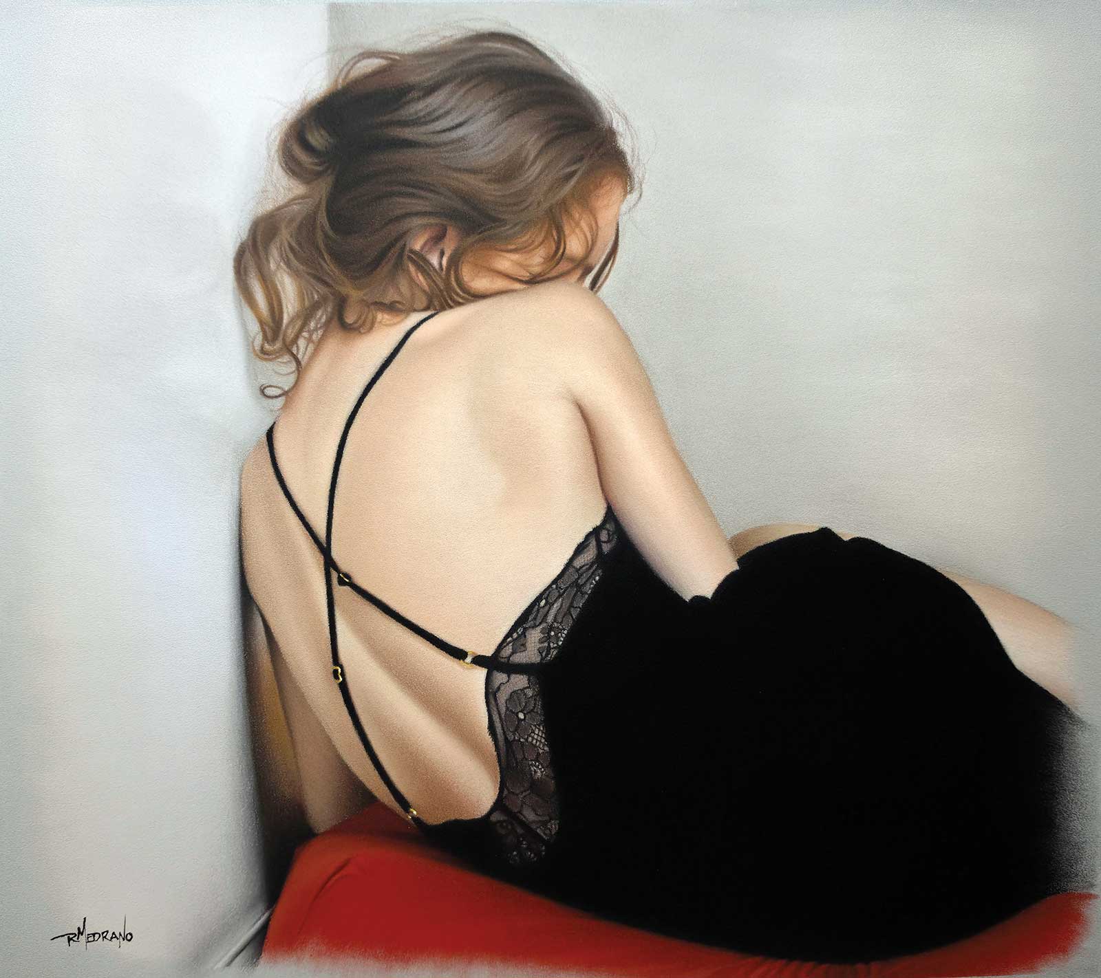 Solitude, soft pastel and pastel pencil, 16 x 20" (40 x 50 cm)
René Medrano
Brussels, Belgium
My Inspiration
The majority of my artwork is rooted in the emotional experiences and memories that have shaped me, influencing the way I see and interpret the world. Solitude is a direct reflection of my desire for quiet, distance and isolation. The piece explores both the comfort experienced while being alone and acknowledges the biased introspection, loneliness and vulnerability that can accompany solitude. Liv Sage is a fantastic art model that helped convey this feeling and express it in ways words could not.
My Design Strategy
This painting is framed in a compact composition to convey a sense of confinement that can be suffocating and isolating. The notion with the pastel trailing off and exposure of the pastel paper is to give the painting a feeling of it being a memory, often incomplete and flawed, a technique I am actively working on. The colors of red and black play a supporting role. The red conveys the inner turmoil and anguish experienced when caught in a destructive self-reflection while black encapsulates negative thoughts and memories, which causes us to pull away from others.
My Working Process
All my pastel paintings start with a bare drawing on Clairefontaine Pastelmat paper. I like to work in sections: hair, flesh, clothes, surroundings, etc. I block in the section with an underlying color and work the pastel into the paper with a Sofft pastel sponge or my fingers. Then build up layers starting from undertones, midtones and finally light tones/highlights. I occasionally rub the pastel into the paper when I am trying to achieve a softer look. I develop a section before I move on to the next and do final touches once all sections are complete.
Contact Details
Email: renemedranoart@proton.me
Website: renemedranoart.com
Third Prize is a one-page editorial feature in American Art Collector magazine
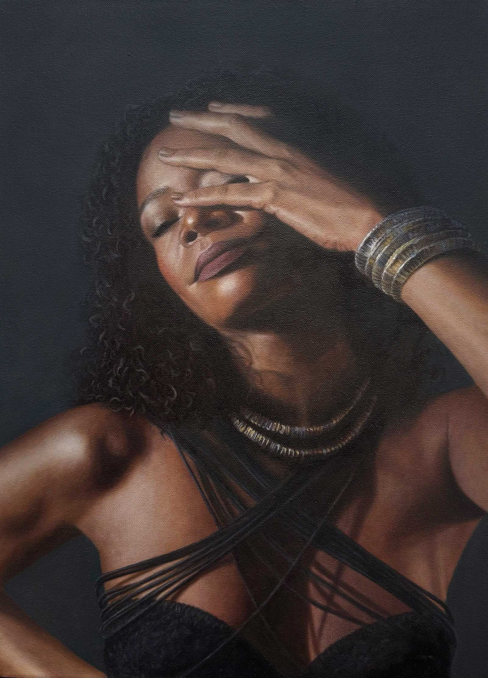 Poise, oil on canvas, 24 x 18" (60 x 45 cm)
Oleksandra Korolenko
New York, USA
My Inspiration
For the painting Poise, my inspiration came from a beautiful woman named Isamar Gonzalez. She is a multidisciplinary artist who creates unique clothing using macramé. Her creativity, appearance, energy and the way the pieces she creates become part of her image were especially inspiring. Her strong individuality and personal style, combined with her unusual macramé work, became a beautiful foundation for a series of portraits.
My Design Strategy
The idea for the series began with selecting the right visual elements for Isamar’s portraits. During a visit to her studio, her macramé creations were explored and several pieces were selected with the composition of the paintings in mind. We then went to a photo studio, where photographer Rita Marchuk and makeup artist Anastasia Granovska joined us for a session created specifically to provide reference images for the artworks. We experimented with different poses, looks and lighting, giving me a wide range of reference images to develop into paintings.
My Working Process
The portrait begins with a pencil sketch, which is then transferred onto the canvas. A translucent imprimatura is applied first, followed by grisaille to establish the main tonal values, light and shadow. Color is then introduced gradually through thin layers and glazing. In selected areas, alla prima is used for accents and additional definition. As the portrait develops, skin tones, transitions and shadows are refined. The final stage focuses on highlights, subtle details and small adjustments that add depth and realism.
Contact Details
Email: alex.aero.pro@gmail.com
Website: oleksandrakorolenko.com
Finalists
Each receives an Award Certificate and a one-year subscription to International Artist magazine PLUS having their work seen worldwide by international galleries looking for new talent.
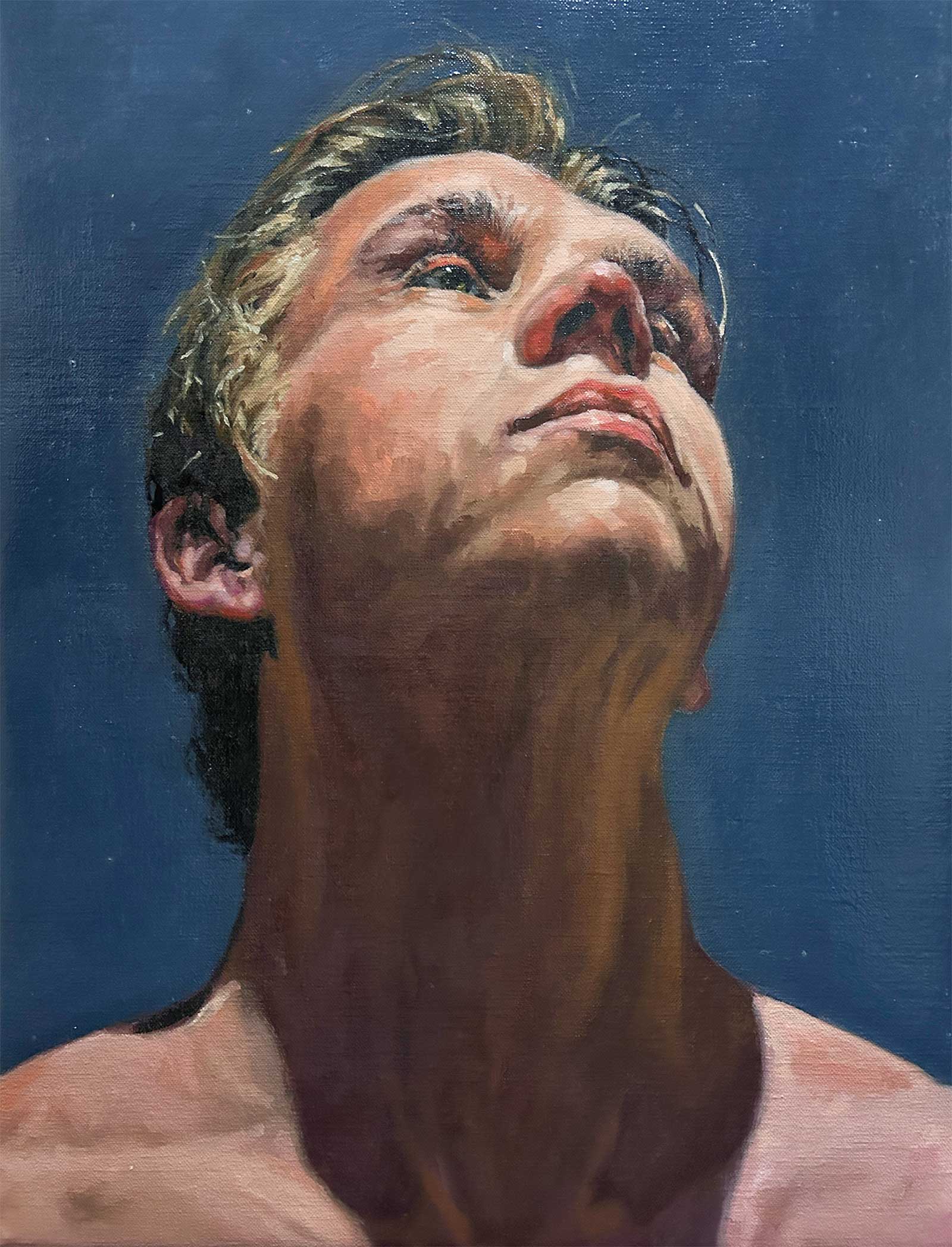 Aspiration, oil on canvas, 19½ x 15" (50 x 38 cm)
Peter Vermeulen
Utrecht, Netherlands
My Inspiration
I draw inspiration from fellow artists and from the countless images and moments I observe in everyday life. Often, it is the small details within a larger scene that capture my attention. I believe every painting has only a few essential elements, while everything else should support them. Rather than painting every detail explicitly, I prefer to let many emerge naturally through the spontaneous application of paint.
My Design Strategy
My son, Stijn, is a dedicated athlete who takes pride in his achievements. Rather than emphasizing his physique, I wanted his character and determination to be reflected through his expression. The large shadow area guides the viewer’s eye toward his sunlit face, reinforcing a sense of pride, confidence and aspiration. The subtle sparkle in his eye reveals a gentler side of his personality and adds emotional depth to the portrait.
My Working Process
I approach a painting in three stages. First, I tone the canvas and create a loose block-in using muted colors and a fast-drying medium. I use the grid method to establish accurate proportions early on. Next, I develop the forms and structure, working from dark to light. Finally, I refine selected details that bring the painting to life while maintaining a balance between realism and painterly expression.
Contact Details
Email: ptmvermeulen@kpnmail.nl
Website: instagram.com/art_by.peter
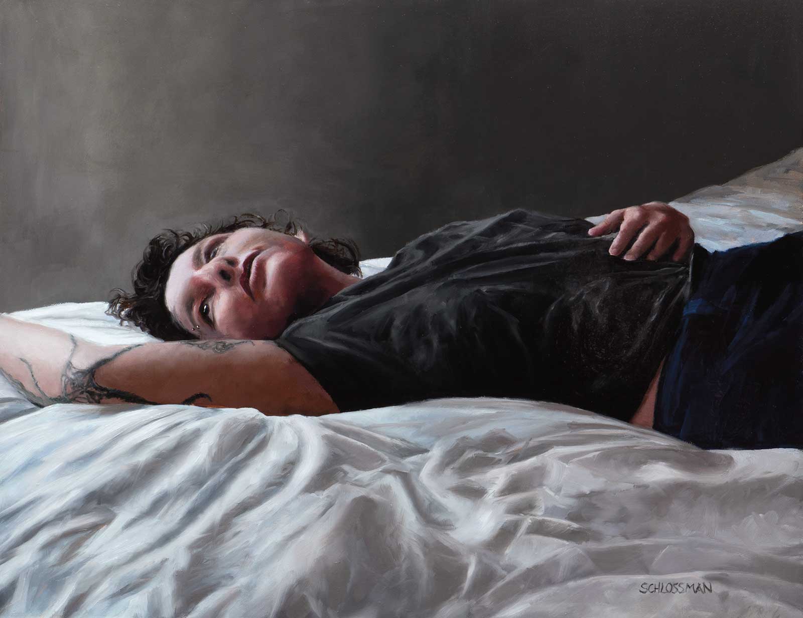 The Illustrated Person, oil on panel, 14 x 18" (35 x 45 cm)
Deborah Schlossman
Massachusetts, USA
My Inspiration
This painting portrays my youngest child, Laura, simply relaxing on their bed. Laura has always been my most laid-back child, and I wanted to capture that sense of ease and calm in the painting. The paintings I’ve created of Laura in the past reflect a very different stage of their life and personality. With this piece, I wanted to create a more current and authentic portrait that feels true to who Laura is today.
My Design Strategy
I wanted the painting to feel as genuine and spontaneous as possible, so I took a series of candid photographs of Laura in natural daylight. To create more interesting shadows and subtle shifts in tone, I photographed them in cool afternoon light. As soon as I imported the images into Lightroom, I knew this particular photograph was the one I wanted to paint. I was drawn to the mood, unusual angle, foreshortening of the face and the way the image was cropped.
My Working Process
I always begin by toning my linen panel with a wash of burnt umber oil paint, followed by a light pencil sketch to establish the drawing. I worked with my usual limited palette of ivory black, burnt umber, French ultramarine, cadmium red, bismuth yellow and titanium white. For this painting, I also used permanent alizarin crimson, yellow ochre and cobalt teal. I don’t use any medium in my oil paintings. I followed my usual process of working from dark to light and from the background toward the focal point. I began by painting the wall and bedding, gradually working inward toward the face and body. I prefer to work alla prima, or wet-into-wet, which allows me to keep the paint fresh and spontaneous. This technique requires careful planning, in that I won’t start an area unless I know I have enough time to complete it in a single setting. Once the painting is dry, it is basically finished. I do go back and check for areas that may need small adjustments in value or highlights that need to be enhanced.
Contact Details
Email: dschlossman5@gmail.com
Website: deborahschlossman.com
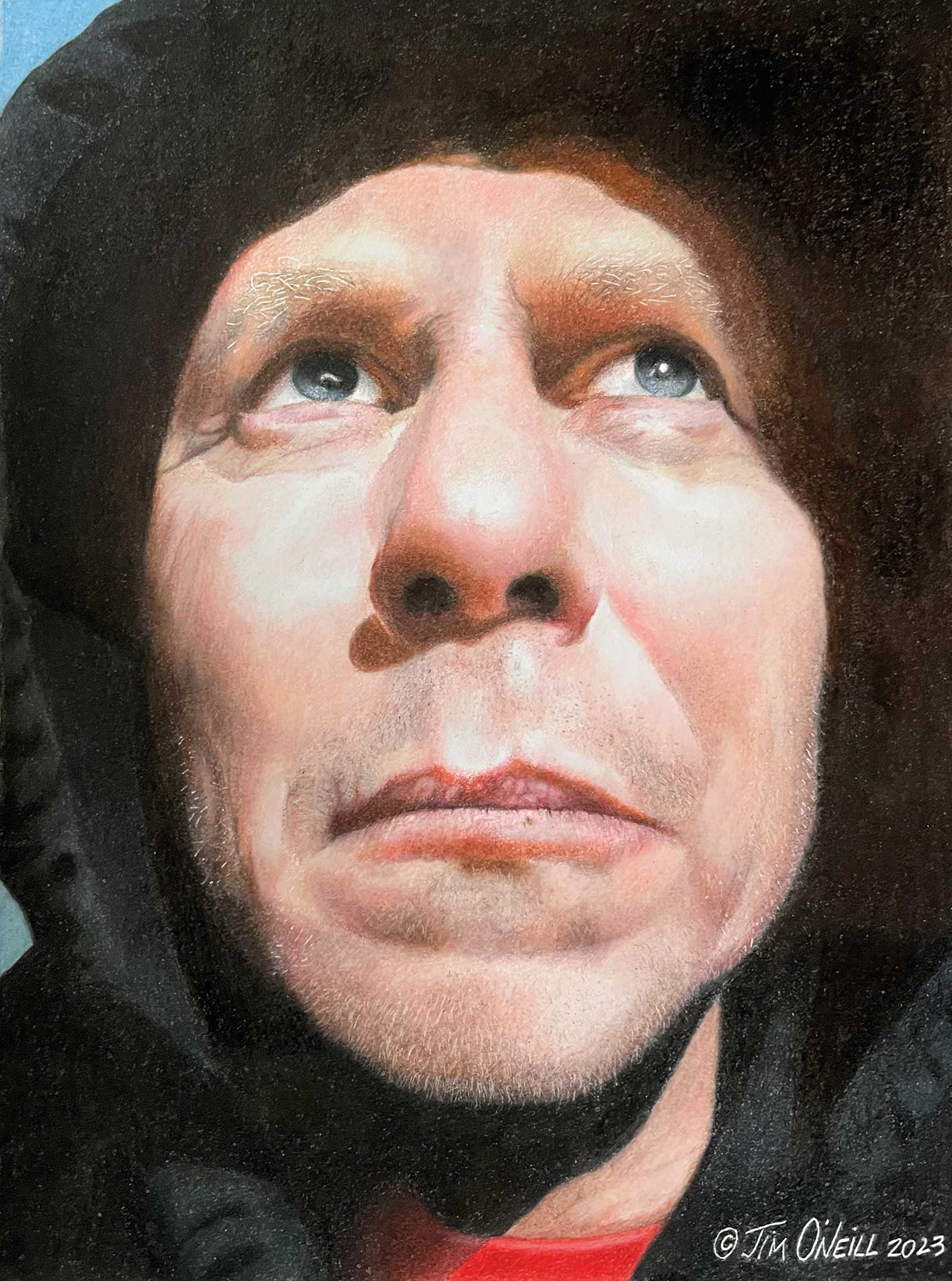 Winterblues, colored pencil on paper, 11½ x 8½" (29 x 21 cm)
Jim O’Neill New
Jersey, USA
My Inspiration
Hiking the trails of the nearby state forest and experiencing the heat of the sun on a mid-winters day was the inspiration for creating my first self-portrait, Winterblues.
My Design Strategy
In this piece, my intention was to convey the feeling of warmth through the bright highlights on the face in contrast to the dark cold background. There is a hint of blue in the corners to suggest the surroundings. Faint highlights indicate the hooded sweatshirt. I cropped in the head and simplified the background to enhance the effect of the portrait. The artwork is a bit larger-than-life size to achieve additional detail.
My Working Process
This drawing was created using reference photos while hiking outdoors and sketches using a mirror. I like to start with the eyes first and work my way to the nose, and eventually the mouth, before completing the rest of the face. I build colors starting with the shadows and ending with the highlights. Being my first portrait in quite a while, this was also an experiment in discovering skin tones using colored pencils on paper.
Contact Details
Email: joneill28@gmail.com
Website: instagram.com/jimoneillart
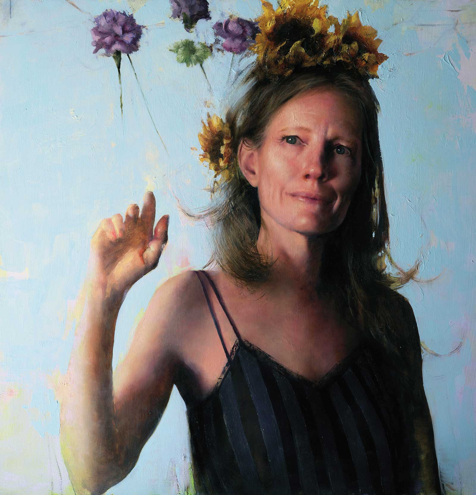 After Every Fierce Storm, I Am Wired To Rise, oil on panel, 25 x 24"(63 x 60 cm)
Jen Starling
Colorado, USA
My Inspiration
After Every Fierce Storm, I Am Wired to Rise is a self-portrait. At the time, I was eager to paint a figure but didn’t have a model lined up, so I decided to use myself as the subject. After experimenting with several elements in the upper area of the composition, I settled on flowers. I love the color and loose brushwork that sunflowers and carnations allow. Their surreal interaction with the hand adds a sense of resilience, transformation and possibility.
My Design Strategy
My design strategy was a simple graphic design based on a primary light and dark shape. It was built around the strong dark diagonal line created by the shadow side of the figure. Most other decisions were made to support and reinforce that dominant shape. The direction of the pointing hand creates important visual movement, while the dark straps of the shirt provide additional shapes that strengthen the composition. Together, these elements create movement and guide the viewer’s eye through the painting.
My Working Process
My process began with a simple charcoal sketch to establish the figure’s placement, followed by a monochromatic underpainting to refine the drawing and establish the overall value structure. From there, I began adding color, with considerable trial and error going into the development of the flowers. I also experimented with the background, which was originally a very light yellow, ultimately changing it to create stronger temperature contrast with the warm skin tones and enhance the overall harmony of the painting.
Contact Details
Email: jenstarlingart@gmail.com
Website: jenstarlingart.com
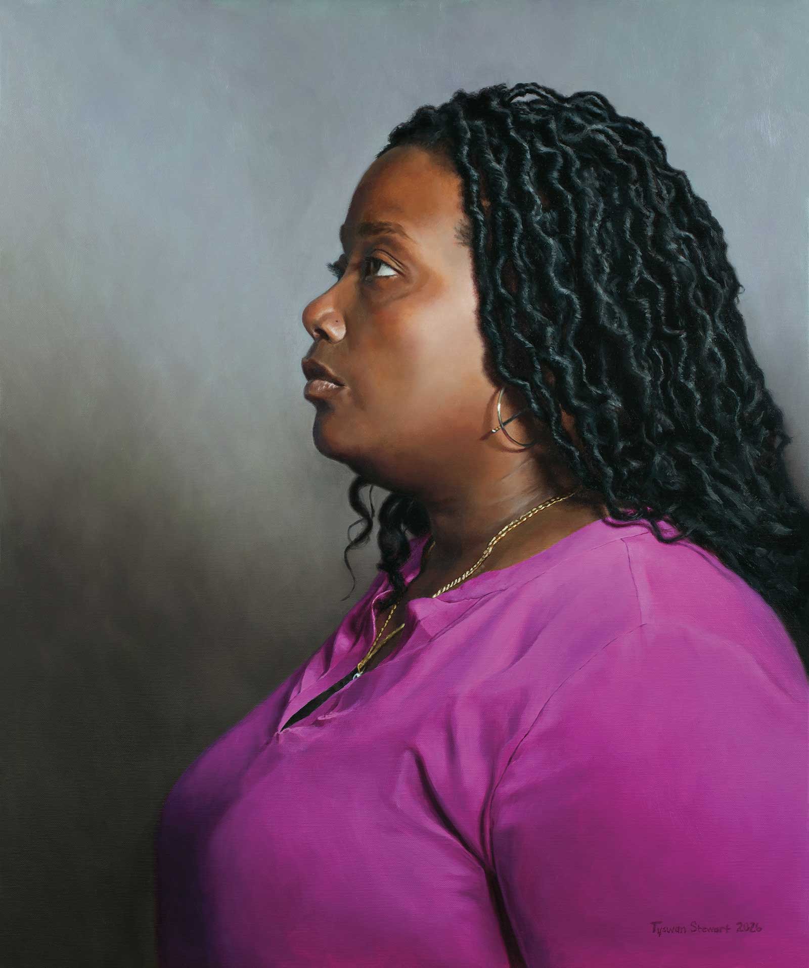 Chelsea, oil, 24 x 20" (60 x 50 cm)
Tyswan Stewart
New York, USA
My Inspiration
The vision came during a time when we were coping with the loss of my mother-in-law. My new studio had been completed, and I was ready to take on another portrait. I thought I’d try to lift my wife’s spirits a little and asked her to pose for me. I wanted to display the smoothness of her skin and the texture of her hair. I loved the contrast between the two surfaces.
My Design Strategy
I wanted to capture Chelsea in deep thought, so after a couple of sketches and a photoshoot, I settled on a side-profile pose. I thought her jewelry would add some visual interest to the composition. I’ve seen her wearing that shirt multiple times before, and I always loved how it complemented her skin tone, so I figured it was the perfect time to capture her in that moment after a day at work.
My Working Process
I drew the portrait onto stretched, Raphael oil-primed linen. I then inked in the drawing with a small brush and ivory black thinned with Gamsol. I then proceeded with a full-color ebauche, thinning my paint with Gamsol. While keeping my shadow and dark areas thin, I began to apply thicker paint in the light areas of the flesh. Several layers were applied throughout the painting process until completed.
Contact Details
Email: tyswan717@gmail.com
Website: tyswanstewart.com