



A quiet walk along a creek close to Geneva, Switzerland, where my daughter lives, inspired me to take a series of photos for future reference for my work. I usually start with a fairly “blah” scene (but with a great deal of potential), as in the case of my Seclusion paintings as well as my demo piece, Fantasy Passage.
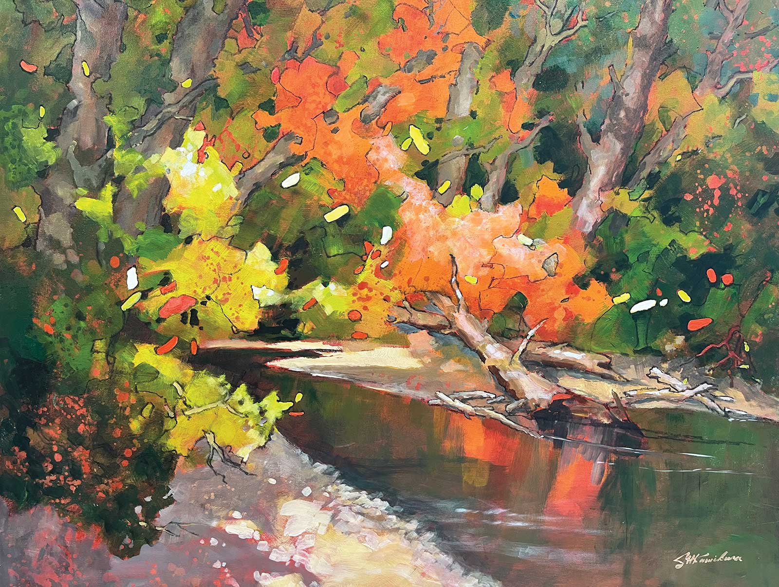 Seclusion, acrylic, 30 x 36” 76 x 91 cm)
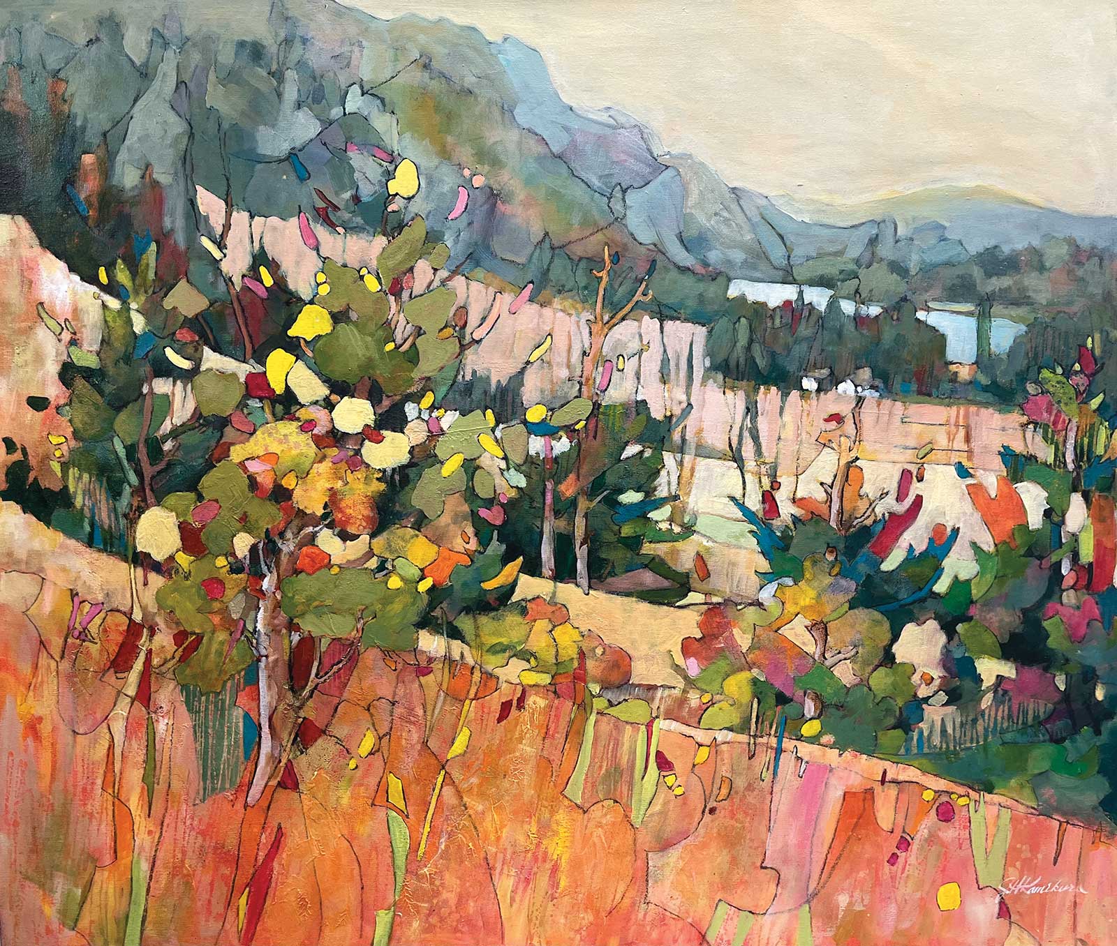
Kettle Valley, acrylic, 34 x 40” (86 x 101 cm)
My paintings are my personal interpretations of my surroundings. My ideas are fragments of what fascinate and intrigue me, and are roots from which my works begin to emerge. These concepts are primarily drawn from elements in nature. Often, something insignificant and unexpected flashes and whistles at me, transforming my idea into shapes, colors, lines, etc. As a result, although my works undoubtedly have origins in my daily living, they may be a good deal removed from reality; some of them may be quite representational while others more abstracted.
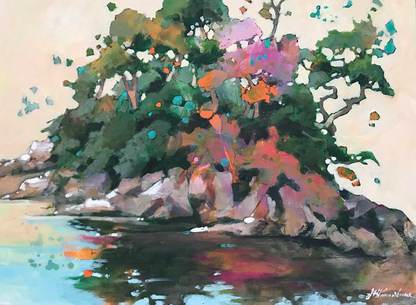
Seclusion, acrylic, 24 x 36” (60 x 91 cm)
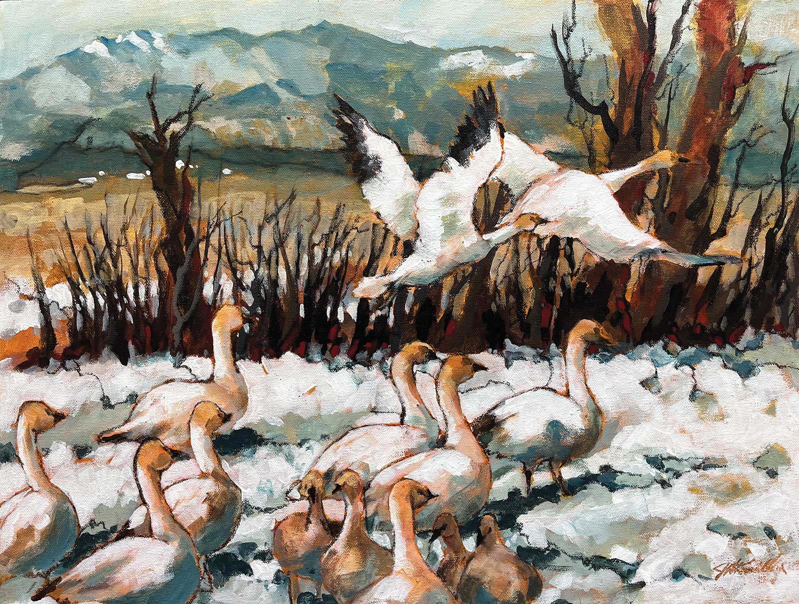
Snow Geese at Garry Point, acrylic, 18 x 24” (45 x 60 cm)
By exaggerating vibrant colors, entertaining visual textures and other elements of design, I take my painting mediums beyond their traditional execution into mixed water media, acrylic, collage and oil. A subject leads to an idea. Then it becomes an immediate cause for me to paint, ultimately experiencing the fun and struggle of permutations and possibilities deriving from that idea. It is not so much in the final product, but in the process and struggle to bring all elements together to function in harmonious presentation, that I derive so much satisfaction and pleasure as an artist. On the following page is an example of my interpretation of the reference photo, which inspired me to paint this demo painting.
My Art in the Making Fantasy Passage
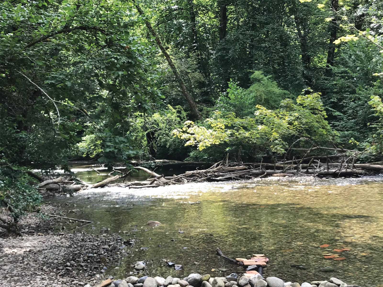
Reference Photo
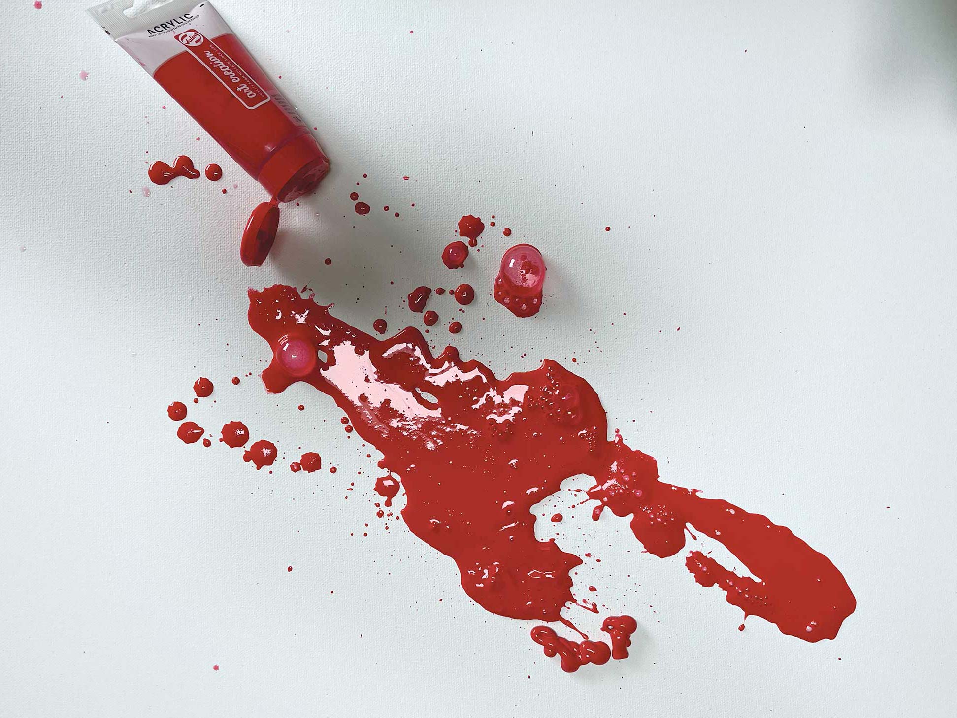 stage 1
Stage 1 Covering the White
Imprimatura of methanol red medium by Amsterdam is applied on gessoed canvas using a 4” flat brush to soothe the glaring white to establish a mid-tone value, which I then let dry overnight. This was an abnormal case using intense color for imprimatura. I normally apply the base coat or imprimatura in warm colors, ranging from warm yellow and deep red, preferring the neutral side, such as azo orange, raw sienna, burnt sienna, deep red and Indian red.
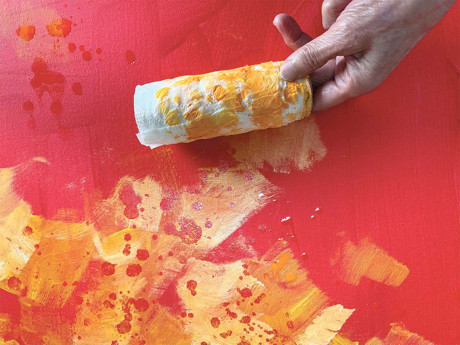 stage 2
Stage 2 Focal Area Color
Still using warm colors, I applied lighter focus colors. I used azo orange and hansa yellow orange plus white. Before these paints dried completely, I sprinkled water with my hand and waited a few minutes. Then I rolled toilet paper over the water to remove wet colors to bring out the first layer of red.
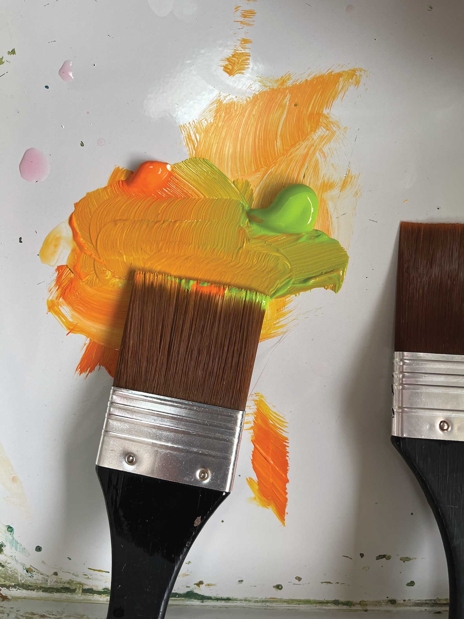 stage 3
Stage 3 Mixing Area
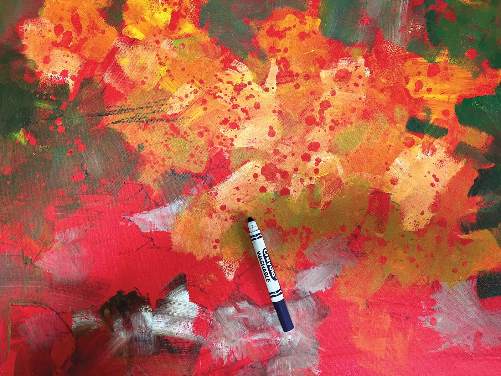
My mixing area is a butcher’s tray where I mixed yellow green with azo orange, further adding primary cyan and titanium white, seen in the next photo.
 stage 4
Stage 4 The Horizon
To the existing mixture of yellow green and azo orange, I added primary cyan for a deeper green for the surrounding warm colors. Golden burnt sienna and burnt umber were used to mix with titanium white for rocks. As I painted another painting using the same inspiration photo, I showed my rough composition with a washable crayon, indicating where my horizon line will sit, changing the direction of the water flow and applying larger rocks, rather than the gravel in the photo.
 stage 5
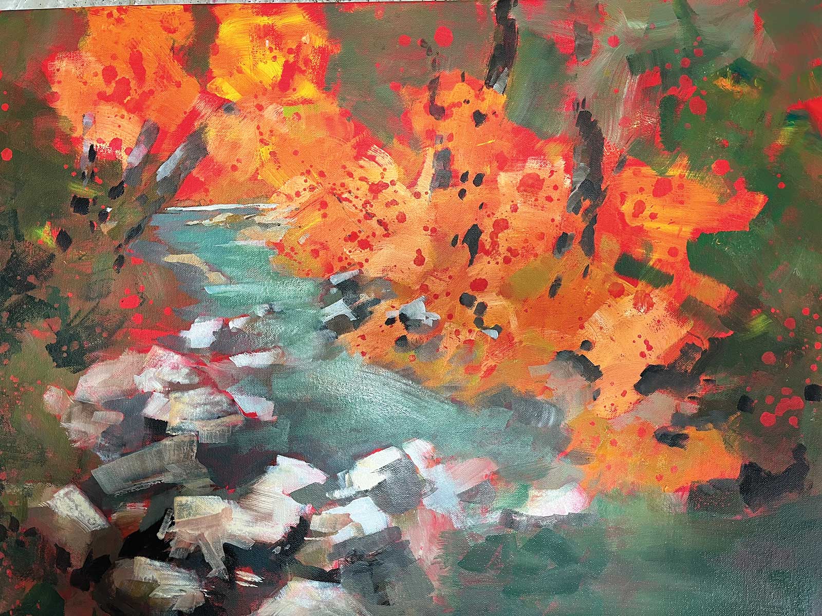
Stage 5 Rough Composition
Using smaller brushes, I’m starting to define the direction of my composition, establishing the shapes of trees, rocks, banks and water.
 stage 6
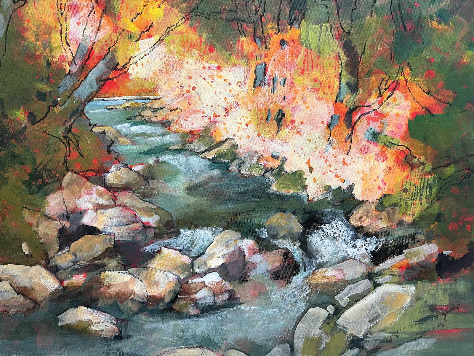
Stage 6 Elements of Realism
Finding the local warm colors a bit too distracting, I used titanium white to glaze over and reveal a bit of the bottom colors. Also, to create different textures, I used water in a squeezable oiler. On the dried paint, I drew my composition with charcoal, clarifying the shapes and raising the right bank a little so that the water will take up a more “quiet” area at the bottom. Then, I sprayed the entire canvas with Krylon Acrylic Clear to fix the charcoal to the acrylic paint.
 stage 7
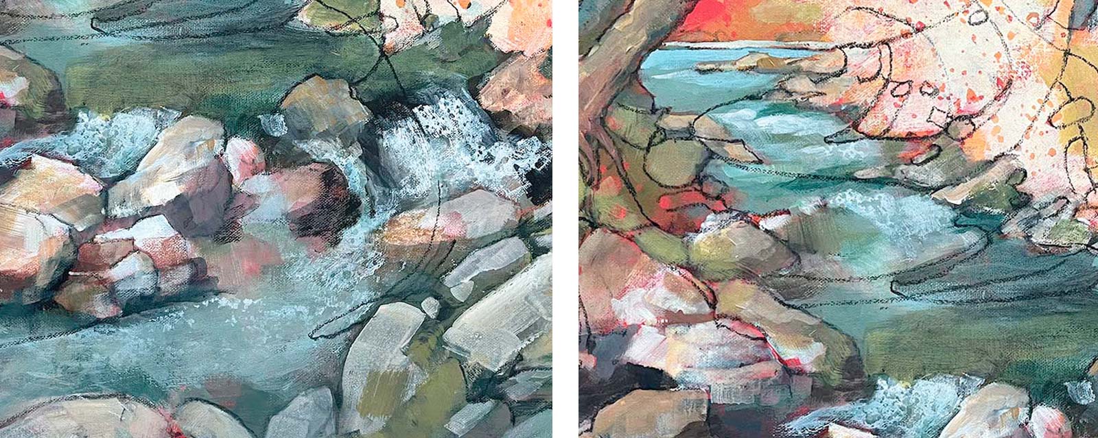
Stage 7 Elements of Abstraction
The palette for water is a mixture of Royal Talens cyan blue, Liquitex yellow medium, Golden titanium white and Golden burnt umber. The same mixture in different proportions and Kroma mars black was used in the lower portion of the water. For the waterfall and drops: after determining the flow of water, I applied a thin coat of titanium white, spraying water with a sprayer and oiler, then immediately rolling over them with a roll of toilet paper. Next comes the most fun but challenging part of my painting: emphasizing abstract shapes. Using charcoal, I shaped how the main focal area will be defined.
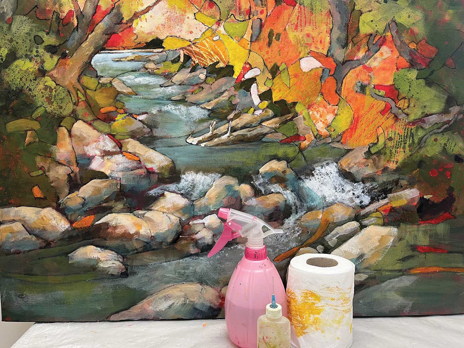 stage 8
Stage 8 Defining Shapes and Focal Areas
Here, I’m continuing to define the abstract shapes of focal areas with warm colors. At this stage, I changed one of the water shapes to two logs instead, but using the same colors as the rocks, which are Golden burnt sienna, Golden burnt umber and Kroma mars black.
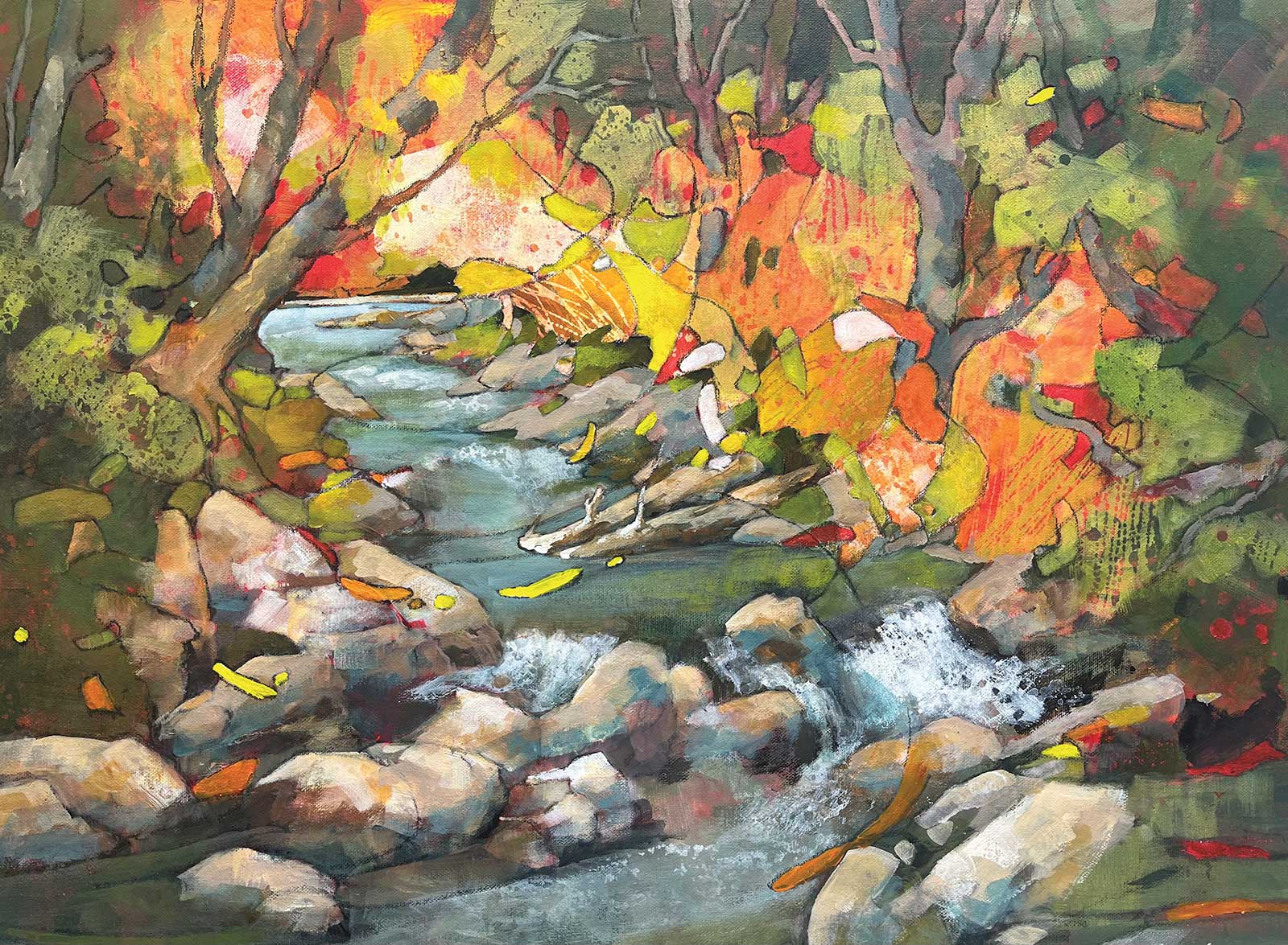 stage 9
Stage 9 Glazing
By glazing the bottom area with the mixture of Royal Talens cyan blue, Liquitex yellow medium, Golden titanium white and Golden burnt umber, I simmered down the intensity, creating a quiet area at the bottom. I finished this stage by extending the water bubbles over the glazed bottom.
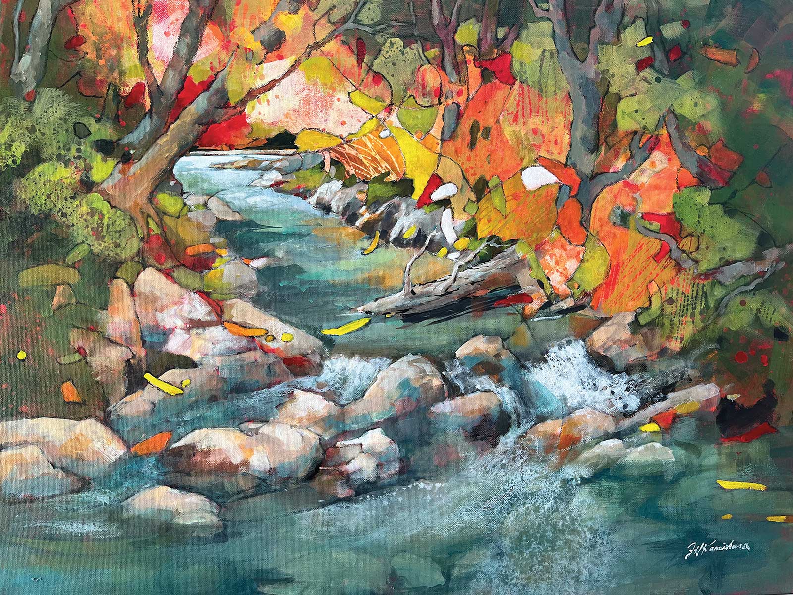 stage 10
Stage 10 Finished Artwork
Fantasy Passage, acrylic, 24 x 30” (60 x 76 cm)
In this final stage, I changed some shapes for simplicity within the complexity of shapes and colors. For instance, I changed the shape of the log to a single shape, simplified the line of the water bank, and intensified the colors of the abstract shapes. I finished the painting by extending the water bubbles over the glazed bottom, again by submerging the bottom rocks to give more space for the “quiet” area.
About the artist
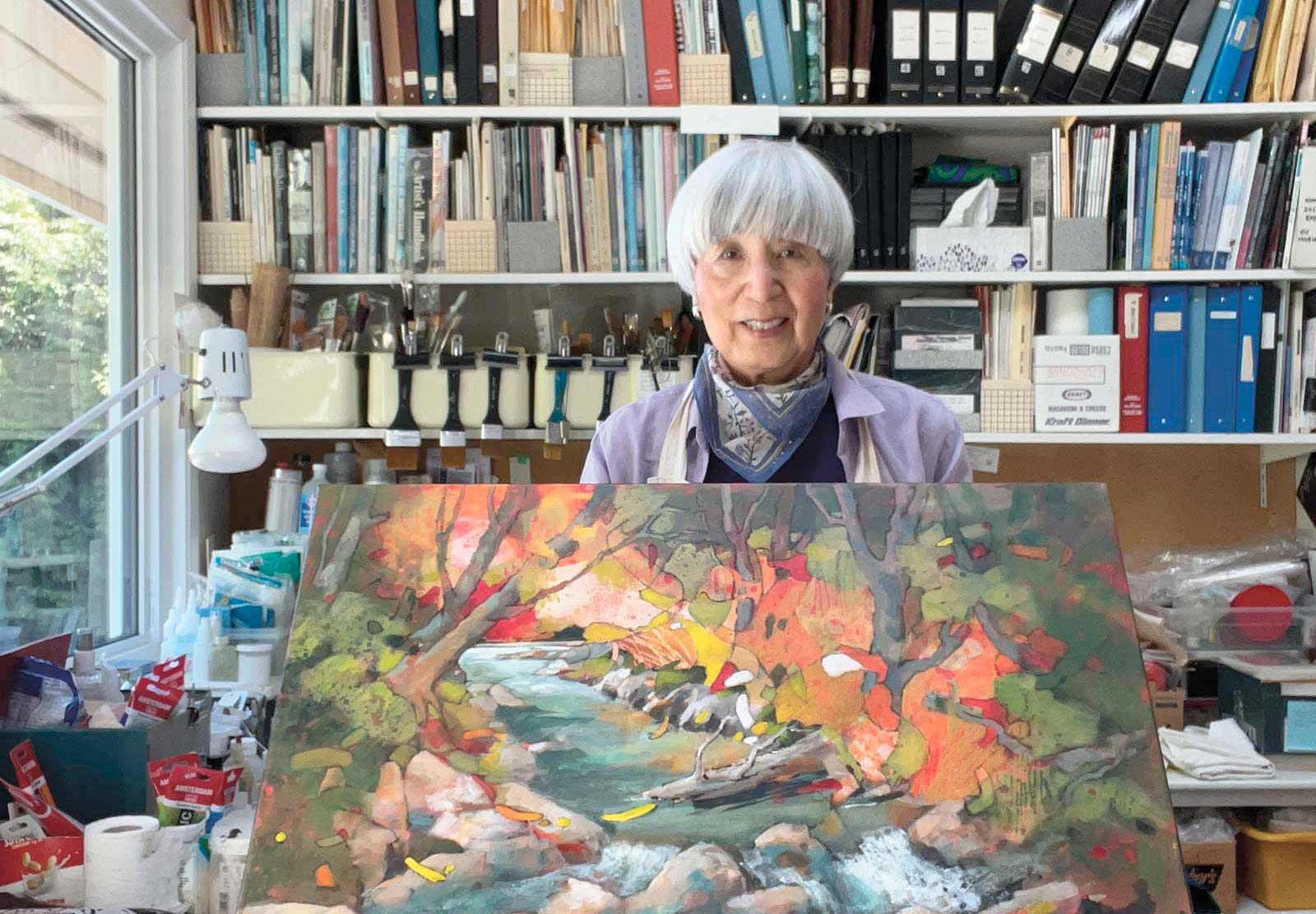 Joyce Kamakura
Canada-based artist Joyce Kamakura had the honor of being recognized as a Signature Member of the National Watercolor Society in 1993, making her one of the first Canadians to receive this distinction. Additionally in the same year, she achieved the prestigious title of Senior Signature Member with the Federation of Canadian Artists, being among the first women to attain this top-ranking position by her peers. She was born in Steveston, British Columbia, Canada. Following that, she spent the first four years of her life in the internment camp at Lemon Creek, B.C., Canada, and subsequently resided in Japan for a period of nine years. Following her return to Canada, she resided in Montreal for two years before eventually returning to Richmond, Canada. After earning a business degree from the University of B.C., she studied art at both Kwantlen and Langara colleges.
Contact at
joycekamikura.ca