



Watercolor painting involves a complex combination of subtle skills. The more you paint, the more your skills improve. In this article we are going to focus on a couple of specific skills that will apply to every painting we do. The aim of the exercises is to build confidence and gain control of tonal and color gradations.
These exercises will not only improve our control of tone and sharpen our color mixing, but also improve our brush control. We will also discover the importance of tone, color and placement in establishing a focal area.To get the most out of the exercises, keep these little squares as precise and accurate as possible.
Controlling Tone
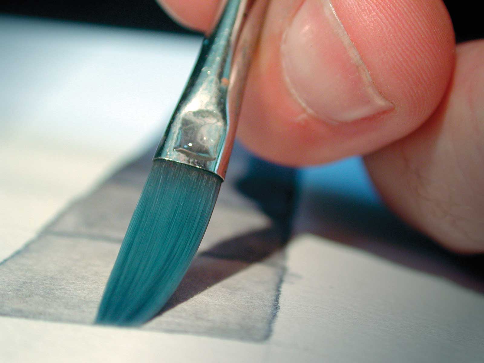
With watercolor, controlling tone is simply a matter of adding water. The more water, the lighter the tone. This exercise is a great way to discover exactly how much water is necessary to produce the tone required.
Draw a series of seven adjoining squares on a piece of watercolor paper. Use a hard pencil so the lines are barely visible. What we want to do is paint a gradation of tones from black on the left to white on the right. It sounds easy, but we want the tonal steps between each square to appear equal. Make a dark mixture of ultramarine blue and burnt sienna. Keep it as neutral as possible, not tending toward blue or burnt sienna. Start with the dark end of the scale, letting each square dry before moving on to the next. Watch as the paint dries, you will find it becomes lighter in tone. This must be taken into account as you paint each square.

You will probably find you need to do this exercise three or four times before you can get an even gradation from start to finish.
A ¼” flat brush lets you make nice square corners and straight, even lines. Turn your paper around so you use the tip of your brush for the straight lines and corners.

Color Gradation
All the saturated colors appear around the outside of the color wheel. Saturated colors are either primary colors or a mixture of no more than two primaries. Compound colors are a mixture of three primary colors; these are all of the browns, khakis and earth colors.
For this exercise we are going to mix a gradation of compound colors. We will go from one side of the color wheel to the other, between two saturated, complementary (or opposite) colors. Again, we want the gradation to be as even as possible across seven steps.
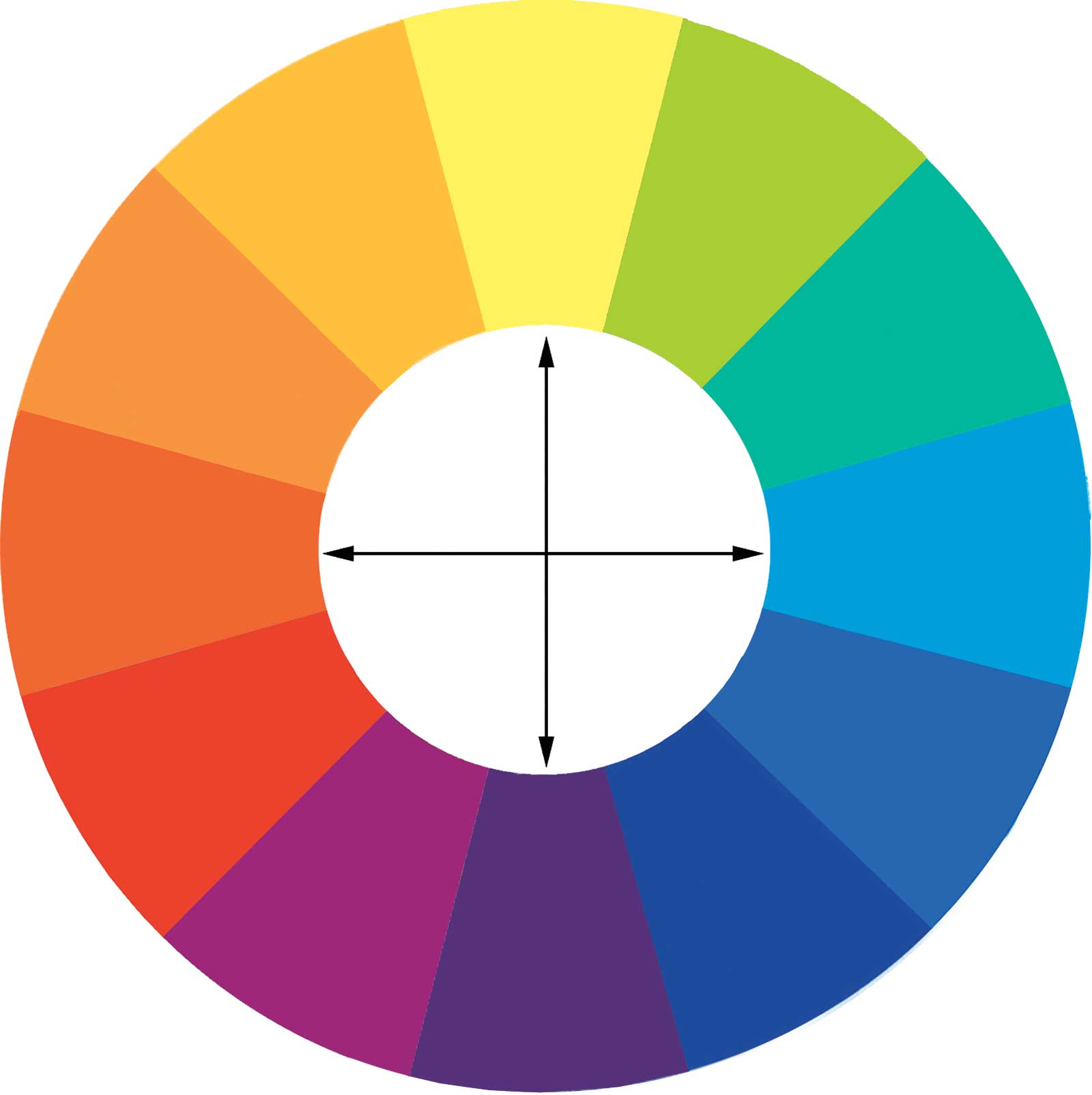
This graduation takes us from red/orange (quinacridone gold and alizarin crimson) in equal color changes to green/blue (phthalo blue). Mix up enough alizarin crimson and Indian yellow to complete the exercise before you start. This will ensure consistent color. The middle square should be as neutral as possible with warm colors on the top and cool colors on the bottom. Colors directly opposite one another on this 12-part color wheel are complementary colors.
Impact Through Contrast & Saturation
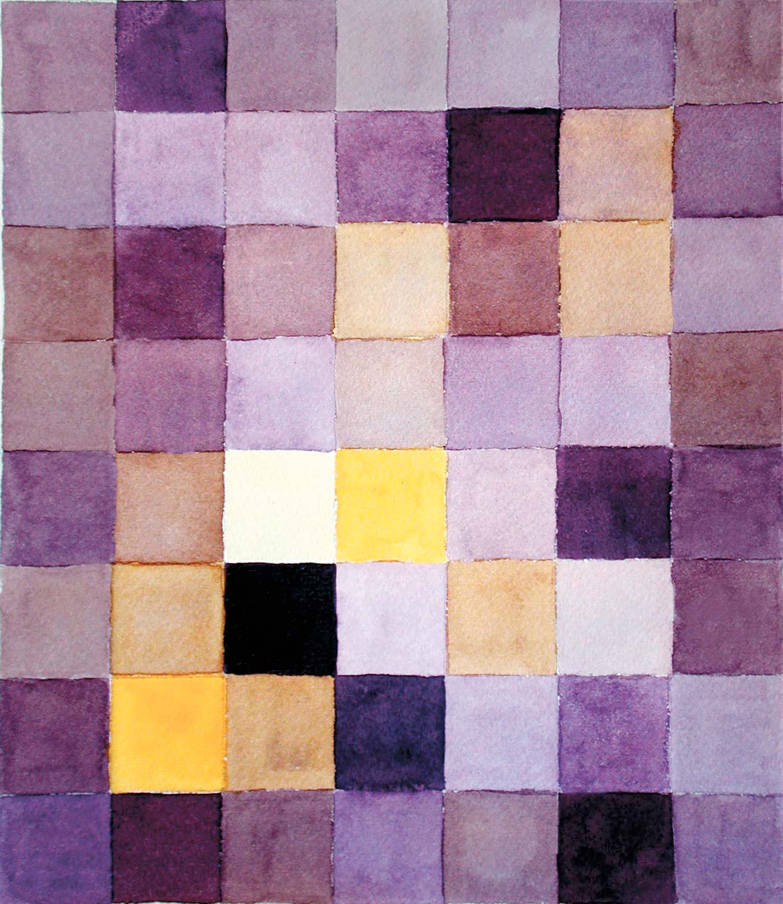
For this exercise we are going to draw up a grid of small squares and create a design using various mixtures of a pair of complementary colors. We want to achieve a feeling of depth in our design. We will do this by using darker, cooler, less saturated colors to recede and warmer, more saturated colors to come forward. We will also establish a center of interest in our design by positioning the most saturated colors and greatest tonal contrast in the appropriate place. I have used yellow/violet as my complementary pair, but you can use any pair of complementary colors you like.
Allow one color to dominate. In this example, the dominant violet recedes and the contrasting saturated yellow jumps forward. The strong tonal contrast between the dark violet square and the pale yellow square immediately draw attention, establishing a center of interest. The saturated yellow squares in this area help to reinforce the center of interest.
No matter what you like to paint, pure design experiments like these free you from the influence of a subject. This lets you concentrate on the abstract nature of composition and design, which is, after all, the foundation for any successful painting. —
Contact at johnlovett.com