



Grand Prize is a four-page editorial feature in American Art Collector magazine
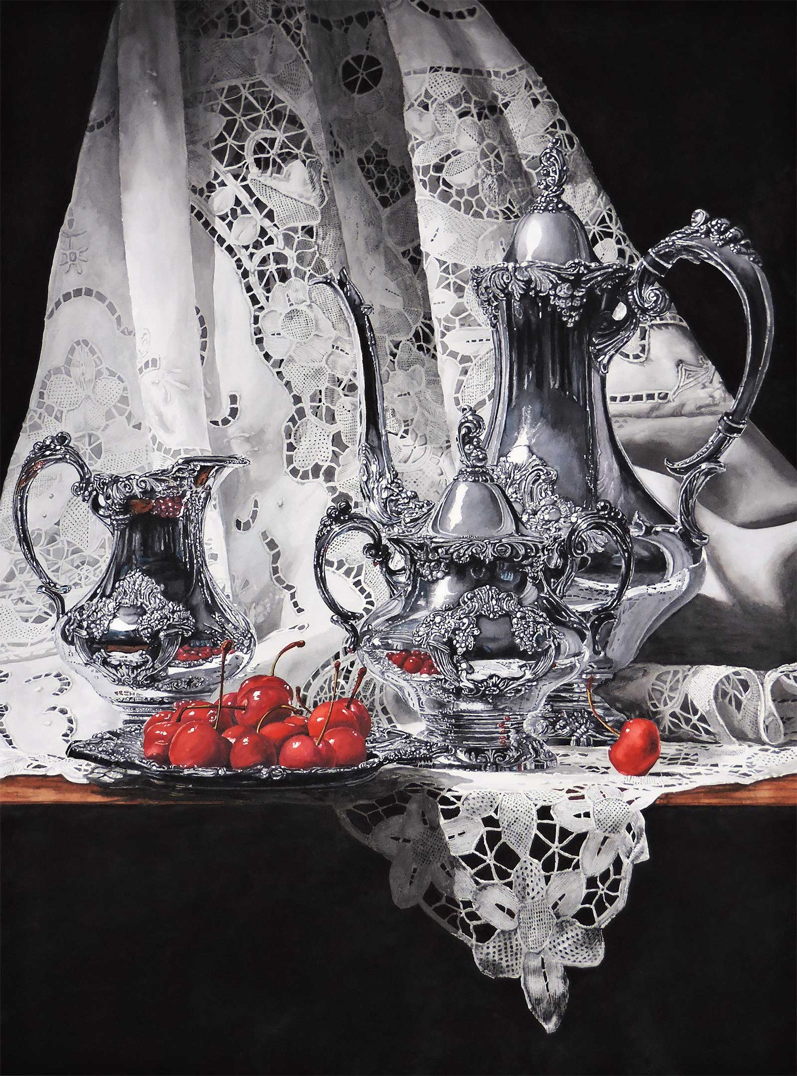 Black, White and Red, watercolor, 28 x 38" (71 x 96 cm)
Laurin McCracken
Texas, USA
Mastering the Craft
Laurin McCracken is a realist painter working with watercolor. “When I look at the world and think about what I might paint, I am reminded of the quote from Henry David Thoreau: ‘It is not what you look at that matters, it’s what you see.’ Then I ask myself, ‘Can I paint that in watercolor?’”
Born in Meridian, Mississippi, McCracken attended Auburn University and holds a Bachelor of Arts and a Bachelor of Architecture from Rice University and a Masters in Architecture and urban planning from Princeton University. His paintings have been included in international watercolor juried exhibitions, and he’s a signature member of more than a dozen watercolor societies including the American Watercolor Society, National Watercolor Society, Transparent Watercolor Society of America, Southern Watercolor Society, Watercolor West and Watercolor USA Honor Society. He is an elected member of the Allied Artists of America in the Watermedia Category.
“Not every artist can see things uniquely, but it is imperative that an artist sees things differently and with a certain clarity that the average individual might have,” he says. “That is the value we bring to our craft. It is the combination of those abilities and a fundamental mastery of the craft that makes us artists.”
McCracken focuses primarily on tabletop still life subjects as commission pieces. “Art collectors contact me to come to their homes to photograph their collections of objects that have value to them. From these photographs I will select three that I believe will make terrific watercolors. The client makes the final choice,” says McCracken.
“I believe that there are three basic aspects that contribute to being an artist: seeing, drawing and mastery of the craft.”
My Inspiration
I am a realist watercolorist whose work is largely influenced by the Dutch and Flemish still life painters of the 16th and 17th centuries. I use my ability to see things with a high level of acuity to transcribe what I see in the world around me into watercolor on paper. I use this historic influence to record the beautiful things in our lives: the flowers, ornate crystal and silverware, clouds, the glassware I grew up with, toys, and anything that attracts my eye and spurs my imagination.
My Design Strategy
I want my paintings to tell a story. Sometimes it is a very simple story about interesting objects on a tabletop. Sometimes it is an enigmatic story about a cup and saucer left on a chair. Who left it? Are they coming back? I work to achieve an orderly and classic composition. I want my viewers to become active participants in the enjoyment of my work. I want their eyes to travel into and around the painting.
My Working Process
I set up my own still lifes. I take many photographs, sometimes only moving one object to gain a better composition or to add a shadow. Then I spend time studying these photos to be able to pick the image that will make the best watercolor. I then project the image onto the paper and draw as much detail as I can. After that I put the paper on my painting board and draw more, gaining even more detail before starting the painting. I tell my classes, “If it is not on the paper, it probably will not be in the finished painting.” The influence of my work by the Dutch still life painters led me to using black in my backgrounds. I worked with Daniel Smith paint company to develop a neutral, transparent black which, if applied correctly, gives the background a dense matte finish.
Contact Info
Email: laurinmc@aol.com
Website: lauringallery.com
Second Prize is a two-page editorial feature in American Art Collector magazine
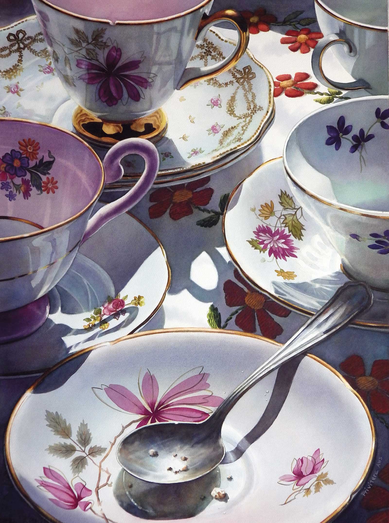 Me Time in Good Company, watercolor, 29 x 21" (73 x 53 cm)
Lana Privitera
New York, USA
My Inspiration
Me Time in Good Company is a painting about friendship. It’s my little homage to old friends and family members that share good and bad times with us. Using vintage teacups for this painting seemed the logical choice. Not only are they a personal favorite of mine, but they also seem to hold great appeal to most women of all ages. I’ve been told on many occasions by my viewers that my paintings of pretty teacups bring up good memories of cherished times spent with grandmothers, aunts and other significant people in their lives.
My Design Strategy
I always take my time composing my watercolor still lifes. For this painting, I took hundreds of photos of my teacups from different angles before deciding on the final design. The placement of each teacup was important to convey my idea. Because I wanted to mimic the closeness and intimacy shared among friends, I decided that the shapes of these teacups needed to interlock and overlap each other just like good friends holding arms would. The abundance of flowers and detail everywhere symbolizes the flow of conversation between friends. Each flower represents a revealed secret, a joyful laugh, or the sharing of pain and loss.
My Working Process
Even though I always plan my paintings very carefully, I also leave myself room for improvements in the final design. When this particular painting was about 80 percent complete, I felt that the overall color bias was too blue and that the teacups were not connecting enough. So, after a few weeks of pondering on a possible solution, I added the meandering red flowers in the cloth as a way to reinforce my concept of unity and a general feeling of warmth.
Contact Details
Email: lanaprivitera@gmail.com
Website: lanaprivitera.com
Third Prize is a one-page editorial feature in American Art Collector magazine
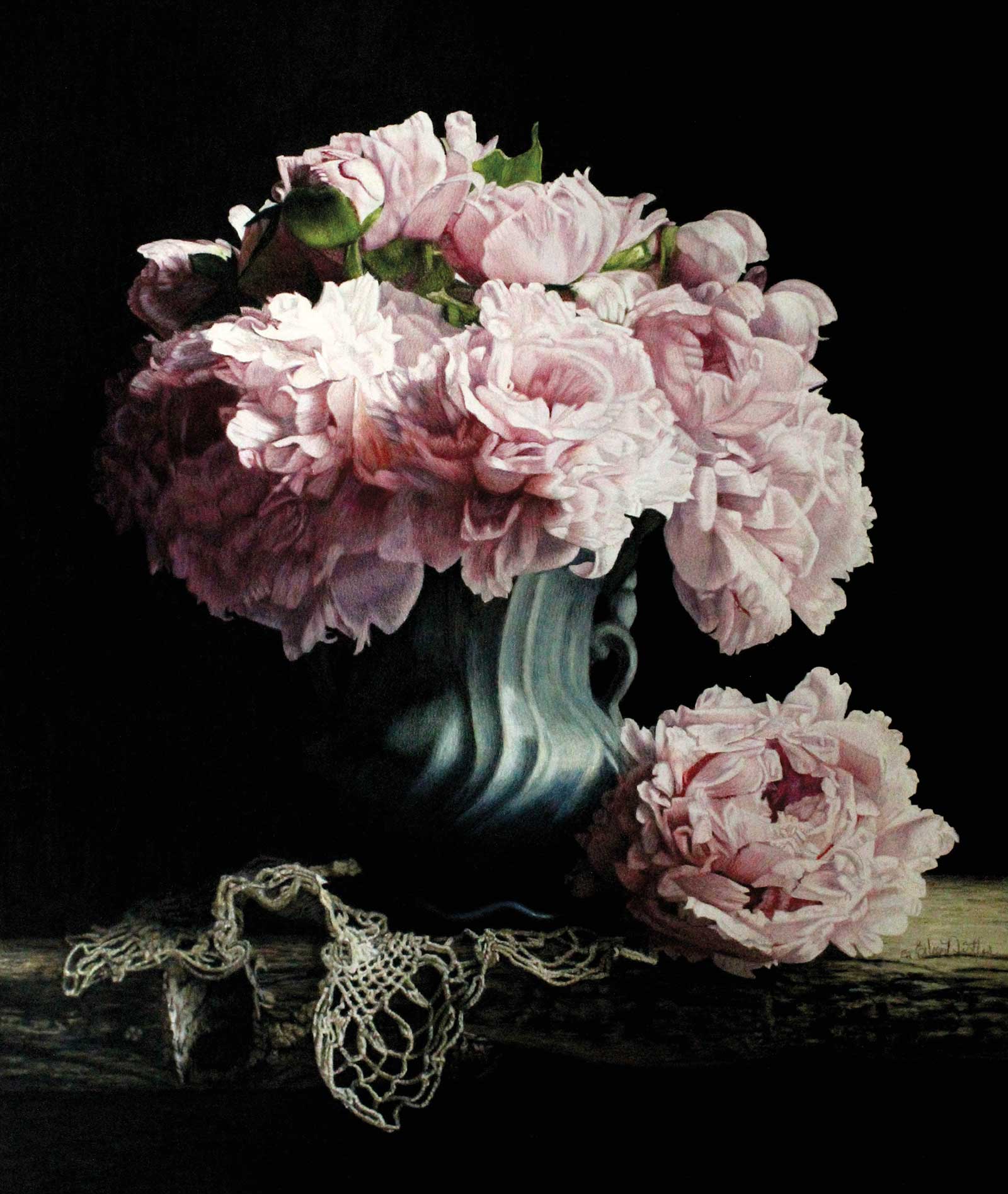 Lovingly, colored pencil, 21 x 18" (53 x 45 cm)
Eileen Nistler
Wyoming, USA
My Inspiration
My mother bought me this peony bush when I first moved into my home. I’ve since purchased many more peonies but this one, Sarah Bernhardt, is my favorite. I wait for June every year for these lovelies to bloom.
My Design Strategy
Value is my favorite design issue. I like my pieces to go from the darkest dark to the lightest light and to lose a few edges in the process. I use reference photos, as peonies take a lot of time to draw and don’t last terribly long. I take thousands of photos when my 30-plus peony bushes are blooming. I drag out loads and loads of vases, fabrics, doilies and other stuff to try to create a beautiful and interesting outcome. Most of the design process happens during these sessions and as I edit them in Photoshop.
My Working Process
I have found that if I cut peonies when they are just about to open (marshmallow size) and place them in a picnic cooler with a little ice, they open slower and with more sculptural interest. I placed the peonies in an old vase and placed a doily beside the vase. My intent was to give the piece a vintage feeling. The vase is on an old plank from our coral. I use this board often. I like the juxtaposition of masculine and feminine.
Contact Details
Email: eileenistler@gmail.com
Website: eileennistler.com
Finalists
Each receives an Award Certificate and a one-year subscription to International Artist magazine PLUS having their work seen worldwide by international galleries looking for new talent.
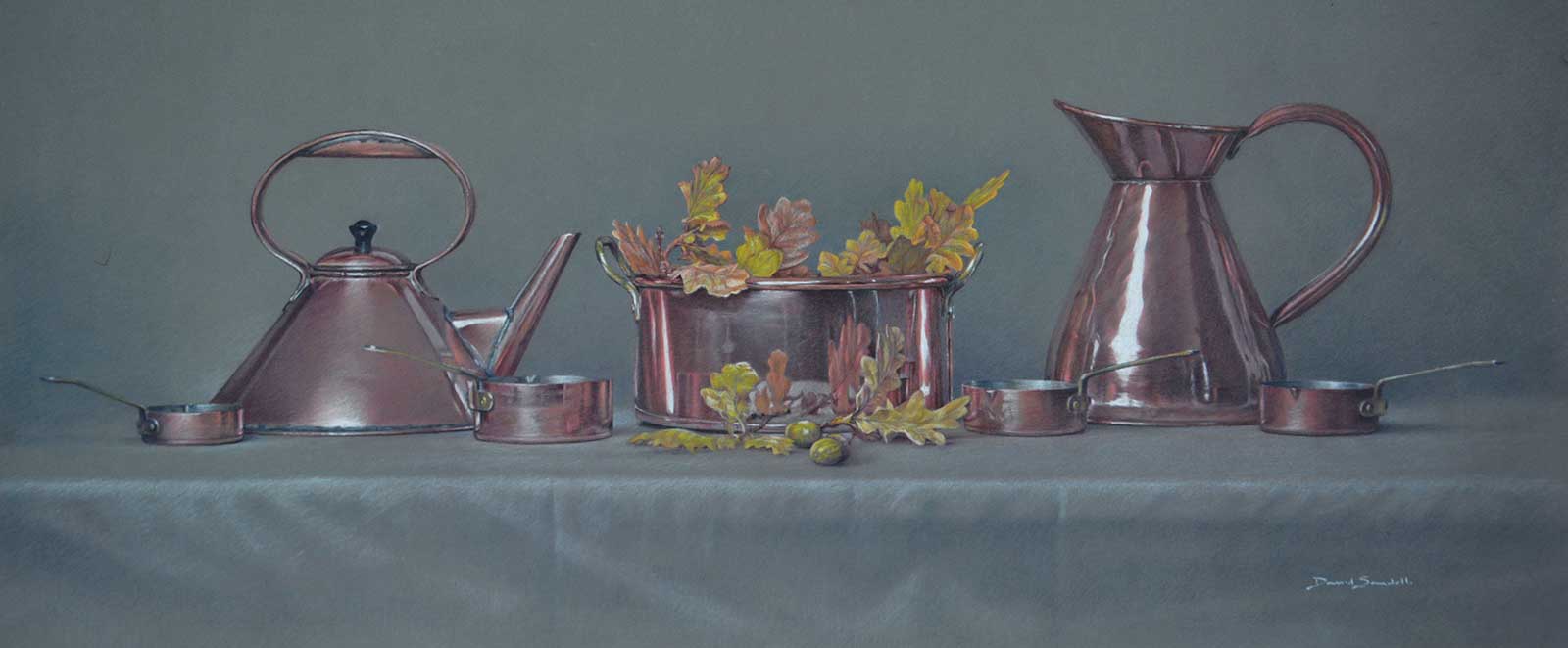 Copper and Oak, colored pencil and white pastel on Pastelmat, 11 x 26" (28 x 66 cm)
David Sandell
Northamptonshire, UK
My Inspiration
Whatever I am drawing or painting, the inspiration comes from what light does to the subject. Here I was interested in the contrasting textures of metal with nature. I allowed an idea to develop in my mind over time, combining copper and oak leaves. Copper had an interesting history being a beautiful and useful metal—unusual in that, like gold, it has a natural color, essentially pink. The name itself comes from the latin ‘cuprum’ meaning ‘from the island of Cyprus,’ the island in the Mediterranean and the main source of Roman copper.
My Design Strategy
The next stage was to develop the concept combining oak and copper. I sourced a range of copper kitchenware from a friend. I allowed the idea to develop in my mind for weeks before I started any drawing. I then decided on a wide table top arrangement using a gray tablecloth as a neutral backdrop. In any event, the key factor was going to be the lighting. As a still life I had total control over this, and I could refer to this set up repeatedly once I had the lighting I needed.
My Working Process
I spent a few hours testing different lighting setups. I used a studio diffused light from one side and a warmer studio light on the other side to play with reflections. Using a mid-toned pastel paper (Pastelmat), I made my initial drawing using a dark red pencil (Derwent Studio), which is good for detail. I then drew the darkest areas followed by the midtones then the lightest areas, all with a light touch. After checking, I repeated phases of this same process over a number of days then completed the darkest areas using dark indigo and white pastel pencil for highlights.
Contact Info
Email: info@davidsandell.co.uk
Website: davidsandell.com
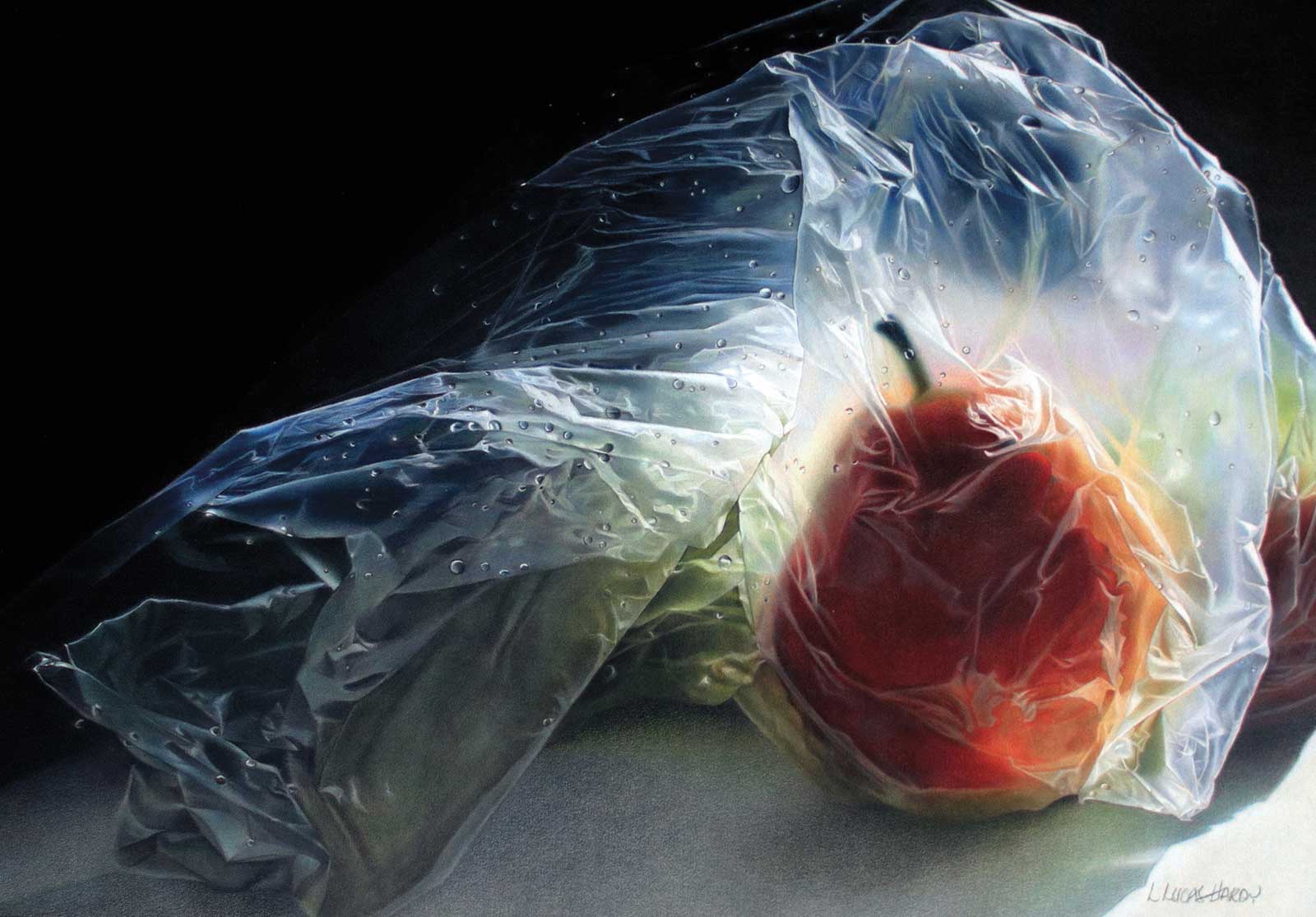 When the Sun, the Moon and All the Stars Came Together, colored pencil, 16 x 22" (40 x 55 cm)
Linda Lucas
Hardy Texas, USA
My Inspiration
I am drawn to extremes of light and dark in a work of art so, objects in plastic bags, at least for me, make intriguing subject matter. The reflective properties add to the drama, and the translucency adds an air of mystery, posing the question, could there be something hidden or could it have a deeper meaning? This particular image was one of the best examples of what I love doing and it kept calling. After a while, I had no choice but to put all other projects aside and see if I could do it justice.
My Design Strategy
The ability to produce realism in any work of art comes from observation, understanding what is being seen, and of course, value. What I am after are clear, crisp images that appear to be sharply in focus. Because I work with pencils, I have a tremendous amount of control, which makes colored pencil the perfect medium for me, as I cannot leave well enough alone. The subjects I choose, the surface I work on and my method of blending not only make what I do tedious and difficult, but incredibly rewarding. Once finished, I am generally awed by my results.
My Working Process
I work on a fine artist-grade sandpaper and blend the colored pencil pigment with a small “dry” bristle brush. Not only is it difficult to do, trial and error has taught me that the binding agent in the pencil must be wax and requires a rather heavy application. Unlike many papers, sandpaper is amazingly responsive in that it grabs the waxy pigment and holds on. Overall, my working process is a combination of drawing and painting. I use all the techniques employed for drawing but unlike paint, my colors are mixed on the paper rather than on a palette.
Contact Info
Email: hardy.lindalucas@yahoo.com
Website: lindalucashardy.com
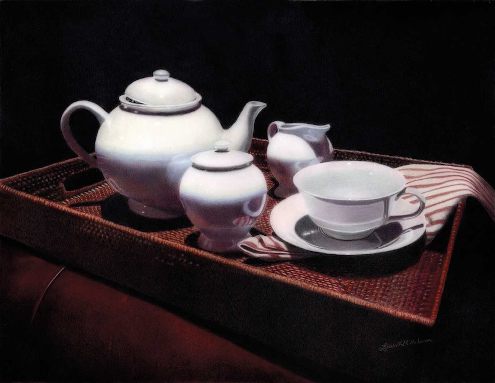 Cuppa, colored pencil, 10 x 13" (25 x 33 cm)
Linda L. Phillabaum
Illinois, USA
My Inspiration
My portfolio is a bit eclectic because I enjoy challenging myself with a variety of subjects. The one constant in much of my work is the use of light and its ability to transform a scene. Inspiration sometimes appears in the most unexpected places. While shopping in a department store, I was captivated by the way the lighting illuminated a white tea set displayed among the furniture. To create a more pleasing composition, I rearranged several items in the display until everything felt balanced. I then photographed the scene to use as reference material.
My Design Strategy
My design strategy was guided by my fascination with light and its role in art. Throughout my work, I have explored reflections, refracted light, mood lighting in portraits and dramatic illumination. For this piece, I was drawn to the striking contrast between the white tea set and the dark furniture beneath a strong spotlight. To enhance that effect, I edited the reference image through cropping and darkening the background, creating a more dramatic composition and allowing the lighted tea service set to become the focal point of the artwork.
My Working Process
I created this work using colored pencils on drafting film, a surface that presents challenges in achieving deep, saturated black backgrounds. To build the “black,” I layered dark reds and black, rotating the film a quarter turn between applications to ensure an even, seamless surface. The leather bench was developed through layered colors, applied loosely, maintaining texture and visual softness. The tray was a more detailed approach. The tea service was rendered with subtle shifts in tone to suggest form and shadow. For the darkest values, I applied color to the back of the film to enhance richness and intensity.
Contact Info
Email: linda.phillabaum@gmail.com
Website: lindaphillabaum.wixsite.com/linda-phillabaum
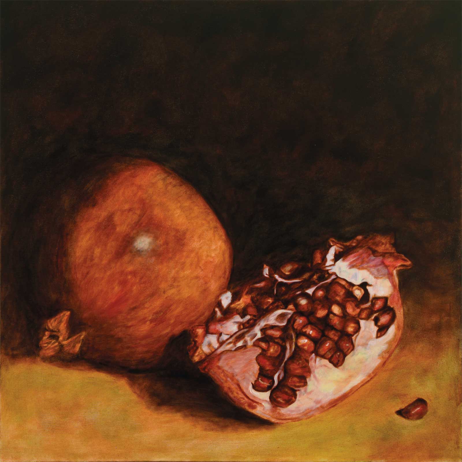 Treasure, oil, 391⁄3 x 391⁄3" (100 x 100 cm)
 Annissa Slusher
Florida, USA
My Inspiration
I have always been drawn to pomegranates because their seeds resemble precious jewels. Yet, unlike gemstones, their value goes far beyond their beauty. Each seed holds the promise of new life, and I am continually amazed by the way nature protects something so precious. Treasure was inspired by both the luminous beauty of the fruit and my sense of wonder at the ingenuity of nature’s design.
My Design Strategy
My goal was to make the seeds the focal point of the painting. I positioned the cut pomegranate as the dominant element and used light to emphasize the jewel-like quality of the seeds. Strong value contrasts help draw the viewer’s eye to the illuminated interior, while the dark, simplified background minimizes distractions. The whole fruit provides balance and context, but the composition was ultimately designed to lead the viewer toward the glowing seeds.
My Working Process
I began by establishing a monochromatic value layer over a burnt sienna-toned canvas to create a strong foundation for the painting. Once the values were established, I gradually developed color through multiple layers, allowing each layer to dry before adding the next. Working in this way helped me build depth and luminosity, particularly in the pomegranate seeds. Throughout the process, I refined the relationships between light and shadow, using transparent and opaque passages to create the sense that the seeds were glowing from within.
Contact Info
Email: studio@aslusher.com
Website: aslusher.com
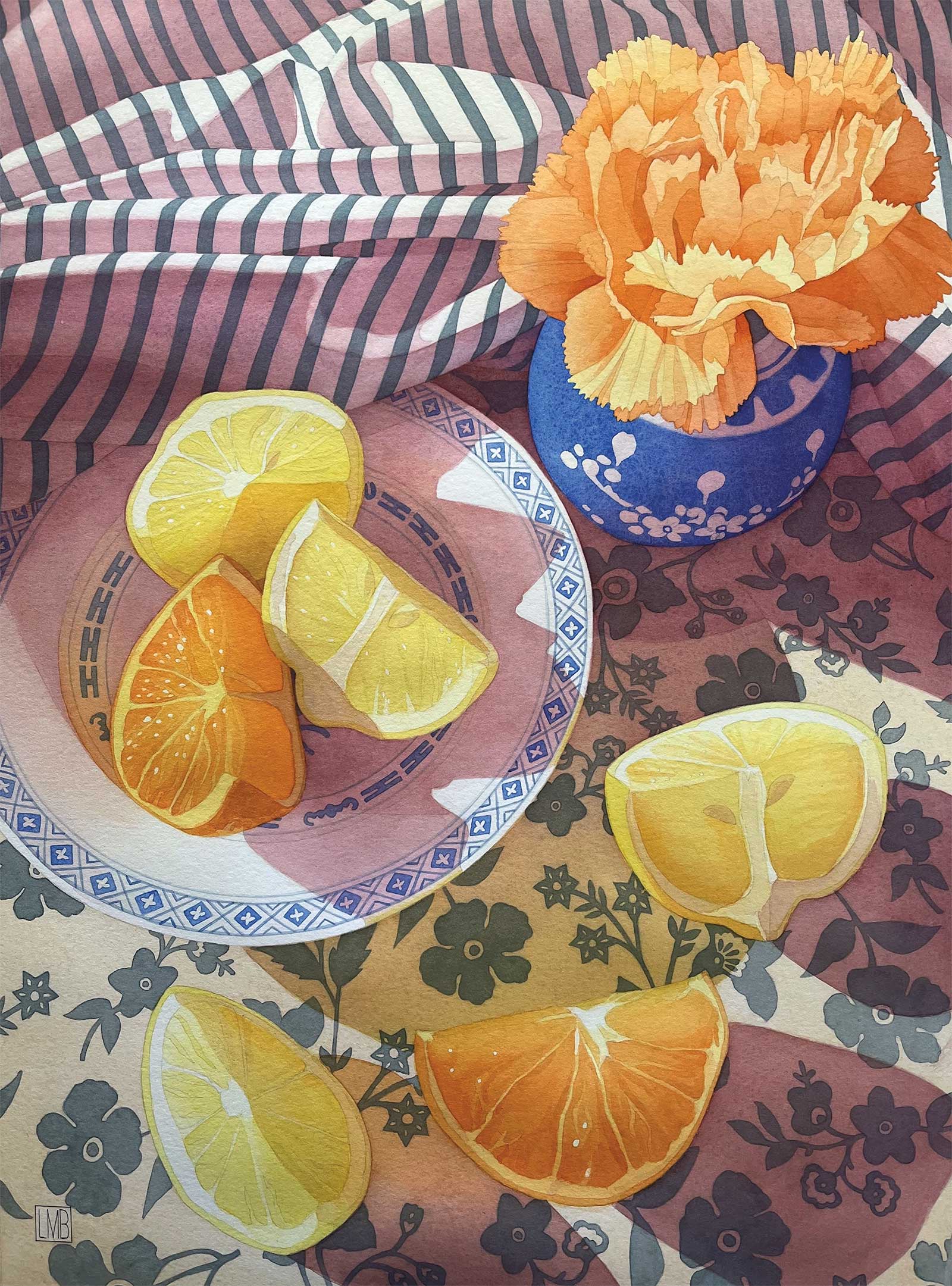 Sunshine Squeeze, watercolor, 19 x 14" (48 x 35 cm)
Liane Bedard
Ontario, Canada
My Inspiration
I love exploring the interplay of sunlight and the patterns it creates in everyday life. By focusing on capturing transient light, especially during the early morning or late afternoon, I discover compelling compositions that inspire me to pay tribute using my preferred medium of water color. The magic of building up color while maintaining luminosity excites me, and this slow layering process, combined with detailed drawing, brings me the greatest joy.
My Design Strategy
For this painting, I arranged a still life featuring juicy citrus wedges and a bright carnation, complemented by a supporting cast of hard and soft textures, stripes, and prints. I placed the setup on a rolling table and waited for the early morning sun to stream in. When the light arrived, I moved the table around my studio until I found an ideal combination of glowing light and striking shadows. I took multiple photos and combined several to create a composition I was satisfied with.
My Working Process
My process began with a detailed drawing on tracing paper, which allowed me to work out all the details without worrying about erasure marks damaging the delicate surface of the water color paper. I then cleanly transferred the finished drawing onto my 300 lb hot press paper. I painted the piece by starting with the shadows, followed by a layer of local color to establish values. Most of my painting time was spent glazing multiple transparent layers to achieve the final depth of color.
Contact Info
Email: lianeb@rogers.com
Website: lianebedard.com