



My illuminated paintings happened on a cold night during a seemingly endless New York City winter in 2019. I had been painting birds for several years by then and mainly exploring the story of the fabled bowerbird: the male bird who collects objects, building an elaborate stage to sing and dance for his prospective partner. For years, I had been creating worlds for him: wallpaper patterns, various types of nests, fruits and still lifes. I imagined him in different places including mushroom lairs and elaborate painted patterned frames. In houses, caves and spaces filled with brightly colored pebbles. After so long, I was getting worn out by this repetitive storyline of love and courtship. And I was sad from the dark winter nights and my solitude.
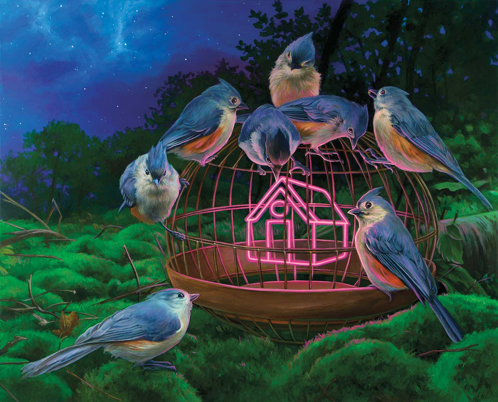
Curiously Illuminated, acrylic on wood, 16 x 20” (40 x 50 cm)
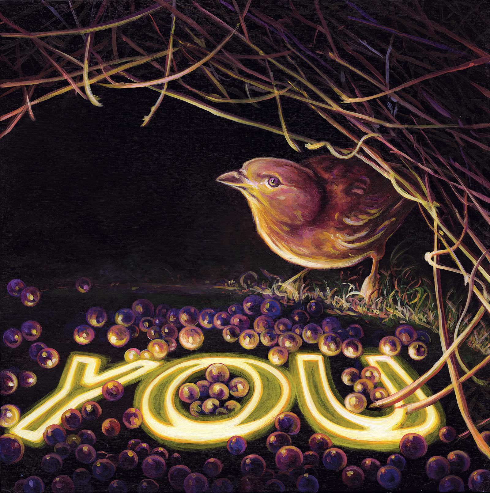
I started to wonder, how can I tell a new story? From this melancholy came the idea to change up the lighting in my paintings. My first neon painting was called I See YOU (I Hope You See Me). The flame bowerbirds lounge in a bed of twigs lit up by the neon sign. As I was working on this piece, I felt electric, like a new surge of energy was flowing through me, and I felt reinvigorated about my work again. Here it was. A whole new visual language I could now endlessly explore.
I also experimented with using text, which is a tricky thing for visual artists because it can easily look trite and on-the-nose. I was looking for something that could be interpreted as both neutral and personal and landed on the word YOU. It is a word that directly singles out the viewer. Ultimately, it addressed the universal desire to be seen. The story of Everyone.
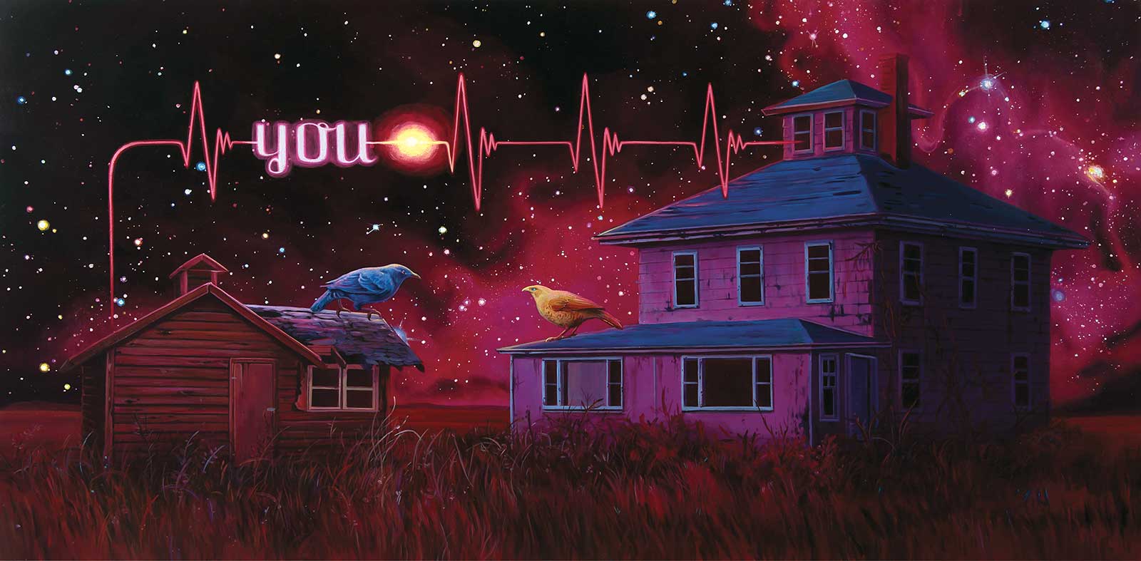
Signs Of Life, acrylic on wood panel, 18 x 36” (45 x 91 cm)
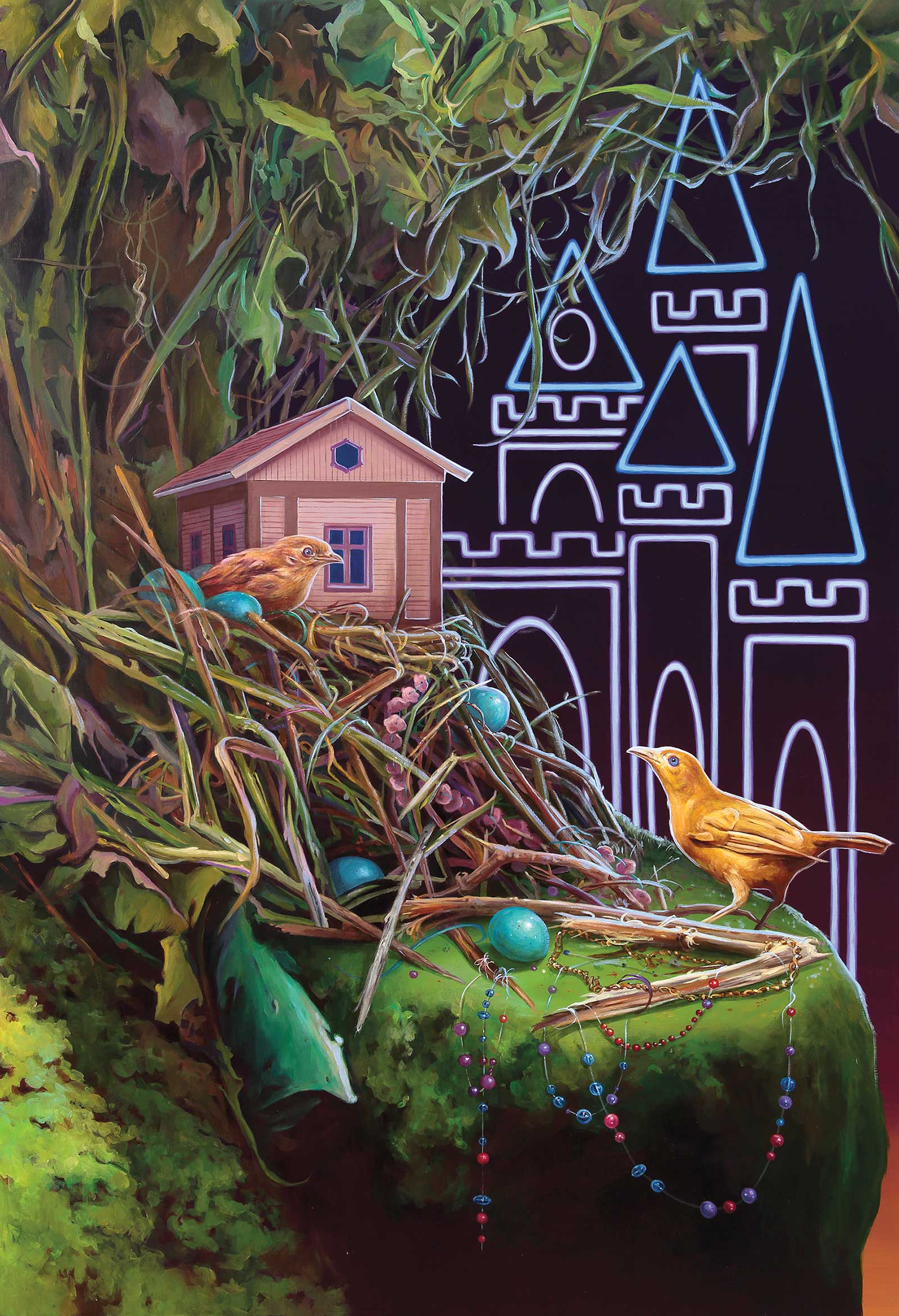
Tell Me What You Want, Tell Me What You Need, acrylic on wood, 24 x 36” (60 x 91 cm)
I created so many YOU paintings, as if I needed to play out this phase I was going through. That repetition helped me pull out of that bleak season of my life and push me into a new place. My favorite YOU painting was inspired by my two close friends, Kateri and Marcelo and their relationship. The piece depicts two homes: one is a small wooden cabin and the other is a two-story beautiful pink house. The bowerbirds perch on the roofs, joined by the EKG signal and the words “YOU.” The households are joined together with love in spite of the differences. The YOU paintings started out from heartbreak and ended with a spark of hope. It was a nice way to close the circle.
I grew up in Queens in New York City, a place that burns bright at all hours of the night. I never even saw the woods until I was a young adult on my very first hike in Vermont. That was when I experienced natural darkness for the first time in my life. It was terrifying and exciting and left an impression on me. In 2020, I picked up bird and wildlife photography, and it further opened my eyes to the natural world. I believe my neon paintings are about that close connection between nature, mythology and civilization. They are about the dichotomy of both being an extreme city girl and a nature lover.
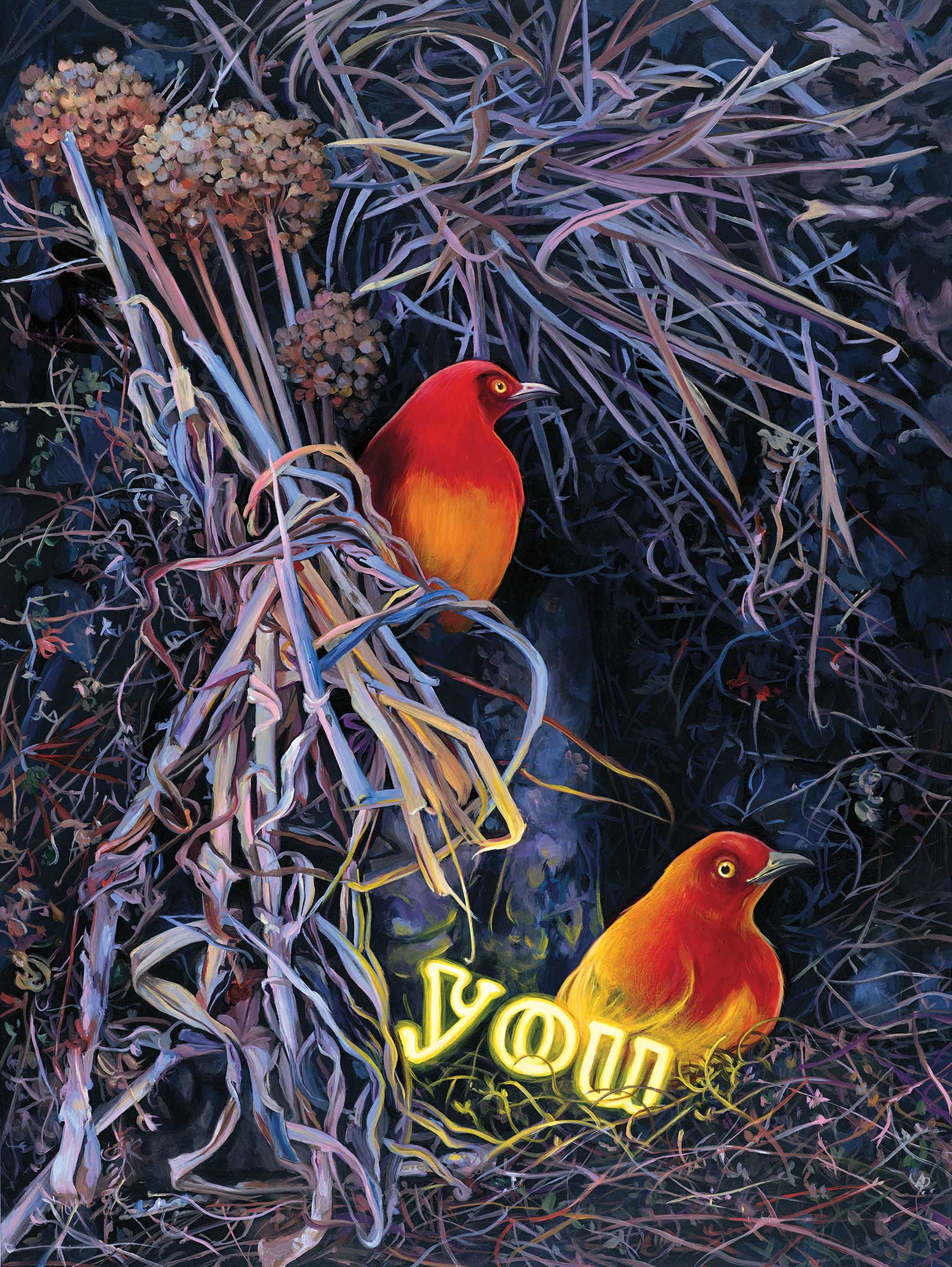
I See You (I Hope You See Me), acrylic on wood, 18 x 24” (45 x 60 cm)
You Are The Warmest Glow, acrylic on wood, 12 x 12” (30 x 30 cm)
Neon opened up a fresh palette and new ways to tell stories. Everything could switch from day to night, literally. Every time I visualize a new composition, I can see it clearly in my head both in darkness and in the daylight. And I get to weigh out the pros and cons of each approach and allow my imagination to direct me. As for my paintings, the wildlife became the conduits for personal narratives about myself and the people around me. Pigeons and sparrows can now be the stars in the story with a twist of magic, and text can be sign posts for my inner psyche.
In my painting Tell Me What You Want. Tell Me What You Need, the title itself is from advice a friend once gave me. “There is a difference between what you want and what you need.” In this painting, the female bird dreams of castles and being a princess, but what she really needs is already being offered to her: a warm house and humble gifts from a kind bird. The eternal dilemma of dream vs. reality.
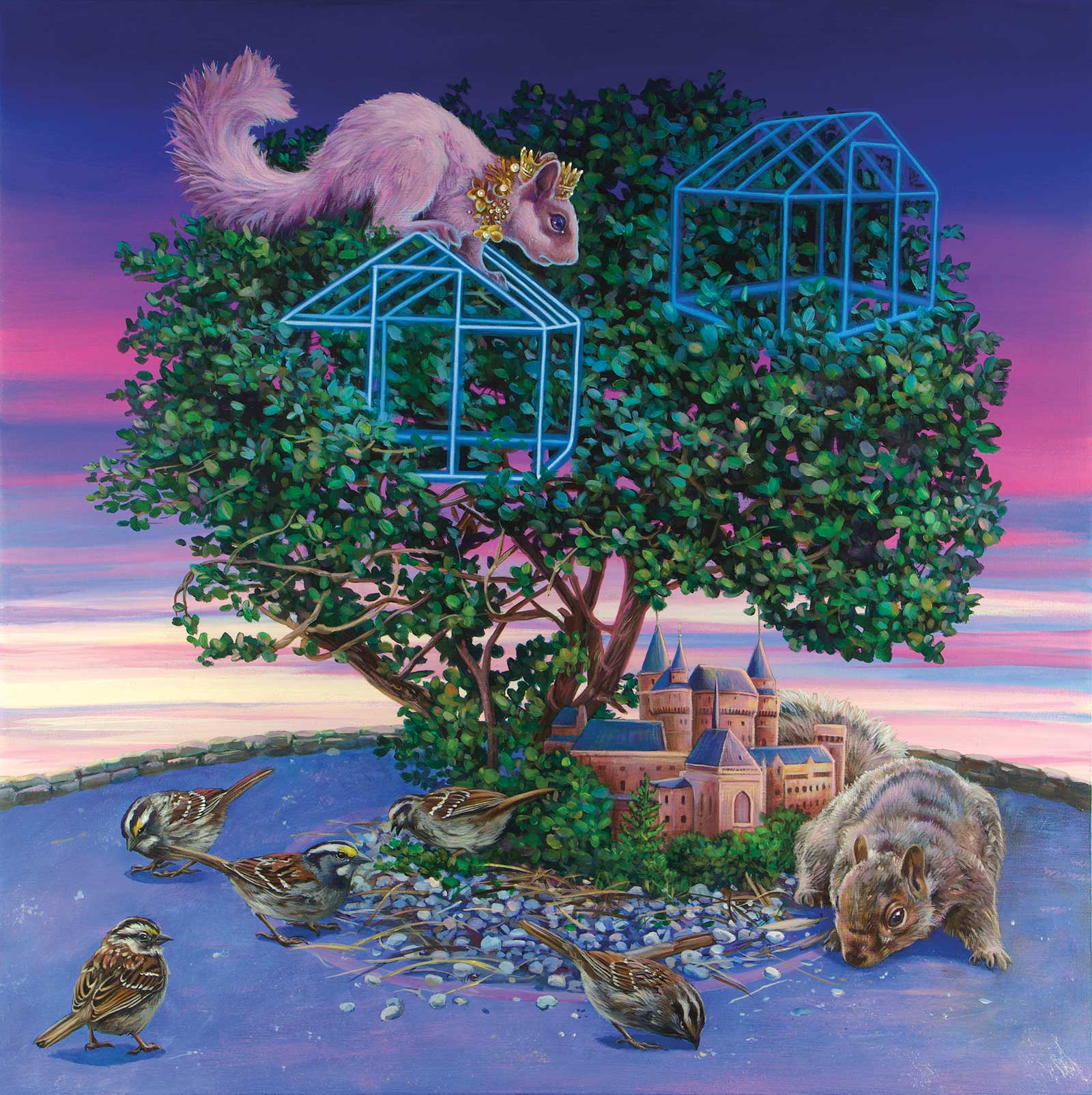
I’m Not What You Want Me To Be, acrylic on wood, 20 x 20” (50 x 50 cm)
My paintings Curiously Illuminated and I’m Not What You Want Me To Be are both about not being sure what my place in the world is. Growing up, I was told that I should strive to live a certain way and aim for “having it all.” Meaning a more traditional life with a regular job. In Curiously Illuminated, the birds encounter a warm, glowing house inside an open cage. They study the house and even admire it, but they do not enter the enclosure. I’m Not What You Want Me To Be also looks at expectations. The female princess squirrel sits atop the tree peering down, ambivalent about her castle and mate. In my own life, I have often dreamed of what my life could have been if I had just accepted that full time job offer or moved away from New York City. And I can continue to tell and retell these stories in the day or the night.
How to achieve the illusion of glow
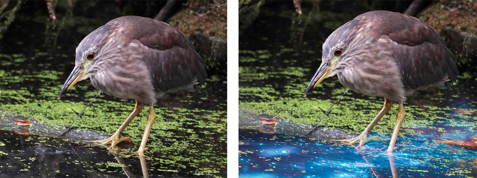
Reference Photos
Lighting is key to any narrative painting. Baroque artists like Caravaggio used dramatic lighting to create suspense while impressionists like Monet employed dappled sunlight to create atmosphere and a sense of warmth. For me, an unusual light source creates magic and a sense of possibility. It sets the tone for a heightened sense of reality. When I create a painting, I want a viewer to wonder “Whoa, what’s about to happen next?”
Wildlife is my favorite subject, specifically birds. I became a birder in 2020, and it has consumed my life as I follow the seasonal bird migration. It has given me new appreciation for nature and the delicate creatures that live among us. There is a fresh dimension of endless learning and limitless wonder that birding and nature has given my life that continues to spill out in new storylines and composition ideas. It has given my work new meaning and more of a mission.
I usually start off with a photo and begin to work out what my intentions for the piece will be. When developing a composition, I ask myself these questions: What is the light source and how does it function? Is it a candle, a neon sign or is the subject carrying an object in their mouth? Will it glow super bright and light up the whole scene? Or will it be subtle, just kissing the feathers mysteriously?
In this painting’s case, I began with a photo I took of a juvenile black-crowned night heron that I captured while in Central Park. These are my favorite kind of heron because of how quirky they look at all stages of life. I especially love the striations of the juvenile before they turn all white and gray as adults. To create a light source, I superimposed a photo of bioluminescence over the water as a guide. Bioluminescence is a tiny plankton that lives in the water that lights up at night and can be seen when the waves crash and move it around. As a concept, I love that it is a natural phenomenon that has a lot of room for visual play and allows for a fun story about this young night heron. Does he come visit this plankton every night? Does he stick his face in the water and try to eat it?
Stage 1
The first phase of underpainting is very dark because I want to slowly build up layers and gradually lighten the composition as we go from phase to phase. I started out by blocking in the main colors. The underpainting is also where I establish movement and pay close attention to the anatomy. Bowling in the colors also directs where the light might go.
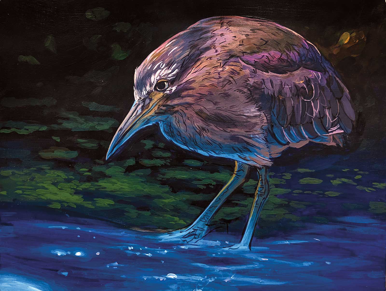
Stage 2
Using a thin brush with Payne’s gray, I loosely redraw the feathers and the anatomy of the bird. I am making a decision to keep the background loose to emphasize the foreground. I further block in where some of the light will go.
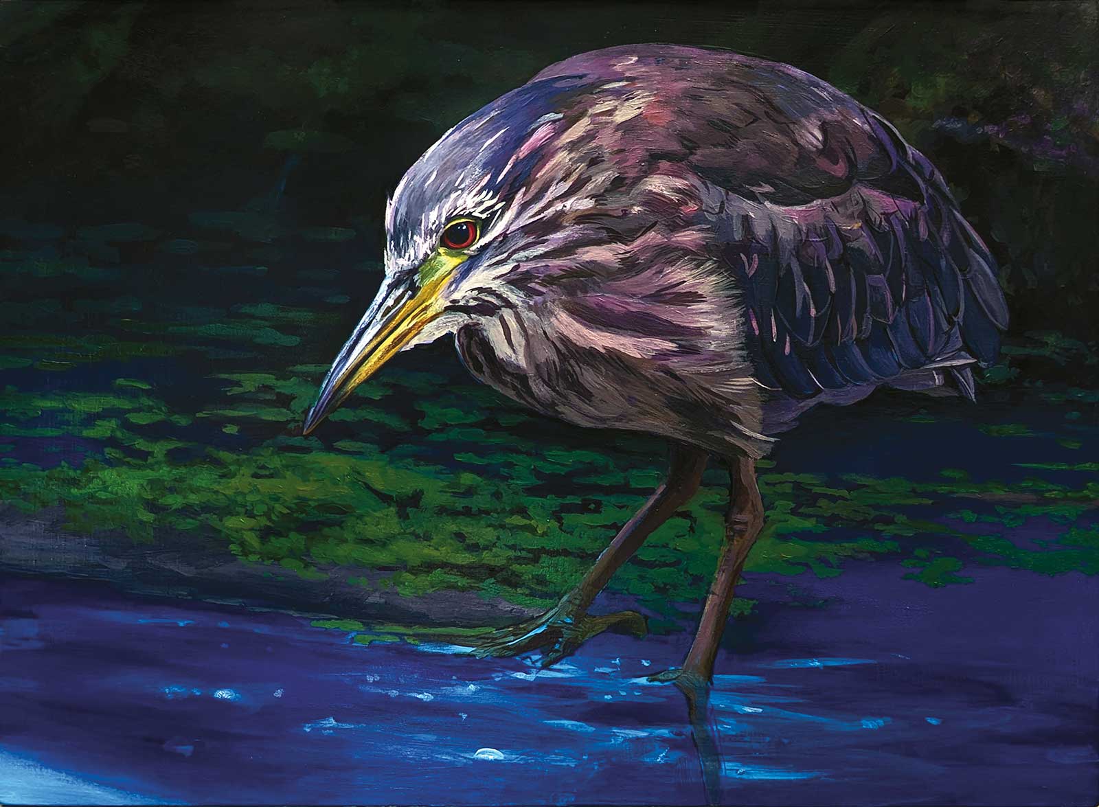
Stage 3
Using thin layers of paint, I start to create anatomy and block in the lights and darks. This is already creating a sense of dimension and character development. I really love the expression of zen on the face of the heron and begin to lay in his eyes, beak and face.
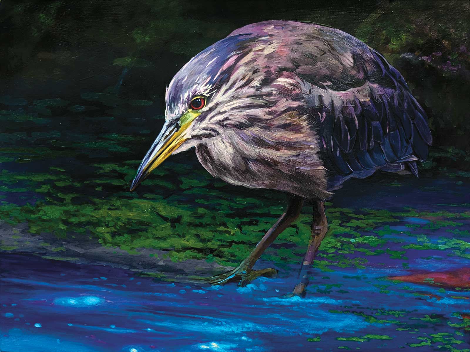
Stage 4
Using a smaller round brush, I add lights and darks to the heron. I also bring my attention to the water. I lightly blocked the shape of the water and how it would move around and where to add the sparkles. For the water, I used a mixture of Payne’s gray, cerulean blue and then started using more cobalt teal and light ultramarine blue for the highlights. Black is not normally part of my palette. Instead, I use a lot of Payne’s gray because I love the blue hue that it has and because it really brings an unexpected depth to the darks.
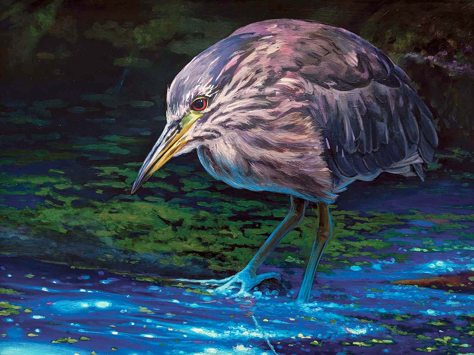
Stage 5
Using thin layers of paint, I built up the colors of the heron and the water. I use buff white instead of titanium to keep the warmth of the feathers as well as the initial highlights of the water. I start working out the feet, which is always the most challenging for me. This is where the photo reference becomes very important.
When I first start building up layers of color, I use water to thin down the paint. As the piece progresses, I also start mixing some paint with the medium to create layers. Layering with medium really gives the piece more body. It also helps extend the paint further, and you can create some pretty translucent glazes. Everytime I felt the water was getting too light in places, I would mix some ultramarine blue with medium and use a flat brush to give it a quick glaze to tone down an area. As the piece develops, I use thinner and thinner layers to build up dimensions.
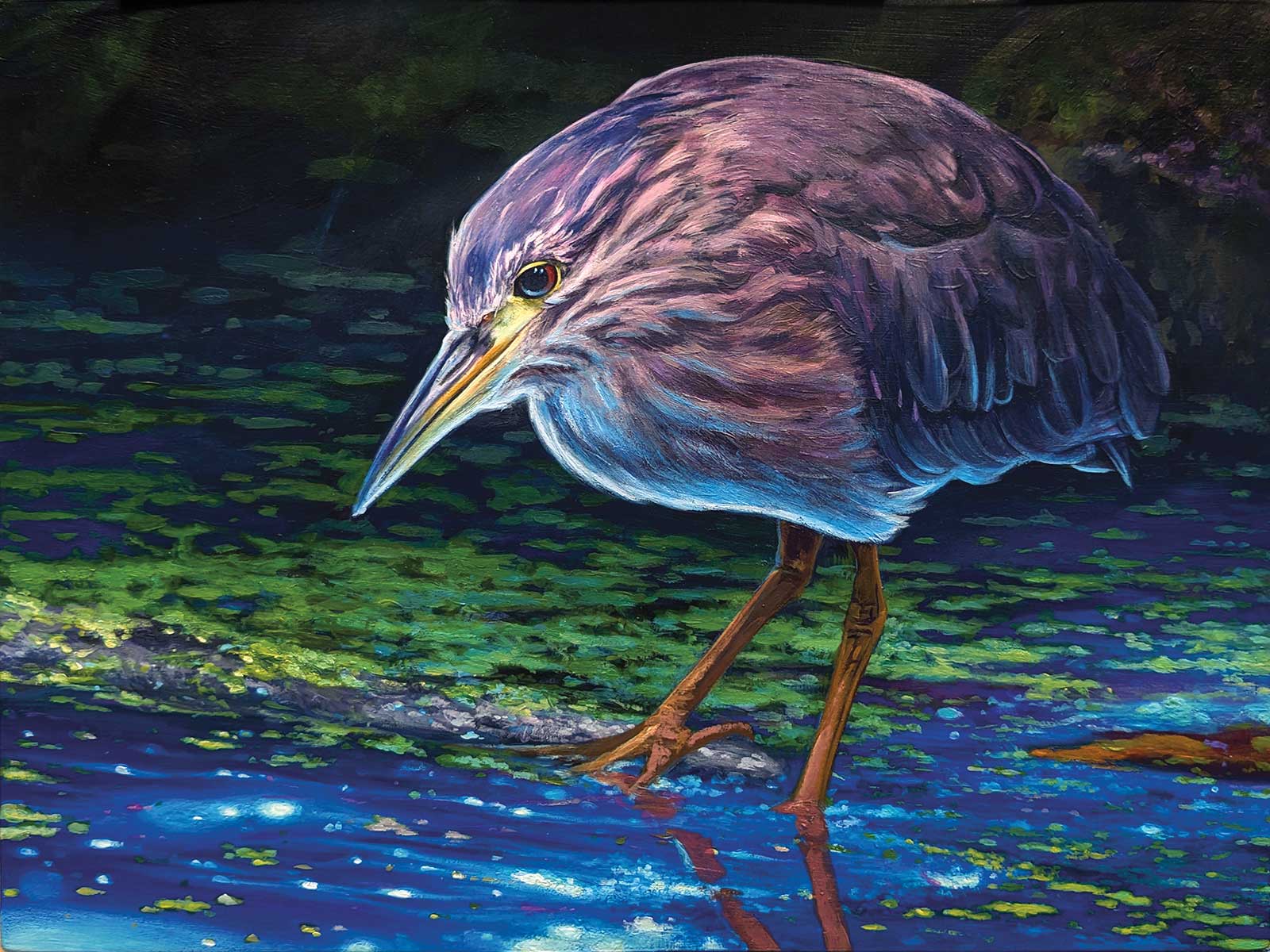
Stage 6
Admittedly, I was incredibly lost in where and how to master the lighting. At first, I added a thick outline of highlight to the underside of the body but toned it down with Utrecht brilliant blue and cerulean before I added back a few subtle highlights with titan buff. And I repainted the feet back to warm colors as a base for the final icy blues.
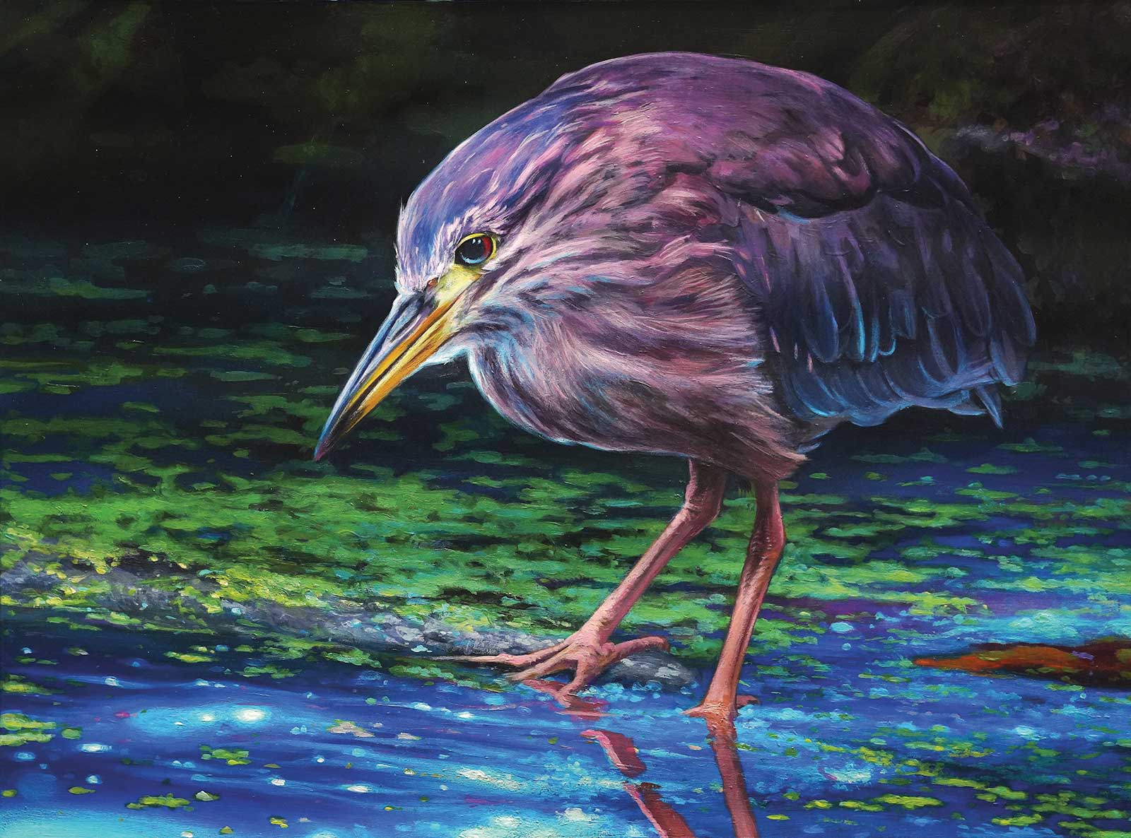
Stage 7
I have a penchant for various shades of violet in the final stages of a dark piece. For example, I love glazing with dioxazine purple in the darkest areas of a painting. It is so unexpected. There are also some subtle touches of Golden medium violet in the water to mimic the colors of the heron.
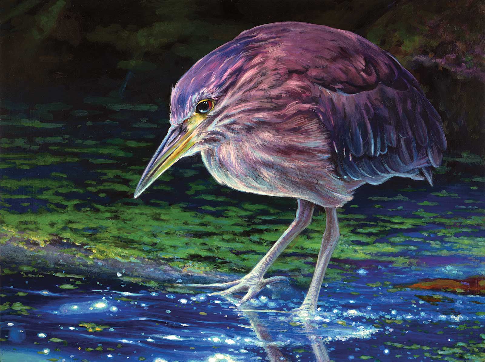
Stage 8
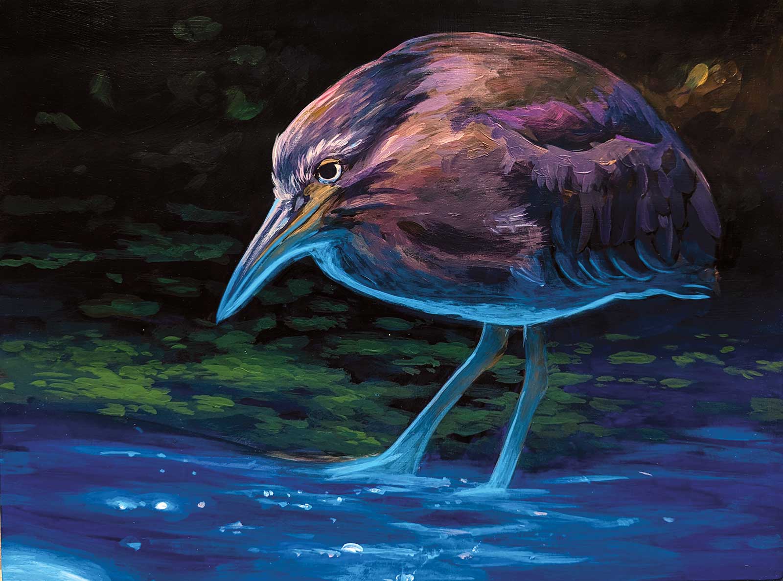
So Much More To See, acrylic on wood panel, 9 x 12” (22 x 30 cm)
For the final phases, I glazed down the water with ultramarine and dioxazine purple to make the darks look richer before I once again added the lighter blues for the shimmer of the water. I used a lot of cobalt teal over the cerulean and brilliant blue. This made the lighting warmer and eerie. I finished off the highlights with buff white and finally used titanium white for a maximum bright glimmer that really pops.
About the Artist
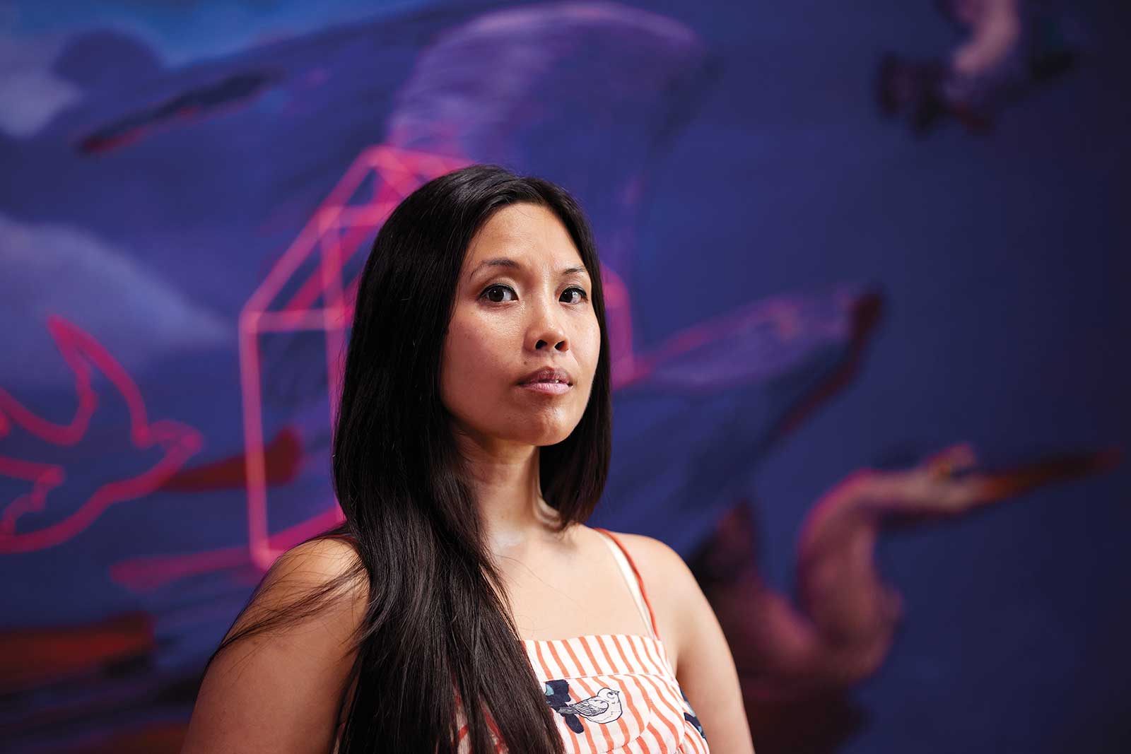 Gigi Chen
Born in Guangdong, China, and raised in New York City, Gigi Chen’s work creates an aesthetic that combines her training as a traditional animator and painter. Entrenched in the art of storytelling, Chen explores themes around family, love and home. Her latest collections are colorful compositions involving wildlife and light and act as metaphors for tragedy and the hope for redemption.
Chen is also an avid birder and burgeoning nature photographer with a growing passion for animal rights. Her work has been featured in solo exhibitions with several galleries including Beinart Gallery in Melbourne, Australia, and Antler Gallery in Portland, Oregon.
See more from the artist
gigichen.com