



I began drawing in 2021, after years of studying nature through the lens of ecology. With a Master’s degree in ecology, I was trained to observe ecosystems closely and to notice patterns, subtle color shifts, textures and relationships. When I discovered colored pencil, I realized it offered a similar kind of attentiveness. It is a medium that rewards patience, layering and careful observation, qualities that feel deeply connected to both science and art.
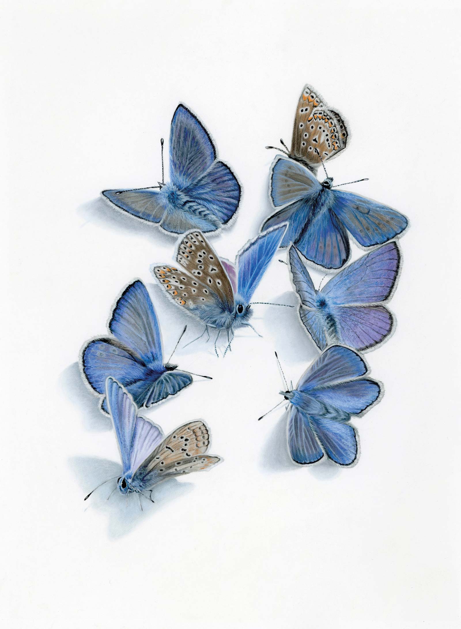 Where Blue Takes Wing, pastel pencil, 19½ x 15¾" (50 x 40 cm)
In my work, I focus on intimate portraits of wildlife. Rather than placing animals in sweeping landscapes, I bring the viewer close enough to study the layering of feathers, the texture of bark or the reflective surface of an eye. I want the subject to feel present and near, as if encountered during a quiet walk outdoors. Even nature close to home can hold extraordinary beauty when we slow down and truly see it.
For this demonstration of a great spotted woodpecker, my approach centers on building depth through transparent layers of colored pencil. I work from light to dark, gradually developing form with controlled pressure and subtle shifts in temperature. Establishing accurate values early is essential: strong contrast gives structure to the drawing and allows the red markings and black-and-white plumage to remain luminous rather than flat.
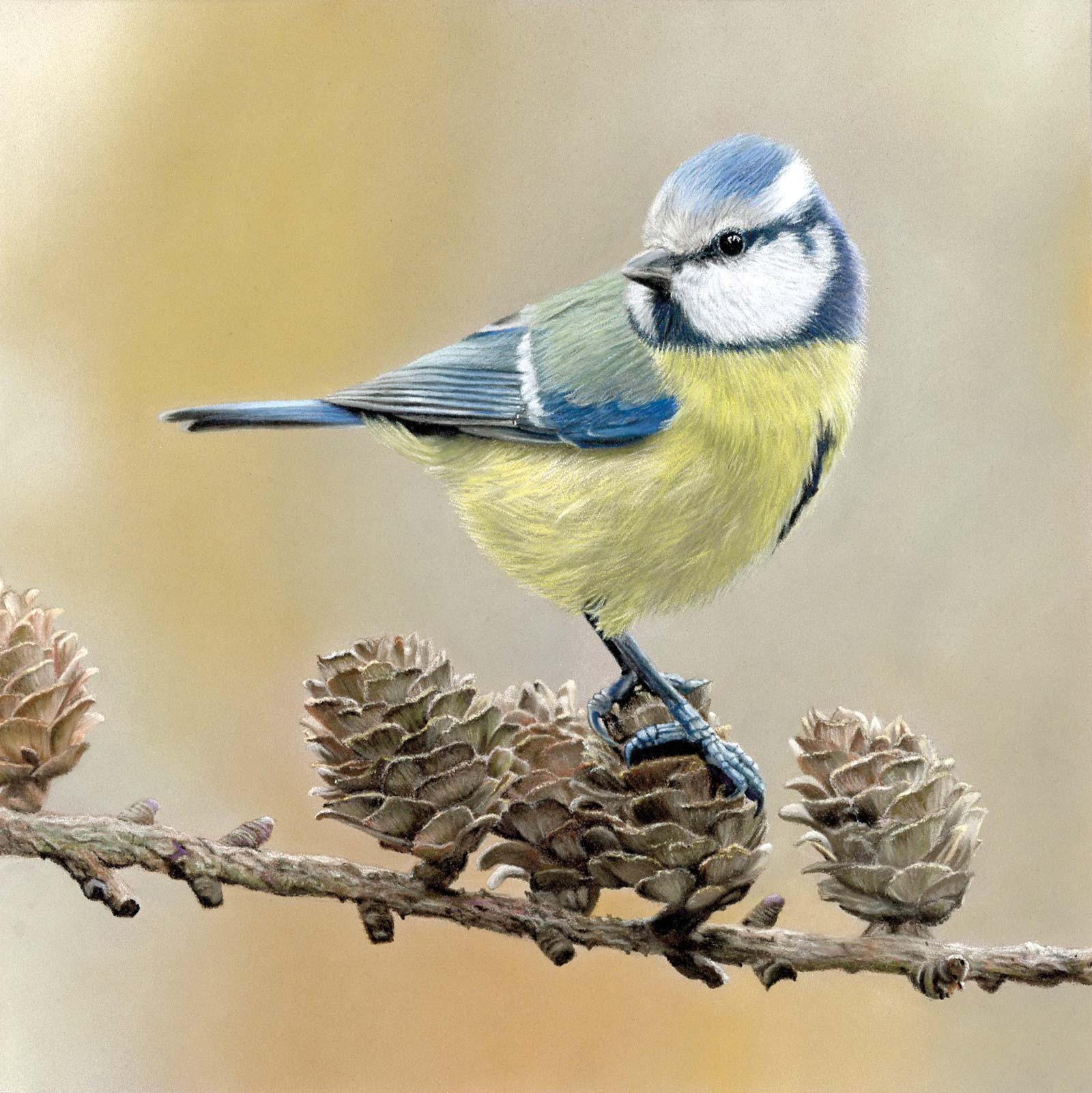
Blue Tit, pastel pencil, 7¾ x 7¾" (20 x 20 cm)
Texture plays a vital role in this piece. The crisp edges of the feathers contrast with the rough, irregular surface of the tree bark. By varying stroke direction, pressure and layering density, I create distinction between these surfaces while maintaining harmony within the composition. I pay particular attention to the eye, where small highlights and precise detailing bring life and focus to the portrait.
Through this process, I aim not only to render a realistic likeness, but also to invite viewers into a moment of stillness, an opportunity to reconnect with the quiet presence of wildlife that surrounds us.
My Art in the Making Keeper of the Woods
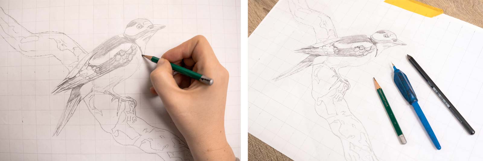
Stage 1 Sketch
To create the initial sketch, I used the grid method. I drew a 2 x 2 cm grid on both a sheet of thin paper and on the reference photo. This helps ensure that the proportions are accurate and that the placement of the elements is correct. Once the drawing was complete, I transferred it to my final drawing paper. I covered the back of the sketch with soft graphite, held it against the light to check, placed it on the drawing paper, and carefully traced the lines. And voilà, the drawing is ready to begin.
WHAT THE ARTIST USED

Faber-Castell Polychromos and Caran d’ache Luminance Colored Pencils
For the Bird
White, Cold gray I, Cold gray V, Black, Payne’s gray, Dark indigo, Mauve, Idanthrene blue, Cobalt blue, Sky blue, Warm gray I, Warm gray IV, Dark sepia, Bistre, Ivory, Beige red, Caput mortuum, Red, Burnt sienna
For the Branch
Sky blue, Dark indigo, Cobalt blue, Mauve, Purple violet, Cold gray I, Warm gray I, Warm gray IV, Payne’s gray, Walnut brown, Nougat, Ivory, Beige red, Burnt sienna, Distre, Dark sepia, Black
Additional Colors
Raw umber 10%, Buff titanium, Warm earth 5%, Burnt sienna 10%, Warm earth 40%, Violet gray, Sepia 10%, Brown ochre 50%, Burnt ochre
Additional Materials
Fabriano Artistico hot-pressed aquarelle paper, 300 gsm, Kneaded eraser, Graphite pencil HB, Graphite pencil 6B, Nippon tape, Ceramic knife from slice tool
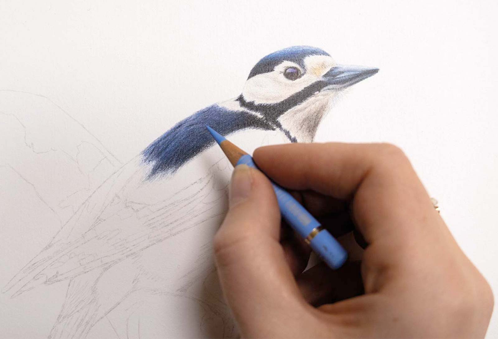
Stage 2 The Eye and Head
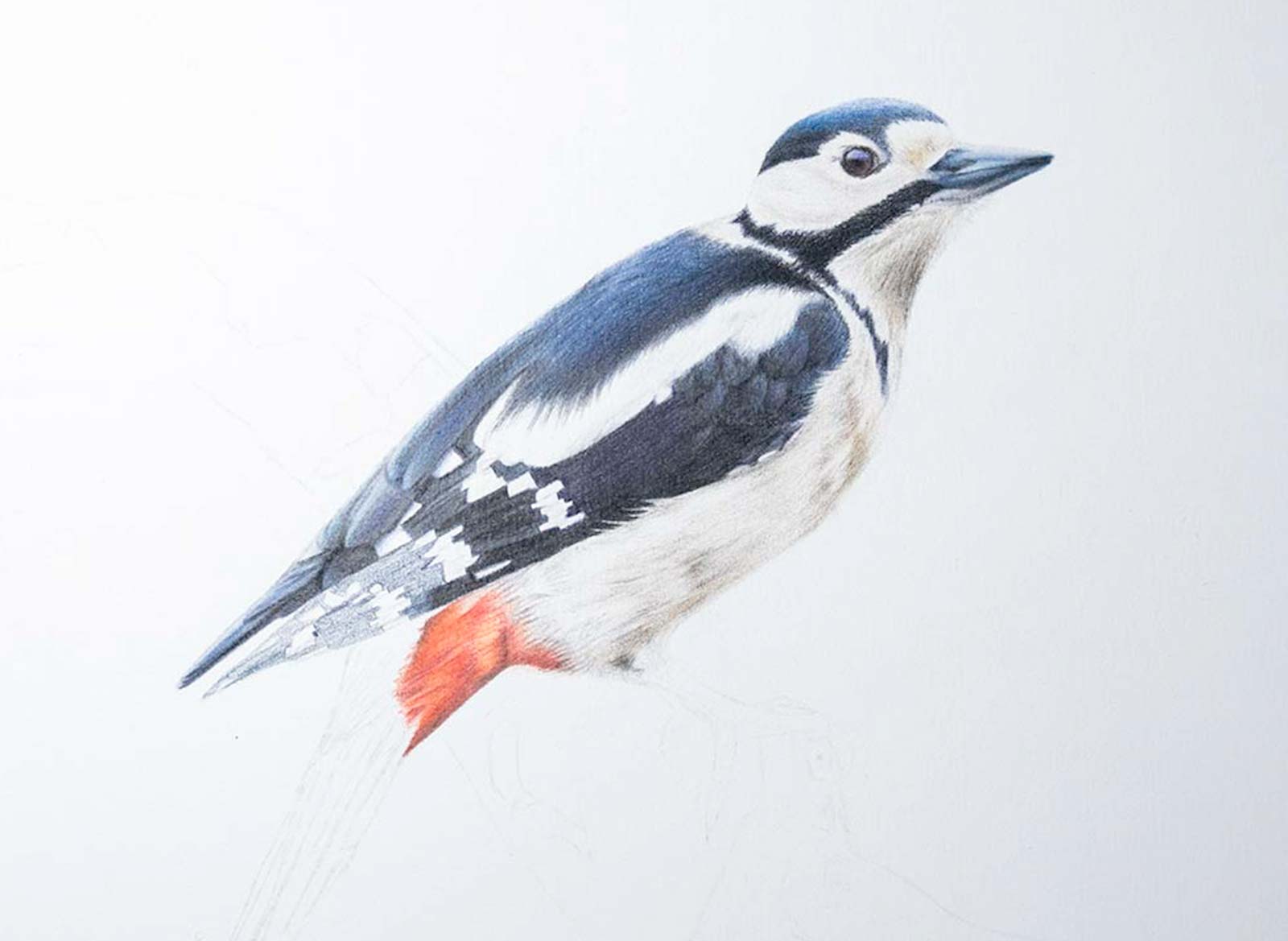
When drawing a portrait, I almost always begin with the eye. It is the most important element; once the gaze feels right and the animal seems to look back at you, the connection is established. Even in this small eye, many colors are layered: sky blue, dark indigo, dark red, burnt sienna, caput mortuum and black. A sharp pencil is essential for capturing the crisp details and tiny highlights.
Next, I move on to the beak and the rest of the head. Black feathers contain much more color than we often realize, as there are blues and even purples within them. I begin with a light blue (sky blue), followed by cobalt blue, idanthrene blue, dark indigo, Payne’s gray and finally black. I build the layers slowly, working from light to dark. The white areas of the head require close observation as well. They are not truly white, but rather soft yellow and warm gray. Again, I build thin layers gradually. For the final details, I use a sharp point to draw the tiny shadow lines between the feathers, leaving the lighter strands untouched—almost the opposite of what intuition might suggest.
Stage 3 The Feathers
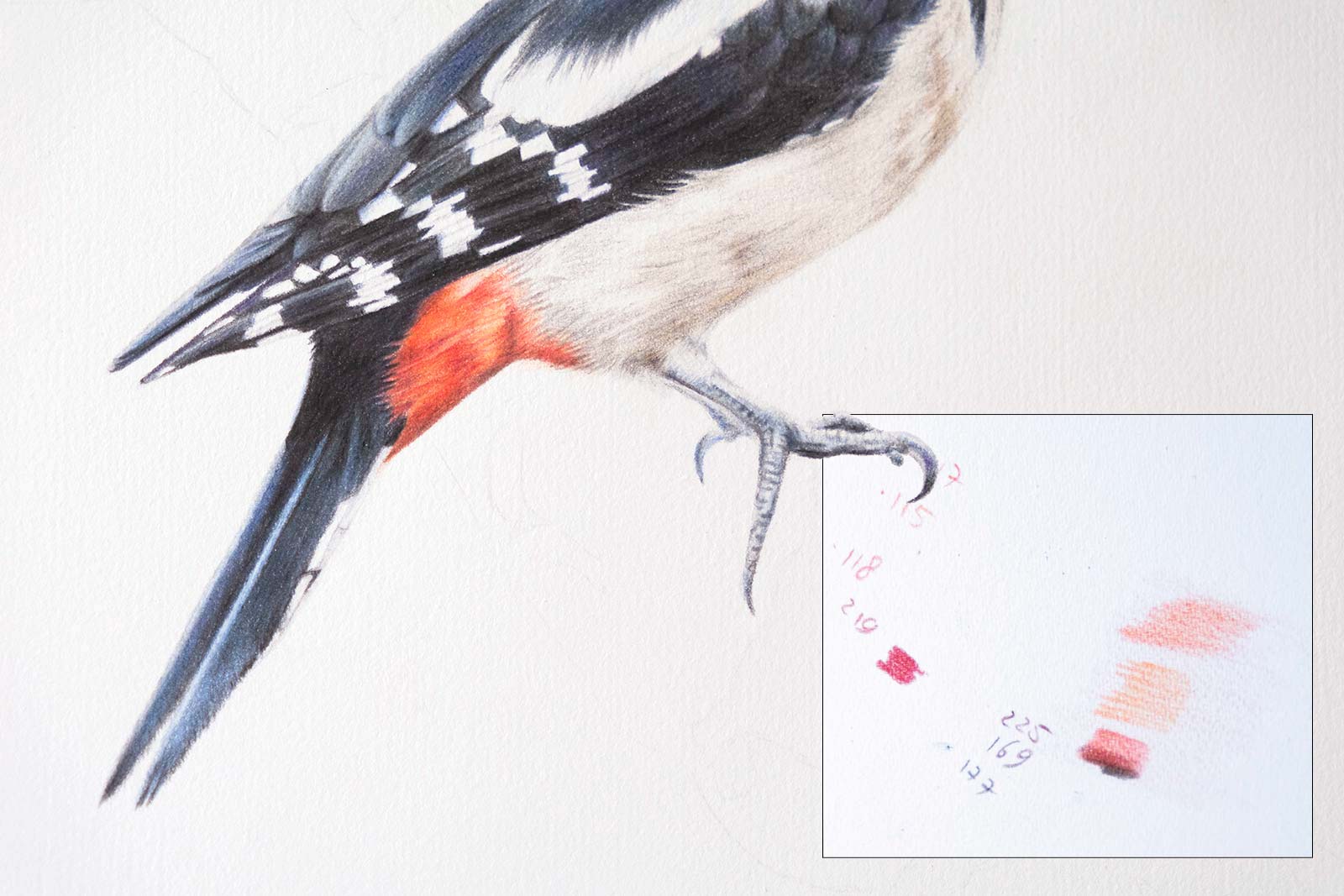
For the black feathers on the body, I use many of the same colors as in the head, beginning again with light blues and grays before deepening the values. I work feather by feather. If I were to fill in large areas at once, I would lose sight of my underlying sketch, making it harder to stay oriented.
Stage 4 A Pop of Red
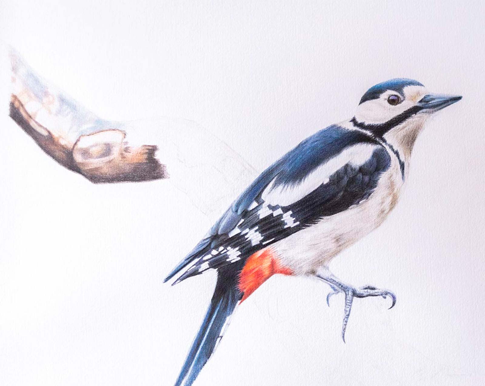
The woodpecker’s bright red patch is an important focal point. Before committing to the final drawing, I tested color combinations on a separate sheet of paper. I began with a soft pink base layer. For the darker areas, I layered walnut brown and caput mortuum to create depth and richness.
Stage 5 The Feet
Feet are always a challenge. Their unusual positions can trick the eye into drawing what you think you see rather than what is actually there. Experience has taught me to trust the process. I started with a light base of gray and blue, then gradually developed the structure using Payne’s gray, dark indigo and black. With a sharp point, I added small curved strokes to suggest the scaly texture.
Stage 6 Upper Section of Branch
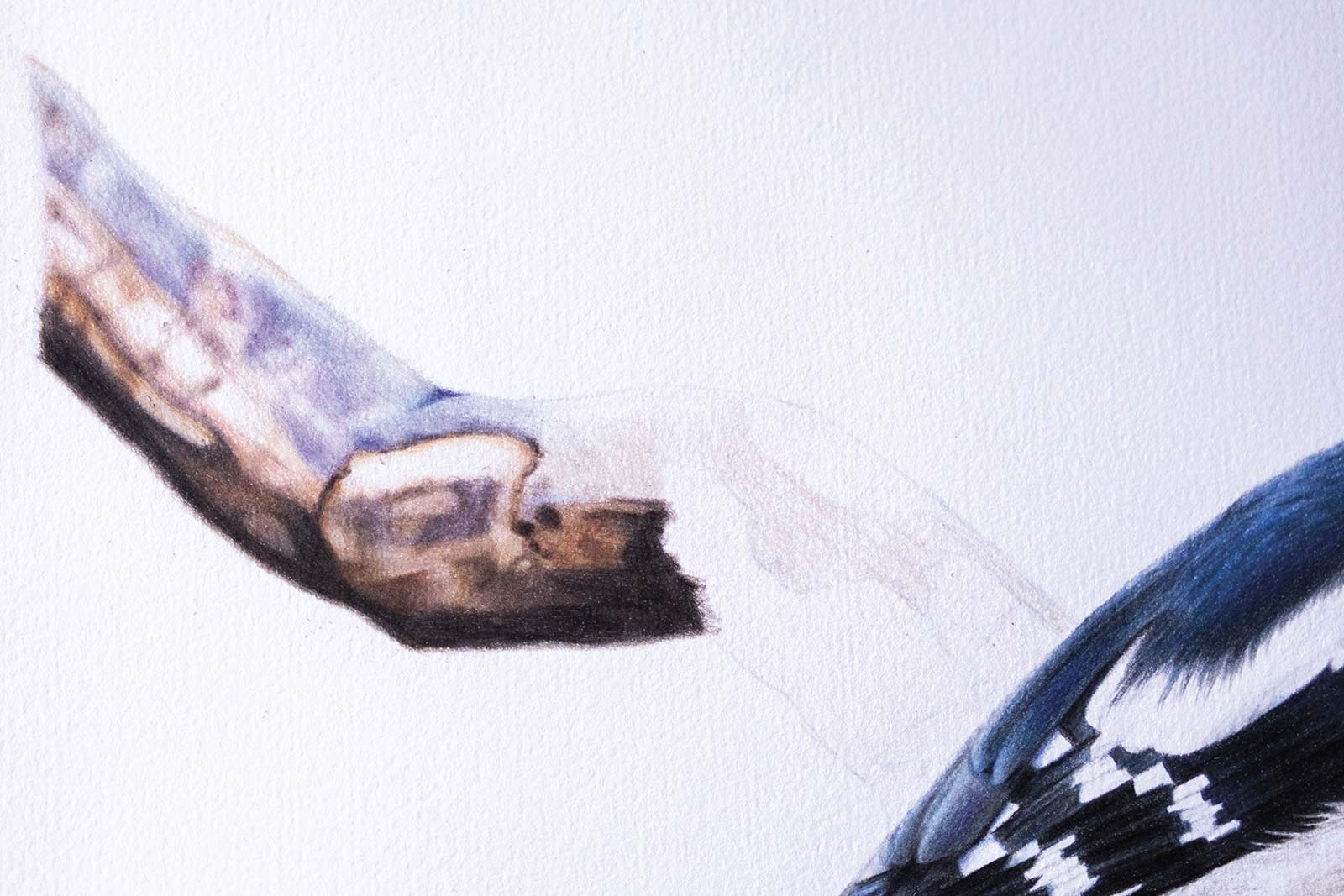
I established the branch with a light base layer of raw umber, 10 percent (luminance). This wax-based pencil is relatively soft, making it easy to blend with subsequent layers. The upper part of the branch is slightly out of focus, so this softer approach works well. I then layered purples and blues in the upper section, while deepening the lower portion with walnut brown, dark sepia, Payne’s gray, burnt sienna and black to create strong shadow and depth. This contrast gives the branch a rounded form.
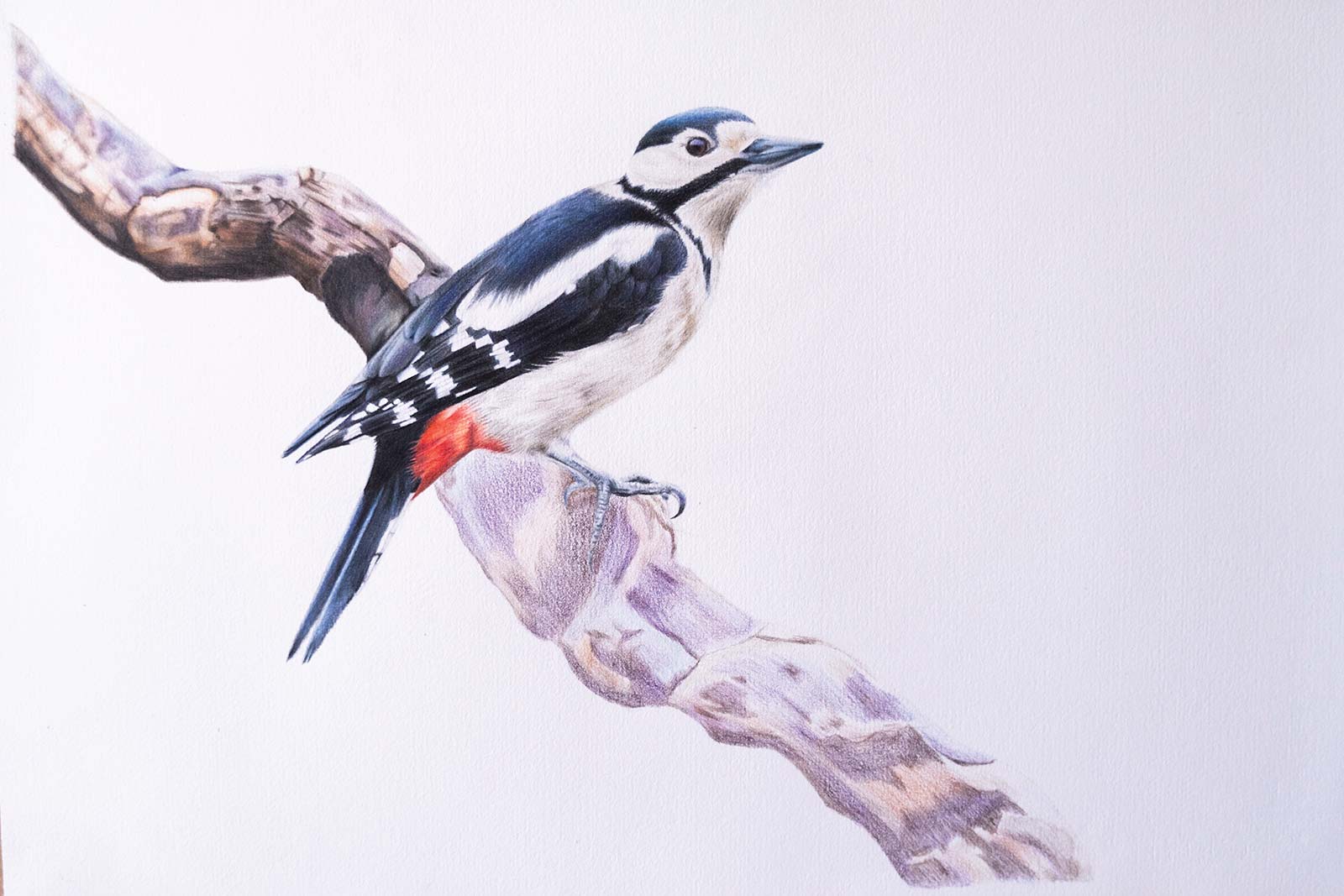
Stage 7 Working on Lower Section
For the final section of the branch, I moved slightly away from the reference photo to create my own interpretation while keeping harmony with the upper section. I used many of the same colors, building layer upon layer over a light base while preserving enough tooth in the paper to create depth and sharper shadows. Texture is essential when drawing wood, so I used a sharp pencil to create many fine lines, mostly following the direction of the branch, but occasionally crossing it, to add variation and nuance.
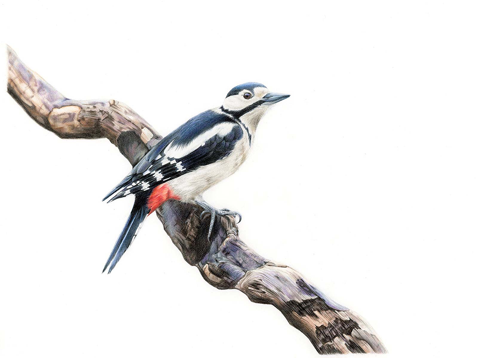
Stage 8 Finished Artwork
Keeper of the Woods, colored pencil, 9½ x 11¾" (24 x 30 cm)
In the final stage, I revisited the feet. They felt slightly too light compared to the darker branch, so I deepened them subtly with Payne’s gray. This reduced their prominence and created better balance within the composition.
About the artist
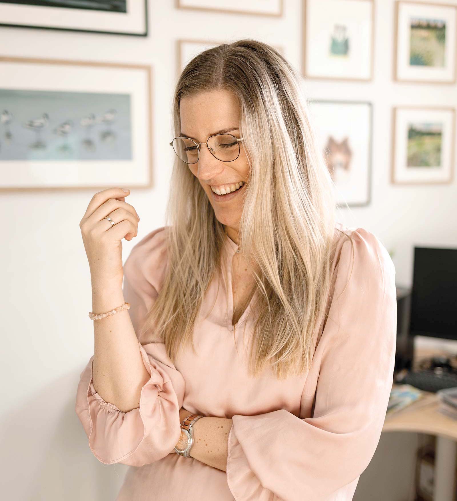 Rebecca Engels
Rebecca Engels is a Dutch colored pencil and pastel artist whose work celebrates the quiet beauty of the natural world. She began drawing in 2021, building her practice from the ground up as a self-taught artist. With a Master’s degree in ecology, her creative journey is deeply rooted in years of studying ecosystems and observing wildlife. Her scientific background continues to shape her artistic voice, combining careful observation with a deep emotional connection to her subjects.
Working primarily in colored pencil and pastel, Engels is drawn to media that allow her to build depth, softness and intricate detail through layered application. Texture, structure and subtle shifts in color play a central role in her process. Whether capturing the delicate layering of feathers or the softness of fur, she approaches each piece with both precision and patience.
Engels creates commissioned portraits, often of beloved animals, as well as personal works inspired by wildlife and botanical subjects. Since beginning her artistic career, her work has received several international recognitions and awards in juried art competitions, further establishing her presence within the contemporary realism community.
In addition to her studio practice, she teaches drawing to children and adults, encouraging her students to slow down, observe closely and reconnect with nature. Her mission is to remind viewers that beauty is not only found in distant wilderness, but also in everyday nature just outside their doors.
Contact at
natureartbyrebecca@gmail.com
natureartbyrebecca.com