



Welcome to our “streets” painting workshop, where we’ll explore the dynamic beauty of San Francisco’s iconic cityscapes. I’ll admit, I never thought I would be drawn to painting urban streets, but there’s something magical about the glow of light streaming down a busy avenue, the interplay of shadows cast by tall buildings, and the charm of a cable car rumbling along its tracks.
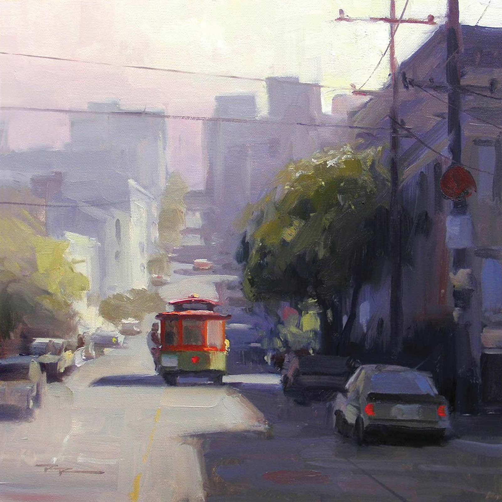
Richard Robinson, San Francisco, oil on canvas, 14 x 14" (35 x 35 cm)
In this workshop, we’ll focus on capturing the atmosphere, light, and unique shapes that make a street scene come alive, while also learning how to free up our color choices by starting with a black-and-white reference image.
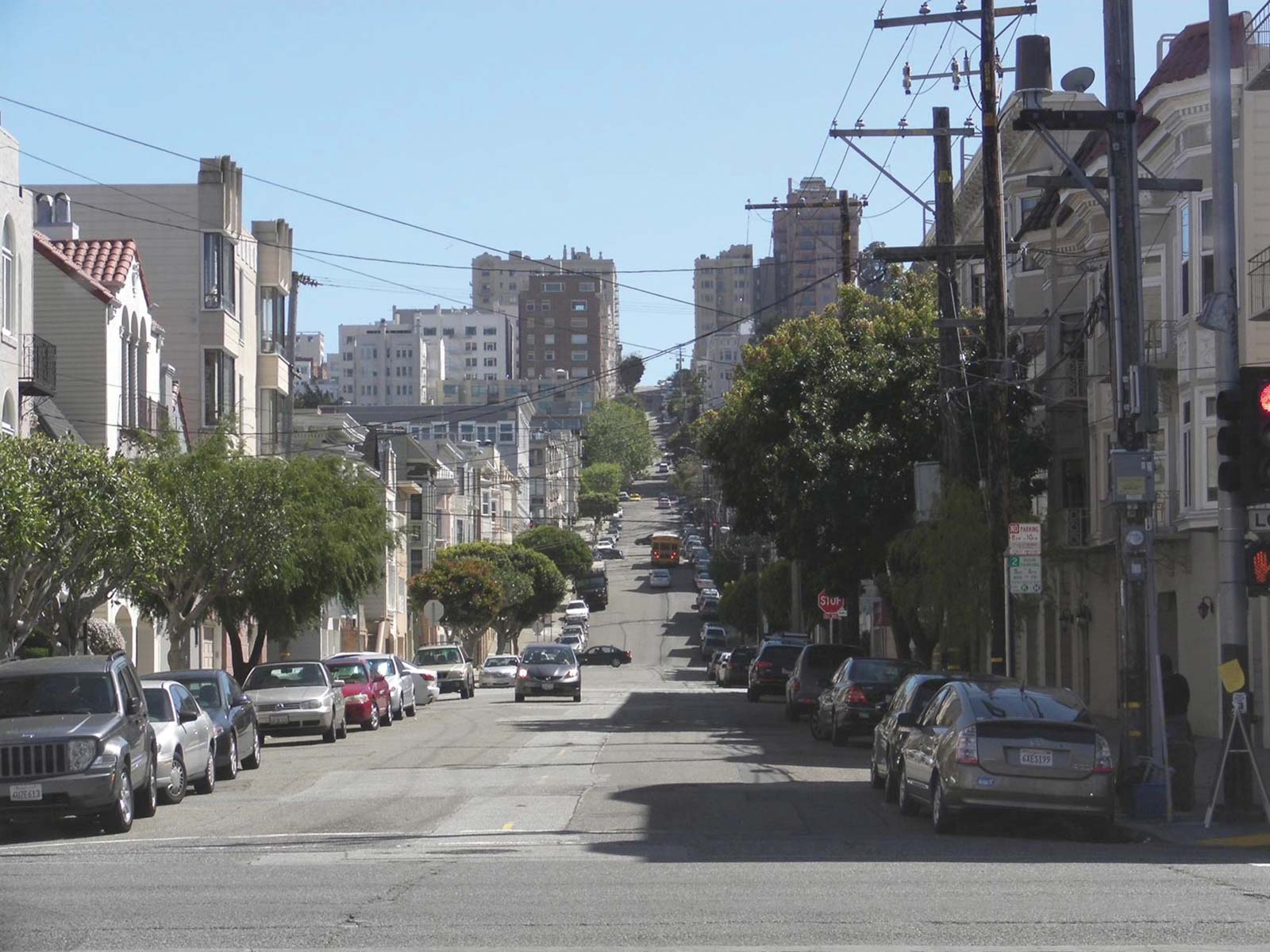
San Francisco, California
Whether you follow along with me step-by-step or take inspiration to create your own unique composition, this lesson is all about experimenting, learning and having fun. Scan the QR code on the last page to dive into the full step-by-step demonstration. And now we’ll take a look at a few student paintings from this workshop, breaking down what worked and what didn’t.
Student critiques
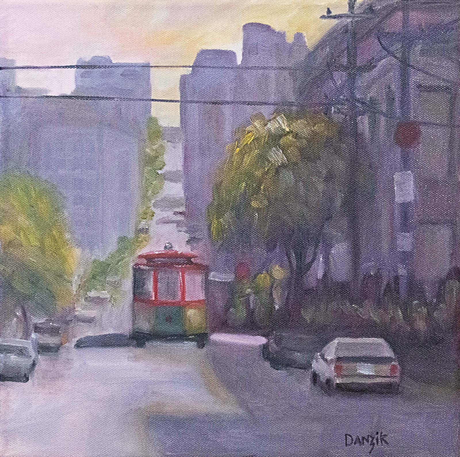 Untitled, oil on canvas, 12 x 12" (30 x 30 cm)
 Jeff Danzik
Strong work, Jeff. This is a good drawing, and you have an eye for keeping the large value masses clear and not over complicated, putting the detail where it counts. If you layered over the light shapes in the road again and sharpened up the cast shadow edges, you’d get a better sense of strong sunlight there. Intensifying the light and color on the right side of the cable car would help with that too, accentuating the center of interest. The greens leading up the street should gray down as they recede.
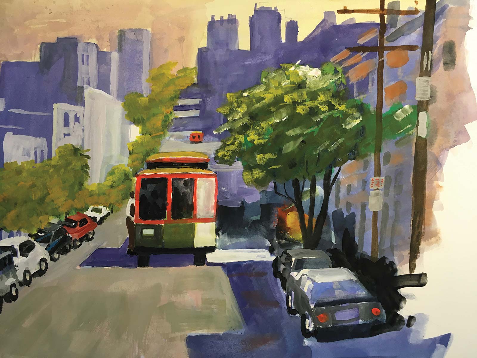 Streets of San Francisco, watercolor and gouache
Eric Hillmer
Very vibrant and energetic, Eric—it draws my attention. You’ve captured the bustling atmosphere beautifully with the bold use of color and strong shapes, particularly the lively greens of the tree contrasting the punchy red of the streetcar. Your composition draws the viewer right into the scene, leading them up the hill and into the distance.
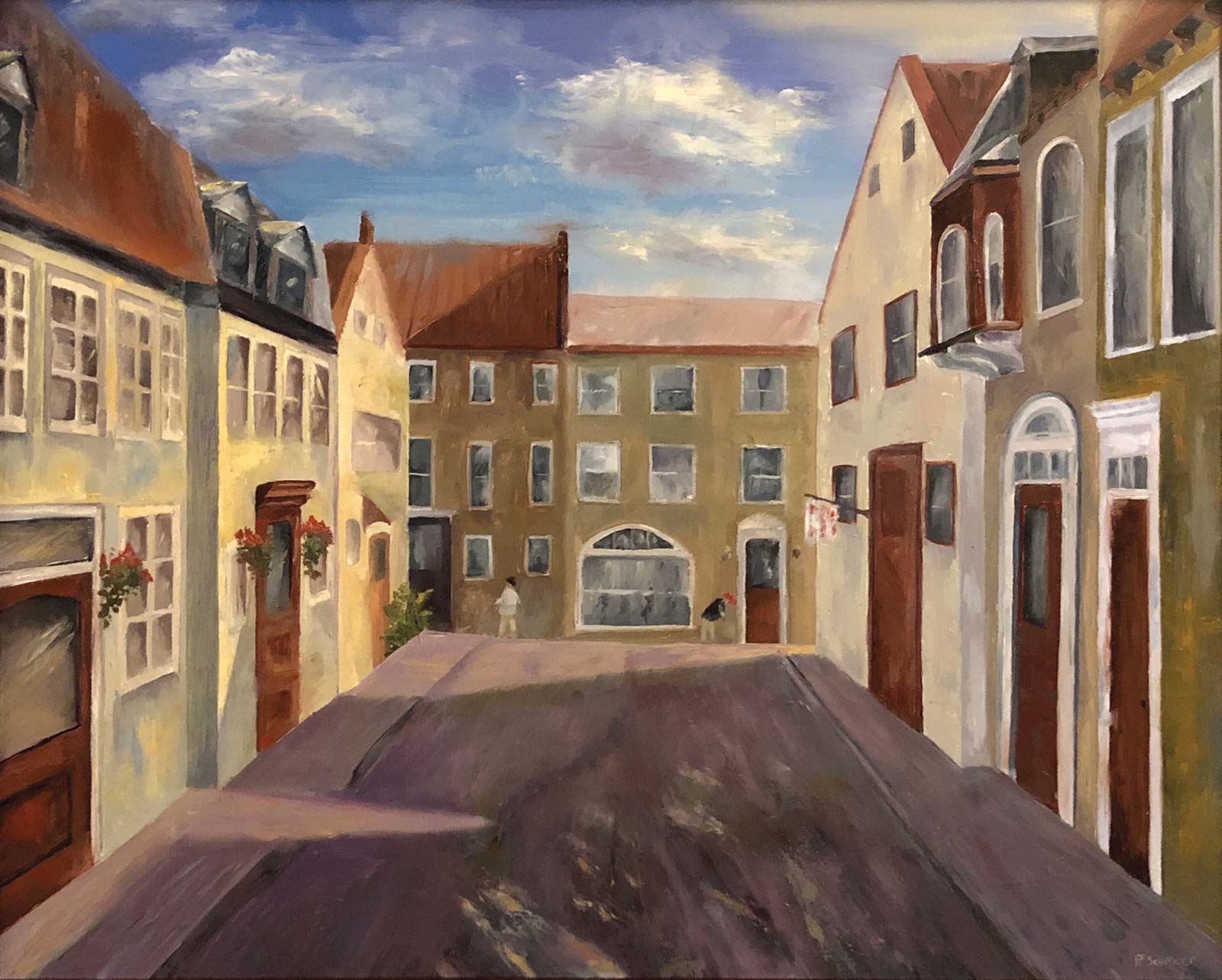 Street Scape
 Paul Seymour
This is a lovely depiction of a quaint street scene. The warm tones and direct light on the building facades create a welcoming atmosphere, and the sky is beautifully rendered with its dynamic cloud shapes and subtle colors contrasting the angular structures below. You’ve captured an inviting sense of place, which is so important in street scenes, although this could be aided by including more life on the street, i.e., vehicles and people. Another element you could add to release the boxed-in feeling of the street is to create a haze of light spilling over the furthest buildings, coming from the right, pushing them further back in space and inviting the view to walk around that corner into the light. At present, all the dark values back there are the same as the dark values in the foreground, which flattens the image. Adding atmospheric perspective could be the next step up the ladder for you. This could be achieved in this painting with light glazes, but the effect is generally more effective and colorful when planned and executed in the first layers. You’re doing great—keep pushing forward, Paul! I’m excited to see your next painting.
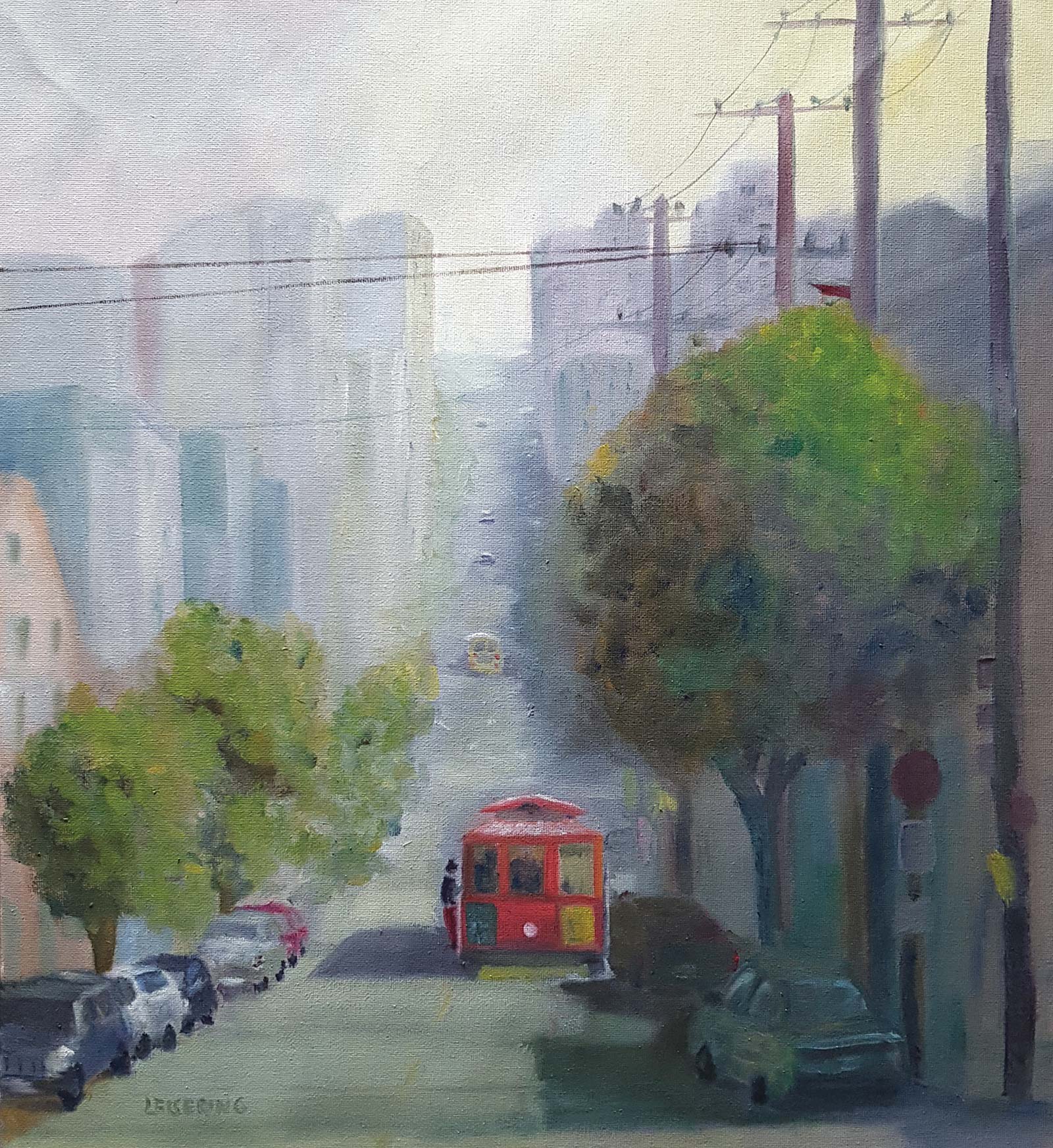 If you’re going to San Francisco, don’t forget to wear some flowers in your hair
Anne-Dore Leisering
This is a beautifully atmospheric piece! I love how the soft haze envelops the city, creating a sense of distance and mood. To have that cablecar really pop you could lighten the street around it and sharpen up the edges. It also needs that strip of light on the road to its right to make more sense of the light there, indicating a gap between the buildings letting in a shaft of light—that perfect moment where the cable car emerges from the shadows into the light. Your powerpoles are making a 1, 2, 3, 4 pattern, which for the sake of variety is to be avoided generally, which you can do by removing the second or third pole. They also need to get much thinner as they recede. I hope that helps. You’re doing some lovely work here. Keep it up!
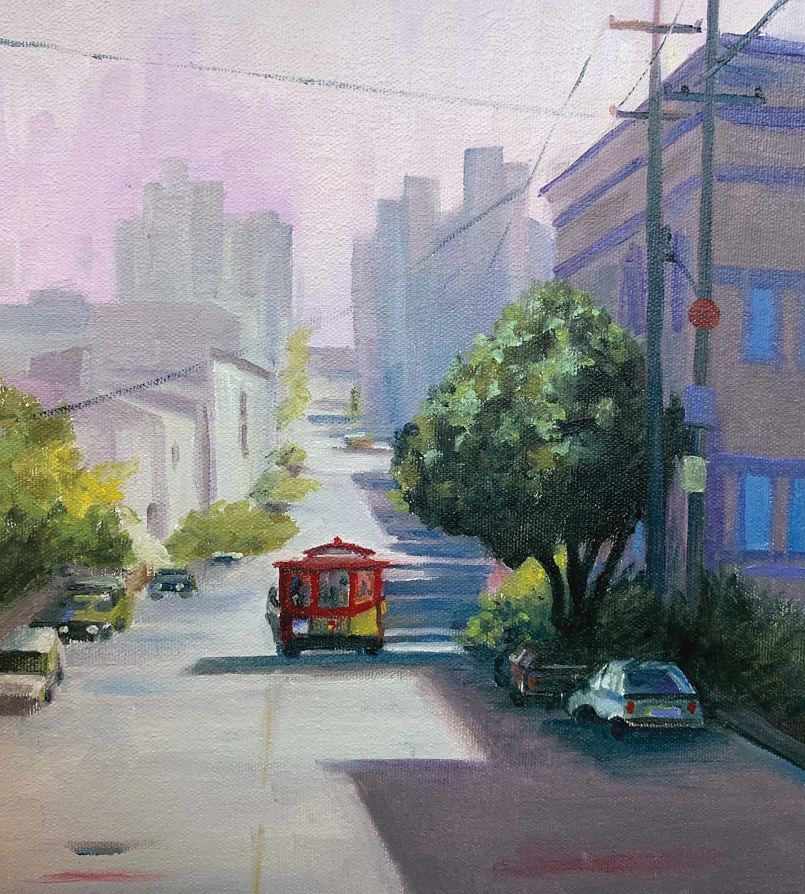 Streets, acrylic on canvas, 9½ x 10½" (24 x 26 cm)
Karen Woodhouse
Hi Karen, you’ve done a great job of the soft atmospheric perspective in the background, being careful to avoid dark values that would have spoiled the illusion of depth. Your drawing is solid too, with the perspective of the street well handled, though the cars could do with a little tweaking, namely making them bigger, and the cablecar as well. Wonderful work overall—this is a tricky subject, and you’ve done a great job capturing its charm!
Congratulations and thanks to everyone who entered a painting into the monthly workshop. Great work!