



A friend sent me a pair of red goggles. My wife Jeanette thinks I look ridiculous in them, and she’s got a point. But they’ve become one of my favorite perception-hacking tools. When I wear them on our morning walk, I notice that greens and blues drop out. What’s left is just the tonal skeleton of the world—light and dark values, nothing else.

James in his red goggles looking like he's come straight out of a sci-fi novel.
The effect demonstrates something most painters are already aware of. Color is conditional, subjective and somewhat arbitrary. With the glasses on, I’m plunged into a simplified alternate reality that starts out pinkish and gradually shifts to amber (not sure why). Our visual system does what it can to make the world intelligible and navigable, and it works just fine in monochrome mode.
Over the last couple of decades, neuroscientists have turned serious attention to how people actually see the world. Some of the findings confirm what painters have known instinctively for centuries. Others overturn popular teaching wisdom. Here are eight insights worth knowing about, each paired with something you can take straight back to the easel.
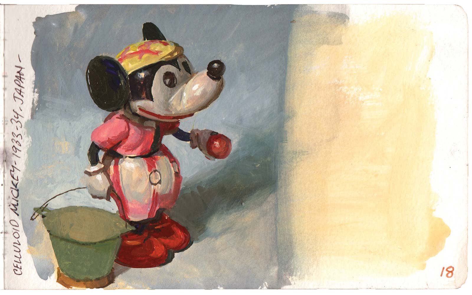
Celluloid Mickey, gouache
1. You See the Whole Before the Parts
The brain perceives the totality of a shape before it parses individual components, matching the overall silhouette against a stored library of known patterns. In his classic paper, psychologist David Navon called this effect the ‘forest before trees’. It happens so fast you can’t catch yourself doing it.
At the Easel
Get the big shapes right before you touch anything inside them. A clear silhouette is your first and best storytelling tool. If it doesn’t read from across the room, no fussy rendering will rescue it.
2. Color Arrives Before Form
The brain processes color up to 80 to 100 milliseconds before it resolves shape or motion. For a brief window, your viewer registers a warm golden glow before they see “sunlit hayfield.” The emotional key has been struck before the subject is identified.
At the Easel
Color temperature is doing emotional work before anything else in the painting registers. A color comp the size of a business card tells you more about a picture’s mood than a detailed pencil drawing ever will.
3. Exaggeration Hits Harder Than Accuracy
Neuroscientist V.S. Ramachandran demonstrated what he calls the “peak shift effect,” which is when a defining feature is exaggerated beyond reality, the brain responds more strongly than it does to the accurate version. He connects this to the Sanskrit concept of rasa—the extracted essence. A caricaturist who amplifies a subject’s big nose and small chin produces something that feels more like the person than a photograph does.
At the Easel
A faithful painting records a scene. A good one exaggerates whatever made you stop and set up. If a guy is hunched and rounded, make him more that way. If the light is warm, push it warmer. John Singer Sargent’s portraits aren’t photo-accurate—they’re painted caricatures. That’s why they feel more real than reality.
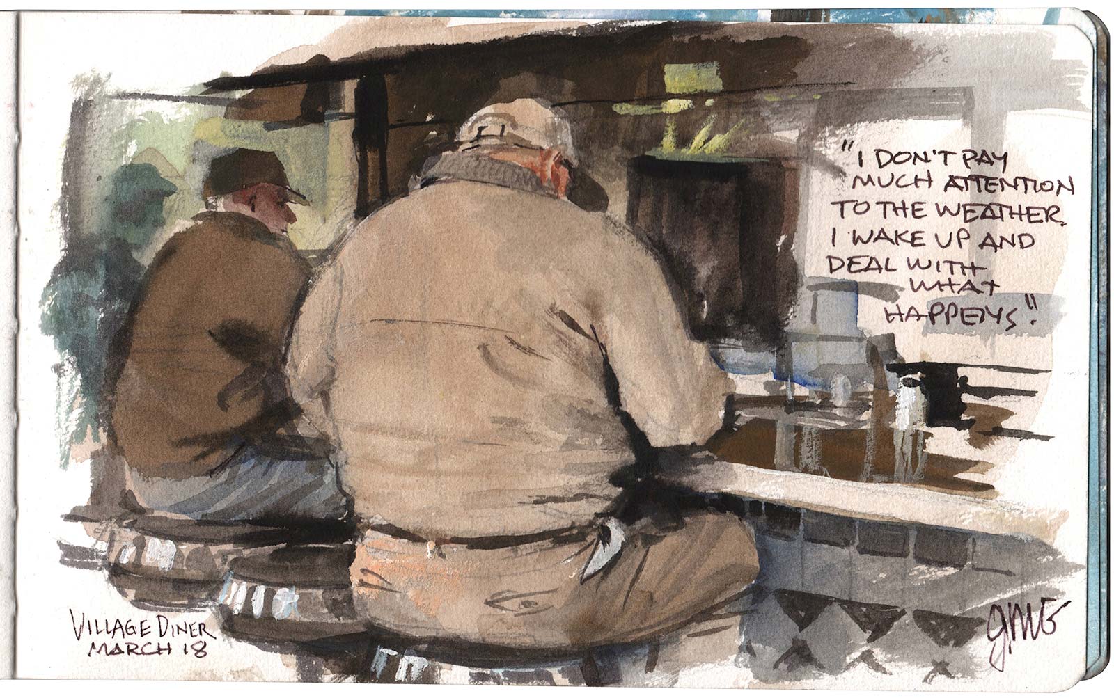
Village Diner, watercolor and gouache
4. The Squint Test Has a Basis in Neuroscience
Aude Oliva’s research at MIT shows that humans can identify a scene’s meaning, indoors or outdoors, calm or chaotic, in as little as a twentieth of a second, even from a heavily blurred image. The brain reads the overall pattern of light and dark masses before it identifies a single object.
At the Easel
Your painting’s big tonal architecture tells the whole story in the first fraction of a second. If your thumbnail doesn’t read as a clear composition when blurred or shrunk to a postage stamp, no surface detail will save it. Design your notan first. Everything else is built on top.

5. Viewers Replay Your Brushstrokes
Finisguerra and colleagues used brain stimulation to show that viewers looking at paintings with visible brushwork activate the specific motor cortex regions involved in making those marks—different muscles for bold gestural sweeps versus fine stippled dots. The viewer’s brain doesn’t just see an Ilya Repin portrait. It physically rehearses the hand movements that made it.
At the Easel
Every visible brushstroke is a fossil of a bodily action, and the viewer’s motor system replays it. This may be why a confidently handled painting carries a charge that a smooth digital render can’t match. Don’t hide your process. The hand of the artist is part of the experience.
6. Time Changes What People See
A 2025 study from the Penn Center for Neuroaesthetics found that museum visitors typically give a painting less than 30 seconds. When researchers guided participants through structured slow-looking—five minutes each on sensory observation, emotional response and meaning-making—the same objects were rated significantly more beautiful, more moving and more personally meaningful.
At the Easel
Anything you build into a composition that rewards sustained attention—layered discovery, a secondary subject that reveals itself slowly, controlled ambiguity—earns the viewer’s attention.
7. The Best Paintings Turn the Gaze Inward
A team then at NYU led by neuroscientist Edward Vessel and literary scholar Gabrielle Starr discovered that when viewers rate a painting as “deeply moving,” it activates the default mode network, the brain circuitry responsible for self-reflection, daydreaming and autobiographical memory. The most powerful paintings don’t just hold the viewer’s attention outward. They redirect it inward, triggering private associations that have nothing to do with the picture’s literal subject.
At the Easel
This is why paintings by great artists such as Edward Hopper or Andrew Wyeth hit so strongly. They look real, but they also tap into our personal lived experience as humans, striking every viewer differently. These painters leave psychological breathing room: a space left open, a hint of a story, a note of ambiguity, so that the viewer’s own memory rushes in to complete it.
8. The Sweet Spot Between Boring and Confusing
Research on processing fluency shows that aesthetic pleasure tracks with how easily the brain can organize what it sees, but only up to a point. Too simple and the brain disengages. Too complex, it gives up. The sweet spot is moderate complexity with underlying order: enough structure to feel coherent, enough variation to keep the eye exploring.
At the Easel
A strong notan foundation under complex surface detail can be effective because the two-value design is easy to parse (and that ease feels good to the brain) while the color and texture give the eye something to keep chasing.
Every time I put on those red goggles and the familiar world goes strange, I’m reminded that what I see is not really what’s out there. If I want my paintings to feel real, I need to help the viewer’s very human image-generator. The more we know about the science of visual perception, the better our paintings will be at accomplishing that goal. Our job remains what it has always been: set up the conditions, plant the clues and trust the viewer’s mind to do the rest. —
About the Artist
 James Gurney
James Gurney has painted on location in gouache everywhere from the fruit section of a supermarket to an NBA locker room. He is the creator of the Dinotopia series, the author of Color and Light and Imaginative Realism, and co-author of The Artist’s Guide to Sketching. His YouTube channel has racked up more than half a million subscribers and hundreds of videos, and he offers a popular (and paywall-free) Substack called Paint Here.