



I am now a watercolor artist, but for many years my focus and strength was on drawing. I fell in love with the art of Trompe l’oeil long ago. The technique of using value to create a three-dimensional illusion on a two-dimensional surface was thrilling to me. As I grew as an artist and eventually began to incorporate color into these illusions, the medium of watercolor provided the challenge and excitement I needed to take this technique further. I value my strong base in drawing as the infrastructure of a believable illusion in painting.
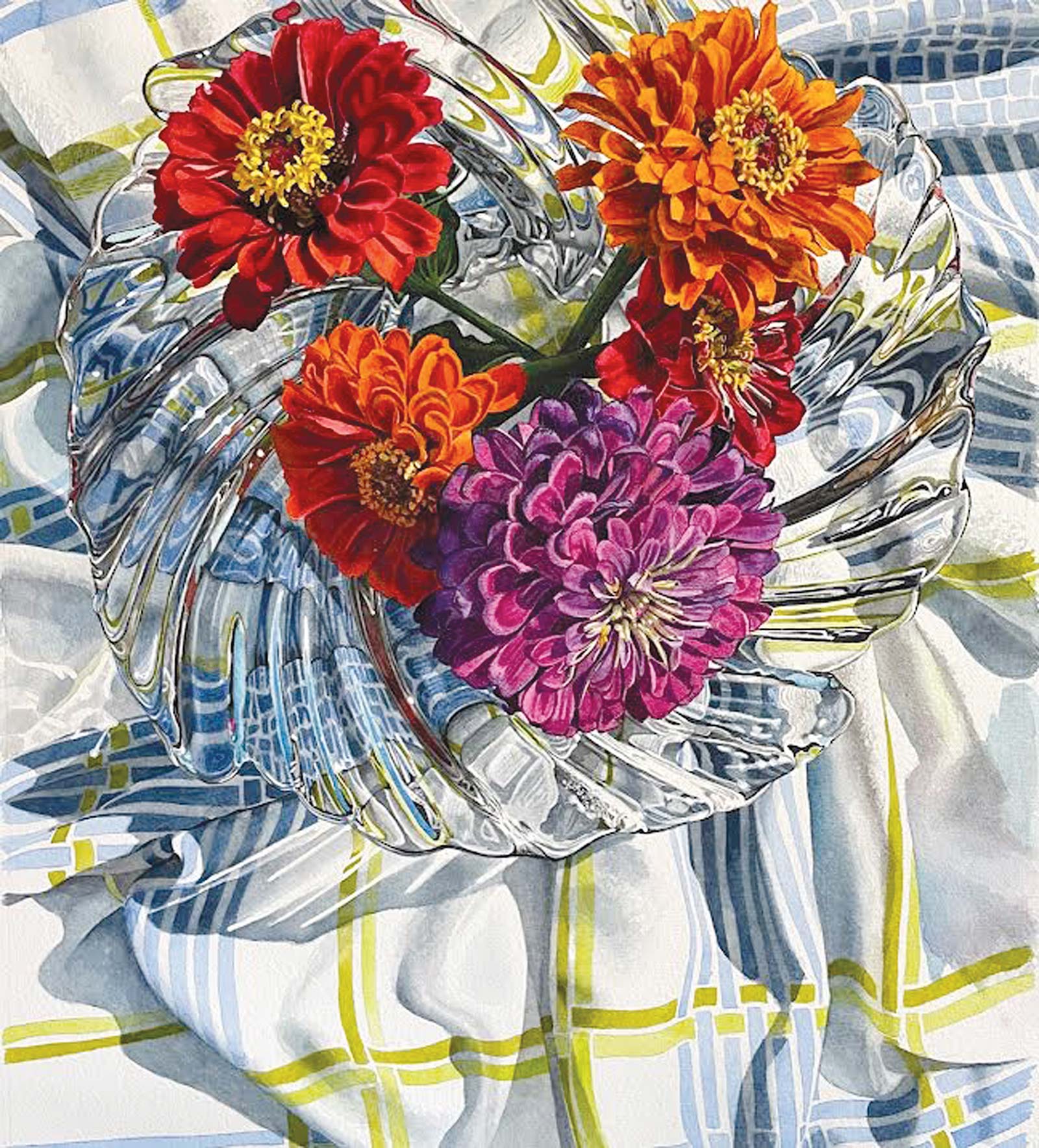
Oculus, watercolor, 23 x 19” (58 x 48 cm)
Still life represents having total control in what and how I lay work down on the paper. I spend many days and weeks on any given piece, so I have to love and be excited by what I see to begin the work. I have collected many props over the years. Glass is a favorite subject of mine so the discovery of a new thrift vase or bowl can spark any number of ideas for a scene. When working on a still life, I gather interesting objects, choose their setting, lighting and point of view, and then begin photographing my scene.
At the heart of many of my still lifes are flowers. I first learned how to paint flowers while on staff at Hallmark Cards many years ago. Flowers are at once bold and translucent, soft and textured and always complicated.
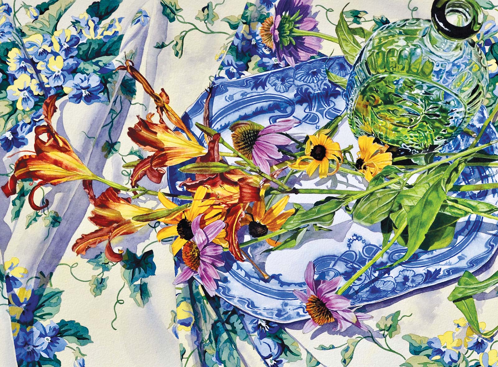
Summer Harvest, watercolor, 18 x 24" (45 x 60 cm)
I primarily use a watercolor technique called glazing, which is a subtle overlaying of one color over another for a lush, rich portrayal. There are often many variations and hues within petals and leaves, and I find watercolor to be the perfect medium to translate their complexity.
I love using a bold, dramatic palette in watercolor. In the following demonstration you will see how I control all this chaos by using careful placement of each color throughout the space. Watercolor has a lovely luminosity and flow to it that lends both a realistic and graphic feel to my work.
My Art in the Making Sanctuary
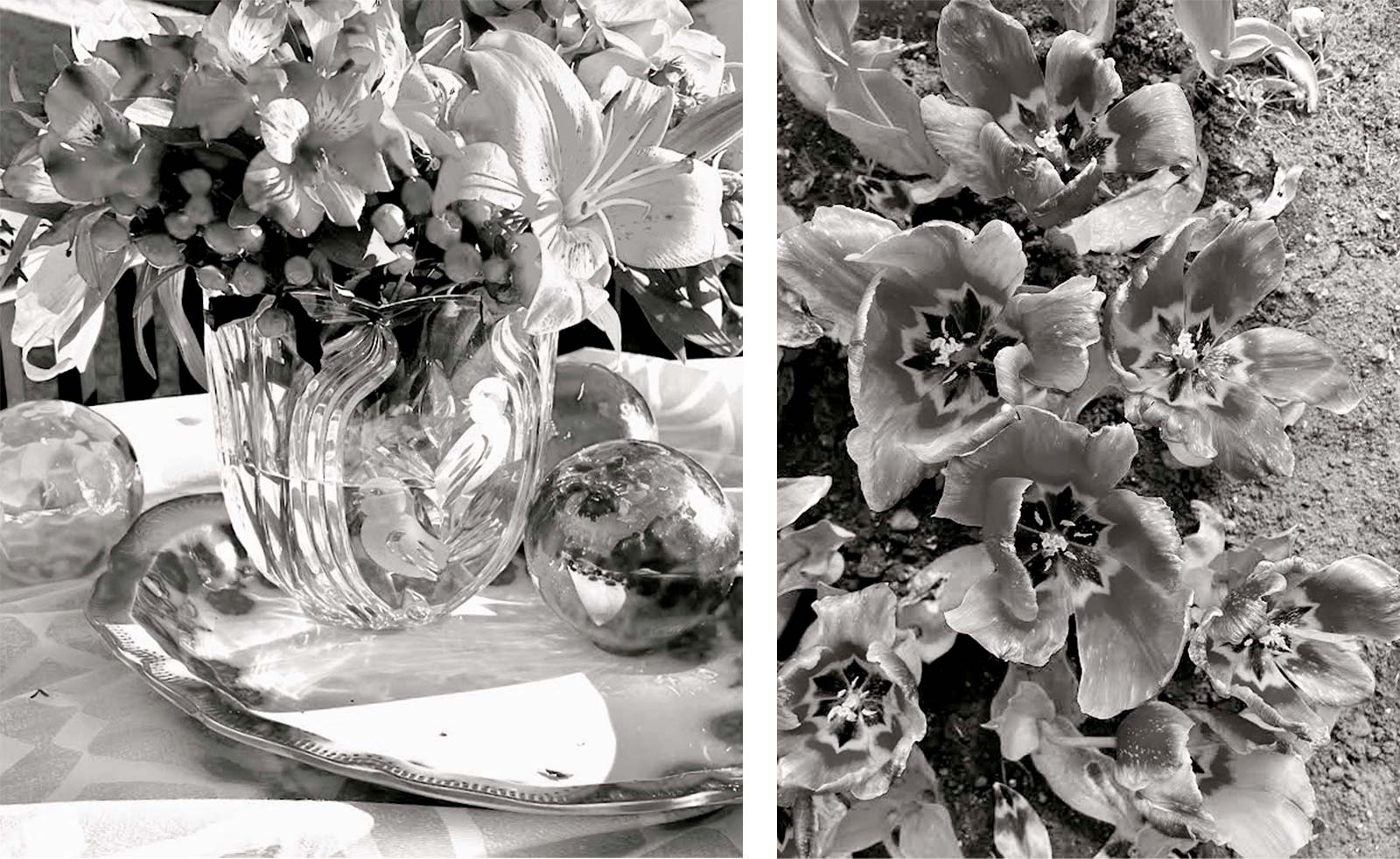 Reference Photos
Reference Photos
I compose through the viewfinder of my camera throughout the photoshoot, stopping to adjust arrangements, remove and add objects and plan where the all important shadows rise and fall. I set up outside on sunny mornings for the best elongated shadows. Arranging on top of a ridged board, I can turn the whole scene around to find the best shadows and reflections. I also choose my color patterns very carefully. Because my work is very detailed and color saturated, I arrange patterns or paths through the scene by strategically repeating colors. When I am satisfied I change the scene to a black-and-white halftone copy and begin the drawing.
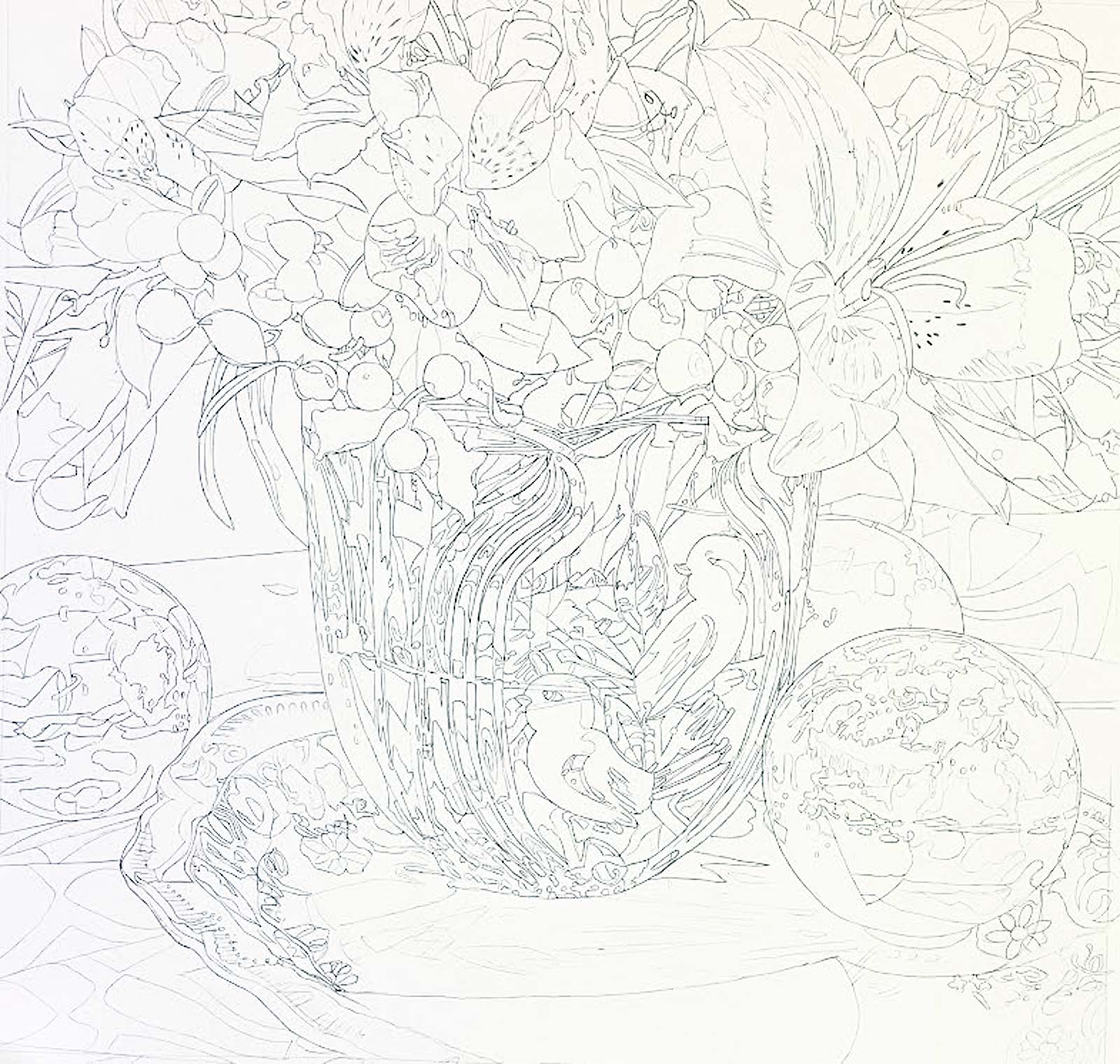
Stage 1 The Drawing
A strong composition is all important in planning an artwork, especially in realistic watercolor. I often make adjustments in editing on Photoshop and by hand-drawing overlays for small changes. You will notice that this first drawing is a little different than the final piece. At the time I was very happy with the large orange lily. That is until a trip to Scotland where I came across these gorgeous tulips at the Glasgow Botanical Gardens. Making sure the light source was coming from the same direction in both subjects made this switch work. So I erased and redrew.
I am asked a lot about my detailed drawings. I love to draw as it was my first focus as an artist. I think of it as a sort of map when I begin to paint. While I do all this drawing, I’m planning out color recipes and value enhancements in my head. I begin the drawing by enlarging my photo reference, tack it to the watercolor paper with a sheet of transfer paper beneath, and using a 9H lead, outline the major shapes for size and placement. I then remove my photo pattern and spend many hours drawing in more definition and small details free hand. After some clean up I soak and stretch my paper, and it’s time to paint!
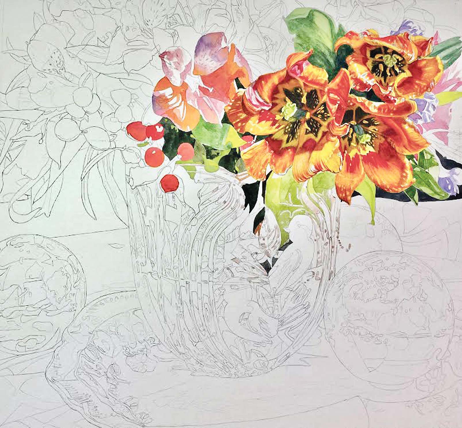
Stage 2 Starting the Painting
I start by painting one section at a time and moving on to the next. It sets the color values, helps me see that I am going in the right direction and the instant gratification is a plus too! I build up color by glazing or layering one color over another to allow more interesting hues to form with the shapes. I try not to get too dark or heavy handed too quickly. There’s plenty of opportunity for that as you move along.
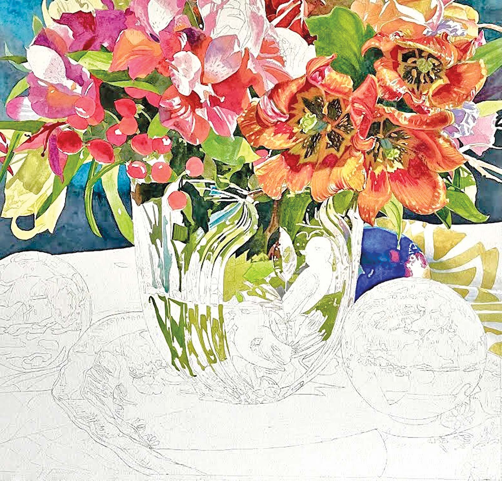
Stage 3 Base Colors
The base colors for the bouquet have been added, and you can start to feel the light as the complements of red and green begin to create color contrast. The blues make an appearance creating a cool contrast to the overall warm palette. My original detailed drawing is serving me well as I move around the picture plane.
My Work Area
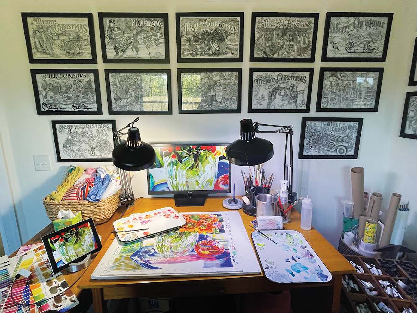
I set this area up to provide as much information as possible to pull from as I work. The small iPad is linked into an inexpensive tv monitor, which sits directly in front of me. It allows me to zoom in for clarity of detailing. I believe the color of light is more true than the color of a printed reference, so I prefer this method to give me as much correct information as possible.
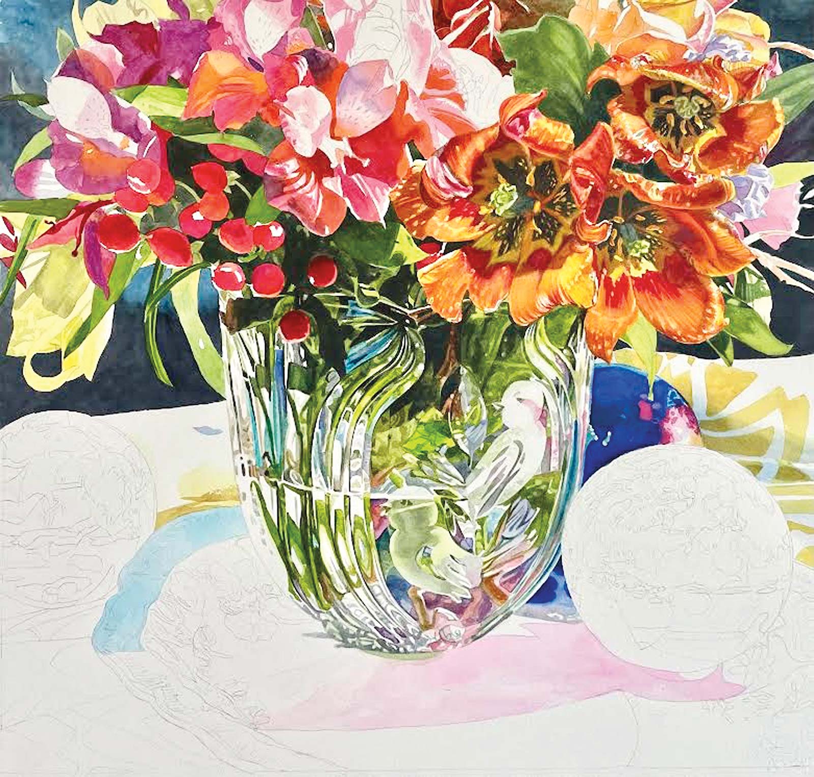
Stage 4 Adding Definition
Defining the cut glass vase adds a great deal to the illusion of light shining from within the painting. The greens are getting darker in areas to give the glass shape and pick up on the highlighted protrusions. My favorite spot in the painting at this point was that yellow drooping lily on the left. It seems to light up under its own power and tells the viewer that the light source is also around the other side of the scene.
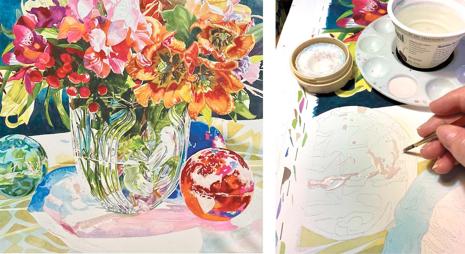
Stage 5 Applying Masking Fluid
Here you can see where I’ve used masking fluid to save my whites and lighter colors. I try not to use too much mask as there is extra work when removed in clean up and defining in some areas, but it is a helpful tool especially when portraying glass. I’m also bringing into focus the spheres where you can see a good example of layering various reds and greens. The cloth reflected on the green sphere and the dish on the red connect the objects and add interest. The illusion of light is holding well, and I’m really careful not to get too dark too fast.
Color Swatches with Glazing Examples
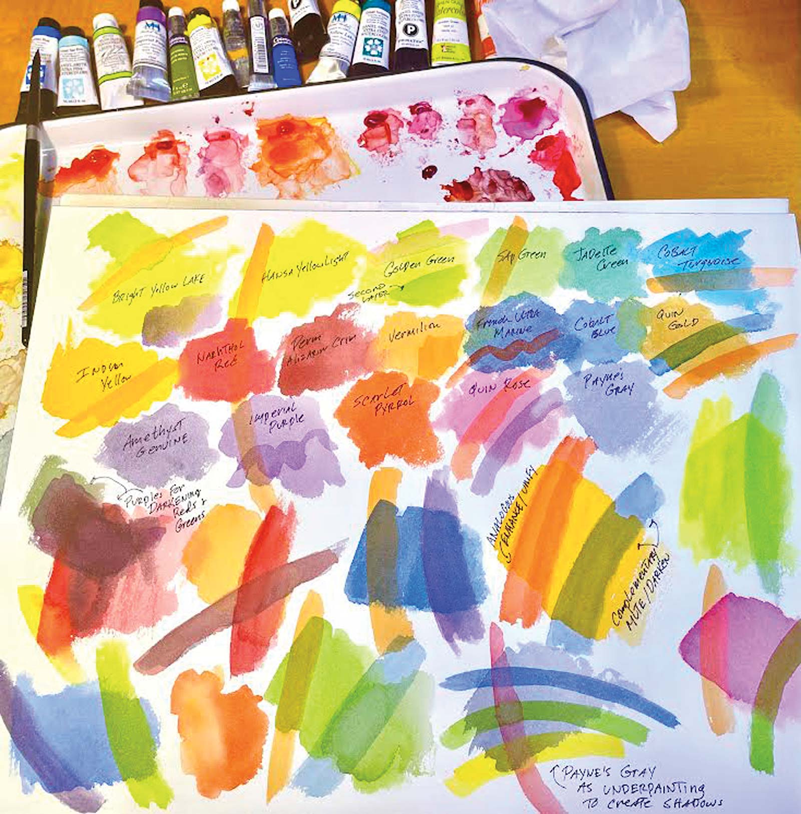
Here I show the colors listed as part of this painting. Each of the colors you see here are from this same list. By showing examples of how glazing is used in watercolor, you can see how colors are changed with each overlay. I always “play” with my colors like this before starting a painting.
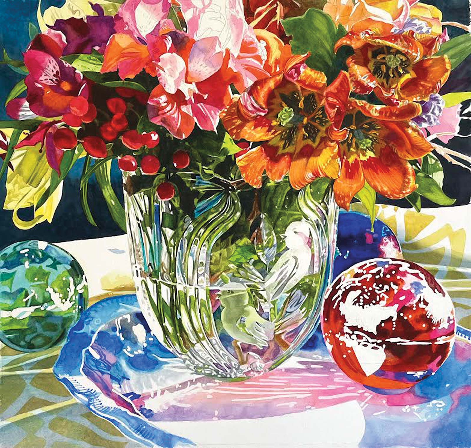
Stage 6 Color Arrangement
The mask is removed, which lends a strong value contrast in the first layer of blues in the plate and cast shadow. It may not look like it, but I still had lots of work to do with those spheres before I could call it done. A word about color arranging: the reds in the bouquet are repeated in the sphere and cast shadow, the greens are picked up below and beside the vase and flowers in the green sphere, and the blues begin with the back sphere and wrap around the central scene, giving it importance. All this was decided way back in the beginning when I chose the items for my set up. Thinking a composition out this way aids in creating unity and movement out of seemingly chaotic color.
Getting Into the Details
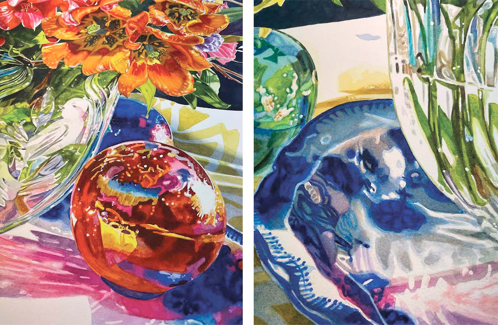
Providing a closer look at how glazing and some wet-on-wet techniques enhance color intensity, mute desired areas and create more interesting shadows.
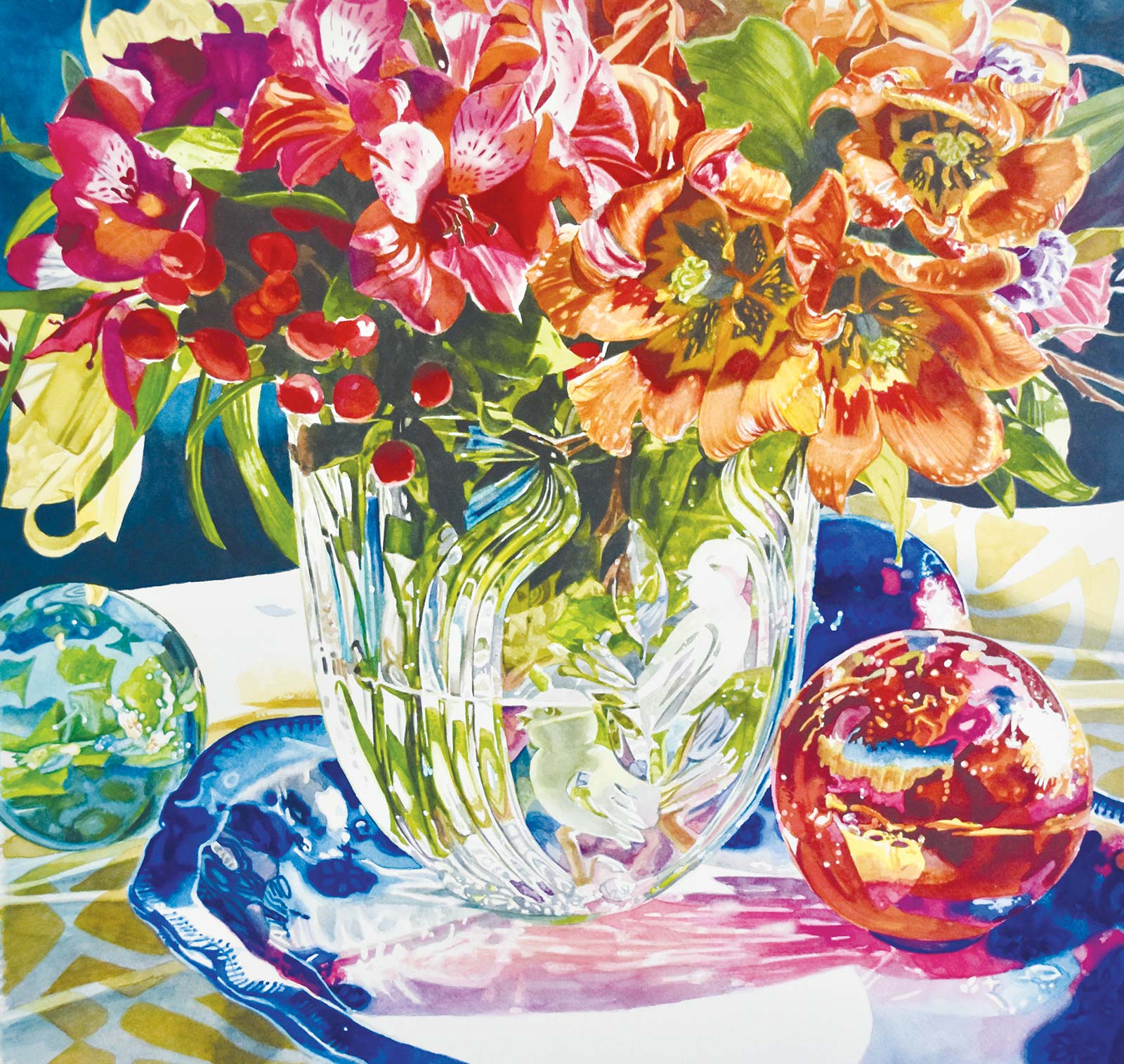
Stage 7 Finished Artwork
Sanctuary, watercolor, 20 x 20" (50 x 50 cm)
I do love painting those spheres—they sparkle and give the viewer a peek into what’s happening outside of our viewpoint. At this point, I will put it aside and come back in a couple of days to reevaluate. Then, I will declare the piece finished.
About the artist
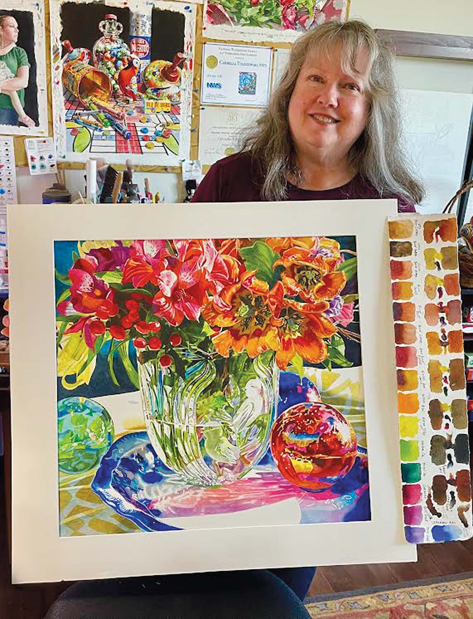 Carmella Tuliszewski
After earning her BFA in Illustration from Moore College of Art & Design in Philadelphia, Pennsylvania, Carmella Tuliszewski was recruited by Hallmark Cards in Kansas City, Missouri, as a greeting card and gift wrap designer/illustrator. After many years in the greeting card industry, she discovered her love for watercolor during a small night class at a local community college.
Tuliszewski has been working professionally in watercolor since 2012, building a strength and passion for detailed, bold palettes and dramatic lighting in her work. Her paintings have been exhibited with the American Watercolor Society, Watercolor USA Honor Society, American Women Artists and has recently received the Mary Bryan Memorial Medal for Watercolor at the 112th Allied Artists of America Exhibition.
She has been awarded signature status in watercolor societies throughout the United States including the National Watercolor Society, Watercolor Honor Society and American Women Artists, as well as appearing in publications like American Art Collector, International Artist and more.
Contact at
carmellatuliszewskiart.com