



Grand Prize is a four-page editorial feature in American Art Collector magazine
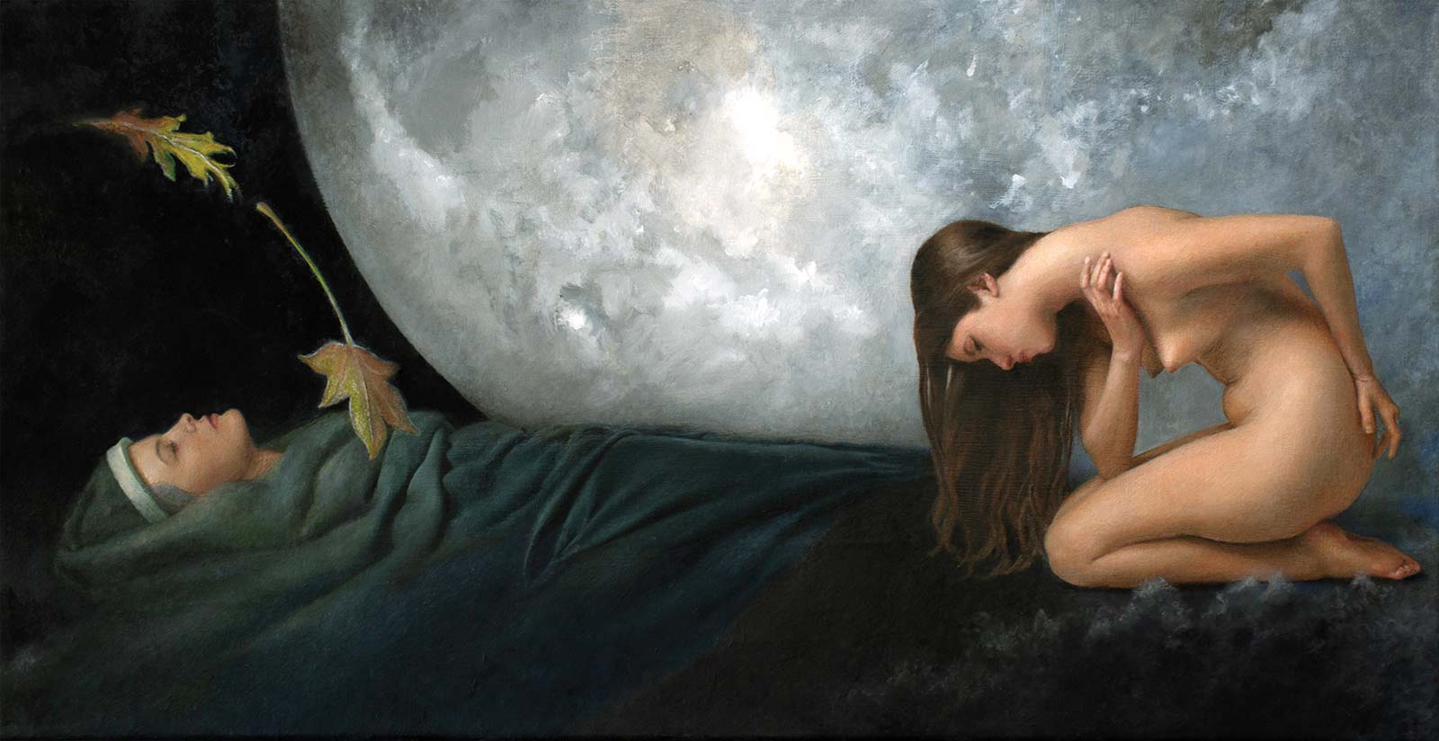 Chrysalis, oil, 10 x 20" (25 x 50 cm)Lisa Rickard
Florida, USA
Allegorical Realism
Florida-based painter Lisa Rickard describes herself as an allegorical figure painter working in imaginative realism. She finds inspiration in simple human gestures that transport her to a place between our physical universe and the unknown, where energy, space and time may not exist.
Across all of her artwork there is an underlying theme, in which all of the human forms personify abstract concepts. “I always want the figure to be recognized as an idea rather than a specific individual. For example, when my sister modeled for Chrysalis, she became the embodiment of a universal idea. I wasn’t painting her portrait, I was painting my interpretation of transformation represented by a figure,” Rickard explains.
“In terms of style and technique, I consider a realistic figure, whose gesture embodies an abstract idea, engaging with or enveloped in a well-crafted imaginary environment in support of the whole composition, as important elements of my work,” she continues. “The specifically chosen collective complementary elements and their arrangement in relationship to the figure are as important as the figure because they contribute to the figure’s authenticity as an idea rather than a specific individual.”
Rickard has exhibited her work in numerous exhibitions across the United States, including New York, Ohio, Florida and South Carolina.
My Inspiration
A chrysalis is a casing that forms around a caterpillar after shedding its skin to prepare for becoming a butterfly. This phenomenon has become a significant cultural icon symbolizing transformation. This idea inspired me to paint an allegorical figure study representing human metamorphosis. A wrapped figure’s crowned head is emerging from her chrysalis while a kneeling figure is participating in the transformation as a personification of the emotionally charged thoughts and feelings that arise with change (maple leaf) and renewal (oak leaf).
My Design Strategy
When my sister wrapped her whole reclining body in a sheet as I made graphite sketches of her supine figure, the idea of personal transformation came to my mind. Involving a kneeling figure whose overall gesture contributed to my concept came next. Then the arrangement of additional compositional elements to create a truly meaningful environment for my allegorical figures. The design for a thought-provoking composition finally manifested after many months of revisions, experimenting, adding, subtracting, re-arranging and simplifying subordinate elements (such as flowers, petals, etc.) until the unerring ethereal mood from a moon and leaves “fell into place.”
My Working Process
Usually a simple human gesture propels me to begin an allegorical figure painting leading to head and figure graphite studies. After that a small color poster study to key the entire painting. Then a contour drawing to transfer onto an oil painting substrate for beginning the first painting layer. However, for Chrysalis, I completed two graphite head studies and a color figure study to prepare for the final painting but didn’t do a color poster. Instead, I worked wet-into-wet on the final painting to express the moon and leaves in one session.
Contact Info
Email: lisa_rickard@yahoo.com
Website: lisarickard.net
Second Prize is a two-page editorial feature in American Art Collector magazine
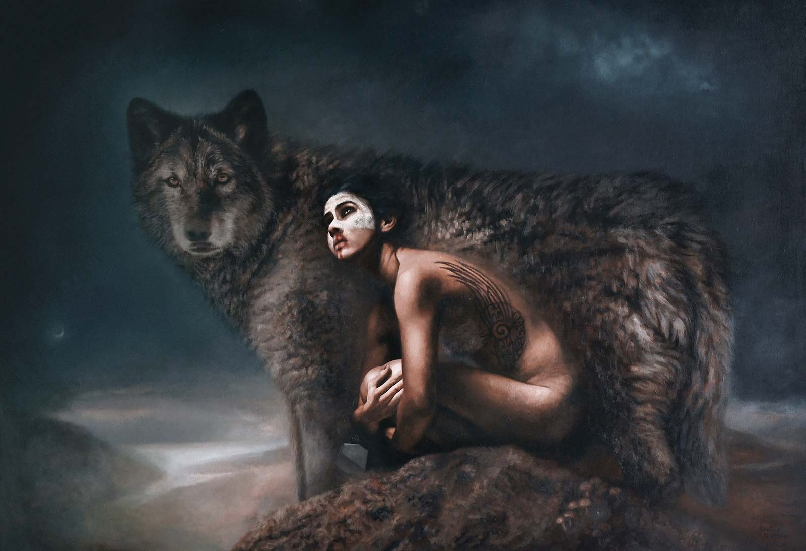 Melancholia, oil, 43 x 63" (109 x 160 cm)Patricia Guzman
Santiago de Querétaro, Mexico,
My Inspiration
I began this painting as a tribute and celebration of the pets with whom we share our lives. This is a very personal painting where I wanted to honor and celebrate unconditional love and its teachings. The wolf is the protector, the teacher and the wise one—the one who guides in times of uncertainty, who protects in times of pain. On the woman’s side she has tattooed a Mayan symbol meaning “I am you, and you are me.” The Milky Way is a nod to the immeasurable nature of existence and the ineffable nature of consciousness.
My Design Strategy
The experience began with a series of photographs I took of someone I greatly admire, Carmen Coronado, who is a filmmaker, photographer, actress and boxer. The idea behind that photo series was to showcase the strength and resilience of women as the starting point for a new painting series. On the other hand, I knew I wanted to add the image of a wolf to the narrative of her specific reference photo, and several years ago I had the opportunity to visit a wolf sanctuary in Canada where I took many photos that served as inspiration for the wolf image.
My Working Process
I began with a very simple graphite sketch to visualize the space the wolf and the woman would occupy. Then I painted a monochromatic oil sketch to visualize the values and the overall composition. I followed the whispers the painting gave me over the following months, intermittently resolving and listening to them. I kept working on it on and off until I felt a click inside indicating I had reached the image in my mind’s eye and heart.
Contact Info
Email: patriciafineart@gmail.com
Website: patriciaguzman.org
Third Prize is a one-page editorial feature in American Art Collector magazine
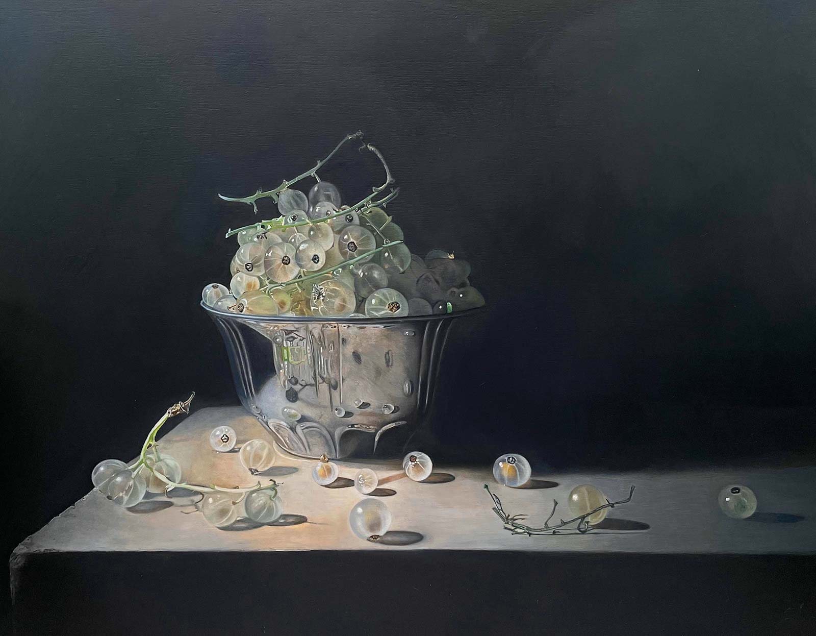 Little Gems, oil on panel, 12½ x 16" (32 x 41 cm)
Ginny Page
Copenhagen, Denmark
My Inspiration
Inspiration seems to be in abundance everywhere I look. My fascination for the natural world in all its complexity and perfection never ceases to amaze me. These pretty little white currants resembled small embryos growing in cells or even glass beads due to their translucency, enabling us to see the precious seed within. Observing the shining clusters in the sunlight sparked the idea for this still life painting. I couldn’t resist the challenge of creating these exquisite textures in oil paint and setting up the idea for this piece.
My Design Strategy
Many of my still life paintings start their life in a cardboard box with a hole cut out on one side to let natural light in. My objects are placed in the spotlight as if on center stage, enabling me to shed light on the things that excite me. The silver bowl was chosen to create complex reflections and contortions from the fruits and to give the illusion of depth and perspective. The fruits were meticulously placed to give the viewer a feeling of both movement and dialogue in the composition.
My Working Process
I use MDF board primed five or six times with gesso, which I finely sand between each layer until a mirror-like surface is achieved. The background and larger shapes are blocked in first, then I gradually build up details using multiple glazes in oil paint allowing drying time between layers. Paint is thinned with a linseed oil-based medium Skovgaard & Frydensberg. My palette is limited and simple: ivory black, titanium white, yellow ochre, ultramarine and burnt sienna. I prefer Old Holland paints. Gloss varnish can be applied approximately one year after completion.
Contact Info
Email: art@ginnypage.com
Website: ginnypage.com
Finalists
Each receives an Award Certificate and a one-year subscription to International Artist magazine PLUS having their work seen worldwide by international galleries looking for new talent.
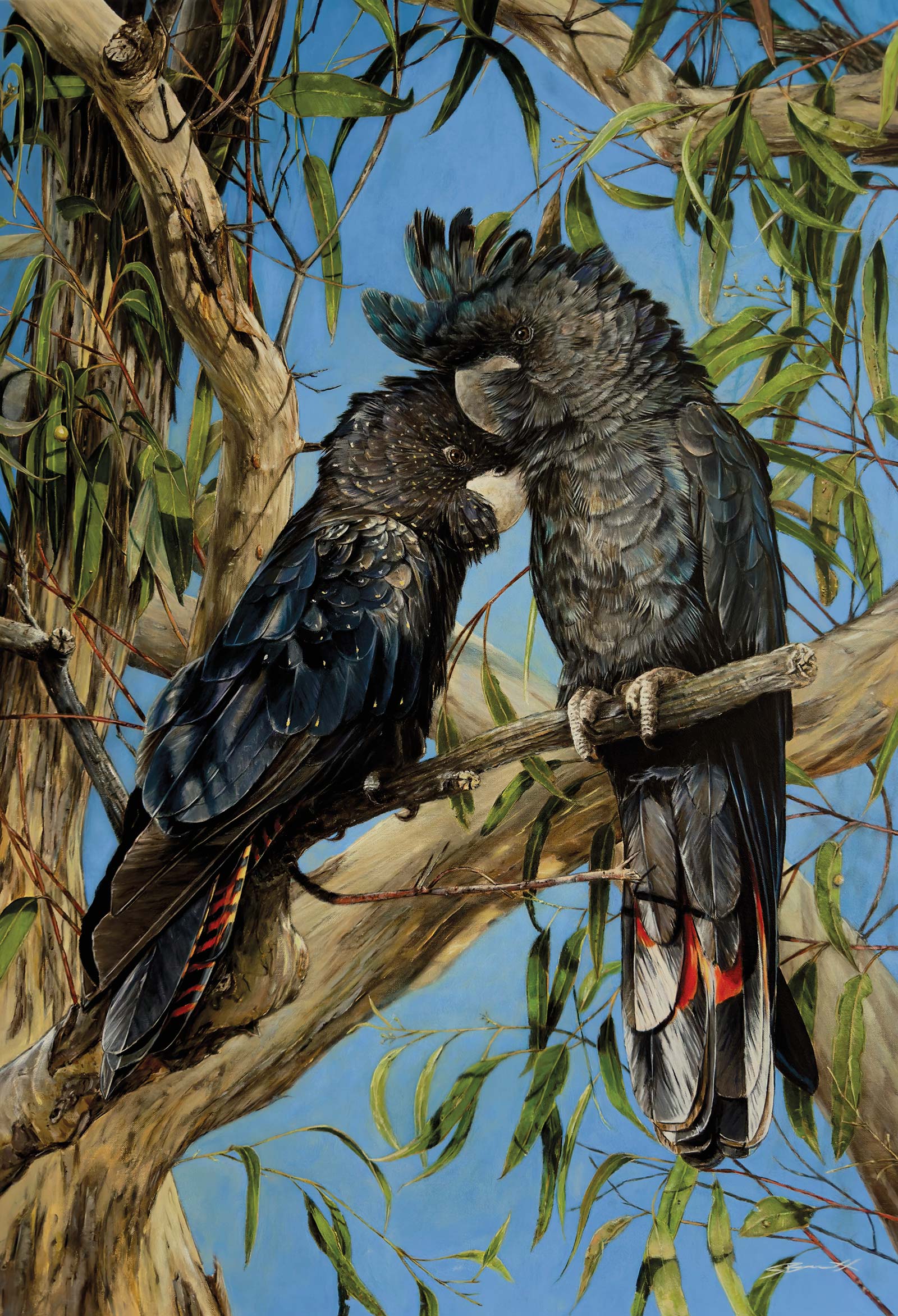 A Quiet Comfort, acrylic on linen, 31½ x 21½" (80 x 55 cm)
Stephen Bennett
New South Wales, Australia,
My Inspiration
This painting is a celebration of endurance, loyalty and partnership. It represents a “kindred spirit” connection, showcasing a quiet moment of comforting profound love that lasts through changing seasons. Painting two black cockatoos is a powerful artistic choice, often inspired by their reputation as lifelong soulmates, their striking appearance against the Australian landscape and their symbolic role in Indigenous culture as messengers of change, rain or guardians of ancestral spirits.
My Design Strategy
To design compelling bird artwork, I focus on structural accuracy first, followed by layering textures, intentional angles to guide the viewer’s eyes, and lighting to create depth. Building these strong design foundations in the beginning makes the creative path a lot easier. This helps to avoid getting lost as you progress through. Having a great reference to work with is fundamentally important in building my vision.
My Working Process
Painting the subject first for me sets the tone and general feeling of my artwork. A sketch of the bird using basic shapes I then build up layers, typically moving from light to dark. Creating space for the all important highlights. Once completed I will work my way around the canvas blocking in the background, adding in all the additional objects. Balancing out the lighting and shadows while refining the fine intricate details. A glazing technique at the end allows me to alter color temperatures and adjust values without covering previous work, as well as create an atmospheric effect.
Contact Info
Email: stephenbennettart@gmail.com
Website: facebook.com/stephenbennettartist
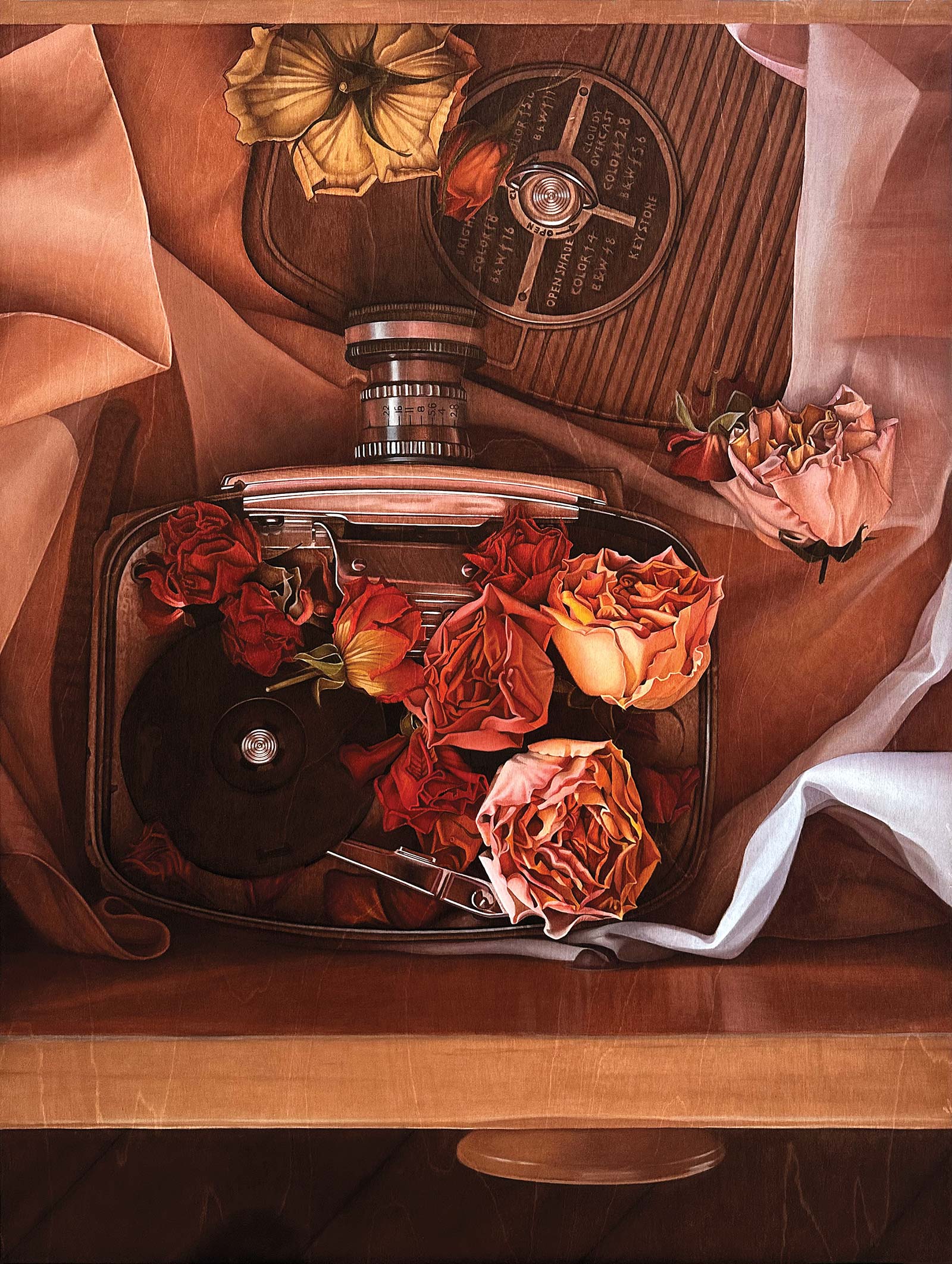 Retrospection, acrylic, 40 x 30" (101 x 76 cm)
Tanya Markvart
Ontario, Canada
My Inspiration
I’m excited to paint images that appear to me in my dreams, so I’m most inspired by the visual language of my subconscious. Broadly speaking, this internal source of inspiration is shaped by my interests in symbols, psychology and philosophy. For example, my current series, The Liminal Space, reflects on over a decade of personal life experience and associated visions and dreams. It portrays the process by which personal and collective identities emerge, form, and transform. My other current series, The Pocket Watches, ponders the linked concepts of time and consciousness with which I’ve been preoccupied for a long time.
My Design Strategy
My work moves between abstract realism and still life genres to illuminate the mysteries of the heart and mind. My most recent compositions harness the language of symbols to convey deeply personal impressions that draw viewers into subjective self-reflection. My technique embodies the coexistence of conscious awareness and the subconscious in that I paint with transparent acrylic ink on birch wood, intentionally allowing the wood grain to emerge through the medium. The effect given by the delicate acrylic ink undergirded by a layer of sinuous grain distinguishes my painterly signature.
My Working Process
I’m very aware of the interplay between process and artistic growth, so I always listen to what I genuinely want to paint and how I want to paint it. If I’m not engaged with that inner dialogue, I know I’m off track. When I’m eager and a bit scared, I know I’m on track. So, from a personal standpoint my process is flexible and open. That said, I generally start by writing about an idea, then I sketch, stage and photograph a reference photo. A good reference is helpful, but I always listen to how I want to paint something.
Contact Info
Email: tanyamarkvart@gmail.com
Website: tmarkvart.com
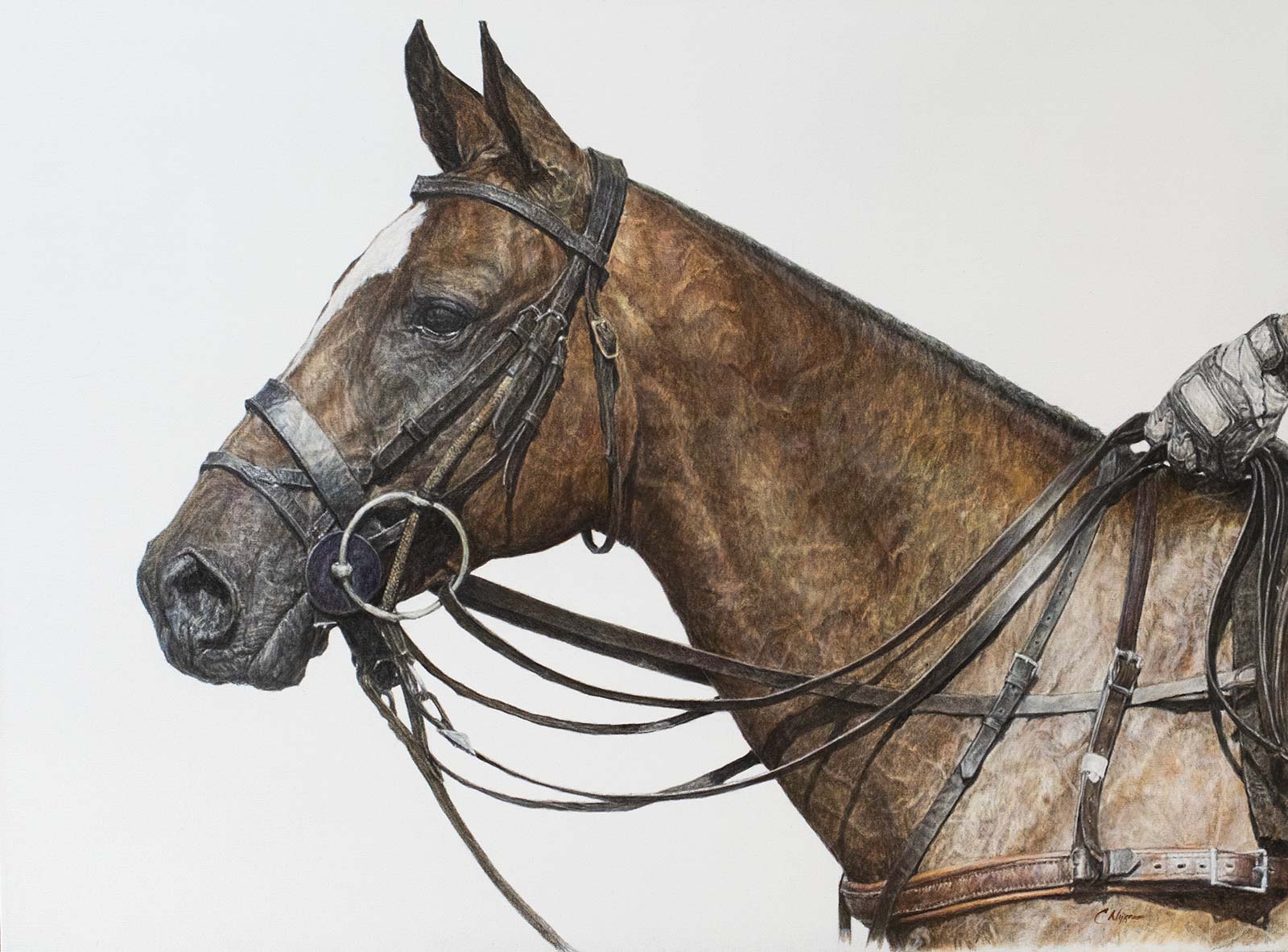 Joy, oil, 30 x 40" (76 x 101 cm)
Carrie Nygren
Wisconsin, USA
My Inspiration
Horses have always been an inspiration for me. Polo ponies are a particularly fascinating equine athlete, holding a unique fascination. Barreling down a polo field the size of nine football fields at speeds up to 40 miles an hour, stopping on a dime, negotiating difficult crowding, mallets and flying balls—they have no fear. They love their job. They define strength and power. Horse and rider are bound by trust and a deep connection. It’s this strength and power of the horse that I’m after in my painting.
My Design Strategy
Painting in a larger format contributes to making a bolder statement. I work with the premise that “less is more” to convey the story or the portrait. Contrasting traditional realist oil painting techniques against a contemporary white background commands your attention to the power of the horse, which allows you to see the concentration and alertness, and feel the emotion in the eye and the posture without any other distractions.
My Process
The importance of drawing is fundamental to my process. I start with a very detailed drawing of the painting, working through tonal values, muscle structure and light I want to achieve, resolving any compositional concerns. From there, I work in a very classical progression from underpainting through many layers of glazing and scumbling, building color and detail very slowly, creating volume and balance, as well as the subtle transition of light over muscle and tack to develop the portrait.
Contact Info
Email: cnygrenart@gmail.com
Website: cnygrenart.com
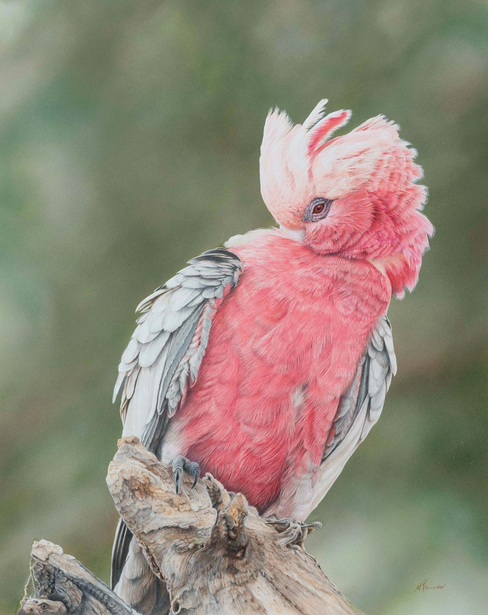 Miss Pinky, colored pencil and acrylic, 23½ x 18¾" (60 x 48 cm)
Michelle Farmer
Western Australia
My Inspiration
I’m inspired by the diversity of Australia’s landscapes, flora and fauna: the colors, textures and quiet details you notice when you slow down in nature. I’m drawn to these places more and more, finding a real sense of peace in the bush and outback. Miss Pinky was captured on a midwest camping trip, calmly preening in a nearby tree as if without a care, yet still keeping a careful eye on me. Her soft pinks, gentle confidence and presence captured everything I love about being out in the natural world.
My Design Strategy
My sense was that Miss Pinky carried a bit of diva energy, with that cheeky galah nature shining through, so I wanted her to be the clear focus of the piece. I kept the background soft and muted to let her color, attitude and presence take the lead. Her larger size allows the detail in her plumage and expression to really show through. Because colored pencil is slow, layered work, I balanced it by using airbrushed acrylic paint for the background, creating a smooth, gentle atmosphere that wouldn’t compete with her.
My Working Process
I work larger colored pencil pieces in my studio because the medium is slow; this drawing unfolded over about 60 hours. I began by drawing from the reference photo, then masked her so I could airbrush the acrylic background cleanly. With the background in place, I moved into the colored pencil work, starting at the beak and eyes to anchor the expression. Each area is built light to dark with multiple colors for depth, detail and tone, using erasers and slice tools for the finer light areas. I worked down the body, wings, feet, and finally the branch, before rebalancing tone across the whole piece.
Contact Info
Email: micknmark@gmail.com
Website: michellefarmerart.com
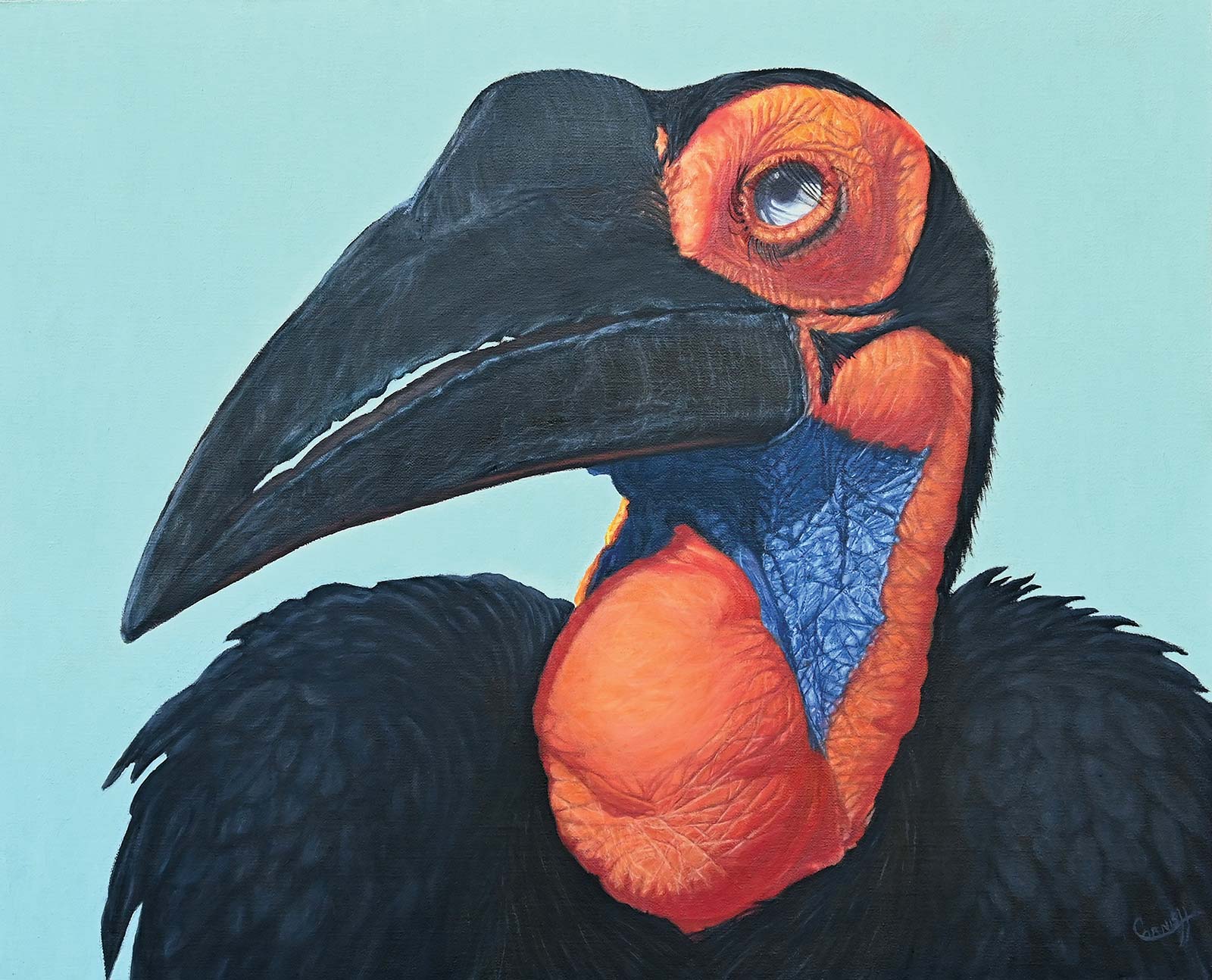 The Rainmaker, oil on canvas on panel, 16 x 20” (40 x 50 cm)
Mary Cornish
Virginia, USA
My Inspiration
Painting extraordinary birds is my passion. I had met the subject of this painting, Abbie, at the Honolulu Zoo. Hornbills are such an unusual bird with their gigantic bill and coloring, especially females with their amazing blue throat patches, so I just had to give it a try. The title, The Rainmaker, refers to certain cultures in Africa that believe southern ground hornbills can be used to “protect a person or property against lightning” and that “the bird can be used to bring rain.” Hornbills are magnificent, and in many cultures, holy birds and spirit animals.
My Design Strategy
I consider myself a portrait artist. I want my paintings to have a three-dimensional quality that will help the viewer experience the subject as I did, firsthand. When I pick a subject for a painting, I browse through all my sketches and photo references for that subject. I always use my own reference material. I believe that since I have experienced the subject, I have a much better insight than just using a photo. Then I draw up a thumbnail composition. I always discover something new, unknown or even a minute detail that may change the course of the painting.
My Working Process
I love to work on a toned oil-primed linen. I start the drawing on the canvas with pencil, using my thumbnails as reference. Satisfied with the drawing, I will continue to do an underpainting, establishing the composition, tonal values and structure of the subject. I will then establish a layer that refines the composition, making sure all proportions are correct. This layer is established with colors that may be close or complementary to the actual color. Then I begin adjusting all colors, highlights and darks with subsequent layers. It can take many weeks or months to finish a painting.
Contact Info
Email: cornishgraphics@comcast.net
Website: marycornish.com