


I believe that painting is more about seeing the beauty in your subject than it is about the subject itself. For me, I love antiques and I love design, so I was naturally pulled towards still life painting. I think there is something really special in finding your artistic voice painting your favorite things, even if they are just old teacups, house plants and flowers paired with beautiful heirlooms.
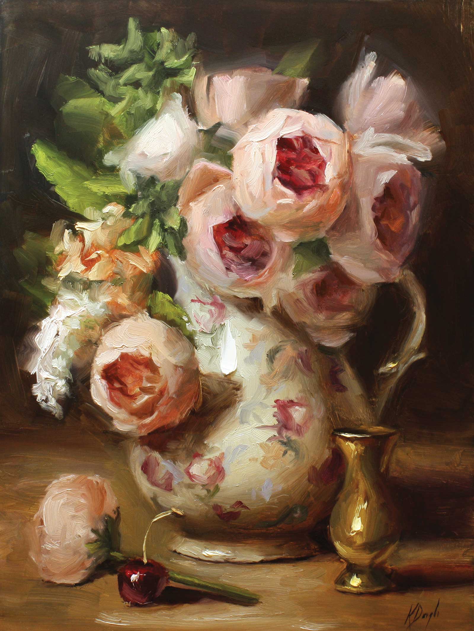
Peonies in Floral Vase, oil, 14 x 11" (35 x 27 cm)
And I love oil paint. It’s definitely a sensory and texture thing. So much so, that sometimes my paintings are as much about the actual paint than the subject I’m trying to convey. I love a thin transparent layer that you can place thick paint on top of and almost sculpt it to create the illusion of form. I love how you can sharpen an edge to bring it forward or blur it to push it back. I quite often work with a palette knife to build texture in the paint. Starting with a blank canvas and ending with a two-dimensional picture that has atmosphere and light is never-ending magic to me.
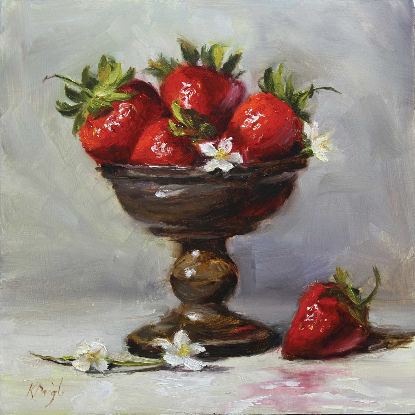
Strawberries in Pewter, oil, 10 x 10" (25 x 25 cm)
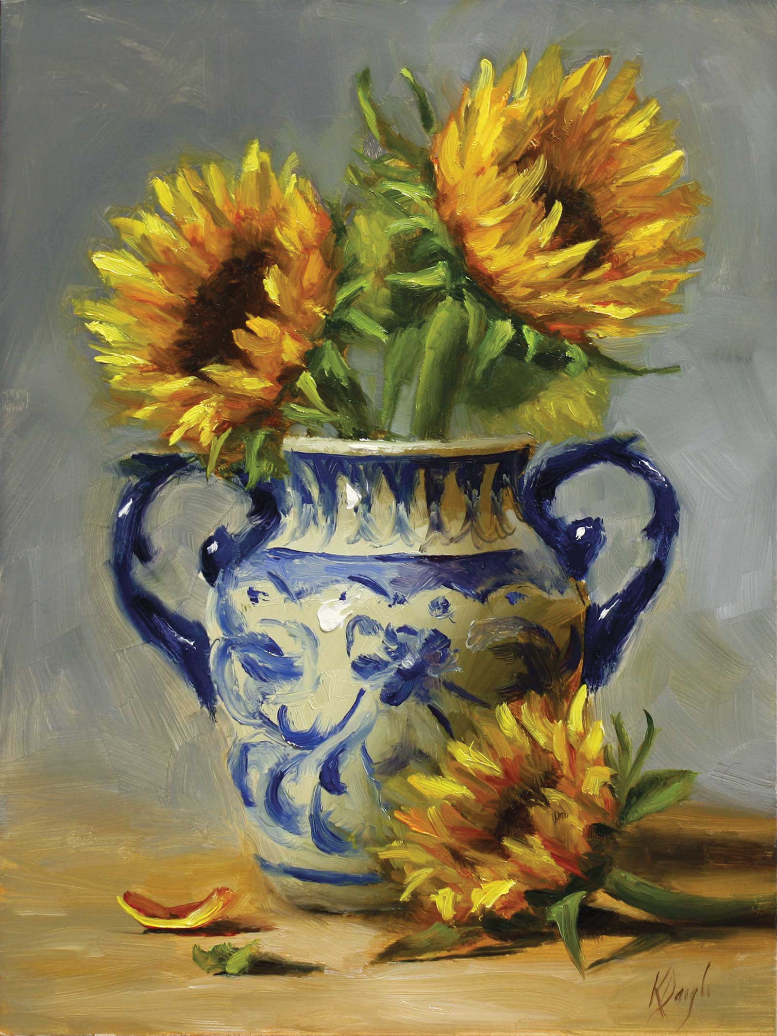
Sunflowers in Blue Vase, oil, , 12 x 9" (30 x 22 cm)
I always paint from life and always alla prima. It’s about reproducing the reality that inspires me, without duplicating the set-up exactly as seen. I like to start out with energetic, loose, imperfect brushstrokes, and I try to make them interesting and exciting. Not all of these first brushstrokes will last to the end. A lot of them will get changed to fix the drawing, tweak the composition or to make the values express the form better (or if I’m honest, by accident). The ones that come last will be fresh, clean and full of expression. These are the ones that have the ability to make a painting feel more alive. As I continue on, my brushwork gets more deliberate and placed with more intention. I find I then end up with an interesting painting that is not too stiff but has a sensibility to it that is realistic enough to make the light believable. Because, really, it’s all about the light.
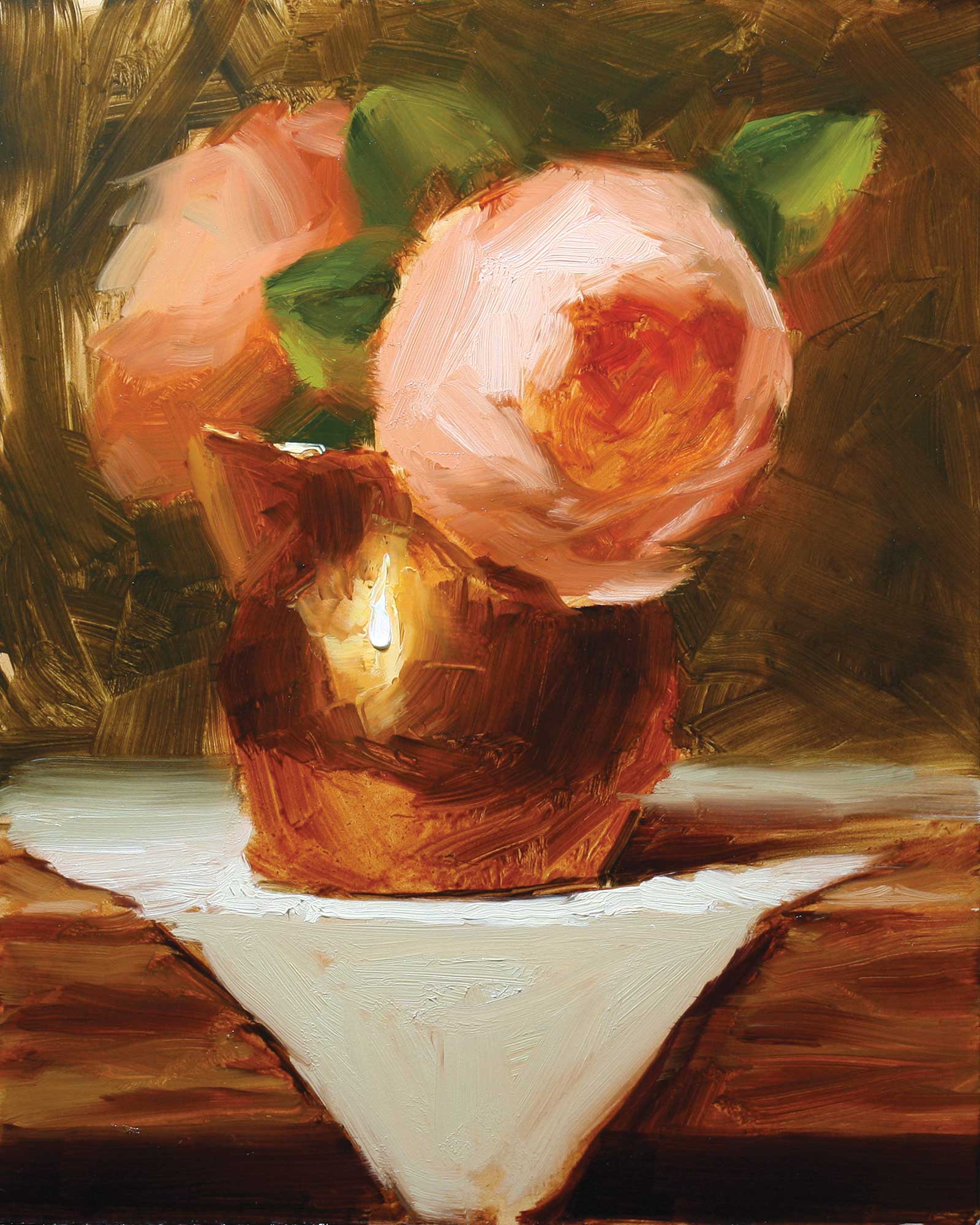
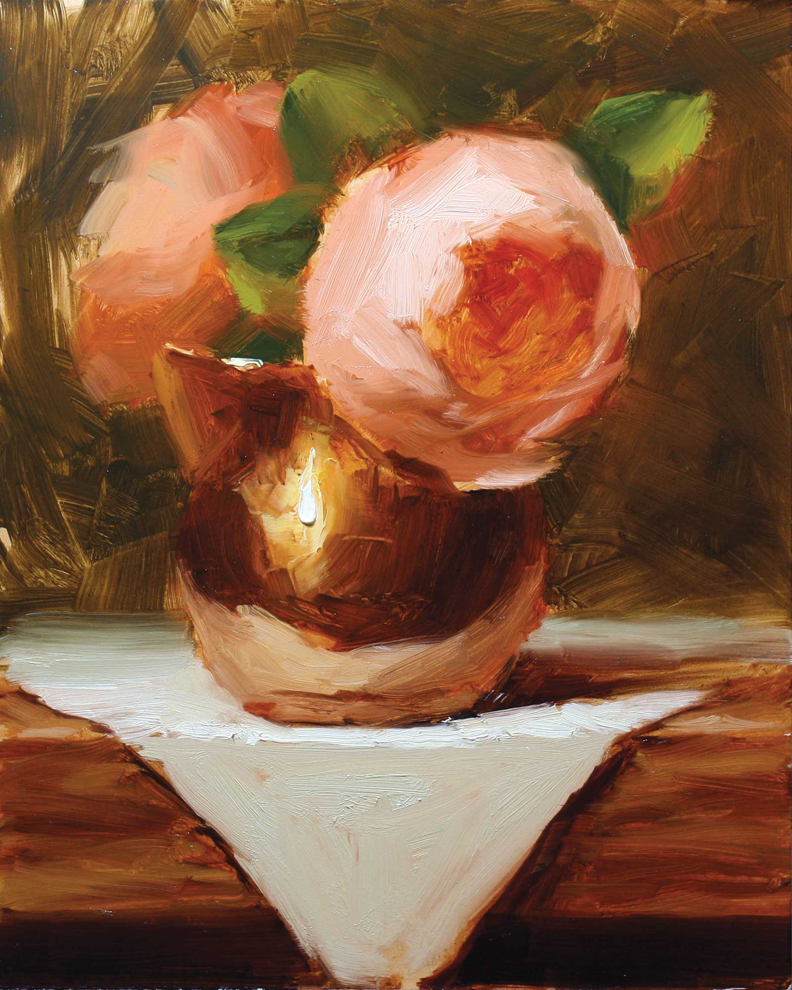
My Art in the Making David Austin Roses in Copper Creamer
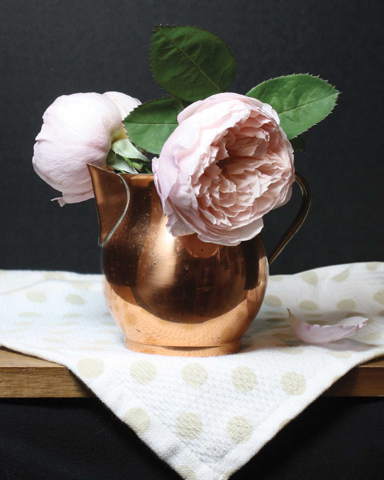
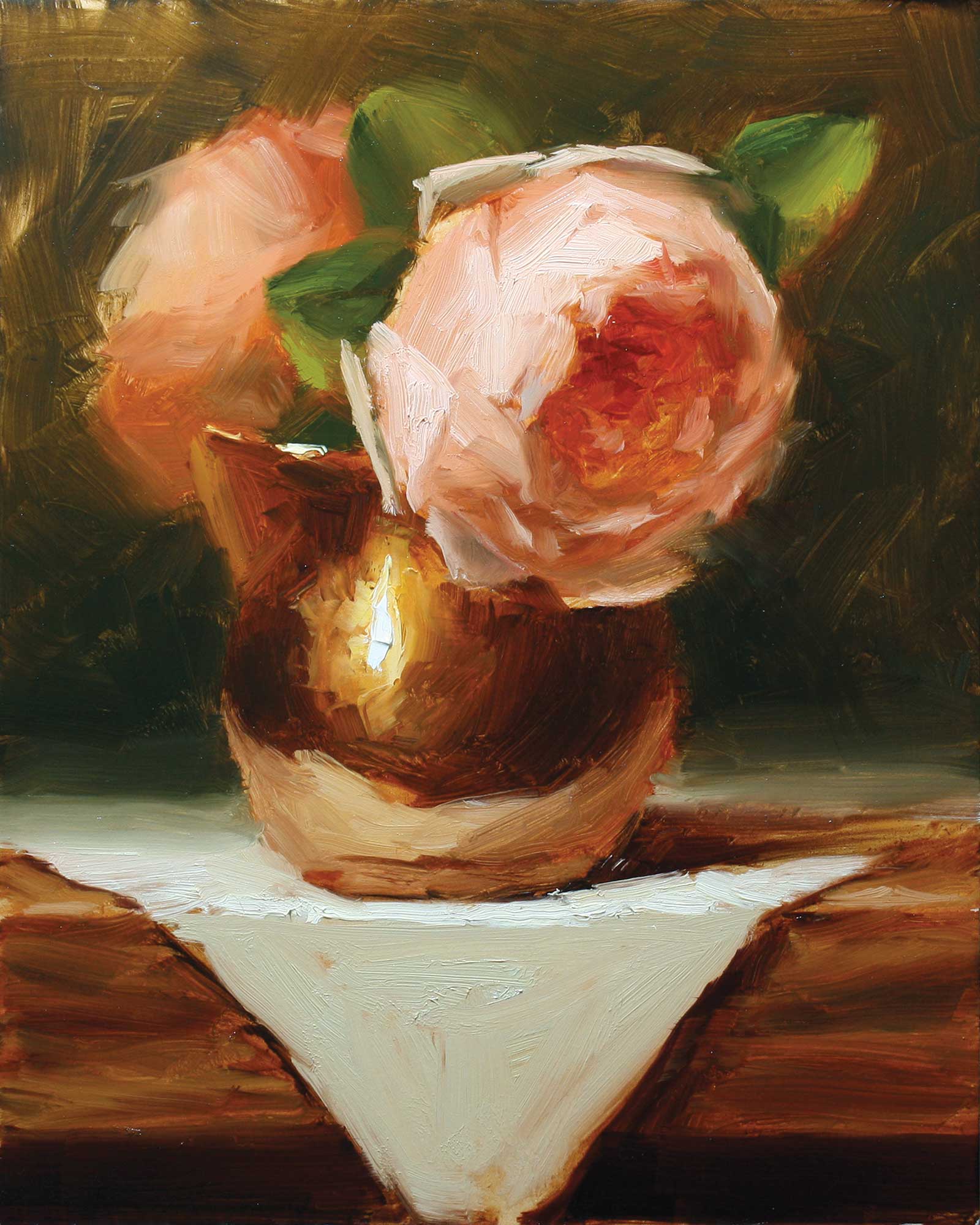
Reference Photo
I didn’t even know you could grow David Austin roses in my climate, so when I saw them in an ad at my local garden center I grabbed my sons for the heavy lifting and headed over. We planted them that same afternoon and they didn’t flower all summer, even though we watered them twice a day. But to my surprise, towards the end of summer there were buds, and before I knew it a constant blooming of big beautiful pink flowers. I was so excited and blessed. This set-up is from the series I did that month.
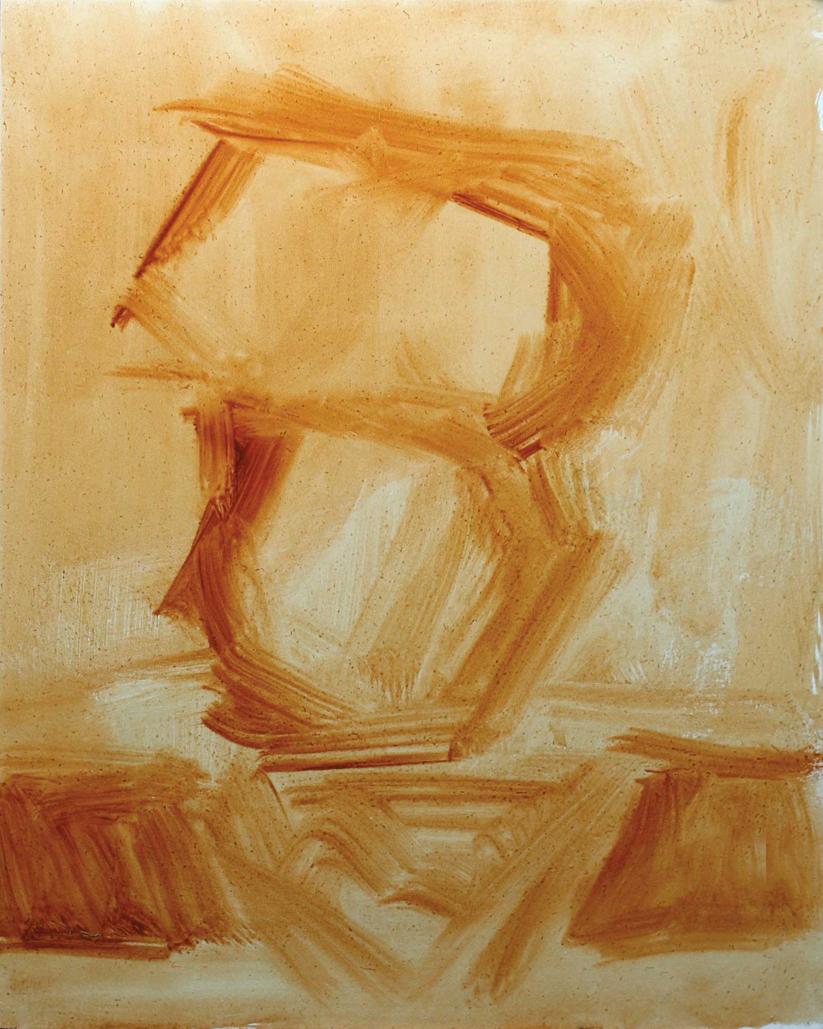
Stage 1 Line Drawing
I’m not a huge fan of pre-mixing colors, but sometimes before I start a painting I’ll mix up some of the main colors to ensure that all are harmonious. It gives me a better plan on where I’m heading and gives me a chance to tweak and change them before I even start so it doesn’t affect the painting. I sometimes do this with paint on the palette and other times using Photoshop.
Stage 2 Tonal Drawing
Here I am doing a tonal drawing using transparent red oxide and a bit of ultramarine blue. I’m starting to get some form in my objects. This will place my lightest lights and my darkest darks and some in between. I take care throughout these stages to keep my big shapes. For composition, this is one of the most important stages as I am solidifying the placement and making sure the objects have flow and movement. My focal point has become obvious, and it is important at this stage that it does stand out.
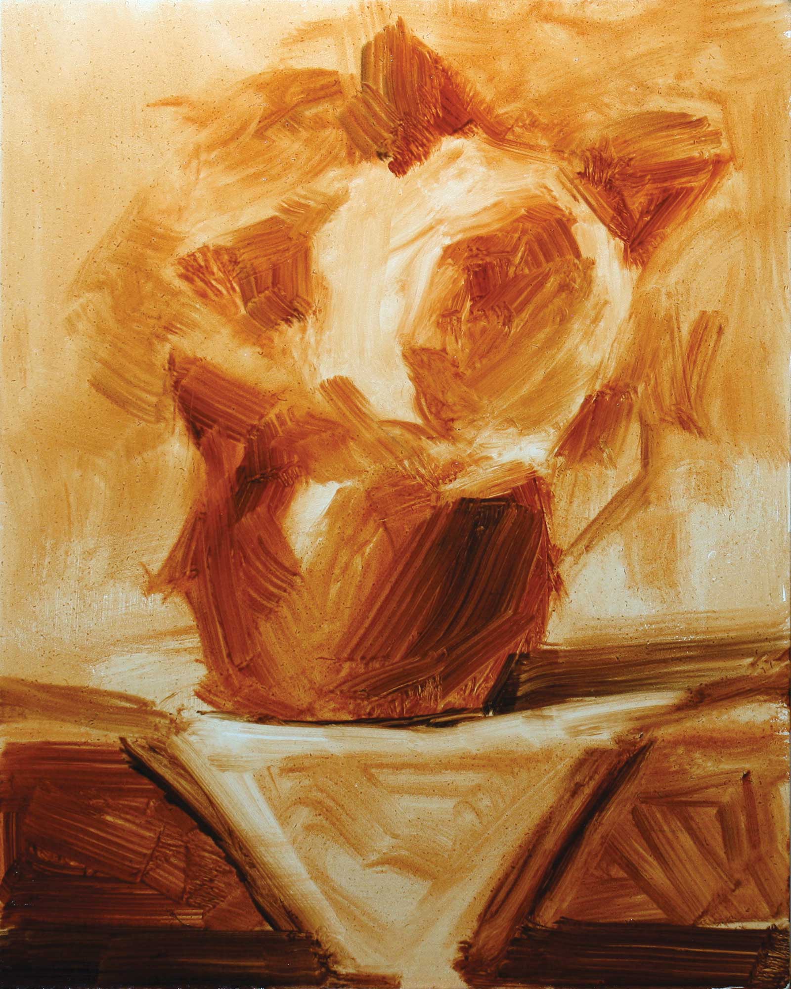
Stage 3 Starting the Background
I always begin with the background or the focal point. Here I begin with the background. This is a combination of raw umber, Indian yellow and transparent red oxide. I love a transparent background and to have my objects with thicker paint, especially my focal point. I’ve also roughed in my main rose.
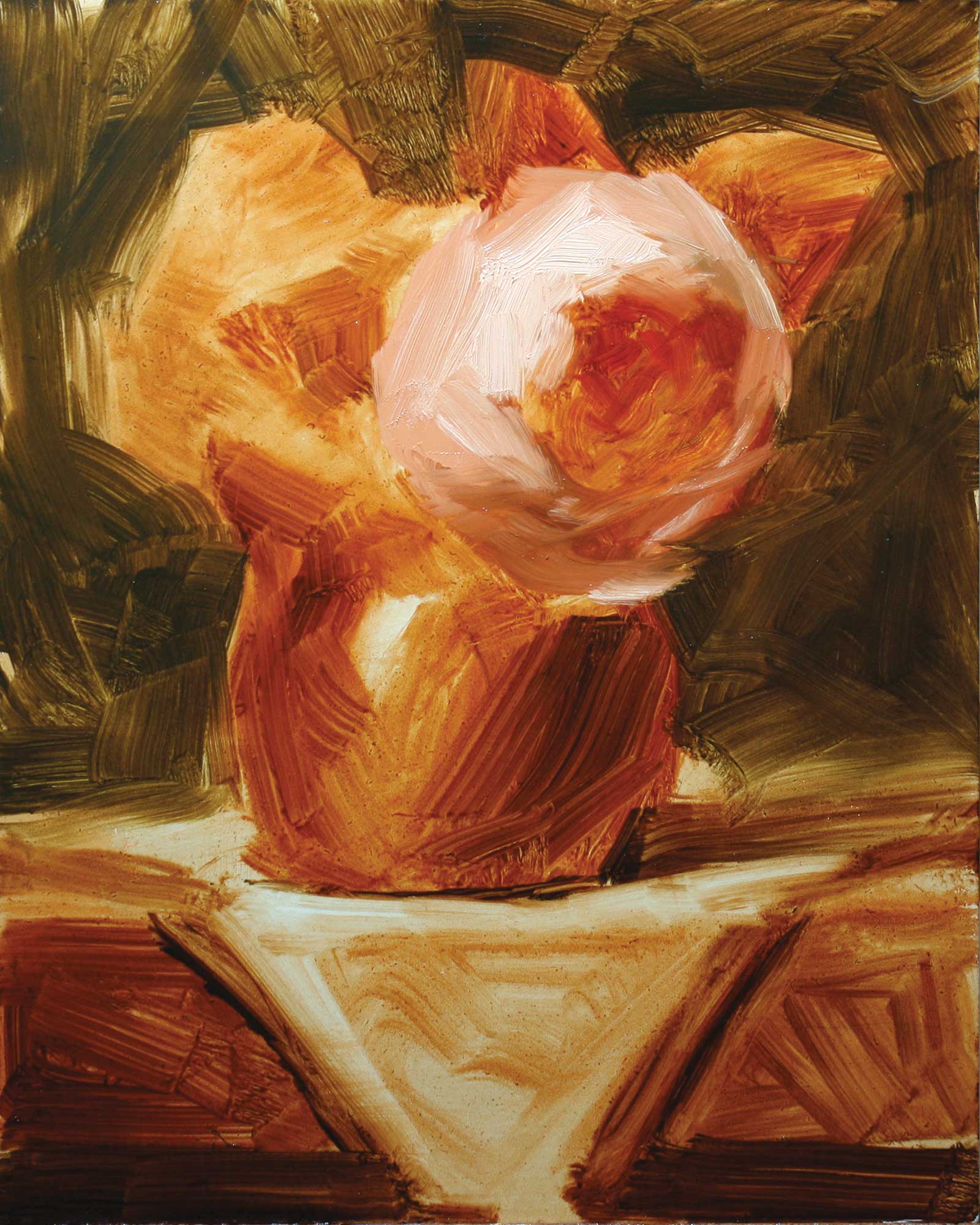
Stage 4 Back Rose and Copper Creamer
I continue with the back rose. I like to keep this pretty minimal. Too much detail will leave it competing with the front rose, and I don’t want that. I’ve also started with the copper creamer. I use a lot of paint when I’m working on metal objects, so much that I quite often have to use a palette knife to put it on and smoosh it around. I do a little of that here, but I wait until the paint dries and sets a bit to do a lot of my finishes. I am not worried about the details at this point. I like to wait to add those toward the end of the painting.
Stage 5 Thin to Thick
I try to work from thin to thick, so here I am putting in the fabric under the pot. It’s a mix of mostly white and a bit of yellow ochre and ultramarine blue. I make sure it is lighter on the top of the table where the light is directly hitting it. I also add in the leaves.
Color Swatches
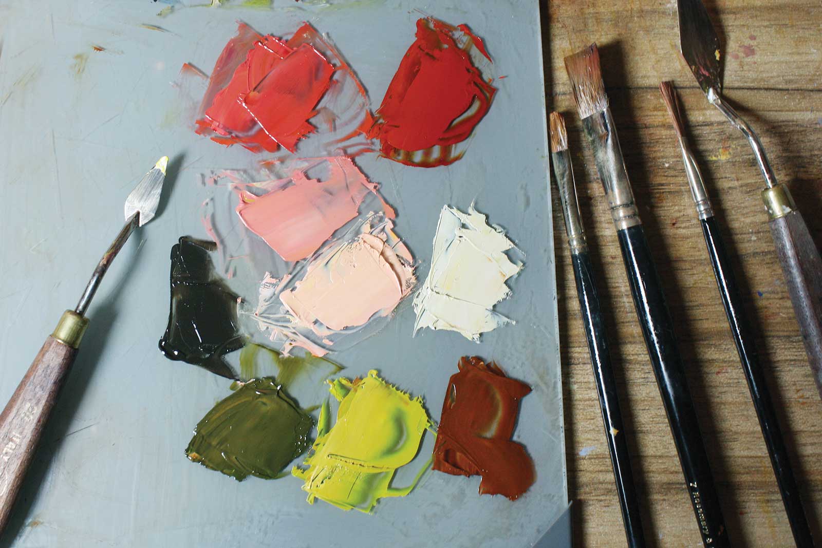
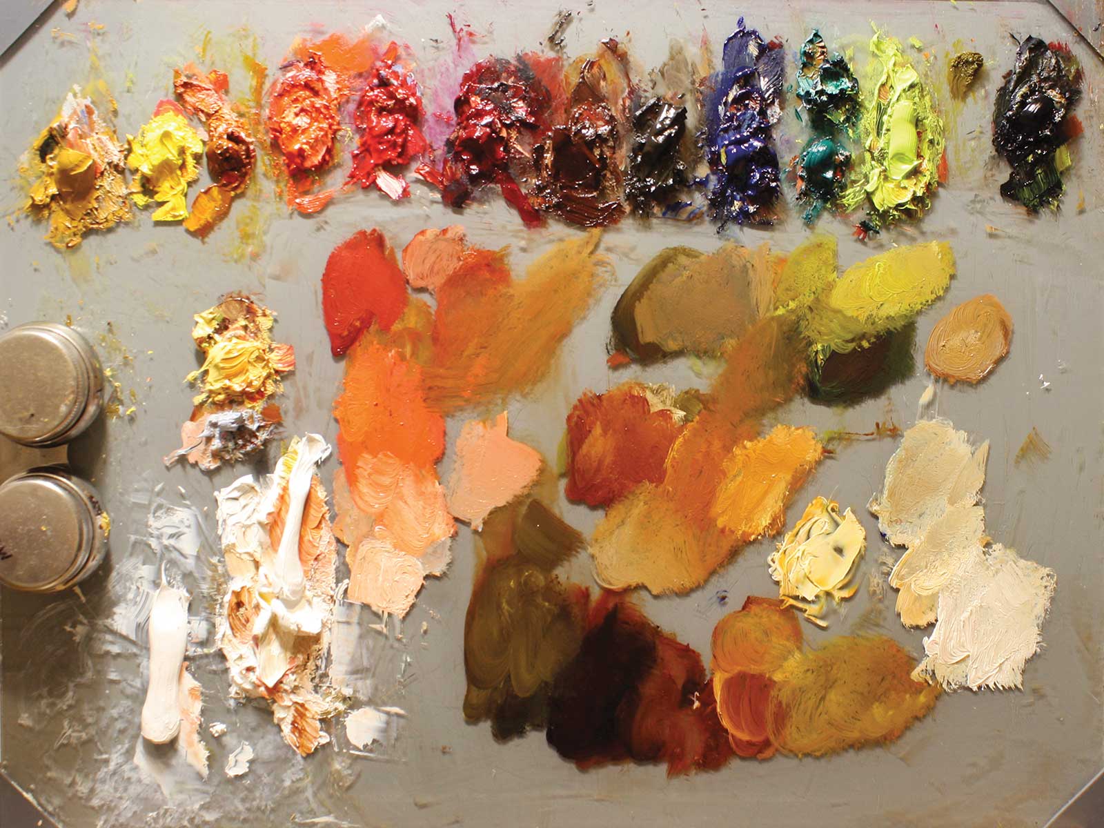
I’m not a huge fan of pre-mixing colors, but sometimes before I start a painting I’ll mix up some of the main colors to ensure that all are harmonious. It gives me a better plan on where I’m heading and gives me a chance to tweak and change them before I even start so it doesn’t affect the painting. I sometimes do this with paint on the palette and other times using Photoshop.
Stage 6 Reflections
I’m putting the reflection into the pot. I’ve used transparent red oxide and white mixed in with some Indian yellow to make it brighter than the cloth. With reflections it’s key to notice the details: see how on the left it starts out strong, gets brighter in the middle and then fades in the shadow. This will help to make the pot look rounded as well.
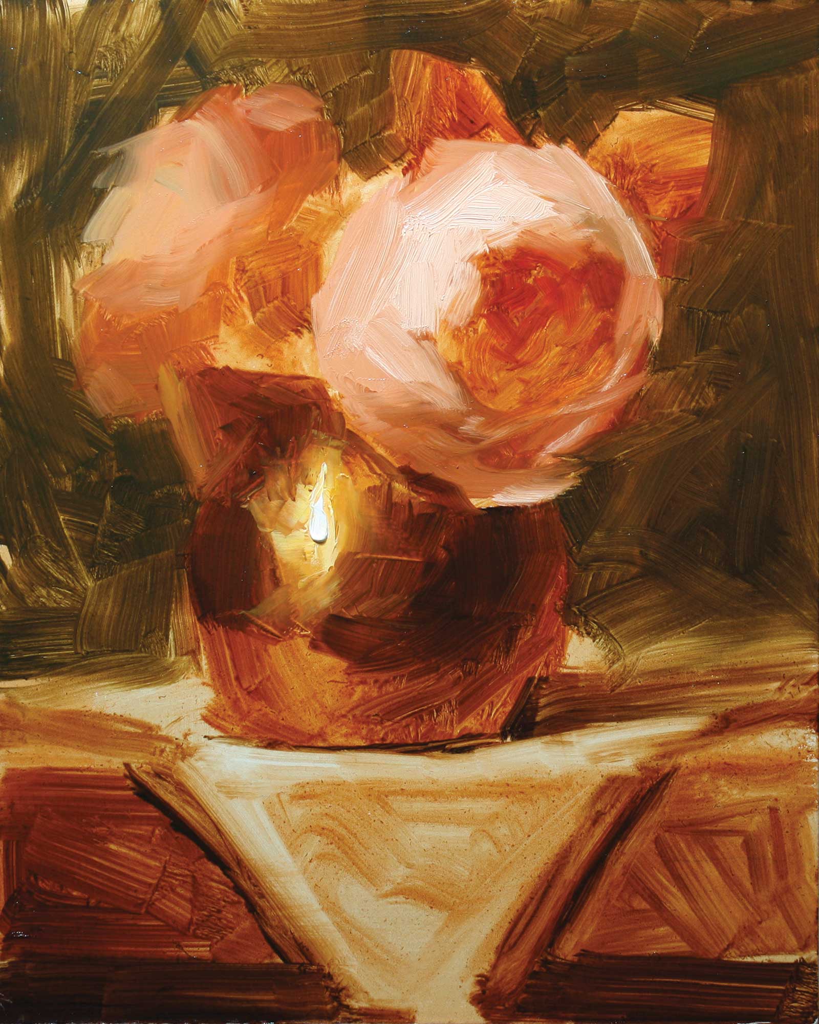
Stage 7 Main Flower
I’m focusing on the focal flower, which is the most significant part of the painting. It’s so important to keep the overall form while working with flowers. I do this by paying close attention to where the light is hitting and where shadows fall. Edges help too; close ones should be sharp and further ones should be blurrier. I’m adding some petals here as well. It’s very easy to go too far at this point. I like to do a bit and then leave it until later to decide if it needs more. I fix up and cool off the background here, too.
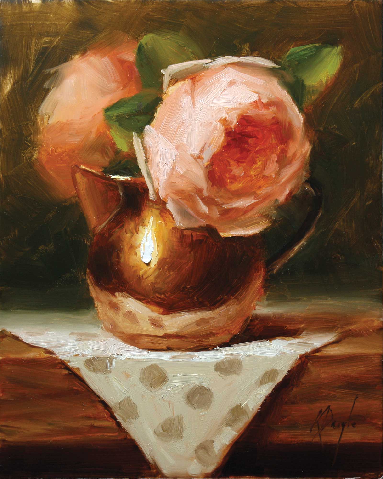
Stage 8 Finished Artwork
David Austin Roses in Copper Creamer, oil, 10 x 8" (25 x 20 cm)
This is the finishing stage where I have added the details. If you can try to keep some of your original brushwork it will help to make the paint look fresh. I slow down a lot at this point and really think about every stroke. I added the polka dots to the handkerchief, exaggerated the highlight, darkened some shadows, softened some edges and added the handle.
About the artist
 Karen Daigle
Karen Daigle is a Canadian representational artist whose vibrant, modern impressionist paintings breathe life into the everyday. She captures the poetry of light, movement and beauty in things often overlooked—lush florals, vintage treasures and sun-kissed fruits.
Originally trained in design, Daigle spent two decades mastering the principles of composition, color and form before fully immersing herself in fine art. While design satisfied her creative spirit, it was painting that offered her true freedom and a way to express without boundaries.
Working from her cozy home studio in New Brunswick, she paints alla prima—working quickly and decisively in a single sitting—to preserve spontaneity and energy in her work. Her style is fresh yet nostalgic, blending Old World charm with a contemporary eye for color and atmosphere. Daigle’s luminous paintings have earned her recognition in juried exhibitions around the world and are held in private collections across North America, Europe and beyond. With a devoted Instagram following of over 48,000 fans, she continues to share her process and inspiration with an ever-growing global audience.
Represented by
Summer & Grace Gallery, Ontario, Canada, summergracegallery.com
Argyle Fine Art, Nova Scotia, Canada, argylefineart.com
Divine West Gallery, New Mexico, USA, divinewestgallery.com
Contact at
artist@karendaigle.com
karendaigle.com