


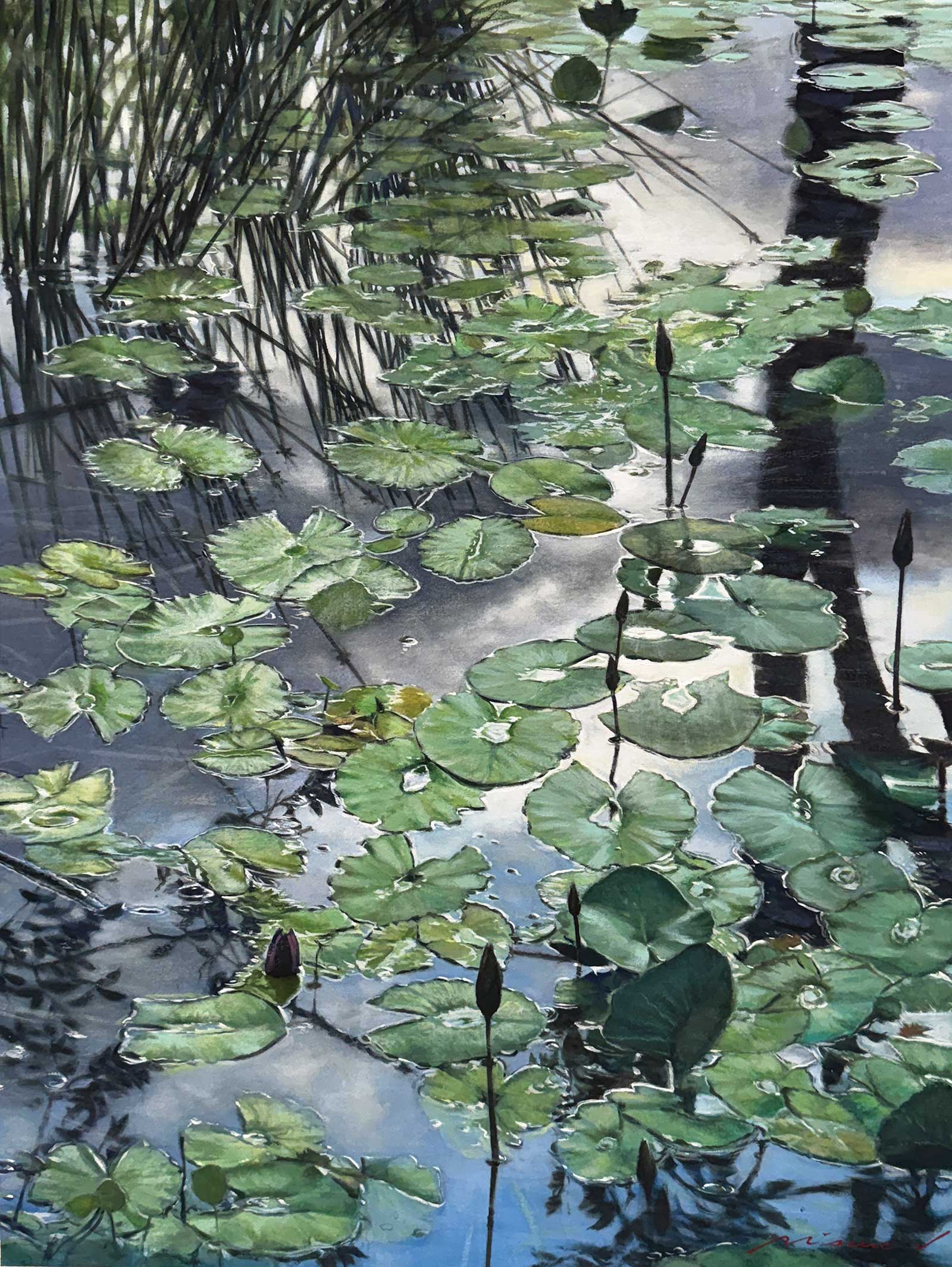
 Morning by the Lake, watercolor and gouache, 30 x 21¼ (76 x 54 cm)
Grand Prize is a four-page editorial feature in American Art Collector magazine
Misure Nien
Changhua City, Taiwan
Deeper Resonance
Born in 1965 in Taiwan, Misure Nien is a contemporary gouache and watercolor artist known for his exquisite handling of light and lyrical approach to realism. With a strong foundation in classical techniques and a deep reverence for nature, his art often captures fleeting atmospheric moments through a fusion of layered brushwork and subtle emotional tones. Whether in watercolor or oil, landscape or seascape, his paintings speak with a quiet precision that resonates deeply with viewers. Nien’s works have been exhibited nationally and internationally, earning awards and a dedicated following among collectors. He is also an active educator, frequently sharing his insights through workshops and lectures.
“I see myself as an artist who builds a bridge between nature and the human spirit,” he says. “My style blends realism with symbolism, using natural forms not only to portray external scenery but also to express resilience, renewal and tranquility. Each painting is both a reflection in the visual world and a meditation on inner existence.”
Nien is inspired by elements of nature like lakes, rivers and the sea, and how the passage of time affects these natural phenomena. “These elements form a continuing series in my work, symbolizing cycles of life, balance and renewal,” he says. “I often focus on the play of light upon water surfaces, extending a philosophical thread that runs through my paintings.”
The artist continues, “The interplay of light and shadow is at the core of my technique, conveying both depth and emotion. I emphasize compositional balance, often contrasting horizontal tranquility with vertical vitality. Texture and layering are equally important, allowing viewers to sense the tangible surface while entering the intangible atmosphere. These elements matter because they guide the audience beyond the visual, into a deeper resonance with the work.”
My Inspiration
The morning lake becomes a mirror of the soul, reflecting nature’s silence and the eternal cycle of life. Lotus leaves and unopened buds embody unrealized possibilities, reminding us that within the ordinary lies infinite hope and renewal.
My Design Strategy
I use the horizontal expanse of the lake to symbolize timeless tranquility, while the vertical reeds suggest resilience and vitality. The interplay of light and reflection creates a space that transcends reality, inviting viewers to contemplate the harmony between nature and the inner spirit.
My Working Process
I begin by establishing the atmosphere, allowing the paper to breathe with the awakening lake. Gradually, I refine the details, harnessing the qualities of the medium so that each lotus leaf and bud becomes a symbol of life. Finally, layers of light and shadow guide the viewer into a meditative realm that surpasses the scene itself.
Contact Details
Email: misure@gmail.com
Website: misurenien.art

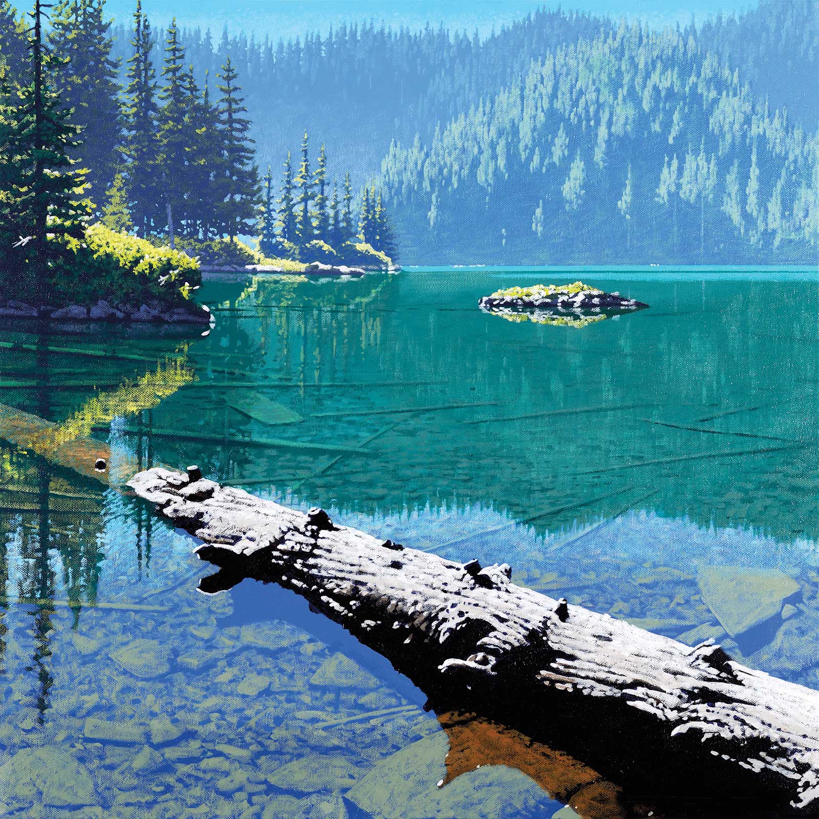 Driftwood, acrylic on canvas, 24 x 24” (60 x 60 cm)
Second Prize is a two-page editorial feature in American Art Collector magazine
Scott Coulter
Florida, USA
My Inspiration
My passion for painting landscapes has spanned over five decades. My artistic motivation springs from the streams, rivers and clear waters that I grew up with. My choice to focus on these subjects allows viewers to share in my experiences. This painting is based on reference taken from a serene lake in the Pacific Northwest. I was captivated by the crystal clear, turquoise waters, and wanted to reproduce that feeling in the painting. The water reflects the surrounding landscape, including the dense pine trees and distant forest hills.
My Design Strategy
The weathered log extending diagonally creates a dynamic compositional line that effectively guides the viewer’s eye into the scene. This balances the horizontal and vertical elements. The partially submerged log suggests both the passing of time and the changes in nature that naturally occur. I like to include shapes in the foreground that essentially provide a place for the viewer to stand. Varying the amount of detail in different parts of the painting is a delicate balance that hopefully eliminates overworking the piece. I tried to use sharp contrast and rich colors wherever possible.
My Working Process
My process in creating a painting usually starts with reference selection from the thousands of photographs in my personal library. I do not do any kind of detailed drawing. Instead, I do an outline of each plane and fill those in with a solid base value. Details are added using mostly dry brush techniques. It is not important to copy the reference exactly. Minor changes in composition are always occurring and details are constantly added or deleted. I apply my acrylic paint very flat, and that allows me to paint over areas that need to be altered.
Contact Details
Email: rs.coulter@gmail.com
Website: scottcoulter.net
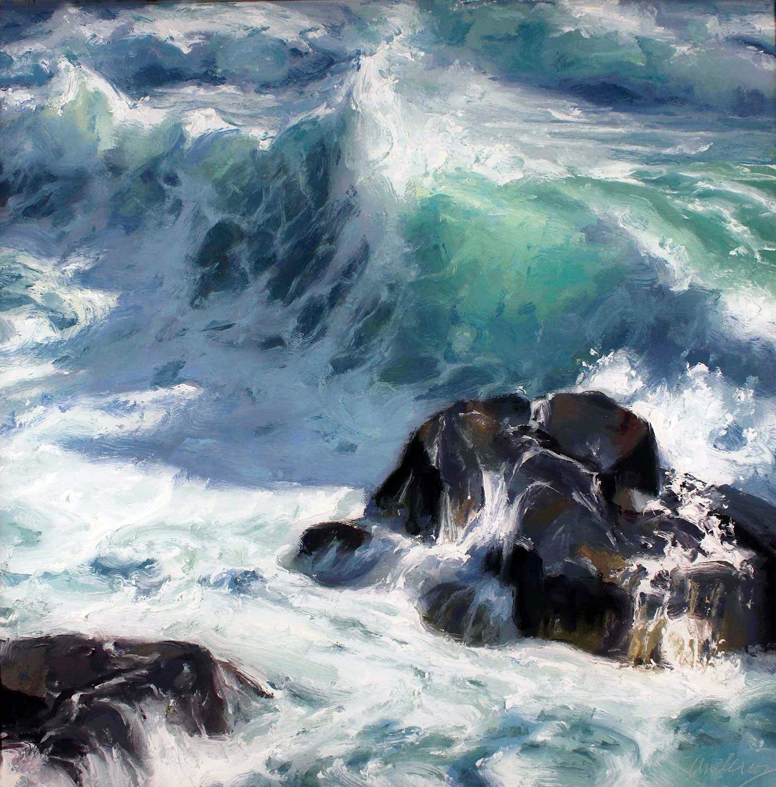 Corona Spray, oil, 30 x 30” (76 x 76 cm)
Third Prize is a one-page editorial feature in American Art Collector magazine
Kurt Anderson
Virginia, USA
My Inspiration
Seascapes became a passion of mine after I moved to the East Coast about five years ago. I have always been captivated by the natural world and have been painting flowers and plein air landscapes for decades. I use impasto brushwork to capture movement and subtle shifts in color, but I love how these techniques can be pushed even further in capturing the dynamic qualities of the sea—the variations in transparency and movement as water rises into a wave, is transformed into spray by the wind, and then breaks violently against the rocks.
My Design Strategy
While I usually work from life, a painting such as this is made in the studio. While pieces of this scene can be found in the natural world, the scene in its entirety is not. It is an invented scene made from paintings and photos made on site. Using these references as a starting point, I begin by creating a compositional study. The second step is creating a small painted study as a color reference. The larger final painting is made by referencing both the color and compositional studies.
My Working Process
I draw the composition loosely on the canvas with a thin wash. The painting is then completed in sections, using a limited palette with large heaps of paint, and the largest bristle filberts I can get away with. I like to work in the moment. As I lay down the color, I try not to look too directly at what I’m painting or overanalyze it. I also try not to get distracted by details and the imperfection of what I may have just painted. Instead, I try to trust in my immediate, intuitive response as it is realized in paint.
Contact Details
Email: kurt@kurtanderson.net
Website: kurtanderson.net
Finalists
Each receives an Award Certificate and a one-year subscription to International Artist magazine PLUS having their work seen worldwide by international galleries looking for new talent.
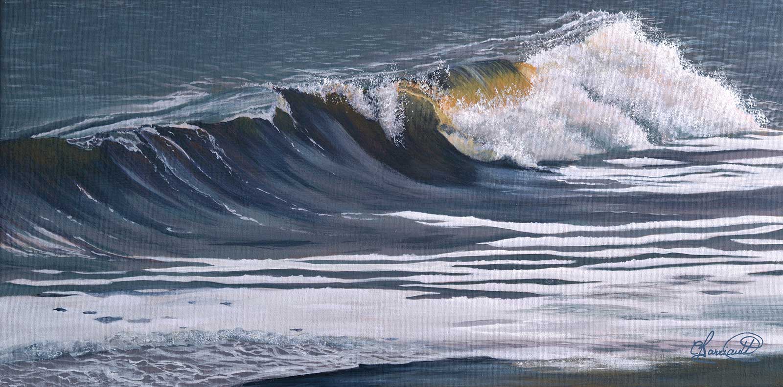 Près de la côte, acrylic on canvas, 12 x 24” (30 x 60 cm)
Claire Barriault
Québec, Canada
My Inspiration
I was born and grew up near the St. Lawrence River in the Province of Québec, Canada. I spent many hours contemplating waves, collecting seashells and other small treasures that the tides leave on the sand. I often walk there to capture specific moments in all seasons and at all times of the day. Each wave is different, and the light brings contrasts and colors no matter the time of the day. My camera and sketchbook accompany me on my riverside excursions. My subject is dictated by the desire to capture nature as I perceive it, in all its beauty, complexity and fragility.
My Design Strategy
Using my own photographs, some observations made while standing by the sea, and my own sketches, I select the elements that will allow me to capture an instant of the wave’s movement that I want to paint. Above all, I want my artwork to evoke emotions, a reminder of happy moments spent by the sea. This painting is inspired by long hours spent on the beach of Sept-Îles in Québec. This St. Lawrence River’s wave is pushed by a southeast wind, giving it a different angle of view to paint. I want to express the movement of the water and the force it evokes.
My Working Process
First, I apply additional coats of gesso to a cotton canvas to create a smoother base. I block in the basic structure with pastel pencils, which I then fade before covering my canvas with a raw sienna wash. This will establish the tonal values. Then, I layer thin coats of blends of Golden Open acrylics. To highlight the focal point of my artwork and the effect of light on the changing form of the wave, I add some glazes of colors in the shadows and dark areas and finish with pure white and blends of yellows until I am satisfied.
Contact Details
Email: cbarriault.artiste@gmail.com
Website: claire-barriault.com
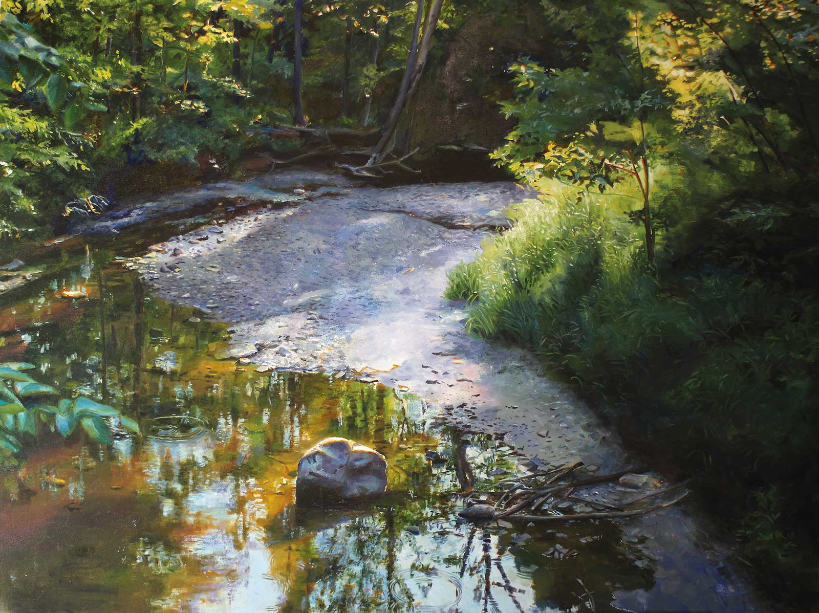 I Know Where The Stones Are, oil on canvas, 30 x 40” (76 x 101 cm)
Dan Knepper
Ohio, USA
My Inspiration
Whether painting the awe-inspiring vistas of Glacier, the wildlife of Yellowstone, the iconic mountains of the Tetons or the grandeur of Rocky Mountain National Park, my subject is light. I look for the glowing translucency of foliage, the illumination of clear water and reflection of ripples and the atmosphere of light dissipated through the mist. I looked for those same elements in the subject of this painting, which comes from closer to home. It is of a park in my hometown, a preserved pocket of wild among the “development.”
My Design Strategy
Ninety percent of my composing comes from taking the reference photos. I bracket exposures, watch the light, and then take more photos from different angles and heights. Values, edges and saturation all play into guiding the eye through the composition.
My Working Process
You’d think I’d have this figured out by now, but each painting seems to require something different. I think I take into account where I’m going and make a plan to get there each time. Soft background focus might allow a little serendipity, but in general, the process is predetermined by the principles and elements I’ve decided to emphasize. That sounds terribly snobbish—like Masters thesis rubbish, but it’s accurate.
Contact Details
Email: danknepperart@yahoo.com
Website: danknepperart.com
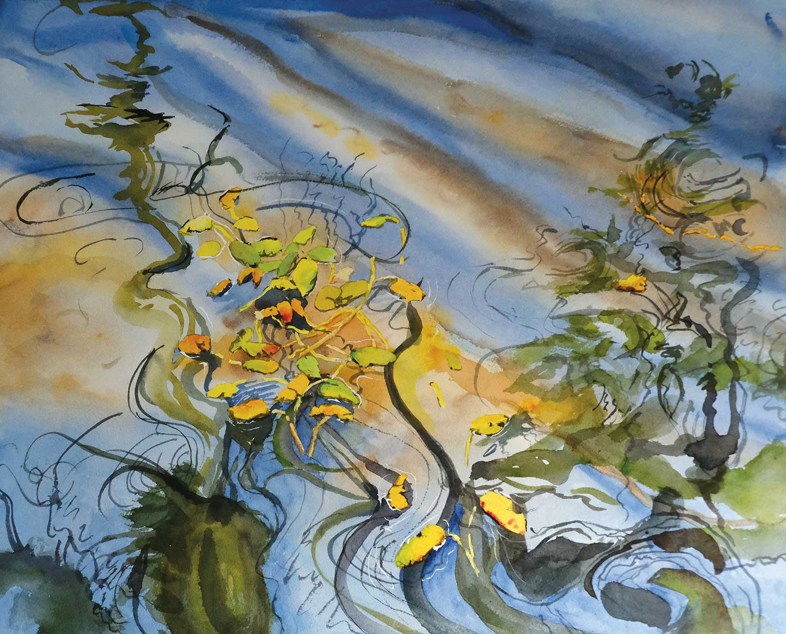 View from our Waters - Drifting, watercolor, 17 x 21” (43 x 53 cm)
Mary P. Murphy
New York, USA
My Inspiration
The immediate inspiration for Drifting was the Swale Pond Bird & Wildlife Sanctuary in Trenton, New York, near my home. I painted in my studio based on photos of fallen leaves upon swirling waters. The larger inspiration was a year painting water to prepare for a live multimedia event with pianist Tina Toglia and actor Peter Loftus. Called “Musical Canvas: Water,” the performance required an intense painting study to be able to paint in front of a live audience. Drifting is part of the resulting series, View from our Waters. I am also fascinated by Asian ink painting and was inspired by a class with artist Sungsook Hong Setton.
My Design Strategy
Initially, my strategy is more instinctive than deliberate: inspiration almost comes to me whole as a composition. Additionally, I compose when I photograph something I want to paint. Normally I sketch roughly what I want to paint in a sketchbook, sometimes redrawing to play with the orientation of the paper, the organization of shapes or the focal point. For technically detailed work, I’ll do a refined drawing to scale and transfer it to watercolor paper. Occasionally I paint a small version to try out colors or brushstrokes, which I did in the case of Drifting.
My Working Process
In watercolor, I plan: what layers need to happen first? Do I need to mask anything so I can keep flowing brushstrokes and not need to worry about preserving a small white? I study so that I can paint freely and enjoy the painting process. Often painters say they want to be “looser.” Paradoxically, I find that careful design and prep is what allows spontaneous painting. When I teach, I liken my process to a relationship: you meet and have an impression (inspiration), then you ask for a first date (sketching), progress the romance (refined drawing) and finally get married (painting).
Contact Details
Email: maryperrinmurphy@gmail.com
Website: marypmurphy.com
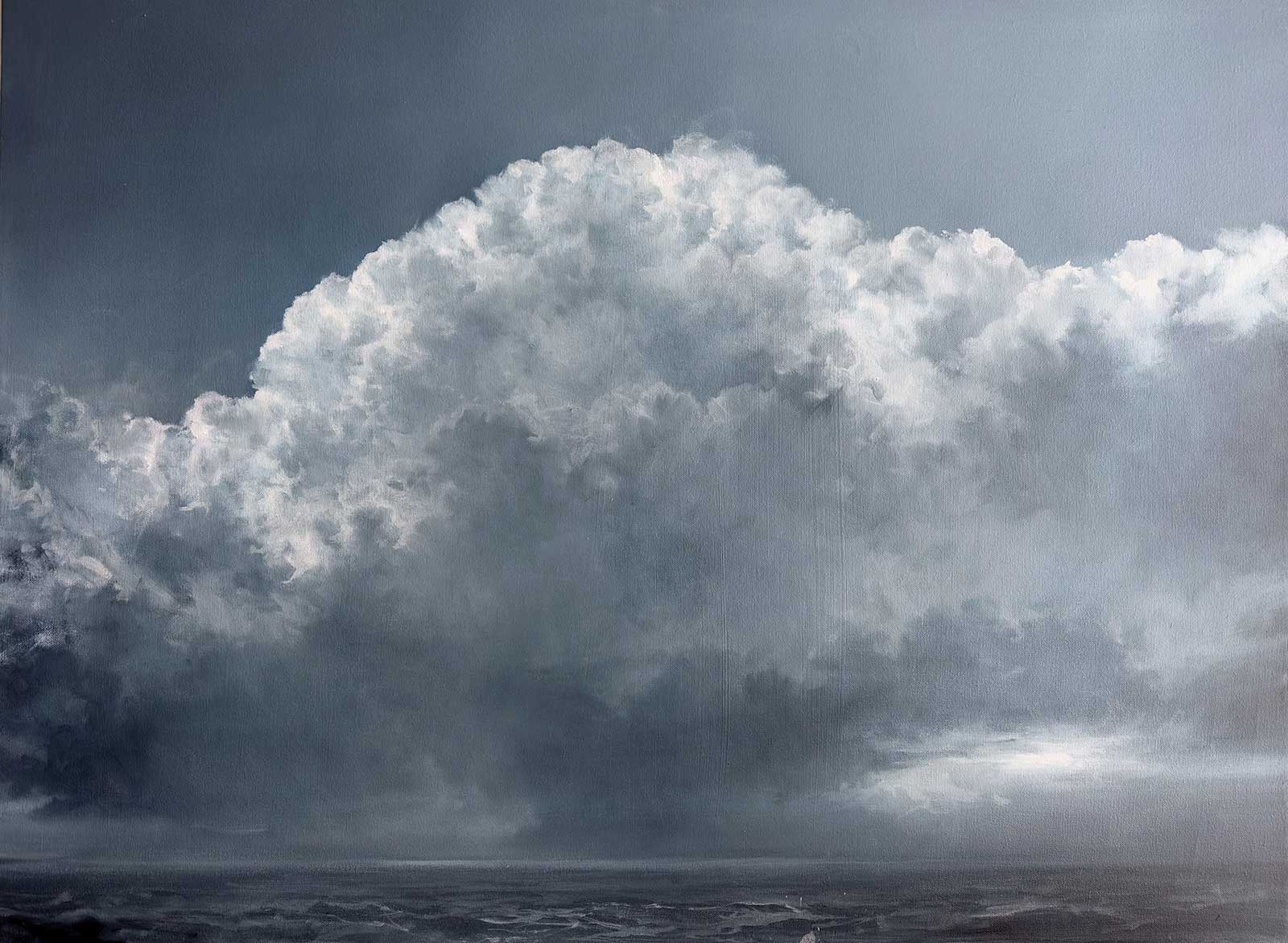 Vows Made In Storms Are Forgotten In Calm / Indigo 75, oil on canvas, 30 x 40” (76 x 101 cm)
Adriano Farinella
Pennsylvania, USA
My Inspiration
Vows Made in Storms Are Forgotten in Calm / Indigo 75 began as part of a series of grief paintings following the long illness and loss of my mother. This series is set up as a sort of altarpiece combining reflection on impermanence, memento mori and the violent cleansing storms bring. The title comes from a proverb about human nature and speaks to the cyclical nature of experience in moments of fear or crisis, when we promise anything and everything for relief or safety. When calm returns, that urgency often fades, and we are faced with honoring what we once vowed.
My Design Strategy
The composition is intentionally simplified: a low horizon positions the cloud to carry the emotional weight and the sea and storm to connect to it as a way to speak to the cyclical nature of water (life).
My Working Process
This painting, like all my work, is invented and imagined. I don’t use photographic reference, and in this series, I didn’t do any preparatory studies. I begin by toning the surface with indigo blue and subtractively establishing the light passages by wiping with a rag. The initial phase focuses on defining what I refer to as three-part-harmony: dark, middle and light values. This simplified value system ensures compositional stability before refinement. Once established, I introduce Portland gray light, titanium white and flake white to articulate middle-value transitions, reinforce form and calibrate light relationships across the surface.
Contact Details
Email: adriano@adrianofarinella.com
Website: adrianofarinella.com
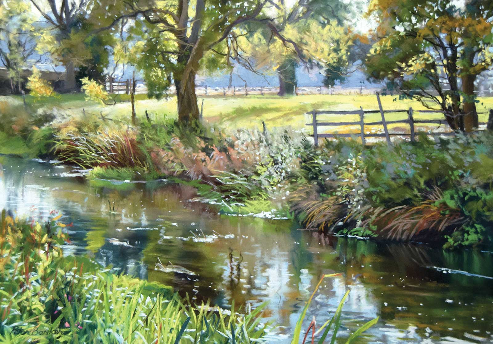 October Reflections, soft pastel, 13 x 19” (33 x 48 cm)
Peter Barker
Rutland, UK
My Inspiration
My inspiration for October Reflections was the gorgeous interplay of light and dark that is always apparent when looking into backlit subjects. This particular view was by the River Welland, a small river that meanders through Rutland, England’s smallest county, where I live. Passing into autumn, the verdant vegetation was now flecked with the rusty colors of the reeds as they started to die back. I paint both in plein air and in the studio, using reference photos. This one was actually a demo painting for an art society, so it was painted indoors using soft pastels.
My Design Strategy
My design strategy was to make the resulting painting interesting. Whether painting on site or taking photos, I use the camera viewfinder to find a good composition and see whether there will be something that excites the viewer’s eye. Most people, when taking snaps, tend to have the sun behind them, so everything is sunlit and the tones are all rather close and bright—nothing to stir excitement in the eye of the viewer. Conversely, looking into the light, verticals like trees, branches and fenceposts appear dark, set against horizontal bright fields or distant banks of trees.
My Working Process
I placed in the dark marks of the nearer trees and the slightly lighter and bluer marks of the middle distant trees. The bright and light greens of the meadow and pale blues of the far distance pack a punch next to the dark marks, and create the illusion of three dimensions on a flat surface. Once I had progressed to the river banks, I placed in the darks first, then superimposed the light marks on top, like in an oil painting, scrubbing out some pigment here and there with an old hogbrush. The water, though often the part that draws the most pleasure from the viewer, is generally the easiest passage of the painting: vertical slabby marks of what is being reflected above, with some horizontal marks to suggest ripples.
Contact Details
Email: peter@peterbarkerfineart.co.uk
Website: peterbarkerfineart.co.uk