


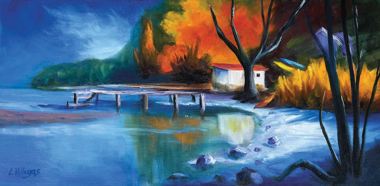
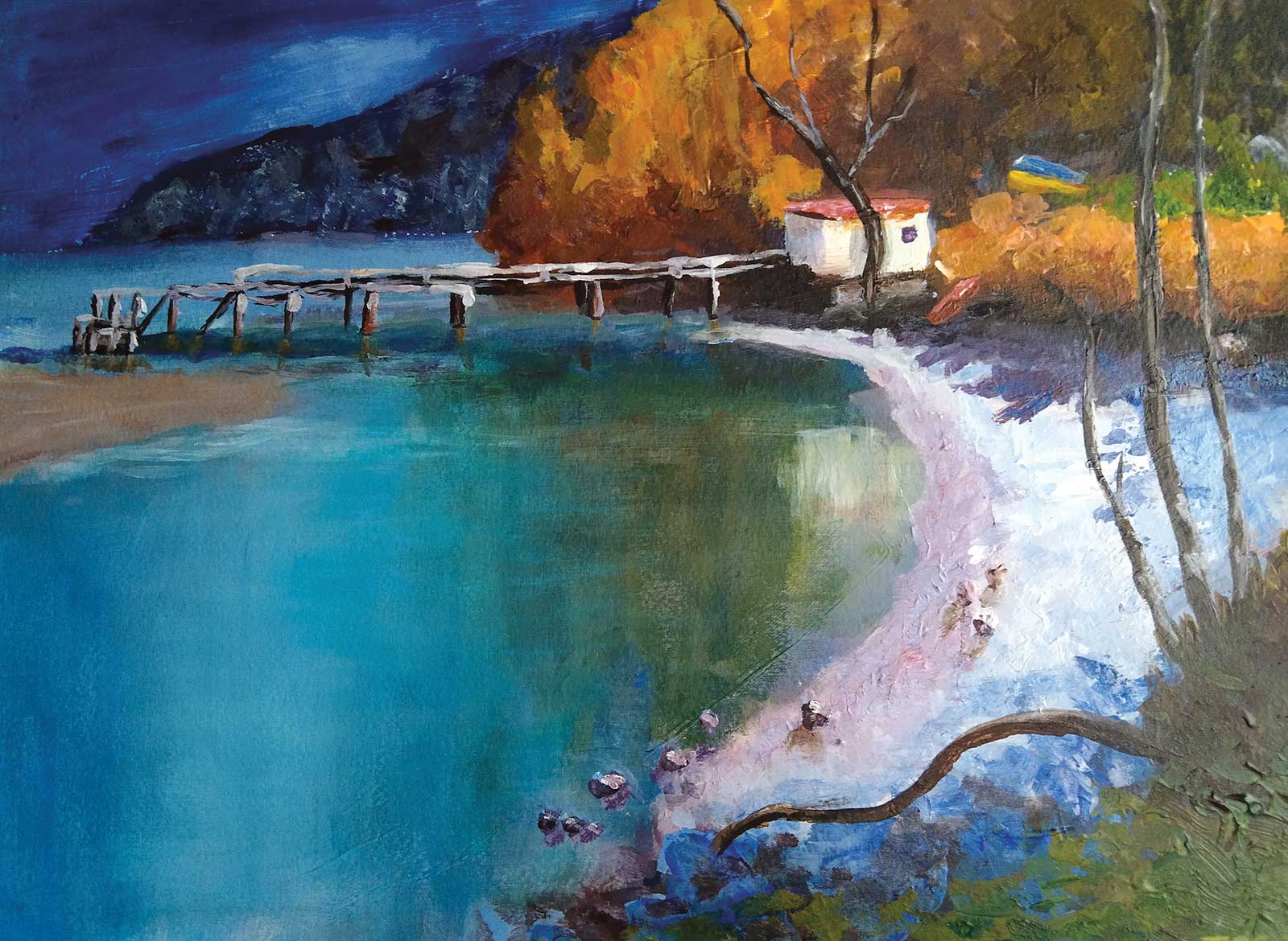
Take a walk with me to beautiful Kinloch on the edge of Lake Wakatipu in the South Island of New Zealand. This is a great little scene full of interest and variety. Look to see where cool colors contrast with warm, where hard edges contrast with soft, where large shapes contrast with small shapes, and where smooth color contrasts with texture.
If you can remember to find each of these differences and enhance them in every scene you paint, you’ll be making paintings with much more variety. Variety, or in other words, contrast, is what holds people’s attention toward a painting.
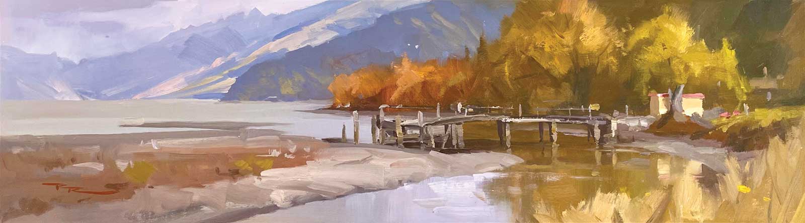
Richard Robinson, Kinloch, Autumn, oil on linen, 8 x 28” (20 x 71 cm)
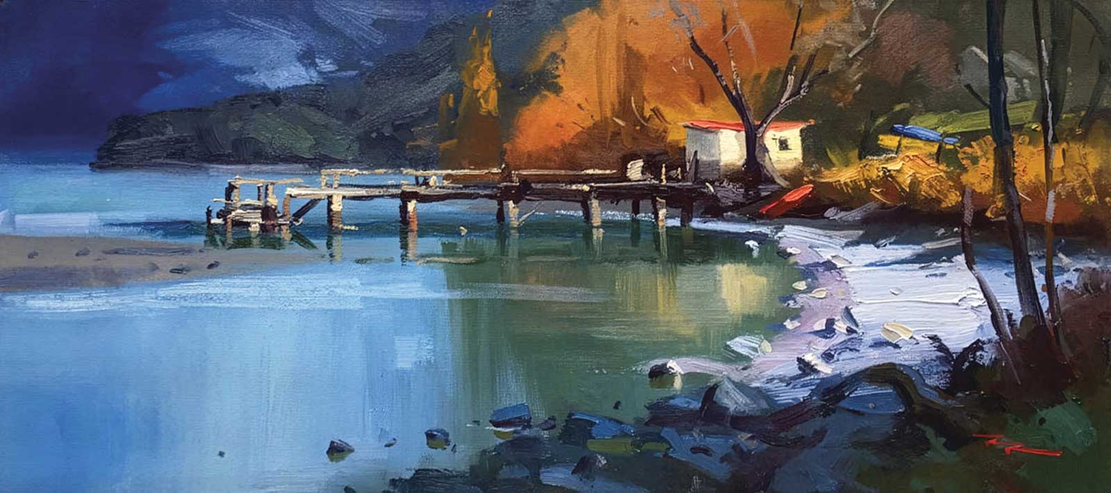
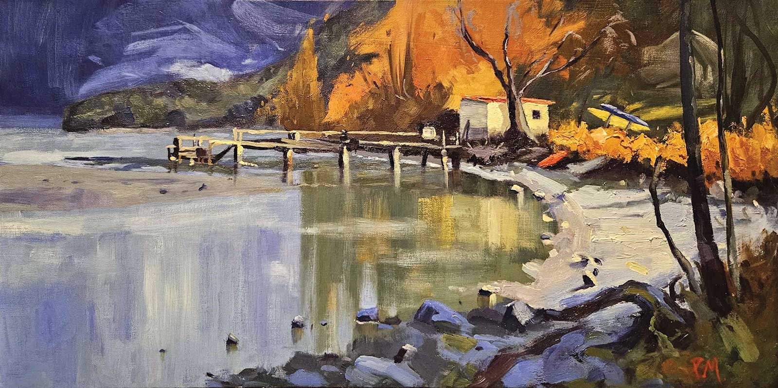
Richard Robinson, Kinloch, oil on canvas, 12 x 24” (30 x 60 cm)
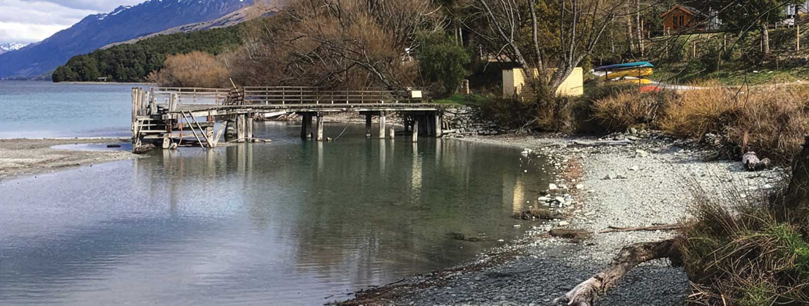
Kinloch, New Zealand
Richard Robinson, Kinloch
Student critiques
Louise Villegas
Walk to the Lake, oil Hi Louise, nice work! Very punchy color and lively brushwork. One drawing issue: be very sure about where the poles for the jetty touch the water. These should be lined up on a straight horizontal line. That’s easy to fix here by glazing over some of the pole bottoms with a blue/green to make them look like reflections.
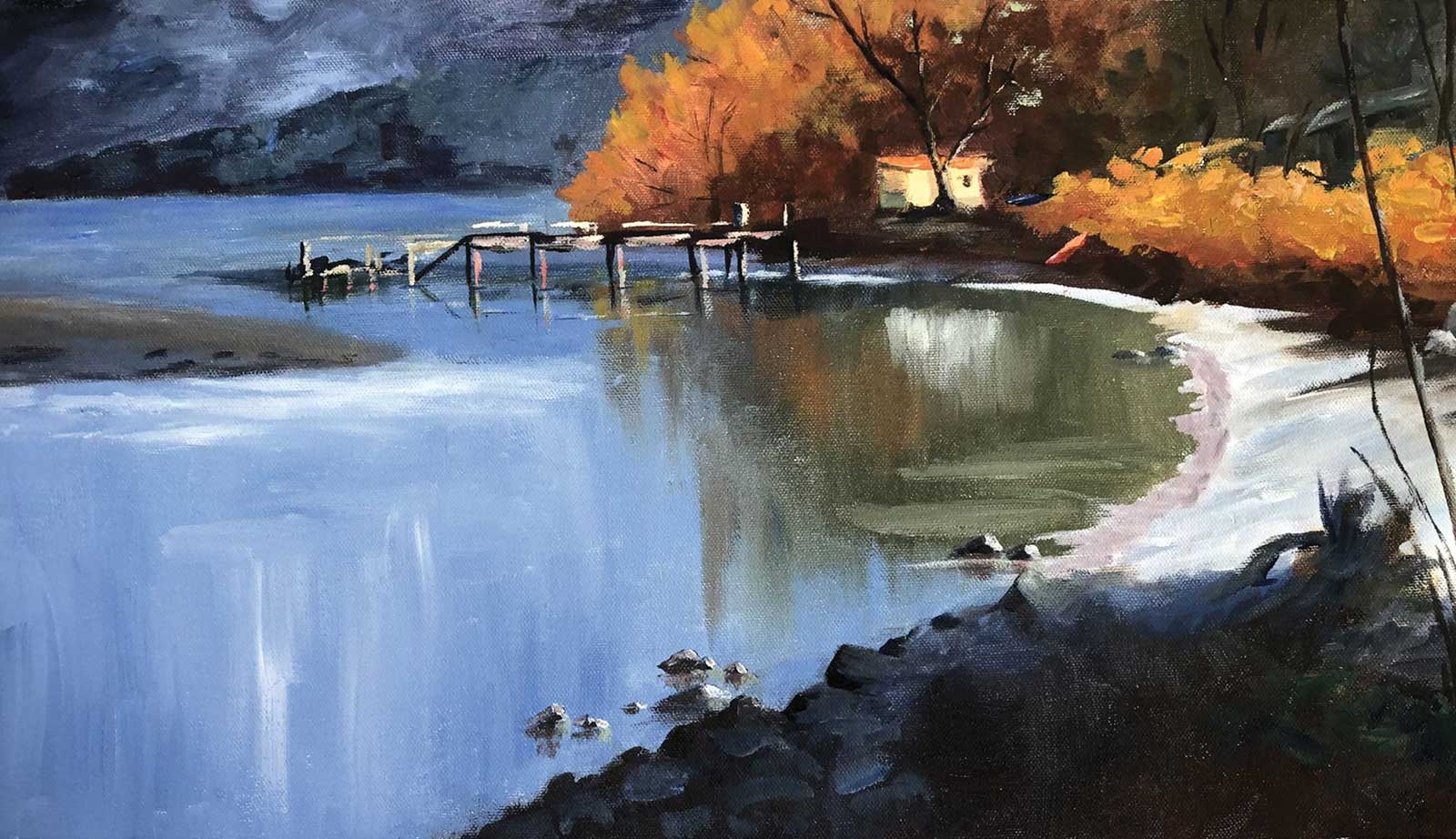
Pierre Manzi
A Walk to the Lake 2 Wow, that’s an exciting painting style you’ve got there, Pierre. There’s so much variety, the canvas is really singing with life! Nicely done. I can’t see anything to improve on.
Estelle Gerrett
Solid work here, Estelle. Good drawing, vibrant color and exciting brushwork. The one big thing I’d like you to look at is just how much color can be put into the darks. My painting has fairly subdued color in the darks to start with, but you’ve gone darker with yours to the point that it looks a little foreboding. Now take that photo of your painting and digitally alter it so that the darks are lighter, and increase the vibrancy so it magnifies the color in the darks. See how that feels. The lights will likely be lightened too much as you do that, but just focus on the darks for now. You’ll notice if you paint with more color in your darks that the whole painting will seem livelier.
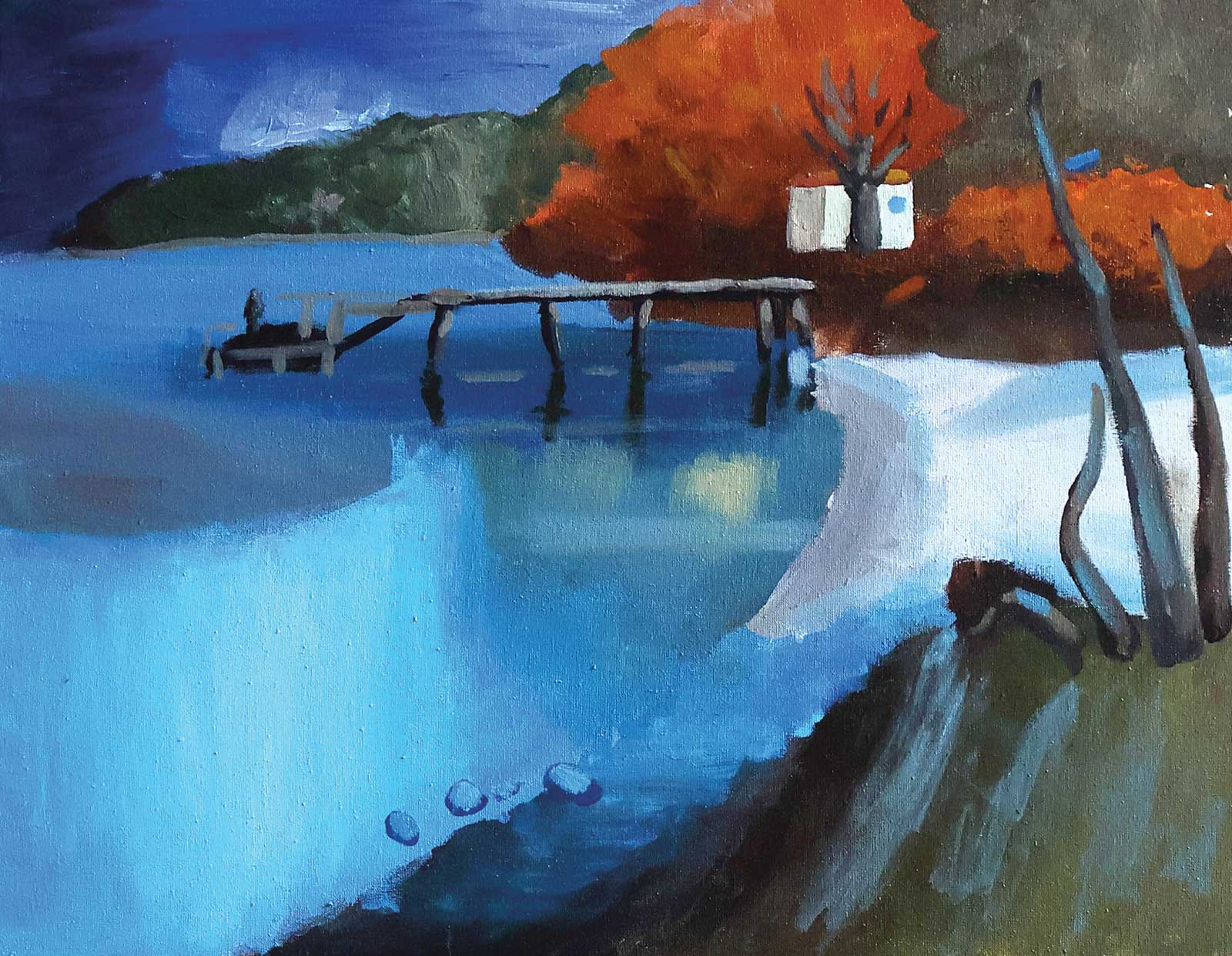
Agnese Iskrova
Laura’s Lake Hi Agnese, thanks for uploading your painting. It’s tricky squeezing this long scene into a shorter canvas, but you’ve made that work in the design. Let me draw your attention to a few things I think will help you with your next painting: Horizons should be straight and level. Shadows on light objects (like the beach here) are darker than you think. Squint and compare darks to darks in your scene. Use contrast to direct the eye. The jetty is the star of the show in this painting, so highlighting it more against the dark background makes sense to make it stand out.
Tony O’ Sullivan
Walk to the Lake, acrylic Hey Tony, nice colorful work with good attention to detail, contrasting with large shapes. The only thing I’d tweak is to have the dock be flat. Just hold a ruler along where the poles touch the water. This should be horizontal. Looking forward to seeing your next one!
About Your Tutor
Richard Robinson is one of New Zealand’s premier outdoor painters. You can view his extensive online lessons at mypaintingclub.com.