


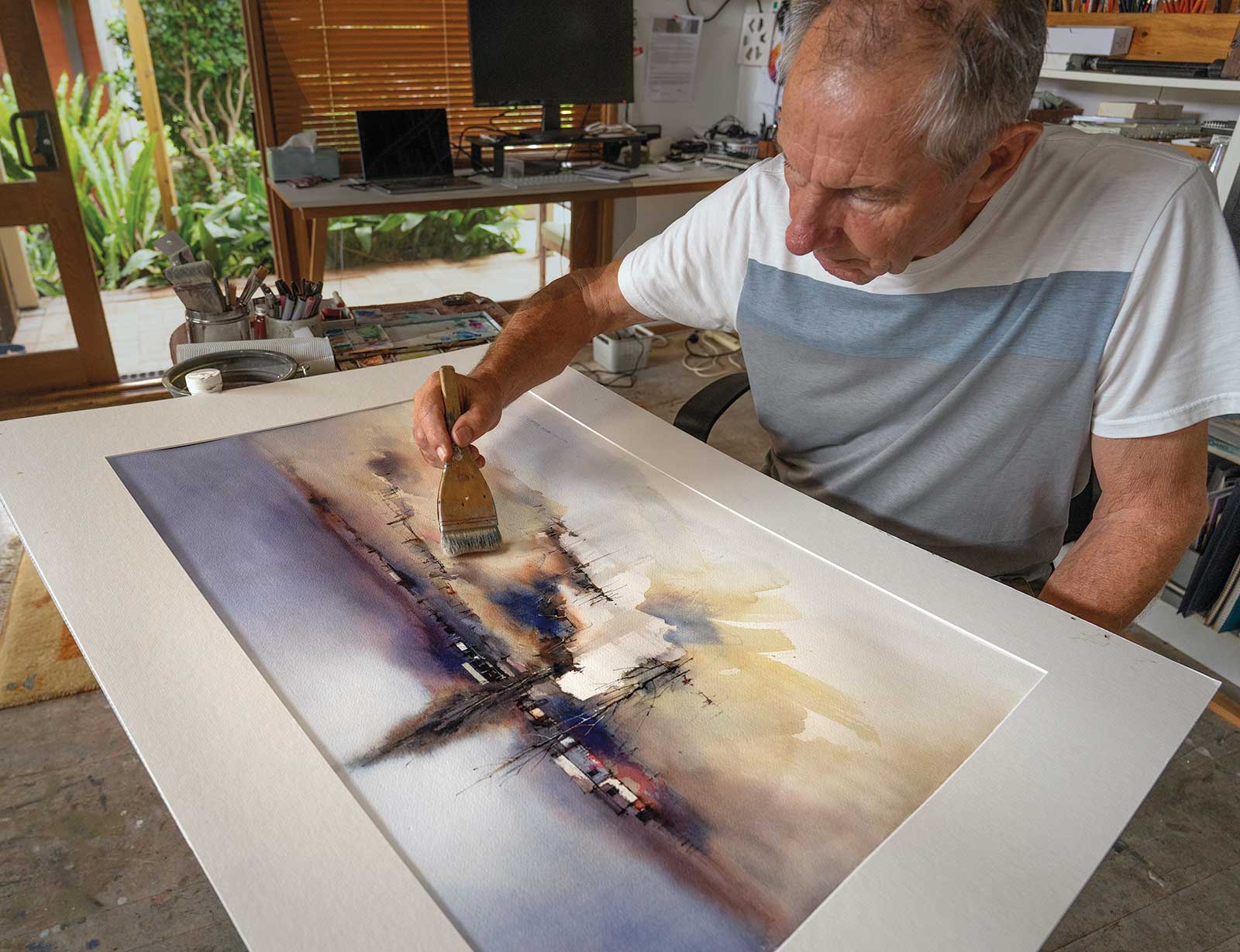
A big blank sheet of watercolor paper can feel frightening when you first confront it but with a little planning, some big brushes and trays to mix large washes, confidence soon returns. We are going to look at three full sheet paintings and discuss the tools, techniques and approaches involved with each.
Tools
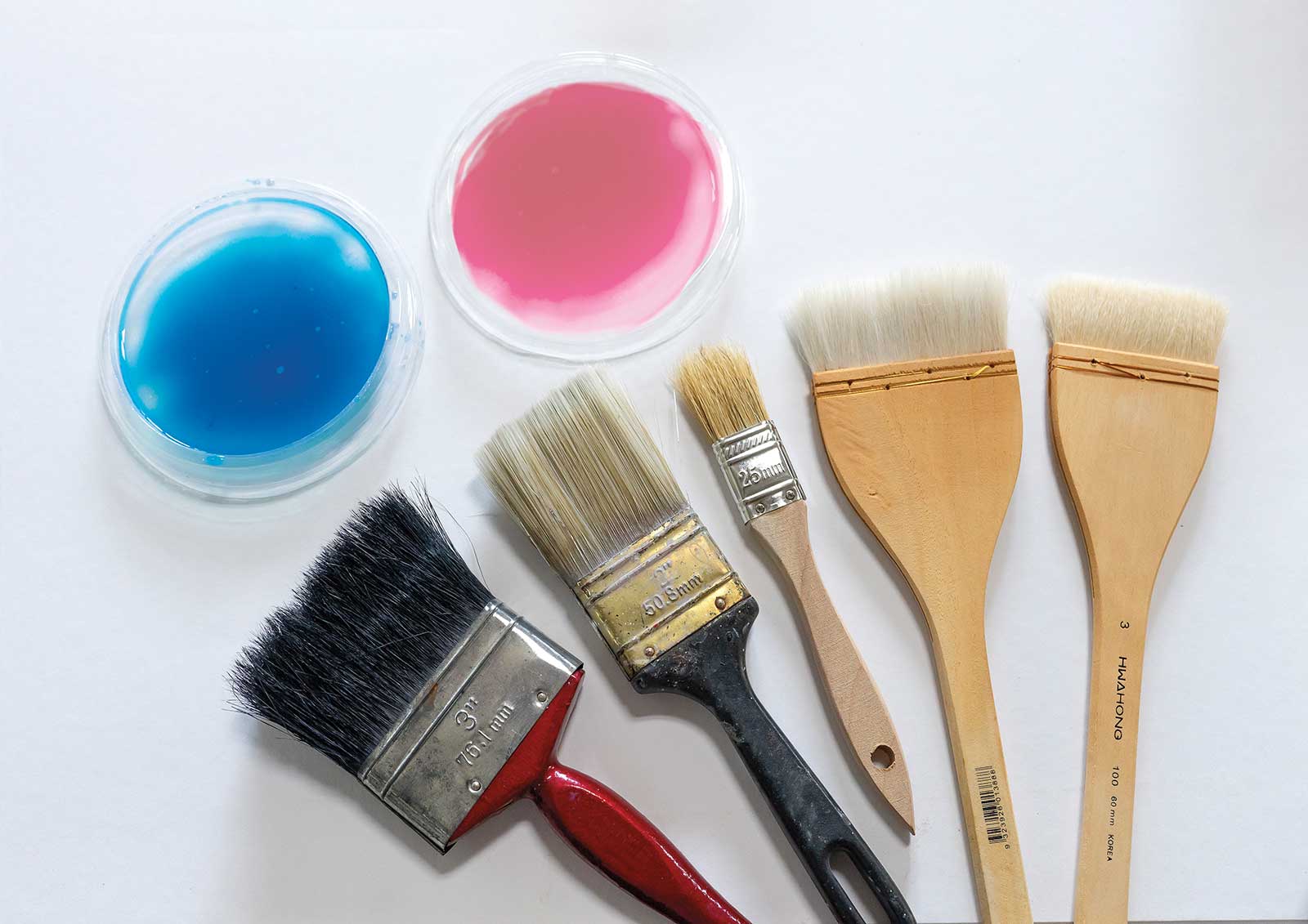
As well as your regular painting gear, a couple of larger brushes, some hake brushes for softening and smoothing washes and some dishes to mix larger washes will make the task easier.
A large water container and an old towel to adjust the amount of moisture in your brush also help when tackling a full sheet.
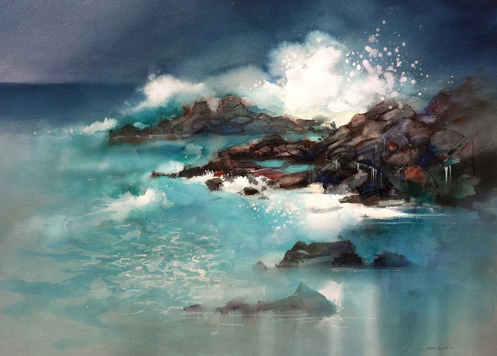
Coastal Rocks and Breaking Waves
These coastal rocks and breaking waves were painted with various mixtures of quinacridone gold, alizarin crimson and french ultramarine blue. Phthalo blue and phthalo green were also used to build up the translucent washes of the water.
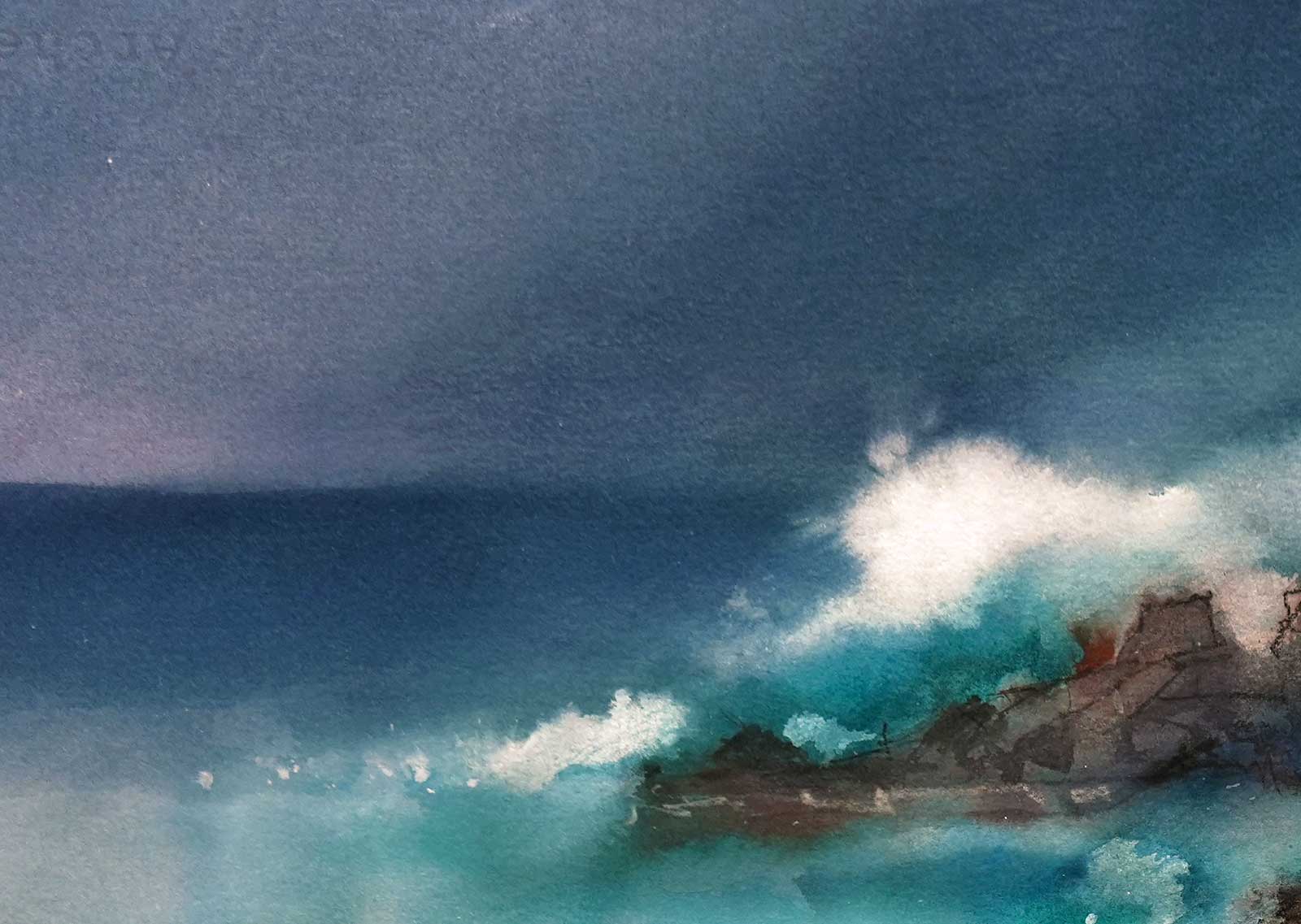
A mixture of French ultramarine blue and alizarin crimson was grayed off slightly with a small amount of quinacridone gold to create the heavy blue/gray sky and distant water. These washes were applied with a 1” bristle brush leaving plenty of white for the breaking waves. The dark washes were then feathered and softened with a dry 3” Hake brush before they dried.
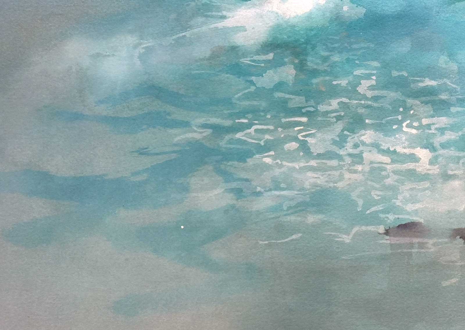
While the blue/green wash was still damp, light patches were lifted out with a paper towel. When the wash dried, white gouache was used to create the texture of drifting foam.
Dampening the edge of the white patches made the impression of water spray. White gouache was thinned slightly and carefully splattered over the wave once everything had dried. Modeling with a pale gray gave the spray a solid form.
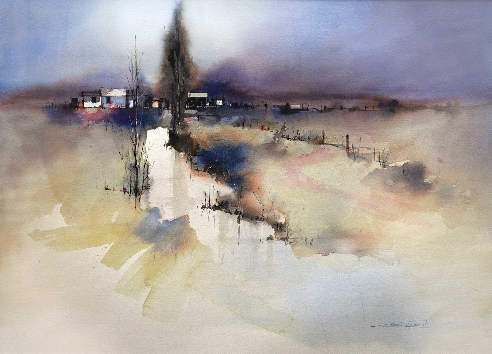
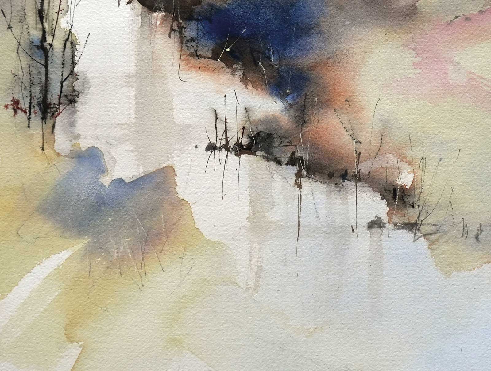
Composition Study
After working out the composition with a couple of rough, charcoal sketches the first dirty yellow washes were applied. A 2” bristle brush was used to cover all of the middle section of the painting except for the area of water. The dirty yellow was applied quickly and vigorously then softened in a few places with a dry 3” Hake brush. Before the dirty yellow dried some dark blues and grays were dropped in and allowed to bleed and run.
The vigorous brushstrokes and cool gray mark add interest to the painting and stop the eye running out the bottom of the painting.
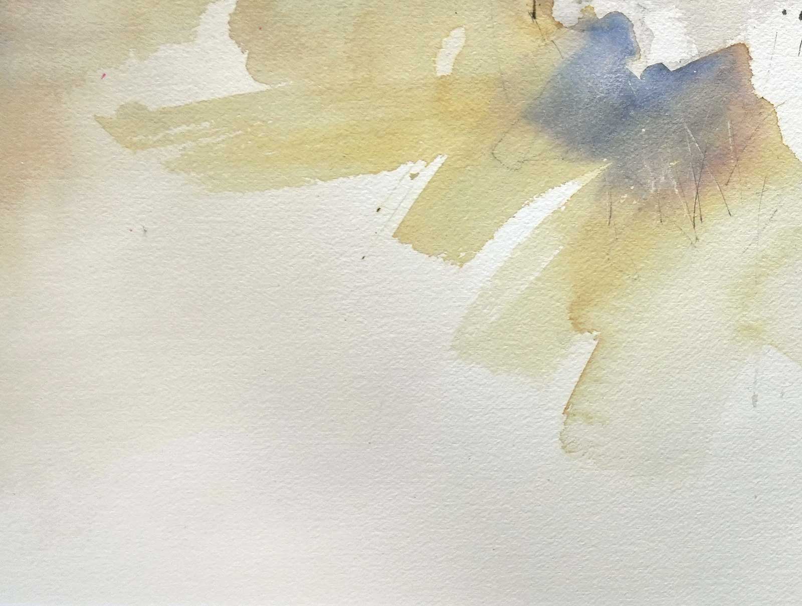
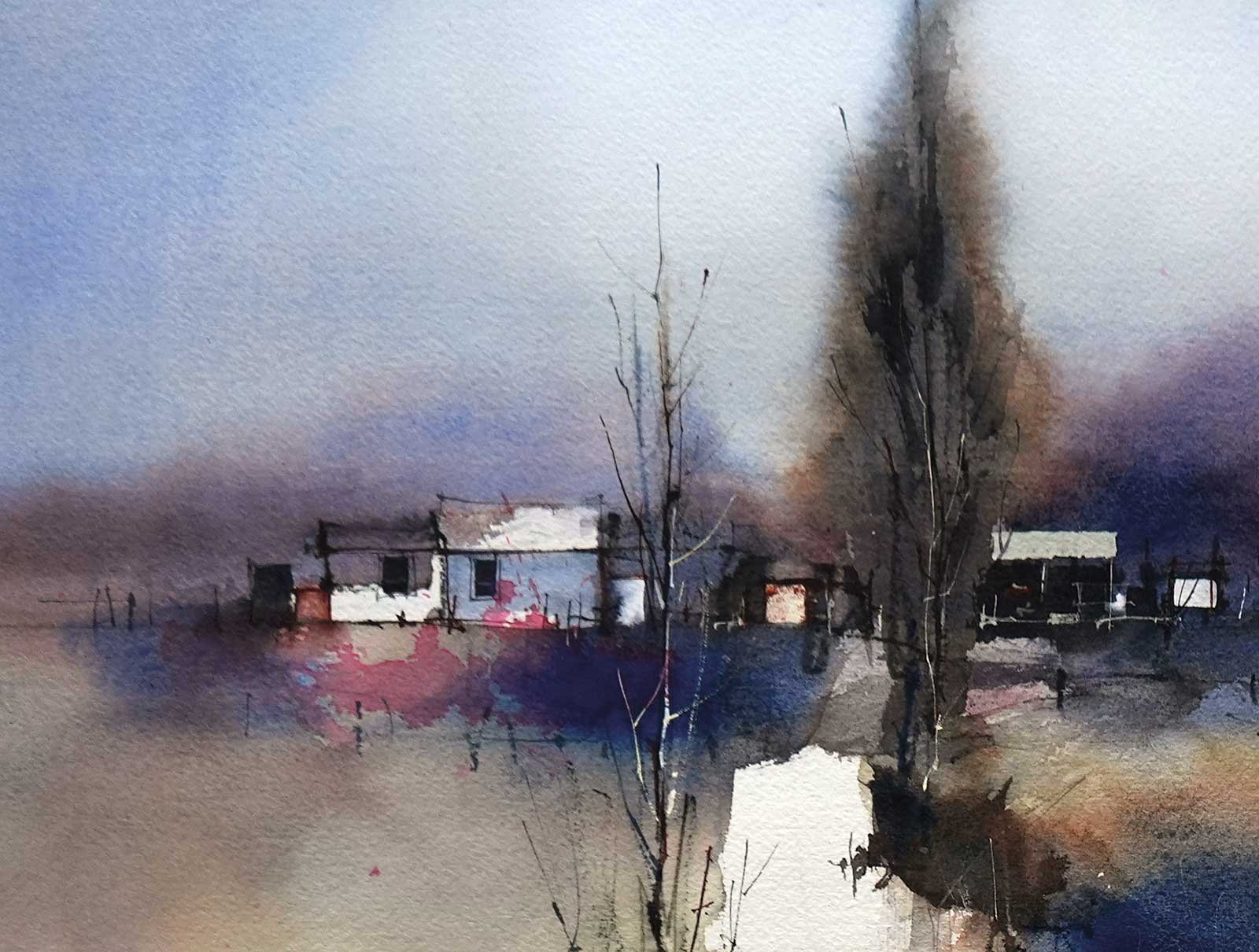
Alizarin crimson, French ultramarine blue and a tiny amount of quinacridone gold to subdue the purpleness was mixed and worked over the area of interest in the distance. It was cut carefully around the building shapes with a ½” flat brush then softened around the outer edges with a damp ½” bristle brush. The dark trees were put in over the dark shape with a mixture of the same three colors and again the outer edges were softened. Detail was added to the buildings with a ½” flat brush and a size 1 rigger. When everything dried a loose splash of permanent rose was dropped into the region of the buildings to hold attention. The sky was made with graded washes of French ultramarine blue.

Pale gray reflections were dragged down into the water and a faint wash of ultramarine was laid over the foreground pool. Fine details in the trees, buildings and along the river bank were built up with a size 1 rigger brush. It is important to vary the size, spacing, tone and direction of these marks to make them look convincing.
Conclusion
It is a lot of fun to launch into a large sheet of watercolor paper. The task is made much easier if you plan things first with some quick rough sketches, then work out a suitable composition, decide where the focal area will be, and preserve white paper for maximum tonal contrast in the focal area.
Once these decisions are made the application of paint can be very loose and casual. It’s like having a framework to experiment and run risks in. As long as you have a clean, high contrast focal area in the right spot and don’t confuse it with other areas of high contrast, the rest should fall into place. The other benefit to working on a full sheet is the increase in confidence when you return to work on smaller paintings. So grab a big sheet of paper and have some fun. —
Contact at johnlovett.com