


In my work, I use a variety of materials: gouache, oil, acrylic, oil pastel and soft pastel, each with its own unique qualities and possibilities. I don’t limit myself to a single medium—instead, I choose based on the subject I want to paint and the size of my canvas or paper.
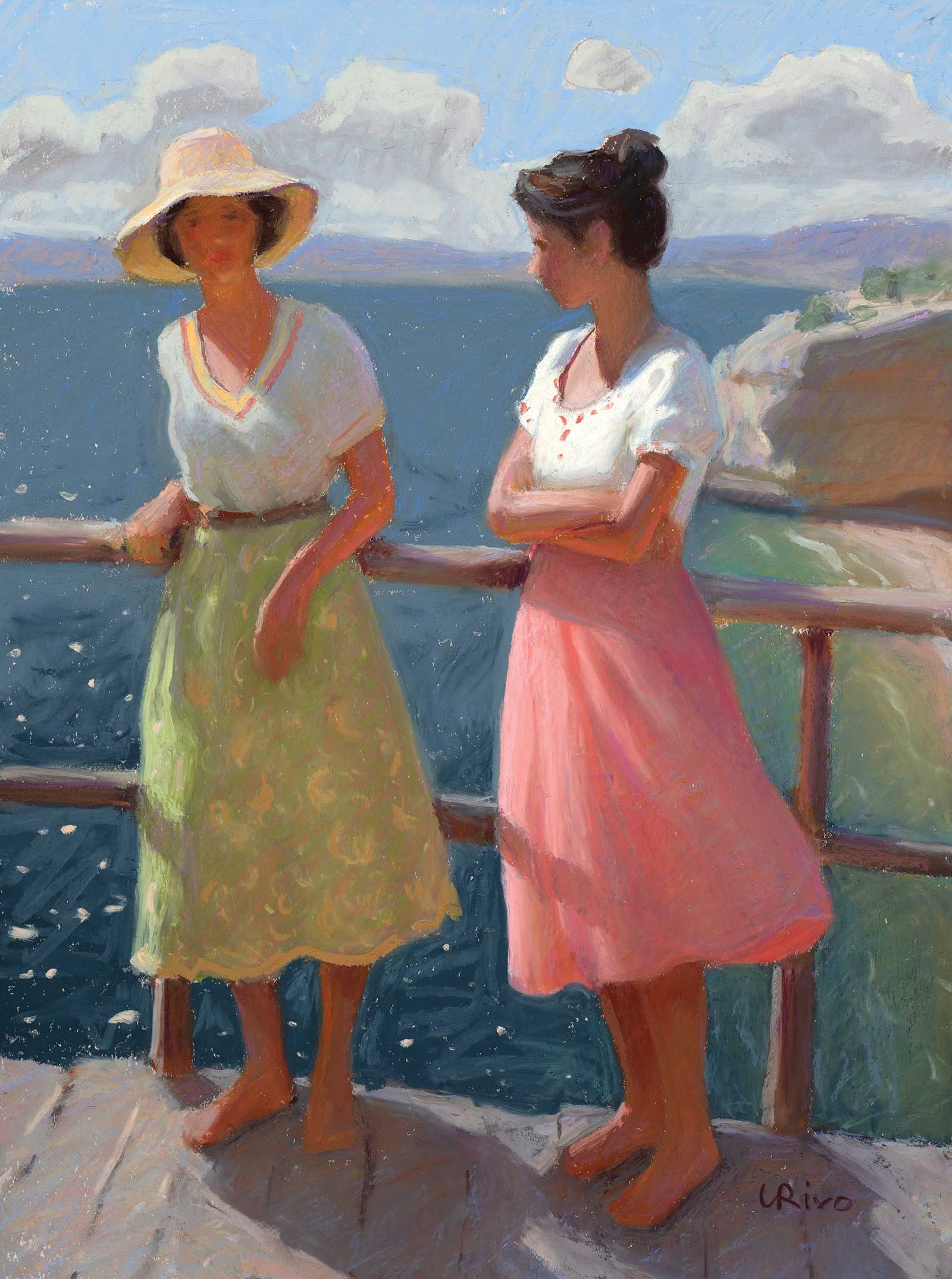 A Day by the Sea, oil pastel, 15 x 11” (38 x 27 cm) For small to medium-scale illustrative work or plein air painting, I use gouache. For large-scale pieces, and occasionally for plein air, I use oil paint. For medium-sized studio paintings, I often opt for oil pastel or soft pastel.
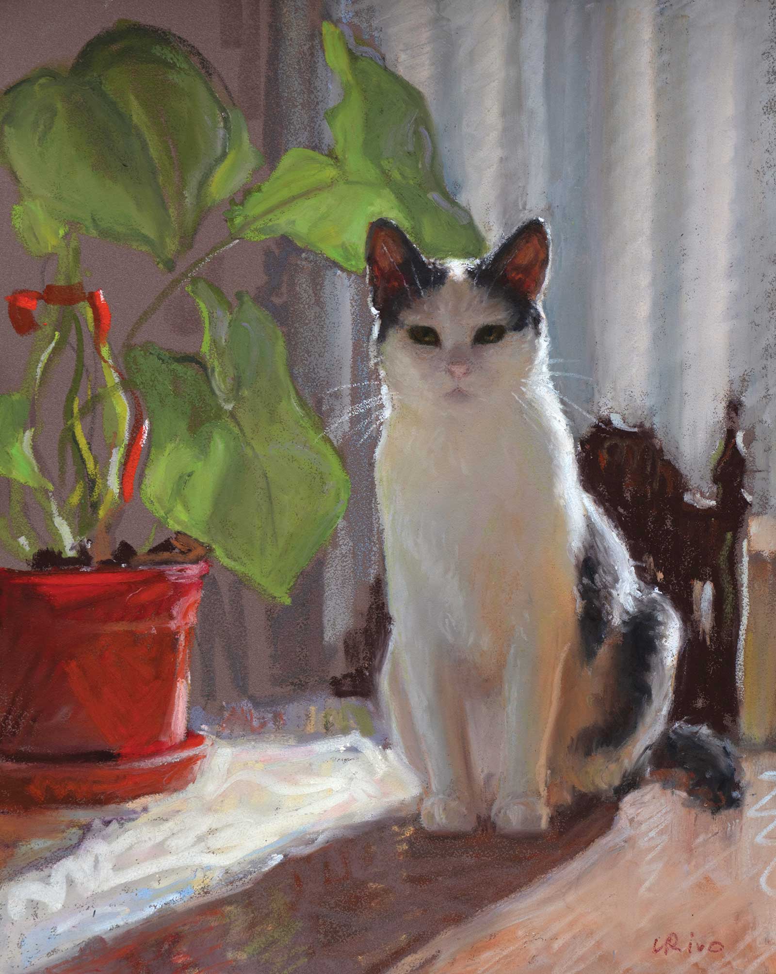
Cat on a Table, oil pastel, 12 x 9” (30 x 22 cm)

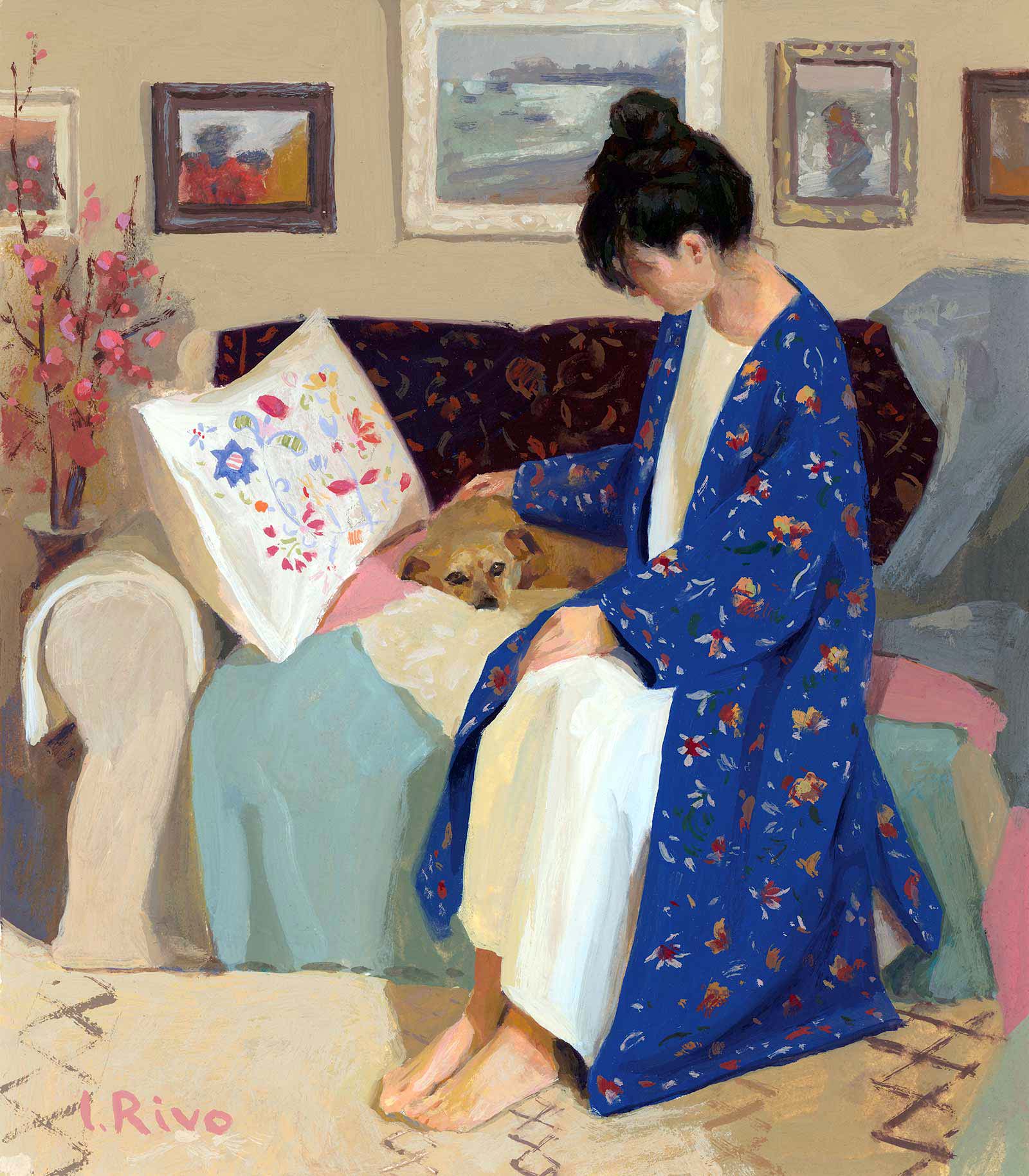
My Dear Friend, gouache, 7 x 6” (17 x 15 cm)
For this demonstration, I selected soft pastel because it is currently my preferred medium for portrait painting. This piece is based on photographs of a friend of mine and her cat. I didn’t have a ready-to-paint photo reference, which gave me the freedom to be creative and experiment with colors and composition.
My Art in the Making: Sofia and Her Kitten
When working with soft pastel, it’s important to choose the right colors from the start without relying on corrections or excessive layering. Once the paper’s tooth is filled with pigment, it can no longer hold additional layers. Therefore, before starting a painting, I always create a small color study to work out the composition, establish the main color and value relationships, and select color sticks to build a palette that expresses the mood I want to convey. The first four stages of this demonstration focus on this color study. Then, I move on to the final piece, using my color study as a reference.
Stage 1 Color Study: Loose Sketch
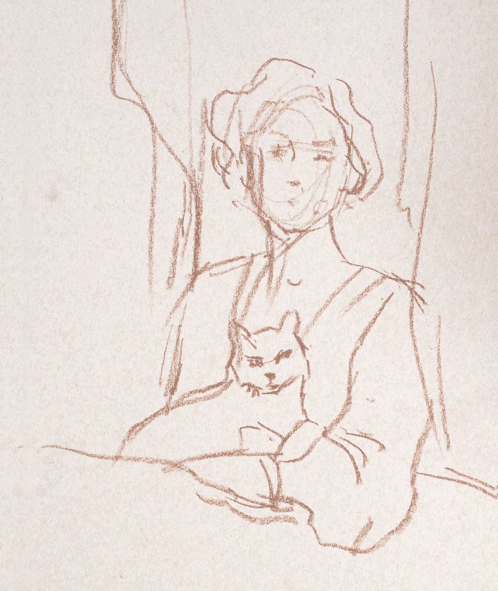
Since my goal with this study was to select the colors for my future painting, I sketched the composition quickly, indicating only the main color shapes. For the drawing, I used a beige-colored pastel pencil. I always use light-colored pencils when sketching for a pastel piece, so that if parts of the drawing remain visible through the pastel layers, they don’t attract too much attention.
WHAT THE ARTIST USED
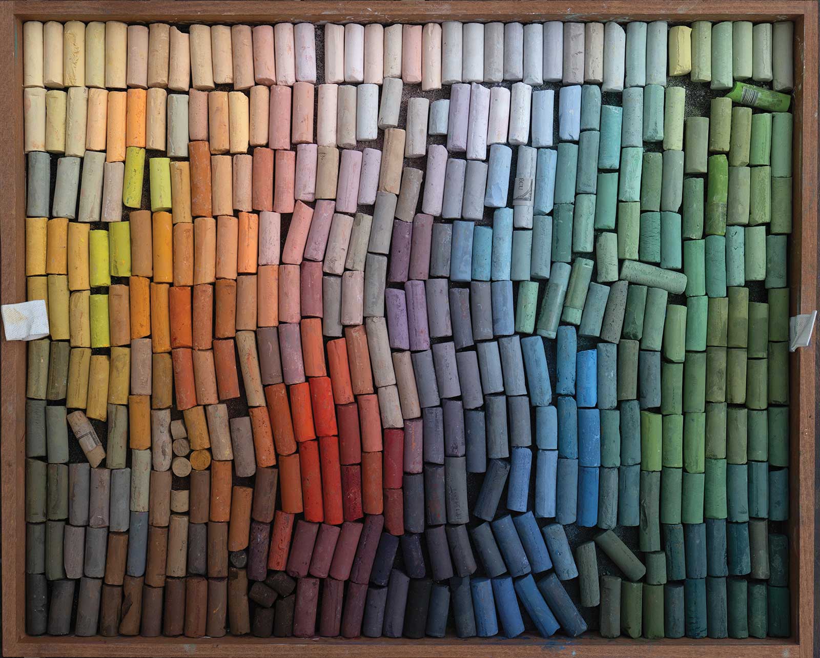
For this demonstration, I worked with soft pastels from a variety of brands, including Girault, Terry Ludwig, Unison, Schmincke, Sennelier, and Henri Roche. I find Girault pastels especially well-suited for portraits because they are small in size and offer a generous range of subtle colors that capture the nuances of human skin.
Primarily, I used warm earth tones (ochres, siennas, terracottas), soft pinks and muted reds for the skin tones; deep blues and cool grays for the shadows; bright and soft yellows for the background; and a range of gentle neutrals to balance the palette.
Even though the painting may appear vibrant, that effect comes only from the contrast between warm and cool colors. Most of the colors I used are muted and slightly grayish. Muted tones harmonize beautifully, creating a natural-looking painting. For skin tones, I always choose a selection of light browns, pinks, purples and greens in subtle, desaturated versions. Human skin always reflects the colors of its surroundings and therefore cannot be painted with just one color.
For this demo, I used a 400-grit UArt premium board. The study was done on 600-grit UArt paper. UArt paper can accept multiple layers of pastel, which makes it ideal for complex works. UArt boards are my first choice for large pastel paintings because they are very durable and lightweight. For smaller works and studies, I also like to use Pastelmat paper and boards, as well as Canson Mi-Teintes velvet paper.
All of these papers have a surface similar to sanded paper, and in my opinion, this is the only surface that truly works for soft pastels. When used on regular paper (even paper labeled for pastels that lack a sanded surface), soft pastels tend to produce a lot of dust because the paper cannot hold the pigment well. On sanded papers, soft pastels create beautiful, pigment-rich marks and produce very little dust. Paintings done on such surfaces do not require fixative, since the paper holds the pigment securely. I avoid using fixatives with soft pastels, as they inevitably alter the colors, often making them darker. In any case, fixative cannot protect a pastel work from smudging when touched with a finger. Therefore, the only real protection for a soft pastel piece is framing it under glass.
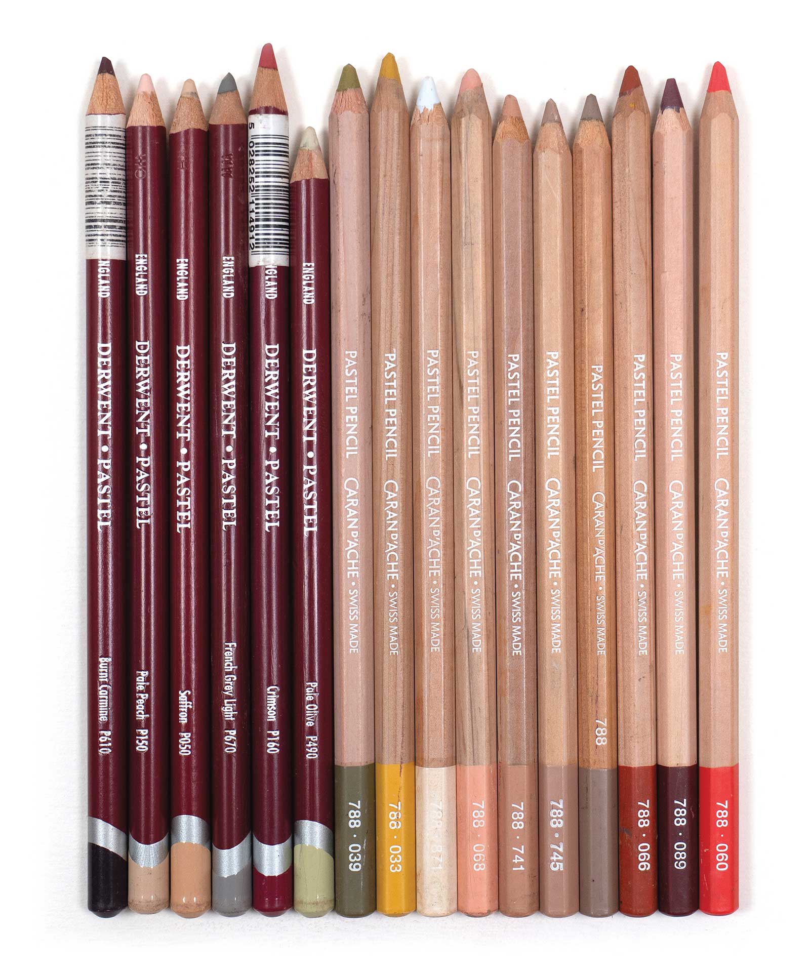
For facial features, I usually use pastel pencils. They allow for precision in areas where a larger stick would feel too broad. The combination of broad pastel strokes and fine pencil lines gives me control over both the structure and the subtle nuances of the work. These are the pastel pencils I use in every pastel portrait I create.
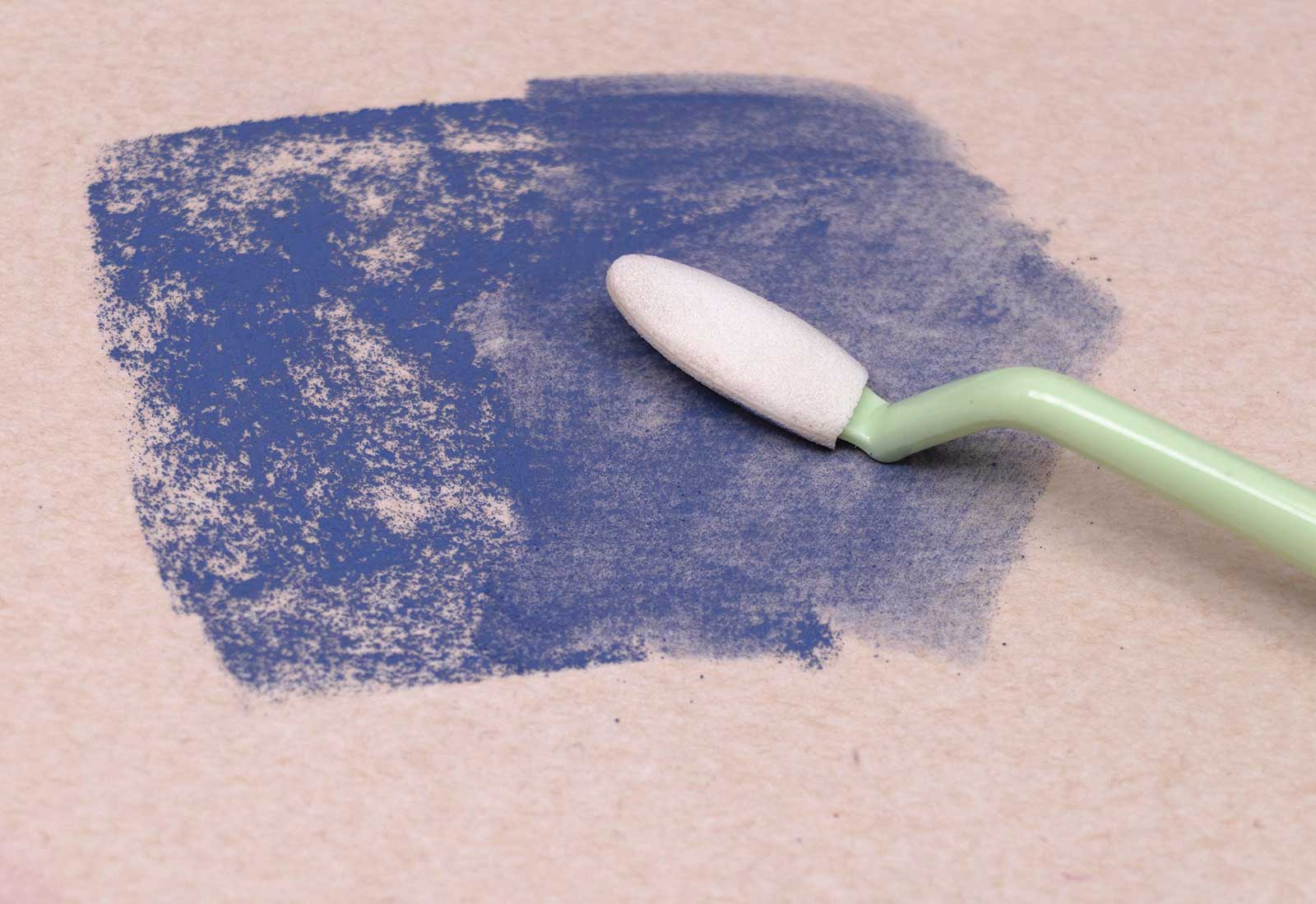
Below is the blending tool I use to soften my pastel marks. When you apply soft pastel to sanded paper, it creates an interesting texture that some paintings can benefit from. However, in works where the focal point is the face, that texture may appear too noisy and draw unwanted attention. This tool softens the texture, creating a kind of underpainting and making the paper more receptive to additional layers of pigment. It should be used with light pressure so that the natural pattern of the marks remains partially visible.
Stage 2 Color Study: Starting the Face
I begin by painting the figure’s face. However, to ensure I choose the right colors for the face, I start by blocking in the background behind the head. In painting, we select colors by comparing one shape to another, which means the background and the figure’s face must be painted in specific, harmonious color and value relationships, unique to each scene. I also like to establish my darkest darks at the very beginning. This helps prevent me from choosing colors that are lighter than necessary. In this case, the figure’s hair was the darkest area, so I painted it first before selecting the colors for the face.
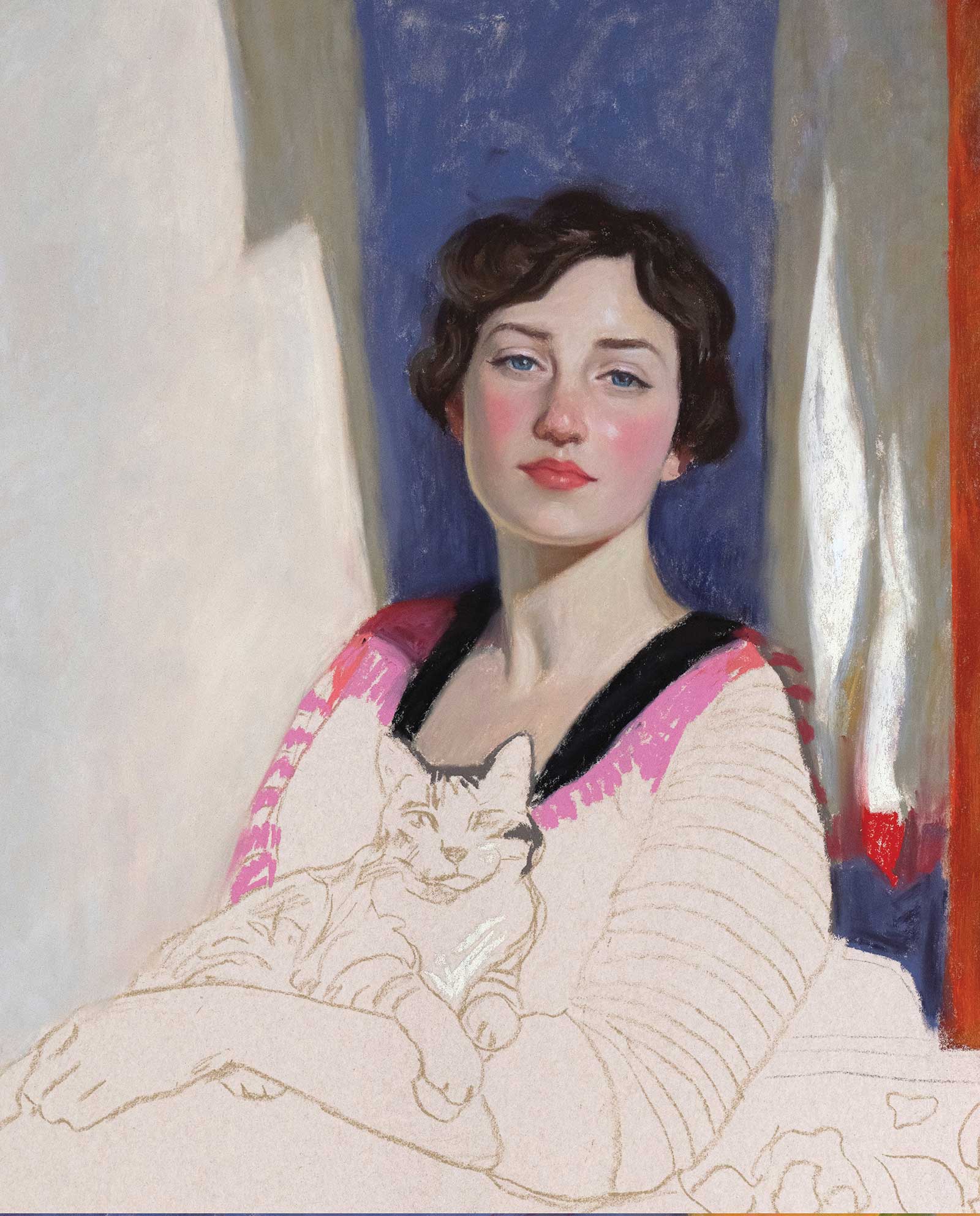
Stage 3 Color Study: Blocking In Major Shapes
Since I wasn’t aiming for a detailed painting, it didn’t take long to paint the face. I used pastel pencils for the facial features because the paper was small, and my pastel sticks didn’t allow for precise placement. Once I finished the face, I blocked in the other shapes with color. I applied soft pastels with very light pressure and didn’t cover the paper completely, knowing I would later use a blending tool to spread the pigment and soften my marks.
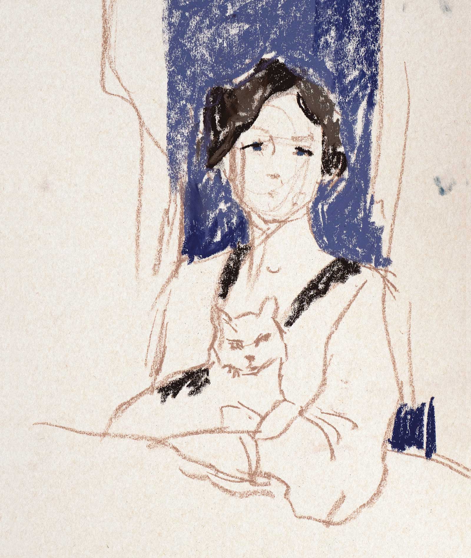
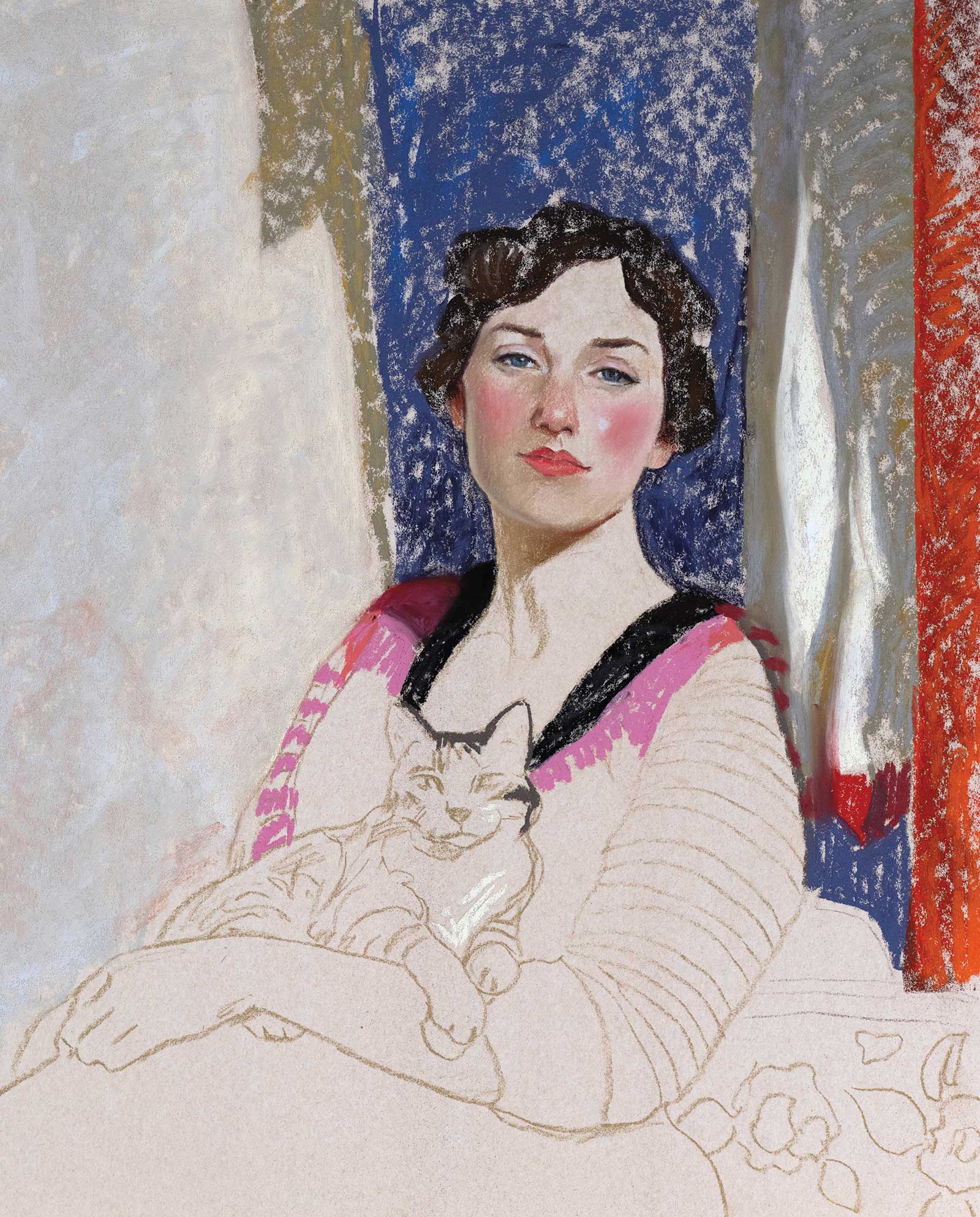
Stage 4 Color Study: Blending & Softening
At this stage, you can see how the blending tool softened my marks without making the color shapes look flat or evenly filled. I like to maintain a slightly broken surface in my pastel paintings. You can see what I mean by looking at the dark blue shape on the wall behind the figure: the pigment doesn’t fully cover the paper, allowing it to peek through in some areas. This effect contrasts nicely with the more opaque parts of the painting. At this point, I was happy with my study and felt ready to move on to the finished piece. This study took me about 30 minutes.
Stage 5 Starting Final Artwork
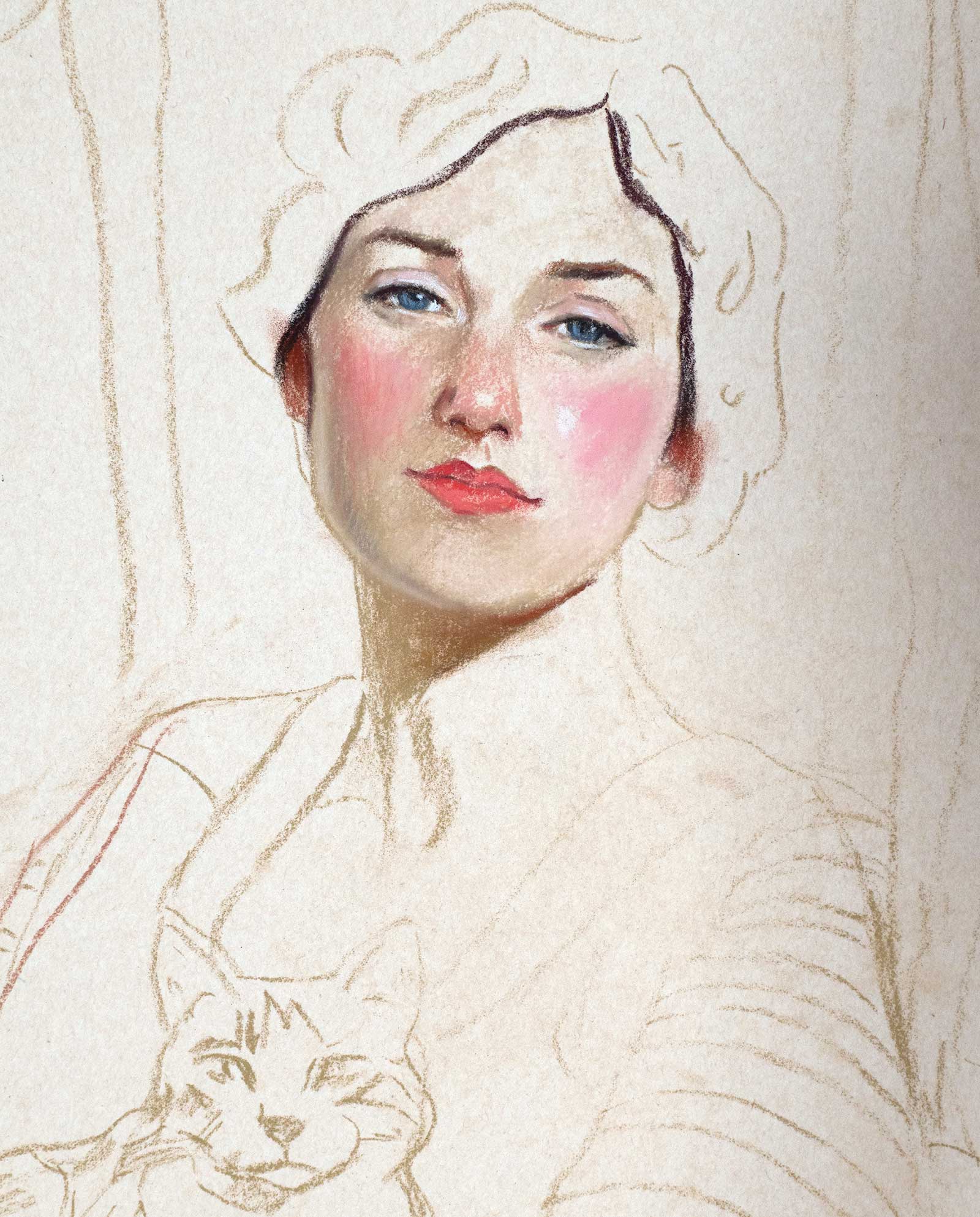
For the finished piece, I chose a 20 x 16” UArt pastelboard. It was large enough to allow for a more detailed portrait. I followed almost the same steps as in the study, with one exception: I worked on the figure’s features first with pastel pencils, then blocked in the hair and background with soft pastels. Since I already had the color selection from the study, I knew I could paint in any order without worrying about choosing the wrong colors. That’s why making a study is so important; it makes the painting process much easier and more intentional.
Stage 6 Details
When creating the drawing for the finished piece, I decided to include the palm of the woman’s hand to make the composition more interesting. Here, just like in the study, I blocked in some of the largest shapes with colors, applying soft pastel with light pressure, making sure to leave some of the paper visible. I find it very helpful to make a study for a painting on the same surface as the one chosen for the final piece. Different pastel surfaces create different effects, and if you like how your study turns out, you’ll want your finished painting to share those same qualities.
Stage 7 Reducing “Noise”
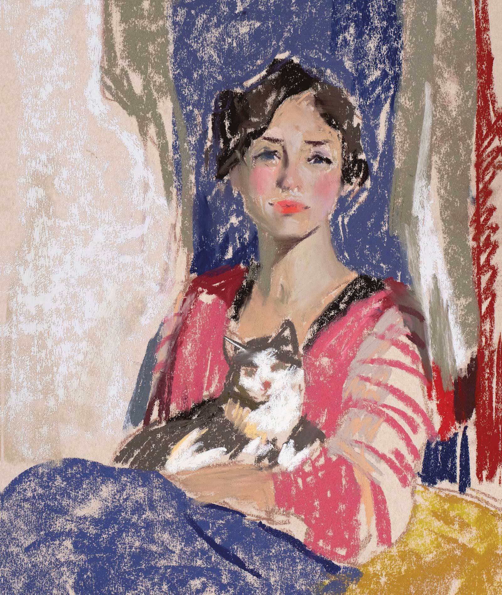
In this image, all the color shapes have already been softened with the blending tool, giving them a more finished and less noisy appearance. Since the surface of this board was larger than that of the study, I decided to finish the upper half of the painting first. Then I painted the cat’s face and the figure’s hand, followed by the woman’s clothes and the bench she was sitting on.
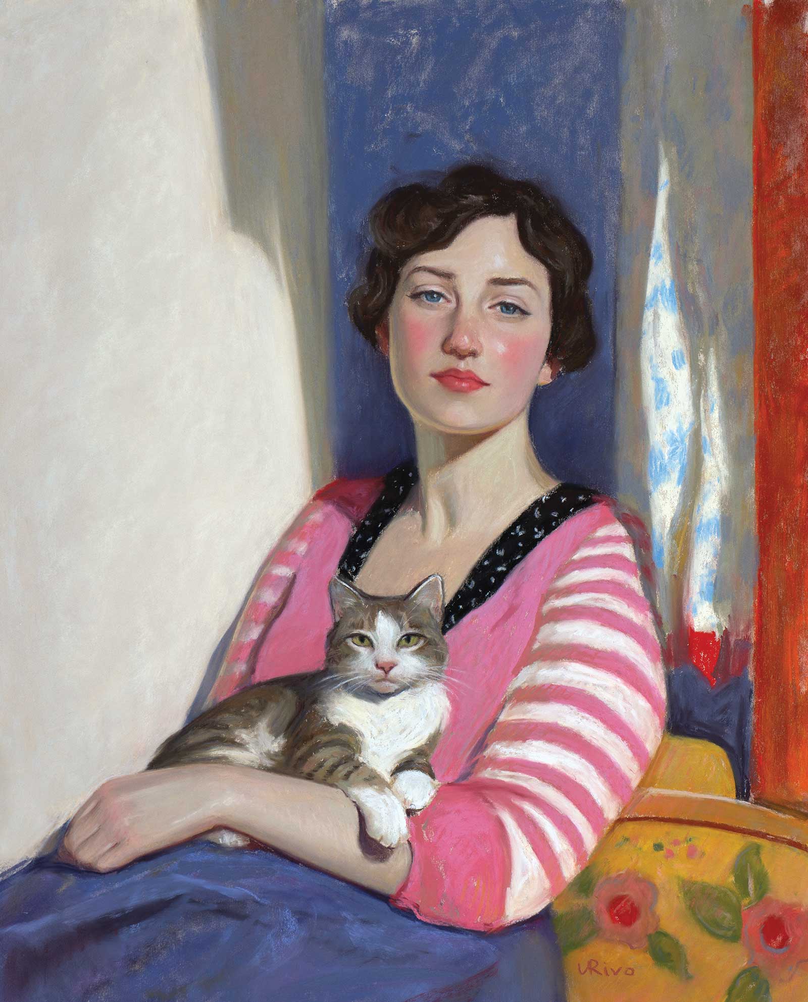 Sofia and Her Kitten, soft pastel, 20 x 16” (50 x 40 cm)
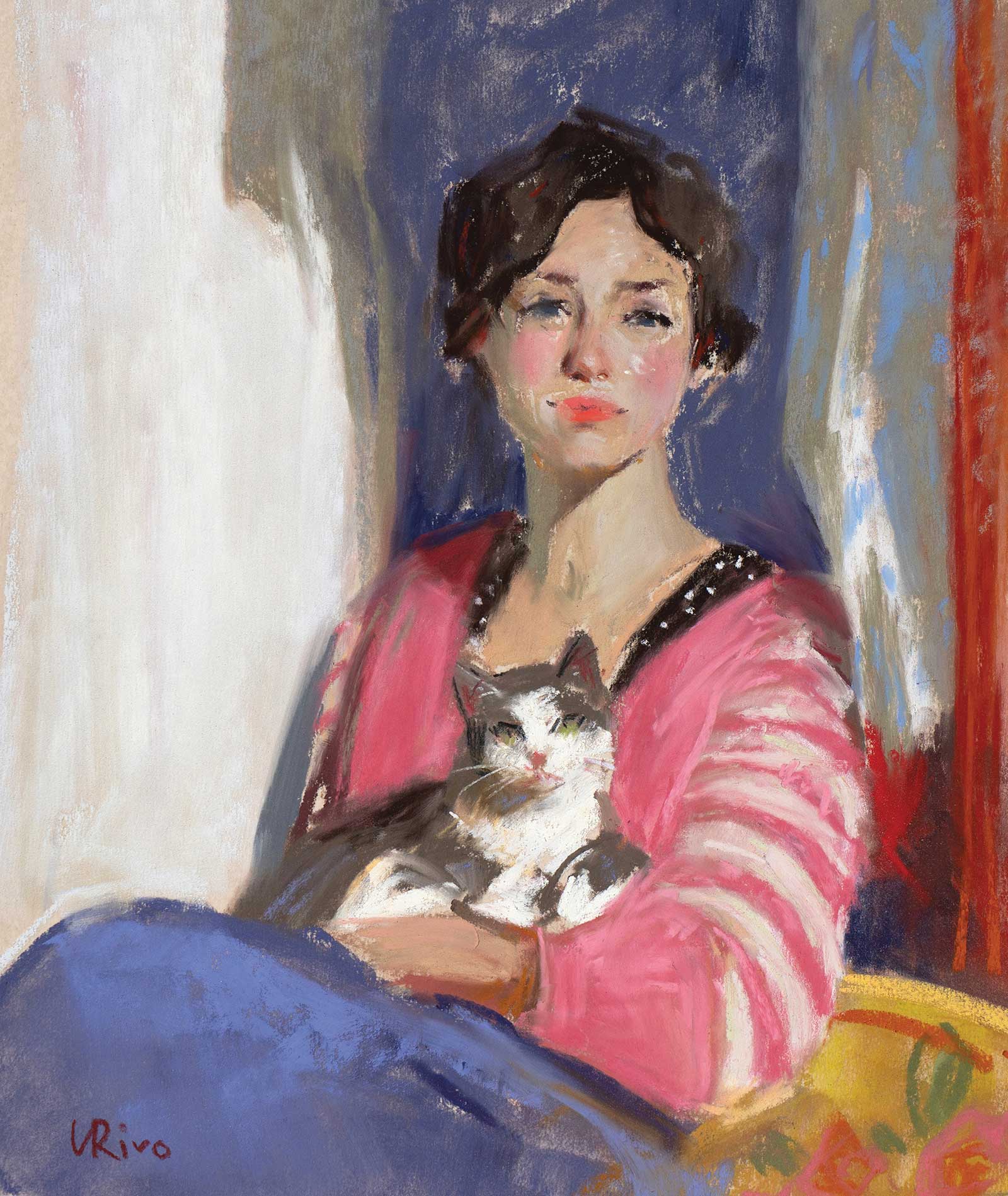
Stage 8 Finished Artwork
This is the finished painting. In contrast with the study, which took me only about 30 minutes, this larger piece required three two-hour sessions. I have learned that with soft pastels, I shouldn’t hurry to completion. Every mark and every line matters, and even when I feel the painting is finished, I usually take a good photograph and analyze whether anything needs correction. Photographs do a great job of revealing a painting’s weak points. I also try to avoid overworking my paintings, no matter the medium. As long as my work looks good from across the room, I consider it finished.
About the artist
 Lena Rivo
Lena Rivo is a professional artist known for her ability to capture light and atmosphere with gouache, oil and pastels. She is also a teacher, offering guidance to other artists. Rivo is based in Portugal and draws inspiration from various subjects, including seascapes, landscapes, florals, animals and figures.
In her 20s, Rivo studied drawing and illustration in Lisbon, but soon realized that much of what truly interested her lay outside the available academic programs. She continued her education independently, studying the works of great artists and reading their writings on the painting process. Joaquín Sorolla, along with French, American and Russian impressionists, had a particularly strong influence on her. Over time, she developed her own approach, one not tied to any particular style.
Alongside her painting practice, she shares her experience with other artists through social media, online courses and her article series the Painting Process, where she helps them explore ways to express light and atmosphere and make the most of their palette. Her work resonates with collectors across the globe, quietly finding its way into private collections across Europe, North America and beyond.
Contact at
lenarivo.com