


Architectural subjects always fascinate me. Whether it’s a collection of buildings or close focused detail, the formal geometry and abstract relationship of shapes always make interesting subjects. In this article we are going to pay particular attention to doors and windows. They are the features most closely related to humans. We look through them, walk through them, are protected by them, and they are the source of fresh air, privacy and security.
As well as the abstract nature of the composition, the character and function of the opening should be taken into account when we make a painting. Let’s look at some examples and discuss the techniques and approach to painting them:
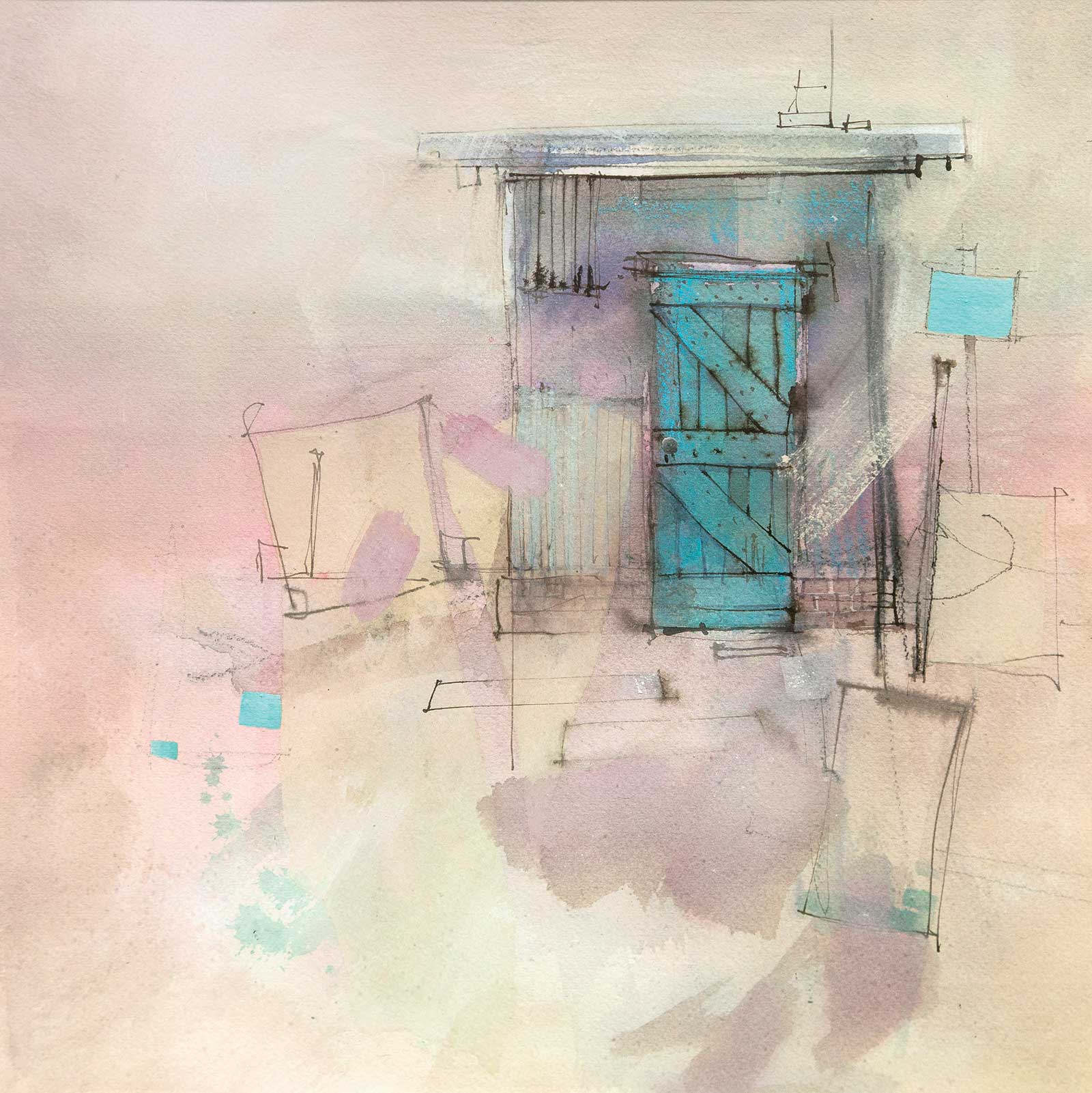
I love this small outstation shed on a cattle station in Central Australia. Everything is purely functional except for the crazy green paint on the door. That may have been functional too, but I prefer to see it as a nod to decoration. The warm, dirty yellows and pinks make a great contrast to the small patches of phthalo green. The door was first washed in with phthalo green, then some of the planks were adjusted with phthalo blue to give it more interest. Detail was added with a pen and burnt sienna pigment ink and a few charcoal pencil lines. For the sign on the fence and some little pieces of scattered junk, I used white gouache tinted with phthalo green. To get that shimmering effect, I kept the tinted gouache as close in tone to the background as I could.
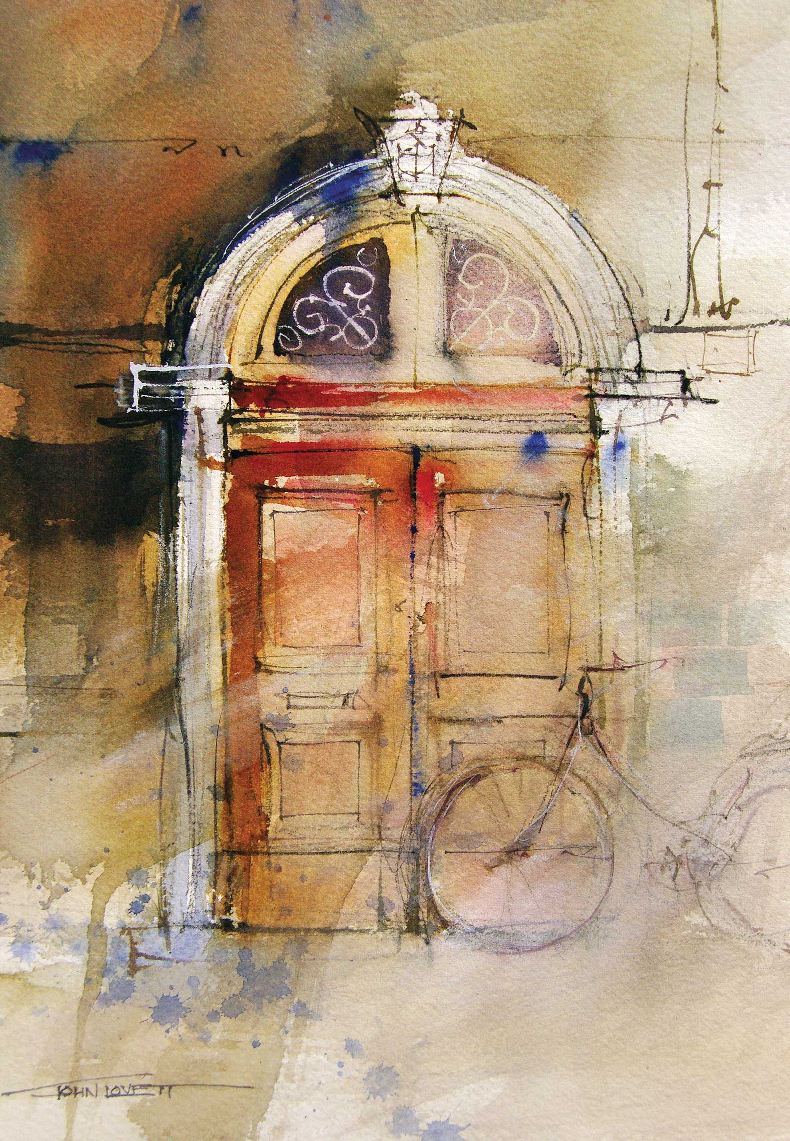
These big old oak doors in the city of Lucca, Italy, were impressive enough, but the bicycle parked in front of them added a sense of mystery to the story. Who owned the bicycle? Were they inside the building? Did some inconsiderate person park it across someone’s entry? Would they emerge soon to dash off into the town? All these questions called for a loose frantic approach in case the bicycle disappeared before the painting was finished.
I used a varied warm wash of mainly quinacridone gold and alizarin crimson, darkened and subdued in places with a little french ultramarine. While the painting was still wet, stronger alizarin was dropped into the door and a few spots of pure ultramarine were dropped around the focal area. Detail was added with a size 1 rigger brush and a mixture of dark brown pigment.
When the painting dried, the bicycle was washed over with a layer of gesso. This was thinned out with water, enough to subdue the bicycle but still have it visible without distracting from the focal area of the upper door. Finally, a few fine details were added with the rigger brush and white gouache. A splash of ultramarine was dropped into the bottom of the painting to coax the eye up to the focal area.
The bicycle stayed in place for the duration of the painting, so it wasn’t placed there for a quick getaway. The mystery still remains.
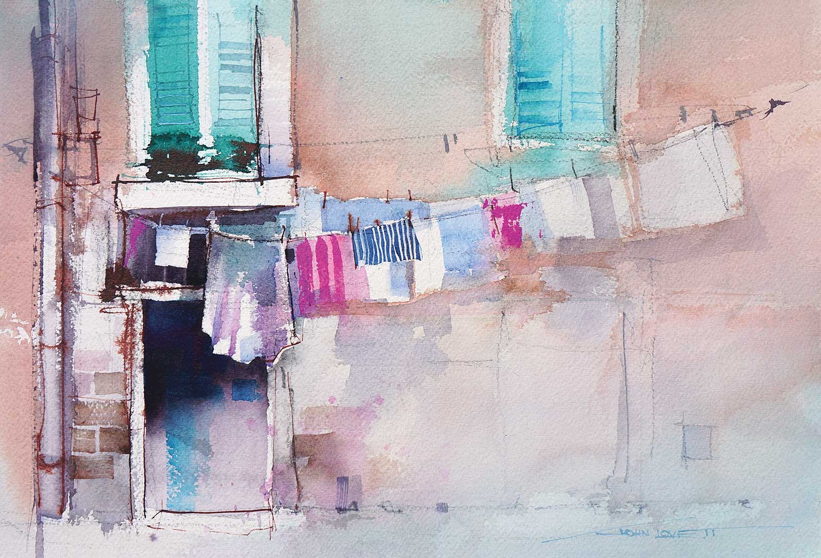
In Italy, washing day always draws attention to windows and doors. Here the washing can be retrieved from either of the different sized windows. This size difference causes the line to slope up to the right. By placing the strongest tonal contrast at the lower end of the line in front of the door, the eye can drift up along the line of washing but will always be drawn back down to the focal area. More intense color and sharper detail around the door and larger window reinforce the focal area. In this painting I used French ultramarine blue, cobalt blue, phthalo blue and phthalo green. The warm wall was made with a wash of alizarin crimson and quinacridone gold cooled in areas with the blues. The strong pink was pure medium magenta.
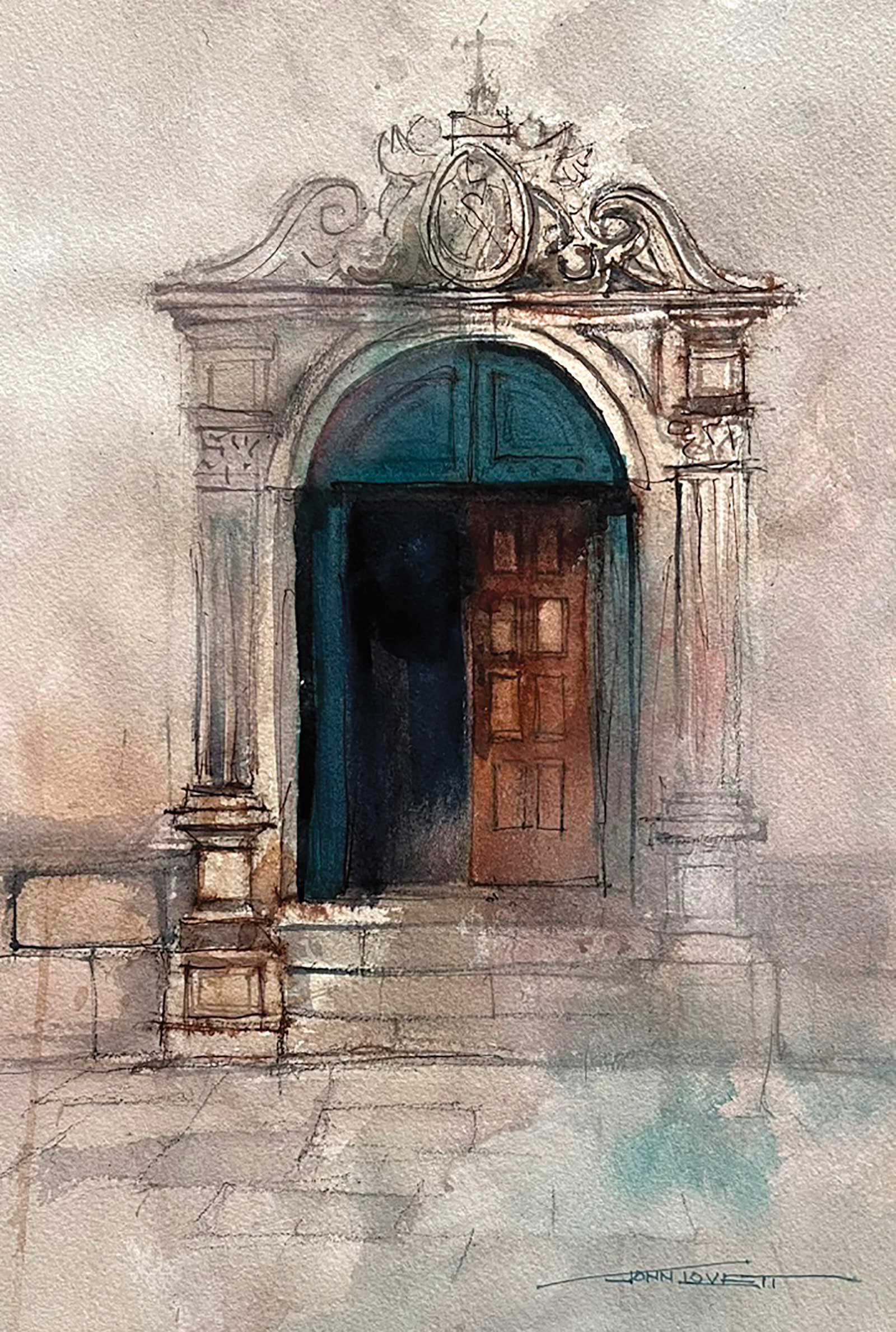
These big timber doors are the entrance to an old church in Portugal. Because of the formal symmetry of the entrance, I kept the arch, columns and ornate decoration centered on the paper. By arranging the strongest tonal contrast in a diagonal from upper right to lower left, the symmetry is subdued and the door has a more dramatic character. The dark bottle green (phthalo green, alizarin and quinacridone gold) relieves the overall warm color arrangement, and with the loose splash in the foreground, leads the eye into the focal area. Perspective in the foreground paving stones locates the viewer squarely in front of the door, adding to its drama and importance. The dark opening was kept cool to make it recede (French ultramarine with a little alizarin and quinacridone gold).
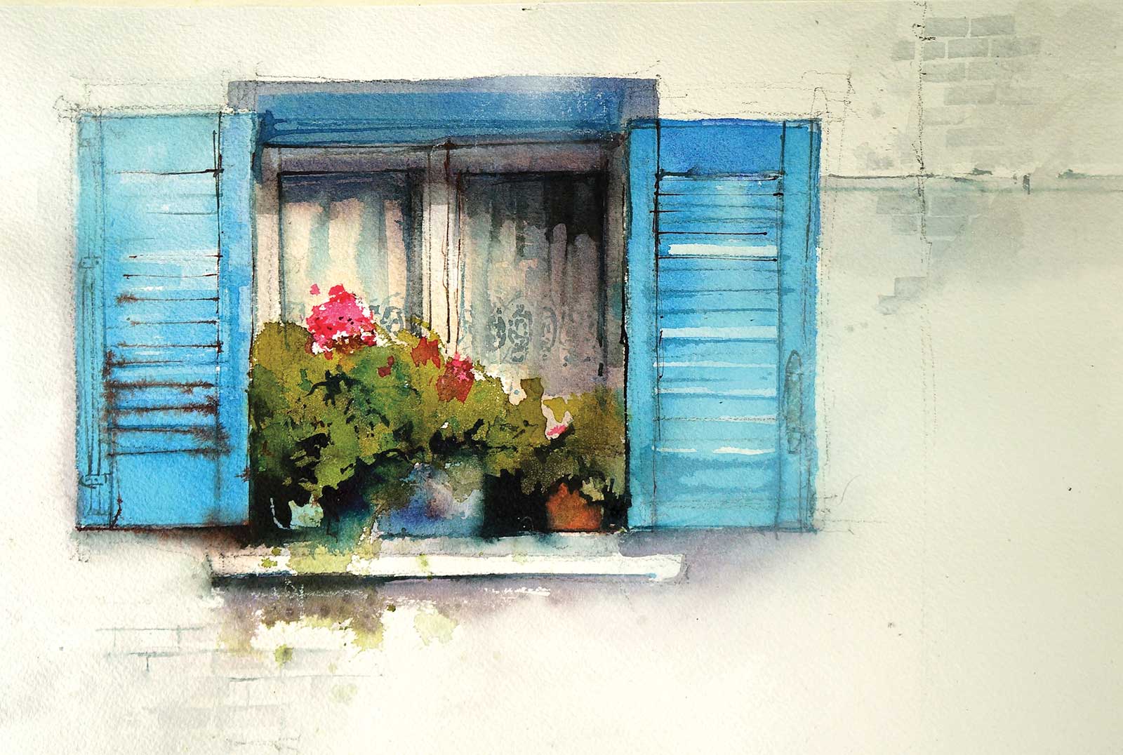
This little sunlit window, stacked with geraniums and protected by two pale blue shutters caught my eye with its bright, contrasting colors. Placing the window off center in a horizontal format provides a more interesting composition. The slightly warm wall and curtains contrast with the cool blue shutters and window frame. The red geraniums and curtain details build a strong focal area balanced by the suggestion of bricks and wiring in the diagonally opposite corners.
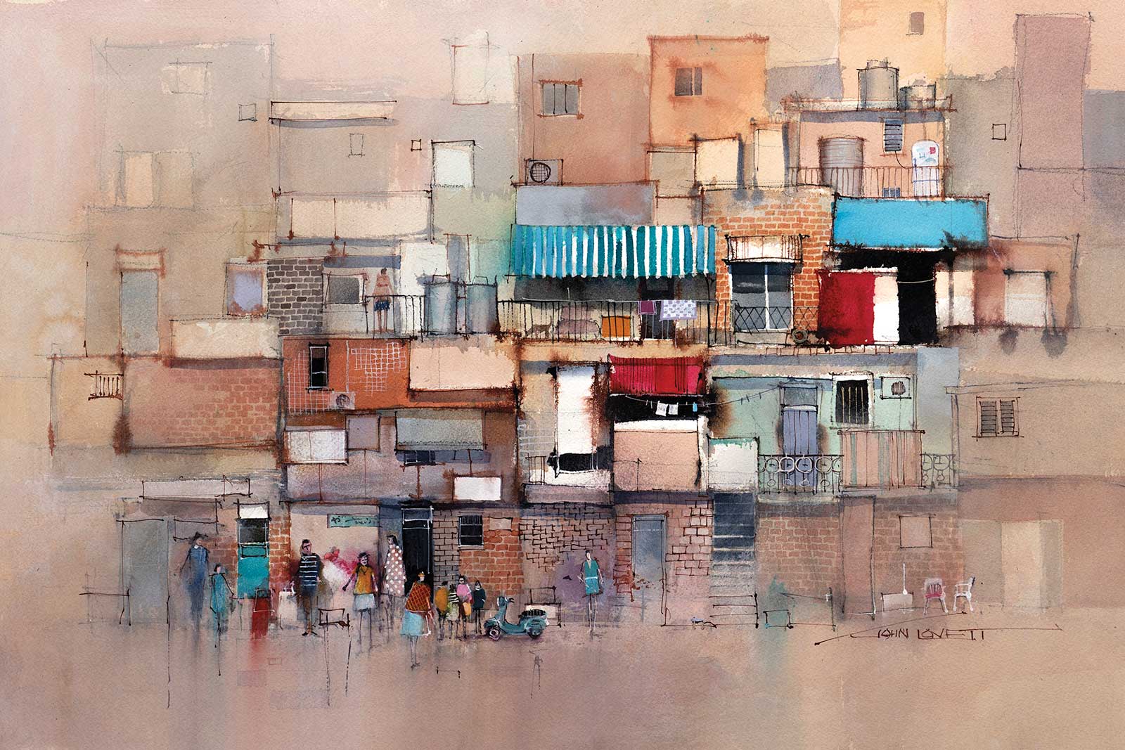
Sometimes one or two windows is just not enough. This chaotic collection of buildings is covered with doors and windows of all different shapes and sizes. This is where a ½” and ¼” long flat brush comes in really handy. Most of the openings can be painted with one or two brushstrokes, and they all stay sharp and square. With busy subjects like this it is important to not only vary the shape and size of the openings, but also the color and tone.
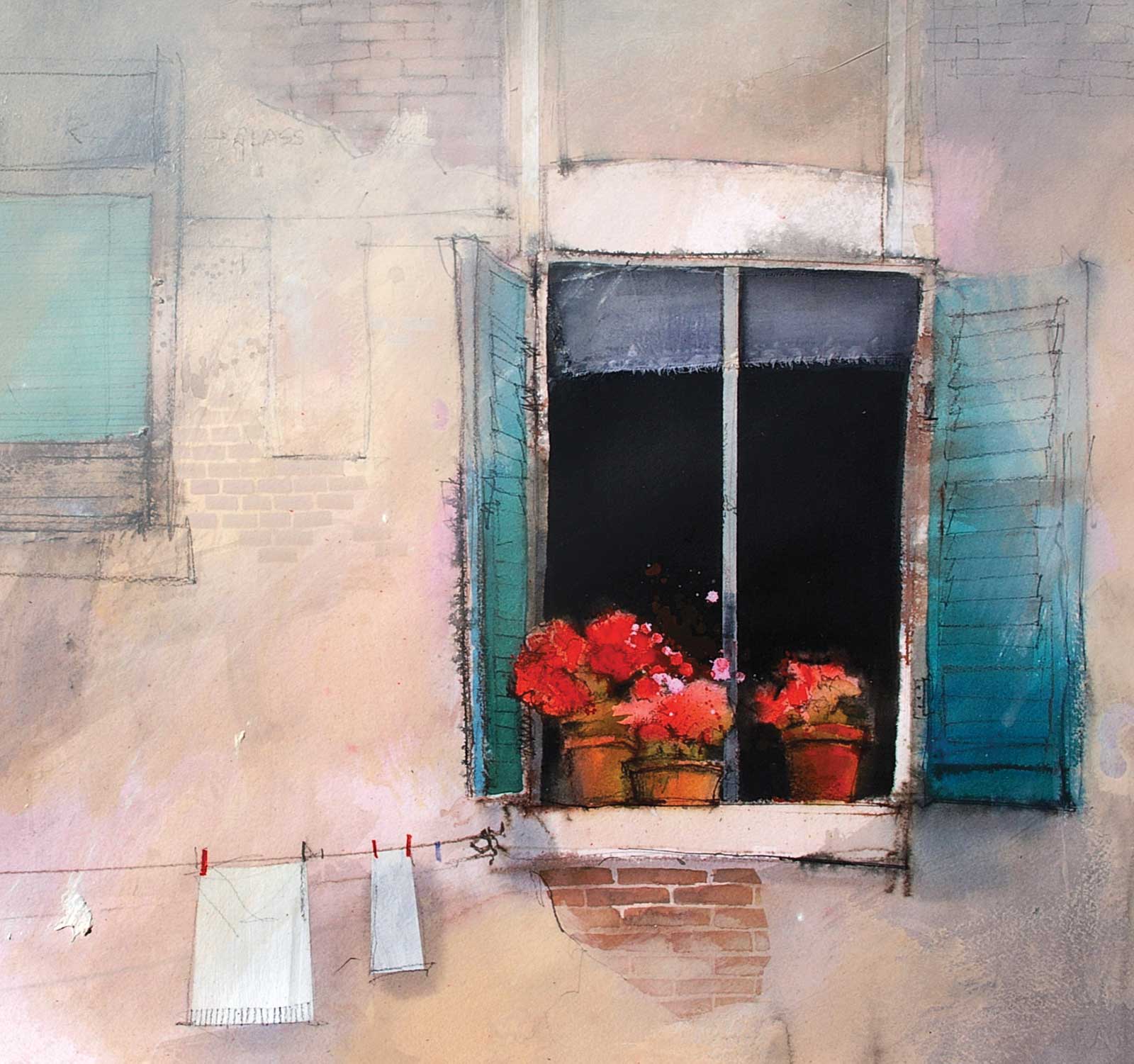
These red geraniums against the cool, slightly blue dark of the open window really draws attention to the focal area. The window blind is a collage of fine cloth glued to the paper with neutral pH PVA glue then washed over with shadows once the glue dried. The smaller green window to the left balances the main window and puts the focal area in a good position within the square format.
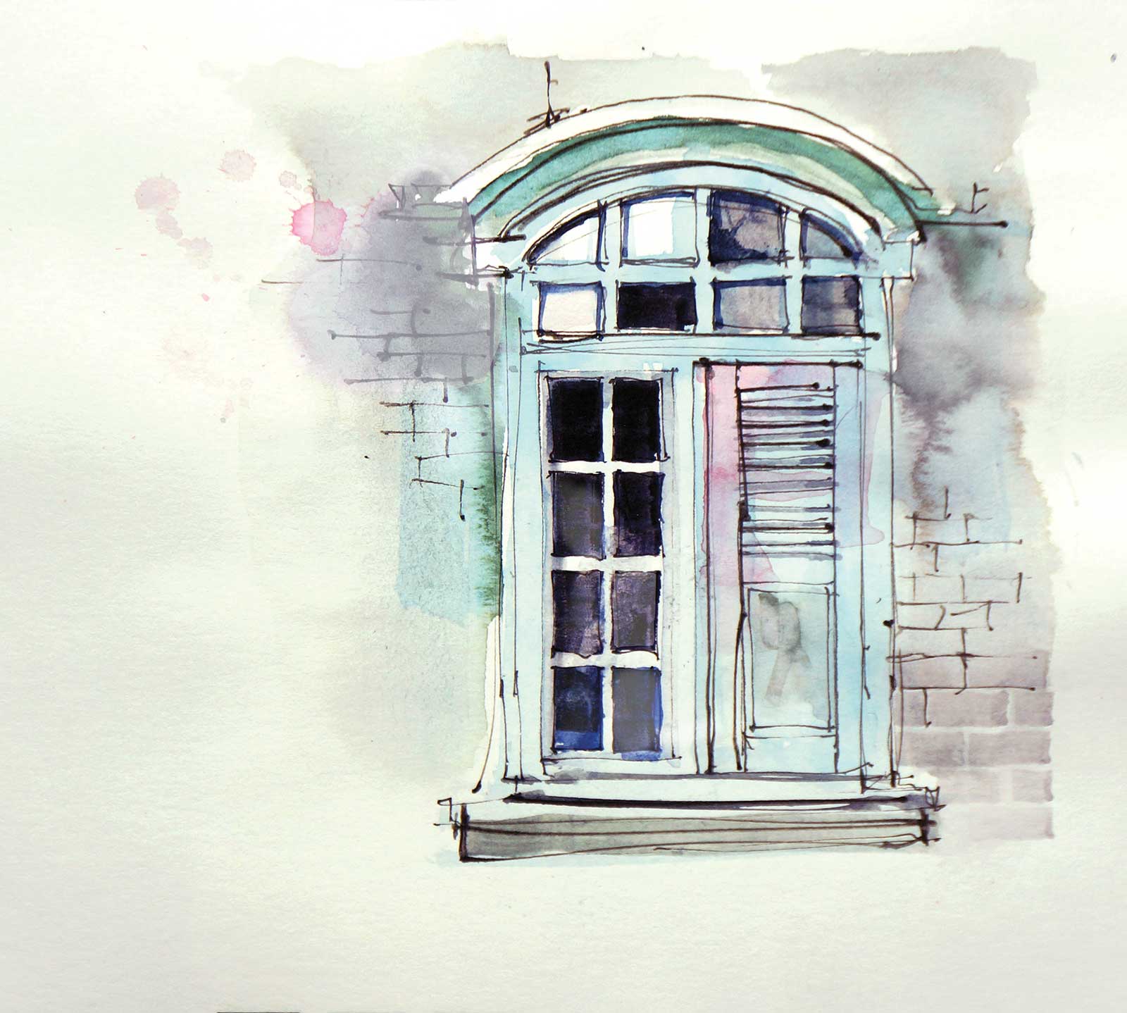
This is a quick sketch of a beautiful timber framed window in an old colonial building in Singapore. I love the pale phthalo green. To make it more interesting, I dropped in some contrasting permanent rose to help pull the eye up to the focal area at the top left. The light reflecting off the glass in the top left also reinforces the focal area. Making each of the window panes slightly different makes the sketch more interesting than if they had all been treated in the same way.
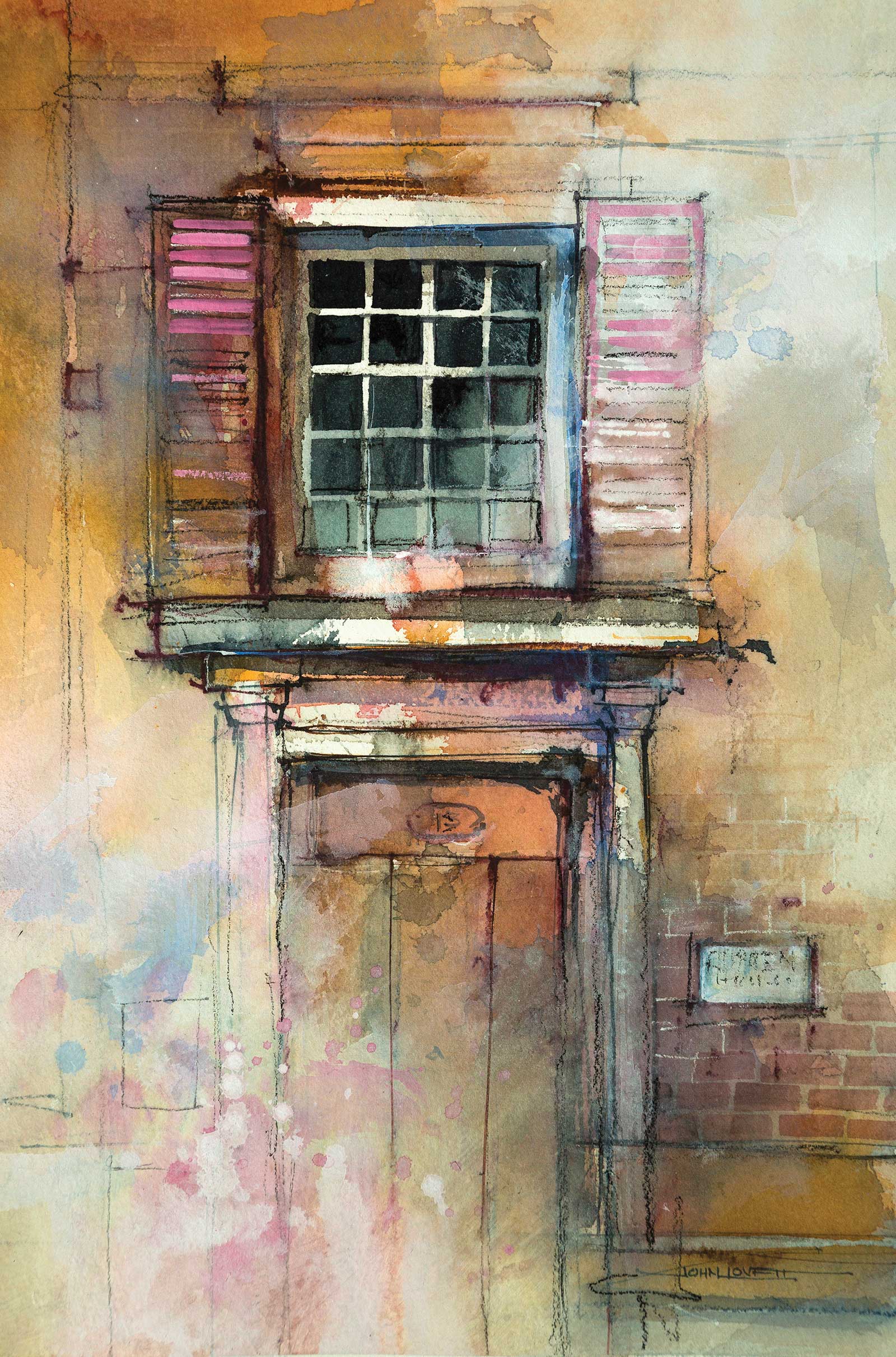
This old door, constructed of three large slabs of timber, leads the eye up to a detailed overhead window framed by two pink shutters. The color temperature of this painting is predominantly warm (quinacridone gold and permanent rose) and is relieved by a cool blue/gray made from phthalo blue, alizarin and a tiny amount of quinacridone gold. Loose splashes of permanent rose, the cool blue/gray mixture and some white gouache were layered over one another to add to the dilapidated texture of the wall and door. Strong light striking the window was suggested by leaving white paper contrasting against the cool dark squares of the window. This holds attention in the focal area and is supported by white paper left in the sill and window frame. Loose charcoal pencil lines suggest detail around the door and window and add to the functional, well-used nature of the door.
Doors and windows make great painting subjects. They are simple and easily understood, allowing you to play around with all sorts of techniques and approaches. They can be treated realistically or pushed towards abstraction. The thing I love about a simple subject like this is the opportunity to experiment and push things past where you feel comfortable. So head outside and find yourself an interesting door or window. They really are a lot of fun. —
Contact at
johnlovett.com