


Grand Prize
Grand Prize is a four-page editorial feature in American Art Collector magazine
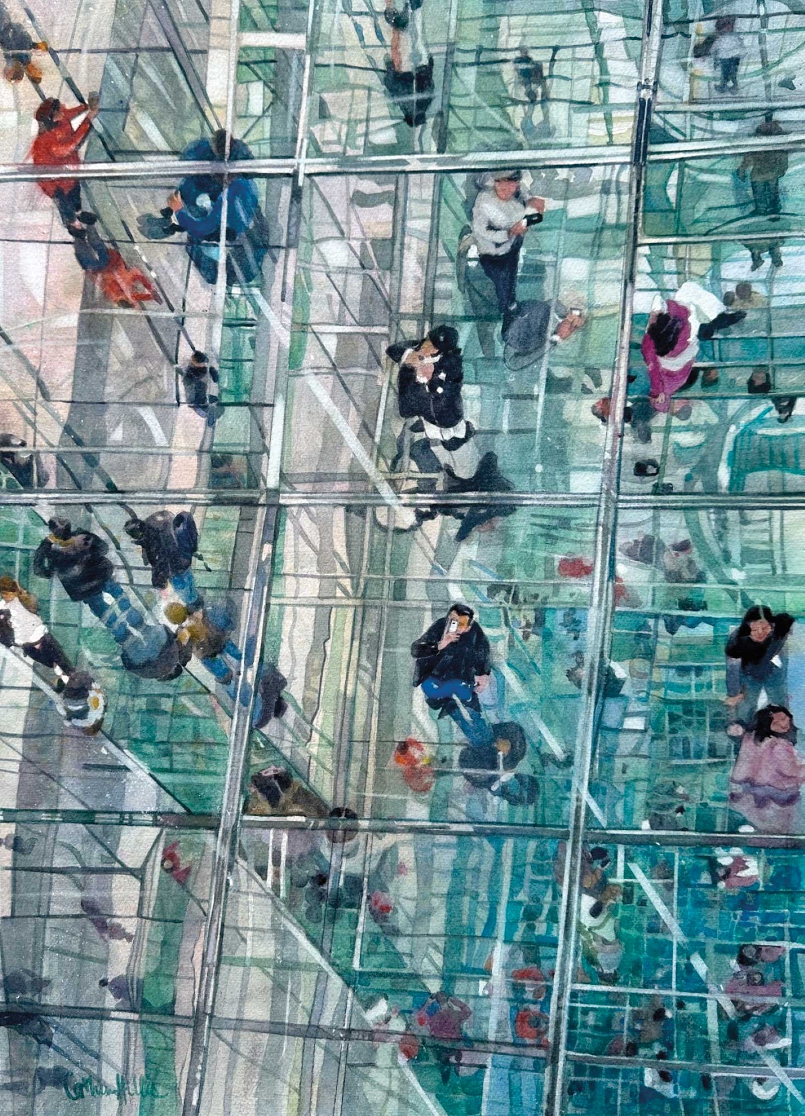 Freefalling, watercolor, 26 x 20” (60 x 50 cm)
Catherine Hillis
Virginia, USA
Moments of Reflection
Catherine Hillis is a transparent watercolor artist who is madly in love with the medium. She enjoys working in realism as well as impressionism, with her own style falling somewhere in the middle of the two.
“I find inspiration wherever I go,” she says. “I’ve often passed an ordinary scene that suddenly appears evocatively beautiful, and I must paint it.” Hillis works both in the studio and in plein air, and while studio paintings take more time, painting outdoors on site forces the artist to think quickly on her feet. She credits plein air painting with improving her technical and compositional skills on a major scale.
“Light pulls me in. Everything I paint is about light,” she adds. “I enjoy seeing reflective light and shadow and its effects on the shapes around it. I also enjoy painting in a series so I can investigate everything I can about my subject. Figures interest me as well, and it amuses me to paint contemporary figures in action, especially with their cell phones. This allows me to also make a comment on society and culture.”
Her Grand Prize winning piece, Freefalling, features people looking up through glass panes taking pictures with their cell phones.
My Inspiration
The past few years I’ve been painting a series of reflective glass buildings in the studio. I love the way light and reflections interplay with architecture. My first series was of Reagan National Airport in Washington, D.C., but then I discovered Summit One Vanderbilt in New York City. How I love painting the angles of that building and the crazy things that happen to reflections there. Geometric shapes become abstracted in unexpected ways, and I love the lines and shapes I see happening. It’s so exciting!
My Design Strategy
I take a large number of photographs when I see a subject and the light is just right. After I’ve loaded photos onto my computer, I take time to think. This can entail weeks or months. I contemplate designs I think will work before I settle on one. My subjects can be very complex, and I must edit what to keep and what to delete, soften or even combine with another photo.
My Working Process
Most of my time is spent working on design and on the drawing. Once I decide on a design, I create small black-and-white sketches to be sure the composition is first rate. I constantly remind myself that not everything needs to be painted. Drawings take me a long time to complete and are my favorite part of the process. I take my time enjoying myself. Once my drawing is complete, the painting is pure fun. I usually have a title in mind at this point, which clarifies my narrative, then I select a triad that will express the subject. If I have a good design and a good drawing, the painting will go quickly.
Contact Info
Email: catherine.h.hillis@gmail.com
Website: catherinehillis.com

Second Prize
Second Prize is a two-page editorial feature in American Art Collector magazine
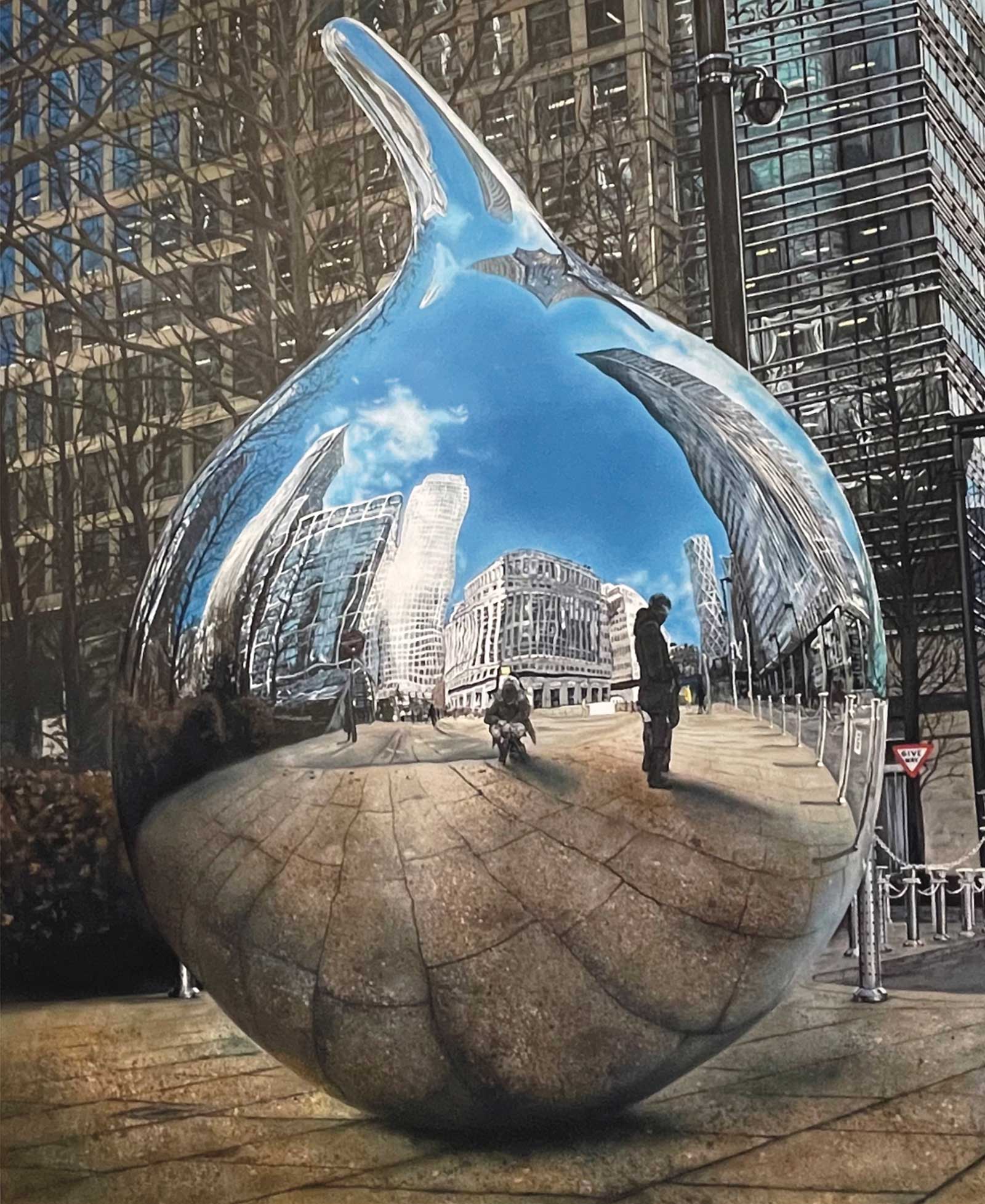 Tear Drop, acrylic on canvas, 47¼ x 391⁄3" (120 x 100 cm)
Susan Bull
Essex, UK
My Inspiration
Photorealism artists such as Estes, Sparnaay, Goings and Averbach are my idols. Capturing what are often considered mundane everyday objects or city scenes into lifelike works of art blows me away. The Tear Drop, a sculpture located in East London, depicts the ever-changing evolution of the business district. With glass and metal in abundance, the reflections on Tear Drop preserve a split second in time, serving as a memory of the many years I spent in that landscape. It’s pleasing to see viewers recognize that there is more to see than just the object in front of them.
My Design Strategy
Taking the photos myself, my ambition is to capture the best reference of reflections on bright sunny days; the light, colors and contrast create a multi-dimensional experience, enabling the ability to portray to the audience a vision of what’s in front of me while simultaneously revealing what lies behind or around me. I’m in a continual challenge to observe the perfect shiny subject matter, capturing it and then moving it to canvas. What features in the reflection is extremely important too. And, just like Estes, I often include myself in the reflection as well.
My Working Process
Especially for large-scale work, using the grid method is helpful, sketching the composition onto the canvas for accurate proportions. I then start painting wherever the moment takes me. I have no real discipline in that respect. Working in acrylics, I build the painting through multiple layers and sometimes partially use an airbrush for soft edges, while preserving the clarity of the surrounding structures. Throughout the process, I continually step back to ensure the composition maintains the perfect curves as well as depth and correct lines of perspective. It is not a fast process but certainly a rewarding one.
Contact Info
Email: sue@suedio.art
Website: suedio.art
Third Prize
Third Prize is a one-page editorial feature in American Art Collector magazine
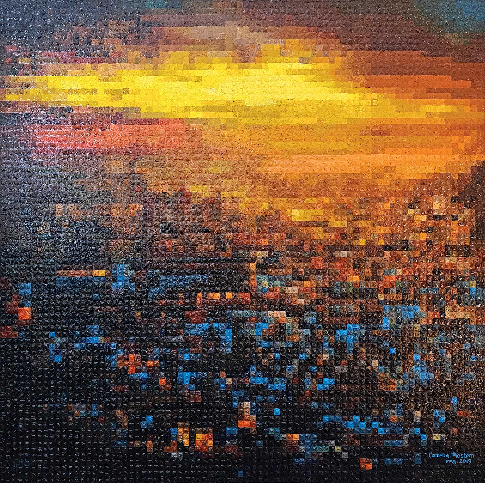 Verso un nuovo orizzonte, acrylic, 31½ x 31½" (80 x 80 cm)
Camelia Rostom
Milan, Italy
My Inspiration
I was first inspired by the pixelated aesthetic that transforms an image into a mosaic of vibrant color blocks. The idea of creating a painting filled with countless small details immediately fascinated me. I began with a traditional flat pixel approach using acrylic paint, but the result felt too static and lacked the depth I envisioned. Wanting the colors to stand out and to make the work more personal, I enhanced each section with thicker, textured paint. This allowed every pixel to become its own expressive element, bringing the entire composition to life in a more dynamic way.
My Design Strategy
My design strategy began with selecting an image that offered strong contrasts and areas of detail that would translate well into a pixelated structure. I used Photoshop to refine the composition, enhance key elements, and convert the image into a precise pixel grid. This helped me determine the exact scale—each pixel measuring 1 cm—so the final piece would fit perfectly within the 80 x 80 cm format. I focused on balancing warm and cool tones to create rhythm and depth throughout the composition. The structured grid provided clarity, while the expressive color choices kept the work visually engaging.
My Working Process
Once the digital preparation was complete, I primed the canvas with gesso and a base layer of acrylic paint to ensure an even surface. I then carefully drew the entire grid by hand, marking each 1 cm square that would become a pixel. Working section by section and following the color map generated in Photoshop, I painted with the canvas laid flat on a table for greater precision. I used a single brush for the entire painting, repeating the same controlled movement for every pixel. This deliberate consistency created a unified texture and rhythm, allowing the image to gradually emerge with clarity and depth.
Contact Info
Email: cococrazycamelia@gmail.com
Website: cococrazycamelia2.wixsite.com/cameliarostomart
Finalists
Each receives an Award Certificate and a one-year subscription to International Artist magazine PLUS having their work seen worldwide by international galleries looking for new talent.
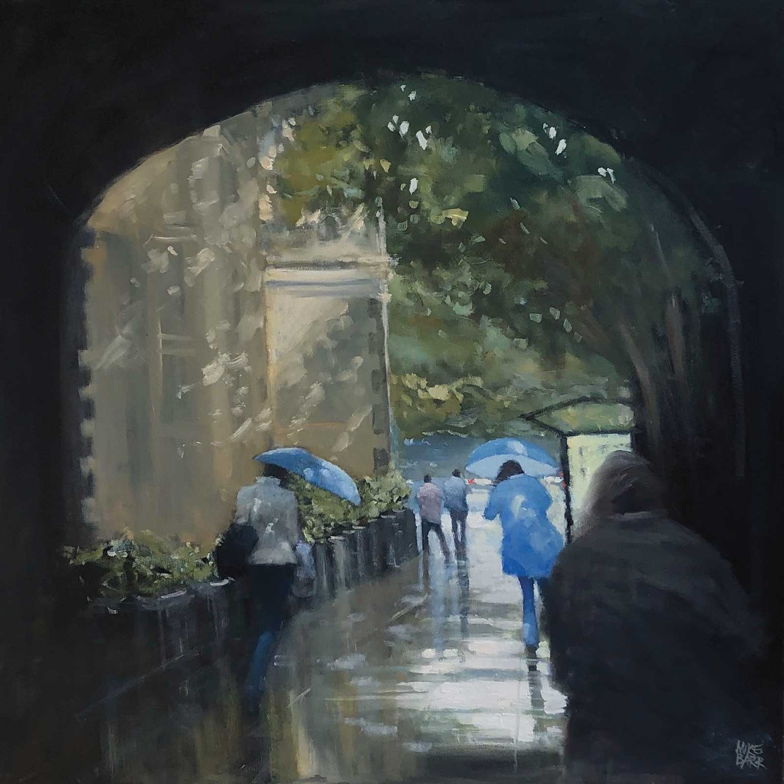 Town Hall Sun Shower, oil, 30 x 30" (76 x 76 cm)
Mike Barr
Adelaide, South Australia
My Inspiration
As I always say, “paint what you know,” and I really know this area of the Adelaide Town Hall. For a number of years I used the bus stop on the righthand portion of the painting to catch my second bus to work—beautifully reflective in the rain and amazing in the sun as the big plane trees produce dreamy dappled light. I’ve painted it many times, and they’ve all been different. It’s certainly my favorite place to paint in the streets of Adelaide.
My Design Strategy
Painting street scenes is nothing without including what is going on in them. So, people who are going about their everyday business can bring a painting to life like nothing else can. The lady in blue on the left is a primary focus that leads into the rest of the scene, while the dark figure on the right foreground balances things out. I love the idea of the painting bursting out of the darkness of the arched portico; it’s a natural progression for the eye to follow. And there is nothing like rain to add some drama.
My working Process
Importantly, I don’t start with a pencil sketch but draw rough shapes with a brush. It helps with the overall dynamism of a painting and gets rid of the rigidity of a pencil sketch. Interestingly, this work started as a straight gray rainy day, but midway through I decided that a sun shower look would be better. I had no reference for dappled light, so I used what I had in my memory of them. The light on the walls and dappled light on the figures set up the scene. I was very happy with the way the combination of rain and sun worked out.
Contact Info
Email: info@mikebarrfineart.com
Website: mikebarrfineart.com
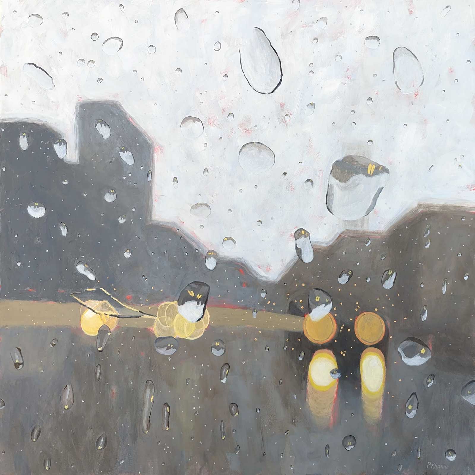 Rain-kissed Metropolis, acrylic, 30 x 30" (76 x 76 cm)
Poonam Khanna
Toronto, CanadaMy Inspiration
I find cities inspiring. They are vibrant ecosystems where we come together to share our ideas and creativity. The dazzling lights and towering architecture serve as a constant reminder of human aspiration and innovation. I also love the anonymity cities provide, as well as the ability to observe others as they go about their daily lives. Finally, cities can be especially beautiful even at their dreariest. As rain blurs the lines between objects, and car headlights and streetlights shine on the pavement, a once familiar landscape is transformed, and the world becomes both grayed out and filled with light.
My Design Strategy
I used a limited color palette of ultramarine blue and burnt umber for the background and a number of yellows for the focal point of the car headlights. The yellows also appear throughout the painting in the raindrops to help unify the painting. It essentially has two foregrounds: the car headlights and beyond that, the invisible window pane that the raindrops are resting on, reflecting and distorting the world behind them. The raindrops add texture and interest to the otherwise simple composition. The angular raindrop at the focal point stands in contrast to the more organic shapes of the others, bringing the eye there.
My Working Process
My process begins with the reference photo. When it rains, I often head out to take pictures through different kinds of glass: car windows, bus shelters, streetcars, storefronts and a piece of glass from a frame (my portable window). Because I’m not aiming for realism, I typically begin with a red ground, letting some of it shine through. It adds pops of unexpected color throughout the painting. I spend a lot of time softening the edges in the background as the rain tends to blur lines between objects. As I paint in acrylics, this can be challenging.
Contact Info
Email: pkhannaemail@gmail.com
Website: poonamkhanna.ca
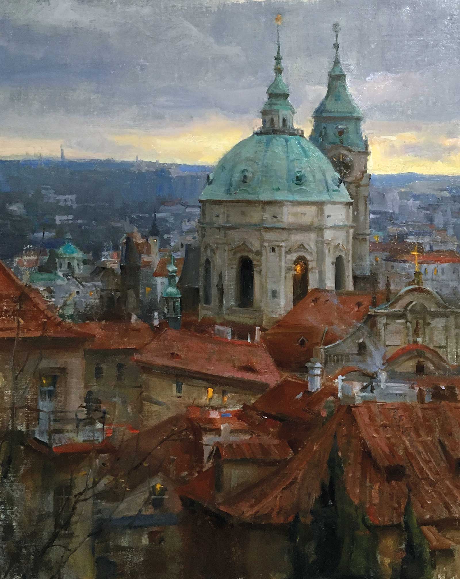 View from Prague Castle, oil on panel, 20 x 16" (50 x 40 cm)
Kyle Ma
Texas, USA
My Inspiration
I went on a trip to Prague last year, and one morning, I walked to Prague Castle. Along the way, I was inspired by the harmony of blues domes, red rooftops and oranges from a few streaks of morning light breaking through the clouds. As I came across the scene, I felt that this subject perfectly summarized all the things I loved about Prague.
My Design Strategy
For the design I wanted to find a way to show the subtle winter morning light while keeping enough contrast to make an engaging painting. I used the streak of light near the horizon to create contrast against the dome, and pushed the blues in the distance to create the atmospheric effects. I also rearranged the red roofs to better lead the eye to the dome, and created a subtle value gradation on the dome to make certain parts of the dome stand out more. Lastly, I used the streetlights that were gradually turning off as the sun came up as an additional element to add interest and reinforce my focal point. While this is a realistic painting, I spent a lot of time thinking about it in abstract terms, considering what arrangement of shapes would work best rather than staying literal to my subject.
My Working Process
The process behind this painting was a lot of trial and error. I began by referencing a few sketches I did on location in Prague for color ideas. Then, I blocked in my major shapes of color, considering the big relationships and overall harmony. I then continued to make subtle adjustments to colors and shapes until it felt like what I remembered observing that scene from life. Then I slowed down and worked on key details and refined my drawing. In the end, I assessed all my decisions and made final touches.
Contact Info
Email: kylekcma@hotmail.com
Website: kylemafineart.com
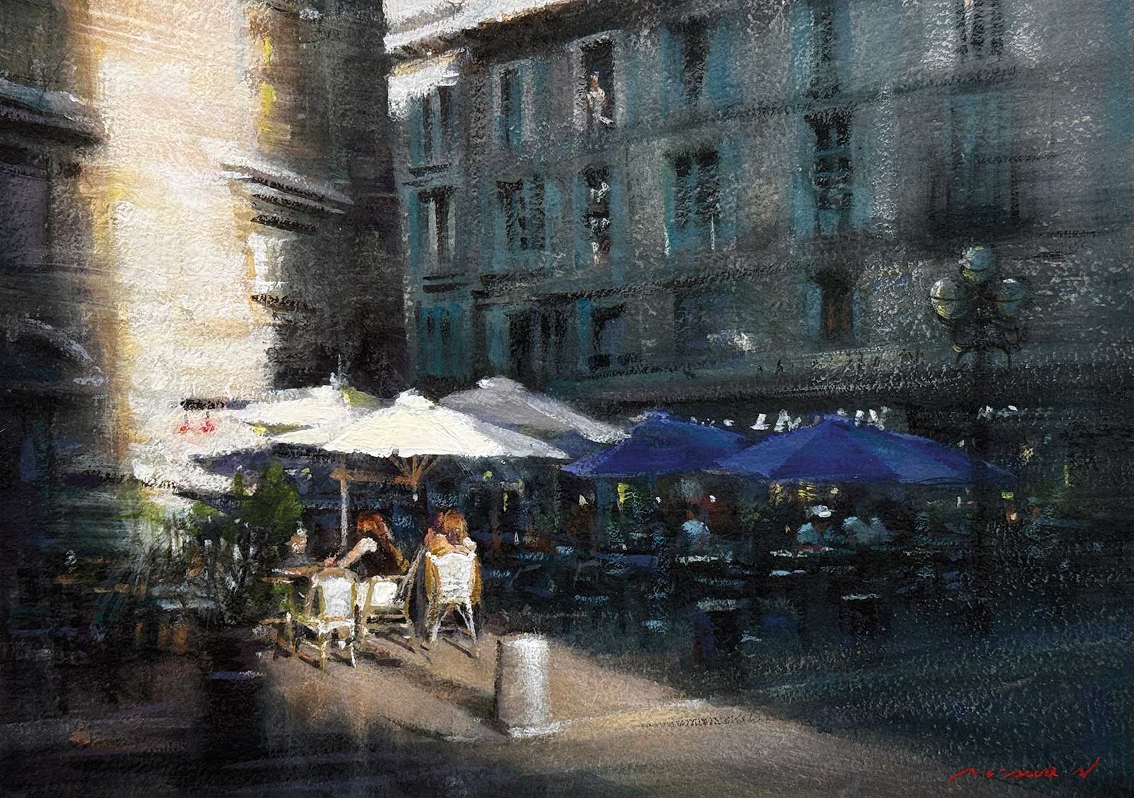 Café in Avignon, opaque paint, 9 x 12” (22 x 30 cm)
Misure Nien
Changhua City, Taiwan
My Inspiration
The inspiration for this piece is the dramatic light contrast defining a moment in an old Avignon street. I aimed to capture the timeless atmosphere where blazing sunlight meets deep shadow. The strong, almost abstract, golden glare on the left symbolizes warmth and immediacy. The café acts as a quiet refuge, where the human element grounds the scene in the simple comfort of everyday life.
My Design Strategy
The design relies on a strong diagonal divide created by the sunlight’s edge, directing the eye immediately to the focal point: the figures under the parasols. Cool slate-blue and deep green hues dominate the historical background, providing depth and stability. The bright white umbrellas and warm-toned figures serve as visual anchors, balancing the dominant cool palette. The simplified human forms are treated as silhouettes and shapes to emphasize the overall atmosphere, ensuring that the light itself remains the central focus of the composition.
My Working Process
Executed in opaque water-based media, the process emphasizes texture and layering. Initial washes established the contrasting light and shadow masses. I applied dry brush techniques heavily to the building and pavement areas to mimic the rough texture of old stone and street dust. Thicker, more saturated layers were used to build up the dazzling intensity of the light zone. The final details—the figures and umbrella edges—were rendered with cleaner, controlled paint to ensure clarity and sharp focus against the atmospheric, softened background.
Contact Info
Email: misure@gmail.com
Website: misurenien.art
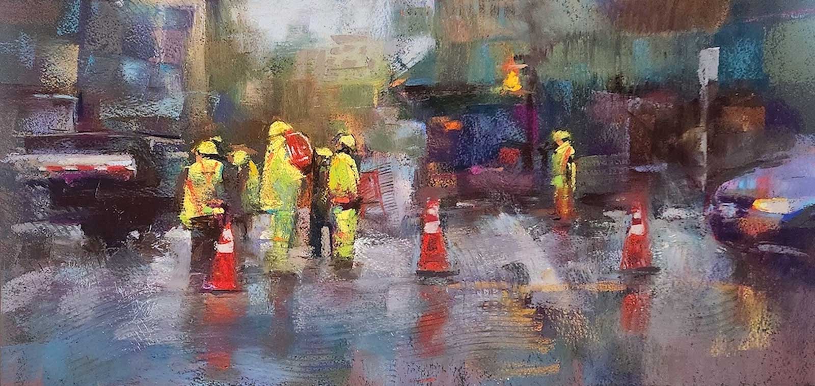 At Work, pastel, 10½ x 21” (26 x 53 cm)
Andrew McDermott
Vancouver, Canada
My Inspiration
I love painting city scenes, specifically rainy or nighttime city scenes. One night, I was walking home in the rain and these workers caught my eye. I loved the yellowish, greenish work gear they had on, and the rain made the scene feel like more work in a sense. I love the atmosphere of people in the rain either walking in the streets with umbrellas or doing construction work.
My Design Strategy
While I usually like to dive into the deep end, on this particular work I did a quick 10-minute study. I wanted to work out the clothing colors on this drab day, and I wanted to get the yellow/green just right. I often use my gut when it comes to design, while avoiding some basic pitfalls in rules of composition. The golden ratio is a great rule to follow in designing your paintings. I’m definitely a believer of not gridding or tracing my work, as I prefer shape massing to build up my paintings.
My Working Process
I started to block in some high-key colors. Blocking in the major elements and working from the large shapes to smaller details can give you freedom to move things around at any point. Drawing in your linework is fine, however it can be constricting, and you may at times need to paint outside your lines. By simply blocking in areas of color you can easily interplay backgrounds to foregrounds, creating defined and undefined borders. After the underpainting, I lay in some local color, and at this point can go heavier with my pastel application. While I continue to build up the lights and details of the work, I also use some stencils and model scrapers to create movement and maintain a sense of looseness in my work.
Contact Info
Email: mcdermottart@hotmail.com
Website: mcdermott-art.com