


The piece The Guardians began as a tutorial for a group of artists I mentor. Like much of my work, it evolved into something quite different than what I originally planned. I’m quite a spontaneous painter, and I enjoy slashing pigment onto the surface and seeing what happens. Perhaps that’s why so many of my paintings morph into something completely different than my reference material. The reference is simply a starting point, the spark of an idea.
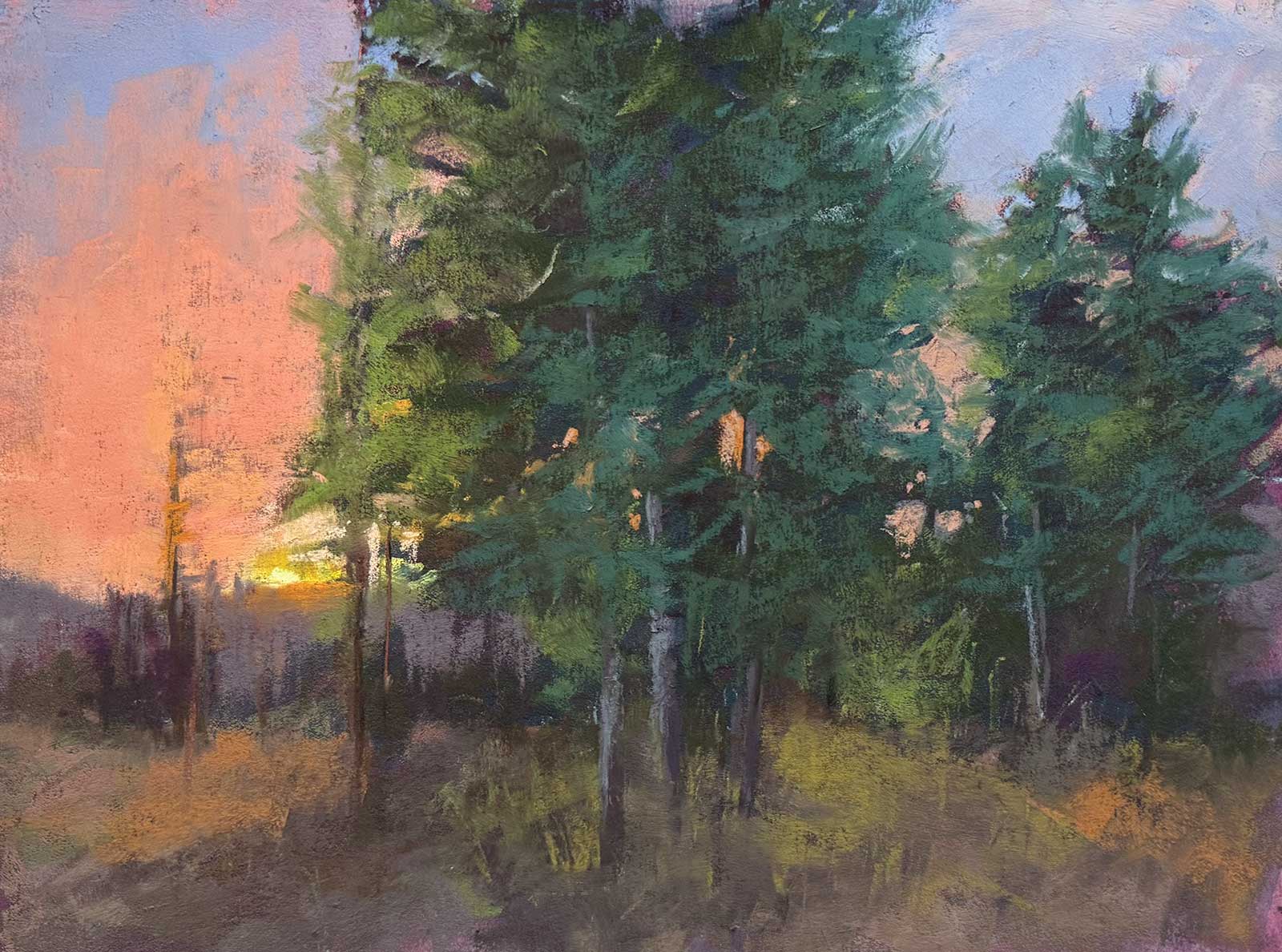
Home, pastel, 9 x 12" (22 x 30 cm)
It’s good to have technical skill and the ability to accurately paint a scene, but I strive to go beyond that. It’s more important to me to be authentic and original. I’m constantly finding ways to push boundaries and think outside the box. Over time I’ve learned to listen to a work in progress. In this sense the painting takes on a life of its own and I simply help it come into being. So was the case with The Guardians. The reference photo for this demonstration is actually a blue-sky day with the sun peeking over the horizon of my neighbor’s yard.
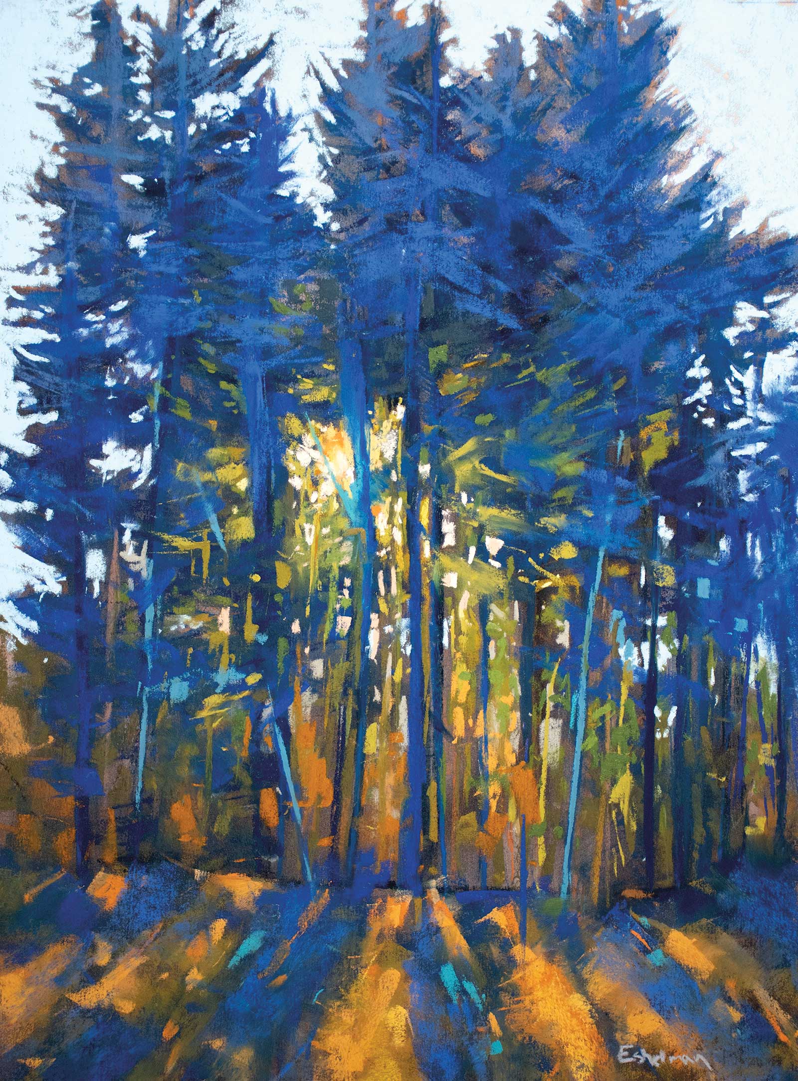
Streaming Light, pastel, 16 x 12" (40 x 30 cm)
This painting started as a demo focusing on the power of a strong value structure, so I began by painting a large notan with sumi ink on my surface. However, there are many ways to begin a pastel painting, and I enjoy them all. Sometimes I’ll create an underpainting with gouache or watercolor. I often work directly as well, focusing on the drawing aspect of the medium. The possibilities are enormous. Another reason I love pastel is the ability to combine the aesthetics of drawing into my work. I love slashing in hatch marks or allowing the underlying armature to become part of the finished painting. Having the pigment directly in hand removes a layer of distance between myself and the painting.
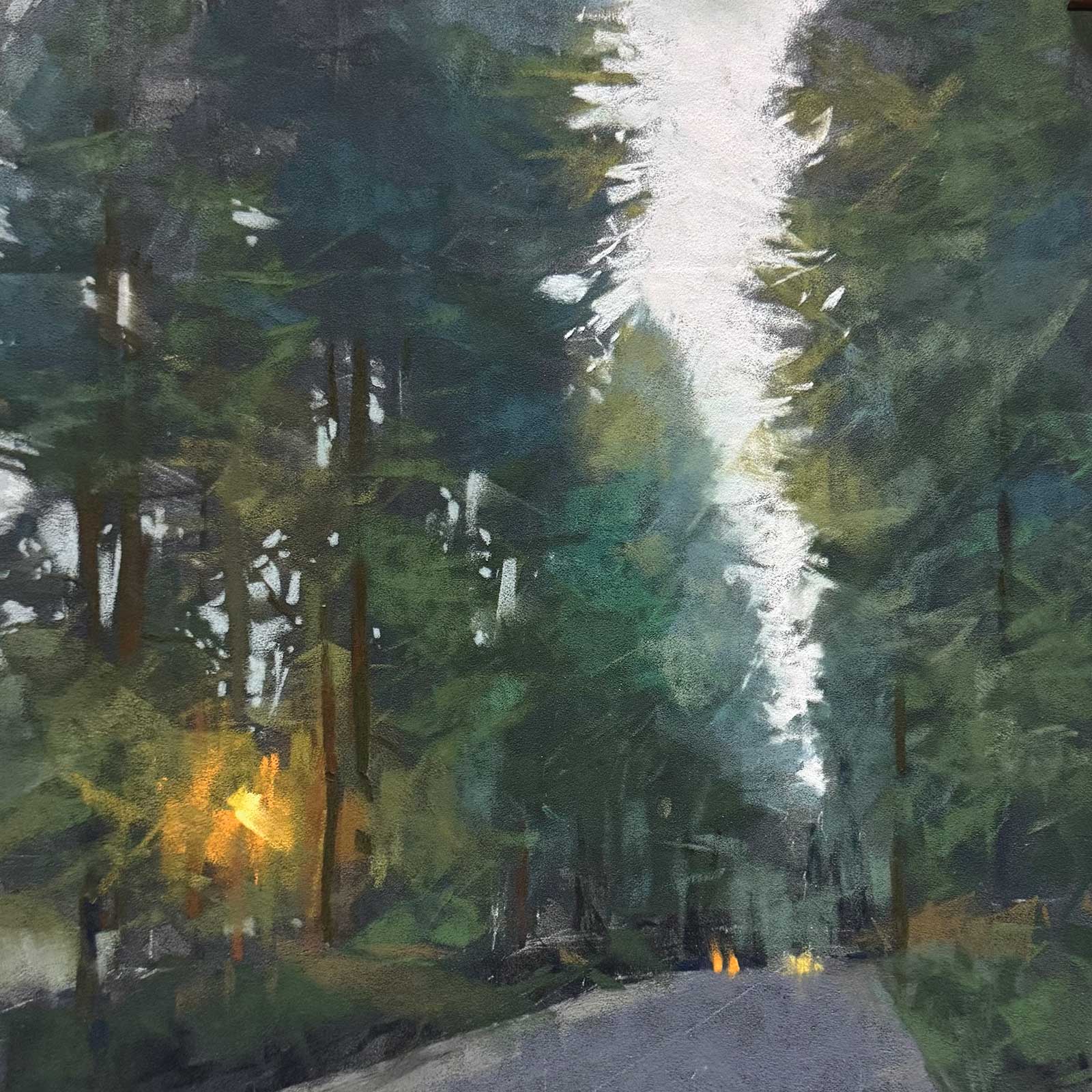
December Evening, pastel, 12 x 12" (30 x 30 cm)
Regardless of various experimentation with materials, there are a few constants in my practice. However I decide to apply pigment to the surface, a strong composition, value structure and unified color scheme are principles always at the forefront of my mind throughout the process.
My Art in the Making The Guardians
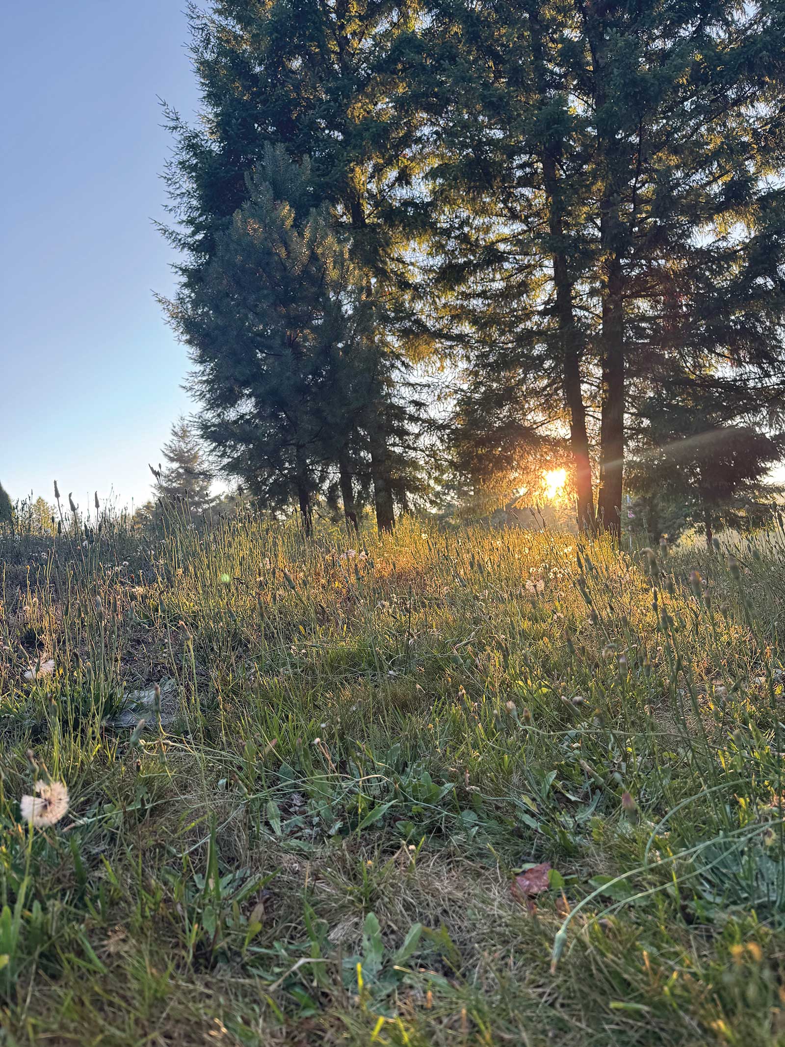
Reference Photo
An early morning photo of my neighbor’s yard. Adjusting the horizon line and a few other elements will make a more dynamic composition.
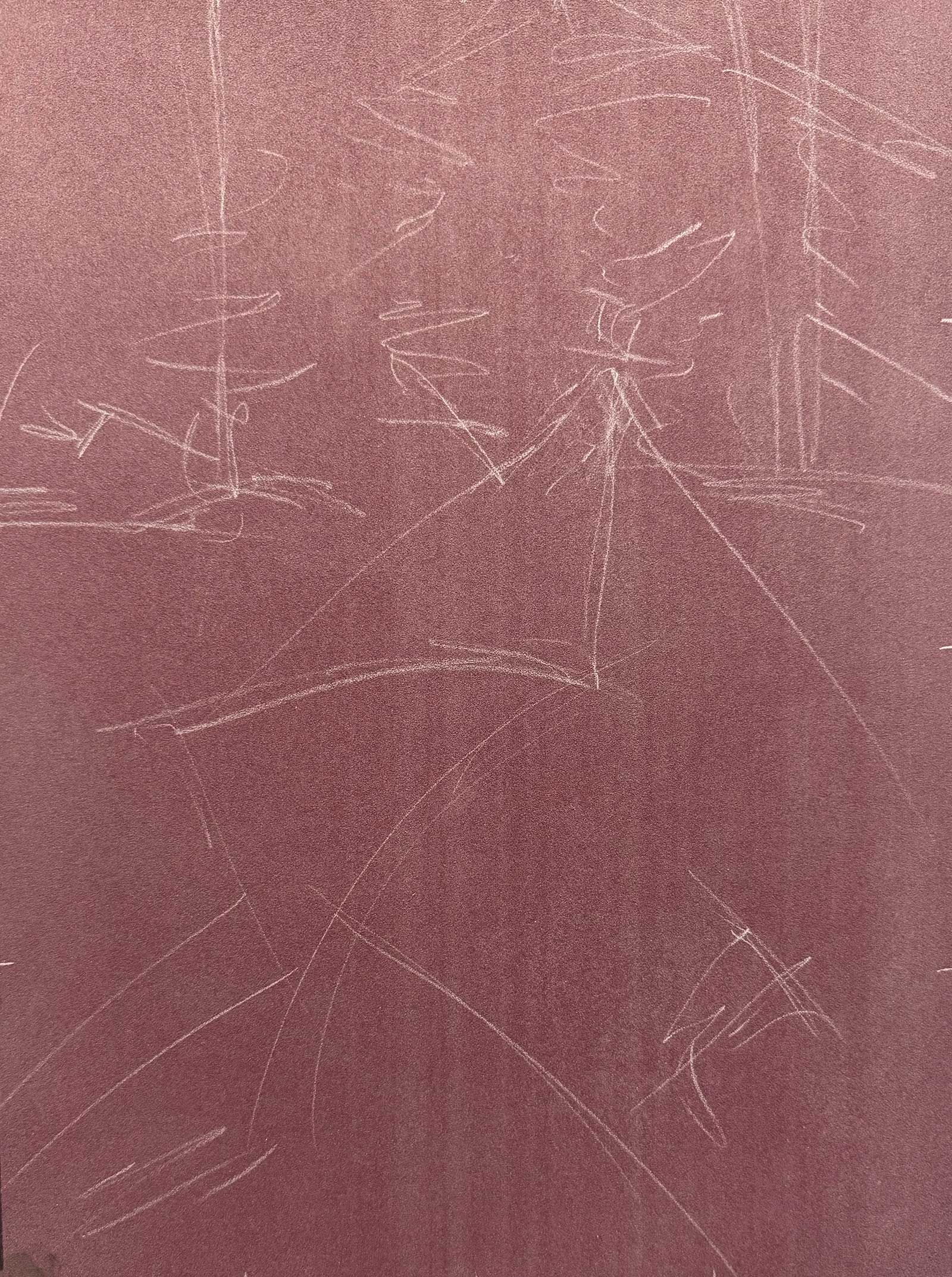
Stage 1 Loose Sketch
I’ve placed tic marks on the quarters of my surface and loosely sketched in the big shapes with a pastel pencil.
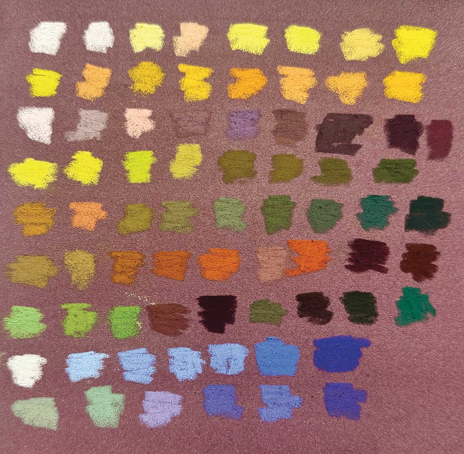
WHAT THE ARTIST USED
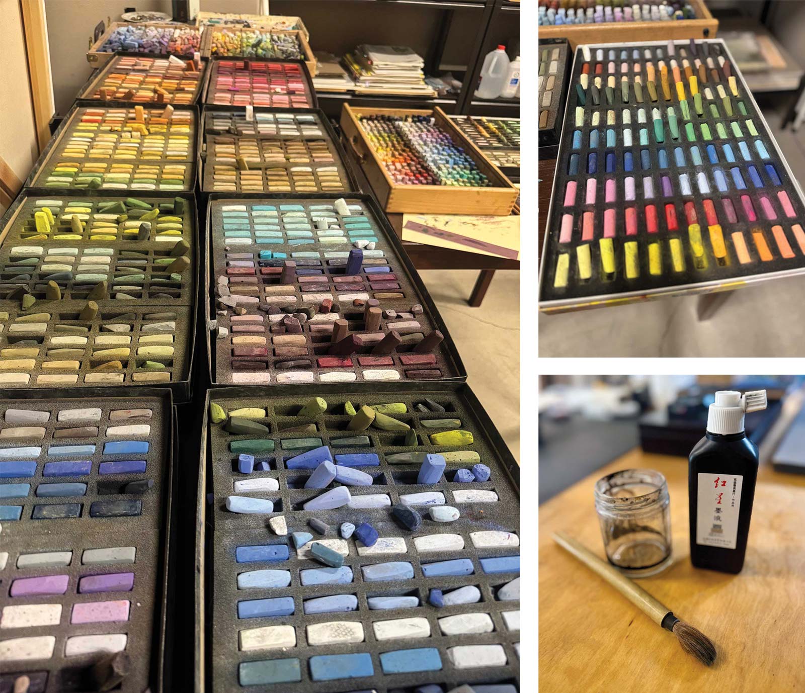
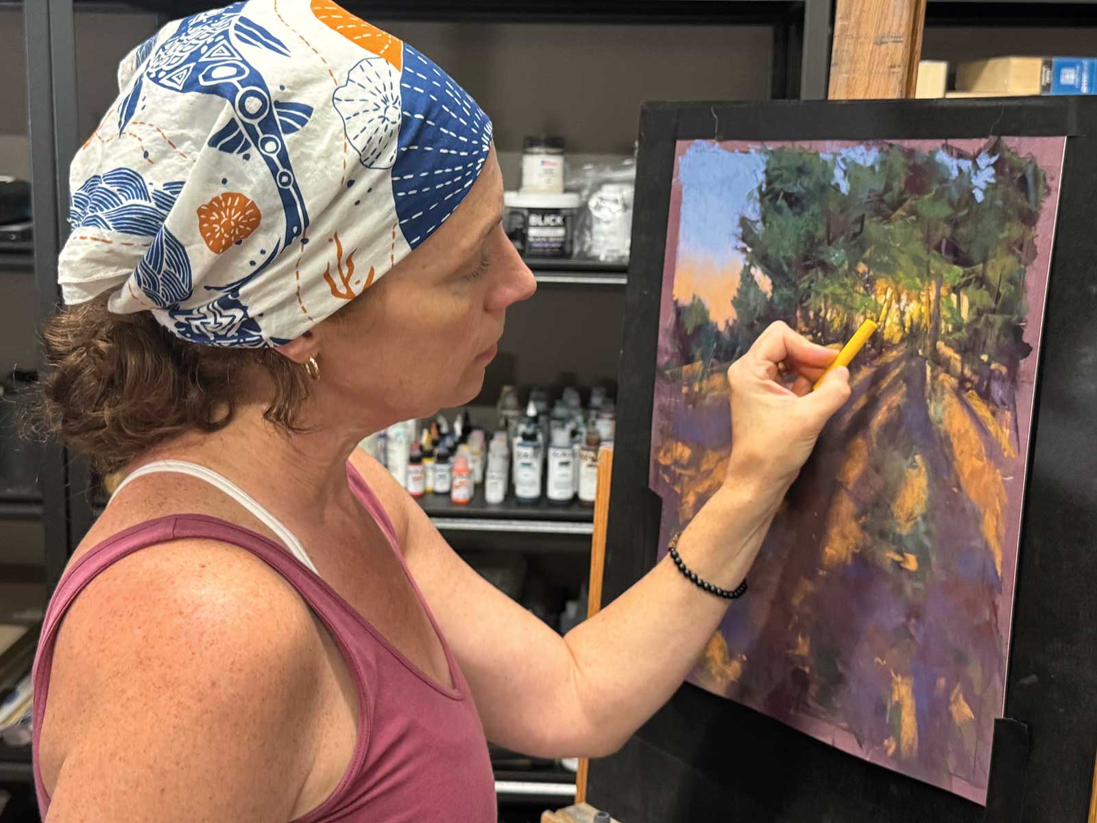
Various soft pastels from manufacturers Terry Ludwig, Schminke, Earthberry and Girault. Unlike painting in a wet medium where I would choose pigments and mix the various colors myself, when working with soft pastel I use a variety of sticks to create transparent and opaque layers. Transparency or opaqueness can be achieved by the amount of pressure applied. I don’t keep track of the actual pigments used in each stick. Most manufacturers don’t provide this information (Schminke is one manufacturer that does label each stick with the exact pigment used).
Additional Materials
Clairefontaine Pastelmat paper in the color wine, Easyou Redstar Liquid Ink, Connoisseur natural bamboo paintbrush, size 10
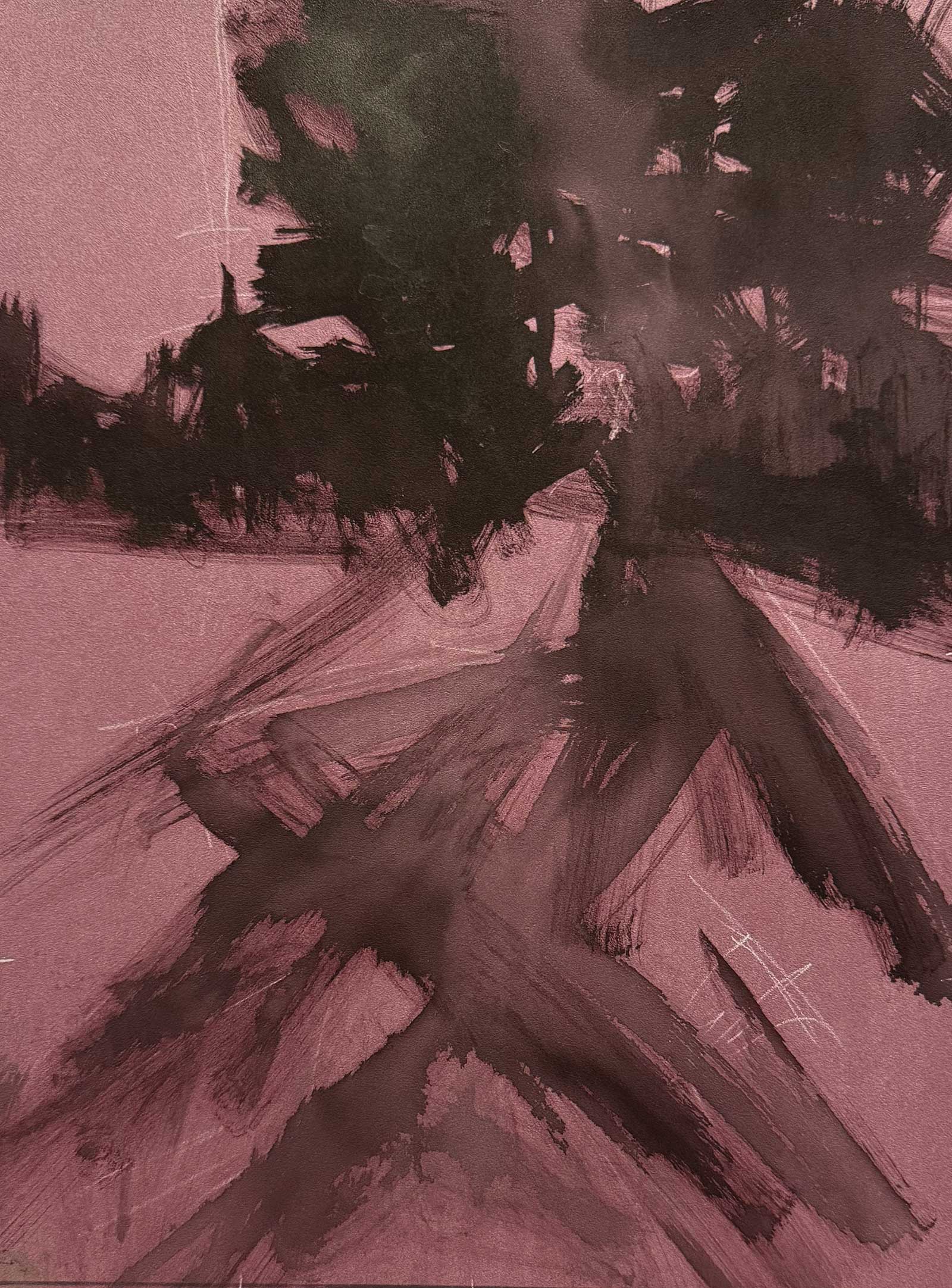
Stage 2 Beginning with an Ink Notan
Working with a bamboo size 8 round brush and sumi ink, I quickly and gesturally create a notan directly on the surface.
Stage 3 Mapping out Lightest and Darkest Values
Here I begin adding dry pastel, starting with the lightest and darkest values I anticipate will be in the piece. A few swipes of color also give me something to play and work with.
Color Swatches
Stage 4 Laying Down the First Layers
Once I have the general shapes and value pattern established, I get to play with color. I don’t preselect a palette. Instead, I focus on temperature and color shifts. This is the most enjoyable stage of painting for me, when I get to throw pigment down with abandon. It often steers the course toward whether the original plan will be continued or abandoned for a new direction. Working with a light hand, I’m able to create transparent layers of color.
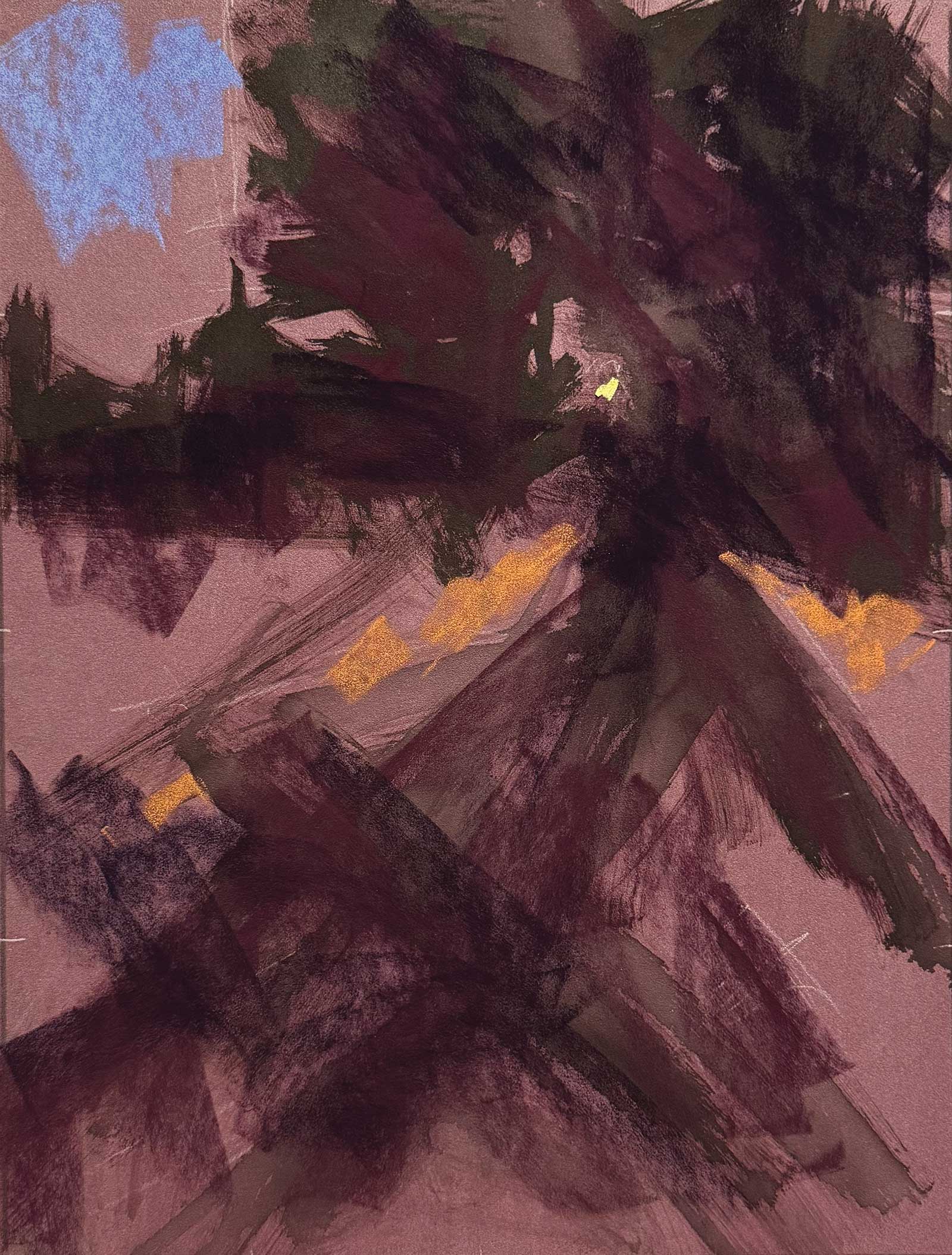
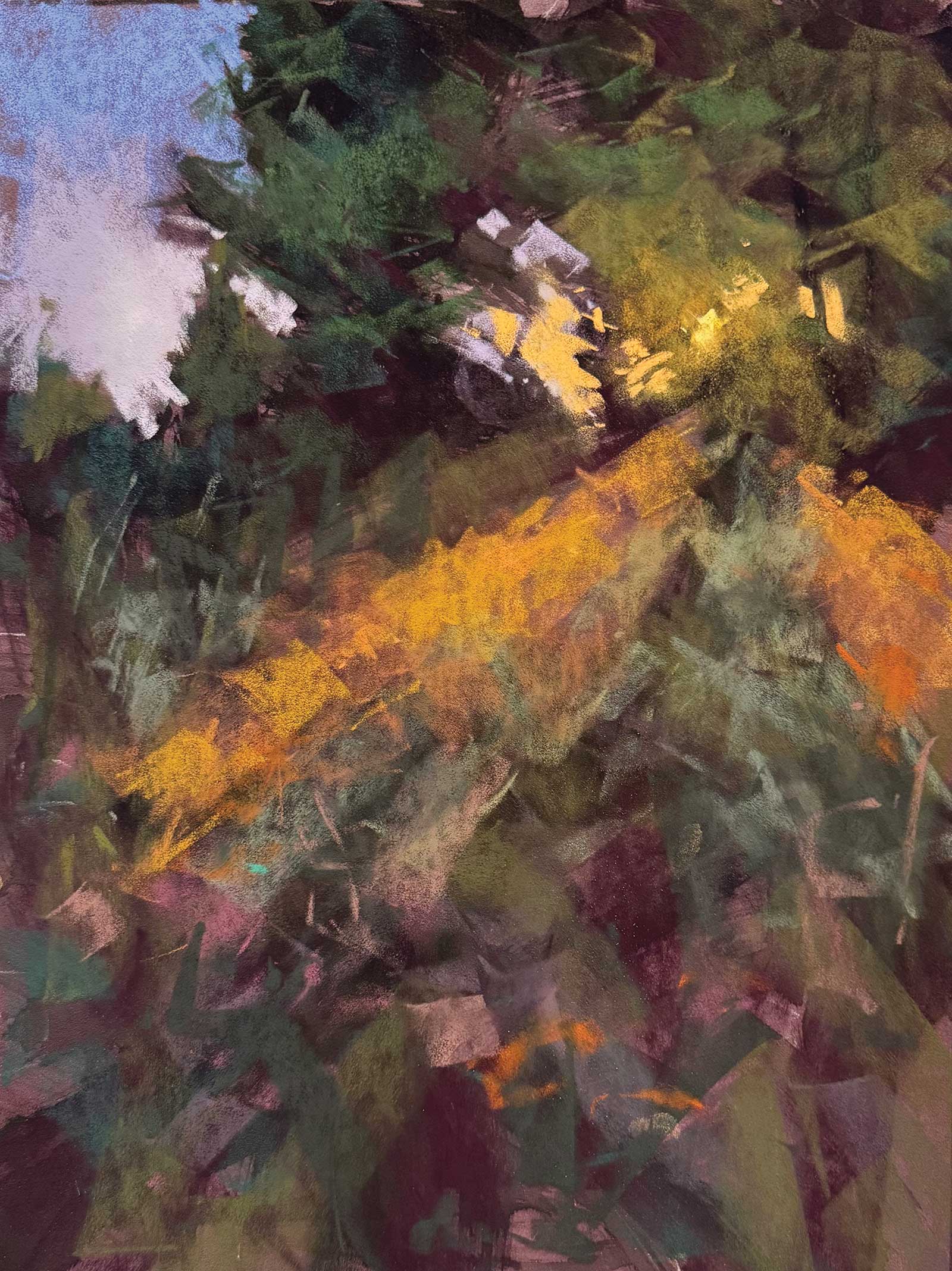
Stage 5 Building Shadow Patterns
At this stage I spend some time focusing on the center of interest, laying some details with accents, highlights and some harder edges. I also consciously decide to create some bolder shadow patterns in the foreground, laying the groundwork for a departure from the reference and a more dramatic lighting situation. Layering the orange light pattern on top with some harder edges helps define the shadows.
Stage 6 Unifying Color
I love the effects of the brilliant layers of transparent color in the shadows, but they need to be unified with an overarching color. Here I glaze a mid-toned warm red over selective areas, allowing some of the transparency beneath to show through in a few areas.
Exploring Your Subject
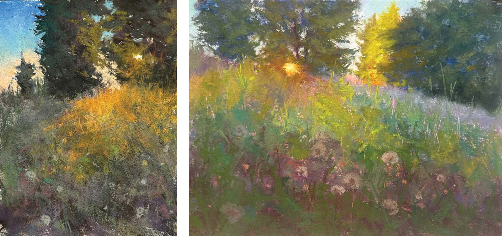
Although I don’t usually paint studies specifically in preparation for larger work, I do explore a subject and paint it multiple times in various formats, lighting situations, etc. A few days prior to painting The Guardians, I painted variations of this scene twice with local color and in more realistic representations. I think exploring a subject deeply opens the door of the imagination and encourages a departure from the reality of the subject, moving toward something deeply personal.
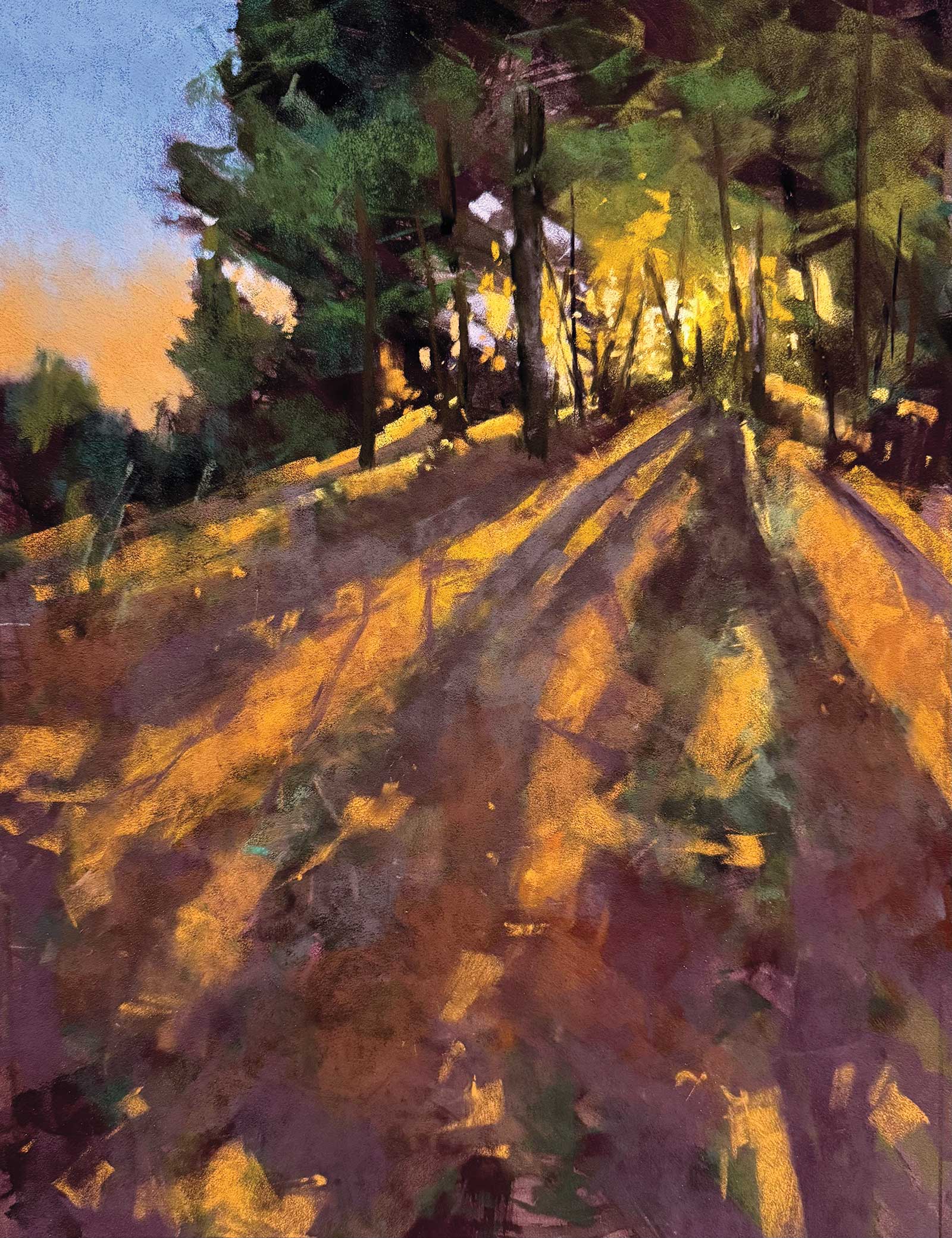
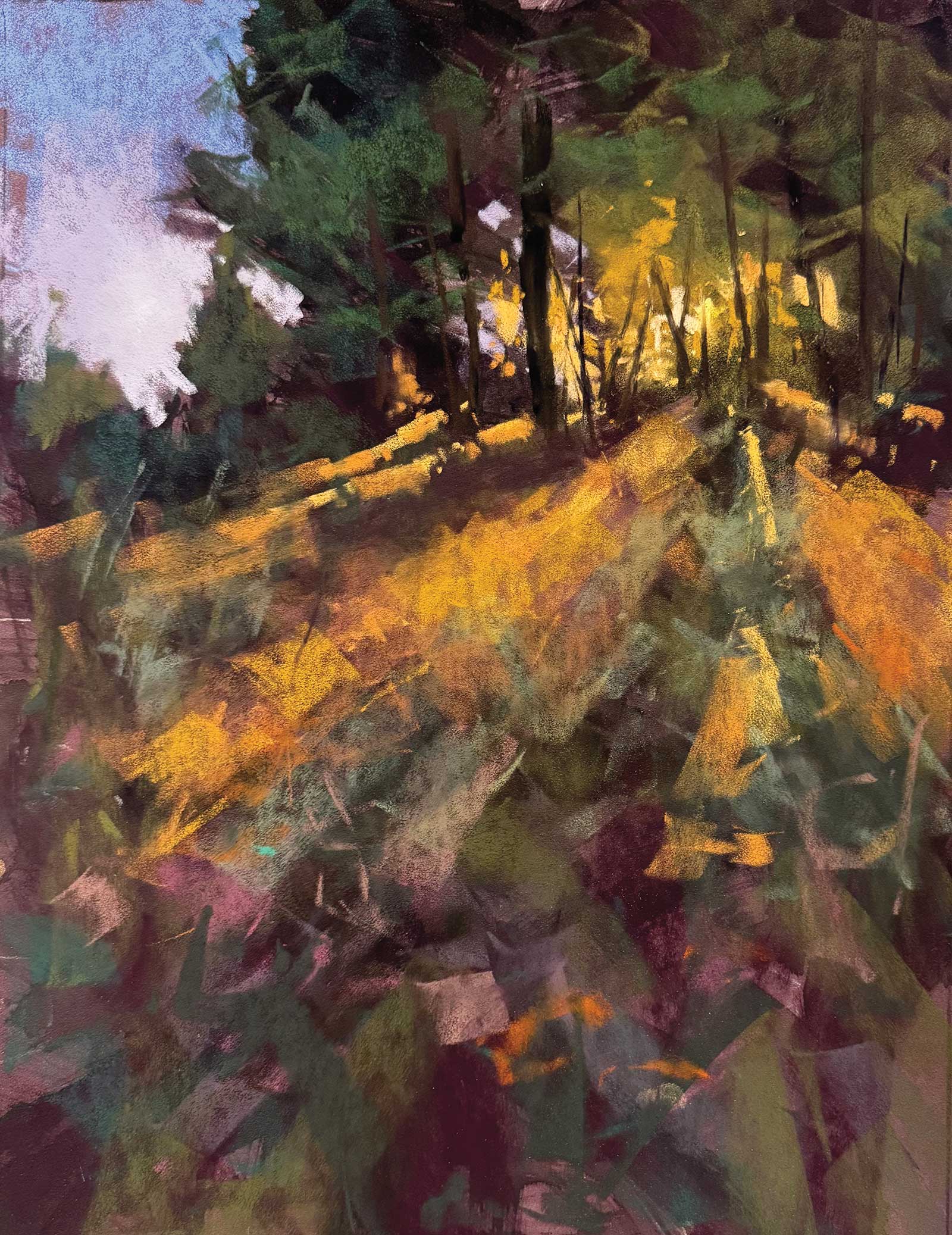
Stage 7 Refining Shadows and Sky
I’ve slowed down at this point and am thinking about details in the shadows. Selectively creating harder edges and chromatic lights to enhance the shadows will lead the viewer through the foreground toward the center of interest. I’ve also added more layers of color to the sky.
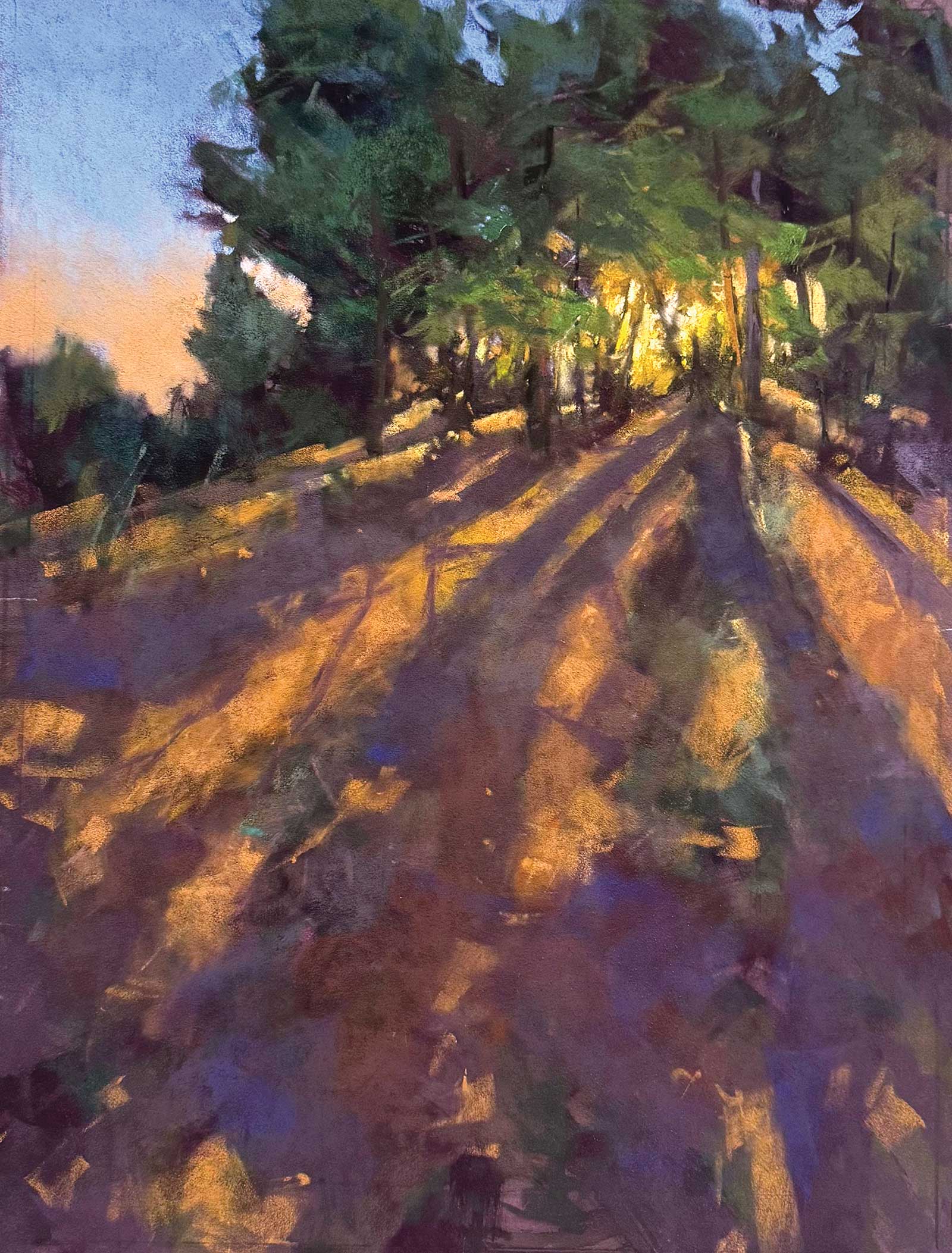
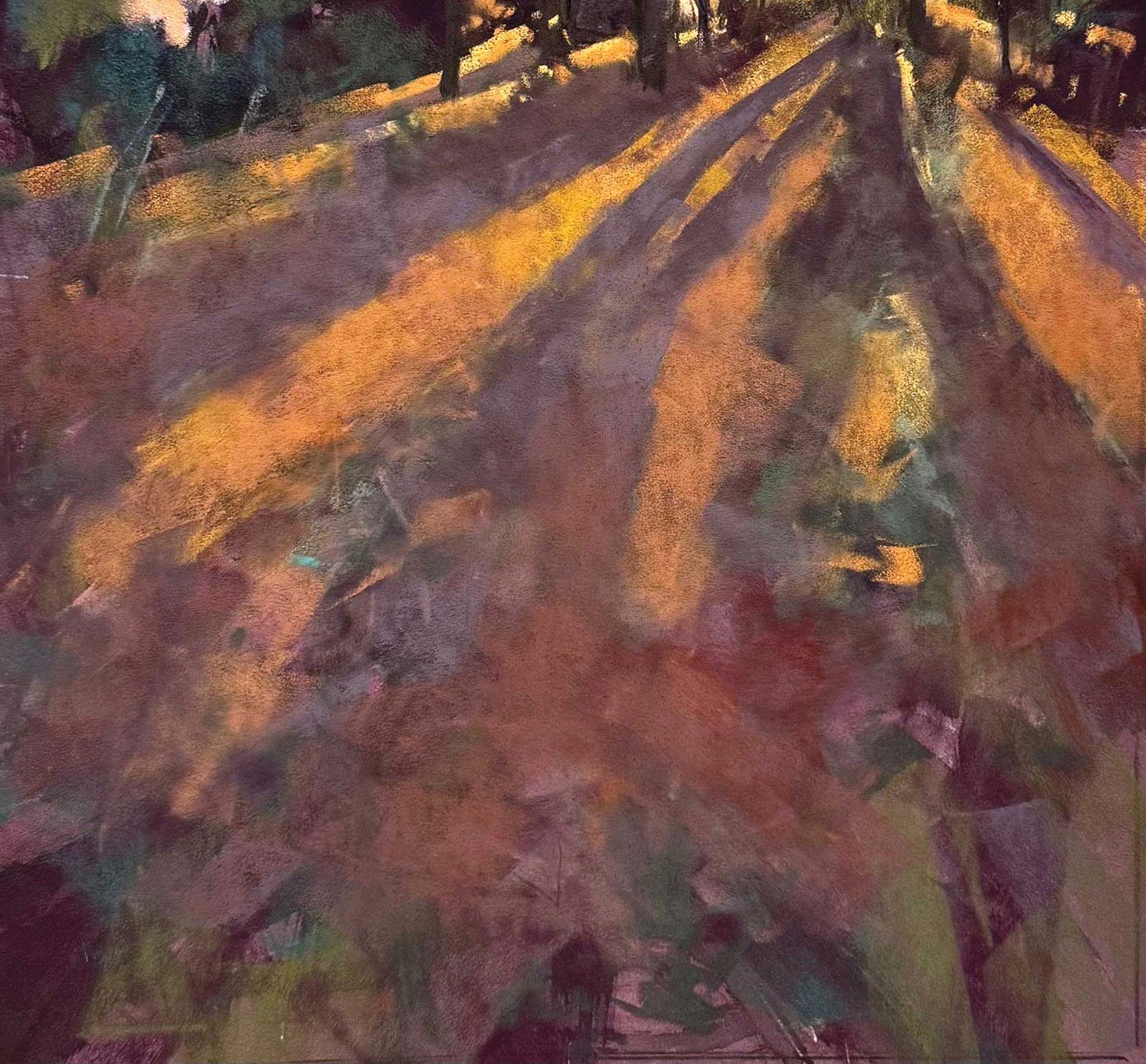
Stage 8 Finished Artwork
The Guardians, pastel, 16 x 12" (40 x 30 cm)
In the final stage I make some temperature adjustments and refine the trees. The painting is predominately warm, and most of the contrasting cool is in the sky and greens. The rest of the painting could benefit from some subtle cool notes. I’ve layered a transparent bluish violet over areas of the shadows and echoed some of the muted cool tones in the underlayer of the trees. This creates temperature contrast and enhances the sunlight by comparison.
About the artist
 Kim Eshelman
Kim Eshelman is an American contemporary artist working in pastel. She has been painting in a variety of mediums for over 30 years. Eshelman exhibits regularly around the globe and has won numerous awards. Her work is in public and private collections worldwide, including the Pastel Museum in Saint-Aulaye, France.
Her landscapes are inspired by the beautiful woods of Washington State where she lives. She plays with light filtering through trees, reflective ponds and stunning skies. Eshelman is a Master Circle member of the International Association of Pastel Societies and a signature member of the Northwest Pastel Society.
Represented by
Childhood’s End Gallery, Washington, USA, childhoods-end-gallery.com
Contact at
kimeshelman.com