


Grand Prize
Grand Prize is a four-page editorial feature in American Art Collector magazine
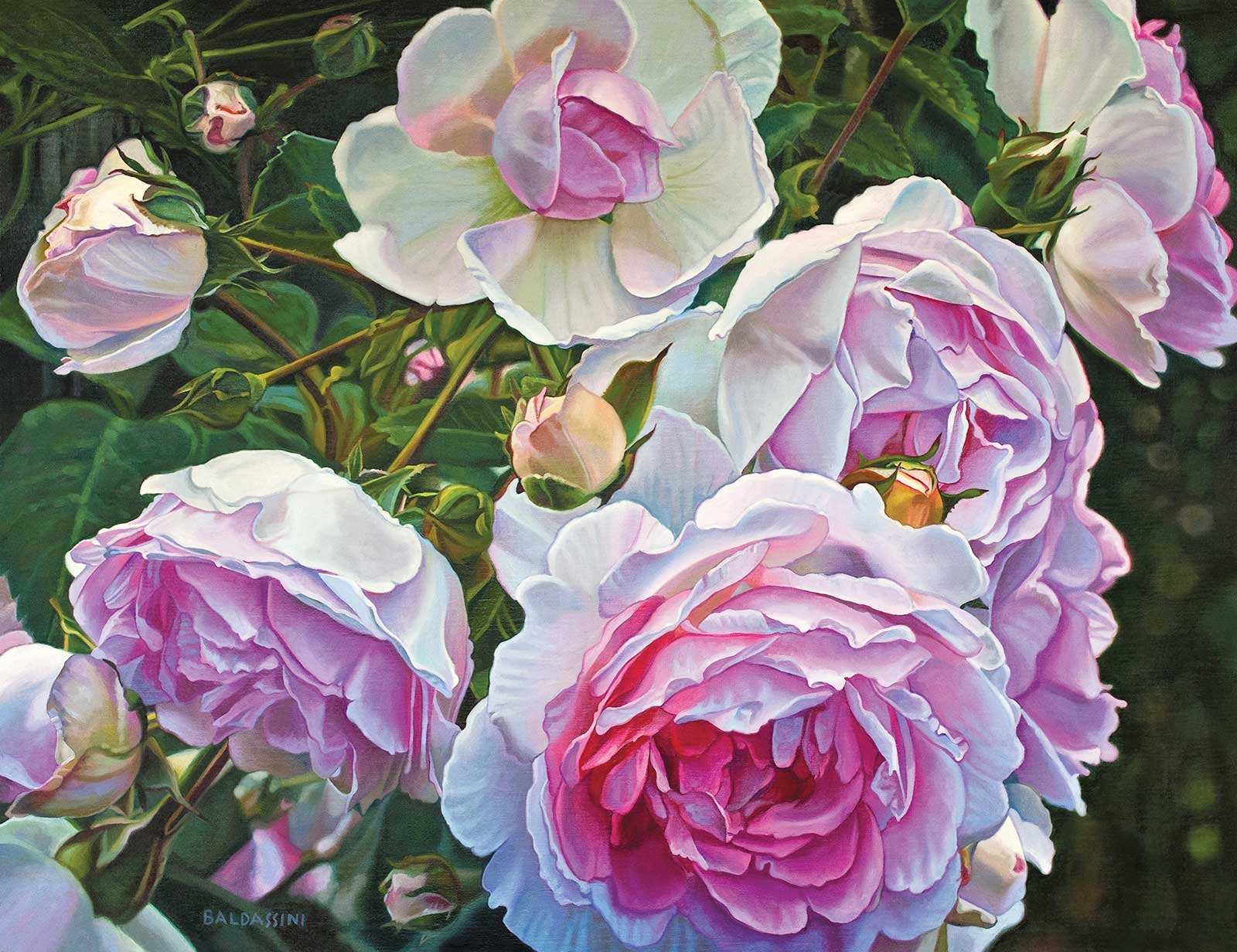 Little Climbing Beauties No. 2, oil, 24 x 31½" (60 x 80 cm)
Paul Baldassini
Connecticut, USA
Showstoppers
These days, Connecticut-based artist Paul Baldassini finds himself most captivated by floral subjects, especially peonies and roses in the deep, golden light of late morning. While the artist also paints landscapes, his crisp, vivid florals—which he has been painting for more than a decade—are the true showstoppers. His particular style of realism, he says, is influenced by the 16th-century Flemish master painters, notably Peter Paul Rubens and his contemporaries.
“Except for flowers and some exotic species of birds, amphibians and marine life, nature is pretty much devoid of saturated colors. It’s mostly a grayed down tableau. I’m not able to photograph those colorful creatures, but flowers are everywhere,” says Baldassini. In addition to his own garden, the artist explores various public and private gardens near his studio where there is an abundance of flowers to photograph.
“In my floral work, I methodically seek to reveal the intricacy and elegance of their design. Every blossom, bud or leaf has its own identity, [and] no color or shape is ever exactly the same or repeated in nature or in my paintings,” he says.
Baldassini continues, “Since I am a realist painter concerned with light effects, the underpainting technique greatly facilitates both the realization of a compelling composition and accurate depictions of light and chromatic subtleties. The design and composition are completed in advance so I can concentrate on color mixing when painting.”
Watch the artist in action on his YouTube channel by searching Baldassini Fine Art.
My Inspiration
Most of what I paint these days are floral subjects, peonies and roses in particular, photographed in situ under late morning light. I believe painting should be the representation of natural appearances on a flat surface, and I strive to capture the intricacy and elegance of their design. Each flower is wholly unique, and I don’t have to travel very far to find them: many private and public flower gardens are just a short drive from my studio.
My Design Strategy
The paintings I create are based on a composite of many images. Like much great art, they are a combination of fact and fiction. My sketchbook is a digital camera with a macro lens, which I use to create compelling compositions that combine variation and rhythm that I can translate into convincing light and shadow effects with oil paint. As a professional designer and master image editor for more than 40 years, I use digital technology to capture, examine and edit the floral subjects I photograph, spending hours exploring design and composition possibilities before I put brush to panel or linen.
My Working Process
After creating a compelling composition using digital techniques, I transfer my design to the panel, then apply a raw sienna imprimatura. Next, I begin the underpainting much like a watercolor, using burnt umber and solvent-free fluid, adding and removing paint as necessary. When dry, I begin the overpainting working a section at a time, with each new section seamlessly blended into the previously painted section. This method allows me to focus completely on color mixing to achieve the right combination of color, value and temperature to model forms, create depth, and accurately render nuances of light and shadow.
Contact Info
Email: pbartist@ comcast.net
Website: baldassinifineart.com

Second Prize
Second Prize is a two-page editorial feature in American Art Collector magazine
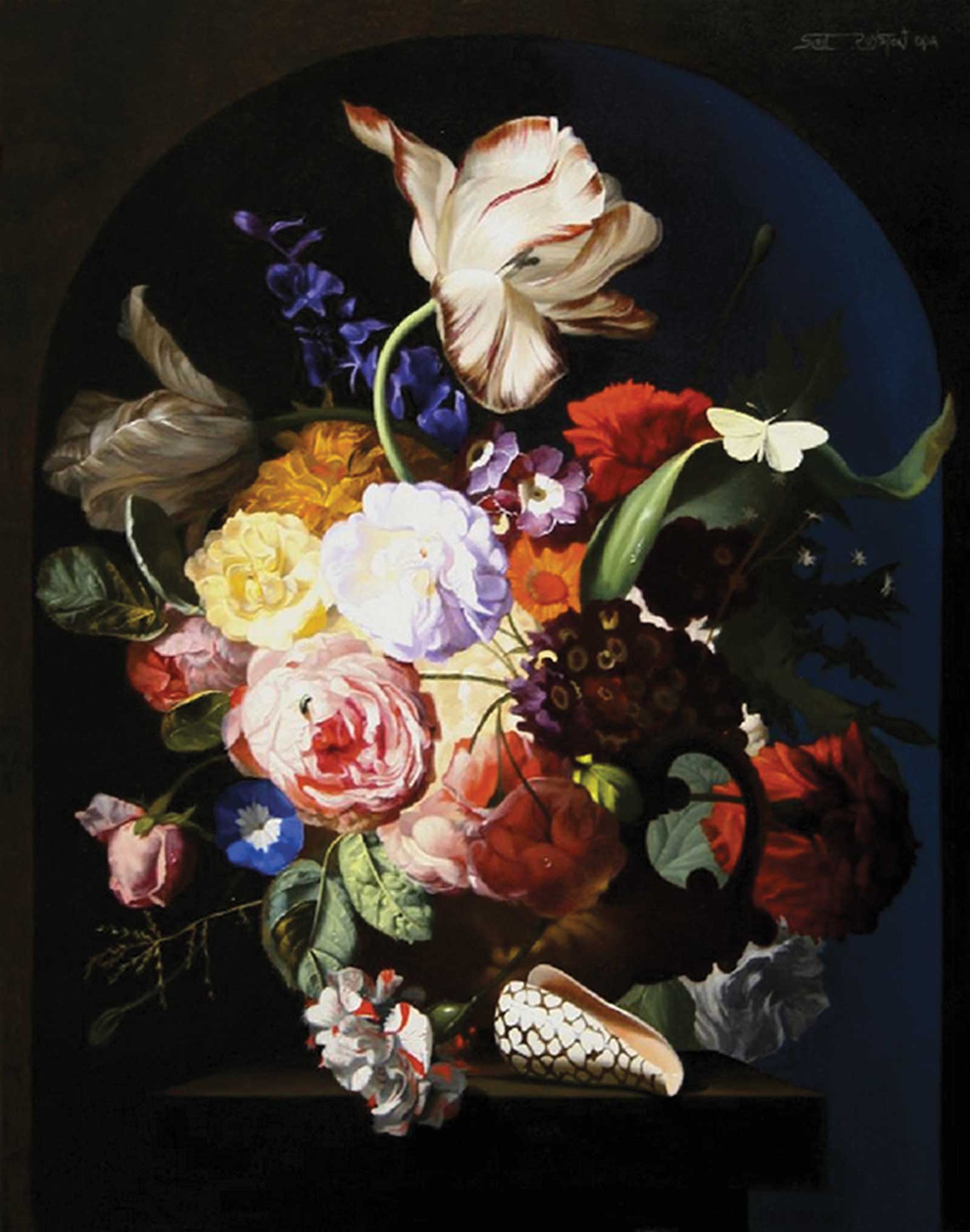 Floral for Lovey, oil, 20 x 16" (50 x 40 cm)
Scott Royston
Maryland, USA
My Inspiration
As this was a commission, my work was already cut out for me. As most of my florals are very Dutch in their style, my client wanted that same approach here in this piece. My true inspirations for my florals are the Dutch Masters such as Jan van Huysum, Rachel Ruysch and Jan Davidsz. de Heem, and that’s certainly no different here. Following their paths with niches, dark contrasting backdrops and interesting curved compositions highlighting some flowers, while intricately integrating and blending others in the middle and back to carry out the dramatic 3D effect of depth help to bring this piece to life.
My Design Strategy
My client allowed me free rein with the design with this piece, so I decided to go dramatic with the niche and really push those lighter lights and darker darks as we were taught at the Schuler School. By bringing out those brightly lit flowers in the front to hype up the drama a bit, I was able to create depth in the foreground and background by softening and glazing the smaller buds and greenery. The shell was added to show the metaphor of life and death with the thriving life in the flowers, while the shell remains still and lifeless in the foreground. The brightly lit butterfly adds a genuine touch of accompaniment to an otherwise relaxed piece. And of course, a Dutch piece wouldn’t be complete without the dewdrops and small bugs to bring the eye closer, while adding interest at the same time.
My Working Process
As with all my pieces, I started out with an underpainting. In this case, because of the overabundance of detail, I made sure to make this a very important step in creating this piece. Using small, long pointed script brushes for drawing the heavily detailed petals on buds and intricate greenery helped make my process easier to complete by having a thorough drawing as a great manual throughout. Once done, it was time to start the next hardest process: establishing color. This part of the journey was achieved with bristle brushes, which are used to hold and apply more paint. I also used Maroger medium during this stage, which is used for glazes and half pastes. Once completed, I took a soft sable blending brush to knock down those hard edges. I allowed a few days of drying time before starting my third sitting with mongoose brushes. This step is all about refining, while keeping the same amount of finesse that was used in the last sitting with the bristle brushes.
Contact Info
Email: scottbroyston@yahoo.com
Website: scottroyston.com
Third Prize
Third Prize is a one-page editorial feature in American Art Collector magazine
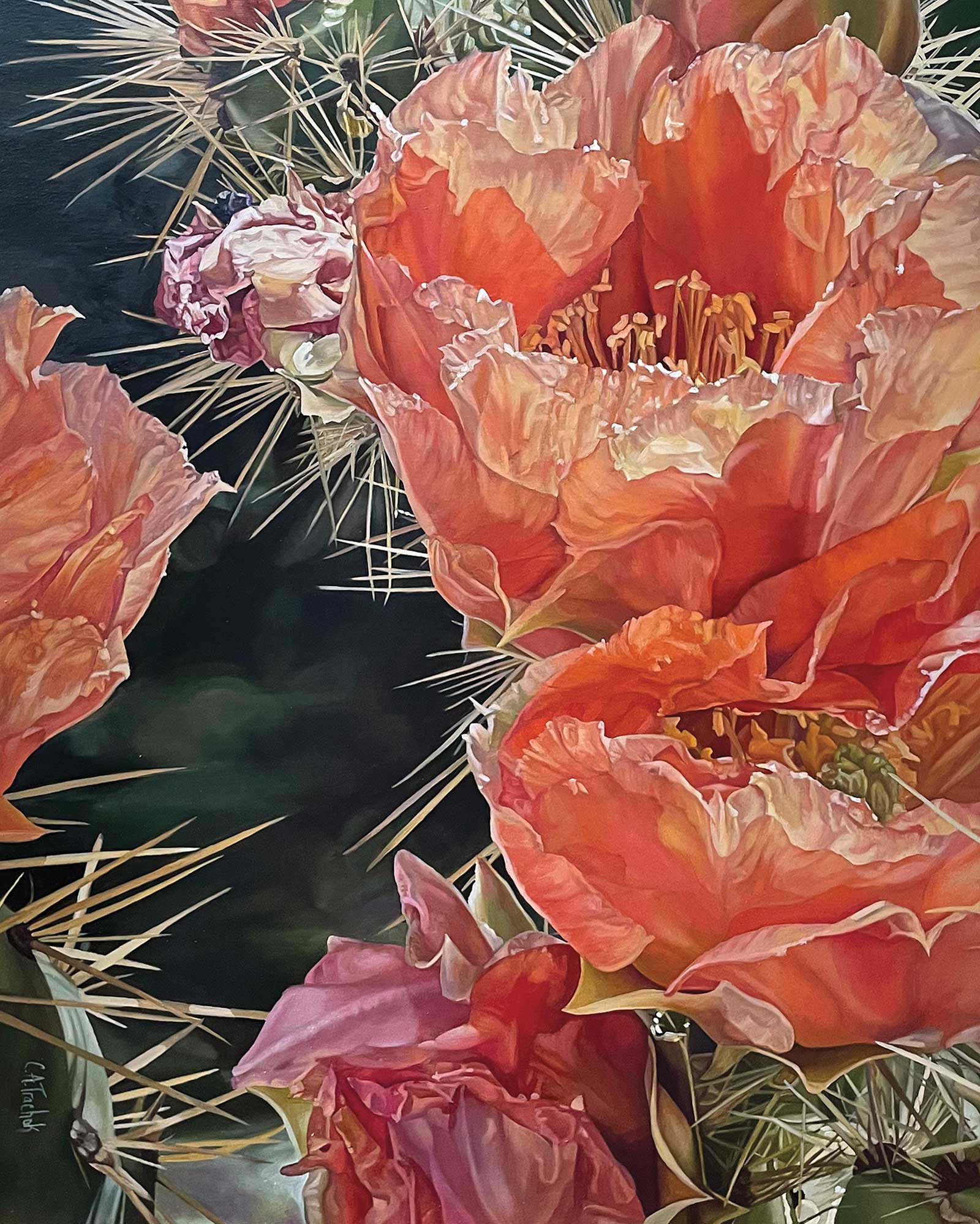 It’s A Prickly Subject, oil, 30 x 24" (76 x 60 cm)
Cathryne Trachok
California, USA,
My Inspiration
The inspiration for all of my work is color and light and how they embrace the form, whatever that form may be. On this specific piece, my inspiration was the challenge to communicate the beauty and impact of these glowing flowers blooming softly through the sharp spines.
My Design Strategy
My design strategy was to highlight the movement by playing with the way the sun was hitting the petals. On this painting, I loved the idea of going big. Utilizing three different photos, I planned my design on a small-scale sketch, then blew the sketch up to the size of the canvas and evaluated what the design was going to look like on a larger scale. Sometimes I do a little color sketch, but I did not do that on this painting. When I was happy with the design, I then put it on the canvas and the excitement began.
My Working Process
I learn from each painting, and although I am a slow learner, each painting is an adventure. It began with redrawing the final sketch on tracing paper and putting it on the substrate. After the drawing was on the panel, I did an underpainting to check my composition with just the values. With a sepia value study on the panel, I then began applying color. I painted darks first, working between medium colors and light colors, with highlights going in last. During the whole process, I took black-and-white photos to make sure my values remained true.
Contact Info
Email: catrachok@icloud.com
Website: cathrynetrachok.com
Finalists
Each receives an Award Certificate and a one-year subscription to International Artist magazine PLUS having their work seen worldwide by international galleries looking for new talent.
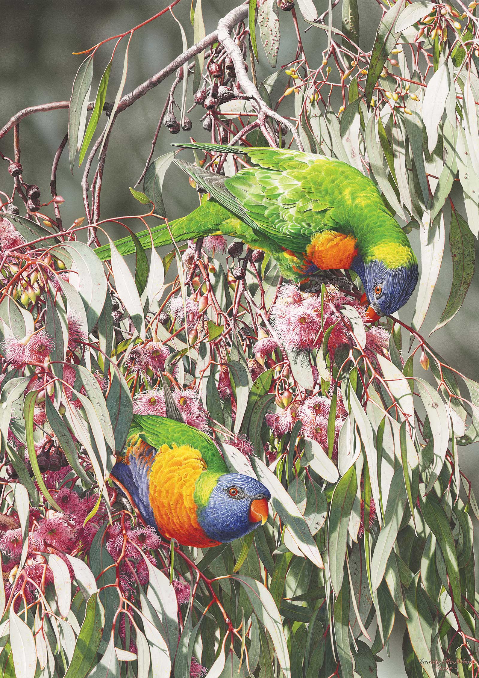 Cornucopia, watercolor, 27 x 19½" (69 x 50 cm)
Frances McMahon
ACT, Australia,
My Inspiration
Cornucopia was a private commission through a client who happened to see another original painting of mine hanging in a brick and mortar gallery. In my mind, commissions are delightfully easy because the client inputs exactly what they want, and it’s up to the artist to make the client’s vision come to life. Therefore, in this instance, there wasn’t really any inspiration required on my part.
My Design Strategy
My client had very clear ideas about the size, content and format. They wished for a painting of two rainbow lorikeets feeding on a flowering gum crammed with leaves and gum nuts. The painting was sized to fit a particular wall in their home and was best suited in a long portrait format.
My Working Process
My major obstacle was gathering reference. I live in Australia where there are millions of gum trees, but I could only find one that was flowering near my local shopping center. Incredibly, the day I went to take photos, there happened to be a family of rainbow lorikeets feeding! It’s extremely rare to see both the target species and setting literally in front of you. The top bird was referenced from one photo, the lower bird from another. After client approval, work commenced on what is my largest painting to date. Most of the artwork is brushed in (with only a small area of airbrushing), so the work took nearly 300 hours to complete. I tend to favor finishing one area before starting another. This means each leaf and blossom will be slightly different in color from its neighbour, and I feel progress is being made. The lower lorikeet had dark and distracting shadows over its face. The client requested that I remove them, making the bird appear more obvious.
Contact Info
Email: birdart65@gmail.com
Website: francesmcmahon.com
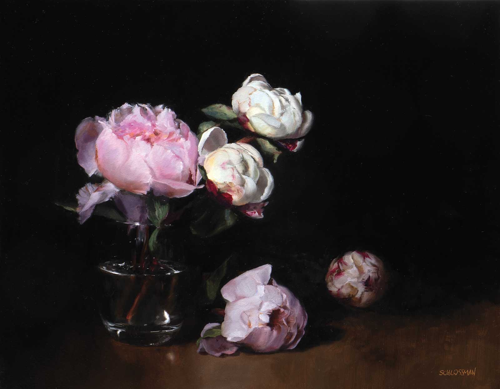 5 Peonies, oil, 14 x 18" (35 x 45 cm)
Deborah Schlossman
Massachusetts, USA
My Inspiration
The peony is thought to represent love, prosperity, honor, happiness and good fortune. Peonies and ranunculi are my favorite flowers to paint. They are so expressive, and although they come in a beautiful range of colors from vibrant red to pink and white, white is my favorite. Starting as little balls, they quickly undergo a dramatic transformation into gorgeous fluffy flowers. I love their slightly wild, untamed and moody look when fully open—like a tousled head of curly hair. Whenever possible, I prefer painting from life. I quickly learned, however, to take good reference photos, after briefly stepping away during a session to return and find that the flowers had completely transformed.
My Design Strategy
Floral arrangements can easily come across as tired and predictable, so I devote a great deal of time to carefully setting up my composition. Using a shadowbox with a single light source allows me to create strong, intentional shadows that add drama and depth. In each arrangement I try to include flowers at various stages of bloom: tight buds, partially open blossoms and fully opened flowers to bring a sense of life and movement. Incorporating at least one bloom mostly in shadow helps ground the composition. I especially love when petals are backlit, illuminated by light passing through their delicate layers.
My Working Process
My preferred painting technique is alla prima (wet-on-wet), an approach that helps the work feel fresh and spontaneous. I typically work with a very limited color palette, though for vibrant flowers, I introduce brighter reds, pinks or purples as needed. White peonies are particularly challenging to paint due to their subtle shifts in value and temperature. I try to paint with the largest bushes I can get away with. Throughout my work, I constantly navigate the delicate balance between tight precision and expressive looseness. This tension is especially apparent when painting flowers: too much control diminishes their essence and vitality, while too much looseness causes the structure to fall apart and can make them look flat. Rather than rendering every petal, I focus on highlighting a select few to convey form and dimensionality.
Contact Info
Email: dschlossman5@gmail.com
Website: deborahschlossman.com
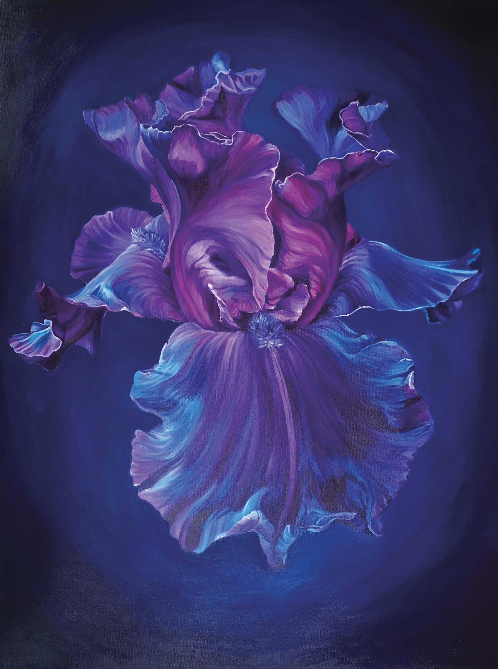 Dioxazine Divine, oil, 40 x 30" (101 x 76 cm)
Daria Eibert
Michigan, USA
My Inspiration
Dioxazine Divine emerged during a quiet yet powerful inner shift. I didn’t yet know I was pregnant, only that I felt an urge to paint a universe through the portal of an iris—the flower that has long guided my work. I first imagined the vastness of outer space, but as the painting unfolded, I saw that it reflected an inner cosmos instead. The color dioxazine purple, so deep it appears almost black, became a metaphor for the unseen—the space before creation, where light and intuition begin to move. This work became a meditation on that threshold moment when life starts to stir beneath stillness, and something new, luminous and unknown begins to take form.
My Design Strategy
The iris has become the central motif of my work, a portal through which emotion, intuition and transformation are revealed. I approach each composition intuitively, seeking an image that resonates with my inner state at that precise moment. I later realized that my choice of the iris was never accidental: its mythological name, Iris, refers to the messenger between gods and humans, a bridge between visible and invisible worlds. In Dioxazine Divine, the flower dissolves into abstraction, inviting self-reflection and exploration of one’s own inner universe. I trust intuition to guide every decision—light, pigment and contrast—allowing the painting to unfold organically rather than be predetermined.
My Working Process
I worked with a very limited palette of purples and deep blues layered over a magenta imprimatura to create depth and vibration. My aim was to show that simplicity can hold profound emotional complexity, and that a few pigments can evoke the entire range of feeling. The canvas becomes my laboratory: I mix colors directly on its surface, letting them merge and react layer by layer, just as emotions accumulate before finding form. Using translucent oil glazes and soft brushwork, I built luminosity from darkness. The process is meditative, intuitive and unpredictable, each layer a quiet conversation between matter and emotion.
Contact Info
Email: daria@eibert.art
Website: eibert.art
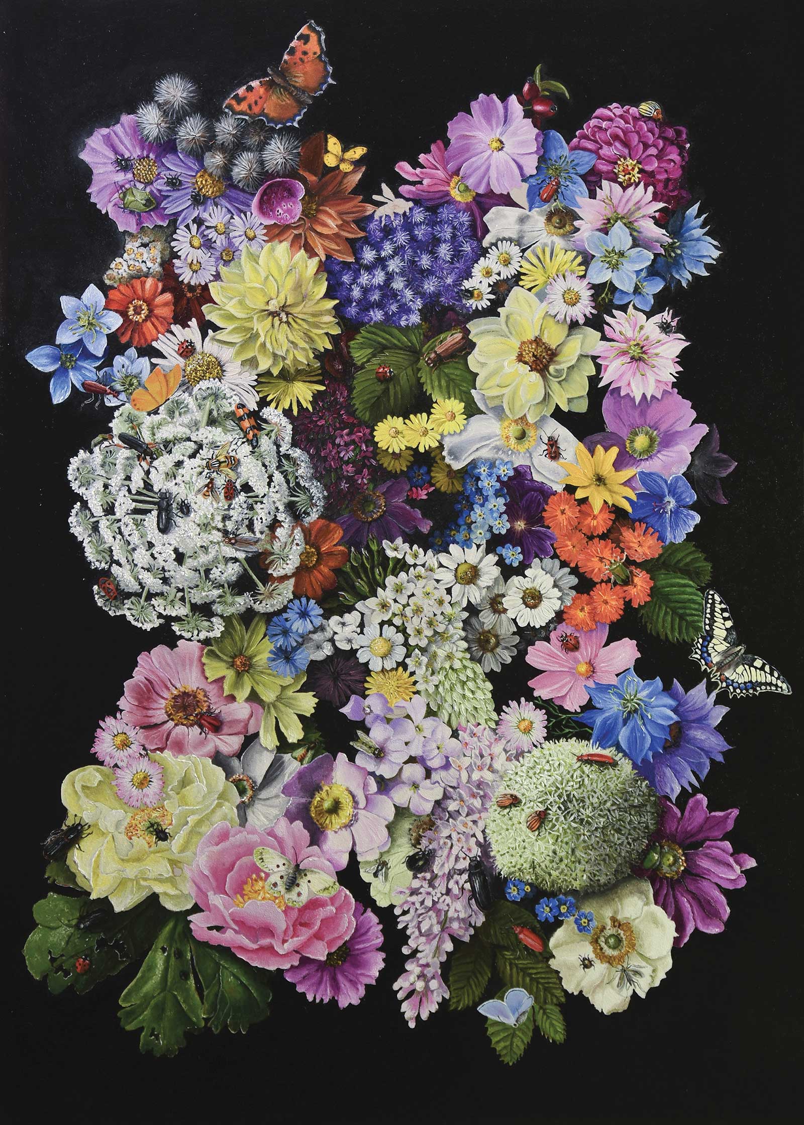 A Pillow for Hard Times, oil, 27½ x 19½" (70 x 50 cm)
Esther Huser
Thurgau, Switzerland
My Inspiration
My starting point is always the same feeling: I find myself surrounded by nature. Despite having both feet on the ground and my head in the clouds, I still have a strong longing for nature. I’ve taken thousands of pictures of things I love: cabbage, leaves, flowers, roots, bark, etc. Some of them resonated with me, most didn’t. Each one on its own didn’t offer much.
My Design Strategy
One day, I took a paradoxical path. I came home from a trip in the woods, still yearning for nature. I took some of the pictures that meant something to me and tried to create my own piece of nature. If I can’t establish a deep connection to nature outdoors, I try to do so artificially in my studio. And it worked. The process is lengthy but exciting and fulfilling. It allows me to create my own nature, paying attention only to my feelings. Usually, I design large paintings with 1,500 or more individual objects. This particular painting is smaller but means a lot to me because it was all I could create during a difficult moment in my life.
My Working Process
For a couple of years now, I have been creating my own compositions for my paintings on my computer or by cutting out pictures and assembling them on a canvas. With all the pictures I’ve taken over the years, I spend a lot of time putting individual flowers, leaves and insects together to compose my own private and emotionally fulfilling piece of nature. In this process, I recreate colors, adjust light and shadow, and through many changes to the objects, I slowly work my way towards an image that feels emotionally right for me. Then I paint this composition in oil.
Contact Info
Email: info@estherhuser.com
Website: estherhuser.com
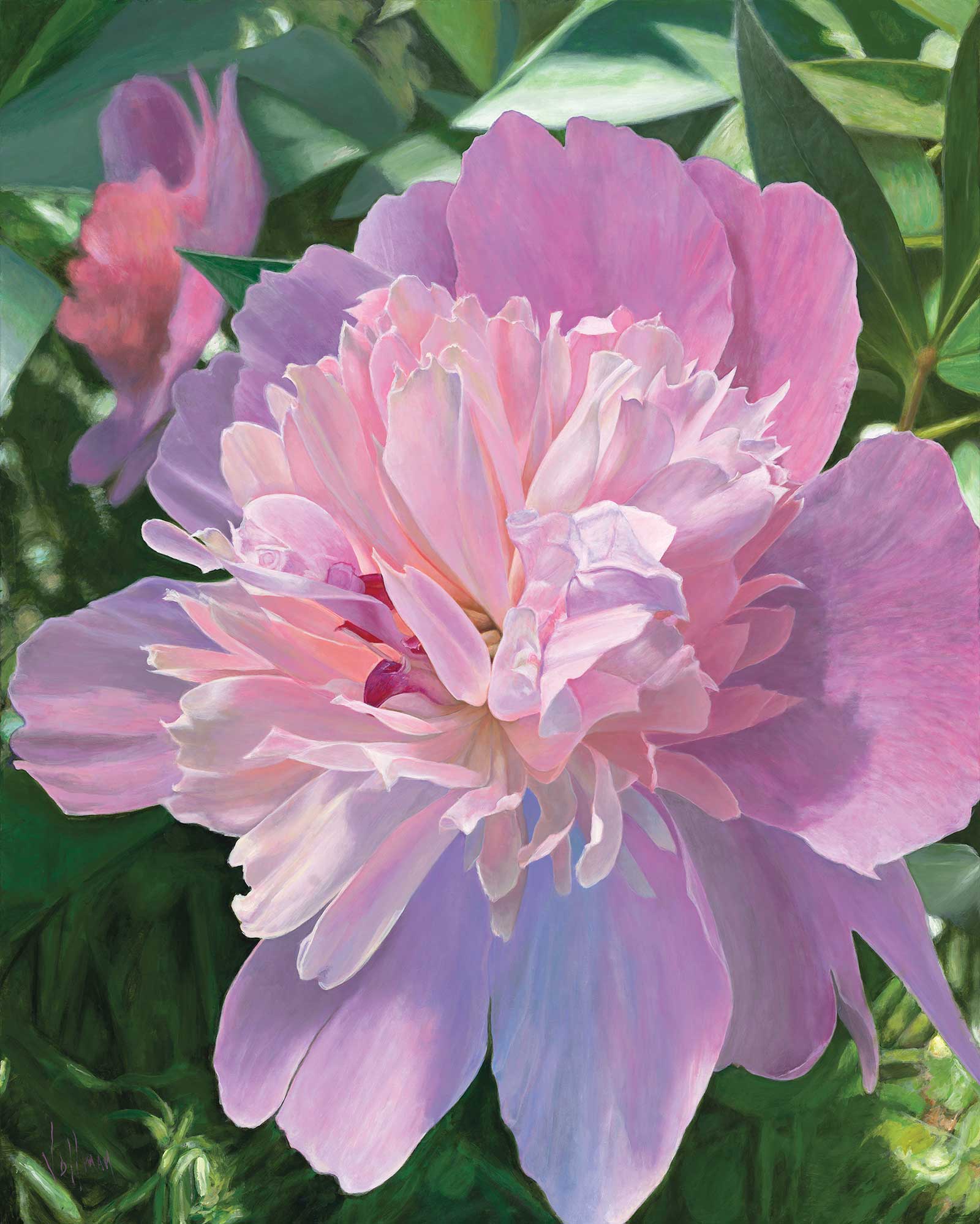 Pink Peony, acrylic, 60 x 48" (152 x 121 cm)
Paul Vollman
Ohio, USA
My Inspiration
I have always found inspiration close to home. This painting became part of a series of large-scale florals created after I was mindlessly staring at a pot of colorful petunias on my patio in the hot sun. As I zoomed in, I was thrilled to discover the myriads of amazing translucent color schemes. In that instant, I knew I had an unlimited supply of subject matter for a new series. Pink Peony became part of this new series: a close-up view of a 3” peony rendered in acrylic on a 4-by 5-foot canvas.
My Design Strategy
My design process started with reference photos. I look for amazing color combinations in random flower beds or gardens and just start taking photos from all different angles and perspectives. Then I start the process of elimination, picking the best shots to combine for the best colors and composition. Once decided on the subject and composition, the next design step is to develop the color “recipes.” Finally, for this particular series, all subjects are rendered on large-scale canvases, and as such, that design element is already decided.
My Working Process
As a trial lawyer and father of twin boys, my working process begins after everyone is tucked in bed. I have always painted at night. Alone in the studio, music, glass of wine, I feel I do my best work in the very late hours. As a former mechanical engineer, I am a bit overly detail oriented. At the start of every new work, I grid the canvas and pencil in the image freehand. Once drawn in, I begin the frenzy of color mixing and value setting, through trial and error, until finished.
Contact Info
Email: paulvollman@hotmail.com
Website: paulvollman.com