


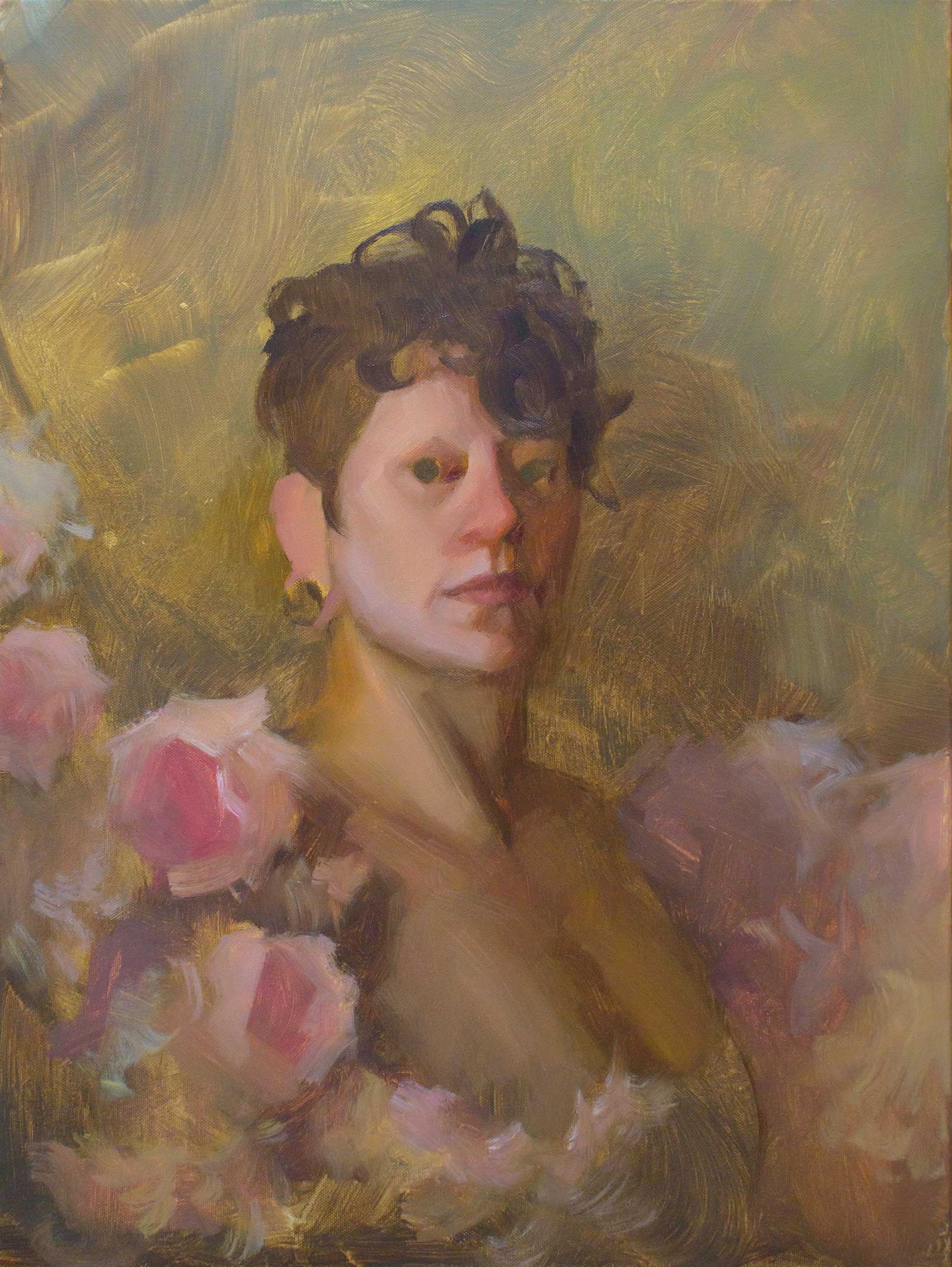
The painting Convergence is a continuation of a theme that I’ve been exploring since 2019: a combination of floral elements and the human body that aims to shine a light on our place in nature and the cycle of life and death. Mortality has long been a subject that artists highlight in their work, but rather than focusing on its bleak inevitability, I prefer to depict it as a precursor to beauty and a starting point for the life that will follow. Though some of my work has been a little more on the nose in its message, Convergence follows this theme with more subtlety, serving more as a portrait of the model that carries this theme with it, rather than a solely narrative piece.
The Cosmos Woke Up, oil on canvas, 24 x 24" (60 x 60 cm)
My approach is heavily inspired by the Victorian masters, using energetic but simple brushwork alongside careful color selection to achieve a loose but realistically rendered painting. I feel that this approach works particularly well with the naturalistic theme of the painting, giving it an organic feel. Oftentimes I will work the entire painting as a whole, or in large sections with an alla prima approach to take full advantage of the oil’s ability to blend while retaining bold brushwork. This means I have to work relatively fast to block in my base, then work each individual section to its finished look in a single dedicated sitting.
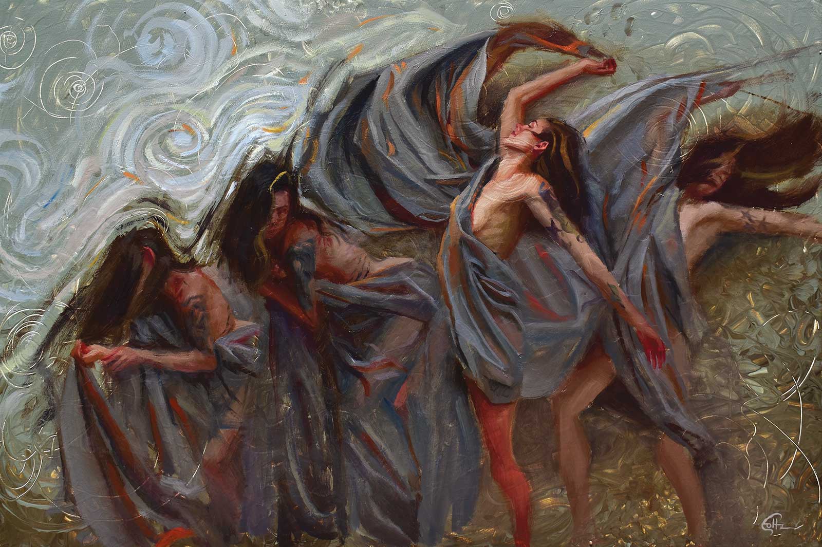
Flow, oil on canvas, 24 x 36" (60 x 91 cm)
I prefer to have a very good idea of the final look of the painting before I start working so that I can focus solely on my execution during the painting process rather than my color palette or design choices. Each painting starts with a photo reference and a rough digital mockup of my concept. This mockup is done on an iPad Pro, using Adobe Lightroom to fine tune the values and colors in my reference images, and Procreate to integrate elements like the flowers and other design elements into the work. From there I move on to a color study in oil, and finally, the full-scale project.
My Art in the Making Convergence
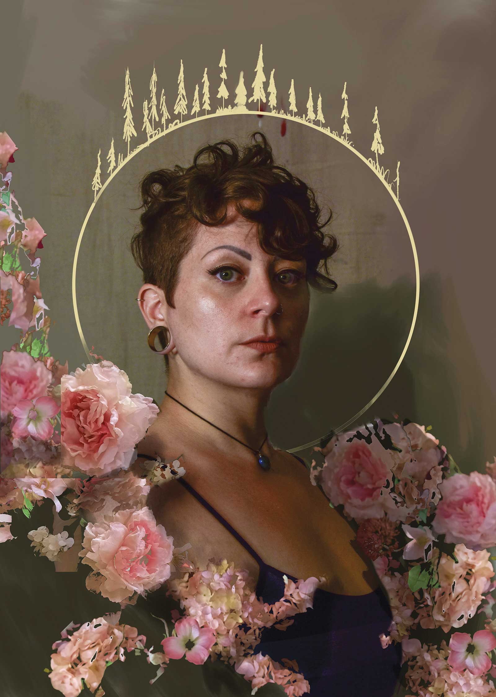
Reference Photo
 stage 1
Stage 1 Color Study
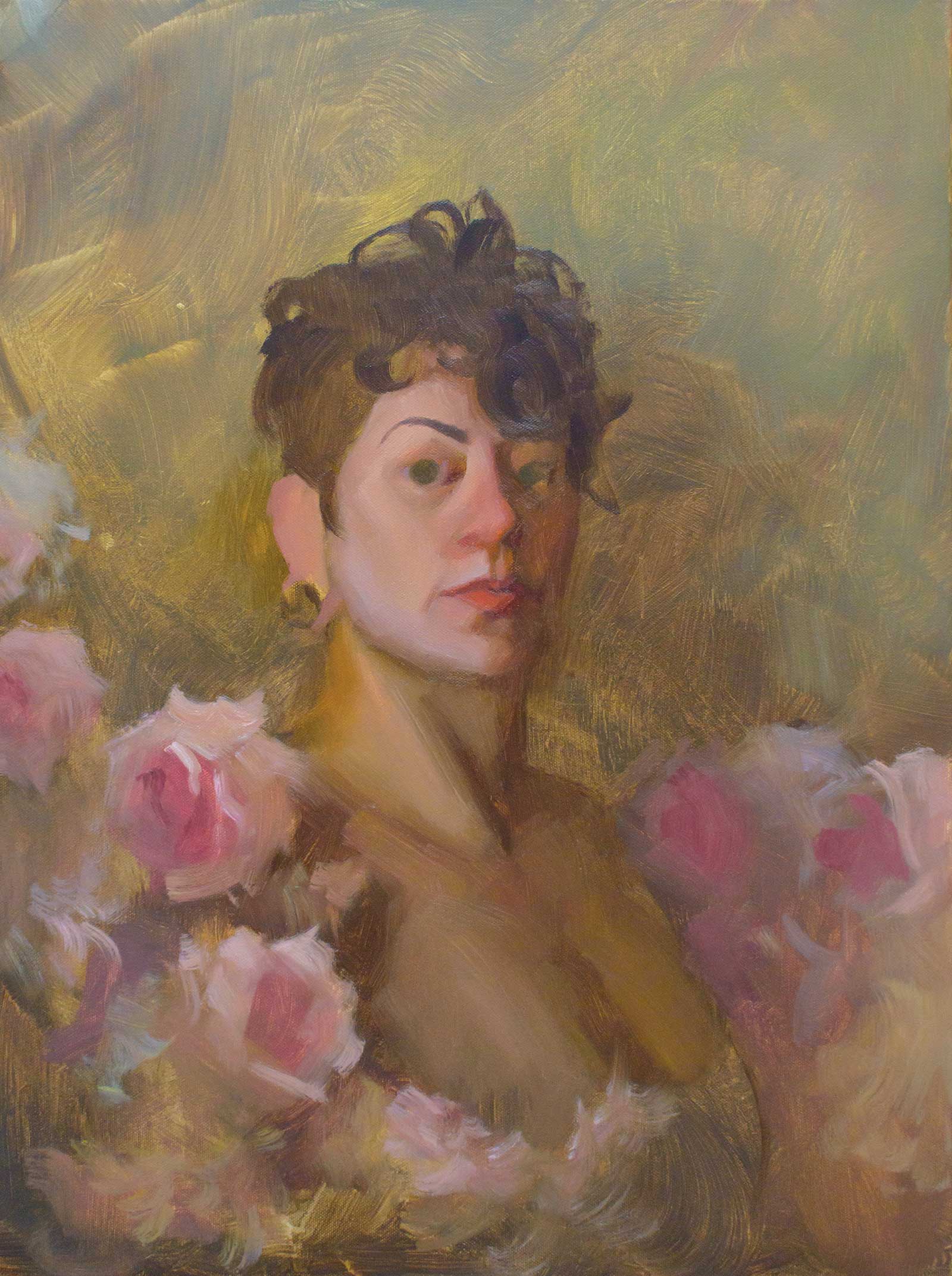
Once I’ve settled on a concept that I like, the painting process begins with a small color study in oil paint on a gesso-primed panel. The goal is to get a feel for the process overall and work out my color mixtures and composition for the final painting. Seeing the concept rendered in its intended medium helps me determine whether or not it will work at full scale. By the time I’m finished with the study, I’m also familiar enough with my colors and subject that I’m less likely to run into any unwanted surprises during the process. Color studies are becoming a more integral part of my process as time goes on: besides the practical benefits, they also invigorate me and keep me excited about the project at hand. I find that being excited about the work you’re doing is as important as any technical skill you apply to it.
 Stage 2
Stage 2 Staining and Sketching
The painting begins with a 2” chip brush to apply a wash of earthy tones using paint diluted with mineral spirits. The colors reflect the background and overall tone that I intend for the painting. I like the textural quality of a thin wash, so much of this stage will be retained through the entire painting, never being covered up in the following layers. I also use this wash color to begin sketching my overall proportions using a small round brush and a proportional divider.
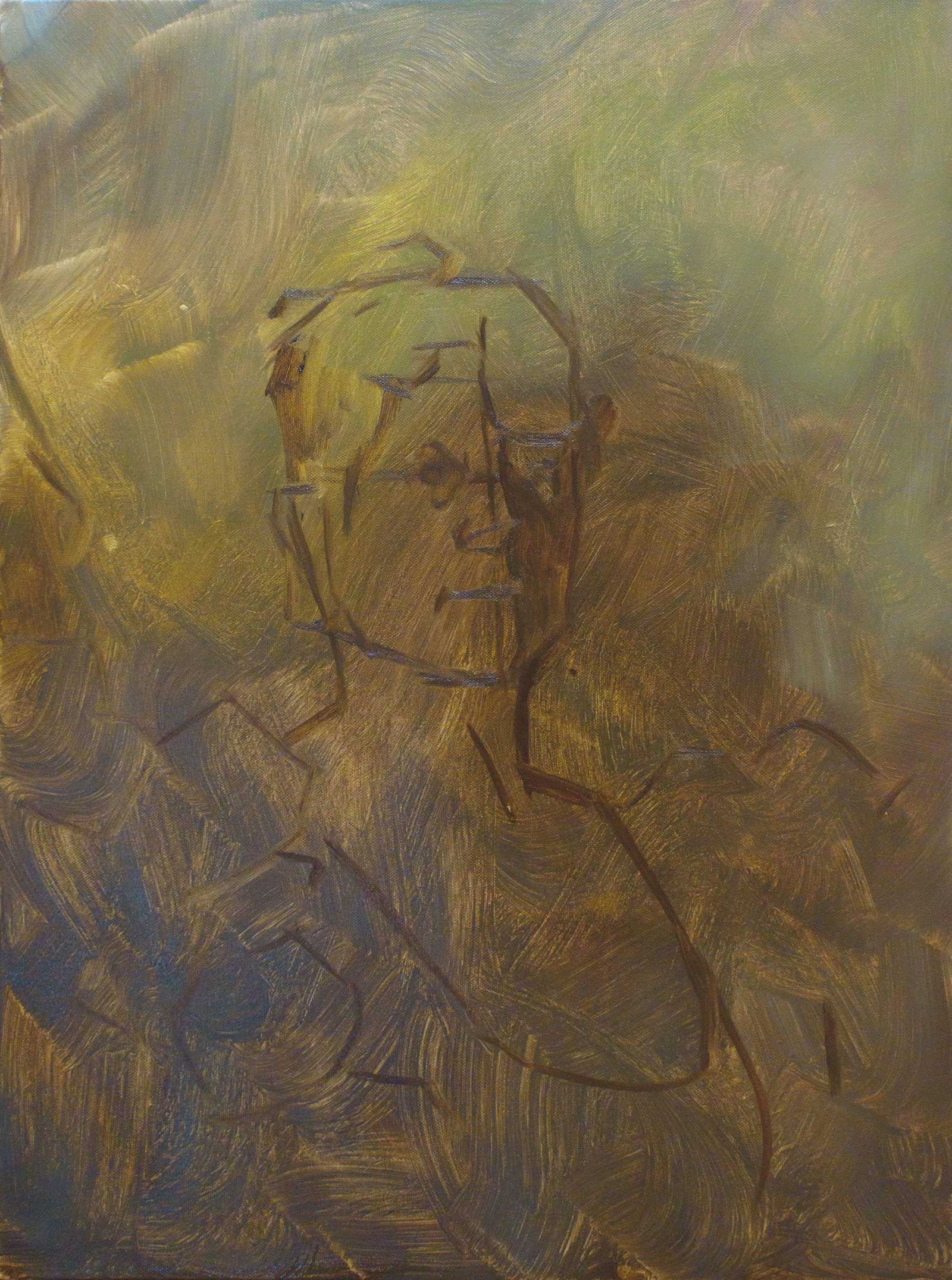
 Stage 3
Stage 3 Wipeout
Once I have my basic proportions laid out, I wipe away the lighter value areas with a paper towel while the stain is still wet. This not only establishes a very basic value structure to follow but gives me a cleaner surface for my lighter value colors to sit on top of in later stages.
Using Digital Tools for Planning
I find it particularly difficult or impossible to visualize images and concepts in my head. Oftentimes a painting starts as nothing more than a narrative idea, and I have to start laying it out as a sketch before I can begin planning it visually. This is where having access to digital art programs on a simple and portable device like an iPad is incredibly valuable for me. Working digitally allows me to quickly sketch thumbnails or compose full color concepts without having to worry about any physical art mediums, and it’s something I can do anywhere at any time. The variety of tools at my disposal in programs like Procreate also allow me to easily play with texture, color and make quick adjustments to my overall composition completely risk free.
 Stage 4
Stage 4 Blocking in the Shadows
Moving into the colors of my main subject, I begin blocking in the darkest values with a 1” chip brush. I always start with my darks, diluting them with mineral spirits to improve the coverage and applying them in a thin layer. The mineral spirits encourage this paint to stiffen up a little faster and will allow me to layer thicker paint on top without disrupting it too drastically. Working these colors into the underlying paint helps to unify the overall color of the piece and allows me to create soft edges where the form turns or is lost in shadow.
 Stage 5
Stage 5 Blocking in the Highlights
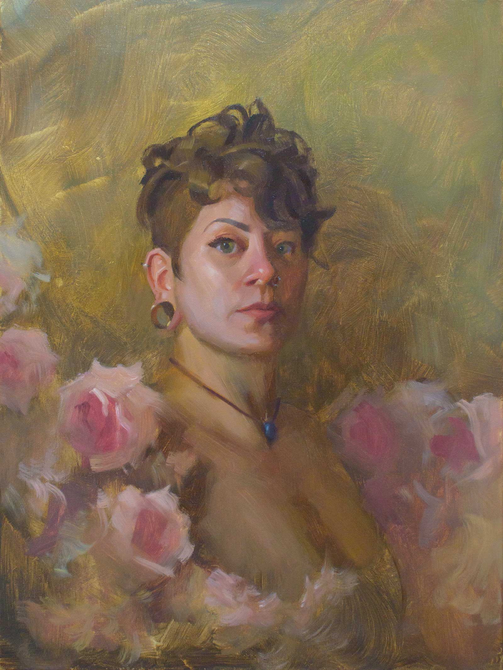
Adding the lighter values, I can start to define the form of the face and the flowers. It’s important for me to slow down in this stage, as mistakes will change the shape of the face and affect the likeness of the portrait. Using significantly more titanium white in these color mixtures, they are notably more opaque than the subsequent layer. This allows me to completely cover it in some areas, while lifting pressure from the brush lets me blend colors to create smooth transitions in others. This step marks the end of my first session with this painting.
 Stage 6
Stage 6 Refining Shapes
After a night away from the painting, I can come back with fresh eyes and refine any mistakes in the form. Every new session begins by applying a small amount of linseed oil to any area that has touch-dried overnight, both to reinvigorate areas of color that have flattened out and to help the next layer of paint go on smoothly. My goal at this point is to achieve a good overall likeness without diving into any of the detail, and in this case, much of the focus was around the mouth and larger forms in the flowers.
 Stage 7
Stage 7 Rendering the Hair
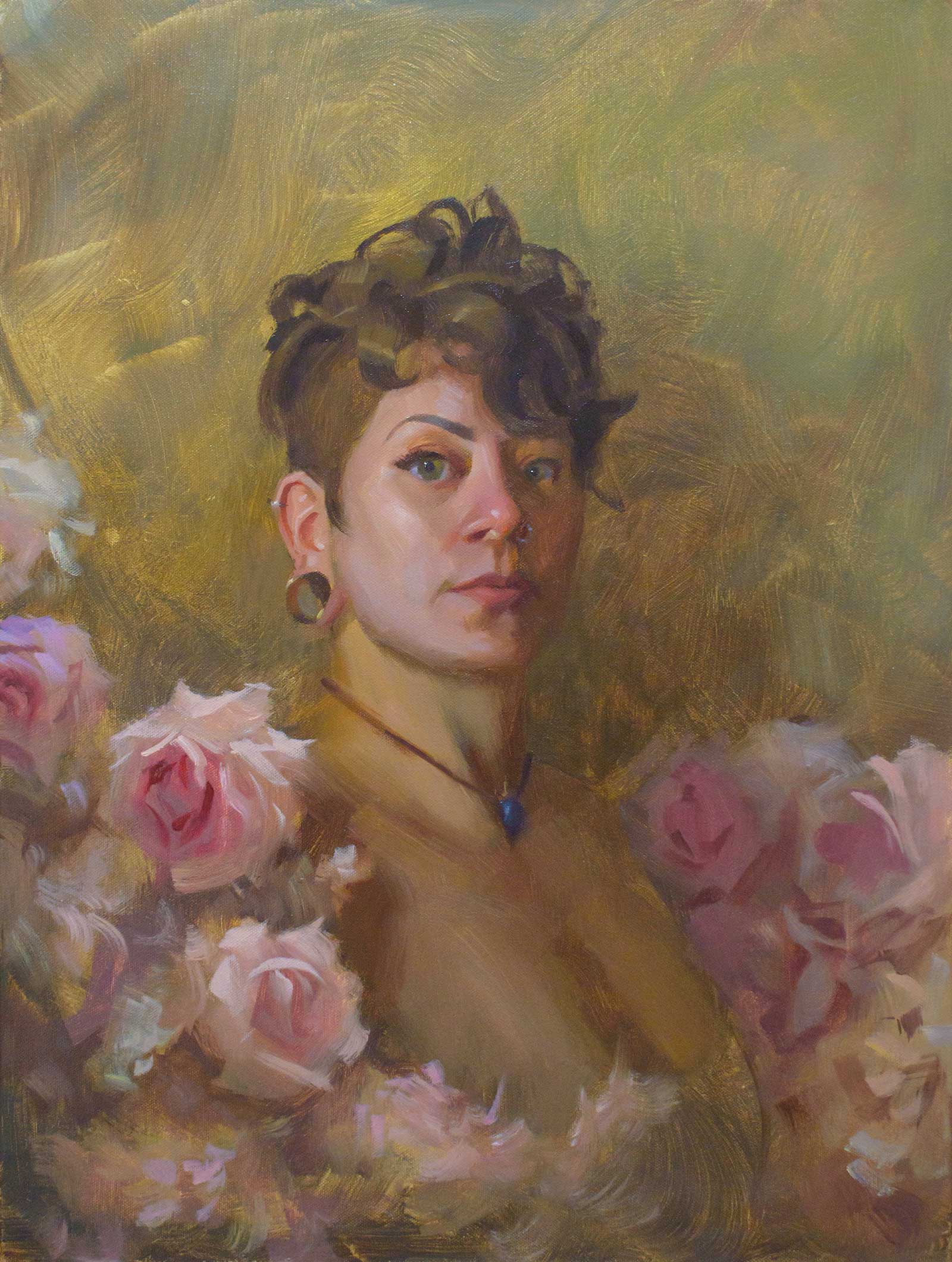
I like to render my hair in large, simple masses when possible. I’m constantly fascinated with portraying texture using simple shapes of color, and hair is a great opportunity to do that. Using my #10 flat, I carve in the shadows and brightest highlights in single strokes, leaving the colors from stage 3 as my mid tone. I take much the same approach to the exposed ear.
 Stage 8
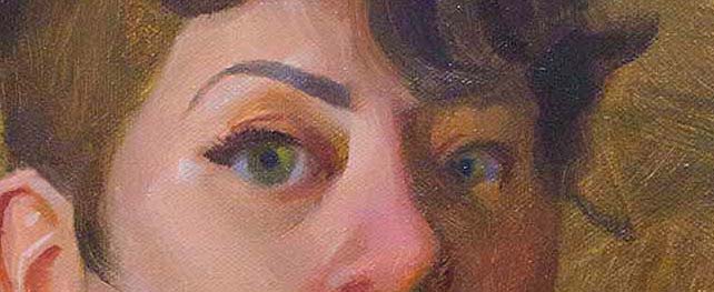
Stage 8 The Eyes
Of all of the facial features, the eyes are often the area I take the most time painting. The eyes are the first place a viewer looks in a portrait, so it’s important that I work slowly and carefully. I use a small angled bright to mark the eyelash line before defining the eyelid, iris and pupil. I try to keep soft transitions between the elements of the eye itself. This helps the eyes look natural and will accentuate the sharp highlight I add later.
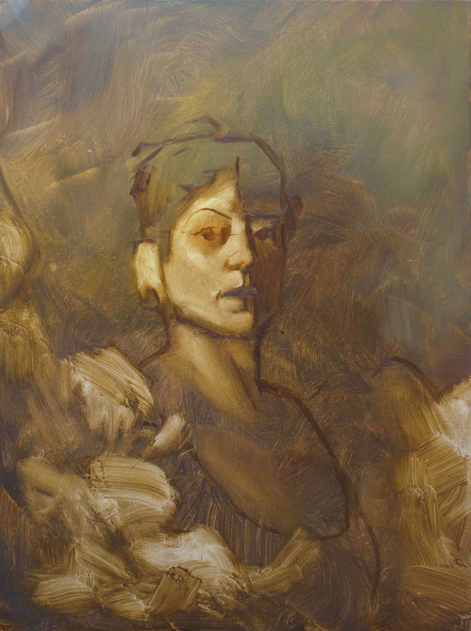
 Stage 9
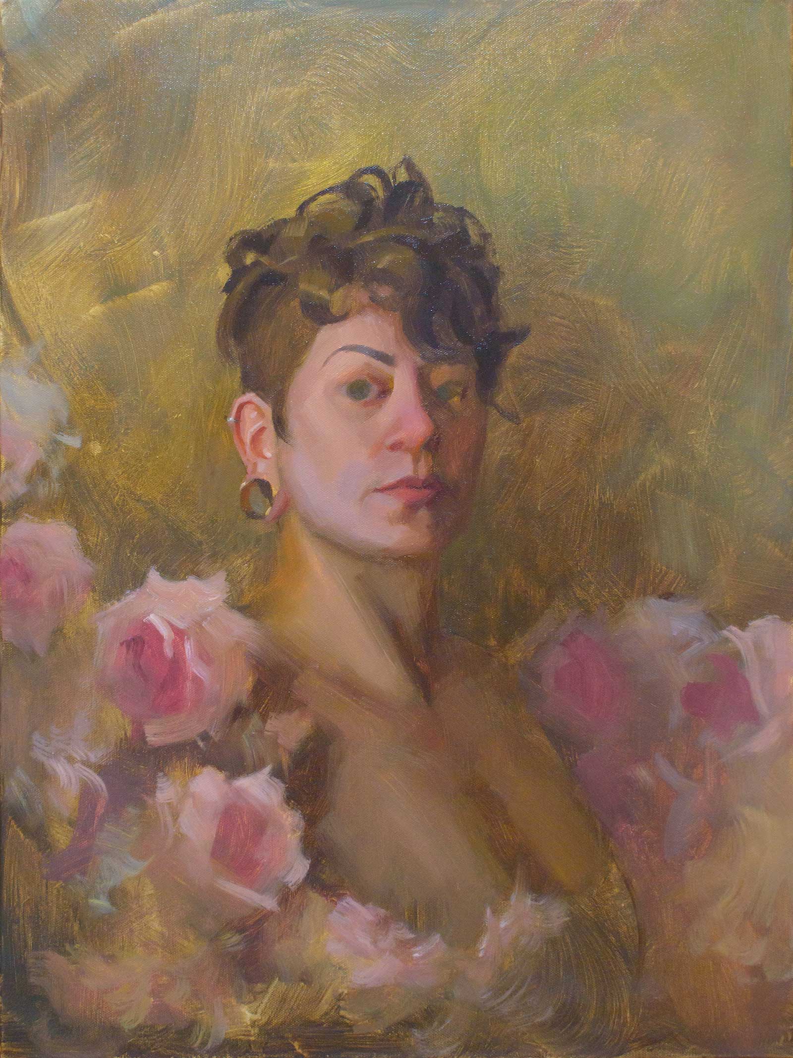
Stage 9 Finalizing the Portrait
The last step in any portrait for me is the brightest highlights. Softer highlights define the shape of the cheek bones, while sharper and brighter highlights are added to the nose and eyes. Interestingly I find that these highlights are often cooler in tone, even under a warm light. I also add the necklace using a few simple brushstrokes to finish up the portrait. This marks the end of my second session with the painting.
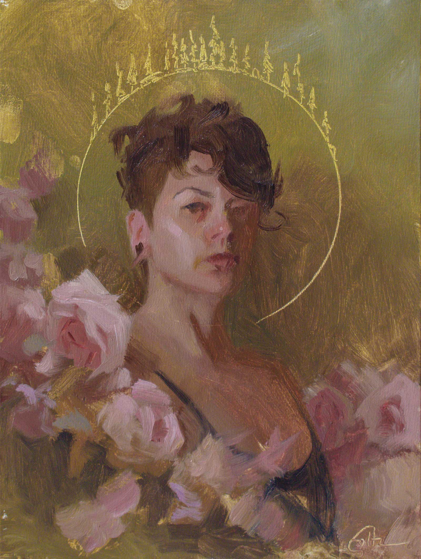
Detail Where It Matters
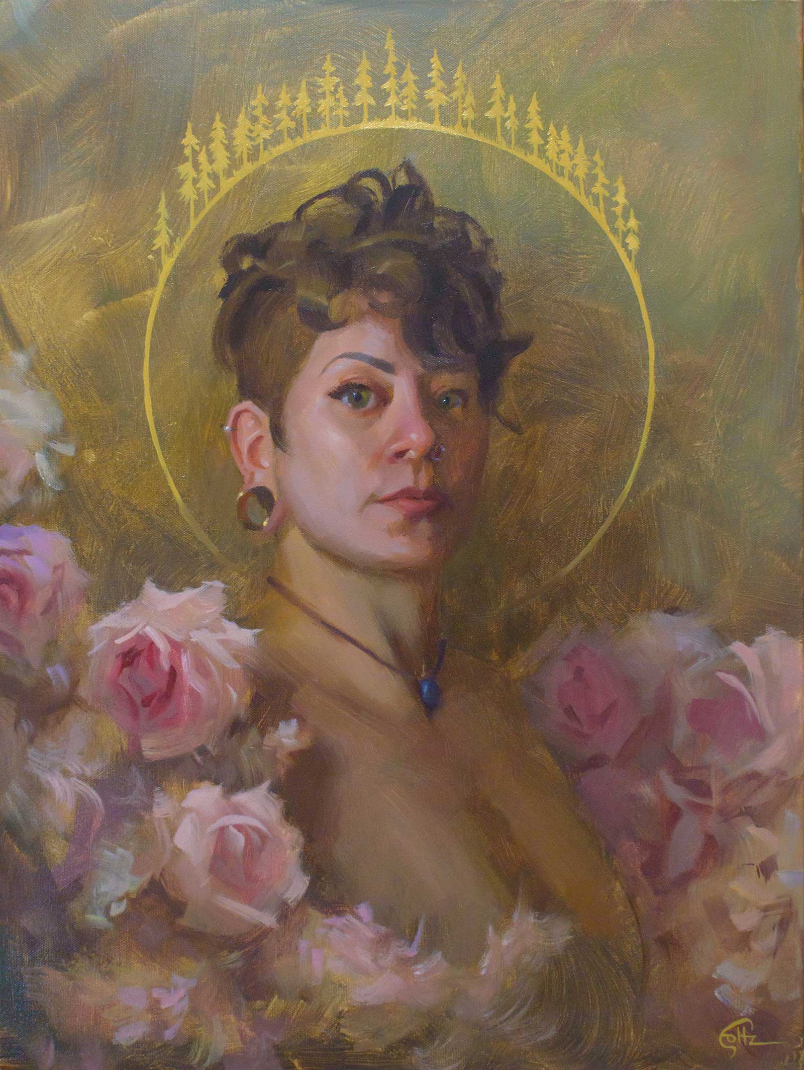
In the finished painting there’s a notable difference in the rendering of the portrait and the flowers that surround it. Playing with the level of finish in different areas of my work is one of my favorite parts of the process, as it allows me to direct the viewer’s eye a bit and differentiate between main focal points and the supporting elements. The flowers got a much looser treatment than the face, and for me it’s the elements that are painted more suggestively that feel like the real test of merit. It’s often more difficult to make something look simple.
 Stage 10
Stage 10 Finishing the Flowers
I return to my #12 bright to finish the flowers. I want to keep them suggestive and loose, so after oiling the previous layer of paint, I carefully select and mark the darkest shadows with a single sweeping stroke. I find the key to keeping my work suggestive is to define only those darkest shadows and brightest highlights, and to let the chaotic application of my rough colors and values from the block-in do the rest.
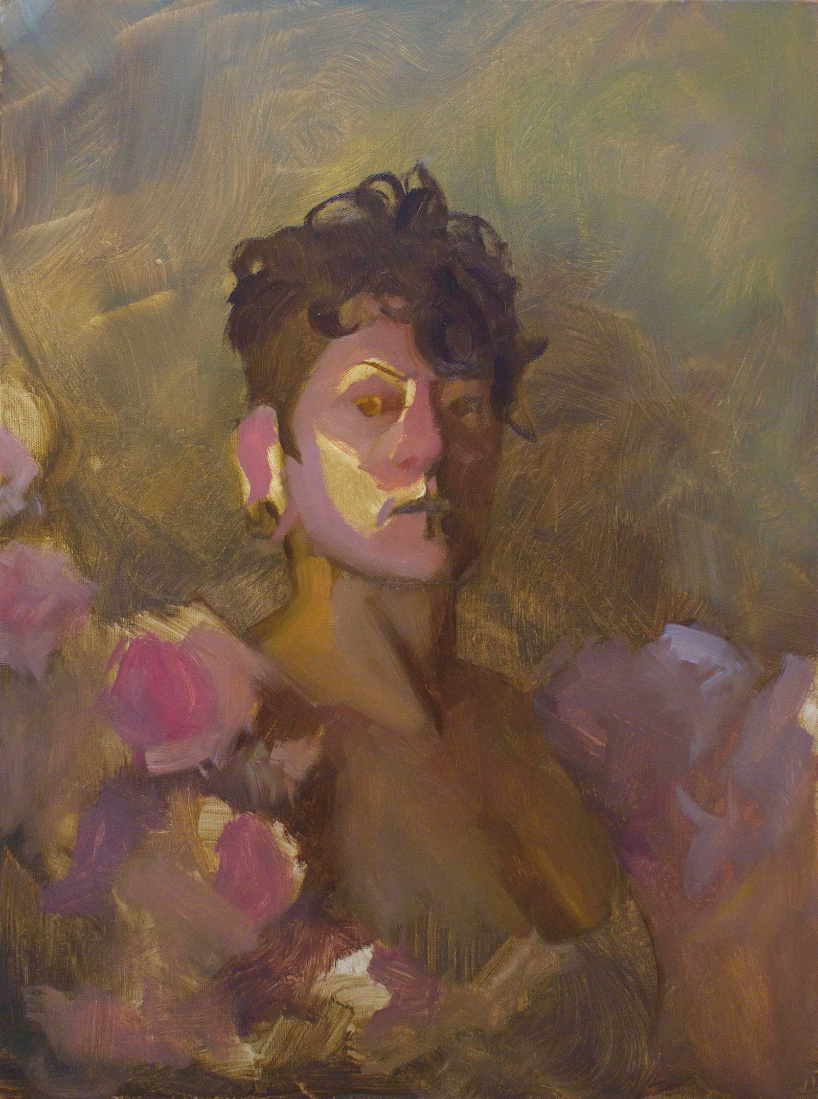
 Stage 11
Stage 11 The Halo
Convergence, oil on canvas, 24 x 18" (60 x 45 cm)
I knew from the onset of this piece that I wanted the “halo” of pines to have a flat, sharp, graphic feel to it. Once the background is completely touch-dry, I use a large mixing bowl to trace a circle onto my canvas, and with a synthetic angled bright, I begin laying it in. To help with the graphic feel, I add a few drops of linseed oil to my paint mixture. This keeps the paint fluid enough to maintain a sharp edge on each brushstroke while keeping the paint opaque so that the background layer doesn’t show through. This final addition wraps the narrative elements of a cycle into the composition of the painting.
About the Artist
 Alex Foltz
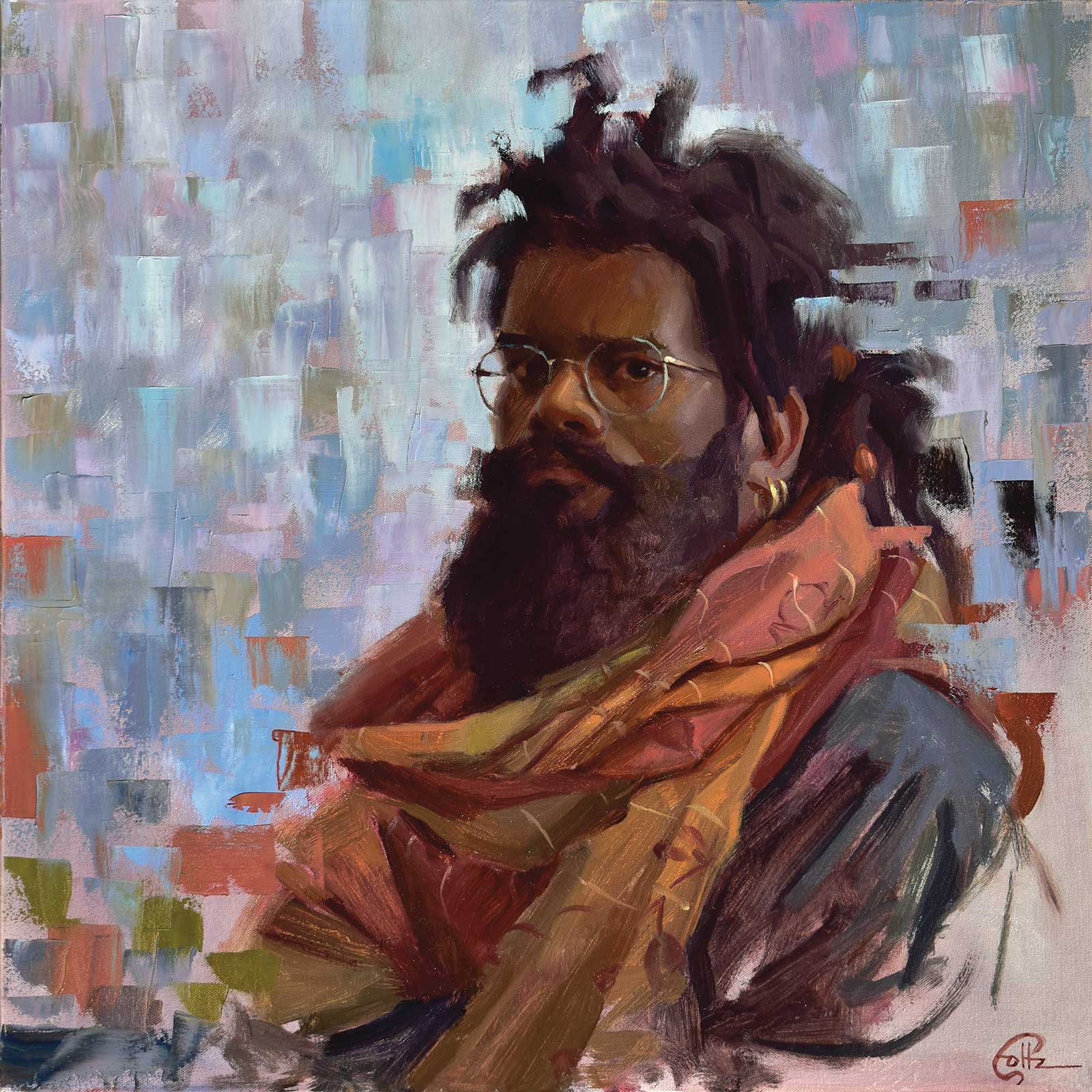
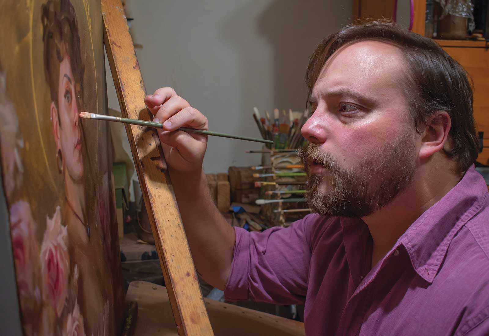
Alex Foltz is an award-winning oil painter currently working in Augusta, Georgia. His passion for expressive realism and visual storytelling has pushed him to explore a wide range of subject matter in his work. Though most widely recognized for his portrait paintings after placing as a finalist in the Portrait Society of America’s Members Only Competition in 2018, he is also an accomplished conceptual artist and plein air painter. His award-winning show “Foltz Studio,” in which he paints the landscapes of his home state in plein air, is in its second season. Readers can watch the show on YouTube at Northwest Access TV. Foltz’s work has received acclaim throughout the Southeastern United States, and his collectors span the United States, Canada, Germany and Australia.
Contact at
foltzstudio.com