


A few years ago I realized that I was at my best when simultaneously painting and teaching. When I’m forced to explain what I’m doing, while I’m doing it, all cylinders are clicking. Teaching requires me to articulate each decision, which causes me to paint with greater clarity, brevity and intent. This has helped me nail down my personal aesthetic.
When starting on a new work, I break down complex compositions into a few large shapes. As more shapes are added, the picture begins to emerge. I prefer to imply detail, adding just enough information for the viewer to complete the picture in their mind.
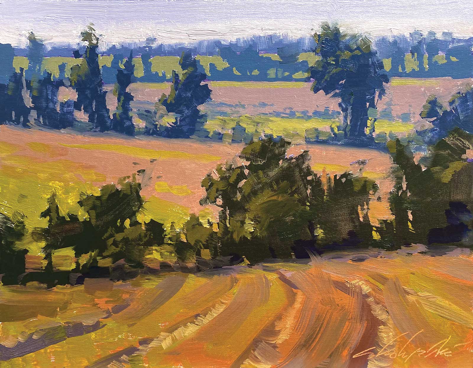
Infinitrees, oil on linen panel, 11 x 14" (27 x 35 cm) In this outdoor and indoor class, we balanced two sets of values juxtaposed against one another: the trees and the ground plane. We mixed both color families cooler and grayer as they recede into the distance.
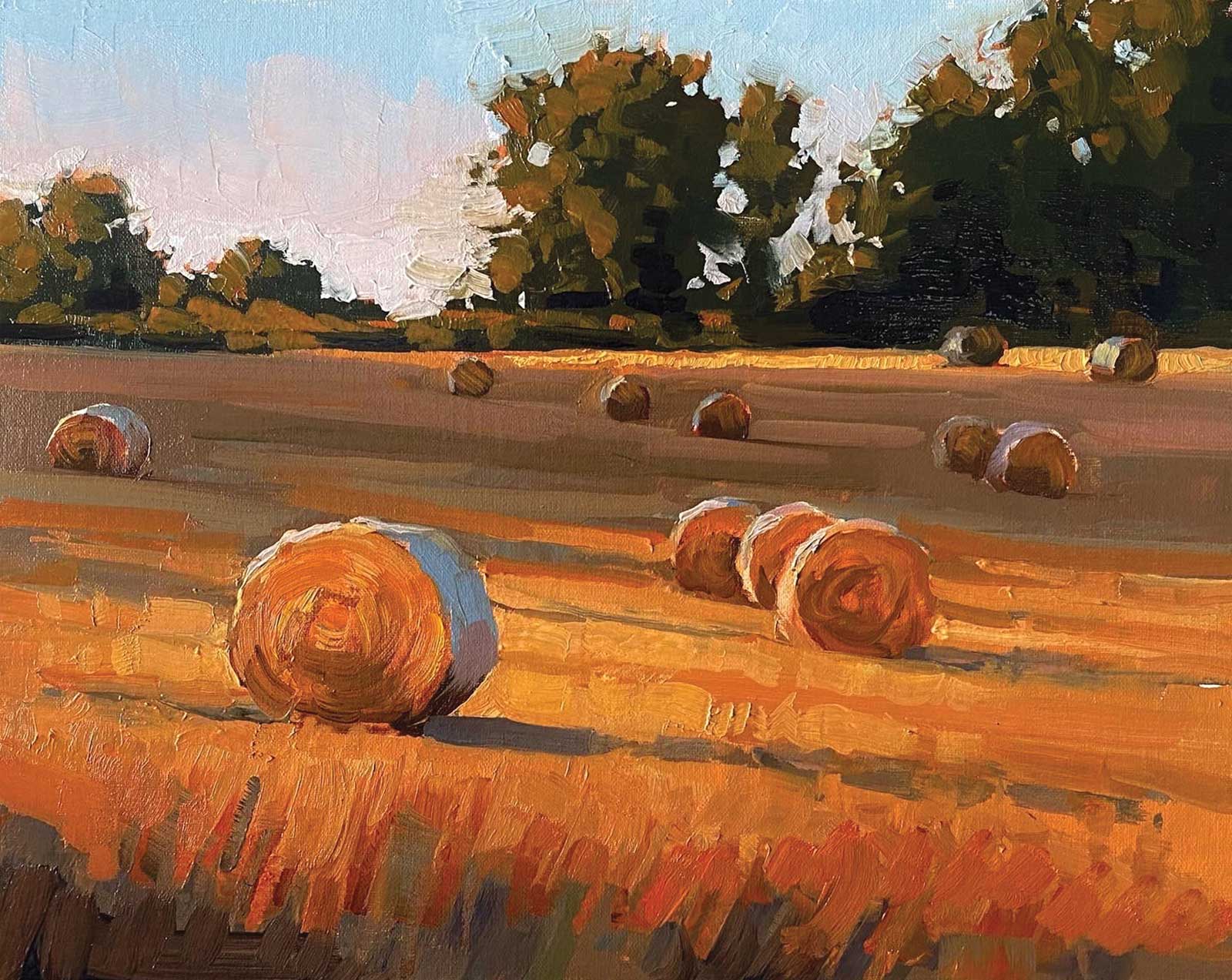
August Bales, oil on linen panel, 11 x 14" (27 x 35 cm) In this studio class, the warm light needed cool shadows to balance it. To keep the viewer’s eye on the center of interest, we kept the trees simple, using only two values and some sky holes.
Before painting a landscape, I scout around, squinting at different views to see if the composition and center of interest are still clear. I also remind myself that I can change the relationships between subjects within the composition without having to physically move. I can enlarge, reduce, eliminate or add information from the left or right. My sketch lets me try out different possibilities.
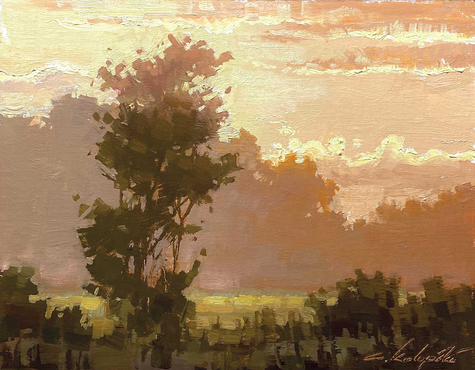
Edge of Anonymity, oil on linen panel, 11 x 14" (27 x 35 cm) In the studio class it was all about keeping the composition singular and uncluttered to evoke this silent, misty morning.
Once I have a composition sketch, I premix some basic colors to relate their values to one another on the palette. This allows me to paint in direct sunlight without the painting darkening too much when I take it indoors. The key is to make sure that my mixed darks are a couple steps lighter than my darkest palette colors. Once my darkest dark and lightest light are mixed, I can relate middle values to these. And all of this can be done in direct sunlight with little difficulty.
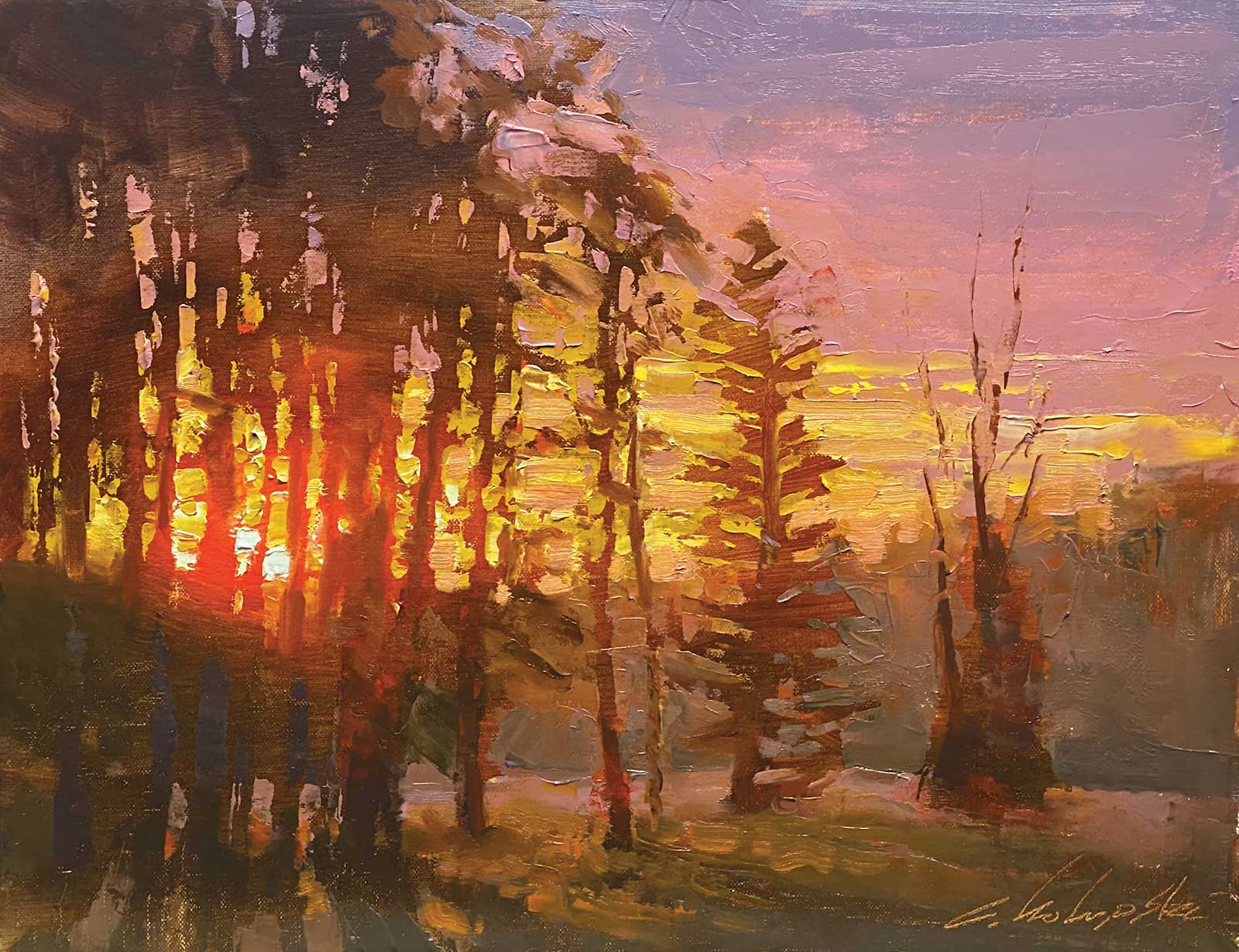
Last Ember, oil on linen panel, 11 x 14" (27 x 35 cm) In this studio class we dealt with extreme luminosity and transmitted light effects.
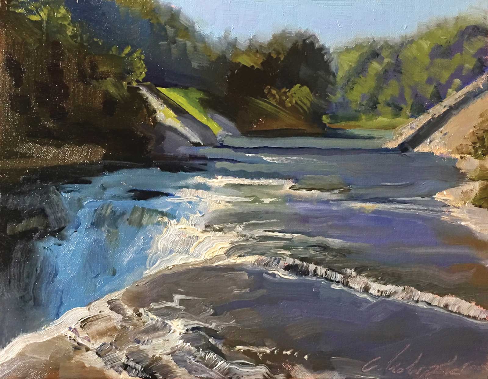
Letchworth Upper Falls, oil on linen panel, 11 x 14" (27 x 35 cm) In this outdoor class, the sketch preserved the light dark pattern as the sun came up. We also had to transpose water information to the rather dry foreground to beef up the waterfall and add drama.
I find it helpful to mix colors that conform to only three to five value positions. I do this by value-matching each new mixture to an earlier mixture, until all of them fall within three to five value categories. Budgeting values in this way gives my paintings more graphical impact.
I start by laying in the darks, looking for ways to connect them together to create a single large pattern. Next I add middle values and finally lights. Wide flat brushes help keep my shapes large and prevent me from rendering details too soon. Once the canvas is covered, I add smaller shapes with the same large brush. Marks made by the corner or edge of a big brush are usually more evocative than rendering details with a small brush.
About the artist
 Chris Kolupski
A longtime painting instructor, Chris Kolupski founded Boxart Street Atelier in Rochester, New York, in 2004, where he taught for almost a decade. He now leads virtual classes outdoors from scenic locations around the country, and from his Rochester studio. Kolupski’s love for the outdoors, from the gorges of the Finger Lakes to the red rock of Colorado and Utah, shines through in his landscapes. He purposefully rides the edge between realism and impressionism, embracing the changing light and other outdoor challenges, and capturing the total experience in paint.
Information on Kolupski’s upcoming workshops is available through his website at chriskolupski.com.
Contact at
ckolupski@gmail.com
chriskolupski.com