


During a recent workshop in Africa, we painted a 900-year-old baobab tree at one of the resorts we stayed in. Rather than trying to introduce too much color to what was an almost monochrome subject, I decided to use a neutral black mixture.
To mix this black I used ultramarine blue and alizarin crimson to achieve a strong, dark purple, then little by little, reduced the purpleness with the addition of a strong transparent yellow (quinacridone gold). Being transparent, it didn’t lighten the value of the mixture, which worked well for the baobab. The slight variation in color with different mixtures kept the painting interesting without needing to introduce any obvious color variations.
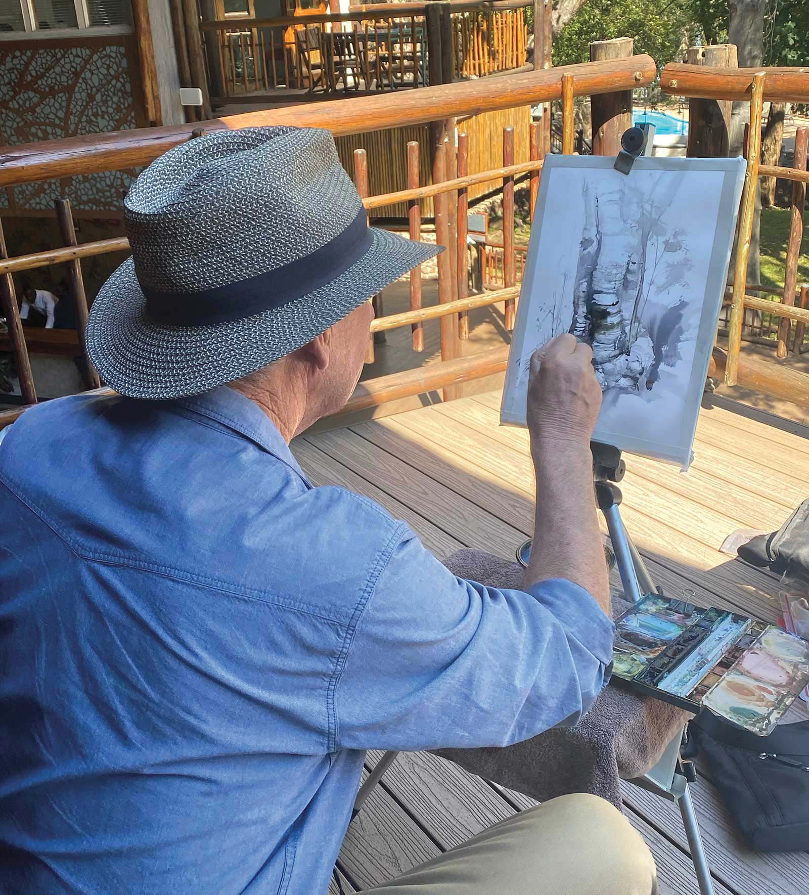
Painting the ancient baobab tree.
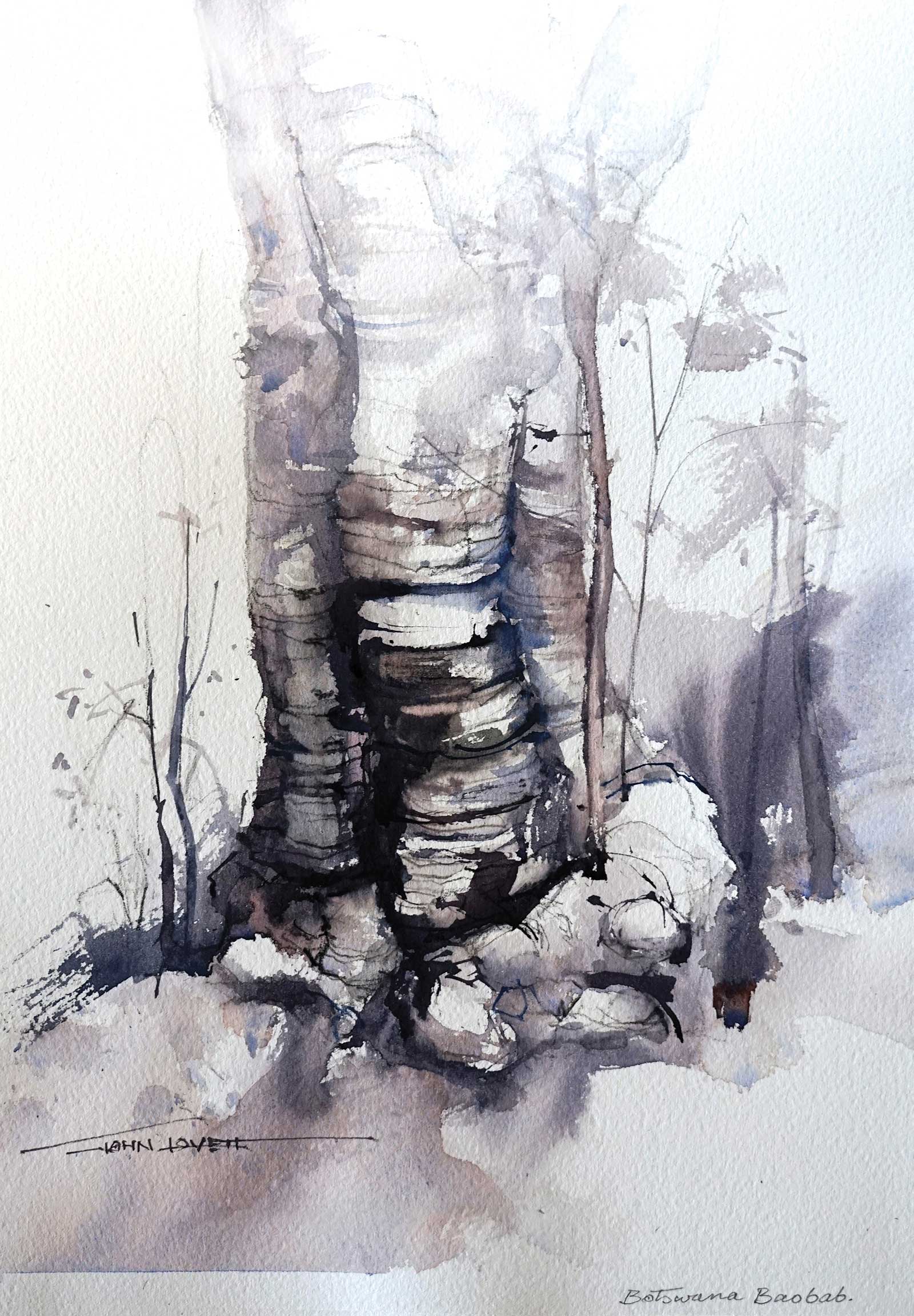
Although the painting shown here was done with an almost monochrome palette the slight variation in color temperature keeps the painting interesting and emphasises the intricate texture of the tree.
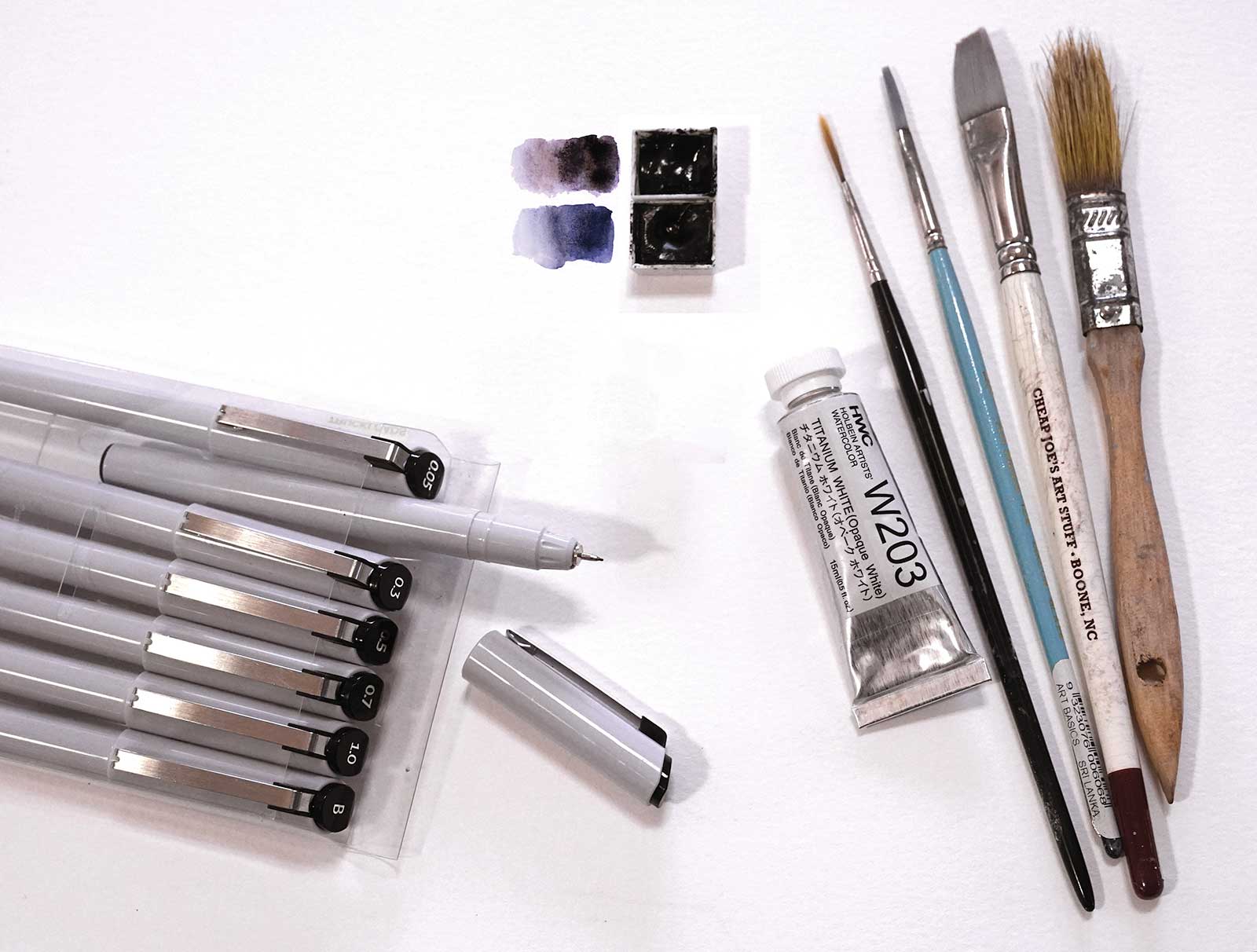
I really enjoyed the simplicity of this approach, so I started experimenting with a couple of premixed darks. The two pans here contain ivory black (slightly warm) and neutral tint (slightly cool). The other tools I used include:
½” bristle brush
½” long flat Taklon brush
⅛” long flat brush
Size 2 rigger
White gouache
A set of waterproof fine liner pens from .05 mm to 1 mm
Additional Examples
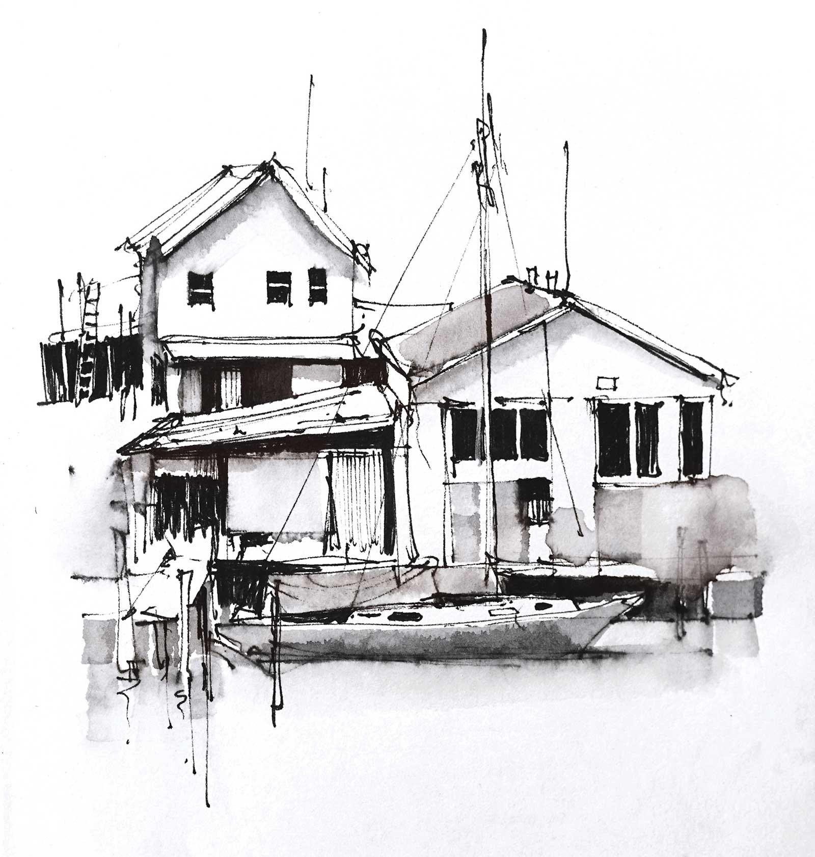
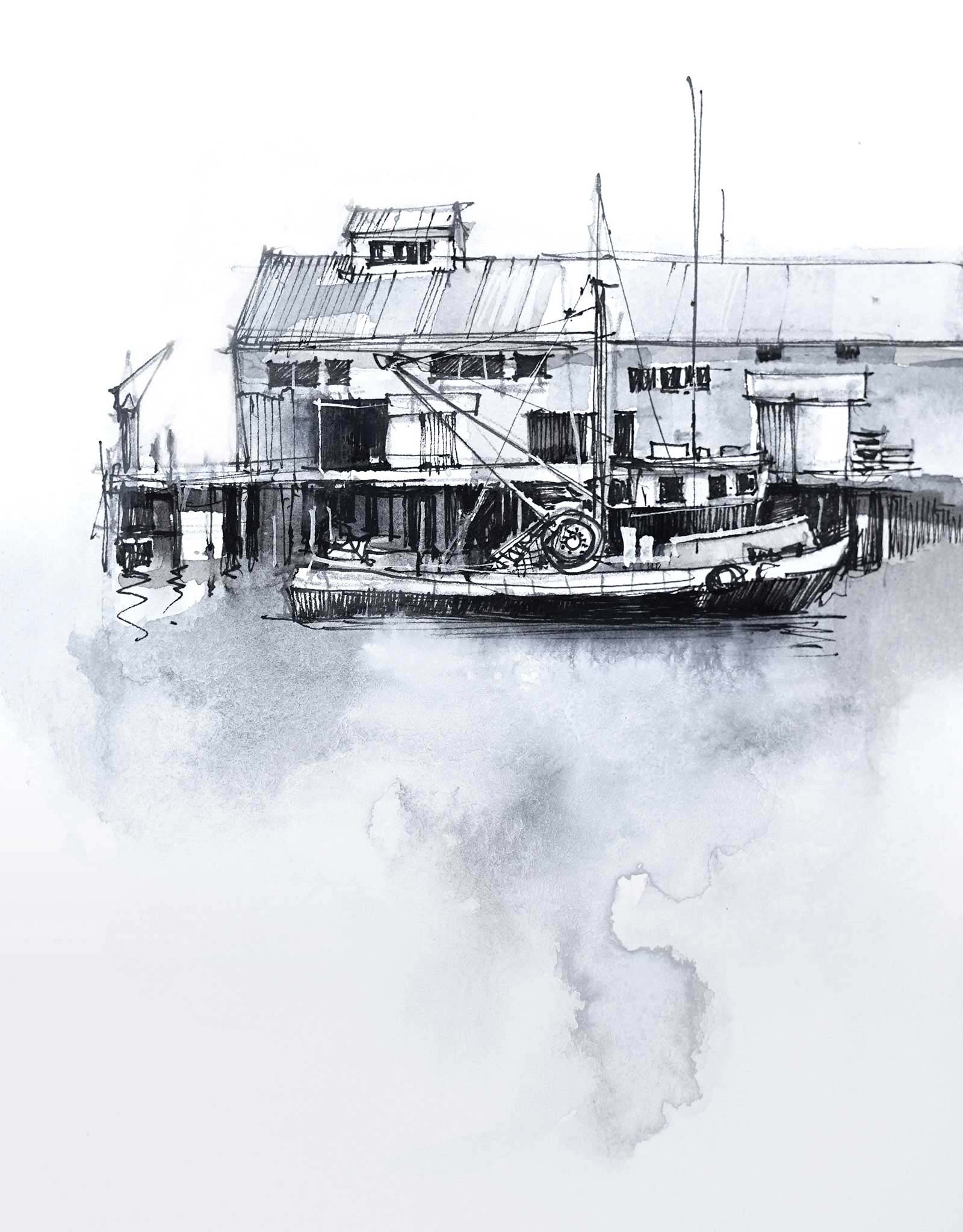
For these old boat sheds I used neutral tint and ivory black plus the liner pens. It amazes me how such a small shift in color temperature gives the suggestion of color.
Here the coolness of the neutral tint adds to the rough marine atmosphere of Monterey Wharf. With this technique the washes can be very loose and rough. The sharp, precise pen lines make an interesting contrast and add a feeling of detail and accuracy to the sketch.
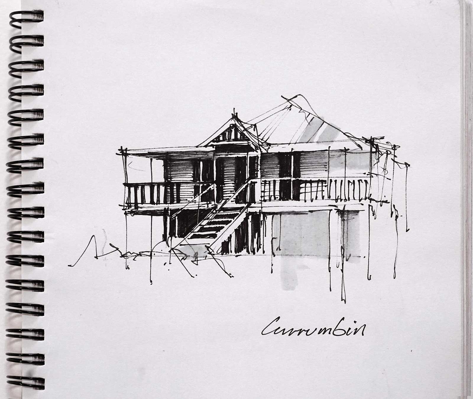
This quick little sketch was done first with loose fine liner marks, then right at the end, a few strokes of neutral gray with the ½” flat brush adds a little subtlety to the drawing.
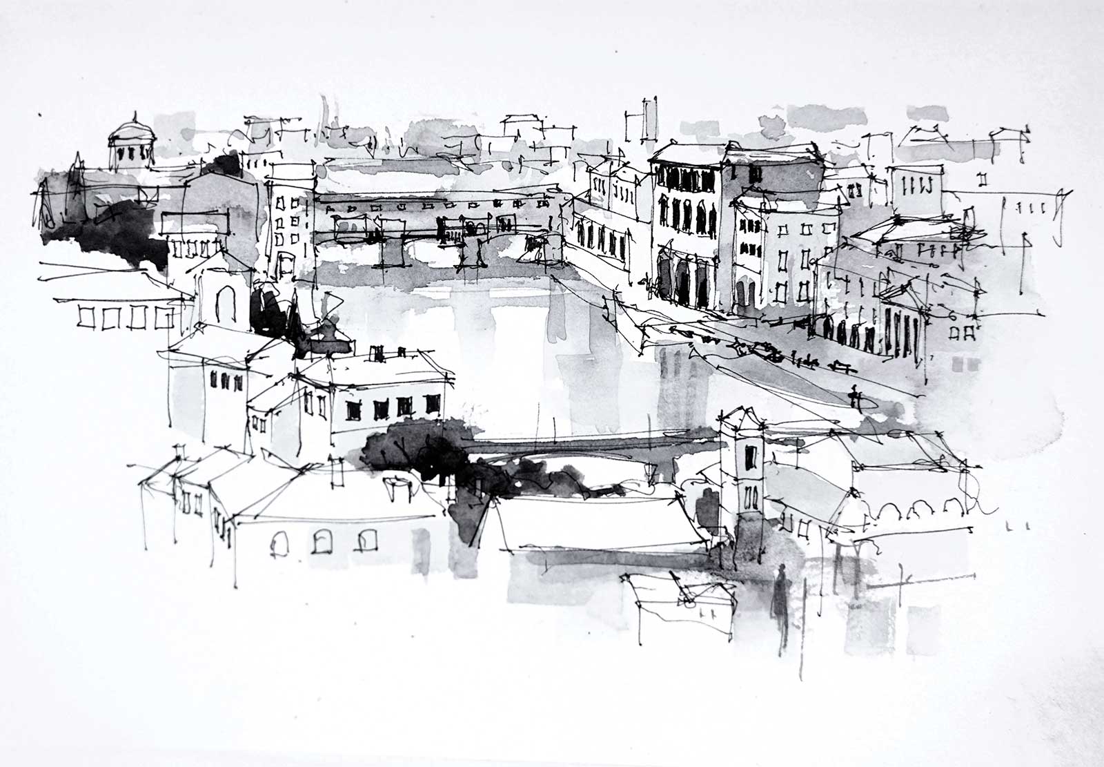
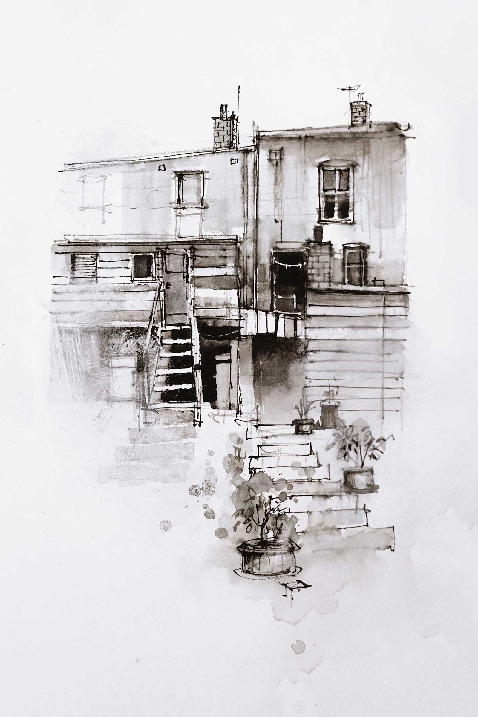
This was a complicated subject so I started by sketching it out with a fine liner pen. Then once most of the detail was done, I added washes of neutral tint. After the washes dried I used a thicker liner to adjust and darken some of the windows and arches.
Here, the neutral tint leans more towards a blue black, giving the sketch a completely different atmosphere.
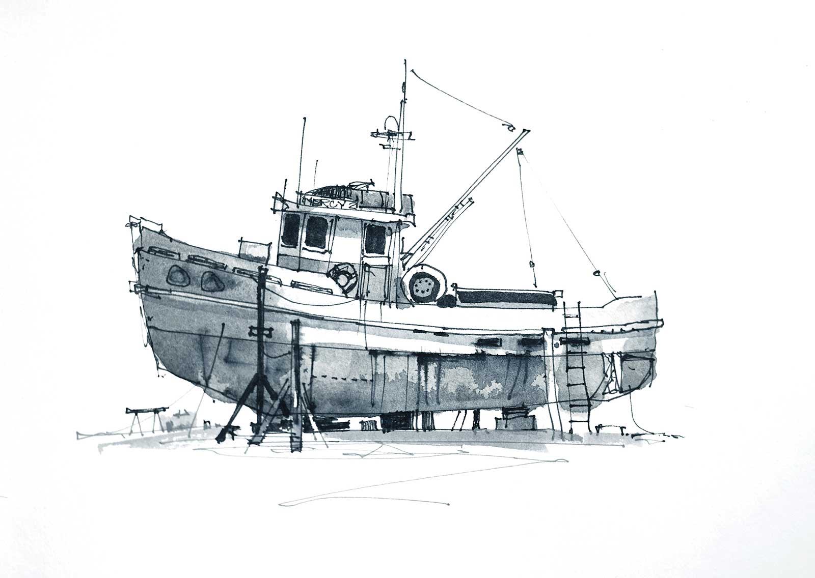
For this sketch I used ivory black, some liner pens and a few fine lines of white gouache. The subtle warmth of the ivory black suits the weathered, rustic nature of the subject.
Exploring monochromatic painting has reminded me that color isn’t always necessary to create atmosphere, depth or emotion. In fact, stripping things back to a very limited palette often brings forward other elements, like composition, texture, tone and contrast that can sometimes be overlooked. With just slight shifts in color temperature and value, a whole world of nuance emerges. Using warm and cool blacks and fine confident pen lines produce a quiet power through its simplicity. Monochrome doesn’t limit creativity—it sharpens it. —
Contact at
johnlovett.com