


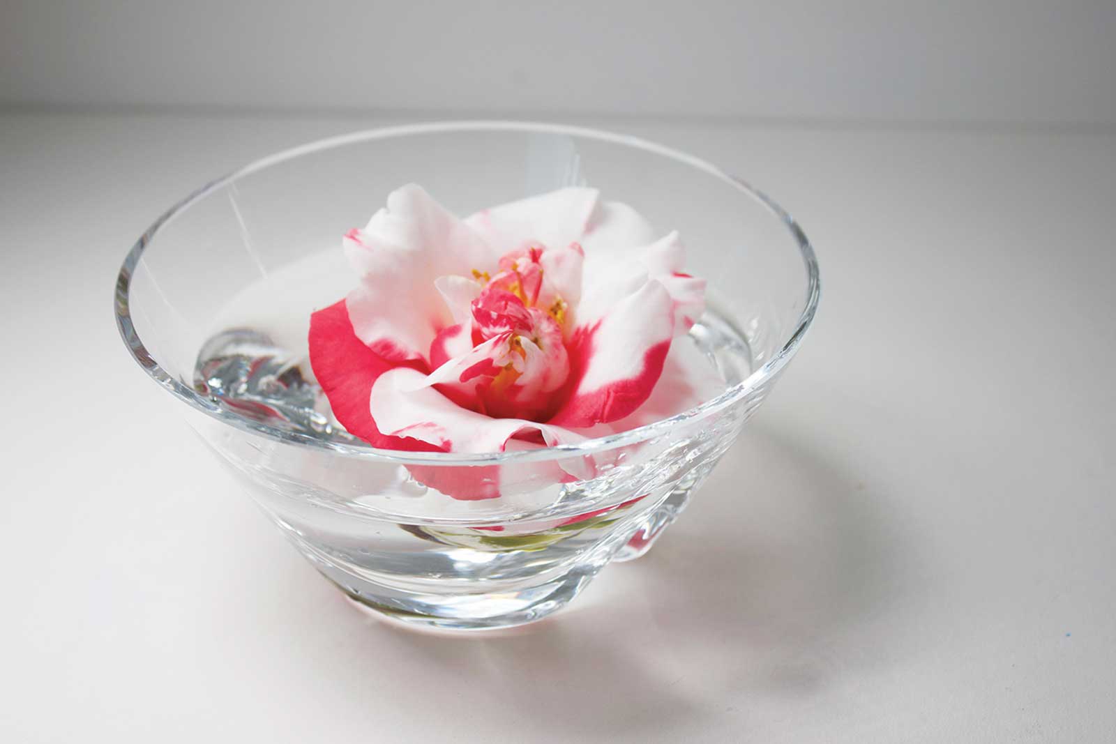
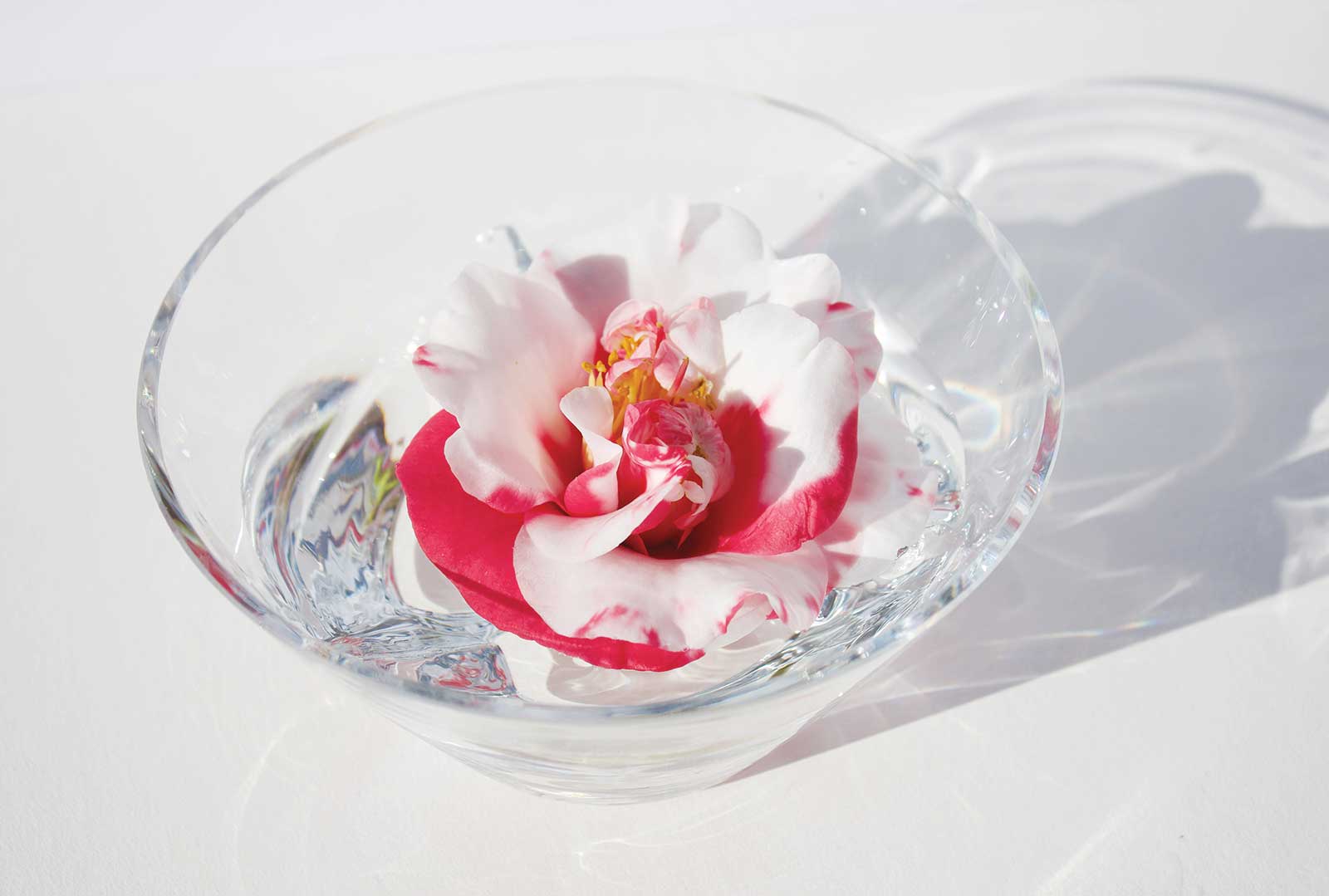
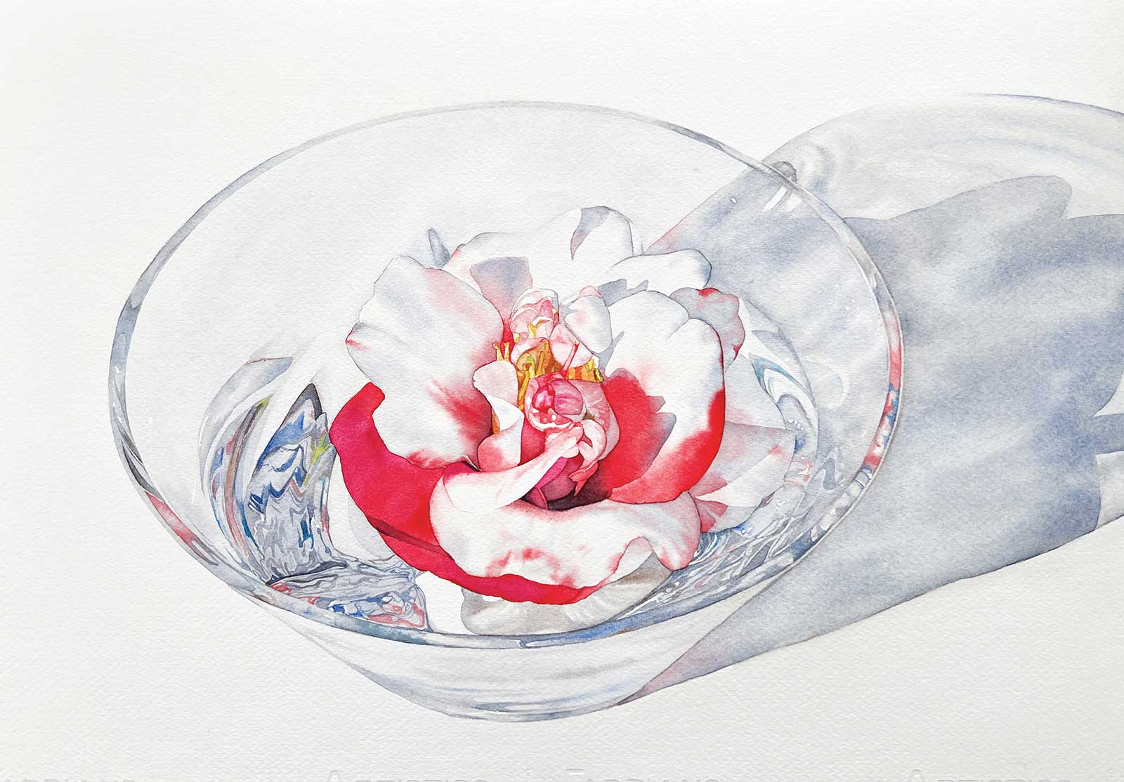
My watercolor painting Floating Memories was created in tribute to my Nanna, who often had camellias from her garden floating in a crystal dish on the dining table. As a child, I’d gently swirl the flowers in the water and watch the light dance through the cut glass. That memory came rushing back to me years later when I noticed blooms on my own camellia tree and instinctively placed one in a bowl of water, just like she did. That simple act became the inspiration for this painting.
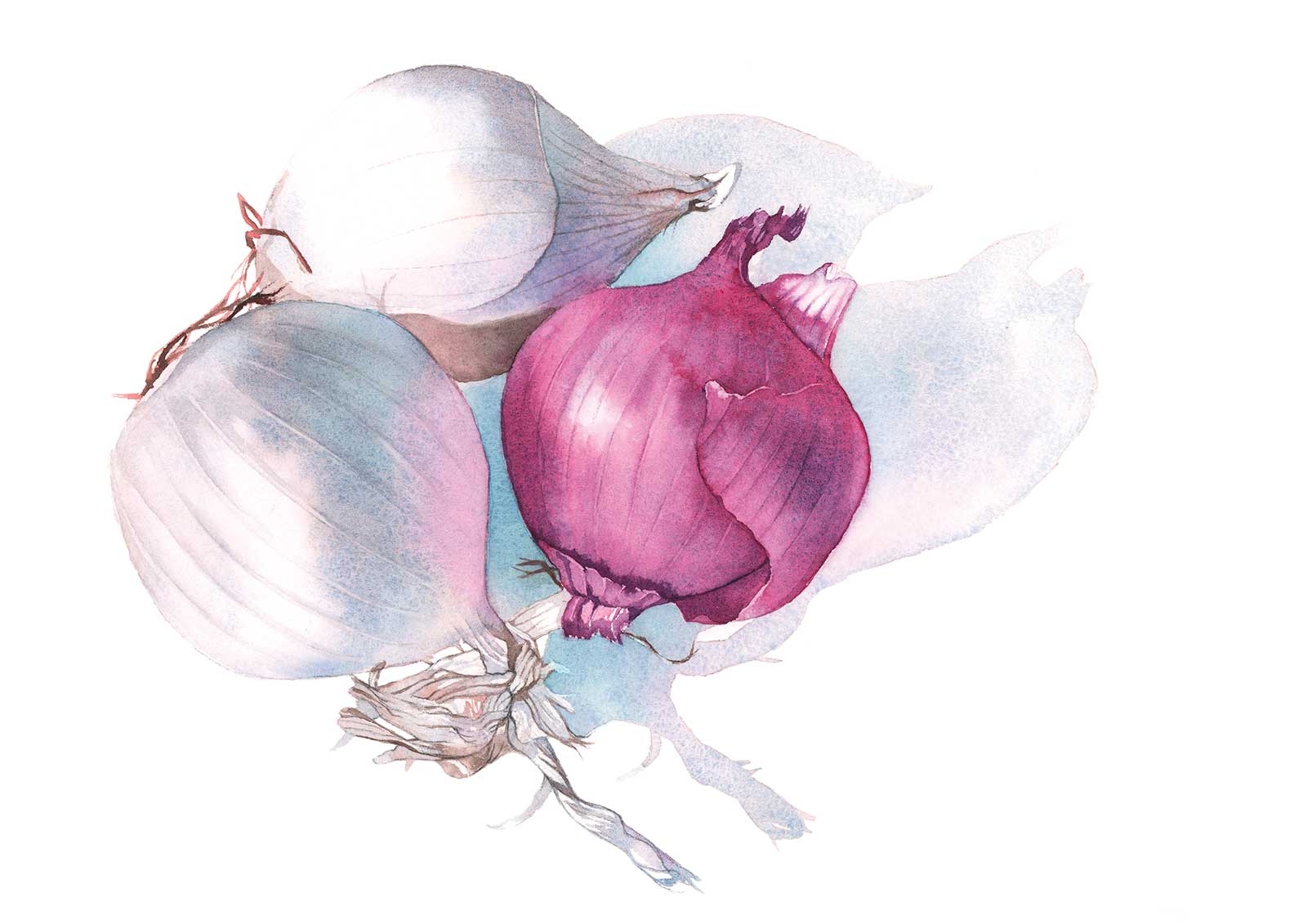
Onions, watercolor, 10 x 14” (25 x 35 cm)
My style is grounded in realism, and I strive to capture delicate transitions of tone and light while preserving the softness that watercolor does so beautifully. With this painting, I wanted to honor the fragility of the flower and the complexity of glass and water, without overworking either. It was also important to me that the final image felt calm and nostalgic, true to the memory it was based on.
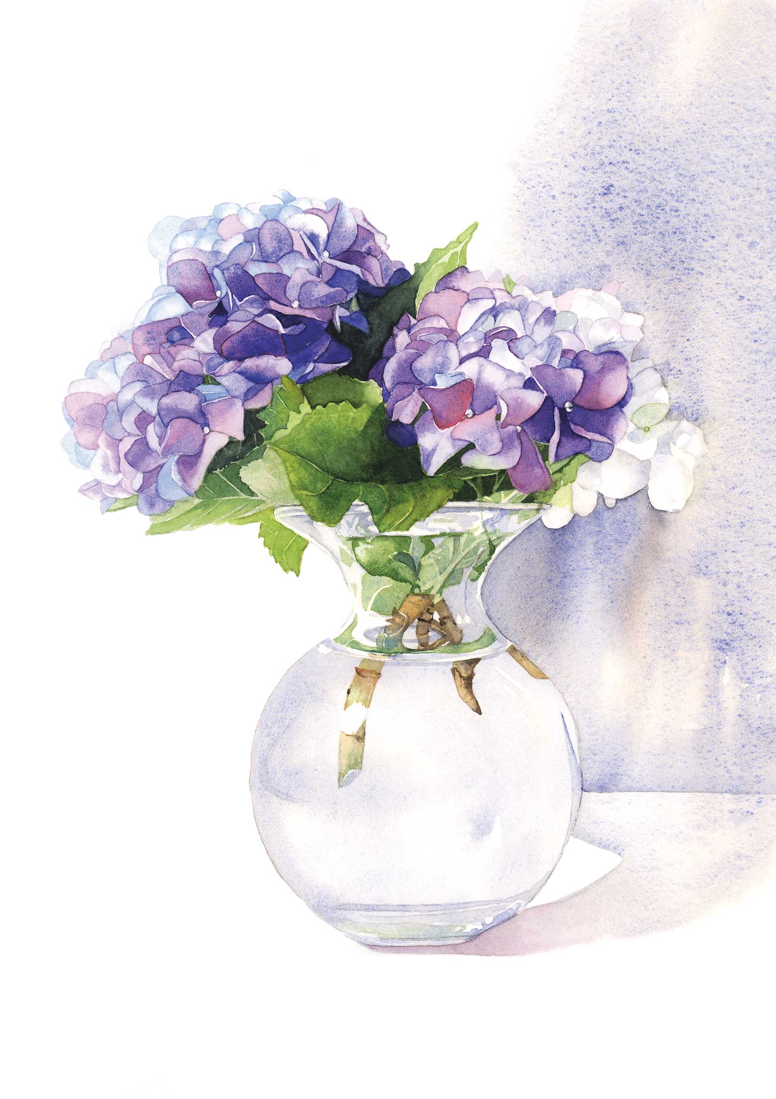
Hydrangeas in Vase, watercolor, 14 x 10” (35 x 25 cm)
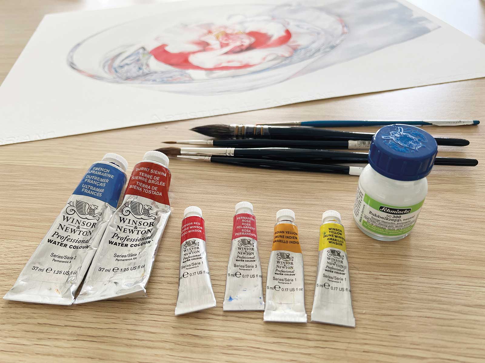
I worked on soft-pressed paper and used a palette of Winsor & Newton colors, building the layers slowly. The petal shapes were drawn carefully, then painted using a combination of wet-on-dry for the sharp edges and wet-on-wet for the subtle shifts in color. I paid close attention to the distorted reflections and refracted color inside the bowl because these add realism and help anchor the camellia inside the glass. The shadow was painted using cool grays to echo the transparency of the bowl and soften the composition.
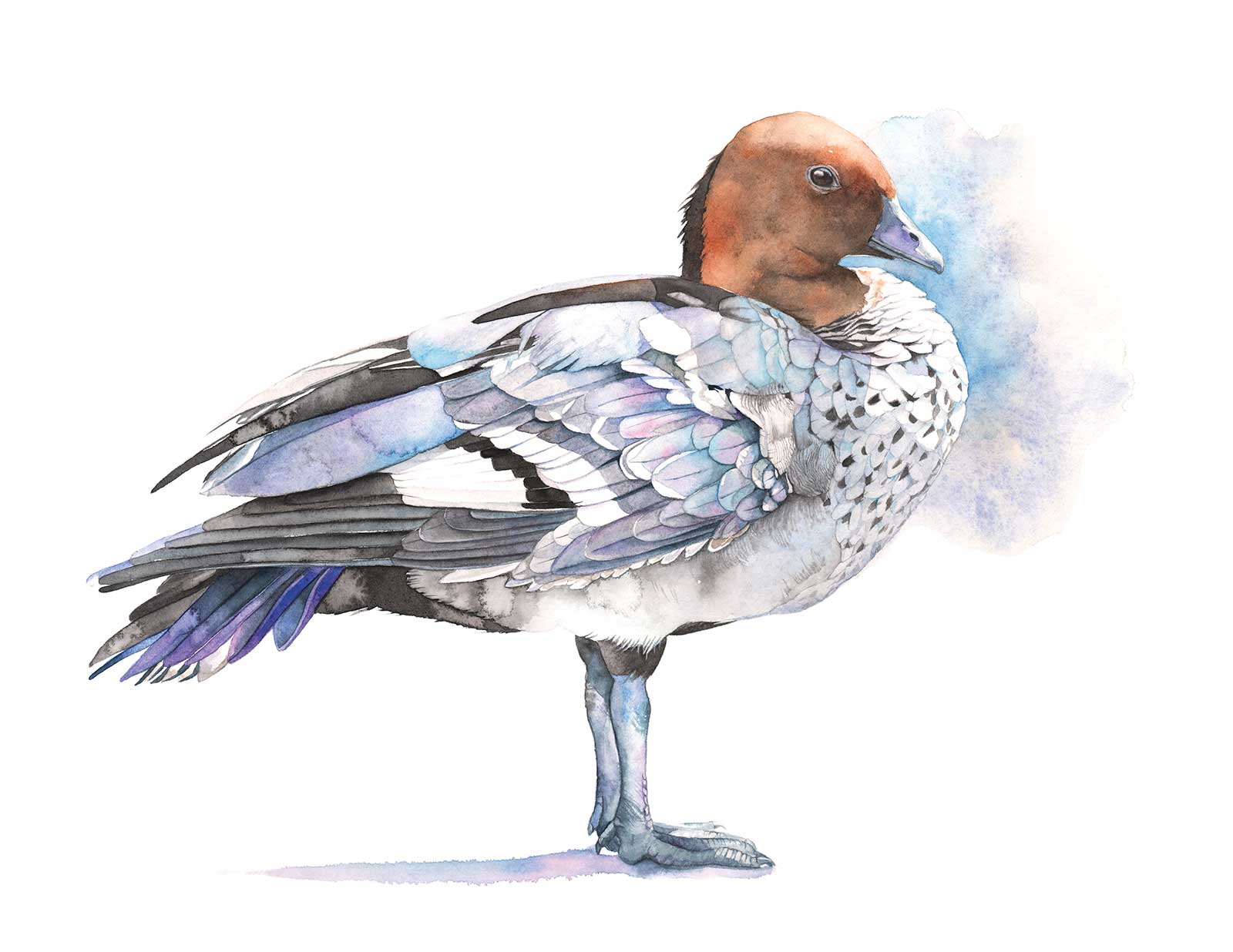
Wood Duck, watercolor, 14 x 19” (35 x 48 cm)
Painting this piece was more than just a technical exercise, it was about capturing a feeling. It reminded me of where my love of beauty and detail came from. In the demonstration that follows, I’ll walk through the techniques I used to bring Floating Memories to life.
My Art in the Making Floating Memories
Indoor
Outdoor
Reference Photos
Because I often need to step away from a painting for days or even weeks to complete other work, I knew I’d need a reliable photo reference to maintain consistency throughout. I initially placed the bowl on a piece of white cardboard against a white wall in my studio and photographed it under artificial lighting. To explore different lighting effects, I also took the setup outside. I used the same white base and propped a piece of gator board against a stool to serve as a simple. In the end, I chose one of the outdoor photos for the reference, as the stronger contrast and cast shadow shapes offered a more dynamic and visually interesting composition.
 Stage 1
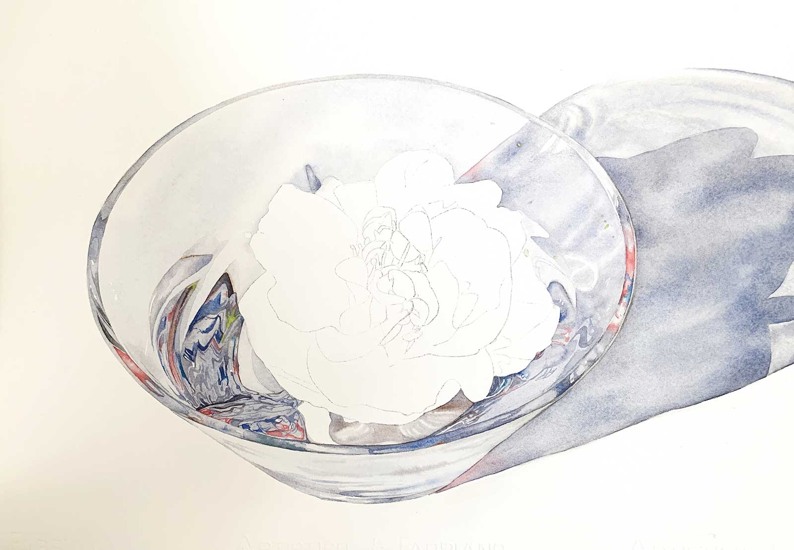
Stage 1 Initial Washes and Shadows
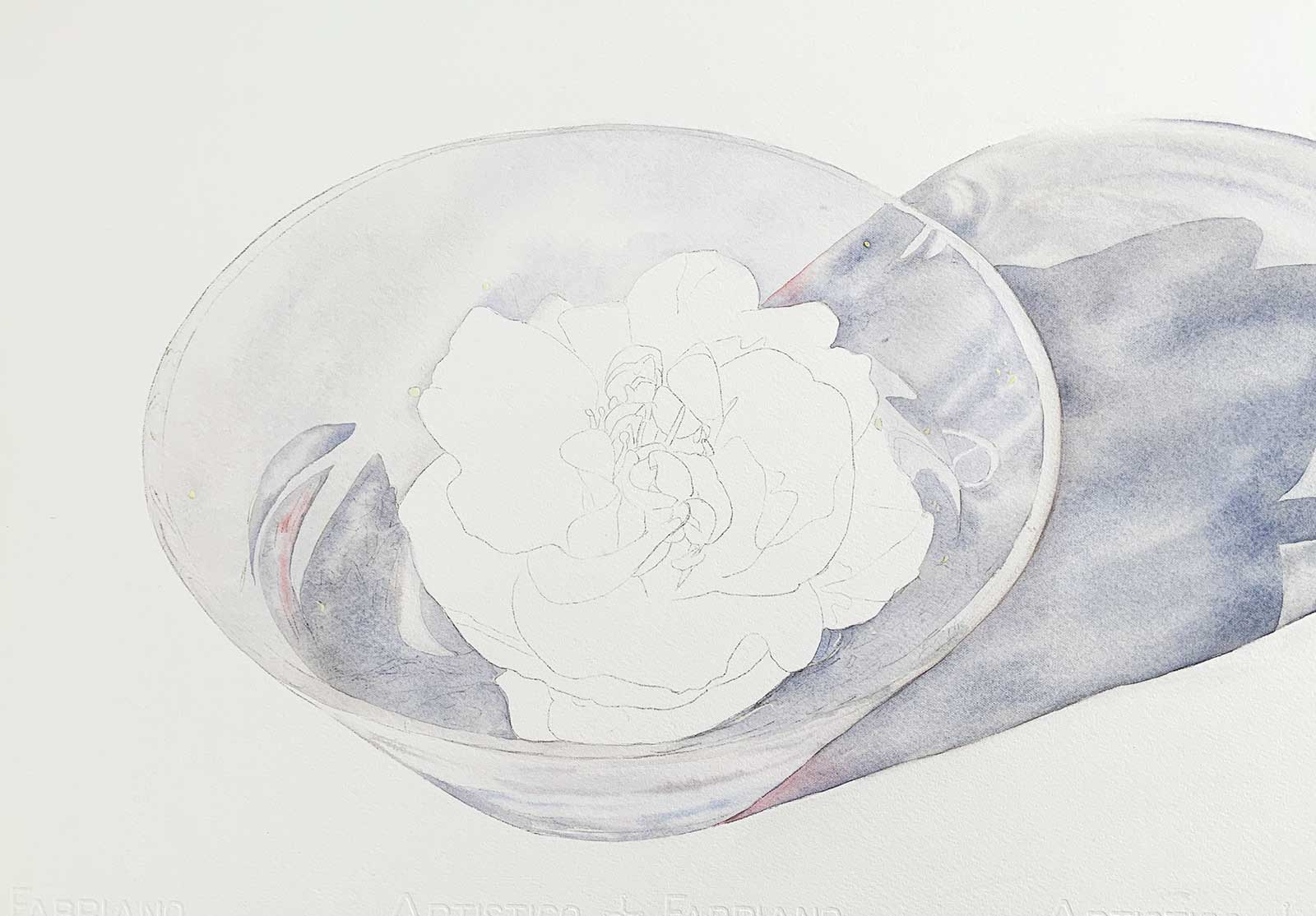
I began by transferring my line drawing onto the watercolor paper using transfer paper. I keep my drawings fairly minimal, just enough detail to guide me. I prefer not to draw everything in too precisely, as it gives me more freedom to move the brush around and respond to the painting as it develops, rather than feeling restricted by pencil lines. Before painting, I applied masking fluid to preserve a few of the lightest highlights and allowed it to dry.
To establish the form and lighting early, I mixed a cool gray from French ultramarine and burnt sienna and painted the cast shadow using the wet-on-wet technique and a large mop brush. Once that layer dried, I began building up the interior shapes of the bowl and the reflected shadows using the same gray mixture, adjusting the depth of color to suggest transparency and form. I also added touches of Winsor red in areas where I saw soft red reflections in the reference photo. At this stage, I was focused on blocking in the large shapes and tonal values, keeping the details for later layers.
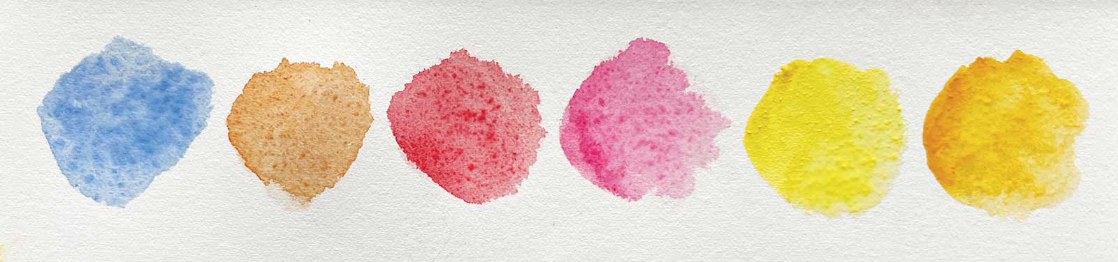
WHAT THE ARTIST USED
Winsor & Newton Watercolors
French ultramarine (PB29), Burnt sienna (PR101), Winsor red (PR254), Permanent rose (PV19), Winsor yellow (PY154), Indian yellow (PO62 - PY139)
Brushes
Da Vinci Maestro series 35, sizes, 0, 2, 7, Da Vinci Casaneo Mop Brush series 438, size 4
Additional Materials
Fabriano Artistico soft-pressed watercolor paper, Schmincke masking fluid, An inexpensive synthetic liner brush to apply the masking fluid
 Stage 2
Stage 2 Refining the Reflections
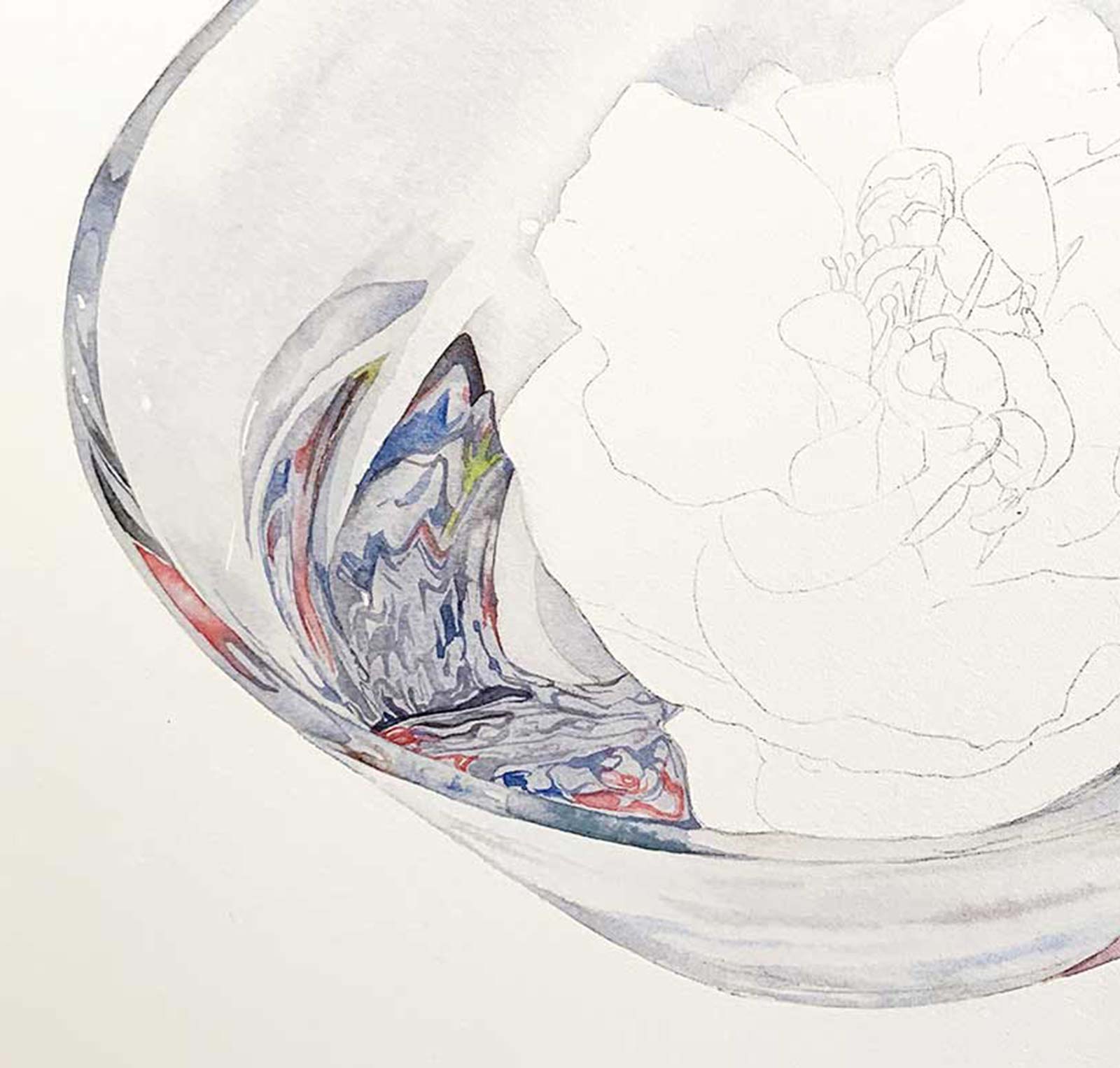
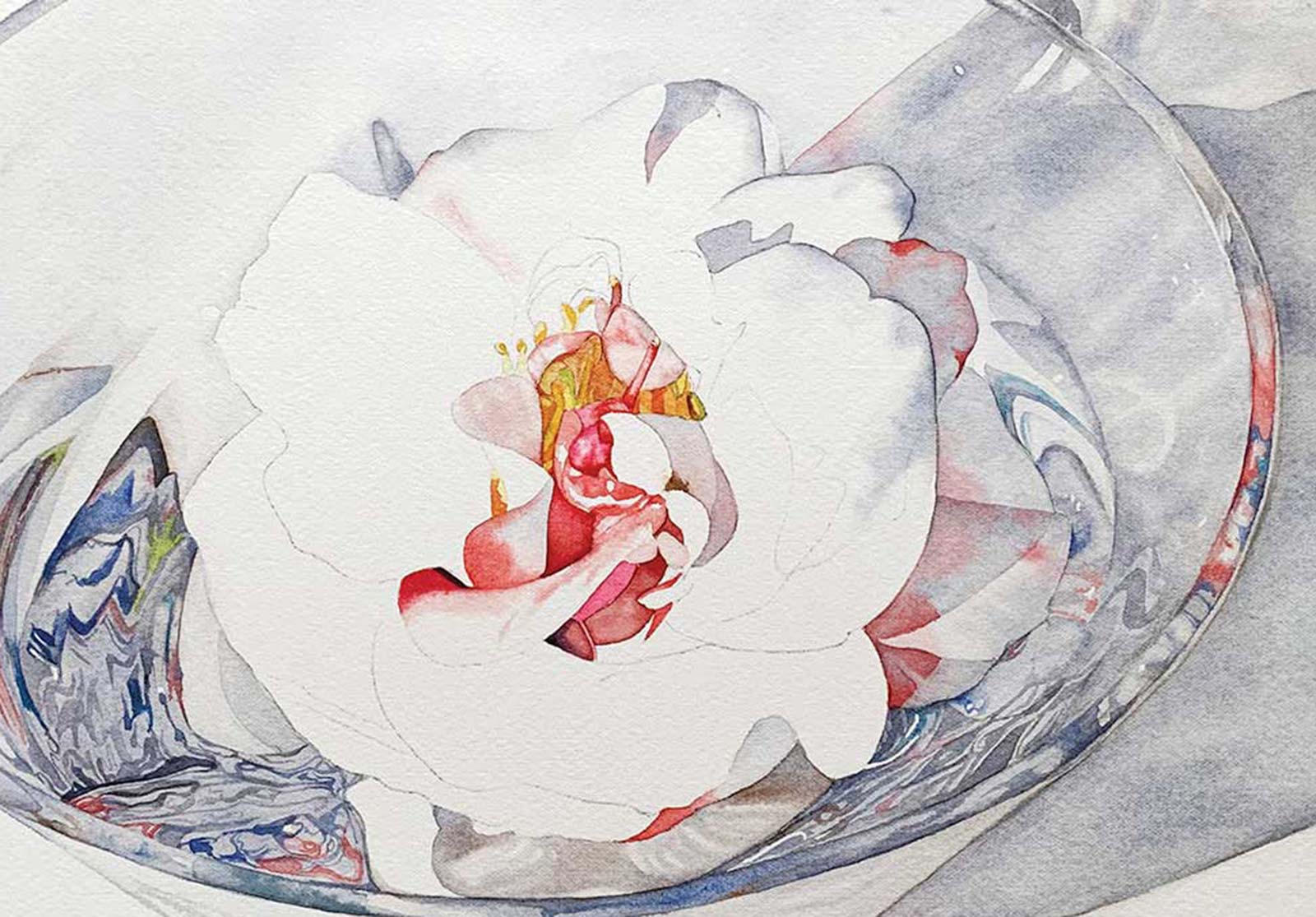
With the larger shapes established, I turned my attention to the intricate reflections within the water and glass. Working wet-on-dry with smaller round brushes, I began to carefully map out these details using French ultramarine, a neutral mix of French ultramarine and burnt sienna, and Winsor red. In the reference photo, I noticed unexpected but beautiful green tones reflected in the base of the bowl. I mixed French ultramarine and Winsor yellow to replicate these subtle hues and glazed them in gradually. I aimed to capture the complex distortion of color and shape in the water as accurately as possible, paying close attention to the way light refracted through the bowl.
At this stage, I also started to define some of the reflected colors and shapes along the outer rim of the glass bowl, using the same palette. The key here was restraint, suggesting complexity without overworking the surface.
 Stage 3
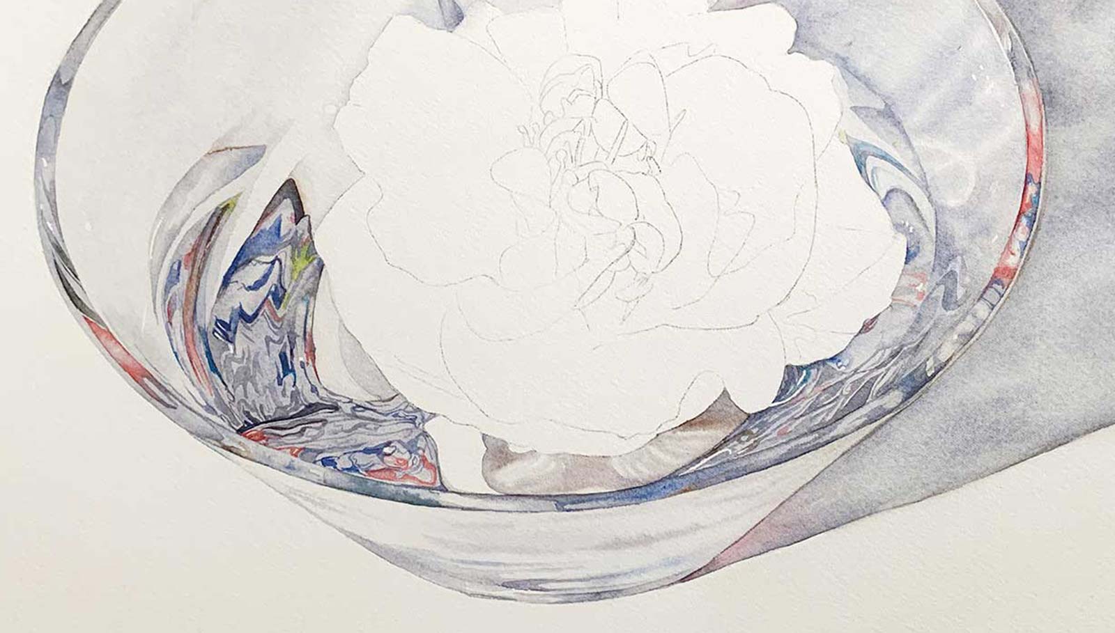
Stage 3 Building Confidence and Interpretation
With the reflections on one side of the bowl almost complete, I shifted focus to the opposite side to paint the remaining water and glass details. I began by closely referencing my photo, but as I progressed, I found myself stepping away from strict accuracy. The overlapping reflections were visually complex, and rather than trying to replicate every detail, I started to interpret the shapes more loosely.
During this stage, I also began painting one of the white petals at the base of the camellia. I used the wet-on-wet technique with a soft neutral gray mixed from French ultramarine and burnt sienna, allowing the paint to diffuse gently and create a smooth transition of tone. At this point, I felt more confident in the direction the painting was heading. That confidence gave me permission to relax and trust my instincts, focusing instead on achieving balance, harmony and the illusion of depth within the bowl.
Color Swatches
 Stage 4
Stage 4 Finalizing the Water and Glass
After completing the reflections inside the bowl, I returned to my reference photo to evaluate the overall accuracy and make refinements. I adjusted a few key areas to improve the flow and cohesion of the reflections and strengthened the edge of the water on the right-hand side of the bowl to enhance its definition. By this stage, I had been working on the painting for most of the day. Rather than push forward while tired, I chose to pause and revisit the piece the next day with fresh eyes. Taking a break at this point allowed me to assess the work with clarity and better judge how to approach the camellia itself.
 Stage 5
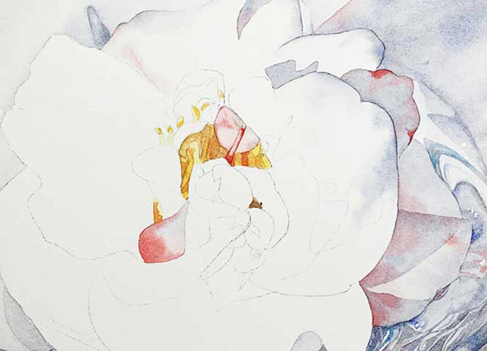
Stage 5 Starting the Camellia
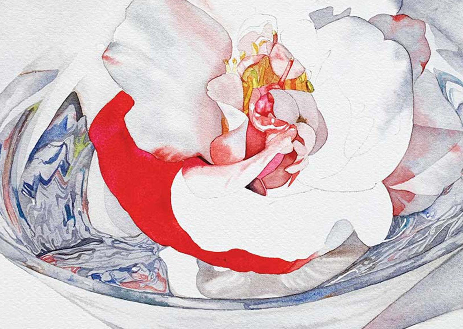
With the bowl and water reflections largely complete, I turned my focus to the camellia. I began with a few of the outer petals, working wet-on-wet with a pale gray (mixed from French ultramarine and burnt sienna) and gently charging in Winsor red while the surface was still damp. This allowed the color to diffuse softly and mimic the subtle transitions in the reference photo. For the center of the flower, I used Winsor yellow in the lightest areas to create a warm glow, then deepened the tones by mixing Indian yellow with Winsor red to create a soft orange for the darker, more saturated parts. I alternated between wet-on-wet for gentle color blends and wet-on-dry when I needed more definition or sharper edges, particularly around the stamens and folds of the inner petals. This stage required a delicate balance, building structure and vibrancy while preserving the soft, luminous quality of the flower.
 Stage 6
Stage 6 Building Petal Form and Flow
At this stage, I began working more extensively across the camellia’s petals, introducing permanent rose to develop the soft pink areas. I continued working wet-on-wet, carefully painting each petal individually to retain control over the soft edges and preserve the highlights. My goal was to capture the delicate transitions and organic flow of the petals, so I paid close attention to the tonal values within each one. I focused not just on the shape of the petals themselves, but also on how the value of each section related to the areas around it. This contrast helped to define the structure of the flower without harsh outlines, keeping the overall feeling light and luminous.
Technical Approach
In this piece, I relied heavily on the wet-on-wet technique to create soft, natural transitions across the petals. Timing was everything—working section by section allowed me to keep control of the paint flow while preserving highlights and subtle color shifts. I like to mix grays from French ultramarine and burnt sienna to keep them lively rather than flat. I can also adjust the temperature of the gray by varying the ratio of the two pigments. Painting reflections in the water and glass required patience and a balance of precision and suggestion. I wasn’t aiming for photorealism but instead to evoke the illusion of light and transparency without overworking the surface.
 Stage 7
Stage 7 Laying in the Bolder Petals
With the center of the flower complete, I was able to move to the outer petals and switch to slightly larger brushes. Returning to wet-on-wet, I focused on building up the bold red petal on the left side. For this area, I used Winsor red mixed with a touch of permanent rose to deepen the hue and add variation. I didn’t want to have to build this area in multiple layers, so I made sure the pigment mixture was rich enough to achieve the depth of color I needed in one layer.
Working while the paper was damp allowed the paint to flow smoothly and create soft transitions, helping to convey the natural curve and delicacy of the petal. This stage brought strong contrast into the painting and gave the flower a sense of weight and presence.
 Stage 8
Stage 8 Finishing Touches
Floating Memories, watercolor, 14 x 20” (35 x 50 cm)
To complete the painting, I worked across the remaining petals using the wet-on-wet technique to maintain the soft transitions that give the camellia its delicate, flowing character. I continued to use a limited palette of Winsor red, permanent rose and neutral grays, building up the depth and form of each petal gradually while preserving the white of the paper in key highlight areas.
Once all the petals were in place, I added the final cast shadows within the flower itself, laying these in as a separate layer once the underlying washes had dried. These shadows helped anchor the petals in space and added contrast, making the form feel more dimensional and complete. This last stage was about refinement: balancing color, checking values and making small adjustments to unify the overall composition while keeping the freshness and luminosity of the watercolor intact.
About the artist
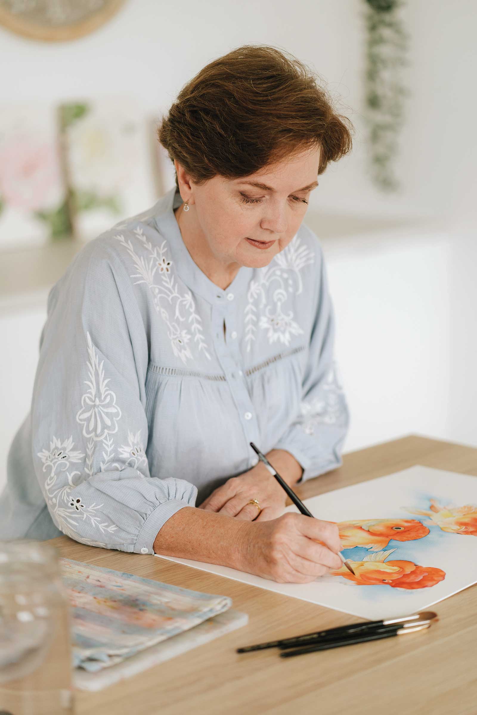 Louise De Masi
Louise De Masi is a professional watercolor artist and teacher based on the Mid North Coast of New South Wales, Australia. Surrounded by 25 acres of native bushland, her home studio is nestled beside state forest and filled with the sounds of birdsong, which is a constant source of inspiration for her work.
De Masi has sold thousands of original paintings and prints to collectors worldwide and has licensed artwork both in Australia and the United States. She is the co-author of The Art of Painting Sea Life in Watercolor and is best known for her detailed, light-filled watercolors that often feature flowers, wildlife and everyday moments captured with softness and precision.
In 2019, De Masi began teaching online and has since built a thriving community of students through her classes on Skillshare and Patreon. Her YouTube channel, where she shares free tutorials and watercolor tips, has further expanded her reach to painters across the globe.
Her focus remains on education, empowering others to develop confidence and joy in their painting practice.
Contact at
louisedemasi.com