


I have always been drawn to the human figure. It can be portrayed in endless ways to produce endless effects, from tightly realistic to wildly abstract. As I have never been one to settle, my artistic pursuits meander and wind through different styles to satisfy my curiosity while searching to create something alluringly beautiful. This work, June’s Captivation, is an example of the departure from my more grounded outdoor figurative work toward one of tantalizing abstraction and wild paint handling. Through planning, building, scraping and changing, I have a chance to respond to the painting as it is being born, coaxing it toward its final state. I always want the figures to say something—to offer insight into themselves or humanity. With this type of work, though, I desire more. When I have captured the charm and intriguing depth of my model, and immersed her in a visual poetry that feels balanced yet energetic, imploring me to continue searching my eyes over the field of varied paint to absorb every detail, I know it is done.
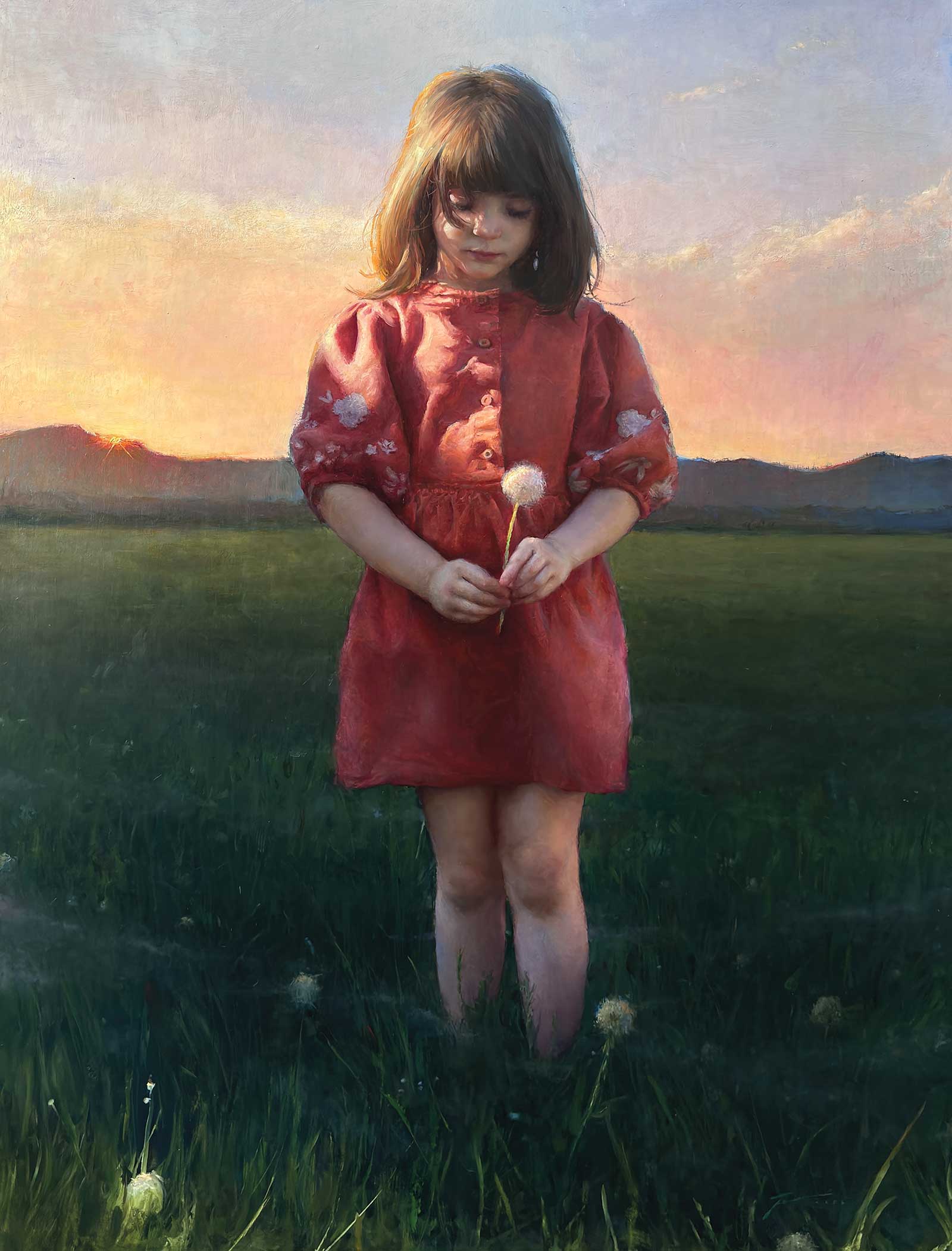
Dawn in a Field of Wishes, oil, 40 x 30" (101 x 76 cm)
My painting techniques shift slightly depending on my subject and the intended visual result. Sometimes I complete preliminary drawings to transfer, and sometimes I work directly onto the canvas. Sometimes I complete a thinned monochrome painting, sometimes a thinned colored underpainting, and sometimes no underpainting. Sometimes I use mediums, and other times I don’t.

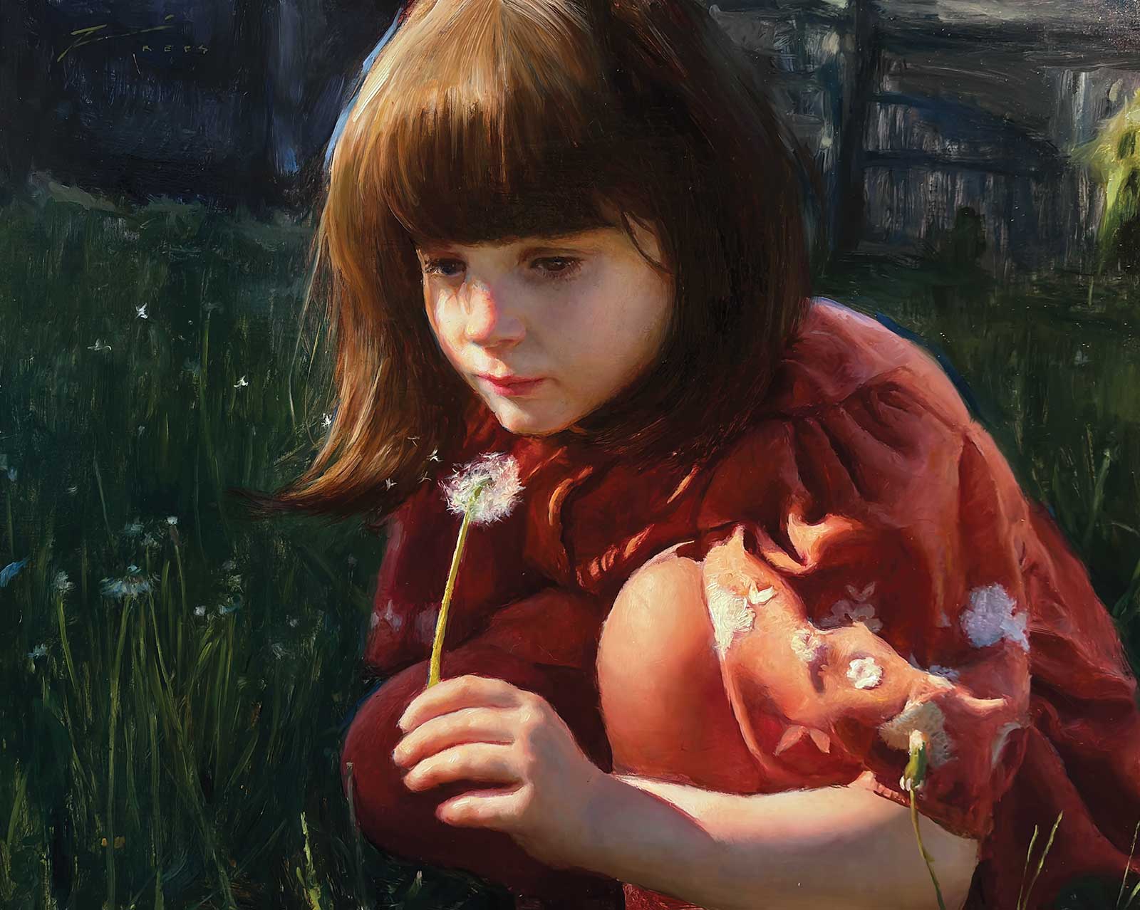
Last Wish, oil on linen, 16 x 20" (40 x 50 cm)
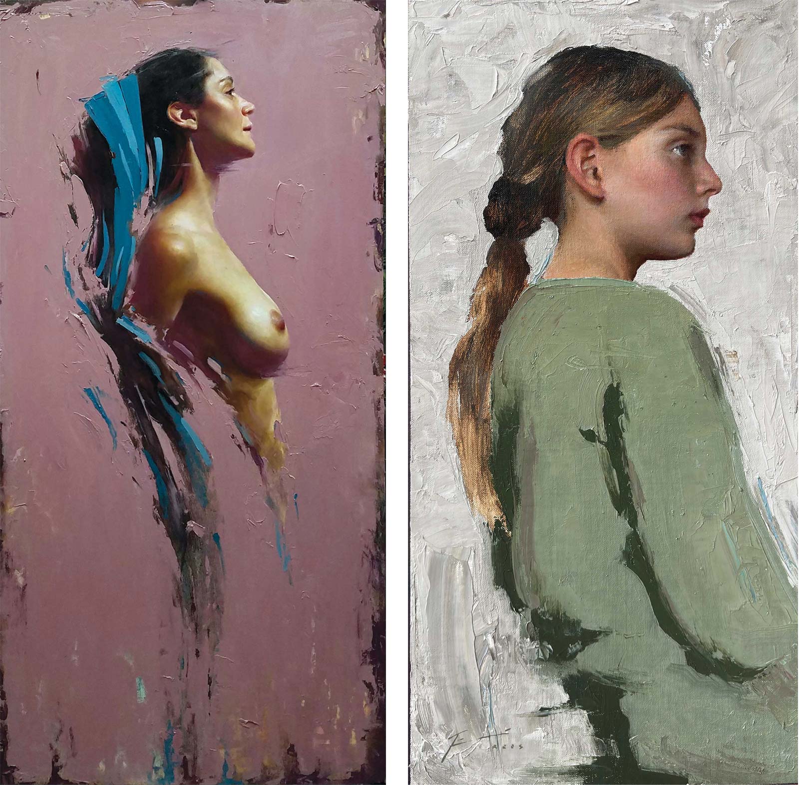
Left: Emergence, oil, 40 x 22” (101 x 55 cm) Right: Stoic Amidst Chaos, oil, 20 x 10” (50 x 25 cm)
Because of my tendency to paint all subjects with all different time constraints, I have developed many different methods, and I pick and choose which method when appropriate. What follows here, however, is an excellent example of the step-by-step process of my studio work, whether the subject is in a field of flowers or a field of abstraction. Within each of the steps, the technique is often adjusted to coax out the best result. And underneath each technique lies fundamental understanding of the core concepts of painting—drawing, values, paint application and color mixing—as well as years of honing observation skills in order to apply them.
My Art in the Making June’s Captivation
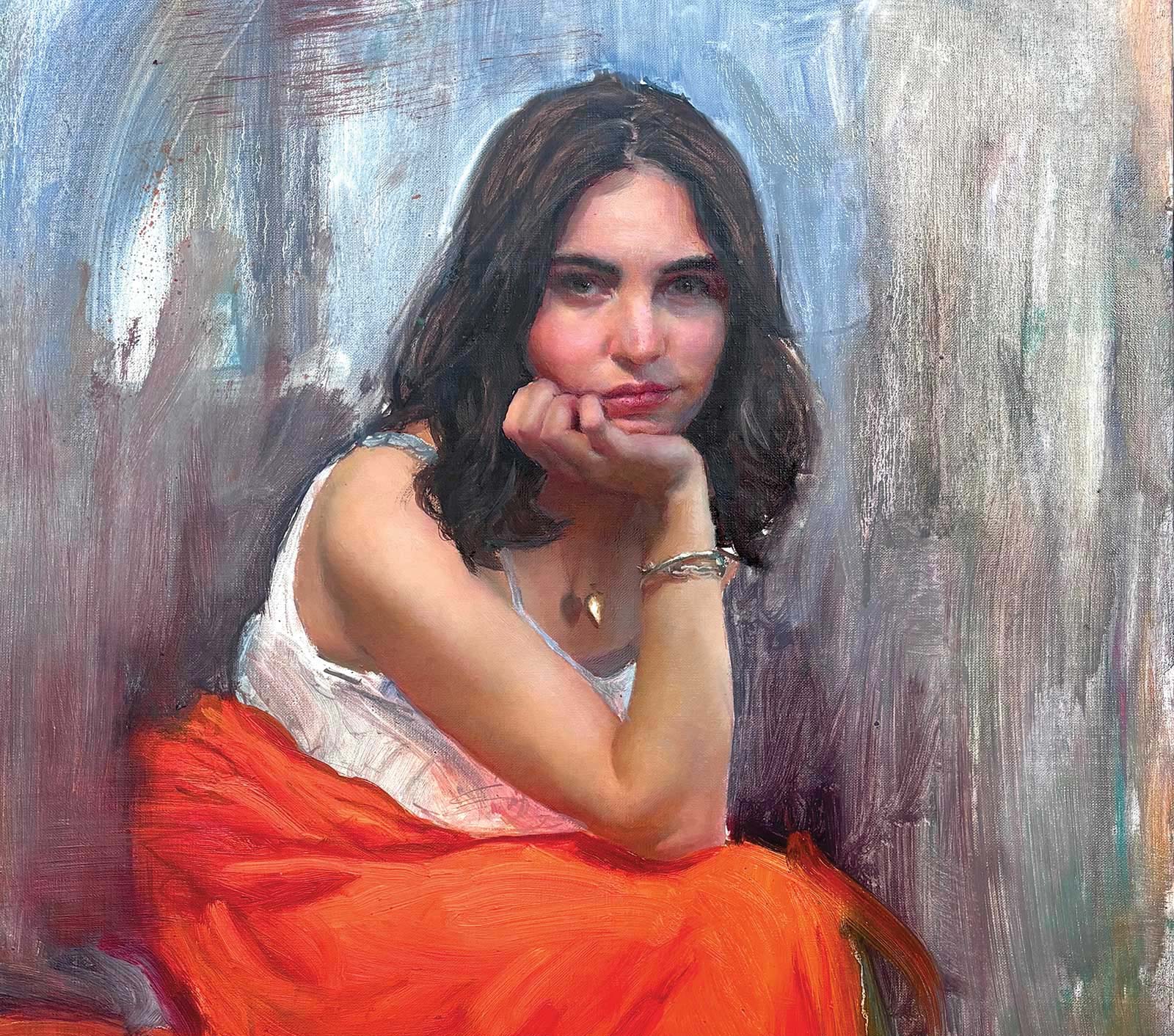
Reference Photo
 Stage 1
Stage 1 The Idea
Great paintings are forged from great ideas, and coming up with ideas is not always easy or natural. For larger paintings, I often employ an idea sketch to test my design. As I had more time with the model and the pose was in the studio, this sketch is larger than my outdoor studies, about 16 by 9”, and proportioned to the size of the final canvas. I work quickly, completing the painting in about an hour. The speed forces me to abstract and simplify areas as I might in a plein air painting, as well as explore how to suggest information instead of rendering detail literally. I also deviate from nature to make things up (changing the background, adding the ring element, etc.), to make an interesting design. At this stage, I can often see the romantic quality of the edge relationships, paint application and color harmony.
 Stage 2
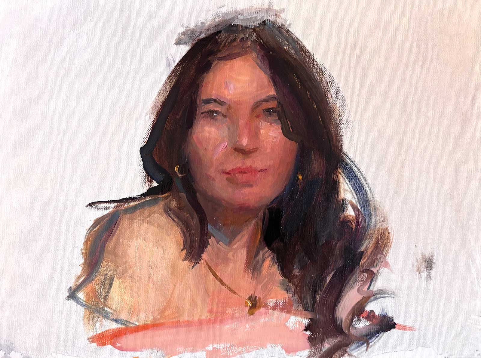
Stage 2 Studies and Reference
Because the final painting will be from a photograph, I paint a color sketch of the model’s portrait, which takes another hour or so. While the drawing is important to capture small mannerisms of the model I might want to include in the final work, such as her slight smile, the color is of paramount importance. I will adjust the photo reference to match the color from my color sketch to ensure it is vibrant and lifelike. Once the studies are complete, I photograph my model and adjust the reference as needed.
 Stage 3
Stage 3 Beginning the Painting
If I am working from poor photograph references or combining multiple references, I often complete a preliminary drawing in graphite to explore the subtle anatomy of my subject, which is then transferred to the canvas. In this case, the photographic reference, taken under stable studio conditions with a posed model, is clear enough to begin directly on the canvas. The paint is thinned with Winsor & Newton distilled turpentine, which dries faster and creates a stronger thinned paint film than odorless thinners. After a few preliminary outlines are drawn in, I work slowly from one section to the next, starting at the forehead and working my way down. I don’t use white to lighten the paint. I instead treat it like a watercolor and allow the white of the canvas to create lighter values. I stick to just the skin, no fabric or background. Because I am working from a reference that allows me to have the same light on my canvas as the reference, and thereby compare/replicate colors exactly, I do not need to tone the canvas or block in other areas to establish a relationship.
 Stage 4
Stage 4 Placing the Paint
I want the surface of the skin to be relatively smooth (which I often decide to do while painting women and children), so I lay in my next layer with paint the consistency it is out of the tube, without mediums. I prefer Michael Harding paints because of their immediate workability. In the darks, I will add some oil to help the stroke level more and not pick up surrounding light. I work piece by piece, slowly covering up the underpainting. Each stroke I make, I compare my underpainting color to the color of my reference and ask, “Should the color be more red, more yellow or more blue? Should it be more chromatic or less chromatic? Should it be lighter or darker?” Although I tried to be very careful and get as close as possible in the underpainting, I know I can push myself to observe closer and get a more nuanced and accurate color. Note that I do not blend any of the paint at this stage. I let each piece lay next to each piece. I don’t want my colors to mix on the canvas and become muddy.
 Stage 5
Stage 5 Softening Where Needed
After this round of paint application (it usually takes about three hours for a face, three hours for a hand, three hours for an arm, etc.), I step back and ask myself if the form turns, if the anatomy looks believable, and most importantly, if it “optically blends.” Remember, I did not soften any strokes in the previous step. If, from a distance, the paint blends together, I come back to the easel and soften the borders of each paint stroke that I want to be soft. I remind myself that this is a stylistic choice, not a requirement to make something look dimensional. If I want my painting to be more painterly, or more ruggedly textured, I do not soften. Waiting until this point has allowed the paint to become slightly tacky, so when I tap the edges of each paint stroke, it does not mix the color, rather it diffuses and dissipates the noticeable difference between each stroke. I work my way through, deciding which strokes I want to leave unfused, and which should disappear.
Mixing Skin Tones
I am using Michael Harding brand paints. While I have a full palette, the majority of all skin colors I am mixing are a simple primary set: yellow lake, scarlet lake and phthalo blue/white. To mix skin colors in the light, I add white to my three primary colors. To mix skin colors in the dark, I use less white, but the same three colors. All other colors on my palette, such as yellow ochre, are colors of convenience, and I use them if I find myself mixing a similar version out of my limited palette. The benefit is that it forces the artist to observe carefully and key in to what is in front of them, as opposed to using a formulaic mixture. Also, because of the range of potential colors produced from this set, it removes the mentality that one must find “the right” set of colors to mix.
 Stage 6
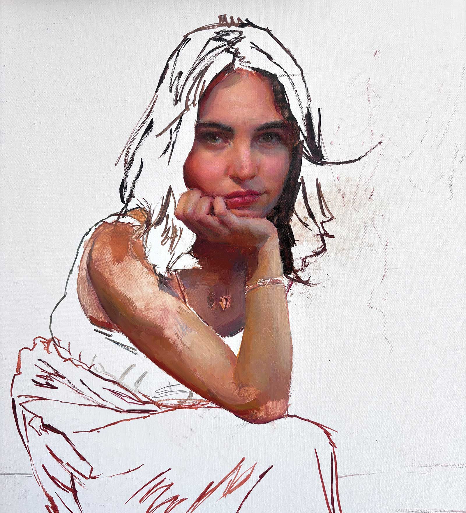
Stage 6 Painting the Surrounding Areas
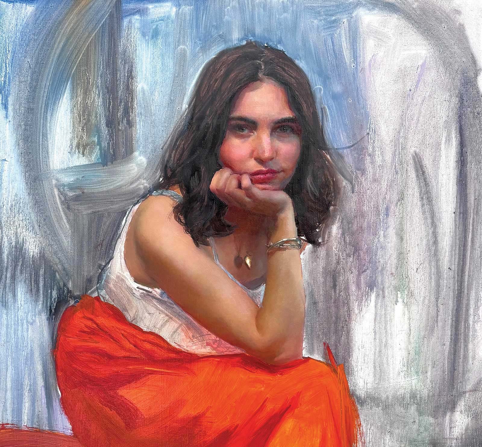
Using my reference photo, I block in the surrounding areas: hair, background and dress. The reference had a different background than my initial sketch, and right now I am working primarily from the reference to ensure that everything is accurate to reality before moving back to my more invented idea.
 Stage 7
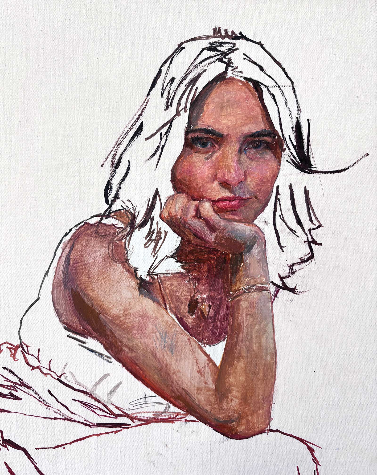
Stage 7 Using Initial Sketch to Continue Developing
As I finish painting in the background colors, hair, and dress from the reference, I start to use my initial sketch to mimic its paint application and artistry. Now it’s time to deviate from boring reality (there were cabinets behind her in the reference, which I have no interest in painting).
 Stage 8
Stage 8 Pushing Abstraction
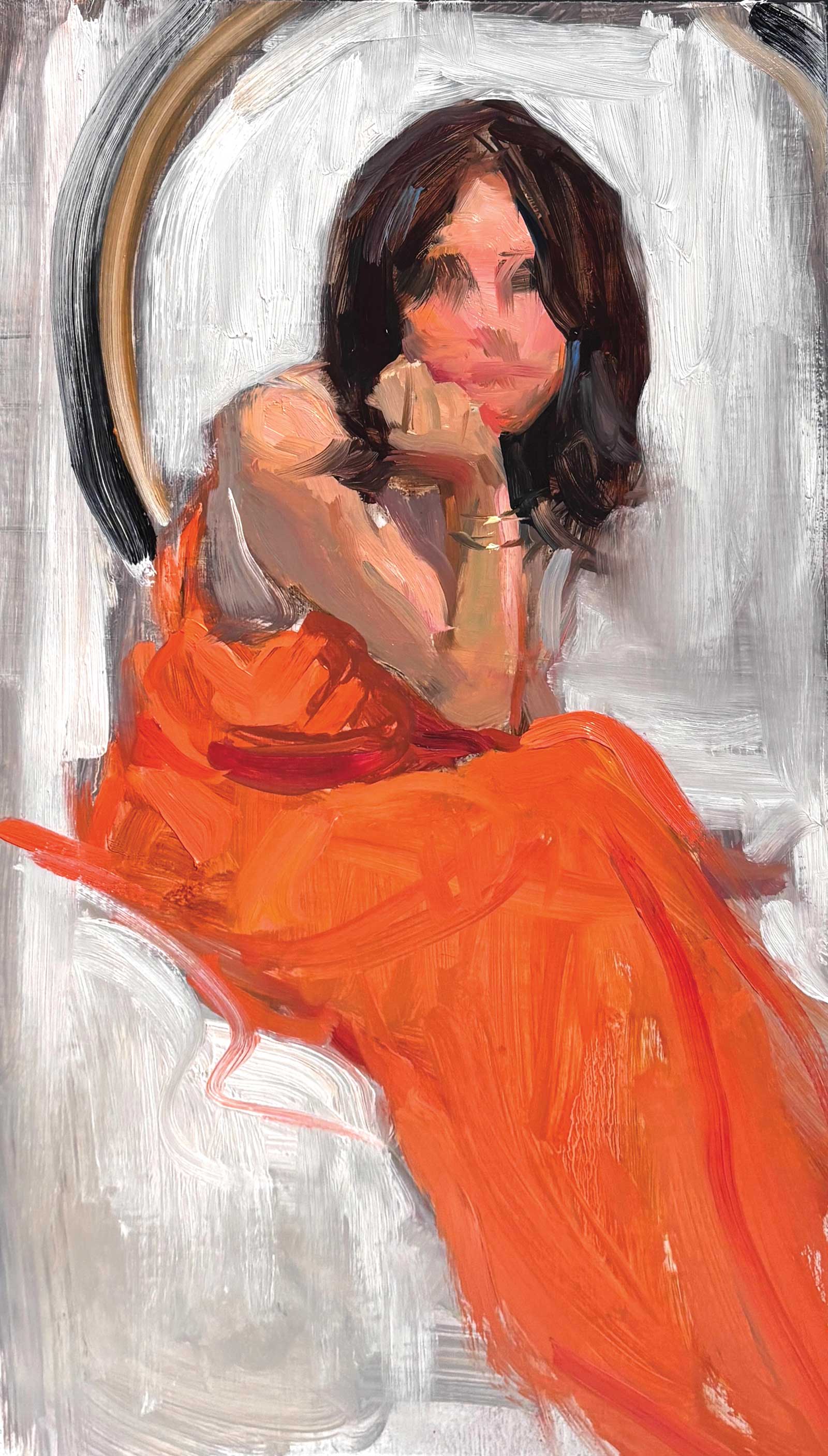
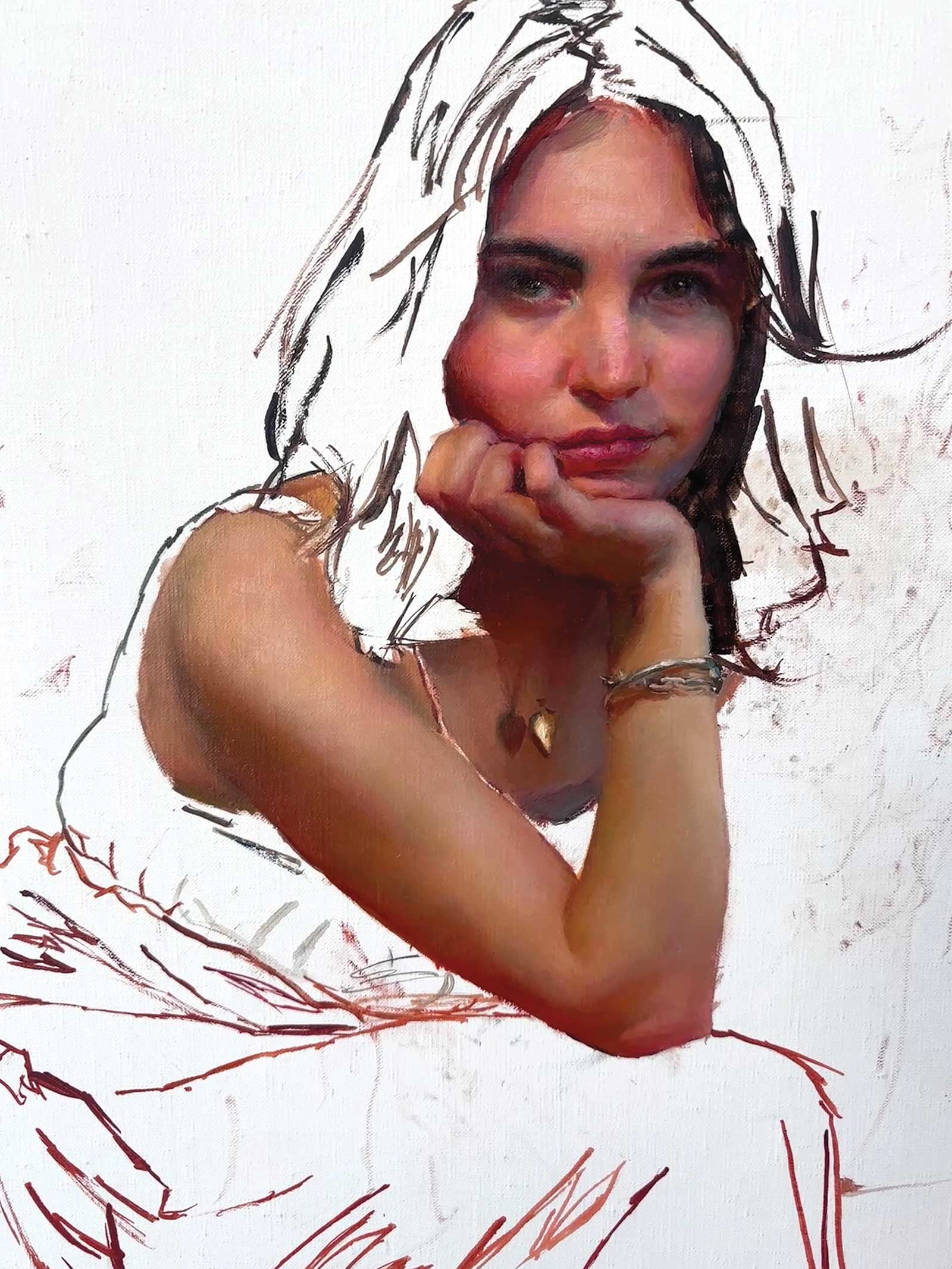
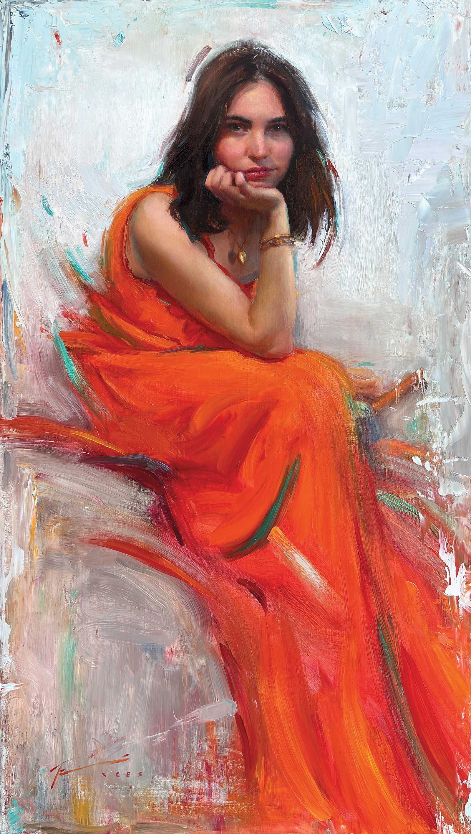
June’s Captivation, oil on linen panel, 32 x 18" (81 x 45 cm)
The painting is built up to the level of the initial sketch. I find it boring. I paint the ring out. The background also seems too thin to me. At its final size (32 x 18”), it requires more paint marks of varying size. I push paint on with a knife as well as large stiff bristle brushes. I scrape it off with a paper towel, then reapply. The initial stark white background seems uninteresting, so I introduce a new color concept, the green. Through transparent layering and broken color, I am able to have both oranges and greens and pinks and yellows in the background, while allowing the background to take on an overall slightly green color. I need to integrate the figure into the green, so when I am pleased with the overall color of the background, I splice notes of green into the model, such as the hair and reflected light. I step back and forth to see the work in its entirety. I want resting space in some areas, like around her head, so the value contrast of the paint pieces are reduced, allowing me to have variety yet still create a resting space. The bottom of the painting is loaded with large scraping variety to balance out the complexity of her head. It is a push and pull, and when it finally appears balanced, the painting is done.
About the artist
 Timothy Rees
Timothy Rees began painting in open studios at the Palette and Chisel in Chicago, Illinois, in 2009. After one year he joined the staff of instructors and soon began teaching workshops locally and abroad. In 2012 he moved to Arizona, where he later created and taught a classical art program for the Scottsdale Artists’ School. In 2017 he opened an atelier, where students studied full-time until it closed during Covid. He now paints in his Scottsdale studio.
Throughout his career he has appeared in numerous publications such as International Artist sister publication American Art Collector. His awards include First Place in Portrait Society of America’s International Competition and Members only Competition, Art Renewal Center’s Gallery Award, FASO’s Bold Brush award, and People’s Choice Award in the SAS Beaux Arts Show and P&C’s Gold Medal Show. Although he no longer teaches full time, he has created a website with all the demonstrations and textbooks from his atelier, made available for free to anyone around the world interested in learning art. It can be found at freearttraining.com.
Represented by
Bonner David Galleries, Arizona, USA, bonnerdavid.com
Arcadia Contemporary, New York, USA, arcadiacontemporary.com
Studio Pintura, Minnesota, USA, studiopintura.com
Susan Powell Fine Art, Connecticut, USA, susanpowellfineart.com
Contact at
tim@reesfineart.com, reesfineart.com