


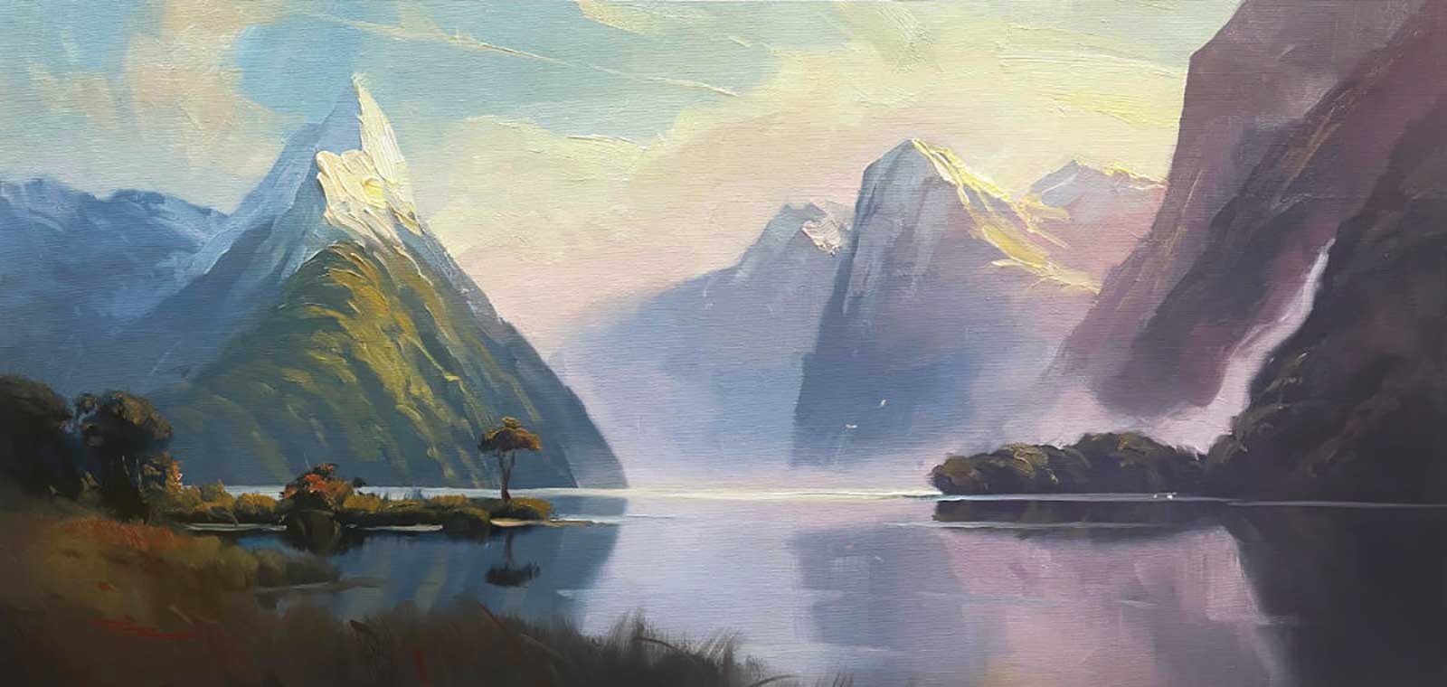
Milford Sound is unbelievable—essentially the eighth wonder of the world. It’s one of those rare places on Earth that has arranged itself as a perfect painting subject, perfectly side- and back-lit. No alterations necessary. It’s also somewhere I’ve dreamed of painting since I was a child, since we had placemats of this scene that captivated me at each meal time and inspired my first ever landscape painting at the age of 12.
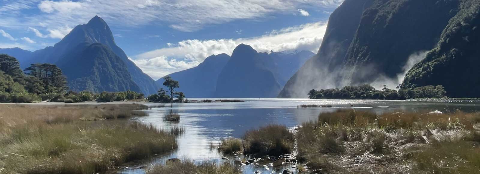
Milford Sound on the South Island of New Zealand.
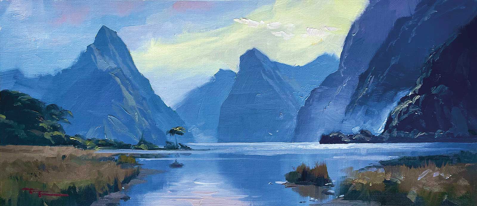
Richard Robinson, Milford Sound, oil on linen, 8 x 16" (20 x 40 cm)
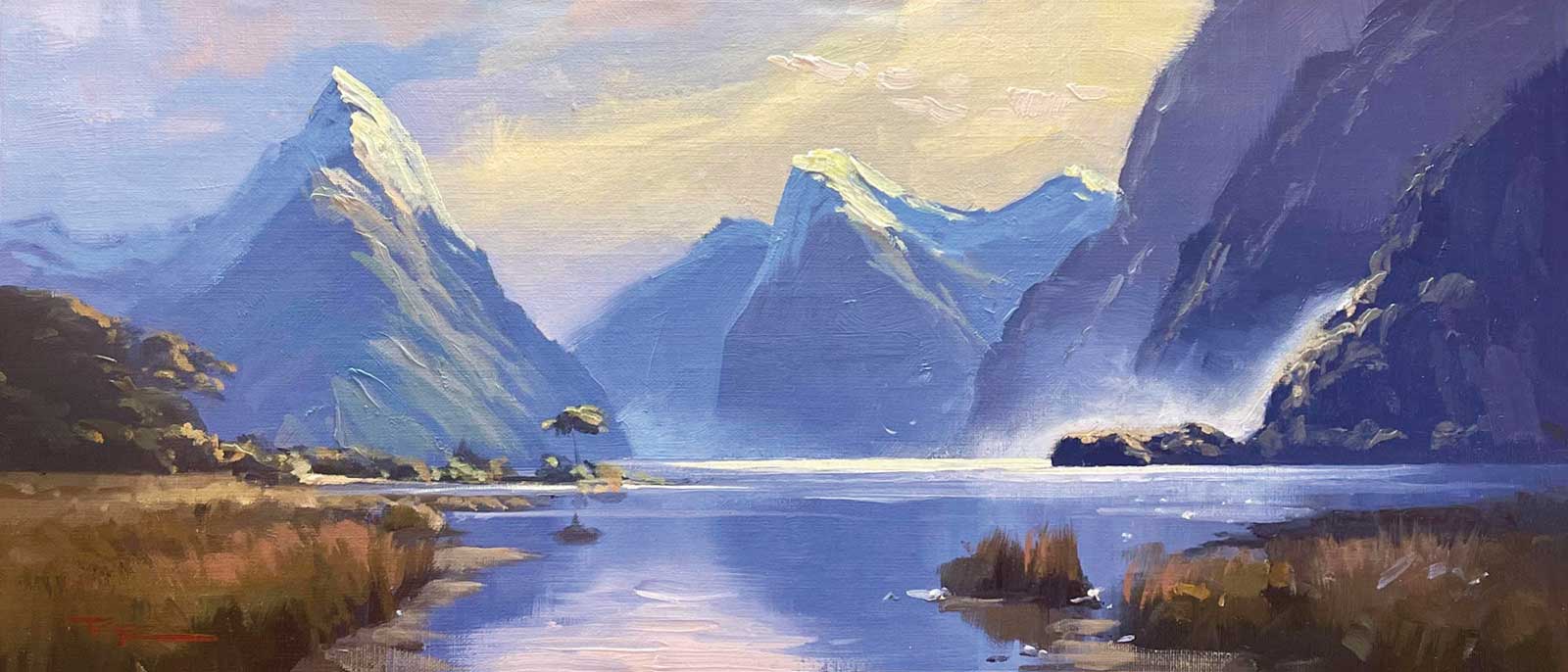
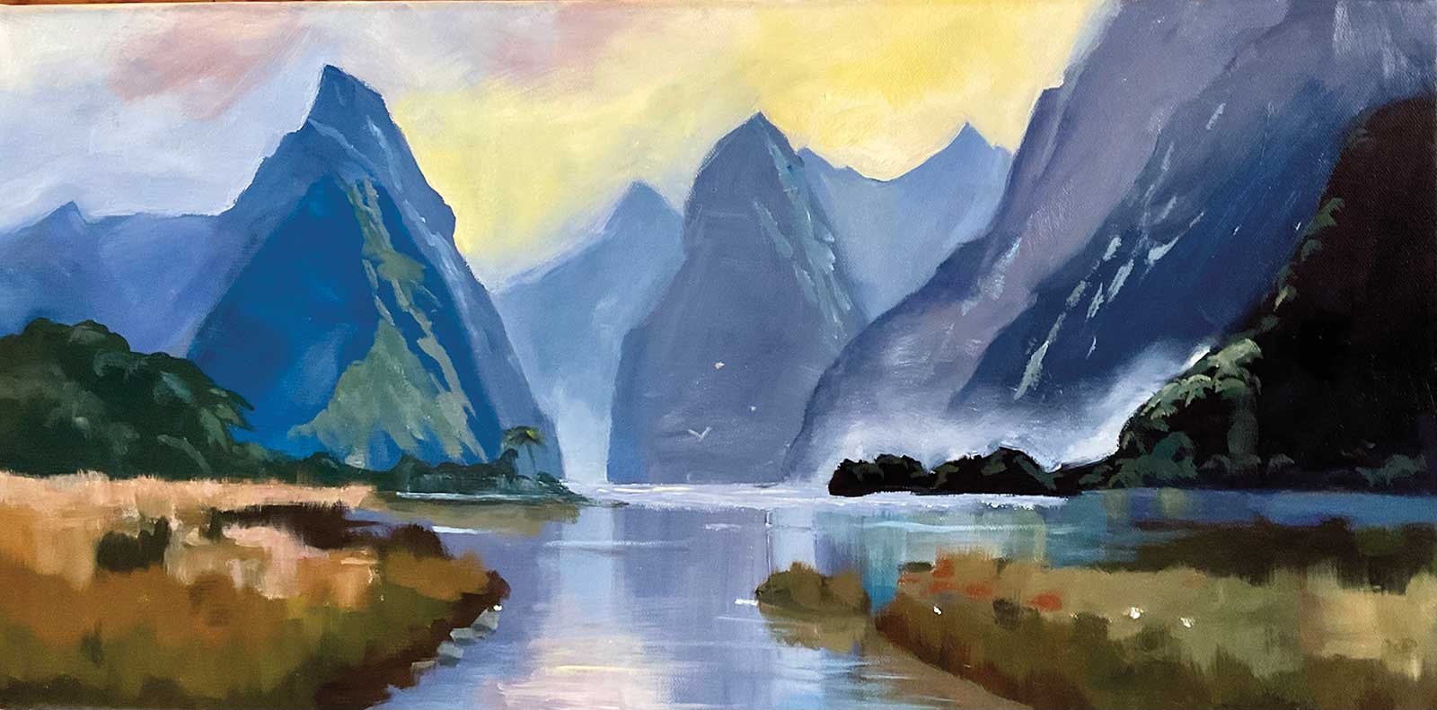
Richard Robinson, Milford Sound + Snow, oil on linen, 8 x 16" (20 x 40 cm)
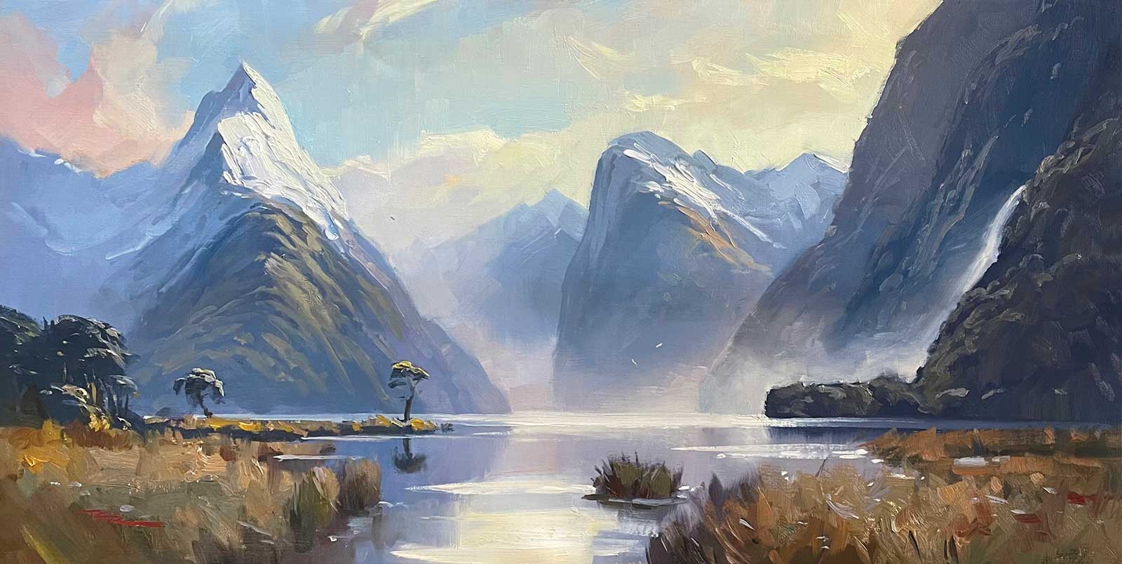
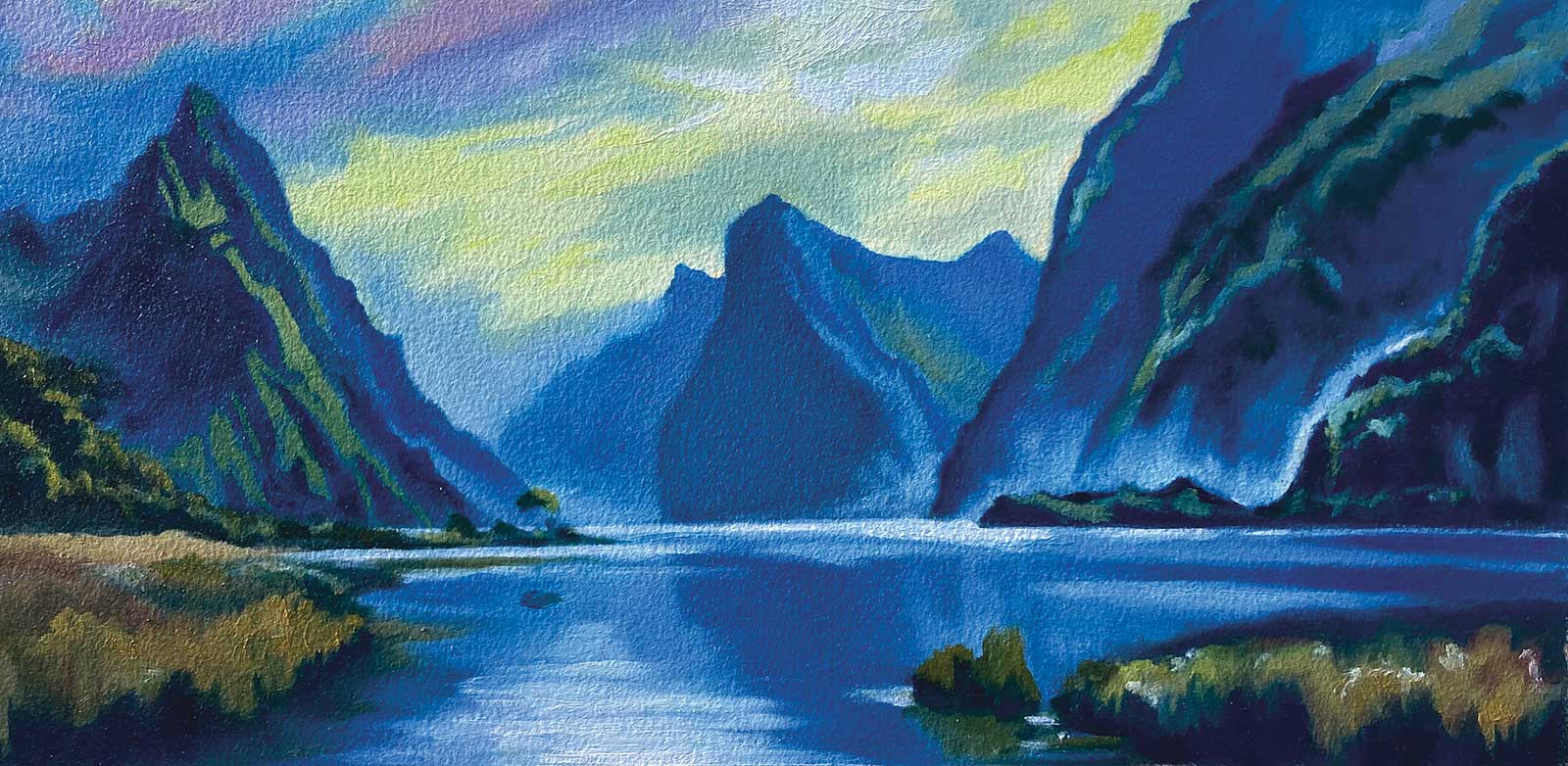
Richard Robinson, Milford Sound 2, oil on linen, 14 x 24" (35 x 60 cm)
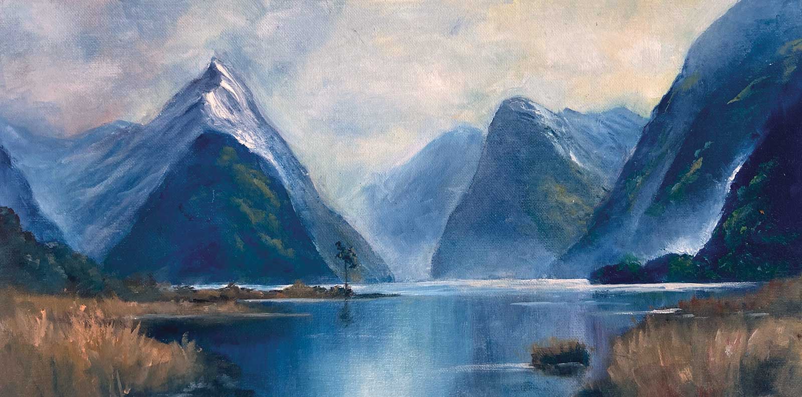
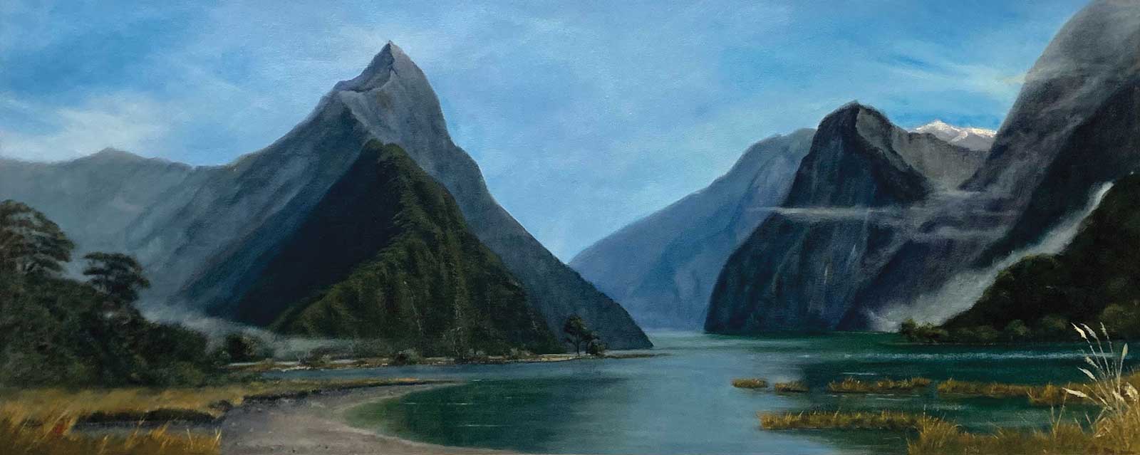
Richard Robinson, Milford Sound 3, oil on linen, 13½ x 28" (34 x 71 cm)
This scene is all about grandeur and creating the illusion of depth. There are seven visual tools we can use to achieve depth in a painting:
- Scale makes foreground objects larger and background ones smaller to suggest distance.
- Atmospheric perspective makes distant objects hazier and cooler in tone, while foreground elements stay sharp and warm.
- Overlapping shapes define near and far by placing objects in front of each other.
- Texture contrasts rough, thick strokes in the foreground with smoother ones in the background.
- Color uses warm, vibrant hues to advance and cooler, muted tones to recede.
- Detail emphasizes sharp, intricate elements up close while softening those farther away.
- Linear perspective draws converging lines to a vanishing point, structuring spatial relationships.
Student critiques
Nancy Newton
Milford Sound, oil on canvas, 12 x 24" (30 x 60 cm) Hey Nancy, you’ve increased the saturation of the colors throughout the scene and given it your expressive brushwork and that all combines to make a very lively feel. There’s a lot of depth there and I can see you’ve made an effort to create a variety of edges in the mountains, which adds to the interest. Just two things I’d like to point out and they’re both drawing issues. First, make sure the base of your mountains on the water is dead straight and horizontal, otherwise, as we can see on the right, it looks like the water becomes choppy there, and that doesn’t match the highly reflective water surface. Second, the baselines of the foreground grasses against the water are too straight and symmetrical, which takes away from the naturalness of the scene. Other than that, great work!
Geoffrey Geeson
Milford Sound, oil on oil paper Hi Geoffrey, this is a really interesting take on it—much more graphic, with distinct organic shapes and more color contrast. Beautifully done! I think this would look amazing large on a big plain wall.
Fay Thomson
Milford Sound, oil on oil paper Really nicely done, Fay. I love the moulding of form you’ve created in the greened slopes by subtly modulating the lights there. The same can be said for the little spotlit areas in the foreground grasses. The reflections are on point too. Two things I can see you could work on in the next one: Give a little more structure to some part of the sky/clouds so it’s not just a woolly blanket. There’s room for more interest there. The gradation you’ve got there is great though. Secondly, you’ve got a line running down the right side of Mitre Peak—a definite no-no, which only serves to flatten form. This can be easily fixed. Other than those little tweaks, beautiful!
Mark Price
Milford Sound, oil on canvas Wow Mark, you knocked it out of the park with this one. It’s great to see you working on such a large canvas, which is always much more difficult to resolve, but this epic scene really deserves it. Lovely composition with that sweeping intro, great depth you’ve created and plenty of interesting details to fill the canvas and hold attention. The reflections are great too. One thing you could consider to give this painting even more power is to strengthen the spotlight effects you’ve created in various key spots. At the moment the overall lighting effect is subdued and austere, which is fine, but you could add some more visual wow by intensifying some spotlit areas. Food for thought. Congratulations on a great painting!