


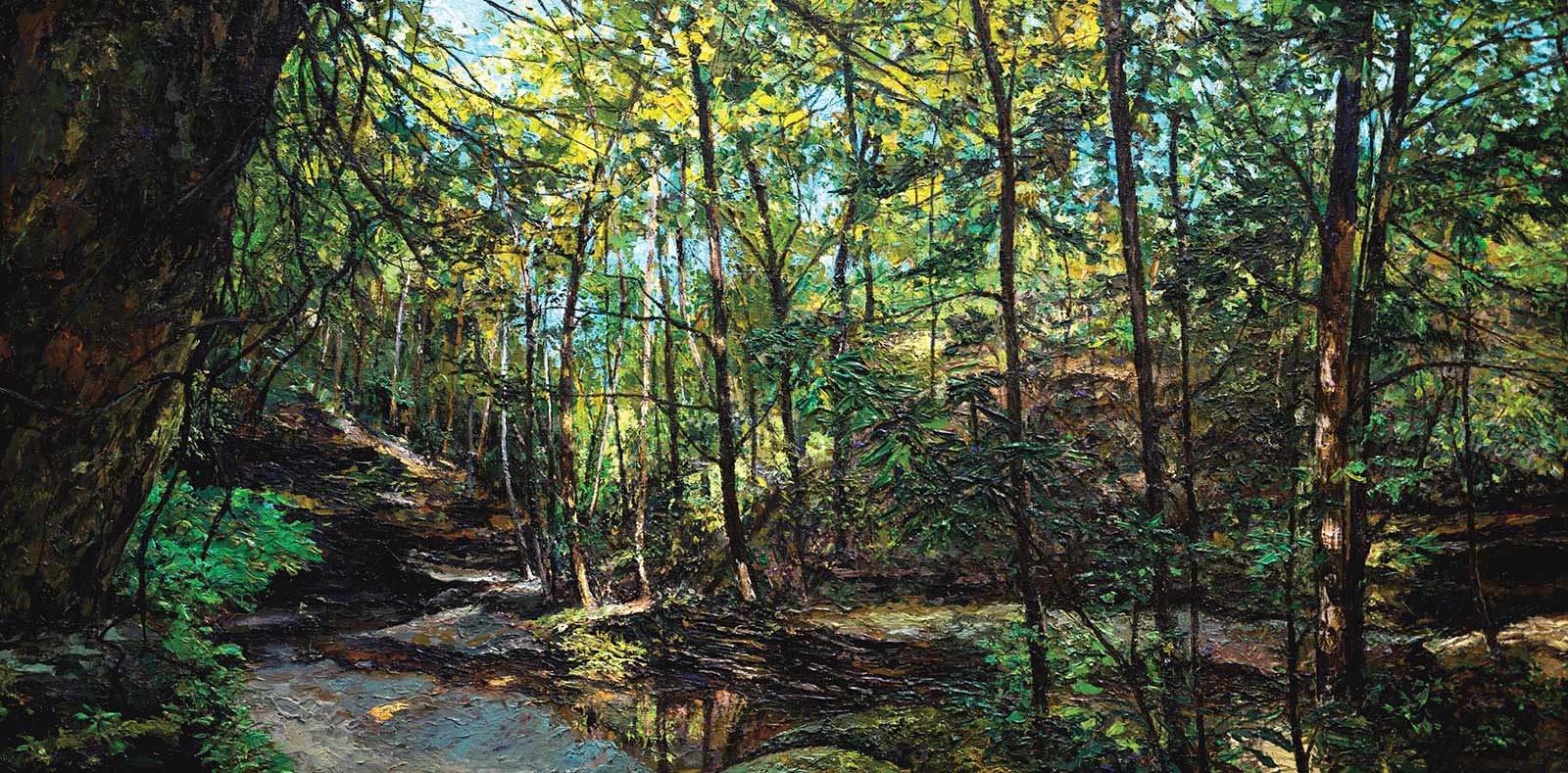
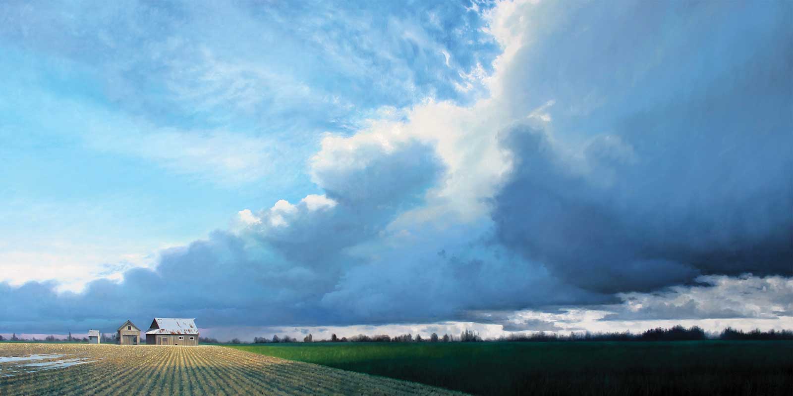
 Hocking Hills, acrylic, 18 x 36” (45 x 91 cm)
Grand Prize is a four-page editorial feature in American Art Collector magazine
Jennifer Sowders
Ohio, USA
Fields and Forests
This is the second year in a row that impressionist artist Jennifer Sowders has won our Landscapes Competition. Rendered in an impasto style that seems to leap off the canvas, Sowders uses a palette knife to create textured landscapes of the fields and forests around her home in rural northwest Ohio. While her paintings fall into the realm of realism, they exude a sense of free-flowing abstraction as well.
“Impressionism excites me. I like to take my own reference photos so all the sensations from that day visit me while I paint,” says Sowders. When choosing what to paint, the artist says that while finding a captivating location is most important, the lighting of that location is a close second. “I like to see the light dance within the scene and help lead the eye,” she says. Landscapes and nature seem to nestle their way into everything she does.
After years of experimentation, the artist now primarily works with acrylics. “Even though I visited the Van Gogh Museum in Amsterdam in the ’90s I could not understand the intrinsic value of mark-making until I picked up a palette knife in 2021. I think part of what took me so long was that I was not willing to ‘go there’ with oil paint (and the foolish notion that oil was the only path),” Sowders explains. “I admit never being a fan of acrylic paint, but I found that the mark-making and texture I love came easily with acrylics. That was the good that came out of Covid lockdowns: boredom that fueled the experimentation to go down this path. Now, ironically, I am often correcting people who assume I work in oils.”
My Inspiration
Inspiration always seems to lead me on trips that involve hiking and beautiful scenes with dense flora. It helps that I live in a rural area in northwest Ohio that includes fields, forests and streams, so I feel like each reference scouting adventure is, “How can I top this?” Hocking Hills in southeastern Ohio did that very thing, including cliffs and caves. I try to visit at least once a year, and this time it was in the thick of summer, which made for a delightful study on the depth nature has to give on the color green.
My Design Strategy
I look for dappled light, shapes, color and values to move one’s eye through a scene. I especially like scenes void of man’s footprint, because one can become immersed in nature’s majesty without any pretense. I had to remove park visitors and a big blue bridge from my reference photos, and after I did, I immediately felt as though I could be looking through the eyes of the Shawnee, Delaware or Wyandot (historical inhabitant) Indian tribes of the 1700s. Everyone who has visited Hocking Hills State Park knows “this fabulous scene,” and no one is missing my edits.
My Working Process
For Hocking Hills, I painted with acrylic on an unprimed wood panel for the benefit of its natural tinted ground. I used a palette knife and a silicone-tipped implement over several passes until it was too difficult to achieve cleaner branches. I then used a paint-laden string to “whip” branches in place for the two-fold benefit of assuring the paint reaches into all the previous textural trenches while allowing a little spontaneity. Lastly, for the finest branch details, I used an ink brush (and the only use of a brush I’ll tolerate as brushwork would otherwise confuse and change the style I’m going for).
Contact Details
Email: mongalleryandart@gmail.com
Website: MONgallery.us

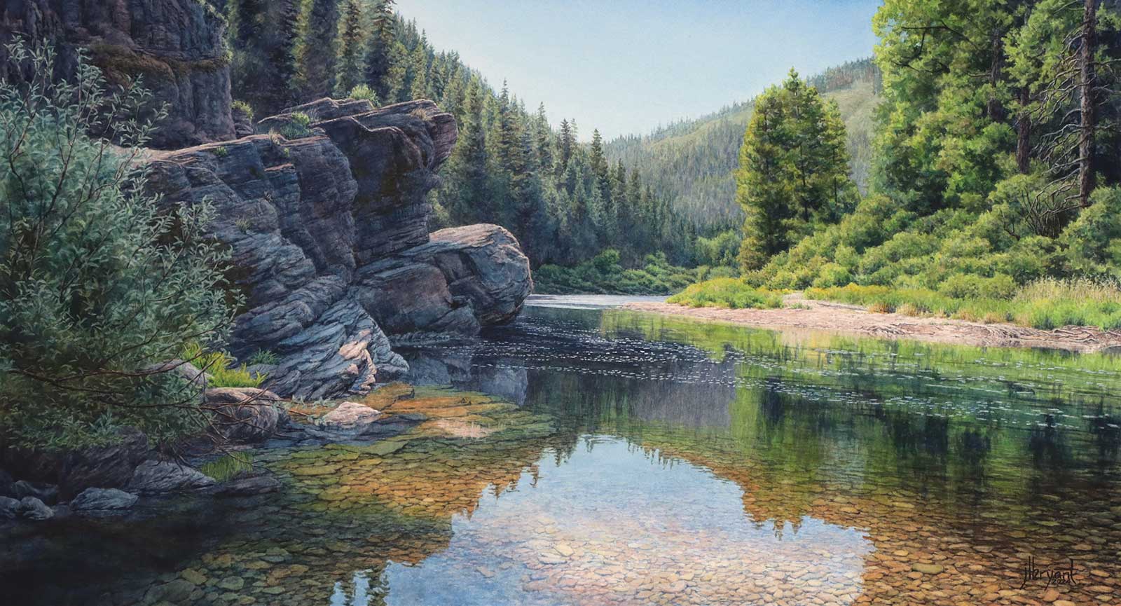 A Quiet Strength, watercolor, 16½ x 30” (41 x 76 cm)
Second Prize is a two-page editorial feature in American Art Collector magazine
Jessica L. Bryant
Idaho, USA
My Inspiration
This river near my home is a favorite place to spend time alone. The light is always incredible, and I love the movement of the water around this bend. Capturing the experience of a unique place is a challenge I relish. It’s an opportunity to feel connected to all the people who have known it throughout history. I approach painting as scientific discovery: What is my relationship with this landscape and its history? How can I translate my emotions and sensory experiences visually to convey a sense of place that resonates with the viewer?
My Design Strategy
It’s important to have a strong emotional connection to the subject but not at the expense of good design. If I can’t make a good composition, I won’t paint it. Once I know what I want to paint, I’m careful to articulate why I want to paint it: my intention. Every decision about the painting should support my “why.” If I change things without keeping that intention in mind, I risk a painting that is lacking the depth and cohesion it could have. The composition, values, color, mood, everything needs to support the intention behind the painting, whatever that is.
My Working Process
I stretch my paper; that’s always the first step. Then I spend a lot of time on the drawing. That is the foundation, the bones of the painting that will anchor everything. Next, I choose music or a story to listen to and dig in. Sometimes I build layers gradually. Other times I finish sections as I go, adding final value or color adjustments at the end. I might work top to bottom or jump around. Every painting is different, and I’m a different person as I work on each one, so I give myself space to change my approach.
Contact Details
Email: info@jessicabryant.com
Website: jessicabryant.com
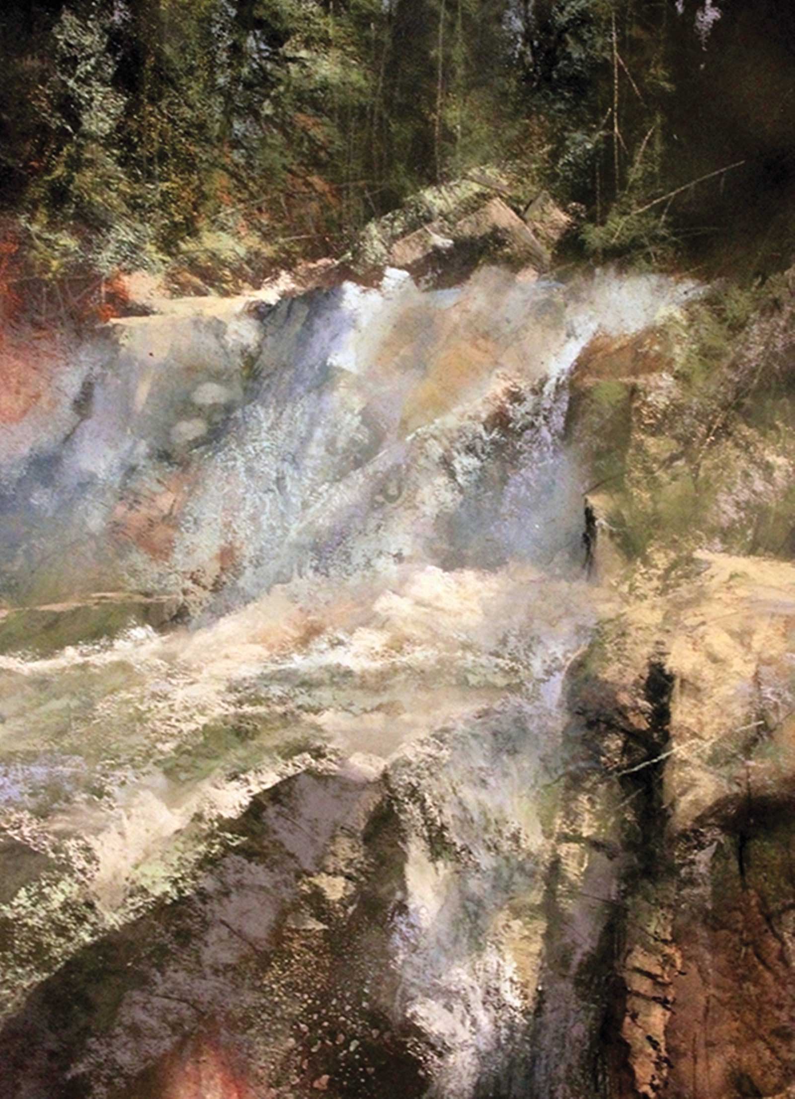 Lower Cascades, soft pastel on Crescent illustration board, 21 x 16” (53 x 40 cm)
Third Prize is a one-page editorial feature in American Art Collector magazine
Stan Bloomfield
Arizona, USA
My Inspiration
Loving nature, I’ve made Arizona and Colorado my lifelong homes. Cascade Creek, north of Durango, Colorado, is one of my special places for its fantastic scenery—and as an added bonus, the Purgatory ski area. Rocks, fallen trees, as well as mountain streams are a favorite source of material. The lower cascades is not a place, but a combination of memories. Indeed, all my paintings are not of a specific place but an expression of my past experiences.
My Design Strategy
I like to begin a painting with a powerful abstract pattern: use of a dominant value, color or object. For Lower Cascades, a modified “S” pattern is used. Contrast is created through the use of dark, hard-edged impressionistic rocks countered by soft-edged falling water. Unity and harmony are created through use of muted color. The painting is half medium and half dark values countered by a small bit of light.
My Working Process
Each painting is an experiment in material (ground) and application of the media (pastel). Working on Crescent illustration board, I lay in an overall value pattern (notan) using hard pastel sticks (Nupastel or Cretacolor). To create texture, I wash off the image and reapply pastel. I do this as many times as necessary to achieve the desired effect. Happy accidents occur, leading in new directions. This approach is a result of my years in watercolor. Soft pastel is then used to restore value and color. I tend not to finish all areas, leaving the viewer to mentally connect the dots.
Contact Details
Email: stanbloomfield6@gmail.com
Website: stanbloomfield.com
Finalists
Each receives an Award Certificate and a one-year subscription to International Artist magazine PLUS having their work seen worldwide by international galleries looking for new talent.
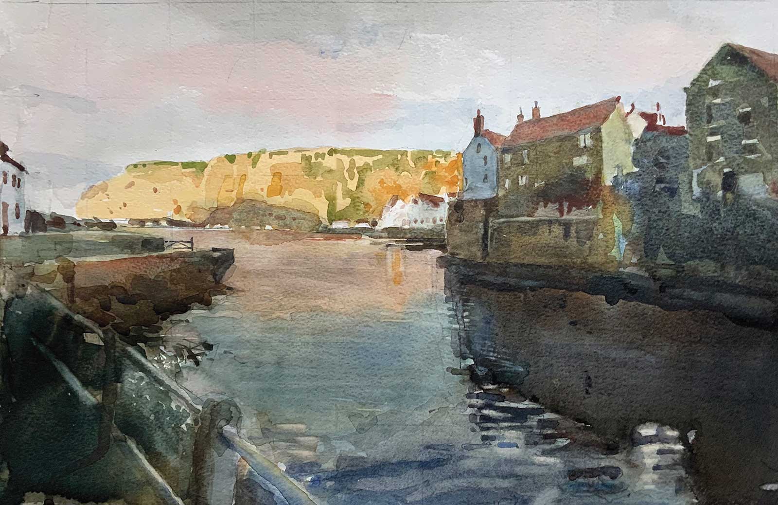 Staithes, East Yorkshire, watercolor, 12 x 18” (30 x 46 cm)
David Thomas
East Yorkshire, UK
My Inspiration
Staithes is located on the east coast of Yorkshire, about 70 miles from where I live. It is immensely popular with artists, who are attracted by the estuary and the fishing boats—often seen at odd angles when the tide is out—and by the houses perched on the steep sides of the harbor. I saw this scene at the end of a weekend, as the sun was setting, and I was about to leave to drive home.
My Design Strategy
When I look back at my paintings, produced during a lengthy life, I can see a common thread, usually to do with the light. The subject matter is wide ranging, but it is always the light and the composition that will have stimulated me to pick up the brush. And it is always watercolor that offers the means to achieve my aspirations.
My Working Process
Although occasionally working in plein air, I mostly work sitting astride my purpose-designed seat easel, looking at my computer. This painting was made that way, using my own photograph. I used a half imperial sheet of Bockingford 200 lb hot-pressed. For larger paintings, or commissions, I use Saunders Waterford 300 lb hot-pressed. Although for this I made a lightly drawn 2 cm grid, I usually just rely on my eye with a few check measurements from a print to make a 6B pencil drawing. Then I embark on adding watercolor, finishing the painting within the day.
Contact Details
Email: dthom1938@gmail.com
Website: paintpal.info
 Break in the Weather, oil on canvas, 48 x 96” (121 x 243 cm)
Andy Eccleshall
Washington, USA
My Inspiration
This painting attempts to capture the feeling of a day back in April of this year in my favorite painting location: Skagit Valley, Washington. Driving north to the valley, I was in an enormous rainstorm and was sure I would spend most of the day in gray wet weather. But the valley never disappoints, and as the weather broke, I watched for an hour or so as the storm moved east into the Cascade Foothills. This scene is based on that experience and painted mostly from memory. Depicted are the farmlands just east of La Conner, partly sunlit, partly still covered by the retreating storm.
My Design Strategy
This painting is the featured piece for a recent solo show at the Seattle Art Museum Gallery, so I knew I wanted it to be large. The canvas is 48 by 96”. The horizon is kept purposefully low in order to guide the eye skyward. The perspective runs directly through the barn, but then the cloud pulls you to the right and into the light behind the trees on the other side of the front. Compositionally I wanted there to be a balance in the weight, darkness and light, and between the positive and negative spaces created by the clouds.
My Working Process
Typically my paintings are based on experiences. When time allows I will do plein air sketches for color reference, but when I create a painting I’m always trying to convey the “feeling” of the day. Remembering the experience, I move the elements of the scene around in my head to find the composition I want. Then, through thumbnail sketches and rapid initial sketches directly onto the canvas, I try to capture that composition. Over the course of a couple of months, I slowly build up the painting, refining and adjusting as I go to try to stay as true to the initial experience as I can.
Contact Details
Email: ajeccleshall@gmail.com
Website: andyeccleshall.com
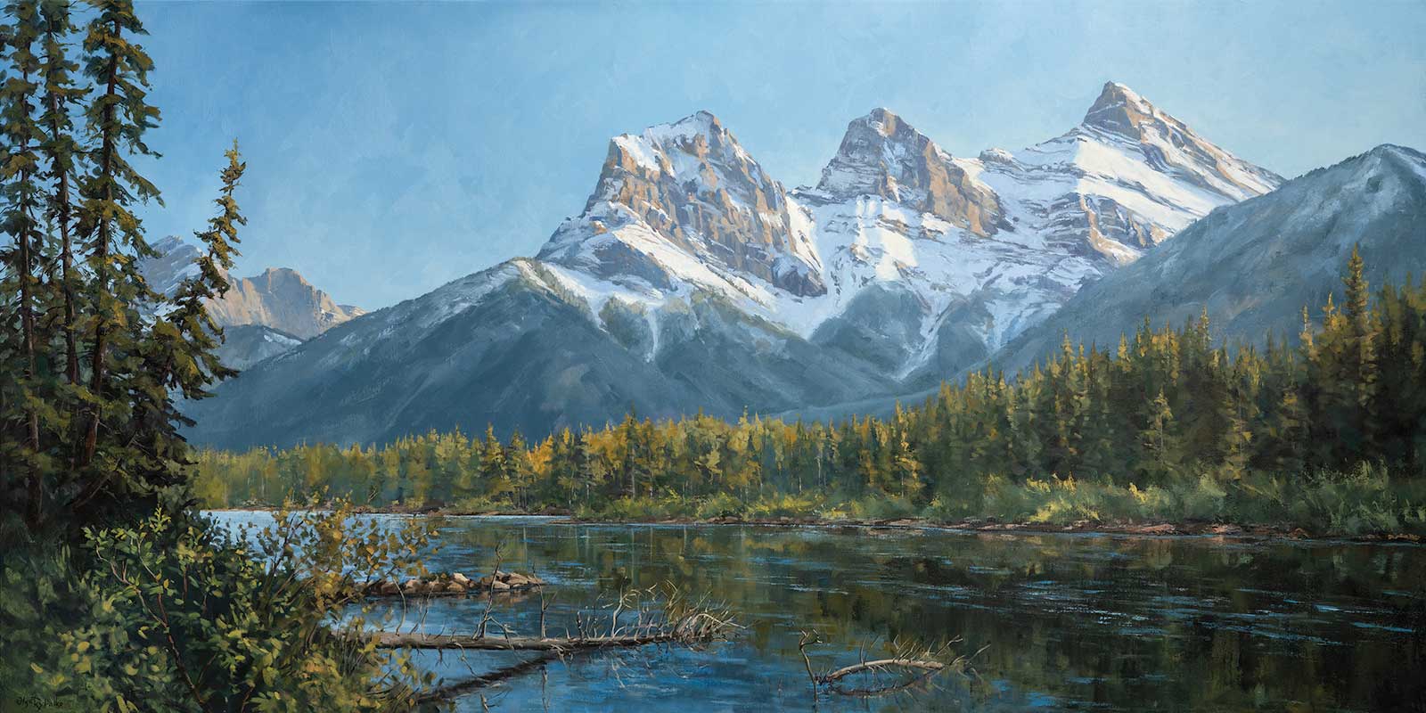 Three Sisters on the Bow, oil on canvas, 36 x 72” (91 x 182 cm)
Olga Rybalko
North Vancouver, Canada
My Inspiration
The Three Sisters mountains near Canmore, Alberta, are a subject I return to again and again. Their dramatic forms rising above the Bow River embody the rugged beauty of the Rockies, while the ever-changing light across their peaks makes them endlessly inspiring to paint. On this summer day, the atmosphere was alive with warmth and clarity. I wanted to hold onto that moment, the stillness of the river, the crisp edges of the peaks against the bright blue sky and the quiet sense of awe that this view always brings.
My Design Strategy
Although the Three Sisters are instantly recognizable, their strong geometric shapes can dominate the canvas. My goal was to create balance and harmony without diminishing their presence. I used the tall trees on the left as a counterweight, while the fallen tree trunk in the foreground provides a natural lead into the scene, guiding the viewer’s eye toward the peaks. This interplay between foreground rhythm and mountain silhouette was essential to give the composition depth, movement and a sense of being drawn into the landscape rather than standing outside it.
My Working Process
I first discovered this vantage point on a walk along the Bow River. With gouache, I made a quick plein air study to record the light, color and atmosphere. Back in the studio, I translated those impressions into a larger oil painting. I began with underpainting to establish the value structure, then built up successive layers, alternating between broad brushwork and palette knifework to achieve texture and variety. My aim was to preserve the freshness of that first encounter while giving the work a lasting sense of presence, as though the viewer is standing right there on the riverbank.
Contact Details
Email: olga@olgarybalko.com
Website: olgarybalko.com
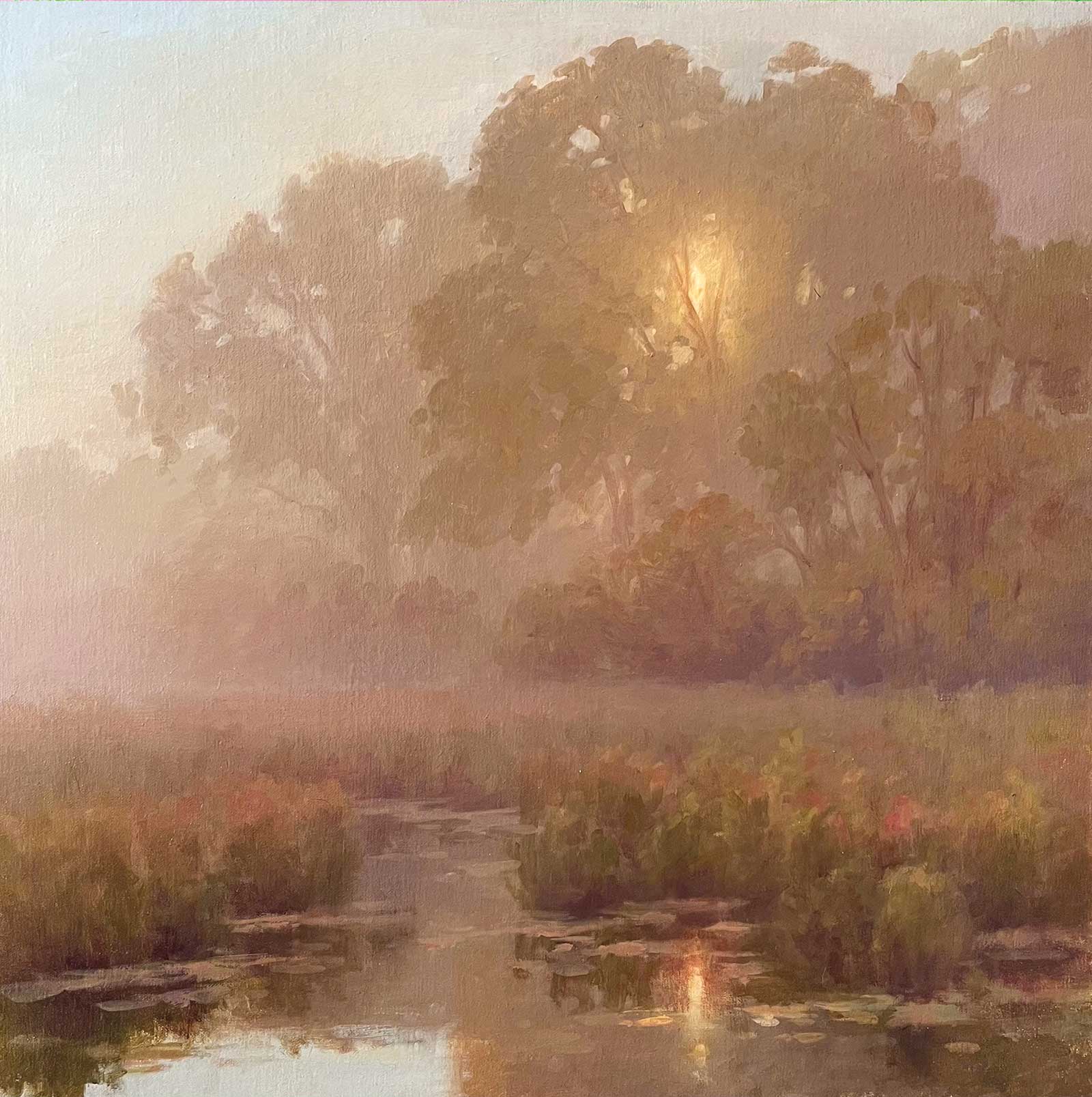 October Mist, oil on linen, 20 x 20” (50 x 50 cm)
Hillary Scott
Massachusetts, USA
My Inspiration
These wetlands are a short distance from my home in Northeast Massachusetts. This hidden gem is a frequent source of inspiration, and I have painted the scene multiple times in various seasons. I created a very similar painting a few years back in a summer palette. When I observed the exact scene last October in a thick morning fog as the sun slowly broke through the mist, I decided to take on the challenge of re-painting the scene but in a warm, muted palette.
My Design Strategy
The most important decisions I make when creating a composition include what part of the scene to emphasize, where to place the horizon line, and the format. I always start the design process with a few value sketches and then a small color study. The sun burning through the fog behind the trees was the clear focal point, and I chose a horizon line about a third of the way up to be able to feature the misty trees but also have room for the beautiful reflections. To convey a strong sense of atmosphere, I needed the trees to recede into the background and fade off the edge of the painting. The square gave me enough space to show this perspective away from the focal point while still retaining balance in all of my compositional elements.
My Working Process
I start most of my larger works with a brunaille underpainting in burnt umber to establish the composition and value structure. Once dry, I start layering/glazing color over it while being careful to leave small areas of the underpainting coming through in sections where I desire more warm tones, like the focal point. This particular kind of painting is always very challenging because meticulous control over the value, hue and chroma is crucial to convey a thick fog. The warm palette was also harder than anticipated. It needed to be significantly muted but also read as fall foliage so a lot of restraint was executed here. High chroma elements with more contrast were reserved for the immediate foreground, and everything else got progressively less chromatic and lower in contrast moving toward the horizon. I generally work background to foreground, and when painting a high key painting such as this one, light to dark, whereas ordinarily I work dark to light.
Contact Details
Email: hillary@hillaryscottfineart.com
Website: hillaryscottfineart.com
Aflatun Israilov
Baku, Azerbaijan
My Inspiration
Lakeside Harmony was inspired by the quiet beauty of a hidden lake deep in the forest in the Caucasus Mountains in Azerbaijan. Reaching the spot required hiking several miles through nearly impassable woods, which made the experience unforgettable. It was the first time I sketched a view directly on location, and I also took photographs that captured the light and atmosphere. Years later, these materials became the foundation for this painting, allowing me to revisit and preserve the sense of peace and timelessness I felt there.
My Design Strategy
In this work, I focused on creating depth and atmosphere through contrast between the forest foreground and the luminous lake beyond. The vertical rhythm of the trees frames the composition, guiding the eye toward the reflective surface of the water. Subtle variations in color and light helped emphasize both the serenity and strength of the natural setting.
My Working Process
The painting was completed in my studio, developed from the sketches and photos I made during that first visit. I began with broad strokes to establish the distant forest and reflective water, building the mood and atmosphere of the scene. Once the background was set, I turned to the foreground, carefully shaping the trees, ground textures, and play of light and shadow. Through multiple layers, I aimed to create a seamless balance between depth, detail and emotional resonance.
Contact Details
Email: contact@aflatunisrailov.com
Website: aflatunisrailov.com