


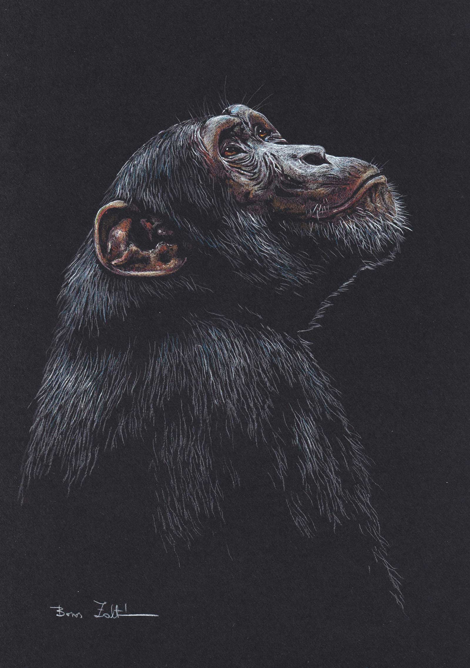
 Böbe, colored pencil, 11½ x 8¼” (29 x 21 cm)
Grand Prize is a four-page editorial feature in American Art Collector magazine
Zoltán Boros
Pest, Hungary
Drawn to the Wild
Zoltán Boros spends as much time as possible outdoors, observing nature and the behavior of animals in their natural environments. Often, he goes to the zoo to study his models up close, paying attention to elements like body structure and anatomy.
“The muscular power of a wild boar, the strong grace of a stag, the wise curiosity of a fox, and the conflict between lion and buffalo are things that have always fired my imagination. Many of my works depict different species, both juxtaposed and in harmony,” says Boros.
A self-taught artist, he practices realism but places a great deal of emphasis on illusion and imagination as well. “I trigger the viewer’s imagination, but I leave it up to them to decide what the final image will look like. I leave space and opportunity for the viewers to fill the picture with their own imagination and experience. I draw some elements in the background or in surrounding space to spark the viewer’s imagination. It’s not important to me that every single hair is drawn; it should look like it is the hair of a real animal,” says the artist.
“I [am] captivated by the rich world of line and tone in graphic art. Most of my art works are based on this technique. I love the simplicity, the broken structure, the ‘naked truth’ of graphics. The basis for everything must be rock steady drawing skills,” Boros adds. “I use my drawing skill for all techniques—watercolor, white pencil drawing, charcoal and in oil painting as well.”
My Inspiration
Böbe the chimpanzee was born in Guinea in January 1963. Her mother fell victim to poachers, and a Hungarian engineer working there took care of the orphaned animal. He donated her to the Kittenberger Kálmán Zoo in Veszprém, Hungary. In December 1969, she was taken back to his native Guinea to let her go free to join the horde of wild chimpanzees. But Böbe was frightened by the other chimpanzees, ran out of the jungle crying and sought protection from her caretaker.
Since then, experts have been paying close attention to ensure that animals can learn from other animals the behaviors that are characteristic of their species and necessary for survival.
My Design Strategy
Knowing Böbe’s story, I thought that I could best portray her character through light and shadow, so I chose black paper and colored pencils. Since chimpanzees are our closest relatives, I had to draw something very human for the character, which is why Böbe looks up. In this upward gaze, we see humility and a request for help. This is my first colored pencil drawing and my first depiction of a chimpanzee.
My Working Process
To better understand chimpanzees, I spoke with the editor-in-chief of Állatvilág Magazin (Animal World Magazine), who knew Böbe’s story well and had also written a book about chimpanzees. I was able to learn important and interesting stories from him about our closest relatives. Then I visited the zoo in Győr, Hungary, to study the primates live and take study photos of them. Then I started drawing. First I drew the main parts with just a gray pencil, then came the colors. Finally, as the last part, I drew the highlights with a white pencil.
Contact Details
Email: borosartwork@gmail.com
Website: borosart.hu

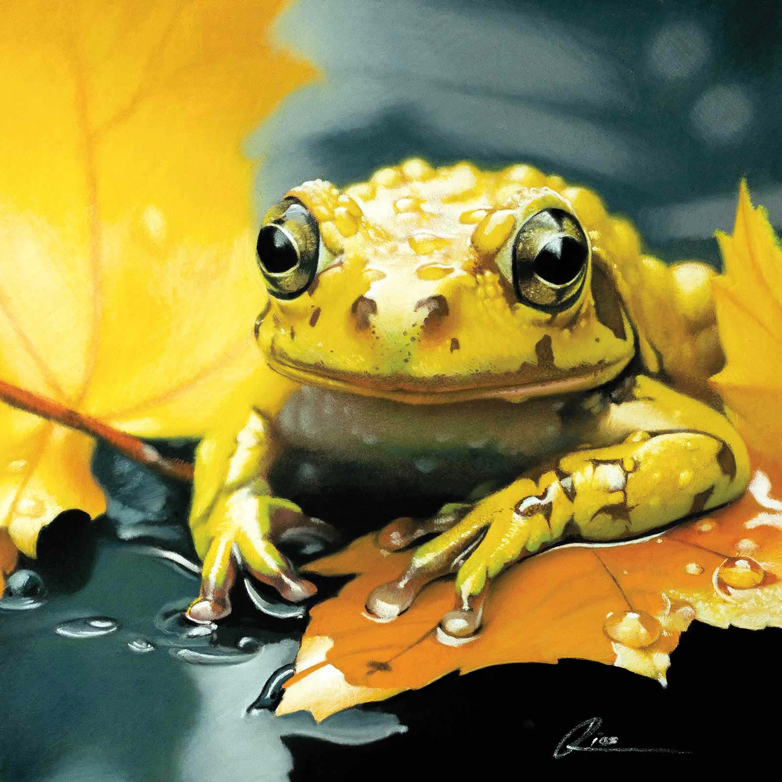 Yellow Frogscape, pastel pencil on Pastelmat paper, 9 x 9” (23 x 23 cm)
Second Prize is a two-page editorial feature in American Art Collector magazine
André Rios
Gelderland, Netherlands
My Inspiration
Yellow Frogscape was inspired by my love of being in nature, especially those quiet moments in the forest when I slow down and notice the tiniest details. I’ve always been drawn to fragile, often overlooked creatures that seem to live on the edge of our awareness. The yellow frog, so small and still, became a symbol for that quiet beauty of nature—the kind that doesn’t ask for attention, but deserves to be seen. What fascinates me is how such a creature can feel like an extension of its surroundings, not separate from them. Through this work, I wanted to honor that delicate presence and give it space to simply exist.
My Design Strategy
In this piece, I wanted to draw attention to the quiet connection between the frog’s luminous skin and the warm tones of autumn leaves. By using a shallow depth of field, a minimal background and the reflective surface of water, I aimed to create a sense of intimacy and calm focus. Rather than constructing an idealized wildlife scene, I chose to frame the frog within a poetic fragment of its real environment. The colors ripple gently between leaf and skin, blurring the line between the subject and its setting—inviting the viewer into a still, suspended moment.
My Working Process
I created this piece with pastel pencils on Pastelmat paper, working in slow, layered stages. I usually start by blocking in the larger shapes and building smooth gradients to set the composition and overall value structure, often moving from dark to light. As the piece develops, I begin refining subtle shifts in color temperature, value and edge softness, always balancing sharp and blended areas to guide the viewer’s eye. The final stage is all about texture: using a finely sharpened pencil tip to add the smallest details, like the gloss of skin or a tiny water droplet. For me, each of these details is more than surface—it’s what brings the subject to life.
Contact Details
Email: andre@andrerios.art
Website: andrerios.art
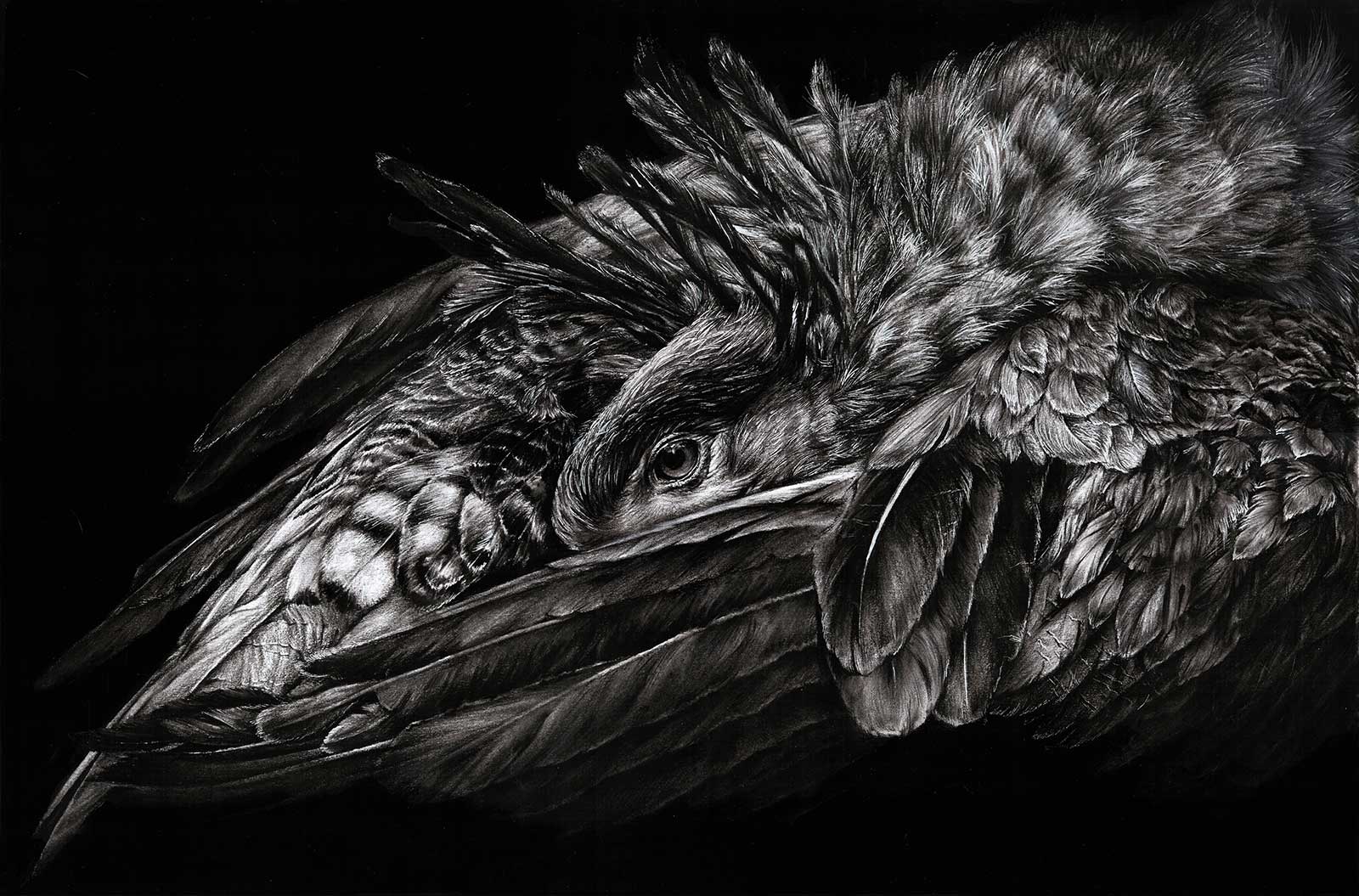 Lurking, charcoal, 12 x 18” (30 x 45½ cm)
Third Prize is a one-page editorial feature in American Art Collector magazine
Yuyang Qiao
Taiyuan, China
My Inspiration
My inspiration for the painting Lurking comes from finding the temperament and beauty of this creature.
My Design Strategy
Secretary birds are so called because they look as if they are keeping a bunch of quilled pens behind their ears. But the question is how to squeeze its entire prepossessing feathers into a single drawing. So I made this secretary bird curled up, looking like it’s ready for sleep. However, its gnarled and menacing temperament should not be underestimated. It opens its blazing, powerful eyes, waiting in the dark, lurking for a good hunt.
My Working Process
The secretary bird’s features are mostly light colors. So I used charcoal to enhance the dark background color to create a strong contrast and intensify its scrooching status. In spite of its gorgeous features, its fierceness can only be expressed through the eyes, so I put most of my energy into them. Painting is therapeutic and lifts the spirit. It’s an indescribable feeling to create such a vivid drawing—one where the bird seems ready to jump out at any minute and capture its prey in one hit.
Contact Details
Email: liryanfanhua94@qq.com
Finalists
Each receives an Award Certificate and a one-year subscription to International Artist magazine PLUS having their work seen worldwide by international galleries looking for new talent.
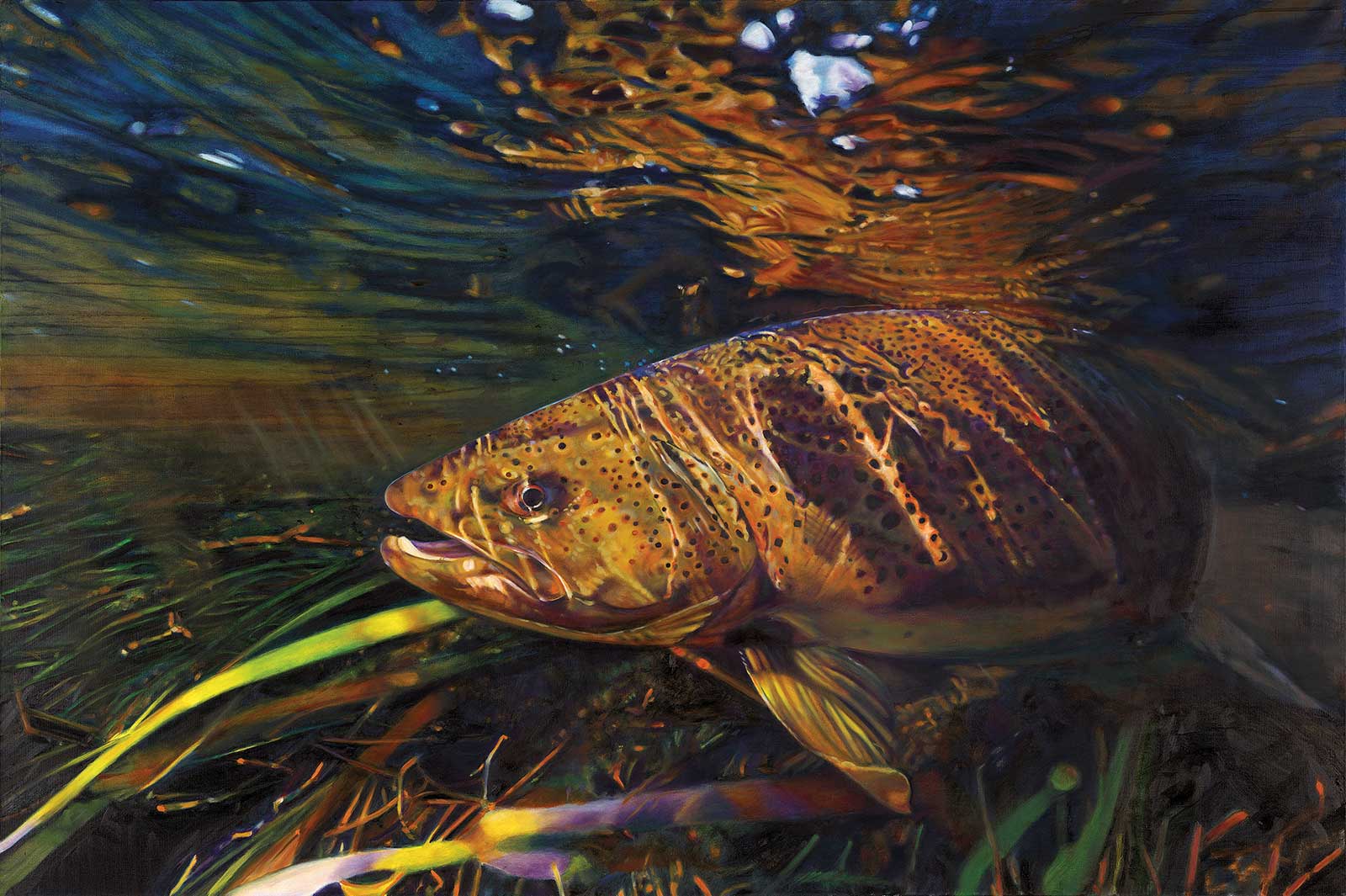 The Legend, oil, 48 x 72” (121 x 182 cm)
Daniel P. Feldhauser
Michigan, USA
My Inspiration
Growing up on the Au Sable River, east of Grayling, Michigan, I was exposed to trout fishing at a very early age. My artistic fascination with this underwater photo, taken by well-known artist and nature photographer Graham Owen, is the multiplexity of colors and lights as they play through the water and reflect off the subject of the brown trout as well as the weeds and grasses on the river bottom.
My Design Strategy
I chose a large 48-by-72” canvas on which I could cover as many details as possible surrounding the main subject and capture the full realistic characteristics of every detail. The idea being to make the brown trout and his environment as realistic as possible. Then, when the original work is reduced in size, it becomes hyperrealistic.
My Working Process
My work requires concentration on using base tones, beginning in the background from left to right, with emphasis on covering large areas with a variety of tones. The fish had many colors relative to all areas of the water. The larger areas are brushed in thinly to establish them with no rough edges, trying to pick a variety of tones throughout the painting. Following these steps, middle tones are developed before final details are finished. It is important to begin with large areas across and down the canvas, then paint “smaller” as details are developed as well as highlighted areas.
Contact Details
Email: pghhh@hotmail.com
Website: danfeldhauser.com
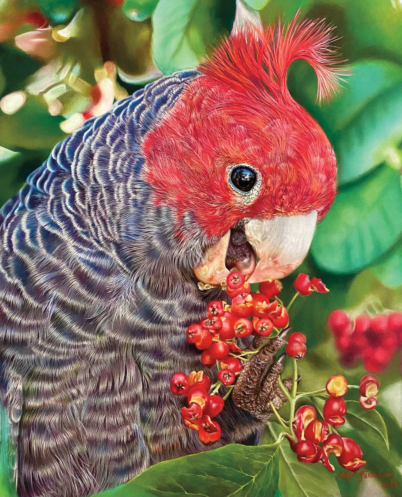 A Taste of Nature, soft pastel on Pastelmat, 106 x 129” (42 x 51 cm)
Maryam Fardinfard
Dubai, UAE
My Inspiration
I was inspired by the natural harmony between wildlife and its environment. The vibrant red of the bird and berries caught my attention and reminded me how color and life are deeply connected in nature’s design.
My Design Strategy
I composed the scene to emphasize the interaction between the bird and its food, using strong contrasts and repeated reds to guide the viewer’s focus. The soft green background was chosen to enhance the vivid colors without distraction.
My Working Process
I used soft pastels on sanded paper to capture fine feather details and the juicy texture of the berries. I layered colors patiently, focusing on contrast and light to create a lifelike yet expressive scene.
Contact Details
Email: fardinfard_m@yahoo.com
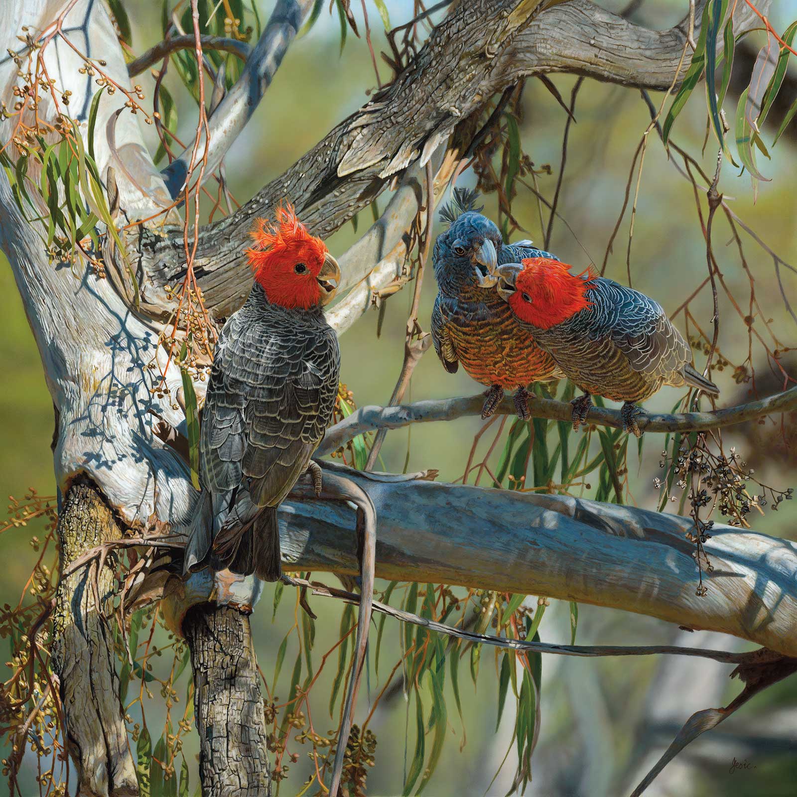 Family Gathering, acrylic, 30 x 30” (76 x 76 cm)
Stephen Jesic
Queensland, Australia
My Inspiration
I have always wanted to explore the design of a square painting and to create an illusion of it not being square. I also wanted to incorporate the increasingly vulnerable gang-gang cockatoos. The loss of older hollow trees and habitat through land clearing has led to a significant reduction in numbers. The gang-gangs are currently listed as endangered.
My Design Strategy
Searching through my reference photos I found a superb river gum scene. Cropping the photo into a square format highlighted the design challenges. The tree and branches had a very dominant shape, which only strengthened the square format. To break this, I warped the tree forming a more diagonal droopy L shape to dominate and overpower the square format. Finally, I added the gang-gangs, branches, flower buds, leaves and bark to enhance complexity, completing the illusion.
My Working Process
I drew out the composition on a gesso-primed Baltic birch panel. Working totally in acrylics, I started from the male bird on the left, blocking in the head and immediate background. This set the tone, vibrancy and cheeky energy of these cockatoos. The background and main trunk of the tree were added, then added the female and fledgling. A combination of multiple brush and airbrush techniques were used until the final result was obtained.
Contact Details
Email: saj@stephenjesic.com
Website: stephenjesic.com
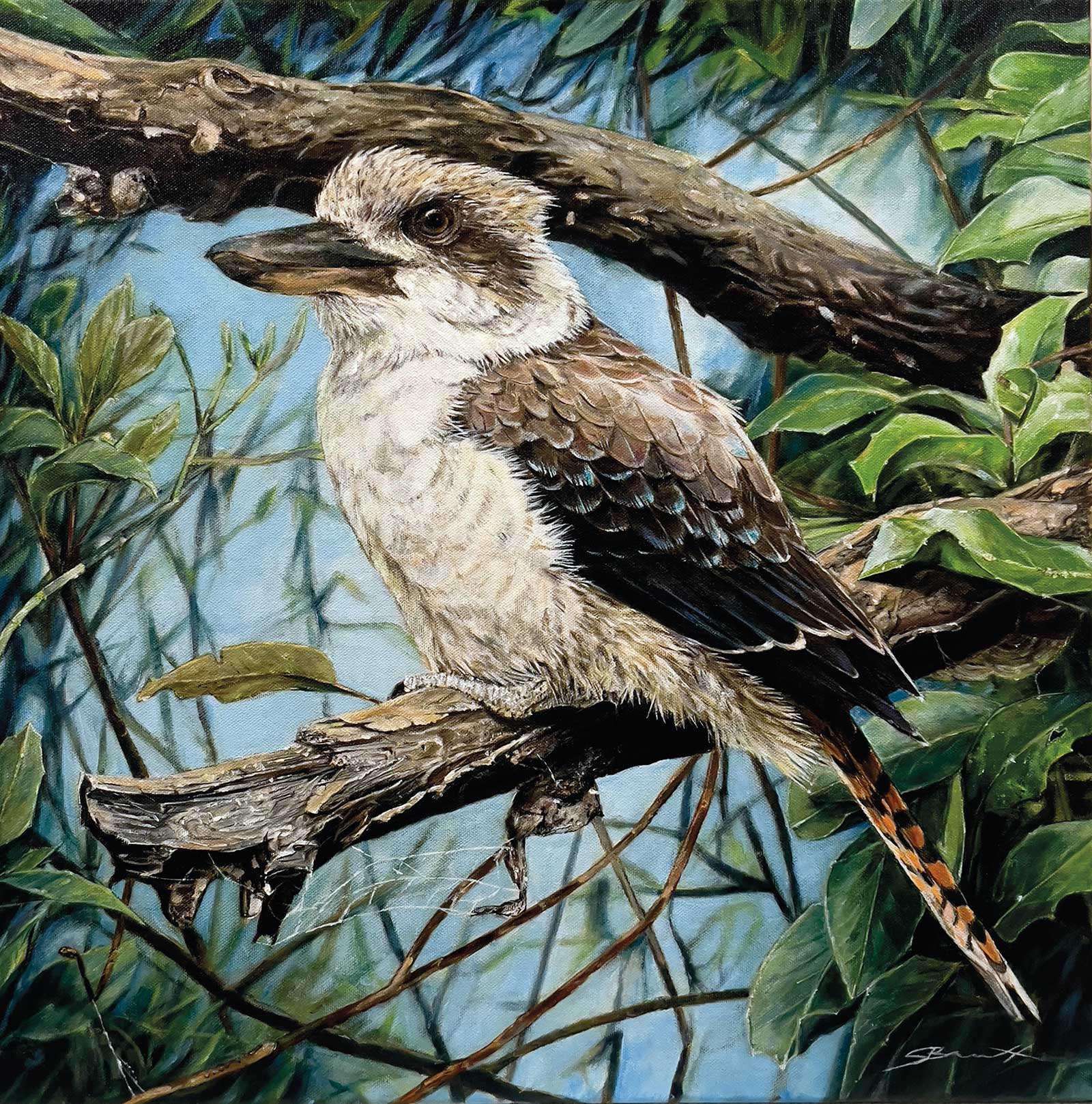 Good Luck, acrylic on stretched cotton canvas, 19½ x 19½ (50 x 50 cm)
Stephen Bennett New
South Wales, Australia
My Inspiration
I have always loved seeing the kookaburra visit our garden and wanted to capture its very distinctive, focused beauty in a painting. Having the kookaburra resting on an old decaying gum tree branch being overtaken by an unforgiving vine, its focused appearance provides a point of symbolic strength to the dense environment, embodying essential qualities of color, communication and awakening. In some cultures, the kookaburra is regarded as a messenger of “good luck.”
My Design Strategy
I always like to have knowledge of the subject I am painting and passion behind what I intend to create. I will have a visual plan in my mind with what I want to achieve based on having many great references. Bringing these together, I will begin the creative process to then create my main reference point to work from.
My Working Process
I have always used the grid transfer method, which saves time in transferring the image over. This will eliminate any freehand drawing errors and get the structure and balance spot on. Always painting the subject first sets the tone and general feeling of my artwork. Once mostly completed, I will make my way around the canvas, creating the background while balancing out the lighting, shadows and intricate details.
Contact Details
Email: stephenbennettart@gmail.com
Website: stephenbennettart.com
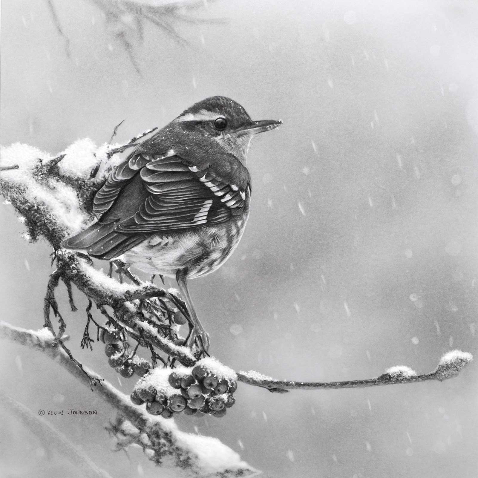 Snow Day - Varied Thrush, graphite on Strathmore bristol board, 9 x 9” (22 x 22 cm)
Kevin Johnson
British Columbia, Canada
My Inspiration
Inspiration for this drawing came while looking out our kitchen window one snowy day. Unexpected snowfalls where I live are still special treats and catch many creatures off guard. As the snow lightly fell and accumulated on the branches of a mountain ash tree, a varied thrush hopped from branch to branch trying to capture the last of the season’s berries. The light was magical, and I knew a drawing needed to be created.
My Design Strategy
For this drawing I was trying to isolate elements of the overwhelming but incredible detail in the branches, berries and snow. I wanted to strike a balance between the softness of the feathers and falling snow with the crispness of the branch and accumulating snow. I found the combination in this scene very peaceful and calming.
My Working Process
My drawing process started with photos of the varied thrush dancing among the branches and perch spots that this bird hadn’t knocked the snow from yet. Thumbnails and a finished line drawing were used to finalize my composition before transferring my idea to a Bristol board surface. Starting with the eyes to provide life, I work my way down the bird to the branch, berries, then onto the falling snow using various grades of pencils and erasers.
Contact Details
Email: artguykevin@gmail.com
Website: artguykevin.com