



I have been pursuing color expression ever since I started painting in earnest. As a result of trial and error, I now paint with a focus on pointillism. I am simply fascinated by the beauty of pointillism. Some painters arrange colors in a theoretically precise way, but I don’t care so much about theory. This is because I place more importance on the feeling and improvisation at the time. I love the miraculous harmony that is born when a certain color resonates with other colors. When I succeed in creating that, I feel great joy.
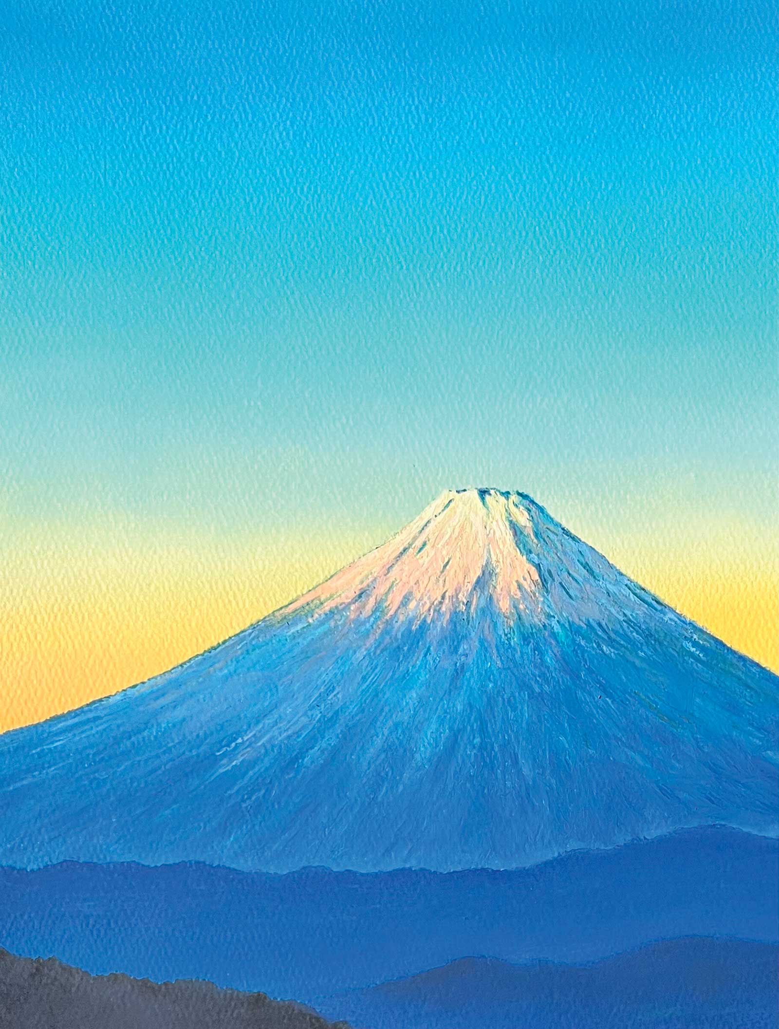
Be Clear, oil pastel, 12 x 9" (30 x 22½ cm)
When I paint a picture, I have an image of the finished product in mind, but I don’t typically stick to it. I feel that I’ve created a good painting when my work exceeds the image I’d initally imagined. The piece featured in this demonstration, Pointillism: Beyond the Sparkle, is typical of my style and consists of a pointillist sea and a sunset sky in contrast to it. This sea is not based on a real location; rather, it is a fictional place I’ve imagined in order to heighten the color expression. I often paint landscapes, which I think are suitable for color expression. I especially love paintings of the sea.
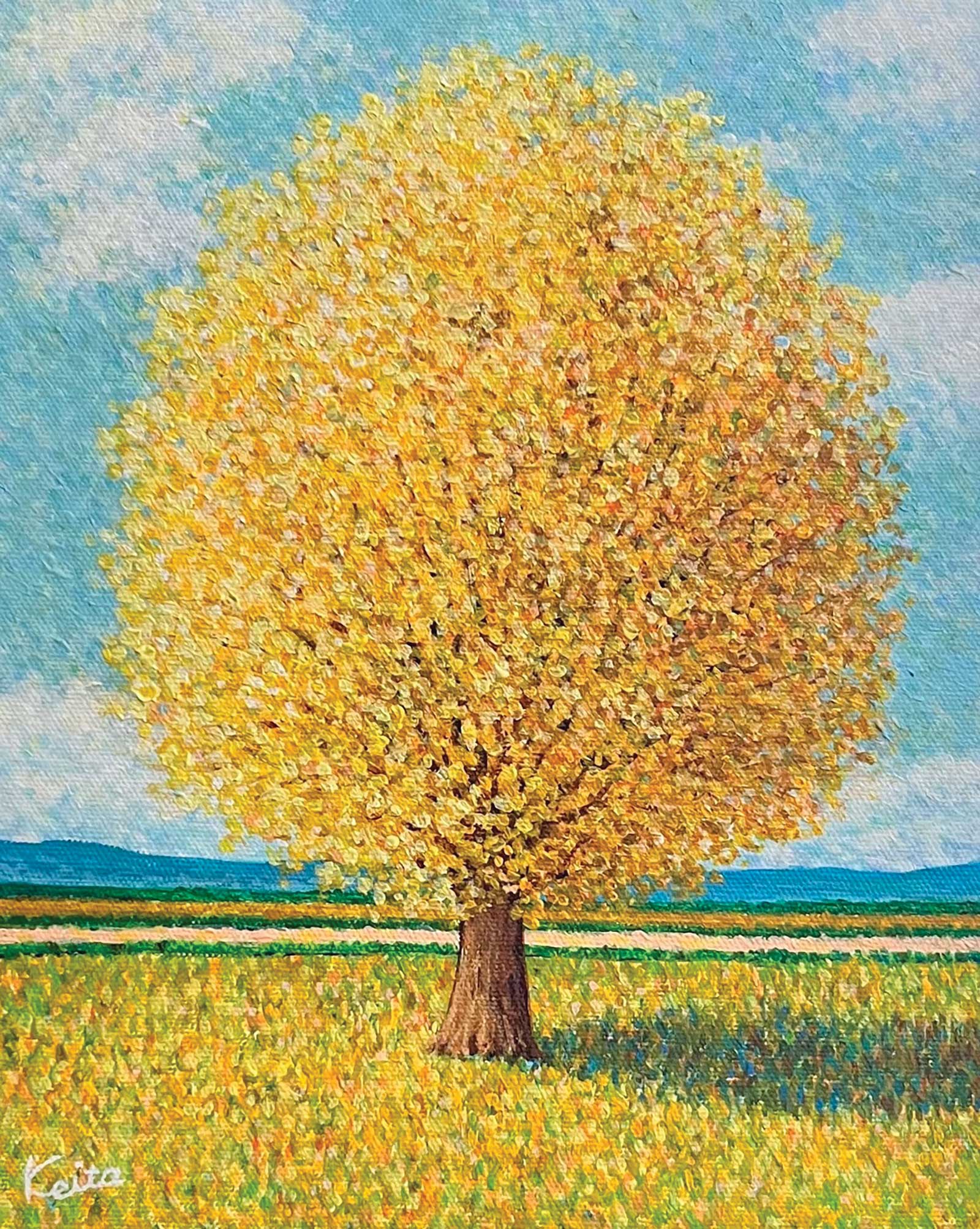
A Single Yellow Tree, acrylic on canvas, 10½ x 8½” (27 x 22 cm)
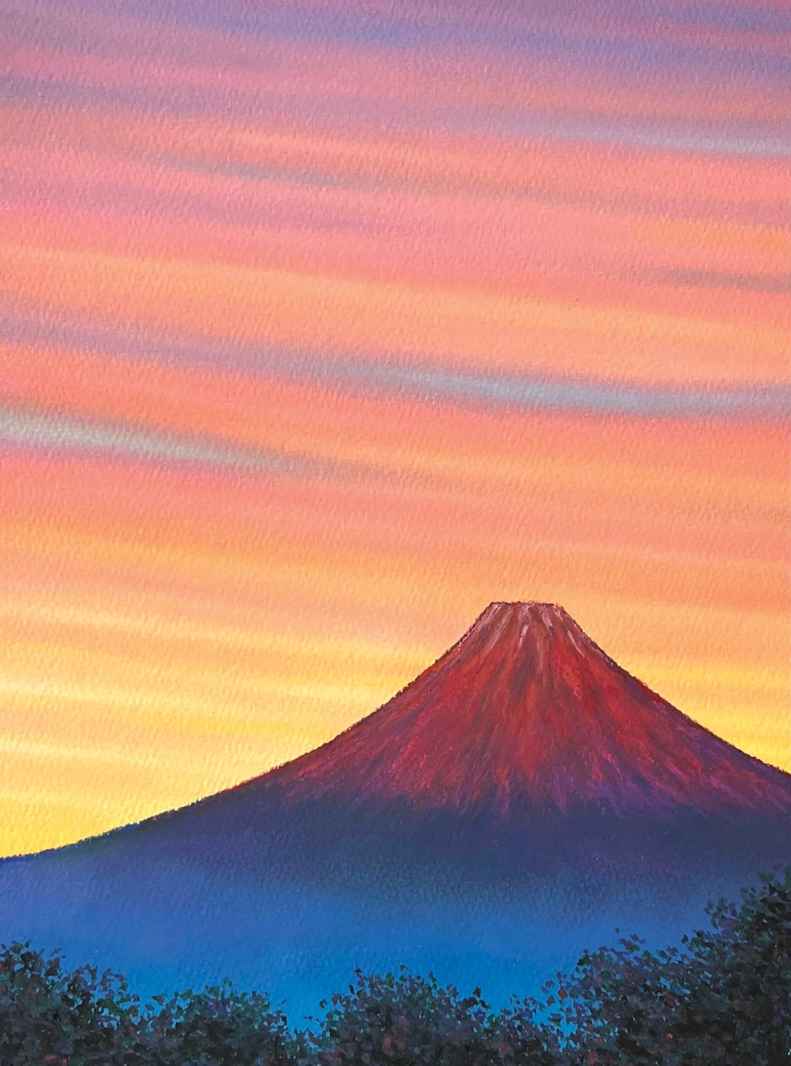
Sunset and Red Fuji, oil pastel, 12 x 9” (30 x 22½ cm)
The pointillism of the sea is composed of many colors, but the color theory used is very simple, such as complementary colors. The sunset sky is depicted with smooth gradations of color, in contrast to the sea. This aims to create a contrast with the pointillism in the reflections on the water.
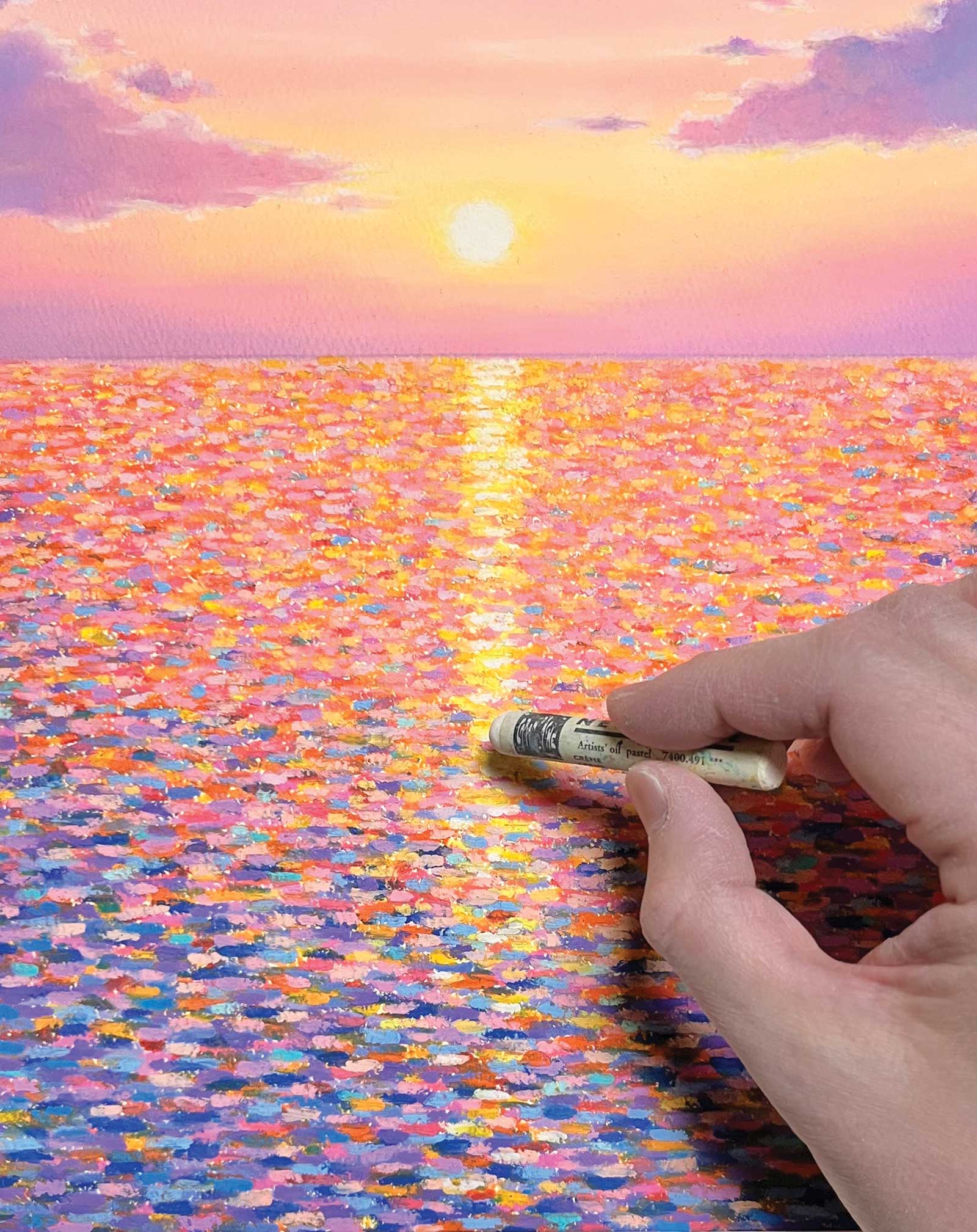
The art materials I primarily use are Caran d’Ache Neopastels. These are very soft oil pastels that are easy to layer and have good color spread. I also use Mungyo and Holbein oil pastels. The characteristics of oil pastels vary greatly depending on the manufacturer, so I think it is important to understand these before using them.
My Art in the Making Pointillism: Beyond the Sparkle
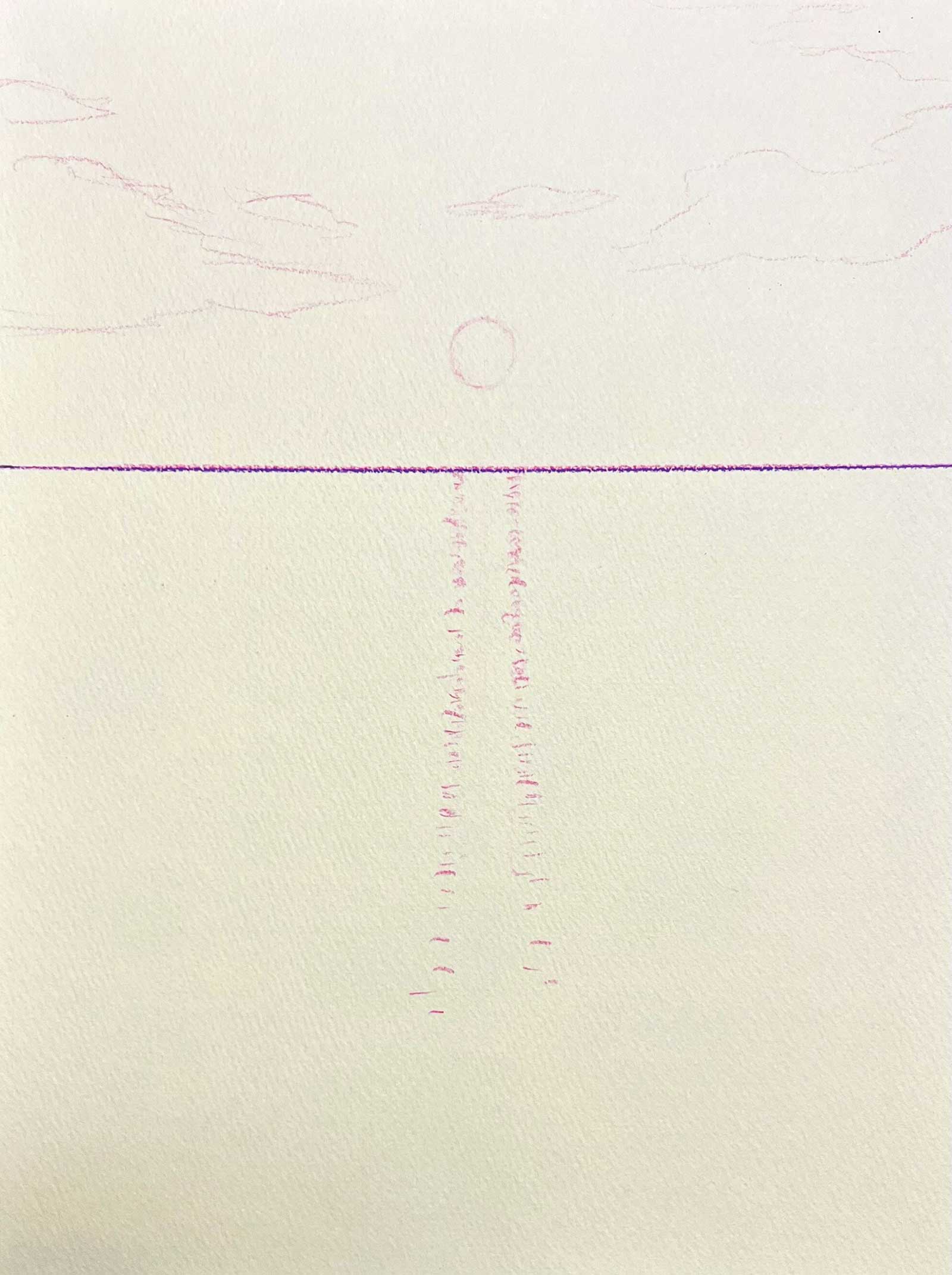 Stage 1
Stage 1 Simple Sketch
I made a simple sketch with colored pencils on a textured colored paper called Mermaid paper in a calm, pale yellow. By using colored paper, the color of the paper remains in the areas where there is no paint, which also becomes a distinctive feature of the work.
WHAT THE ARTIST USED
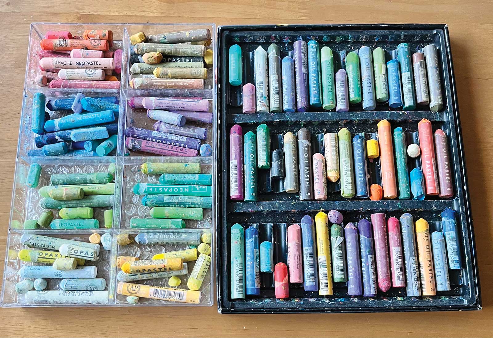
Caran d’Ache Neopastels
Salmon, Salmon pink, Orangish yellow, White, Cream, Yellow, Lemon yellow, Pale yellow, Golden yellow, Light purple violet, Sky blue, Turquoise blue, Sapphire blue, Turquoise green, Granite rose, Fast orange, Reddish orange, Mauve
Mungyo Gallery Artist’s Soft Oil Pastels
Flame red, Orange, Golden yellow, Cobalt blue, Sapphire blue, Pink, Violet
Holbein Artist’s Oil Pastels
Light blue, Coral red
Additional Materials
Mermaid paper, Fixative, Holbein crayon coat, Tombow colored pencils
 Stage 2
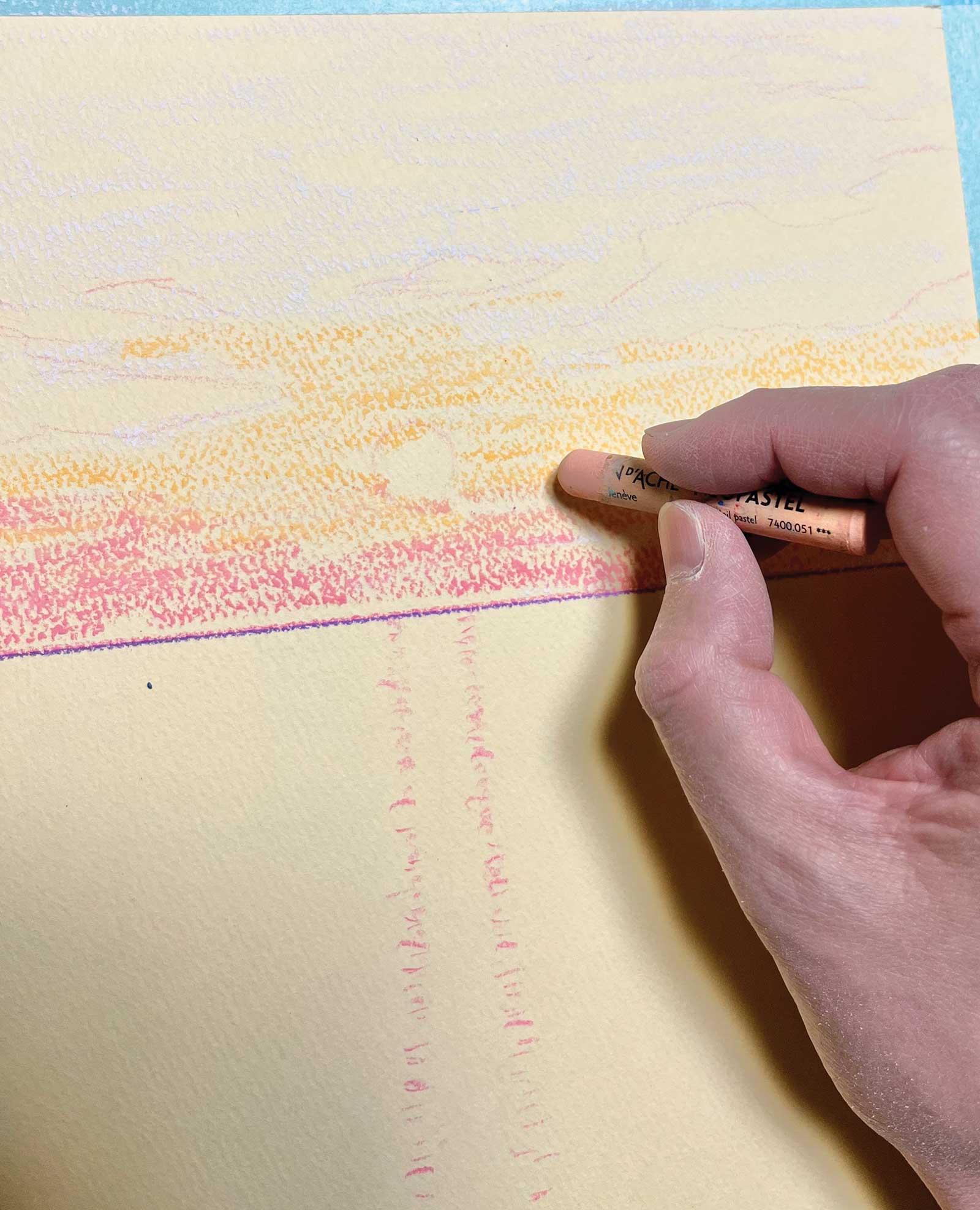
Stage 2 Starting to use the Pastels
As you can see, there are some parts that get colored and some that don’t because of the unevenness of the paper. The irregular coloring that comes from this unevenness creates a subtle touch. I’m using Caran d’Ache Neopastel in the color salmon.
 Stage 3
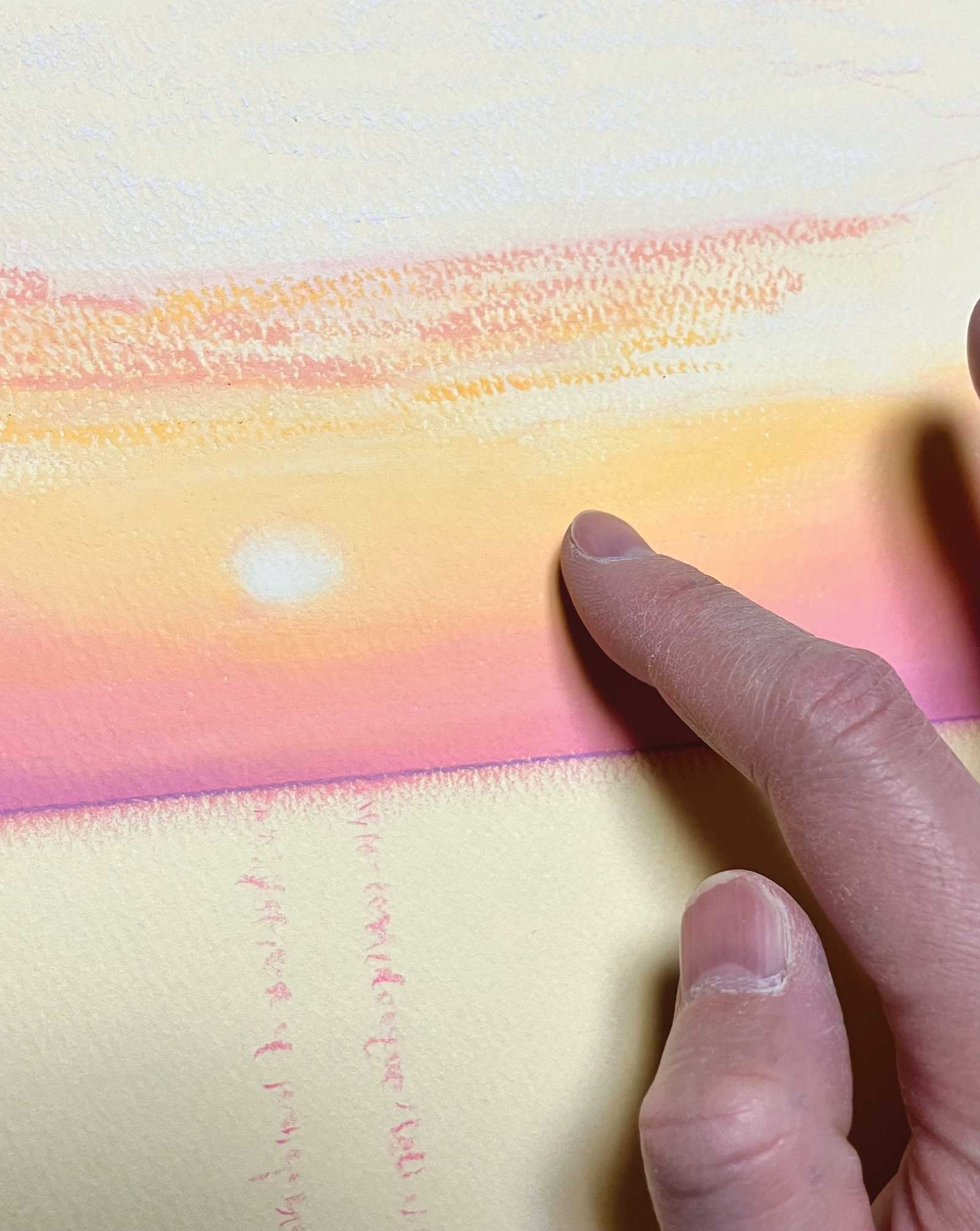
Stage 3 Blending
To create a smooth gradation in the sky, I used my fingers to blend and spread the pastel onto the paper.
 Stage 4
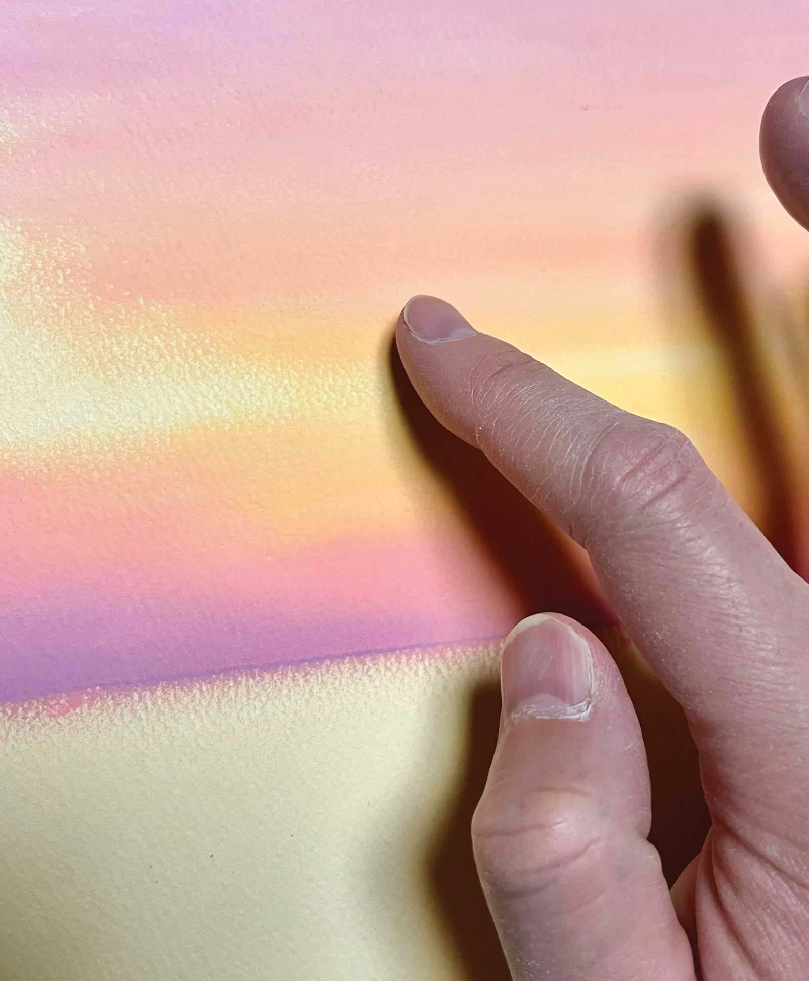
Stage 4 Gradations
I add colors little by little, adjusting the hues to create deep shades. Pastels are a great medium for creating gradations.
 Stage 5
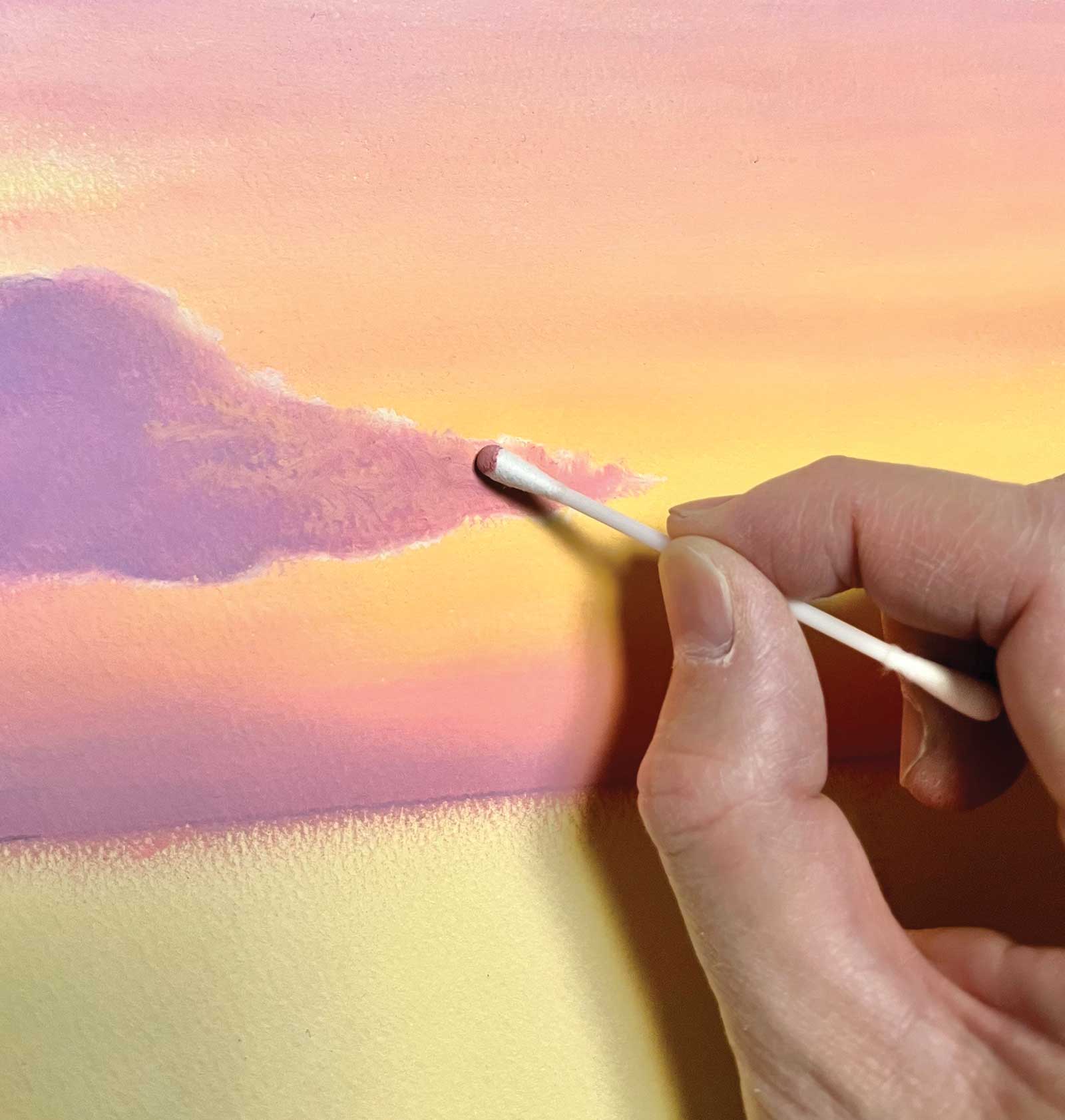
Stage 5 Clouds
In this stage, I’m working on drawing the clouds. It’s difficult to apply the fine details with my fingers, so I use a cotton swab to spread the pastels.
 Stage 6
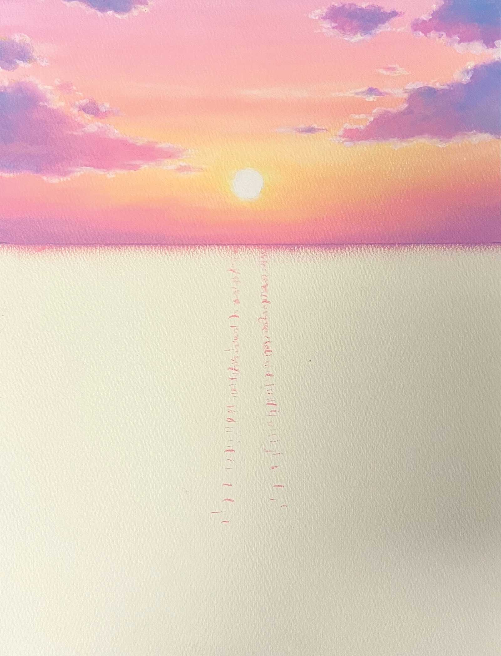
Stage 6 Sky Complete
The sky is complete. By expressing the sunset sky with a smooth gradation, it creates a contrast with the pointillism of the sea that I will paint next. The colors I used in this part are Caran d’Ache salmon, salmon pink, orangish yellow, white, cream, yellow, lemon yellow, pale yellow, light purple violet and sky blue.
 Stage 7
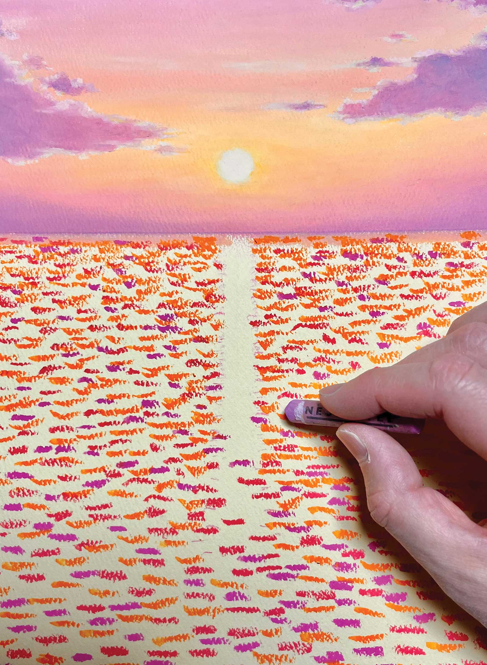
Stage 7 The Ocean
I’m now drawing the ocean. At first, I roughly add orange and purple colors, starting with the dark colors and adding lighter colors later.
 Stage 8
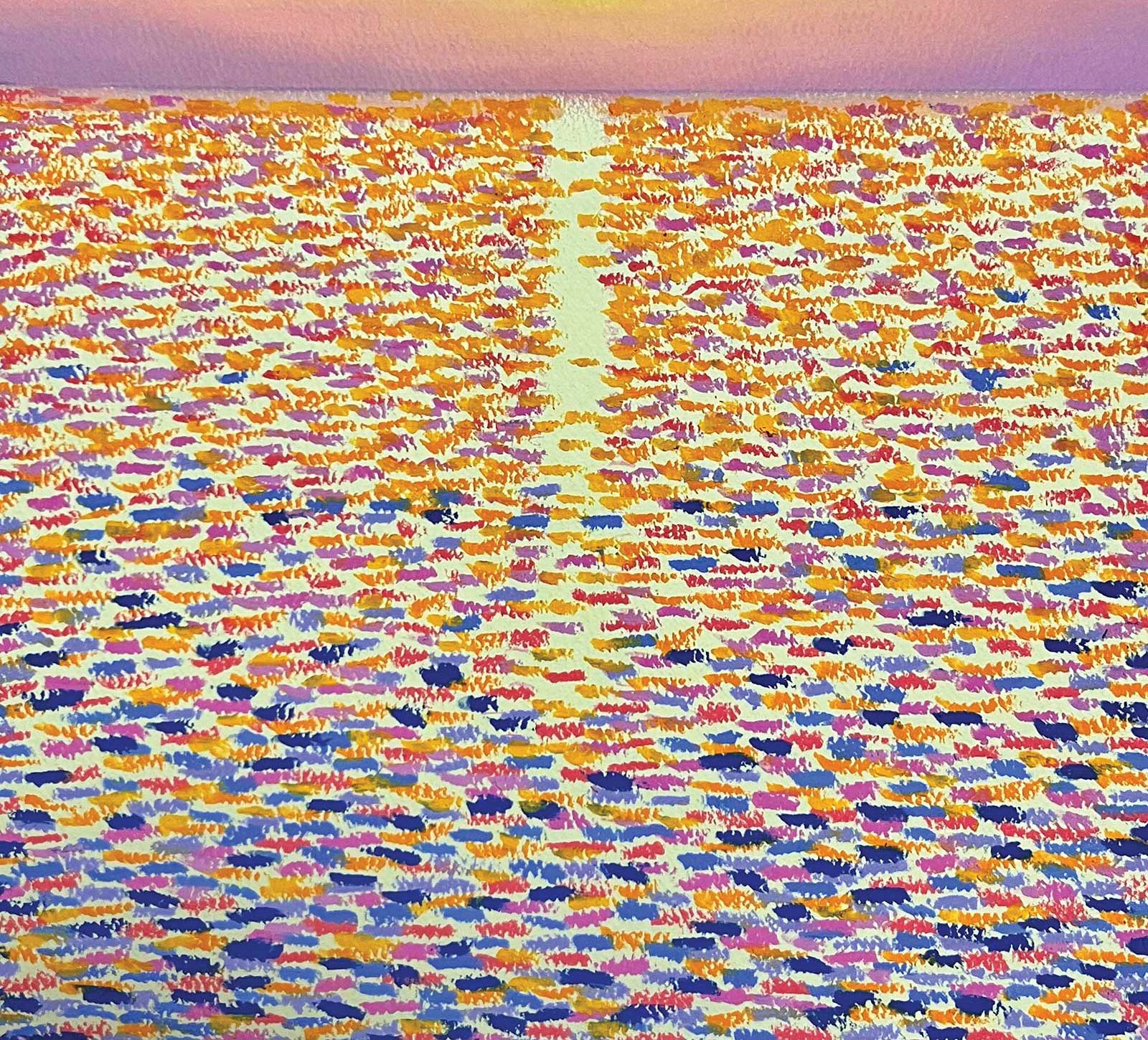
Stage 8 Refining the Ocean
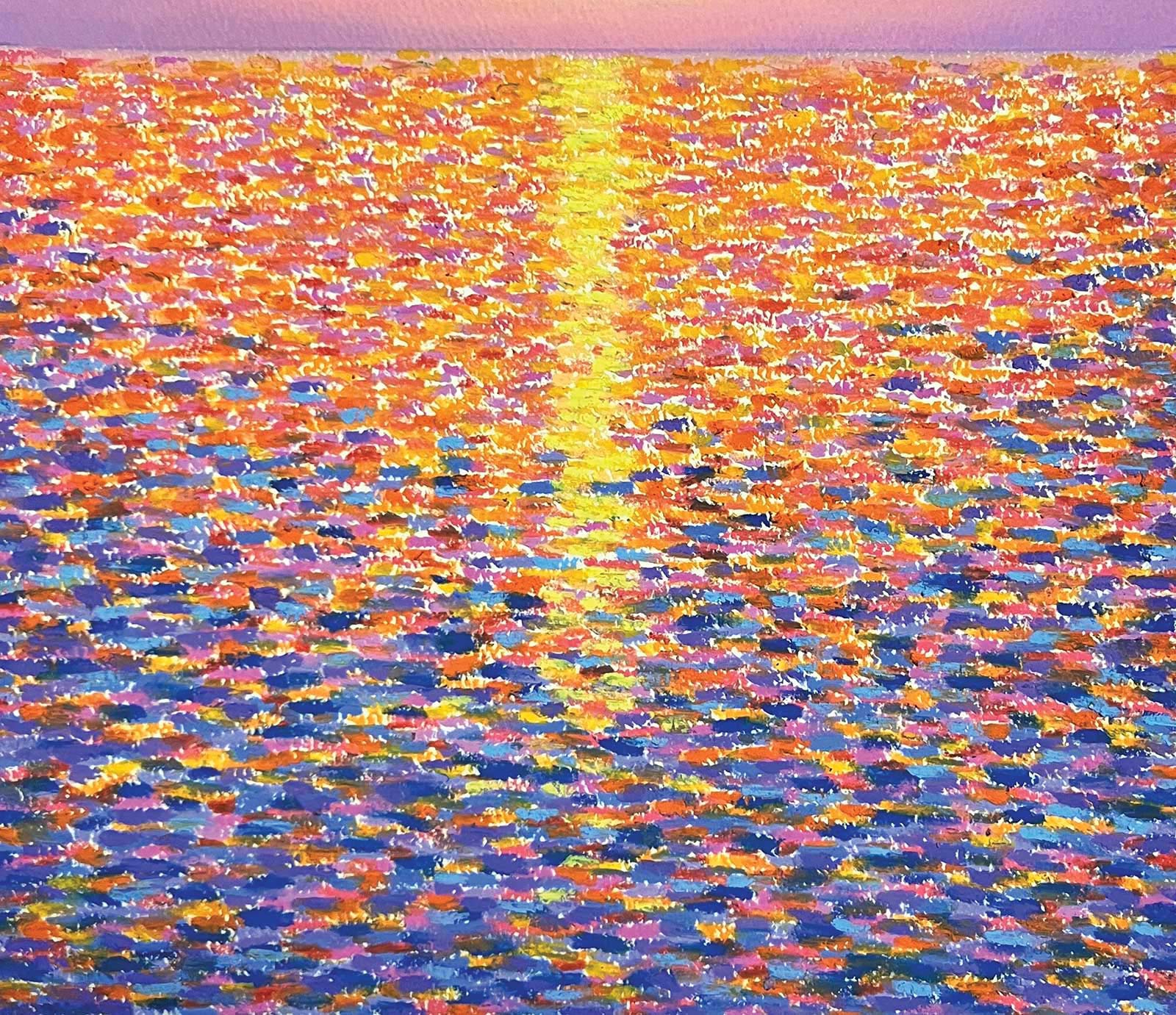
The upper part of the ocean is painted with small dots of orange colors, and the lower part is painted with slightly larger dots of purple colors.
 Stage 9
Stage 9 Applying Fixative
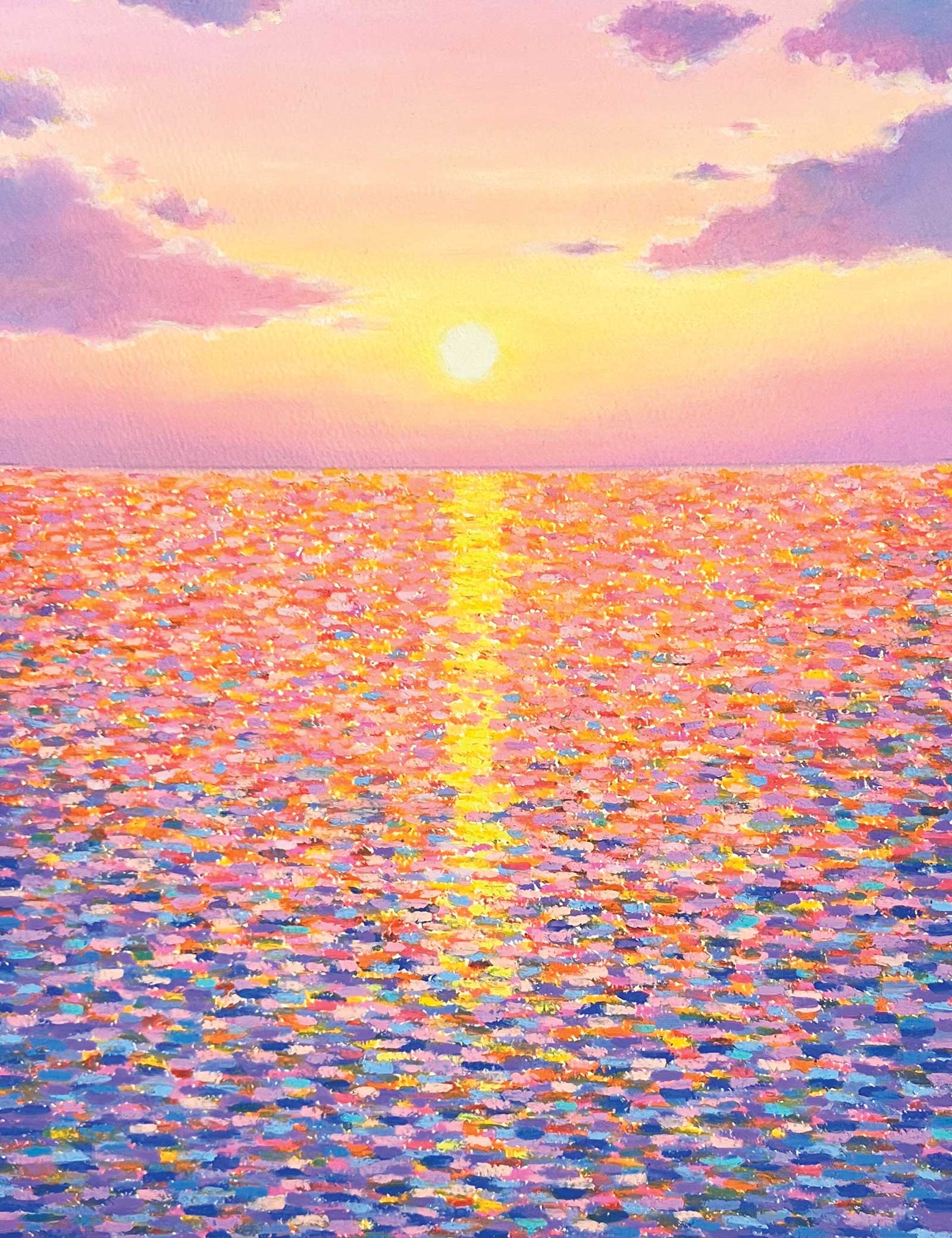
I add pink, blue and yellow colors using pointillism. After this, I used a fixative to harden the pastels before adding the brighter colors. This makes it easier for the colors to stick.
 Stage 10
Stage 10 Bright Colors
Now, I am applying bright colors such as salmon pink and lemon yellow. There are some pointillist painters who use colors in a theoretical manner, such as Georges Seurat, but I place importance on intuition. In terms of color theory, I was conscious of complementary colors. Especially in the latter half, I focused on my experience and intuition and added colors little by little over time.
 Stage 11
Stage 11 Final Details
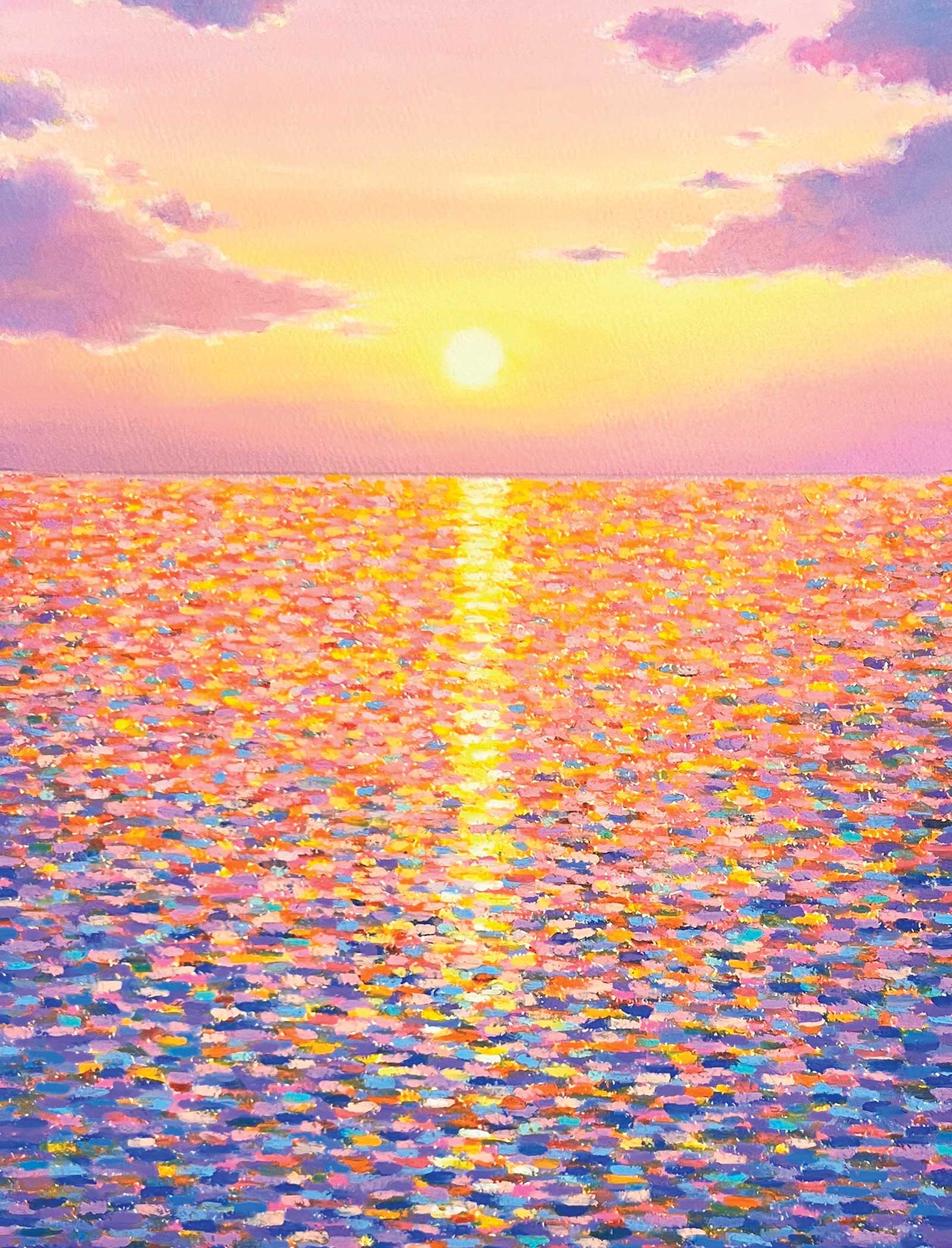
Finally, I add white and cream. Then, I look at the piece as a whole and work on any other details that need tweaking.
 Stage 12
Stage 12 Finished Artwork
Pointillism: Beyond the Sparkle, oil pastel, 12½ x 9½" (32 x 24½ cm)
About the Artist
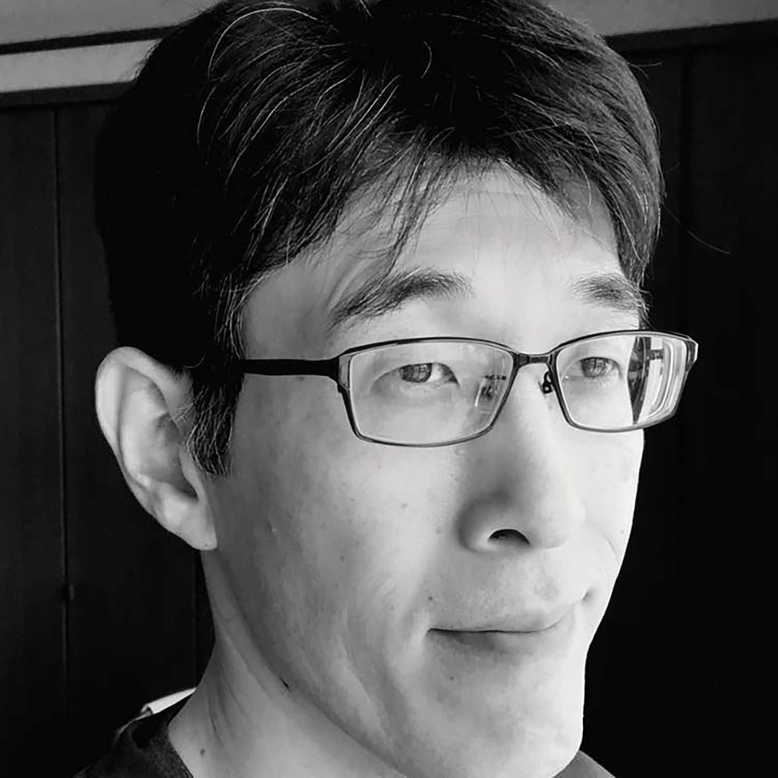 Keita Tsuji
Keita Tsuji was born and raised in Ishikawa Prefecture, a regional city in Japan, and holds a solo exhibition in his hometown about once a year. Tsuji works primarily with oil pastels due to their convenience and ease of use. They are the perfect medium for him, as he strives to capture an image and express it immediately. Although the range of expression is limited by the medium, Tsuji enjoys the trial and error within those limitations. The artist’s style would not have developed into what it is today without the medium of oil pastels.
Contact at
keitapastel.base.shop