


I find inspiration in the simple, everyday moments that often go unnoticed—the way light catches the edge of a building, the quiet rhythm of people moving through their day, or the intricate details of architecture that tell the story of a place. Traveling has always been an important part of my artistic journey, and I love observing different cultures, their ways of life and the atmosphere of their streets.
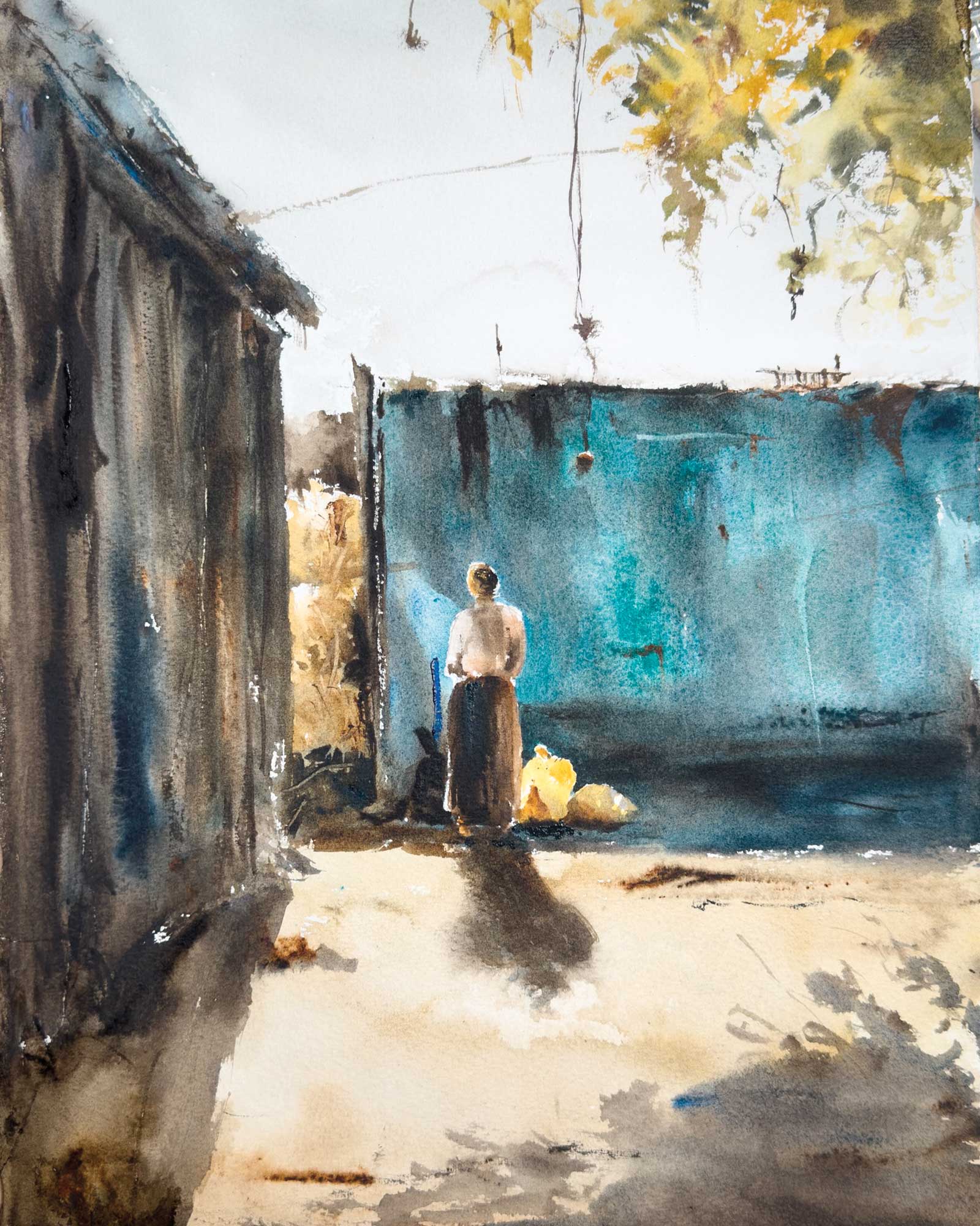
Exhaustion, watercolor on paper, 15 x 11” (38 x 28 cm)
My approach to watercolor is spontaneous yet intentional. I like to work quickly and loosely, allowing the medium to flow naturally while maintaining control over composition, contrast and color harmony. My style is impressionistic, focused on capturing the feeling of a place rather than strict realism. I use bold colors and deep shadows to bring depth and energy to my work, balancing soft transitions with sharp edges to guide the viewer’s eye.
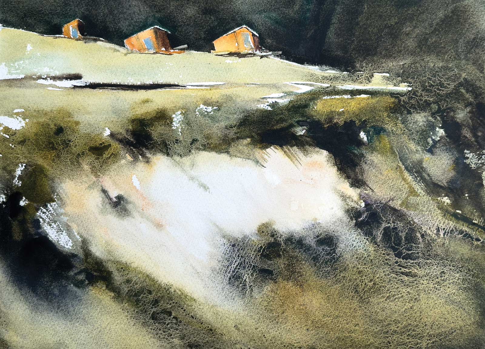
Passing By, watercolor on paper, 11 x 15” (28 x 38 cm)
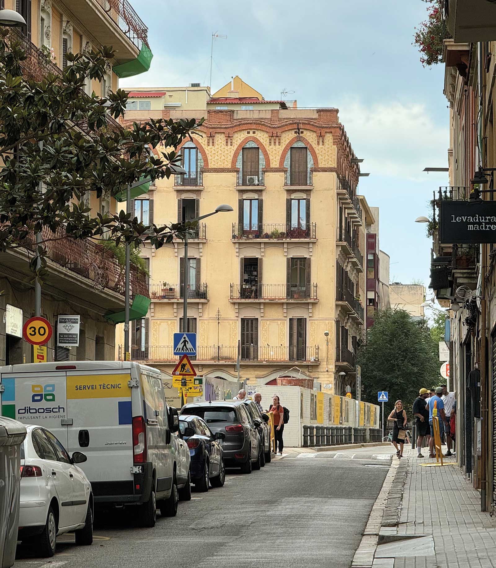
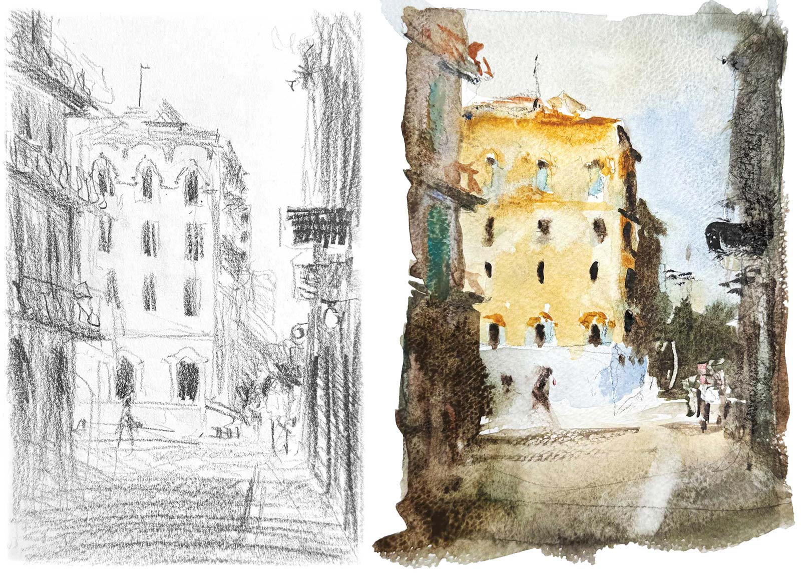
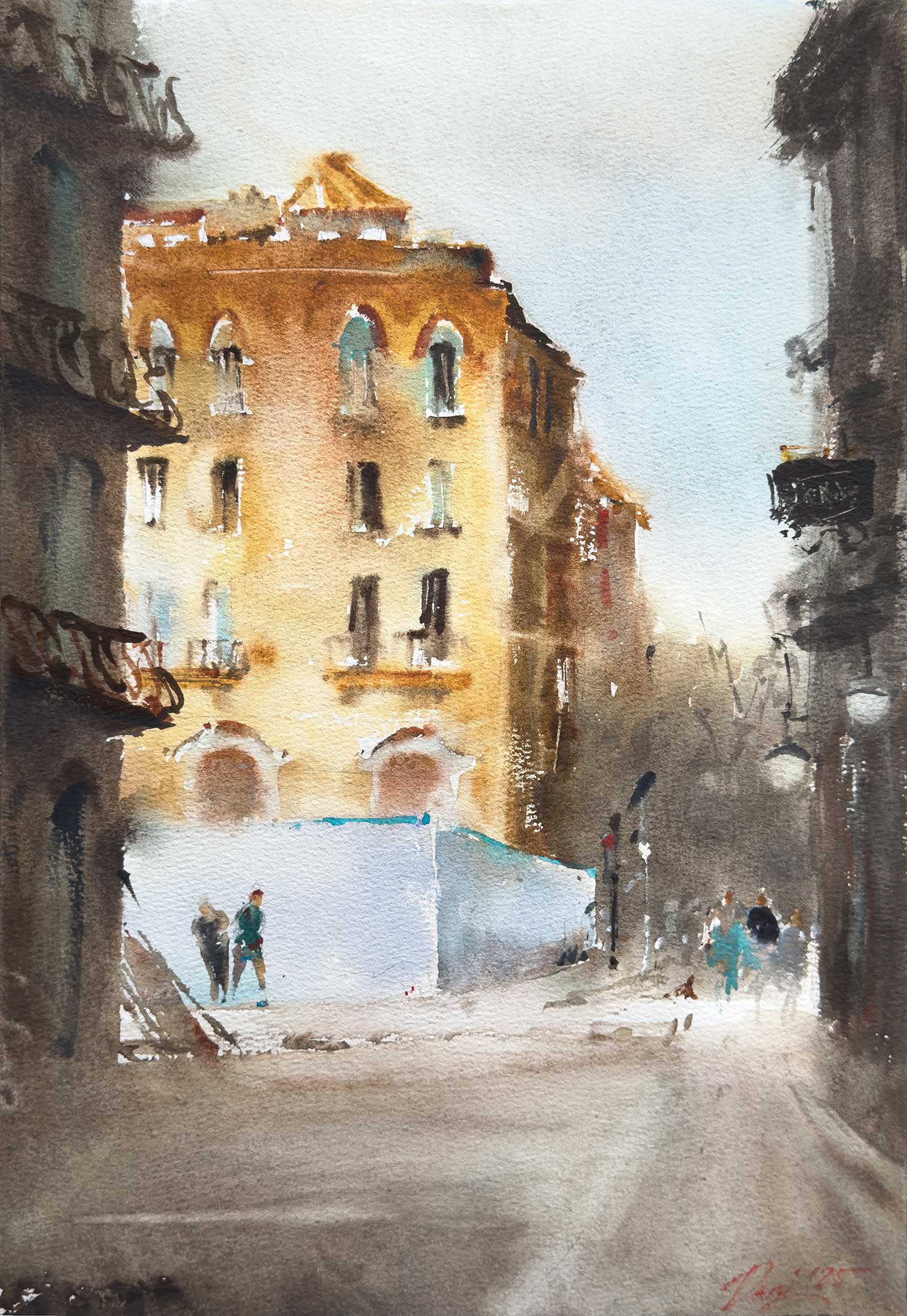
The demo painting is a cityscape from Barcelona’s La Vila de Gràcia district, a scene that immediately caught my attention. The intricate architecture glowing under the afternoon light and the quiet movement of people created an atmosphere I wanted to capture. My goal was not just to depict the building but to convey the warmth and lighthearted energy of that moment.
Before starting, I take time to analyze what drew me to a scene. I begin with a pencil sketch, mapping key elements, and often create a small watercolor study to test my color choices. This stage helps me plan how to use warm and cool contrasts while keeping the composition loose and spontaneous. My technique is a modified alla prima approach, working in sections rather than multiple layers to keep colors fresh and vibrant.
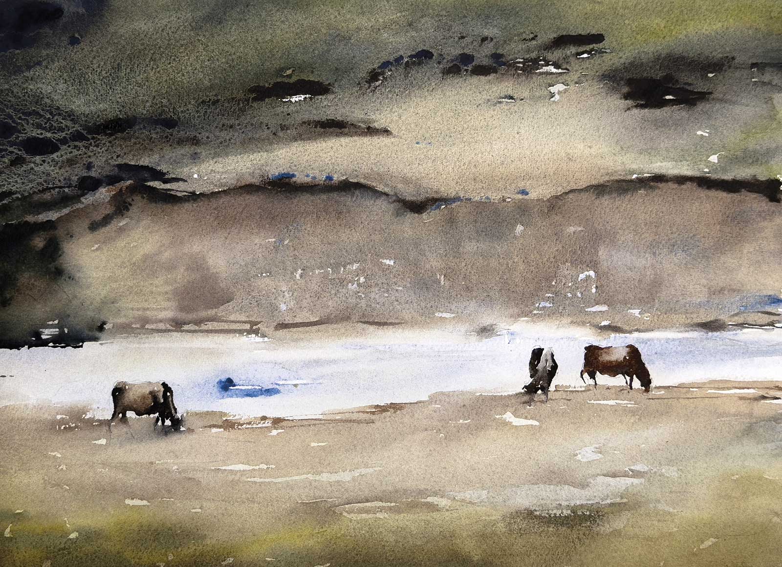
In the Mountains, watercolor on paper, 11 x 15” (28 x 38 cm)
For this piece, I used a combination of wet-in-wet, dry-brush, glazing, lifting and scratching techniques to create depth and texture. The final details, like lifting highlights for the pavement and streetlights, helped bring the scene to life. This painting is a personal memory, a reflection of my travels, and a way to preserve the fleeting beauty of light and atmosphere.
My Art in the Making Golden Facade
 Reference Photo
This reference image captures a quiet street in Barcelona’s La Vila de Gràcia district, a place that caught my attention during a walk. What drew me in was the beautiful historical building with its intricate details and warm tones, glowing under the soft afternoon light. The way the sunlight hit the facade and how people moved through the scene created a relaxed, uplifting atmosphere, so I wanted to paint this moment to capture the feeling of warmth and life that I experienced while being there.
 Stage 1
Stage 1 Pencil Sketch and Watercolor Study
I begin with a light pencil sketch to establish the structure of the composition. This helps me position key elements and ensure the scene flows naturally on the page. At this stage, I focus on basic shapes and proportions, keeping the lines delicate so they won’t be too visible under the watercolor. Before committing to the final painting, I also create a small, 20-minute color sketch to explore how I want the colors to interact. This quick study helps me visualize the overall color balance, decide on warm and cool contrasts, and plan where to place my darkest and lightest values.
WHAT THE ARTIST USED
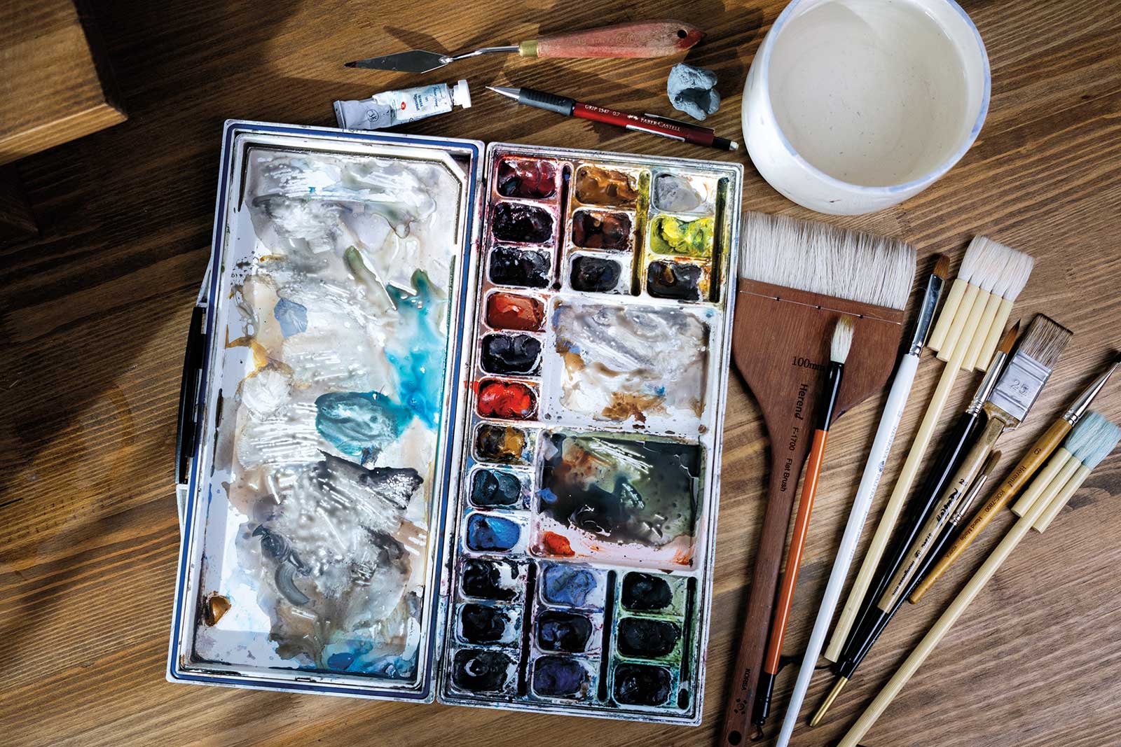
Daniel Smith Watercolors
Buff titanium, Lavender, Raw sienna, Burnt sienna, Ultramarine blue, Sepia
Van Gogh Watercolors
Cerulean Blue
Paper
Baohong 100% cotton watercolor paper, cold-pressed, 300gsm
Brushes
Flat brushes: goat hair and kolinsky sable, Round brushes: synthetic with fine points, Eraser brush: any stiff flat brush
Additional Materials
Mijello watercolor palette, Water container, Palette knife, White Nights watercolor in titanium white, Mechanical pencil, Kneaded eraser, Paper towels
 Stage 2
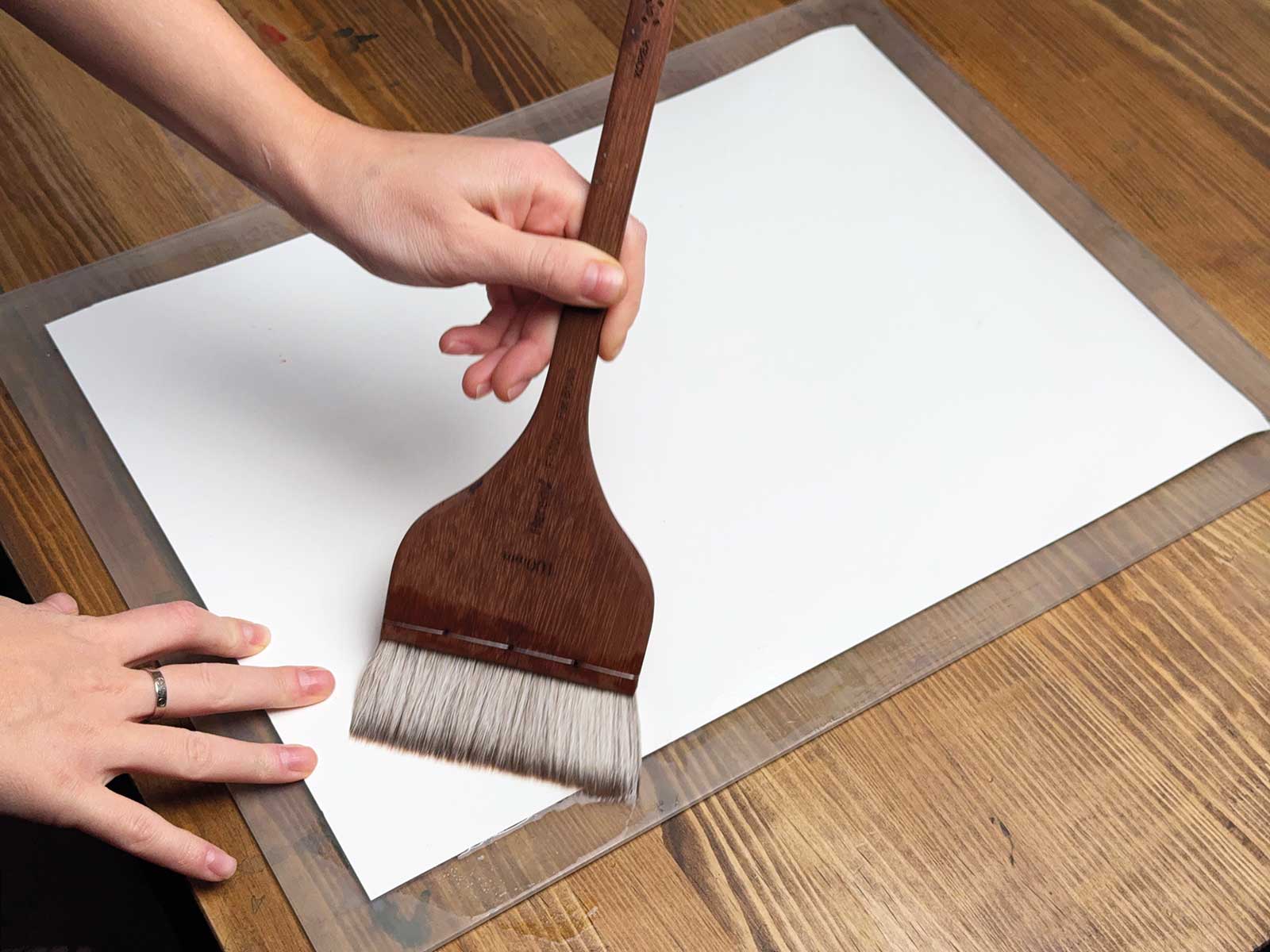
Stage 2 Prepping the Paper
I used 300gsm cold-pressed 100 percent cotton watercolor paper by Baohong. To prevent excessive warping and allow for smoother wet-into-wet work, I secure the paper onto a plexiglass board. This solid surface not only keeps my paper in place but also gives me the flexibility to tilt and manipulate the paint flow as I work. To prepare the paper, I first wet the back with clean water using a large brush. This helps the fibers absorb moisture evenly, keeping the paper from drying too quickly while I paint. I then secure the front with masking tape along all four edges, ensuring a firm hold. Keeping the front surface dry at this stage allows me to maintain more control over edges and fluidity, letting me balance between soft washes and crisp details.
 Stage 3
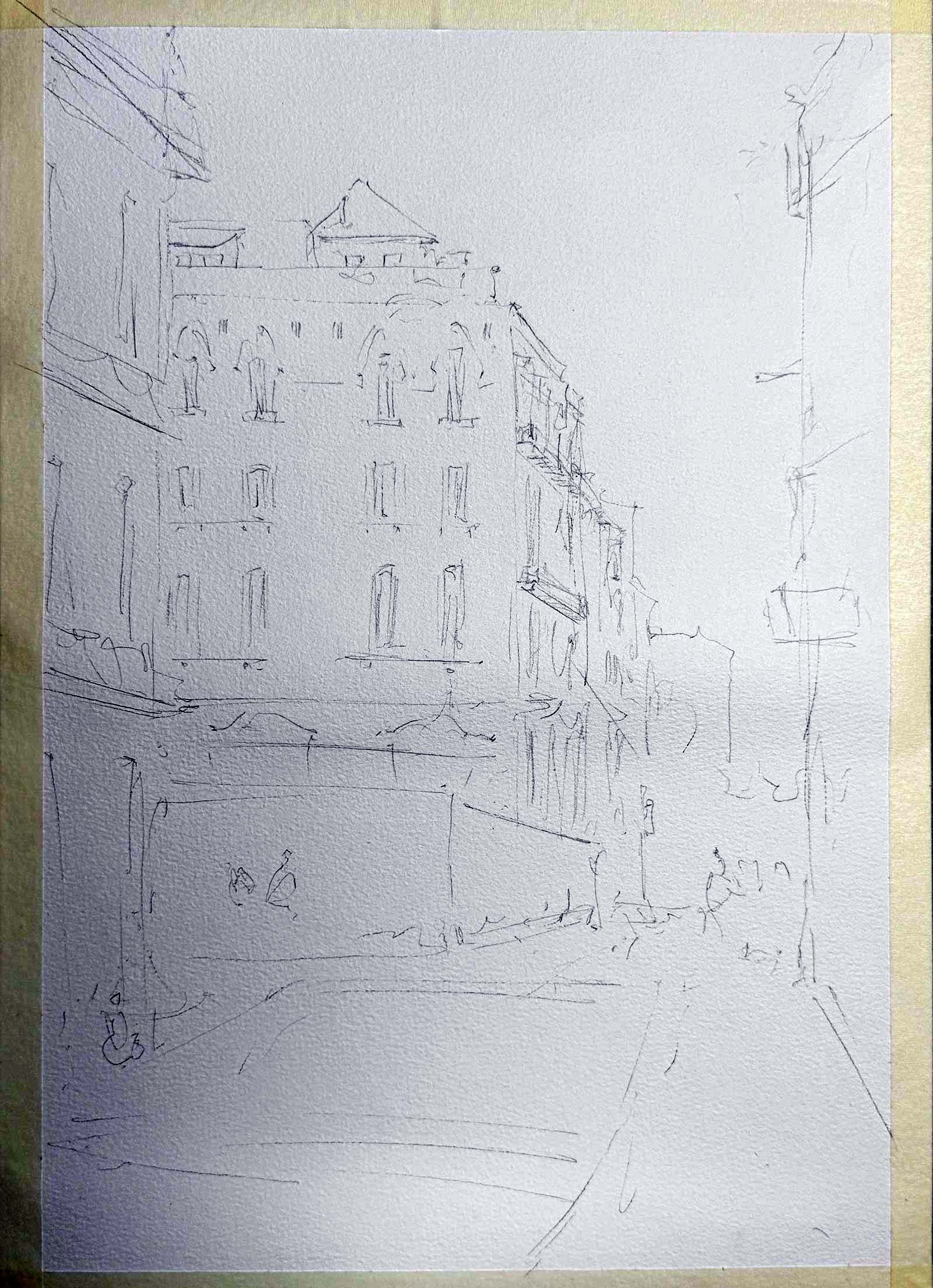
Stage 3 Using a Pencil Sketch as a Guide
Once the paper is secured, I lightly re-sketch the composition onto the watercolor paper. This second sketch serves as a guideline for the painting process, ensuring I stay true to my initial vision without over-defining elements that should remain loose and expressive. I keep my drawing very loose and make sure it doesn’t take more than five minutes to complete because making the sketch too detailed can result in getting bogged down in minor details while painting and losing the overall freshness.
Scratching Technique
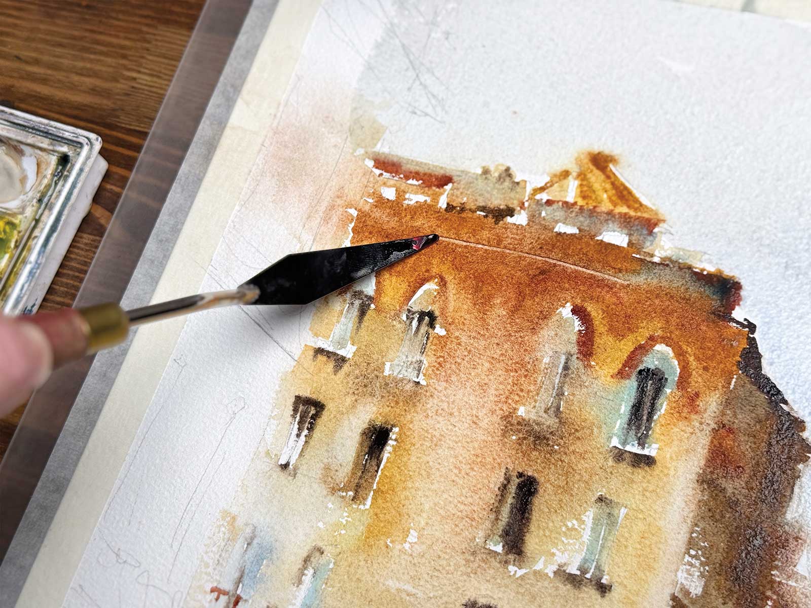
When the paint is damp and close to being dry (but not completely) there is a sweet spot to do the scratching technique. You can use a palette knife like me, or a plastic card, or even your fingernail to scratch out some highlights. It really takes time to practice to find the perfect moment, and it works best on juicy dark paint.
 Stage 4
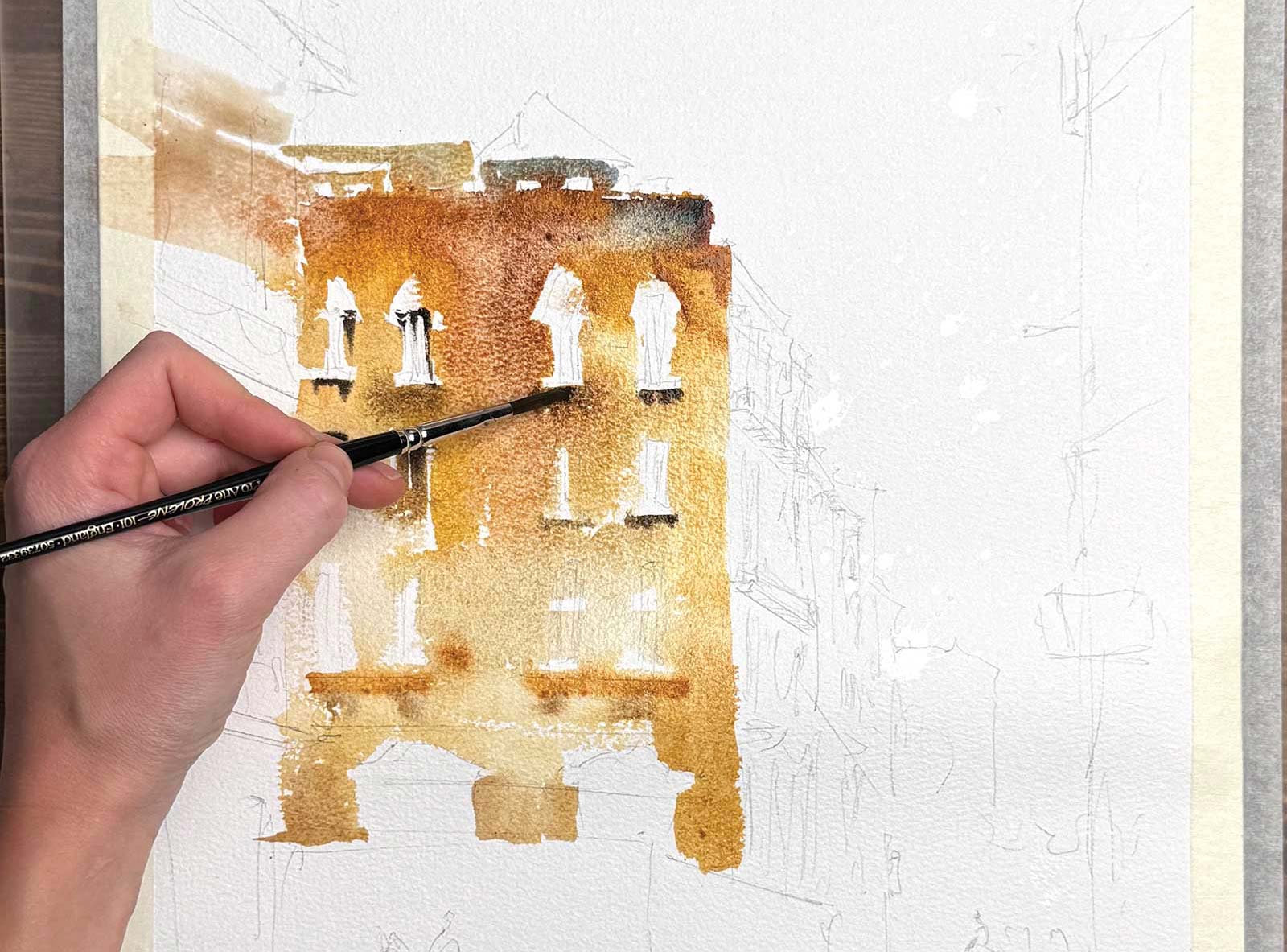
Stage 4 Painting the Focal Point
I start with the main subject, the building, using wet-in-wet techniques to create a sense of depth and light. I leave small gaps of white paper for highlights, ensuring the structure retains a sense of light and atmosphere. To keep the colors lively, I mix warm and cool hues instead of relying on a single flat color. I charge in shadows with rich colors while it’s still wet for depth and subtle details. I also use a palette knife to scratch out highlights, preventing the building from feeling too static or dull.
 Stage 5
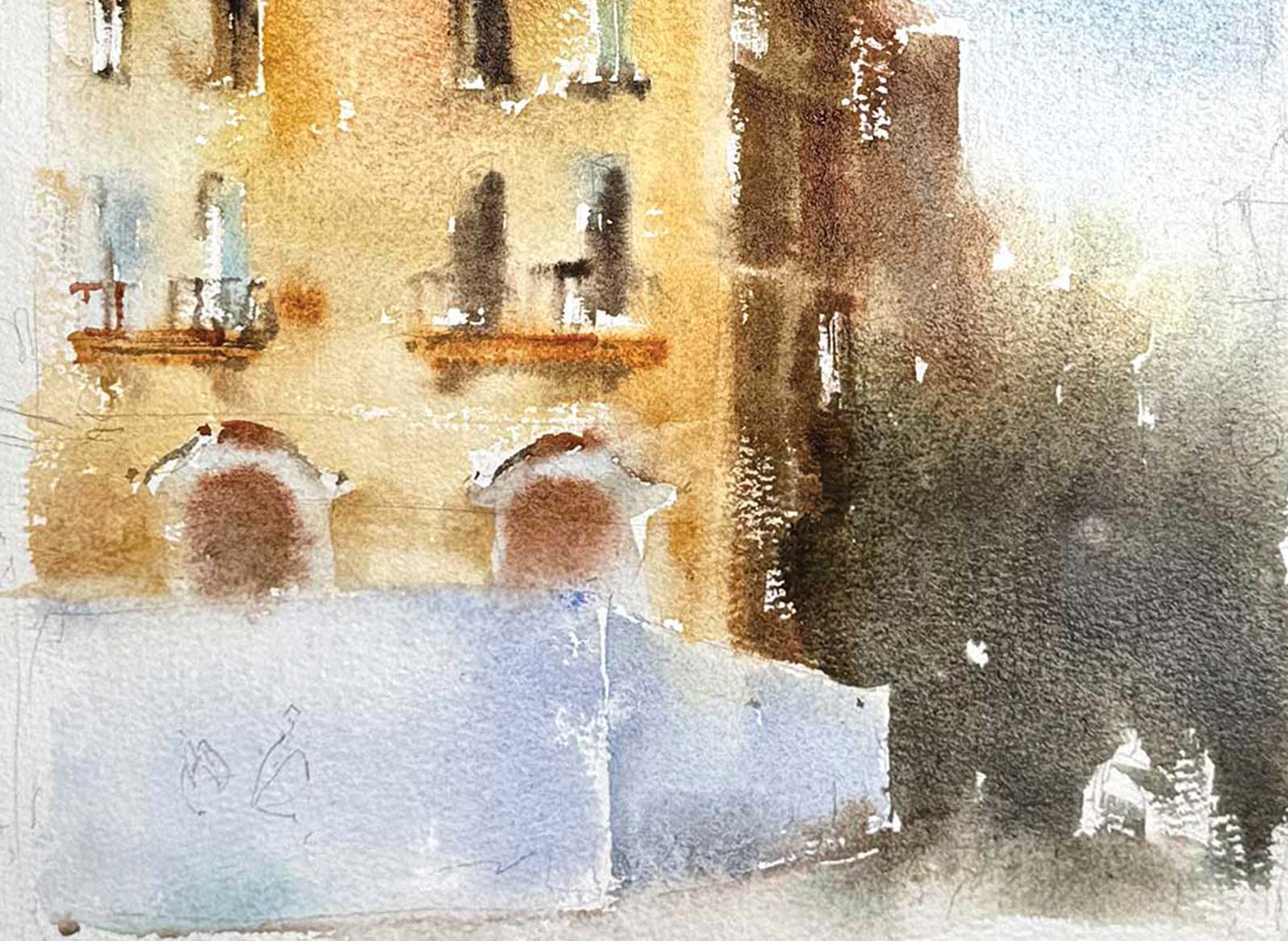
Stage 5 Continue Building the Scene
Next, I begin merging the building with its surroundings starting with the bollard fence and the side of the building. The trees and sky are also painted at this stage wet-in-wet, allowing them to softly blend into each other. I deliberately keep the trees loose and atmospheric, ensuring they don’t steal attention from the focal building. The sky is also painted at this stage, but I’m careful to avoid unnecessary bleeding into the building. If the edges are too wet, I leave a small gap and connect them later once the paper has absorbed the moisture.
 Stage 6
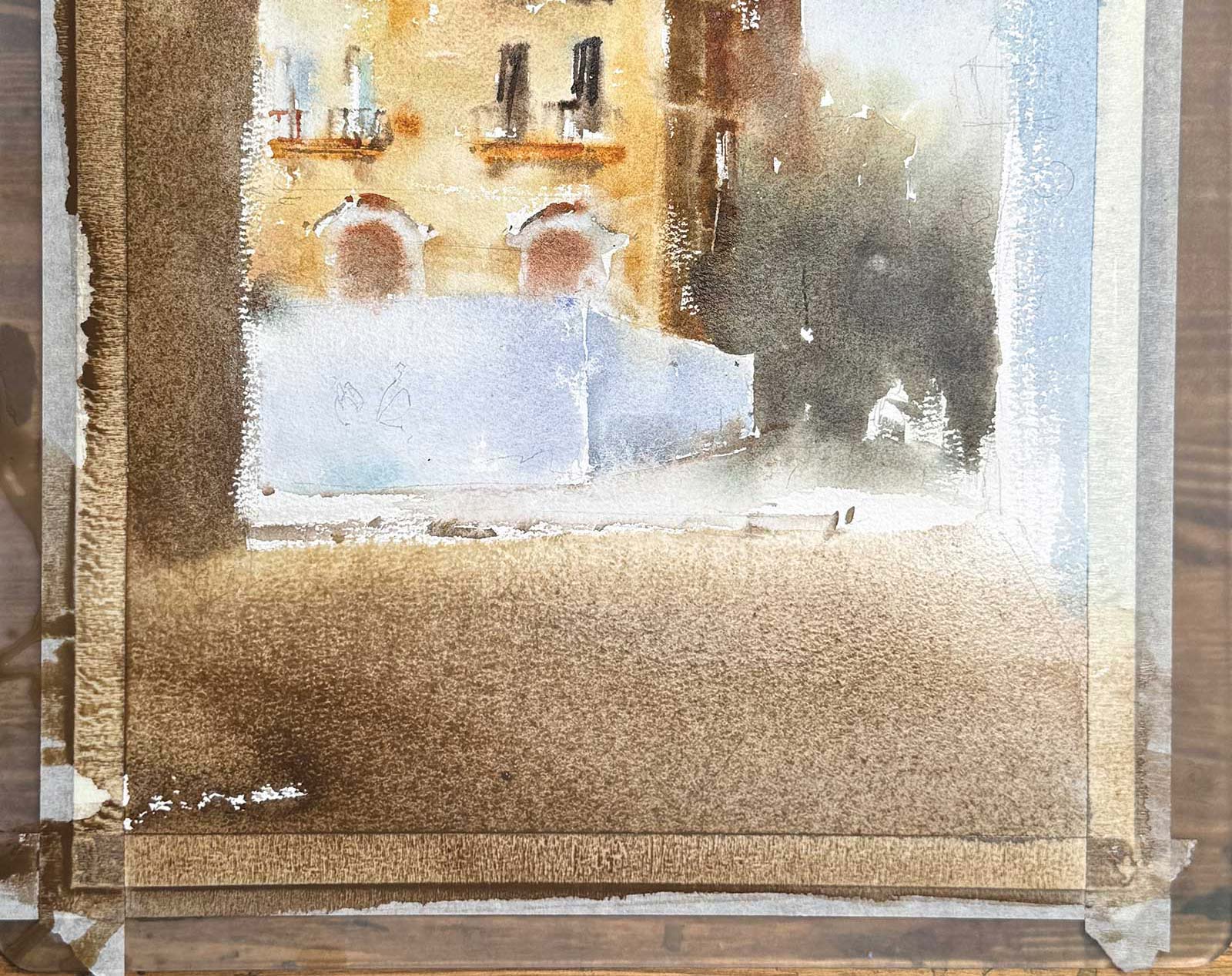
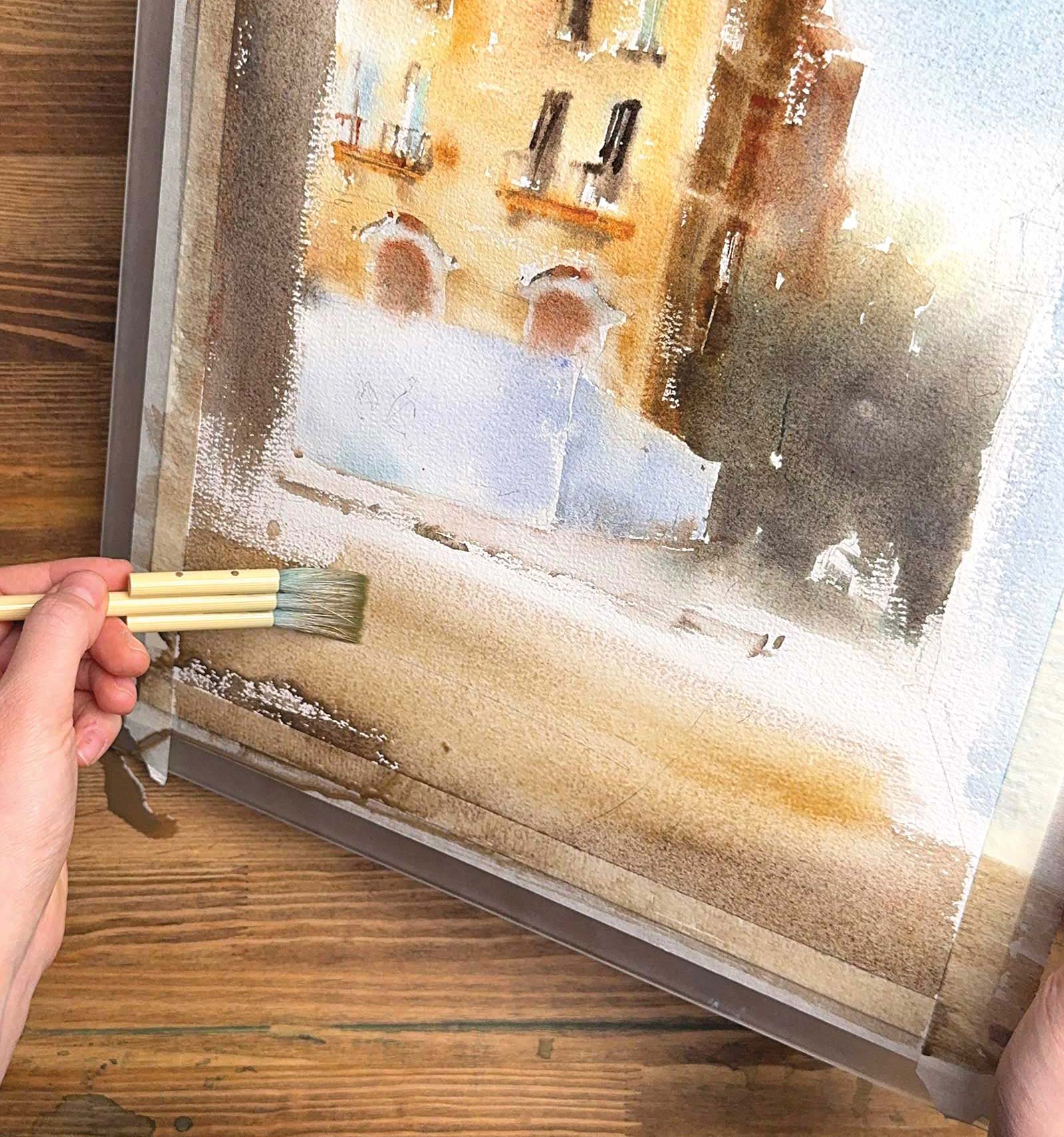
Stage 6 Painting the Foreground
The next stage is the foreground buildings and street elements. I use bold, vertical brushstrokes with a muted color mix to differentiate the building from the background. Then I quickly paint the foreground and make it a connected wash to the building.
Tilting Technique
For a gradual transition on the foreground, I add watery strokes above of the wash and tilt the surface to let it bleed. It can be clear water or you can add a touch of a different color for a nice effect. This allows me to create depth, add in more light and maintain a loose way of painting.
 Stage 7
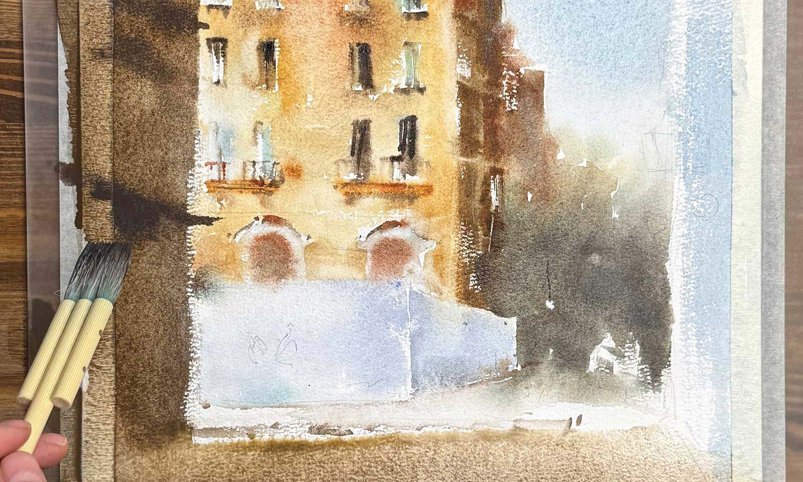
Stage 7 Deepening Shadows and Textures
With the foreground still damp, I charge in rich, dark tones using thicker paint to add structure. Balconies and architectural details are introduced with dry brushwork and scratching techniques, giving the buildings more dimension. At this stage, I also add soft greenish windows by painting with diluted pigment and water, creating subtle highlights.
 Stage 8
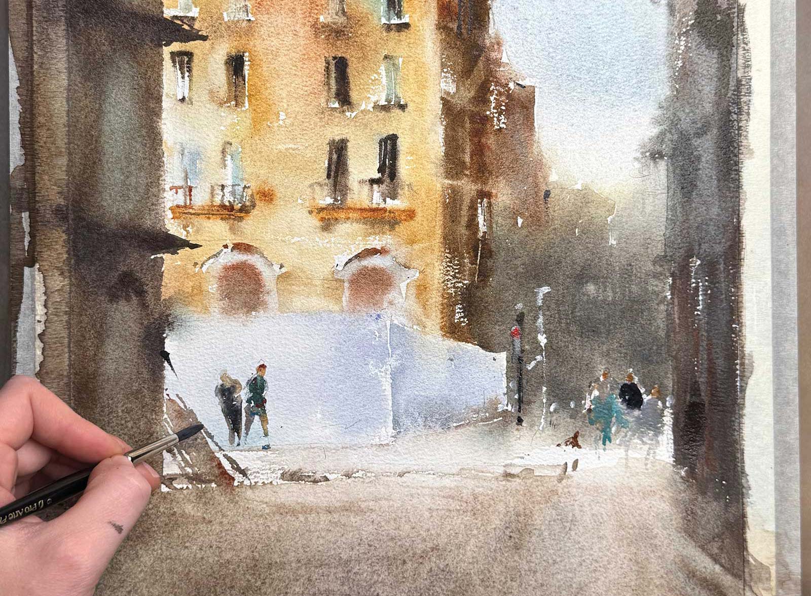
Stage 8 Adding Figures and Small Details
I introduce small human figures and street elements using varied colors to create visual interest and suggest movement. Pops of color in the clothing help break up the muted tones of the architecture, making the scene feel lively and dynamic. At this stage, I also use white gouache or white watercolor to add fine details.
 Stage 9
Stage 9 Lifting and Adjusting Highlights
I can lift highlights with a wet brush and paper towels, allowing me to create soft, natural highlights even after the paint has dried. To achieve this effect, I use a clean, damp brush to gently paint over the areas I want to highlight with water. Then, I take a tissue paper and wipe off the area, lifting the paint. This technique allowed me to add depth to the pavement.
Lifting Technique
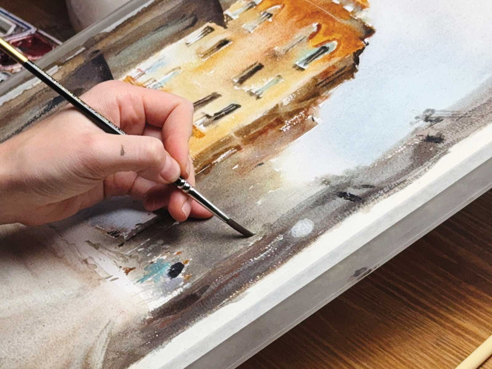
I was able to define the streetlights on the building by painting circles with clean water when the paint had dried and then boldly wiping off that area with a paper towel, making them stand out against the darker background. This works great for lifting off the sun, moon and any other small highlights instead of painting around them.
 Stage 10
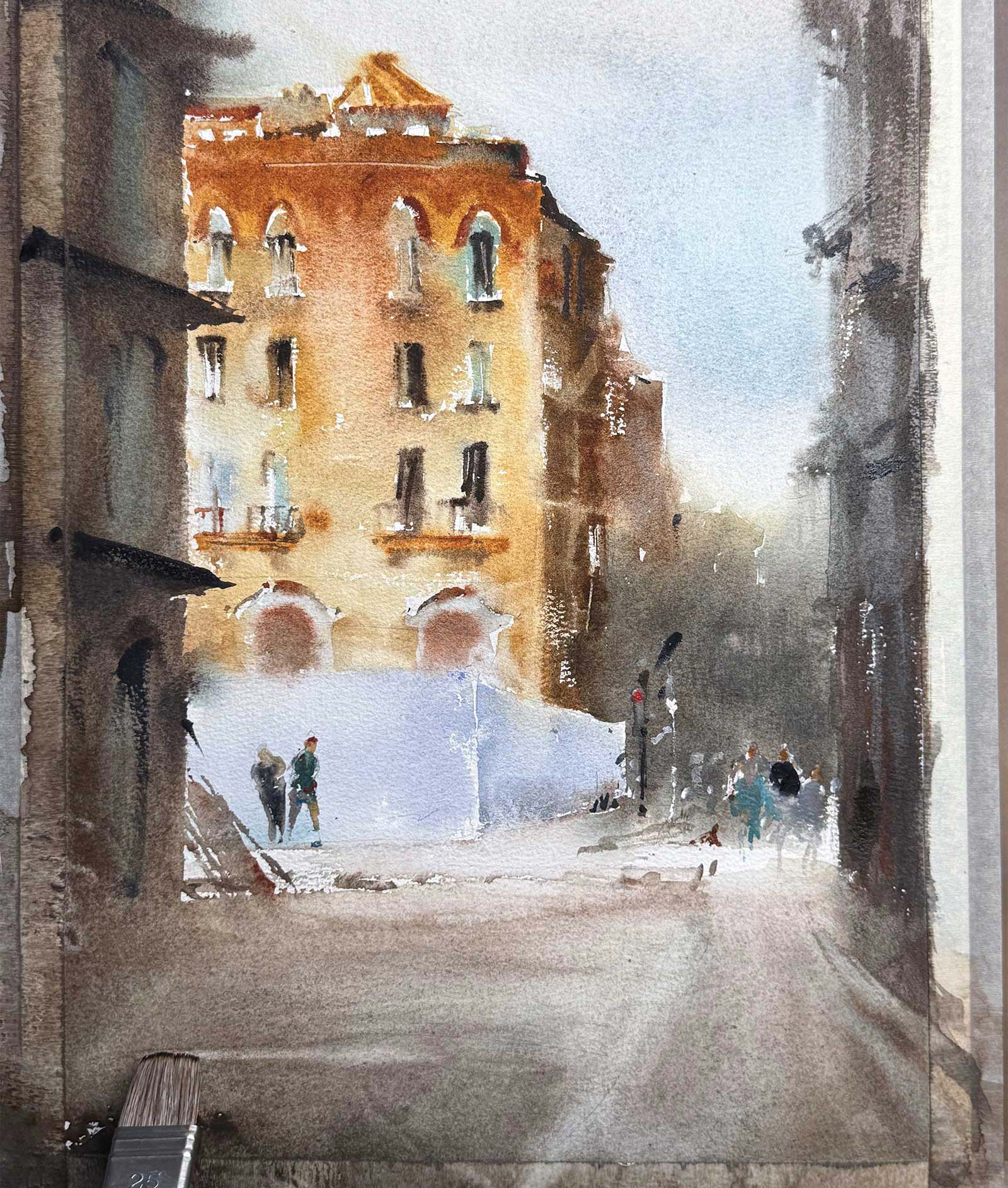
Stage 10 Final Touches
Golden Facade, watercolor on paper, 16½ x 12” (42 x 30 cm)
With all the major elements in place, I add small refinements—enhancing contrasts, adjusting edges and refining textures. Once everything has settled, I let the painting dry completely, ensuring the colors retain their vibrancy.
About the Artist
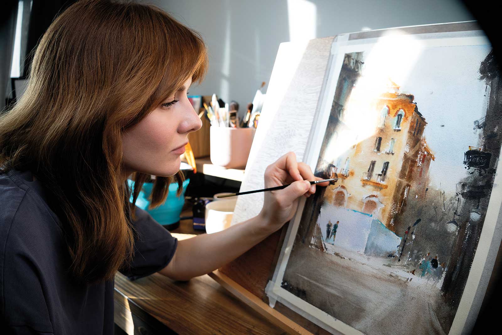 Daria Antonova
Daria Antonova is a watercolor artist based in Moscow, Russia, known for her expressive style, bold colors and passion for sharing knowledge. Her artistic journey began with digital illustration and fashion retouching, but it was the spontaneity of watercolor that truly captivated her. After starting to share her progress online, Antonova quickly built an engaged audience, now reaching more than 90,000 followers on Instagram and a growing YouTube community, where she posts painting insights, tutorials and creative discussions.
Beyond personal practice, teaching has become a core part of Antonova’s artistic path. She is an instructor at Terracotta Online Art School, where she guides students through watercolor techniques and creative development. Through both structured lessons and free educational content, she strives to make watercolor painting accessible, enjoyable and inspiring for artists at all levels. A large part of her work revolves around exploring color theory, breaking down color mixing strategies, and helping others overcome creative blocks.
Antonova’s work was exhibited at the International Watercolor Festival in Armenia in 2024, marking an exciting milestone in her artistic career. Looking ahead, her goal is to continue teaching, sharing creative insights and inspiring others to find joy and expression in watercolor.