



Sometimes, by moving away from the colors visible in your subject, you can add greatly to the impact of your painting. Simply reproducing the colors in front of you will result in a likeness but imposing your own color arrangement will give you more control over the atmosphere you create. These examples will give you some ideas on how to adjust and manipulate color to enhance your subject.
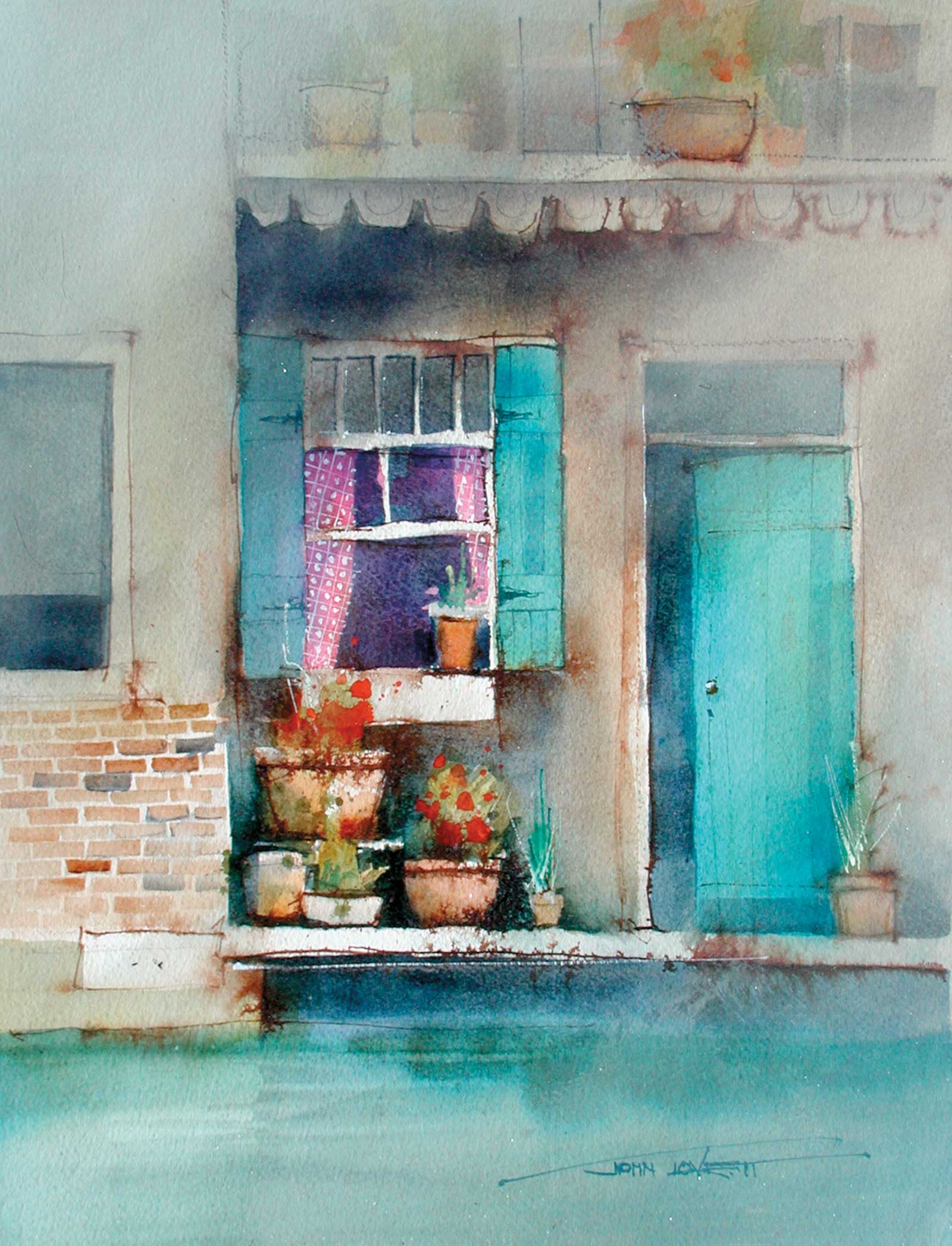
The predominantly cool greens and grays in this painting produce a strong color harmony. The focal area of window and pot plants contains contrasting warm pinks, reds and terracottas and stronger tonal contrast than the rest of the painting. To break up the formal geometric structure of the composition, I added the terracotta pot in the upper right corner and the warm brick wall in the lower left. These warm additions create a diagonal band that relieves the formal layout.
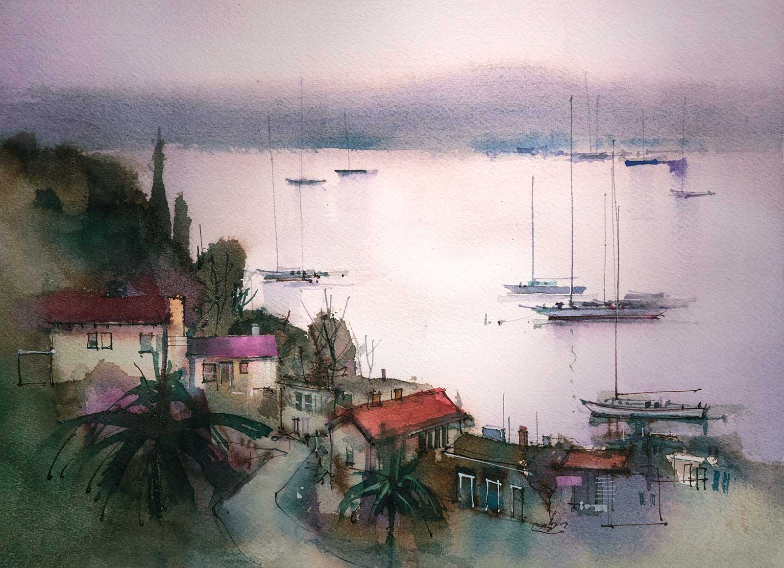
The warm pinks and purples of this sunset provide a great opportunity to go crazy with some permanent rose. The pink roofs in the foreground are permanent magenta acrylic, so once applied there is no going back. The red roof is a mixture of alizarin crimson and quinacridone gold. A few soft blue/grays give relief to the overall warmth. The thing that first appealed to me with this subject was the way the high horizon and the strong diagonal were linked and balanced by the vertical masts, chimneys and cyprus pines.
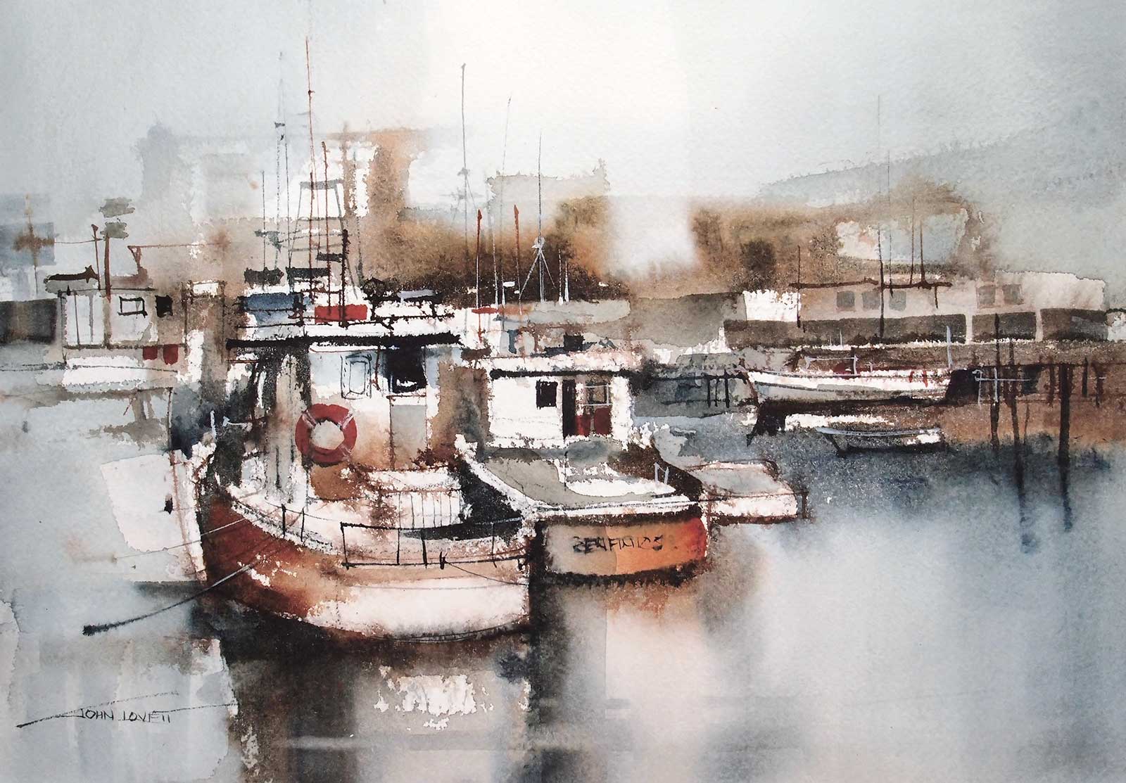
This little harbor with its weathered fishing boats and collection of rusting nautical buildings makes a great subject. To emphasize the rusty patina of the boats, I reduced the color palette to burnt sienna, alizarin and indigo. The sky, water and left-hand jetty surrounding the focal area were kept a cool gray (burnt sienna and indigo). The focal area of the boats contains the warmest reds and browns and also benefits from the maximum tonal contrast. By placing the strongest darks next to white paper, attention is held around the cabin area of the boats. This is a very simple approach to color but very effective in creating a rusty, weathered patina.
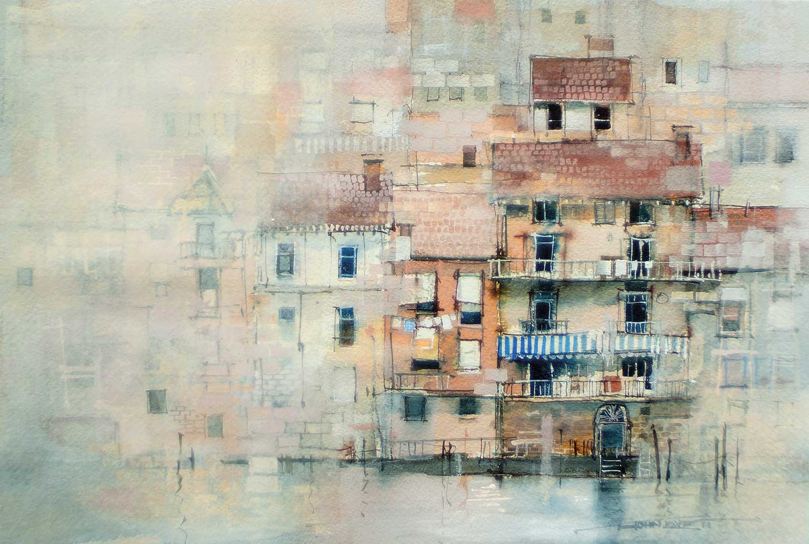
By subduing the color variation in these buildings and concentrating on the browns and terracottas, the painting has a much tighter color harmony than the subject actually possessed. To give impact and interest to the focal area, I limited a contrasting, saturated blue to the awning, washing and a couple of window surrounds. The buildings still have enough variation to remain interesting, but the simple color arrangement tells the story without confusion.
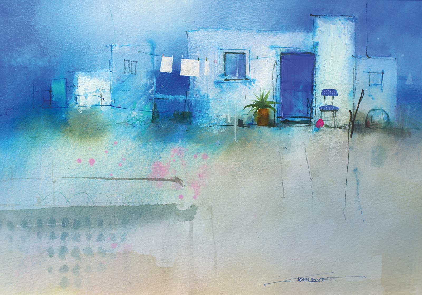
The small Greek island of Paros has some beautiful, simple, white-washed buildings featuring ultramarine doors, windows, shutters, etc. The clear blue sky and surrounding water make the intensity of the colors almost overwhelming. For this painting, to get that intensity, I used a variety of blues and grays with a few tiny spots of pink and burnt sienna to draw attention to the focal area. Some of the blues were built up with washes of cobalt, other blues were strong washes of French ultramarine, and the main door and chair were ultramarine gouache. The warmer grays in the foreground make it appear closer even though it lacks the tonal contrast of the focal area.
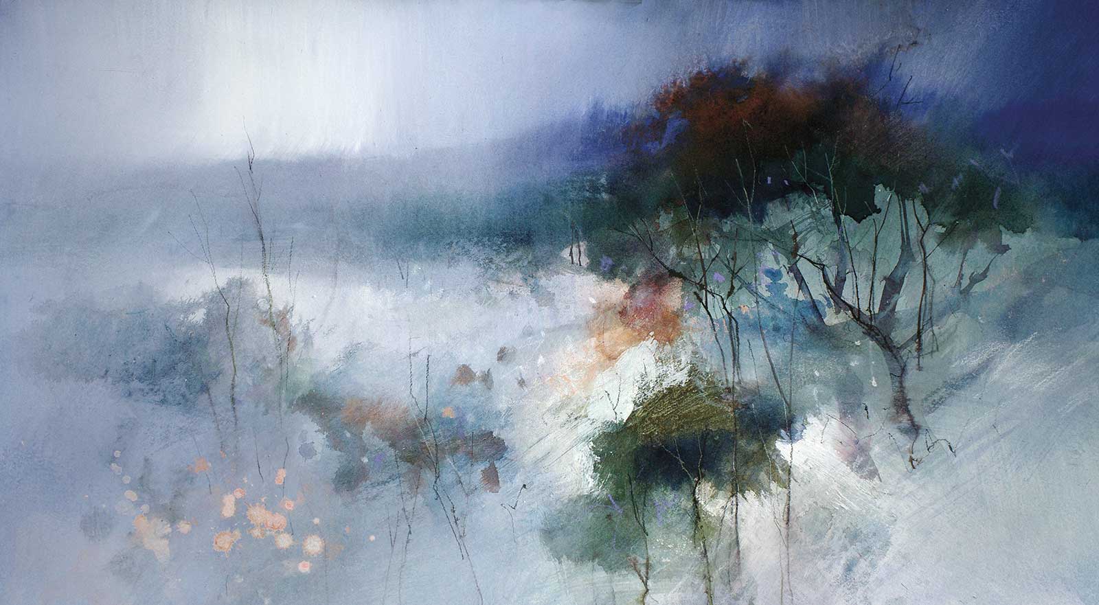
Mountain scenery in the Australian high country is spectacular. In the winter it is cold, wet and miserable, but it looks amazing. Blues and dirty green/grays make up most of this painting, but a small amount of contrasting warmth brings life to the focal area and leads the eye in from the lower left-hand corner. Keeping the color arrangement compressed and the details understated and simple allows the viewer to make their own interpretation of the information provided.
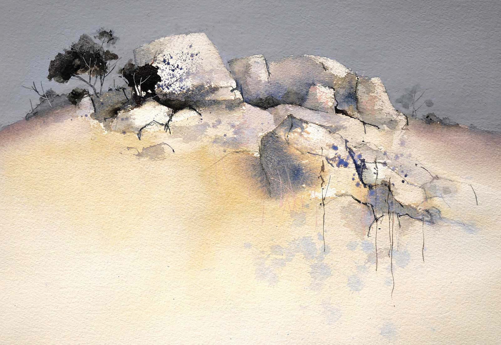
For this rocky outcrop, most of the colors were strongly influenced by yellow. Even the flat gray gouache sky contains a fair amount of yellow. To provide some relief I splashed some loose spots of pale complementary violet into the foreground and put some blue/violet into the shadows on the rocks. My reason for choosing yellow was to try to capture that sea of soft warmth created by the mass of pale, dry grass.
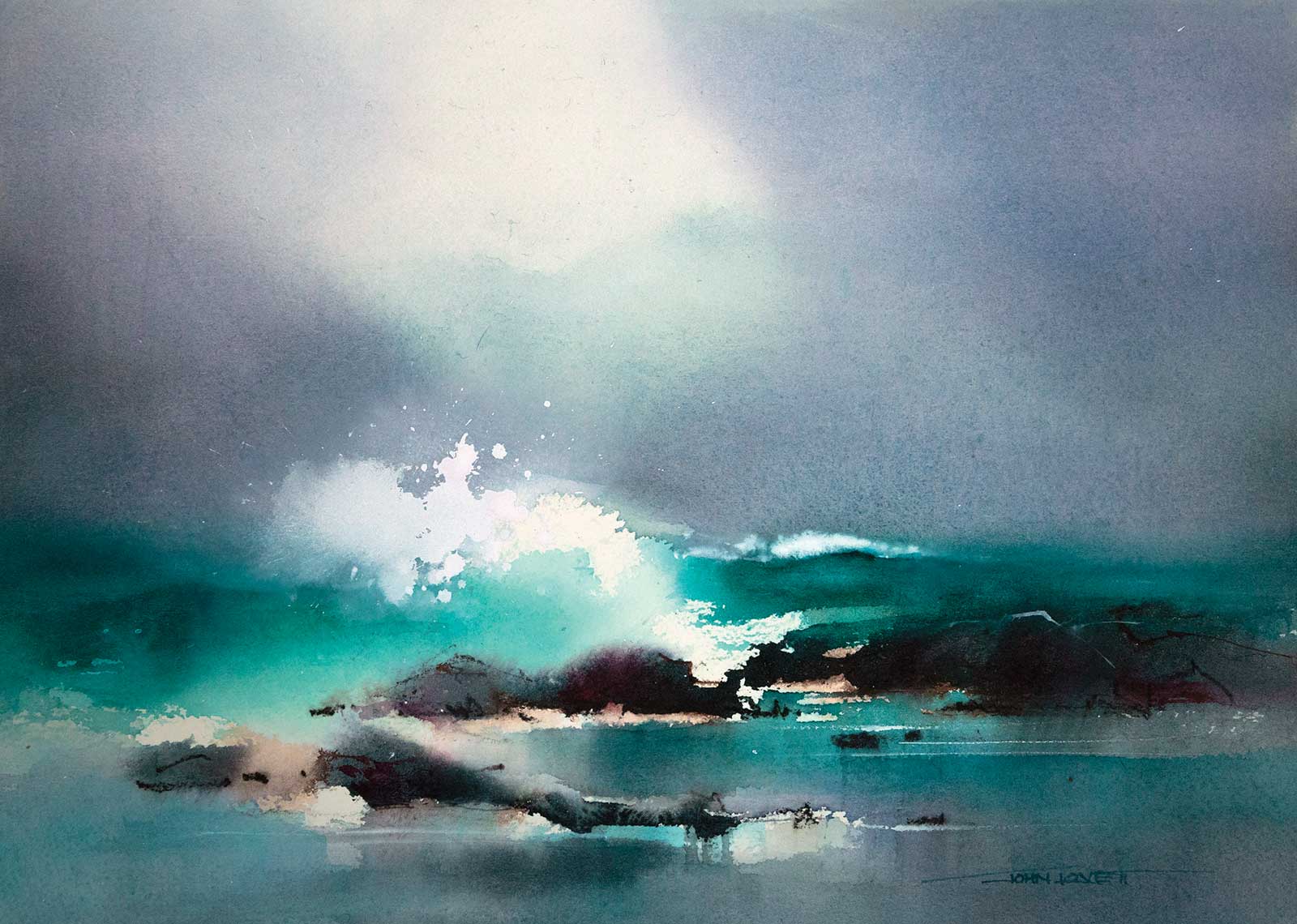
The light through this breaking wave makes a great focal point. I limited the entire painting to various shades of blue and green with some of the darks just hinting at a contrasting warm brown. Concentrating the green through the area of sea and rocks and framing it above and below with a bluer mixture helps hold attention in the band containing the focal area. The patch of light in the sky guides the eye down to the focal area.
It’s easy to jump in and simply reproduce the colors presented in your subject. Often, ignoring or selectively editing the colors in your subject will yield a better result. Colors can be subdued, exaggerated or completely ignored—it’s entirely up to you. I will often pick a color that suits the subject and make it dominate then use a small area of contrasting, complementary color in the focal area. The next painting you do, try experimenting with your approach to color. It’s a lot of fun. —
Contact at
johnlovett.com