


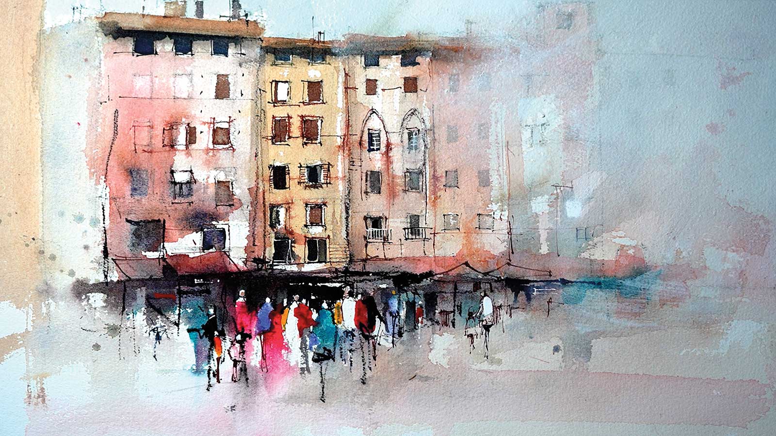
There is something irresistible about the colors, textures, patterns and ancient patina of the medieval villages in Italy. This group of buildings with a gathering crowd of people caught my attention. I love the strong colors in the people and the contrast against the dark shadows under the awnings. The buildings have quirky, varied shapes and the windows are all slightly different—a fantastic subject from which to coax out that wonderful medieval atmosphere.

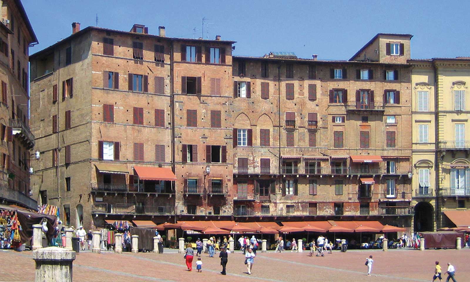
Reference Photo
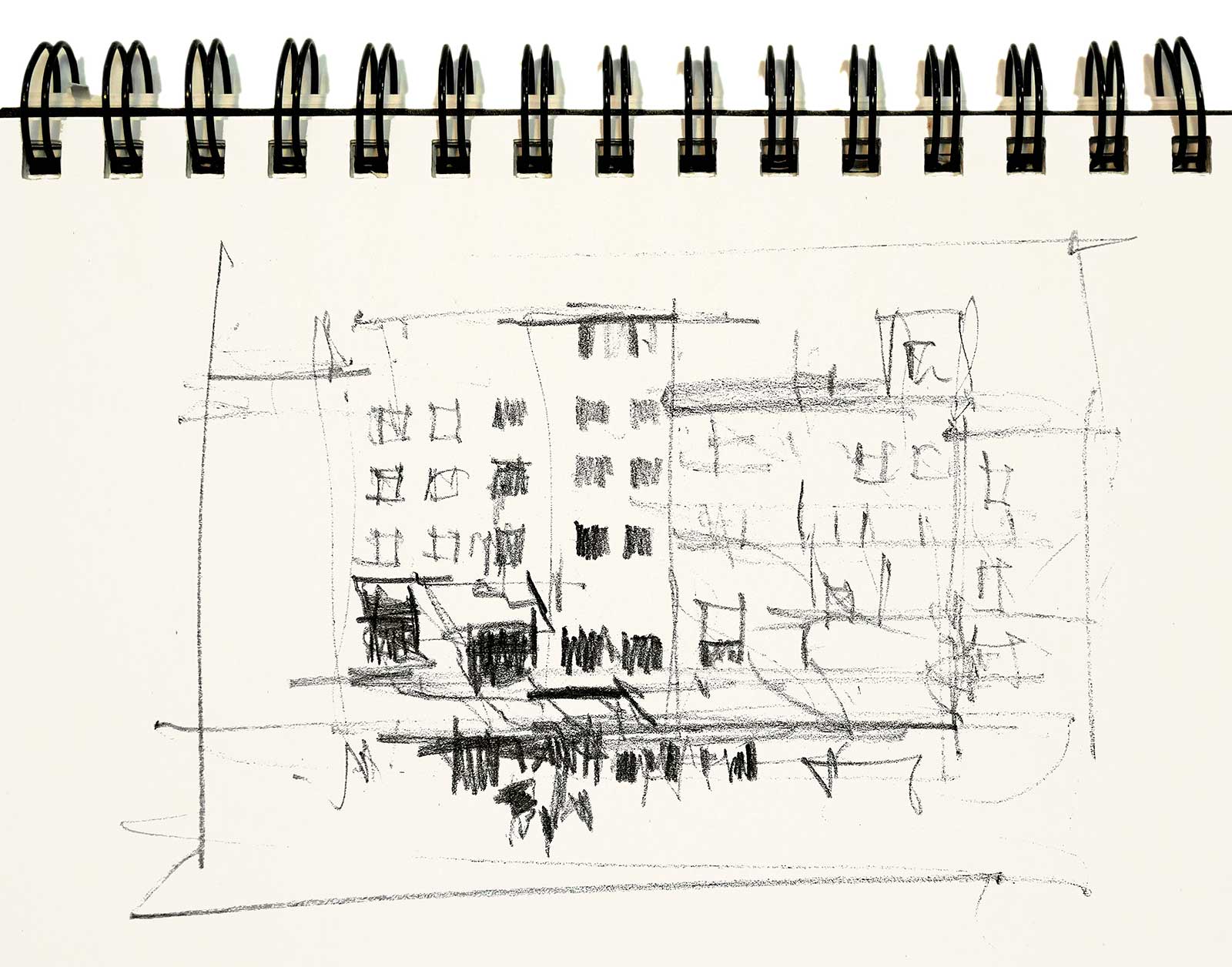
Quick sketch in charcoal.
The colors I used for this painting were cobalt blue, aureolin, permanent rose, alizarin crimson, phthalo blue, french ultramarine blue and quinacridone gold. I also used some burnt sienna pigment ink and white gesso. For brushes, I used a ½” bristle, a ½” long flat, a ¼” long flat, a size one rigger brush and a goat hair hake brush.
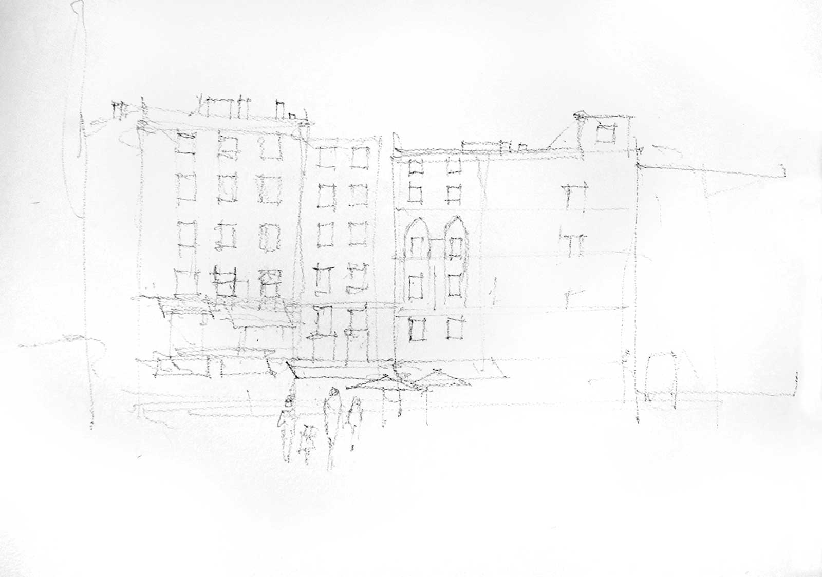 Stage 1
Stage 1
The initial drawing was done with a charcoal pencil. I like the combination of charcoal lines and watercolor washes. Some of these lines will be left visible when the painting is finished. I will also use charcoal lines over some of the washes.
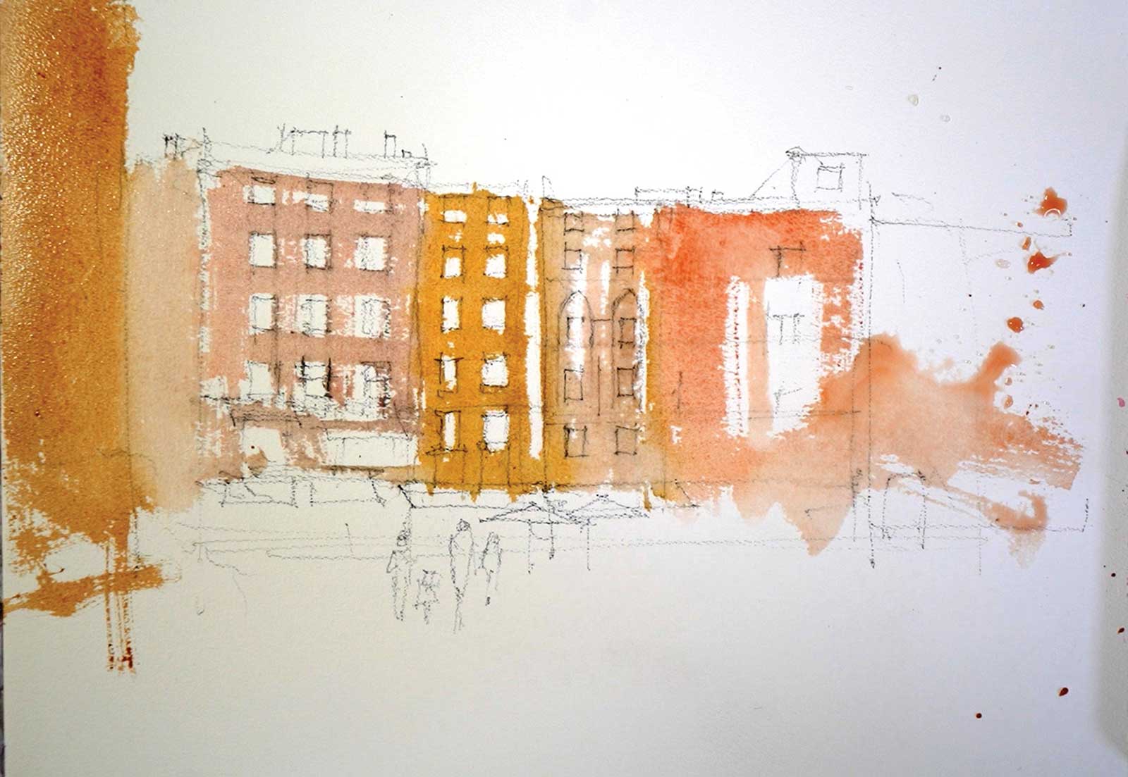 Stage 2
Stage 2
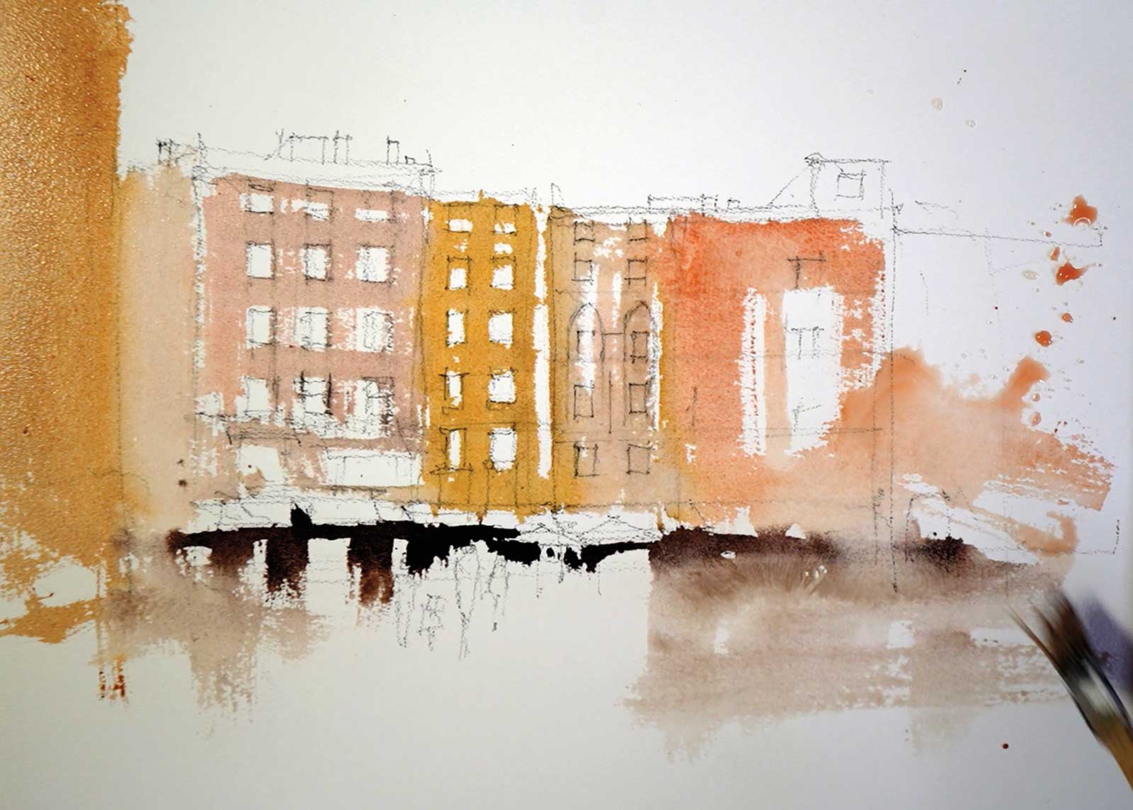
The first washes were a mixture of quinacridone gold and alizarin, subdued slightly with a little ultramarine blue. The different building shapes were treated with slightly different colors to keep them interesting, and plenty of white space was left for windows and figures.
 Stage 3
Stage 3
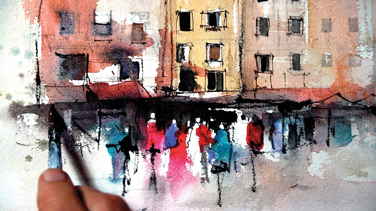
Next, a dark mixture of quinacridone gold, alizarin and ultramarine blue was roughly cut in around the figures and worked along under the awnings. This shape was applied fairly loosely, then softened along the lower edge with a damp brush and dragged down into the foreground.
 Stage 4
Stage 4
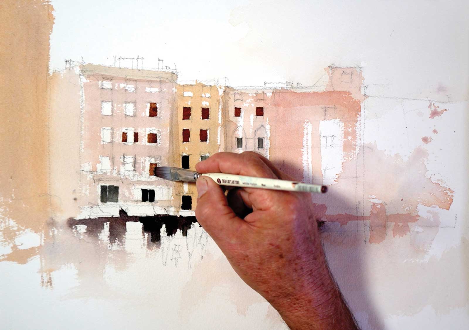
With the same dark mixture and a ½” flat brush, some of the windows were added. The dark mixture was varied slightly from window to window to keep them interesting. Leaving small areas of white around some of the windows also added to the variation.
 Stage 5
Stage 5
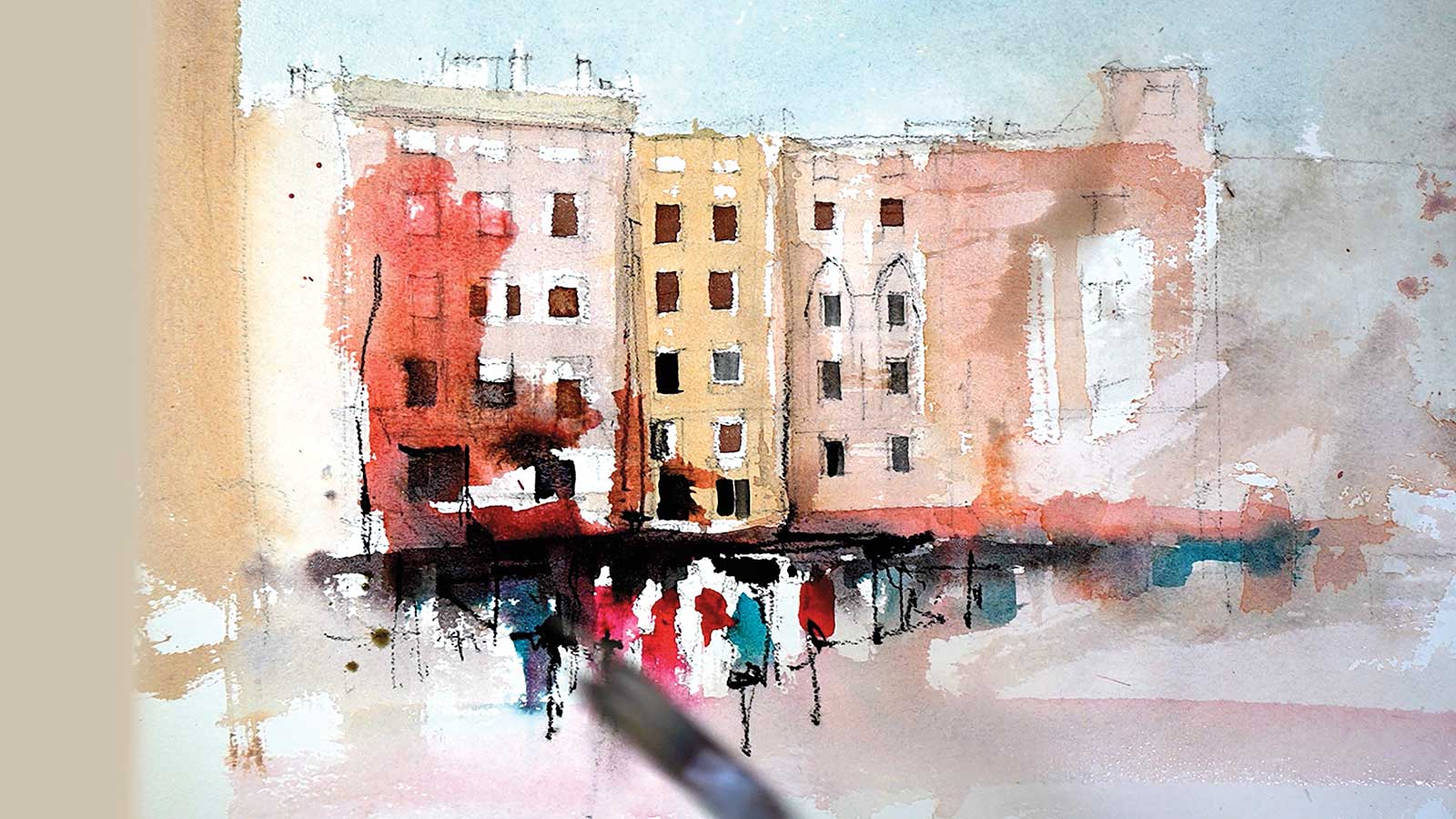
The rusty red awnings and some shapes of permanent rose for the figures were applied with the ½” flat brush. I also left a few white shapes for figures to get maximum contrast into the focal area. Once the reds had been applied, the brush was rinsed clean and a couple of phthalo blue shapes were added.
 Stage 6
Stage 6
While the red shapes were still wet, I used a clean, damp ½” bristle brush to drag some of the reds up into the buildings to give the focal area more impact. A very pale phthalo blue was added to the sky, and a dirty gray/brown was dragged down over the right-hand buildings.
 Stage 7
Stage 7
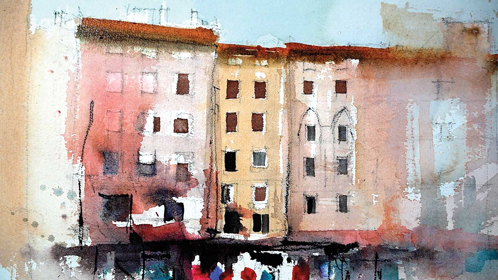
Once everything had dried, the terracotta roof shapes were added. Again, this was mixed from quinacridone gold, alizarin and ultramarine blue. I left the top edge of the roofs hard above the focal area but softened towards the right hand side. The underside of the roof shapes was darkened slightly and softened with a clean, damp brush.
 Stage 8
Stage 8
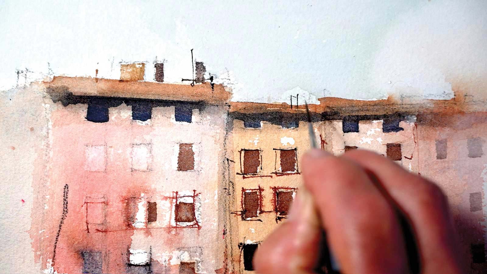
The next step was to add some fine rigger lines and a few burnt sienna ink lines. These fine lines are great for squaring up windows and adjusting their shapes. The windows can still look loose and interesting but give the appearance of being structural and architecturally aligned.
 Stage 9
Stage 9
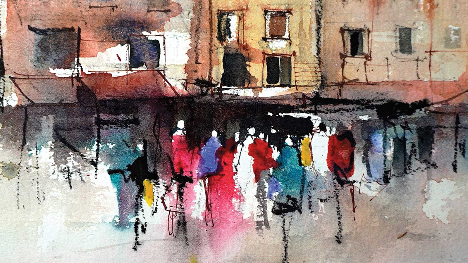
A couple of spots of pure cobalt blue and some clean aureolin add interest to the figures. The dark background was cut in carefully around the top of the figures, leaving a variety of head shapes of varying size, heights and spacing. The secret with these figures is to overlap them, making some come forward and others appear in the background. The other thing to remember with figures is not to be too detailed and defining; suggestion works much better, allowing the viewer to interpret the shapes and marks.
 Stage 10
Stage 10
Chimneys, antennas and geometric marks suggesting rooftop paraphernalia keep these hard lines interesting and make the roof line appear authentic.
 Stage 11
Stage 11
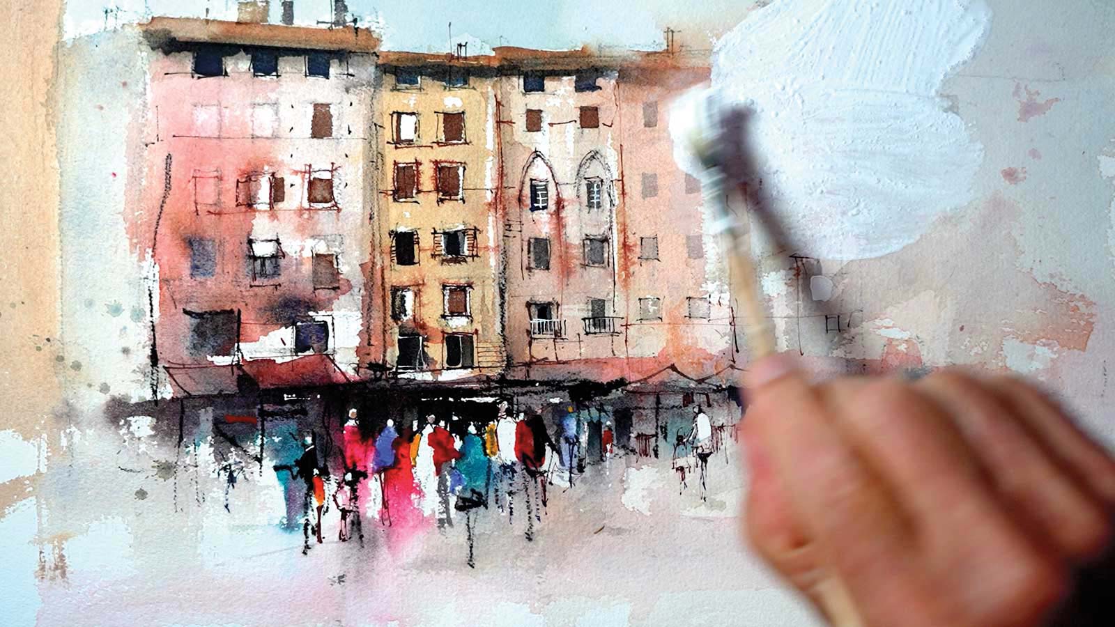
When I arrived at this point I decided to subdue the buildings on the right a little more. Applying gesso, diluting it, then softening the edges with a clean damp brush knocks things back.
 Stage 12
Stage 12
The gesso is then gently brushed over with a dry hake brush, one stroke at a time, thoroughly cleaning the brush between each stroke. This technique requires practice but gives an interesting softness that helps control eye movement through the painting.
 Stage 13
Stage 13
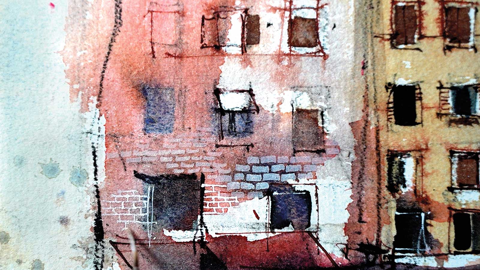
After everything had dried, I used a 1/8” flat brush and a rigger brush to build up a variety of brick details around the focal area.
 Stage 14
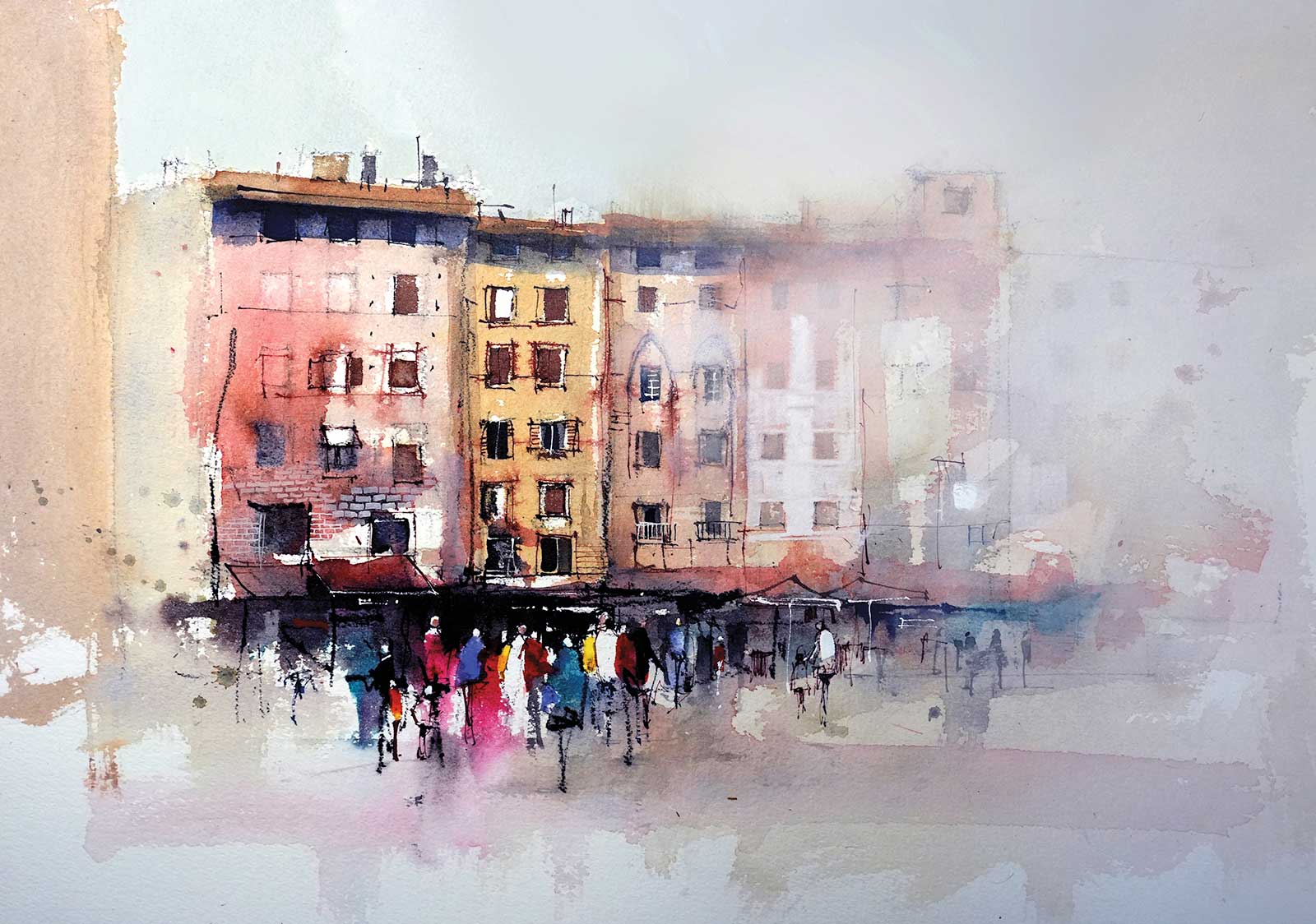
Stage 14 Finished Artwork
The thing I love about painting these medieval buildings is being able to take a very loose, almost accidental, approach with the initial washes. Flat brushes and fine detailed lines, overlaying these first washes, bring back the sense of order and formality evident in the buildings. The contrast between the rough accidental marks and the detailed, structural marks gives a sense of the facade’s ancient patina.
Join John Lovett for a painting retreat in Tuscany, Italy, from October 1-8, 2025. For details go to his website at johnlovett.com.