


I love the immediacy and unpredictability of watercolor. My approach is all about capturing the essence of a scene in the simplest way possible. Using a limited palette of just three primary colors—red, ultramarine and yellow—I create dynamic, harmonious compositions on A3-sized cotton paper. I enjoy working wet-on-wet, a technique that allows colors to flow into one another, creating a sense of spontaneity and life.
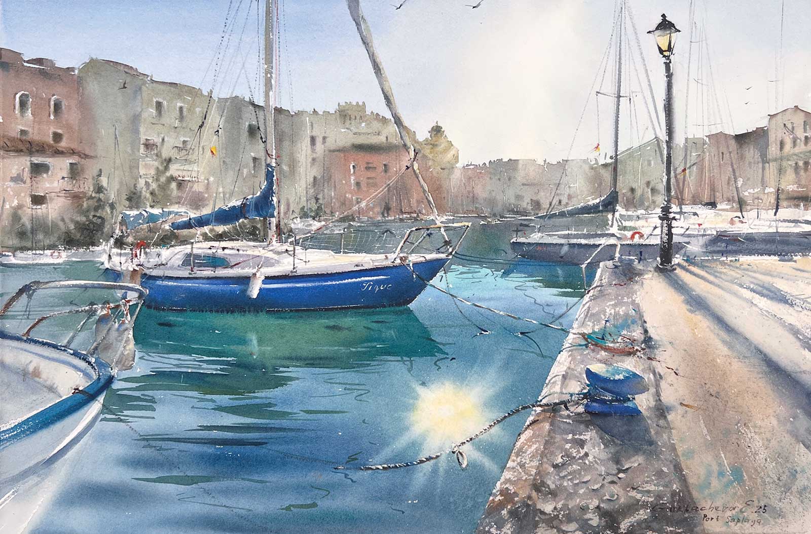
Sunlit Port of Saplaya, watercolor, 22 x 15” (56 x 38 cm)
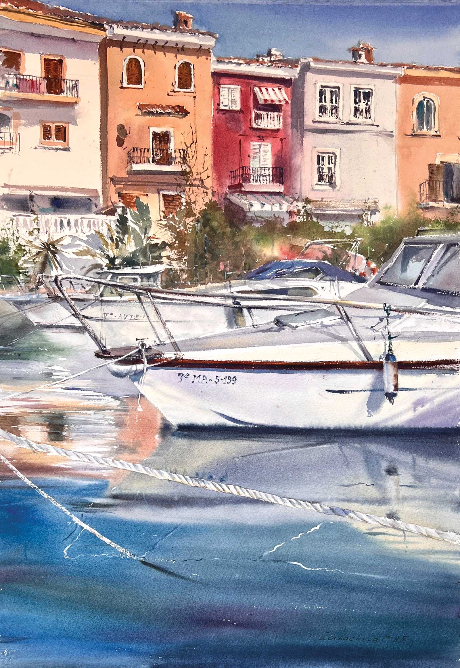
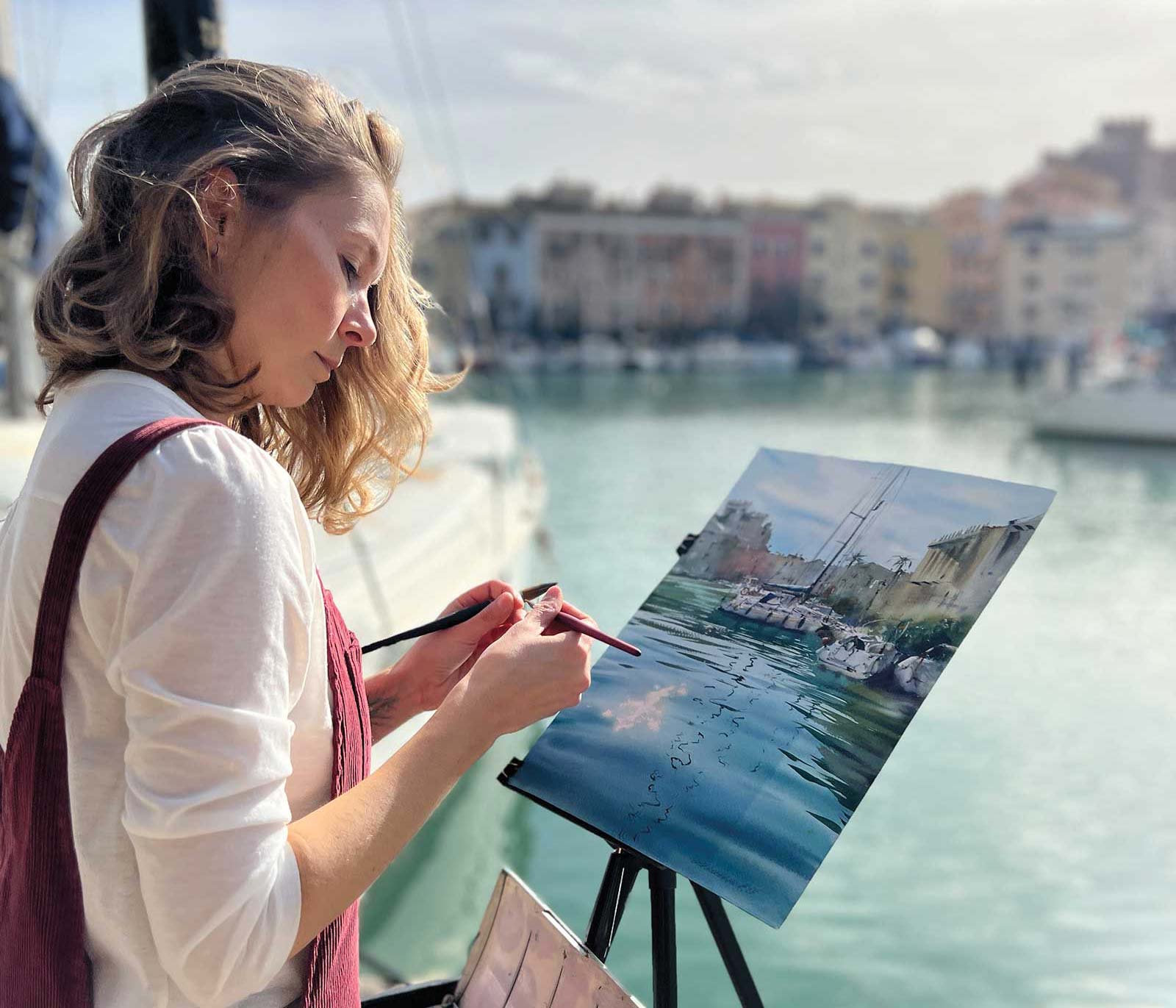
Boats at the Pier #4, watercolor, 16 x 12¼” (41 x 31 cm)
One tool that has become a signature part of my process is a Chinese calligraphy brush. Its unique shape and flexibility make it ideal for expressive strokes. I pair this with a palette knife to add sharp edges and textures, ensuring each piece has a balance of softness and structure. My focus is on mood and atmosphere rather than fine details, which helps viewers connect with the emotional essence of my work.
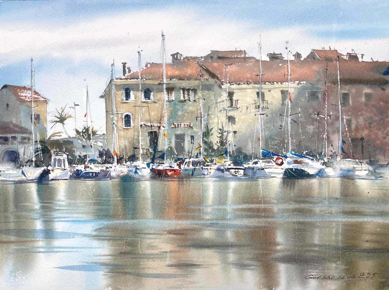
Golden Hour in Port Saplaya, watercolor, 15 x 22” (38 x 56 cm)
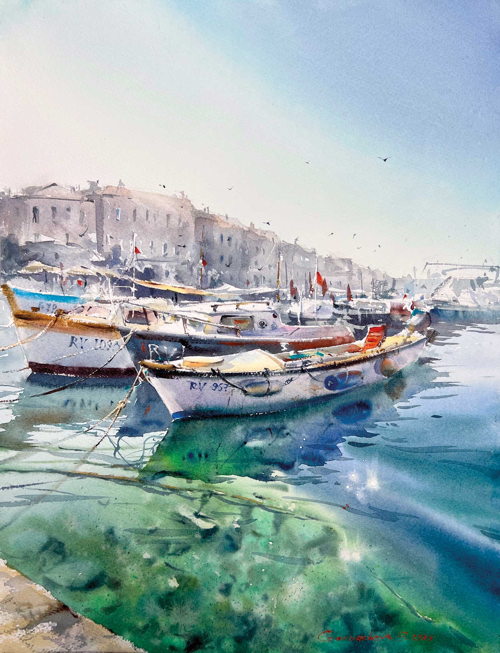
Coastal Charm of Valencia, watercolor, 9 x 12¼” (23 x 31 cm)
In my online lessons, I emphasize the importance of embracing accidents as opportunities. Watercolor, with its fluid nature, teaches you to let go of perfection and enjoy the process. Recently, I demonstrated this concept by painting a vibrant cityscape. I started with loose washes, allowing the colors to mingle freely, and gradually layered bold, intentional strokes to define the forms. The result was a painting that felt alive, full of energy and movement.
I find joy in simplifying complexity, whether in my art or the way I teach it. Through my work, I hope to inspire others to pick up a brush and explore the endless possibilities of watercolor.
My Art in the Making Golden Hour in Port Saplaya #2
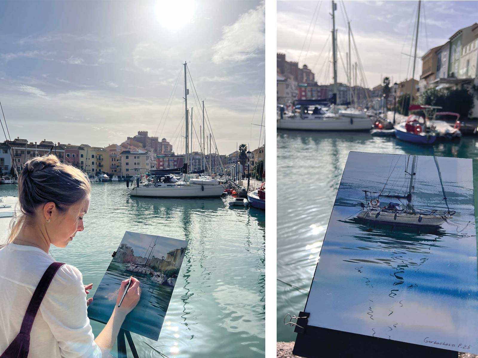
To create a deeper, more expressive artwork, it’s ideal to start with plein air sketches from real life. Observing nature firsthand helps develop a strong sense of atmosphere and light.
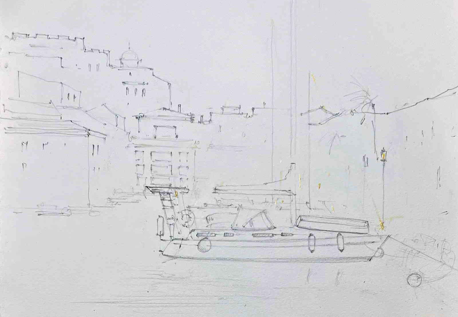 Stage 1
Stage 1 Preparing the Composition
Back in the studio, I worked on a large format paper (38 x 56 cm) using my plein air sketches and reference photos. I began with a pencil sketch, carefully mapping out the composition. Then, I applied masking fluid to preserve the highlights such as the sunlight reflections and brightest areas on the yachts (small lines, dots, etc.).
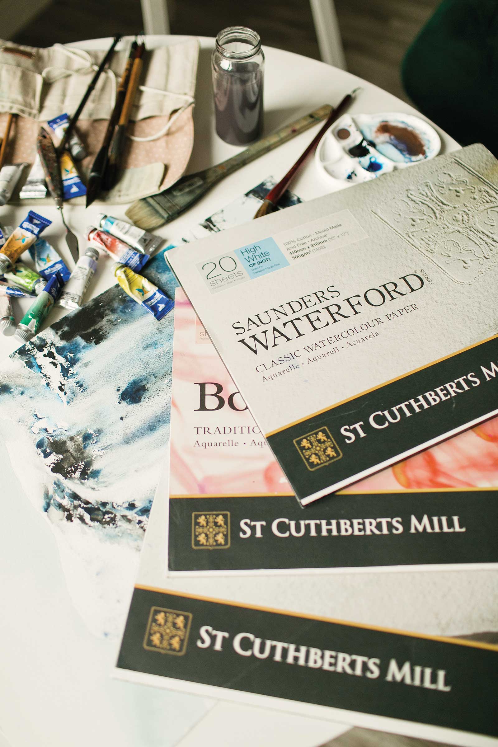
Artist’s materials
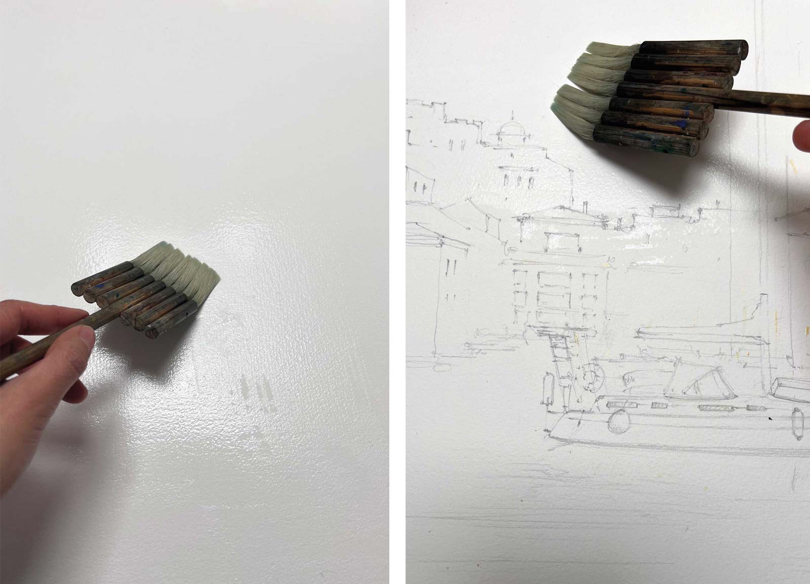 Stage 2
Stage 2 Preparing the Paper
To ensure a smooth workflow, I thoroughly moistened the back of the paper and let it absorb water for 10 to 15 minutes. Keeping the paper evenly damp throughout the painting process is crucial. I used a natural goat hair brush for this step. Next, I flipped the paper over and moistened the area where the sky would be painted.
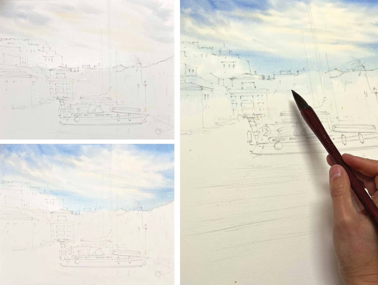 Stage 3
Stage 3 Painting the Sky
I always start with the warmest and lightest areas of the sky using a Chinese calligraphy brush. The color sequence is transparent gold for the warmest areas, then cobalt blue, then a touch of pink to avoid a greenish hue. For the deeper blue areas, I used ultramarine with a drop of carmine. I also extended this blue into the distant buildings to create a sense of depth and perspective, still using the Chinese calligraphy brush.
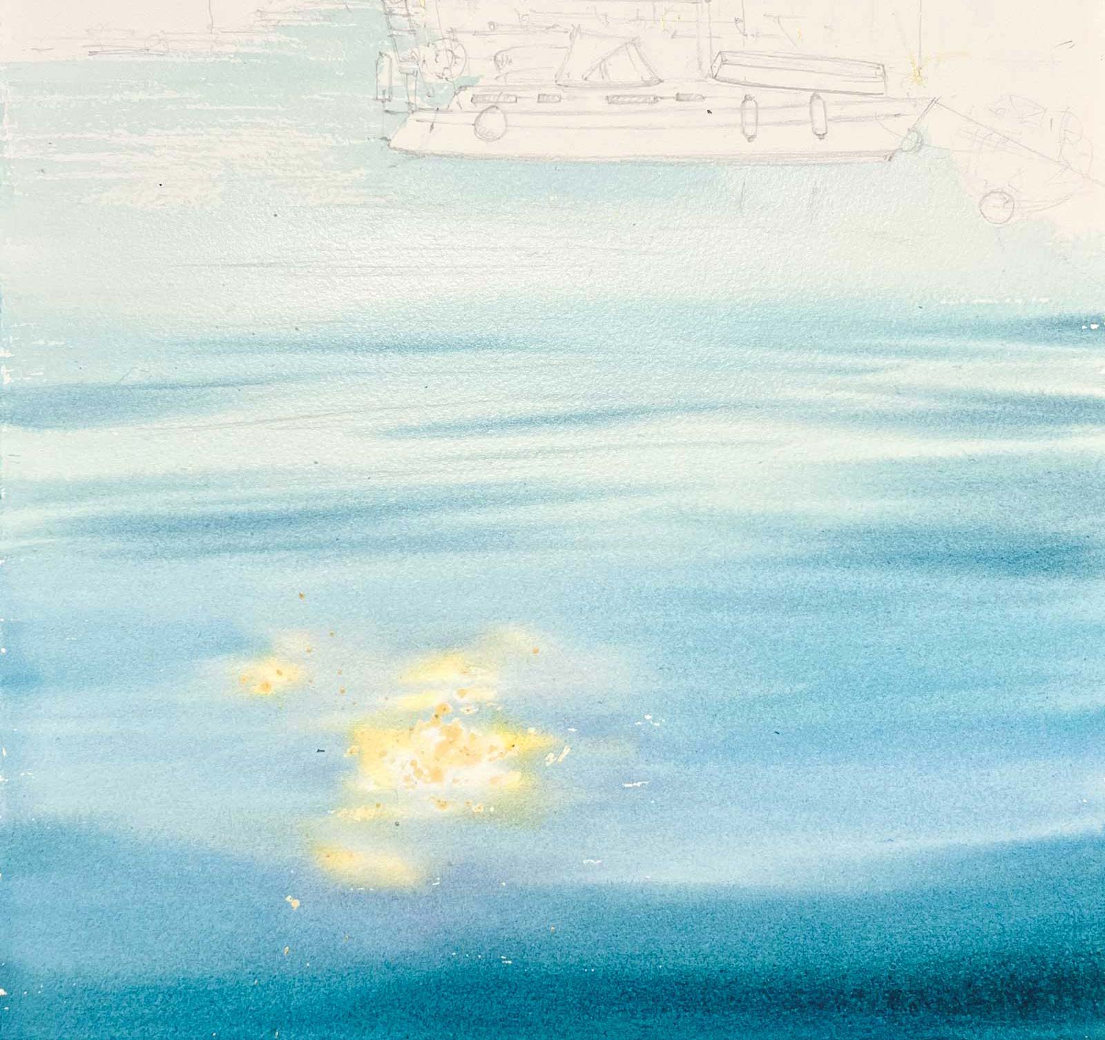 Stage 4
Stage 4 Painting the Water
I first washed the light areas with a semi-transparent cyan and a drop of emerald green. Closer to the foreground, I added more pigment for a darker tone, using ultramarine and a touch of burgundy for depth. For the water reflections, I used a round synthetic brush (slightly smaller than the calligraphy brush) to create delicate ripples, preserving highlights by adding a touch of golden hues and softening the edges with water.
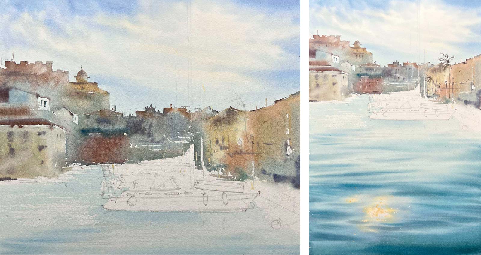 Stage 5
Stage 5 Painting the Cityscape
For the distant buildings, I used different shades of sienna, sky blue (PW6 plus PB15:3, “White Nights”) and cadmium red for warmth. To tone down bright colors, I mixed them with sky blue. Finally, I sprinkled clean water over the cityscape and used a squirrel brush to create soft, airy light spots, adding an atmospheric effect. Once dry, I added small details like windows, palm trees and streetlights with a synthetic brush, working almost dry.
 Stage 6
Stage 6 Starting the Yachts
I started with the blue sail and a loose suggestion of elements in the background, avoiding detailed rendering—just spots, dots and lines to indicate movement.
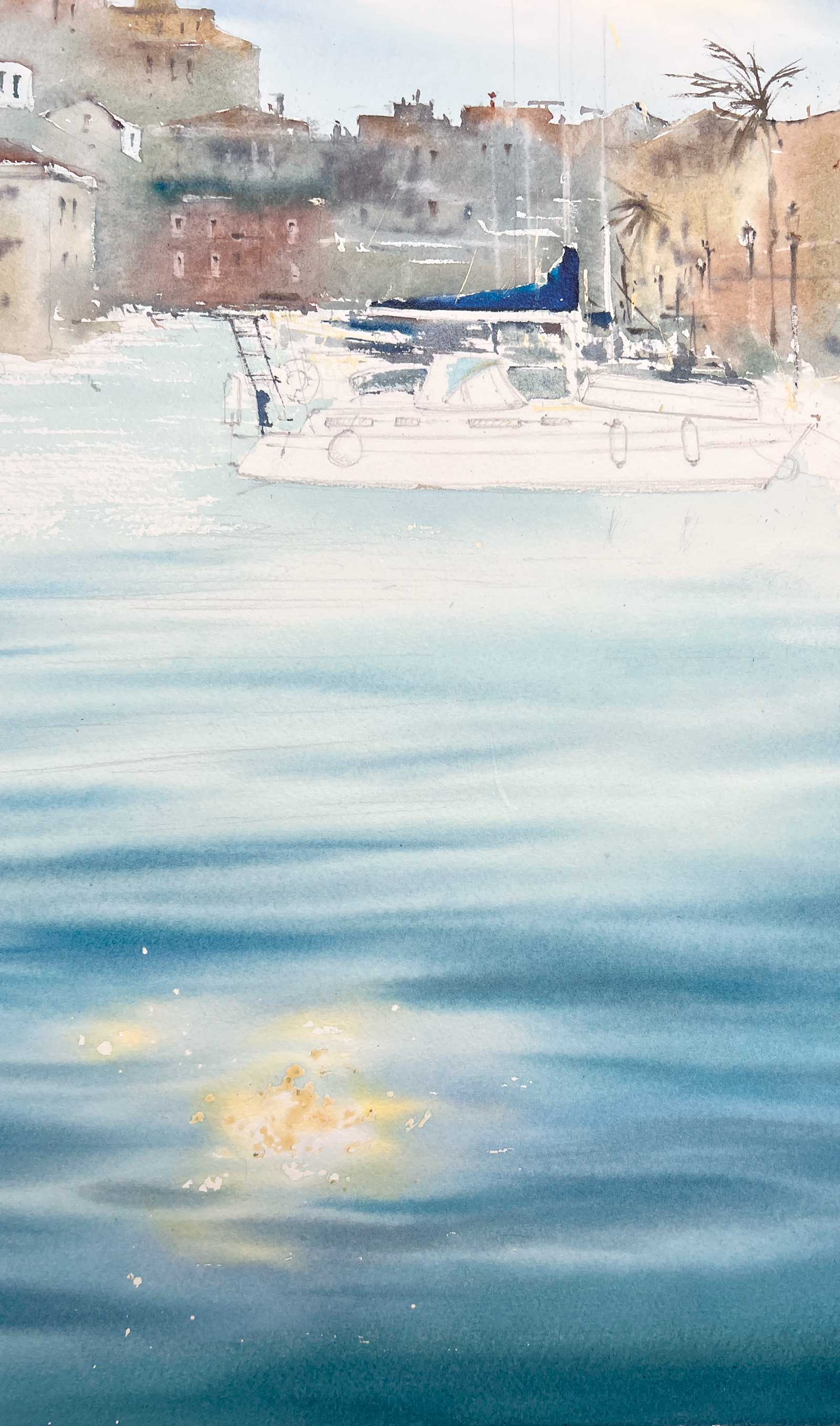
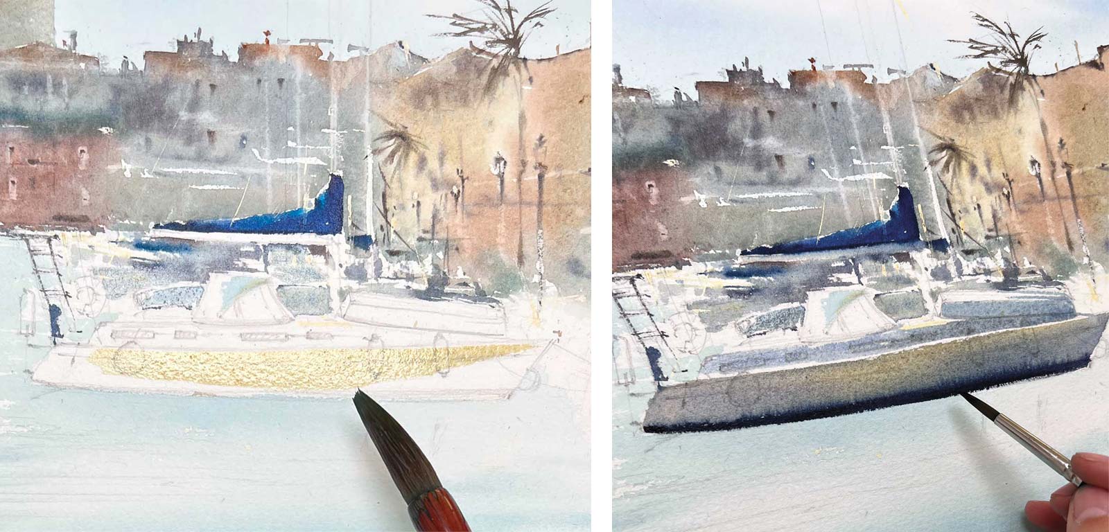 Stage 7
Stage 7 Primary Yacht in Foreground
For the main yacht in the foreground, I began with a warm ochre/raw sienna base, then added cool gray-blue tones (cobalt blue plus carmine).
 Stage 8
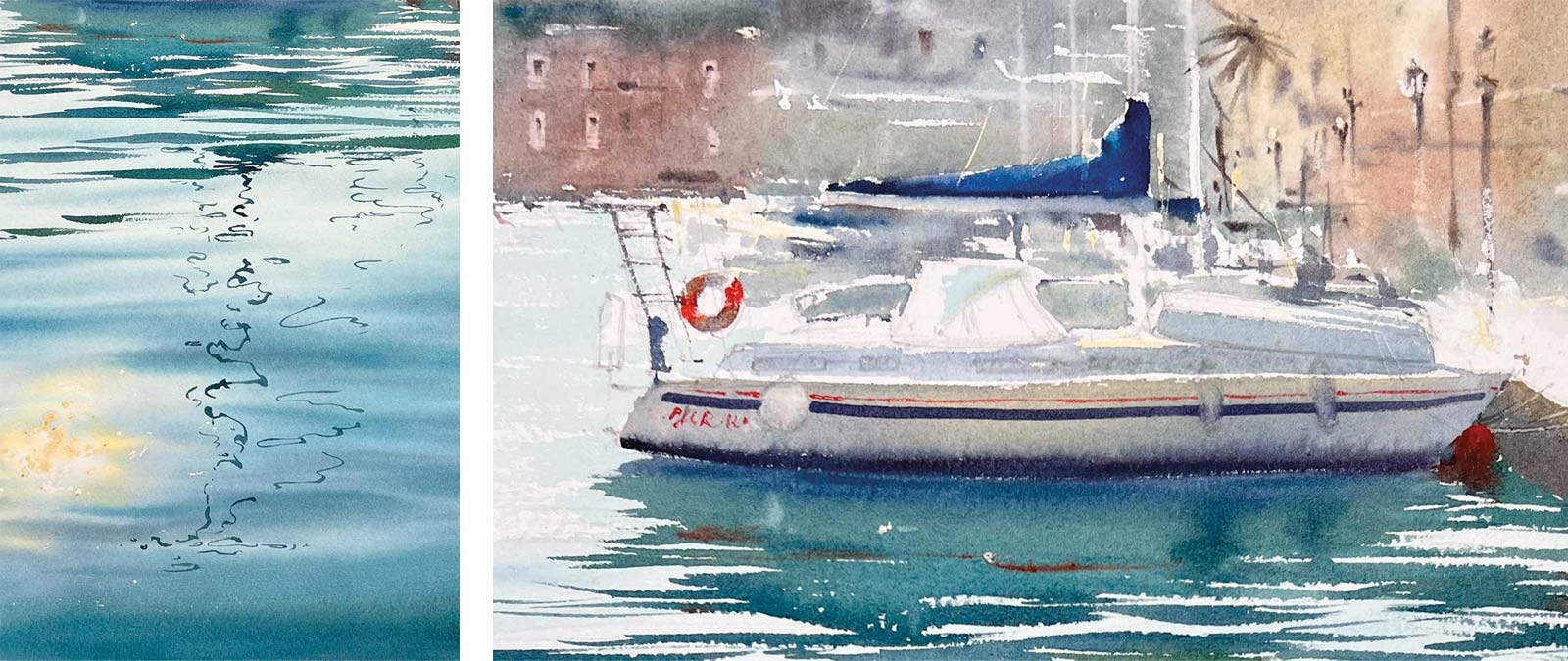
Stage 8 Water Line and Reflection
While the hull was still wet, I painted a thin blue water line using a small round brush with concentrated pigment. Immediately, I extended the reflection below, keeping it fluid and cohesive with the yacht. I used a Chinese calligraphy brush and mixed blue with warm tones like Indian gold for a natural effect. Into the wet reflection, I introduced a thin red stripe (matching a detail on the yacht) and also painted red buoys as small accents.
 Stage 9
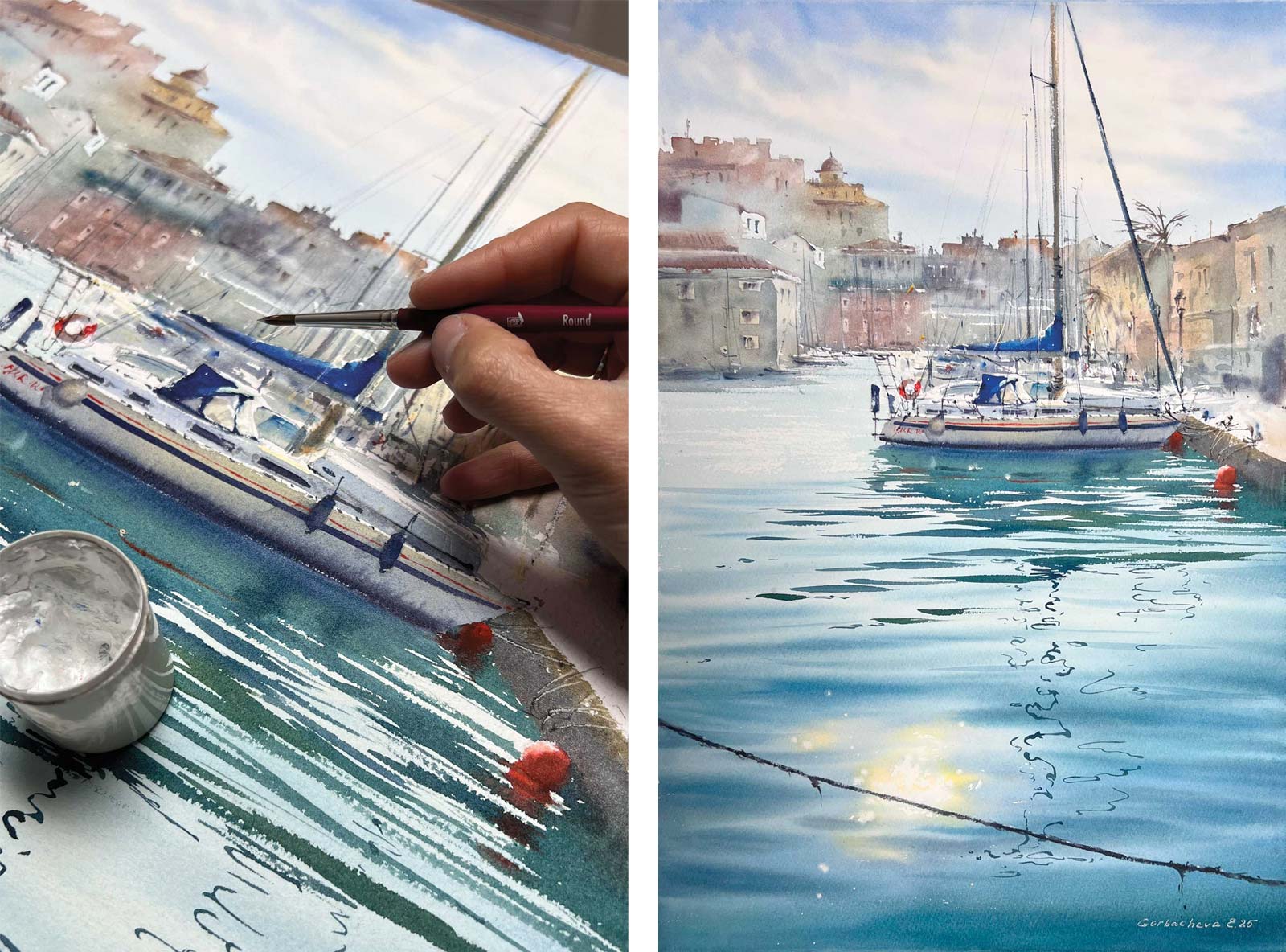
Stage 9 Final Touches
To highlight sunlit areas, I added white acrylic or gouache for sharp, bright accents. Once the painting was dry, I removed the masking fluid and softened the edges with a melamine sponge for a more natural look. At the very end, I debated whether to add a rope covered in seaweed in the foreground that crossed the composition. I decided to take the risk and painted it as a final element to enhance depth.
 Stage 10
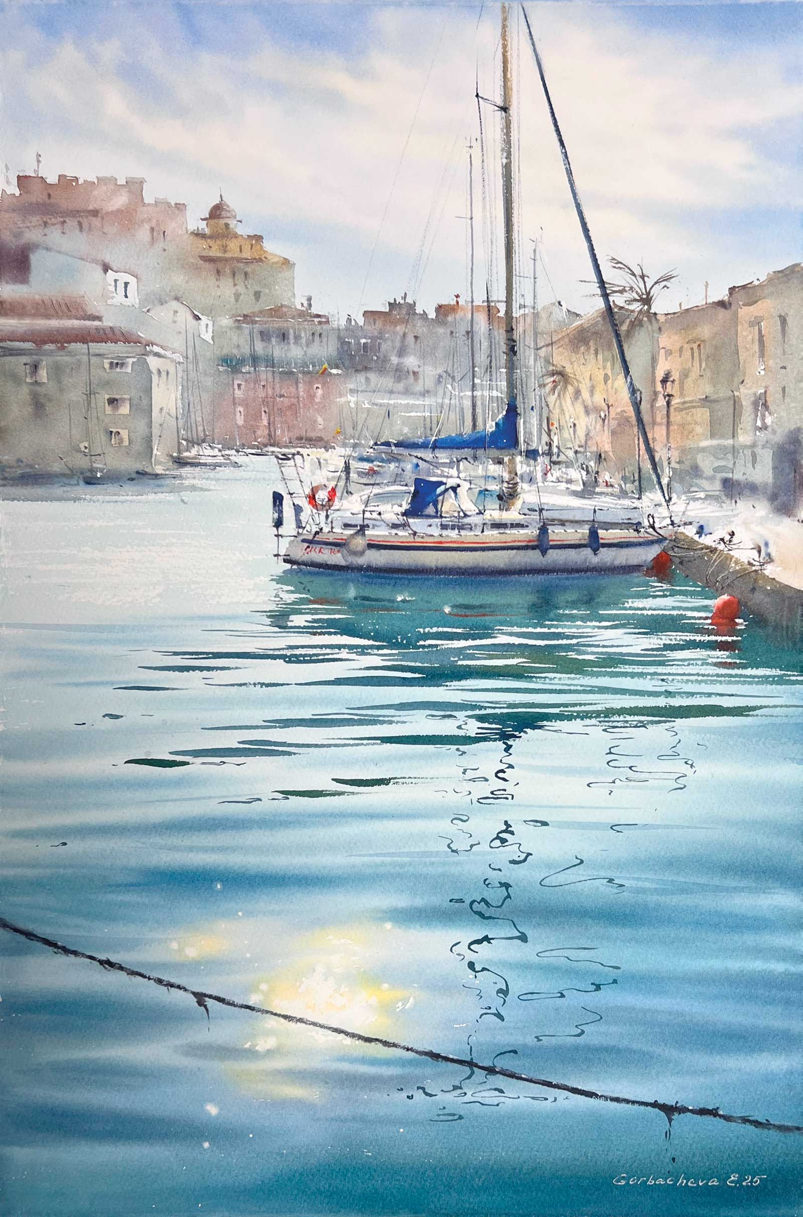
Stage 10 Finished Artwork
Golden Hour in Port Saplaya #2, watercolor, 22½ x 15” (57 x 38 cm)
About the artist
 Eugenia Gorbacheva
Eugenia Gorbacheva is a watercolor artist and instructor based in Valencia, Spain. Her work is known for its expressive simplicity and vibrant color harmonies. In 2024, Gorbacheva’s paintings were among the top sellers on famous online galleries, showcasing her appeal to collectors worldwide. Gorbacheva invites art enthusiasts to explore watercolor together on her Patreon page, where over 200 masterclasses in English are available. These lessons dive deep into her techniques, providing insights into creating atmospheric landscapes, vibrant compositions and the nuances of watercolor. She fosters a community where students can learn, experiment and grow under her guidance.
Gorbacheva’s highly anticipated book, Seaside Watercolour: How to Paint Seascapes and Coastal Views, will be published in English and Spanish at the end of summer 2025. It will feature step-by-step tutorials focusing on seascapes and an in-depth exploration of her artistic approach. Discover more on her website, eugeniagorbacheva.com, where you can browse both giclée prints and original works.
Contact at
eugeniagorbacheva.com