


My pastel works combine elements of realism, abstractionism and impressionism, based on keen, direct observation of my subject. I interpret the visual information with varying ratios of conscious calculation and spontaneous experimentation. My preferred painting genre is still life, as it allows me to work undisturbed in silent conversation with the setup and the painting.
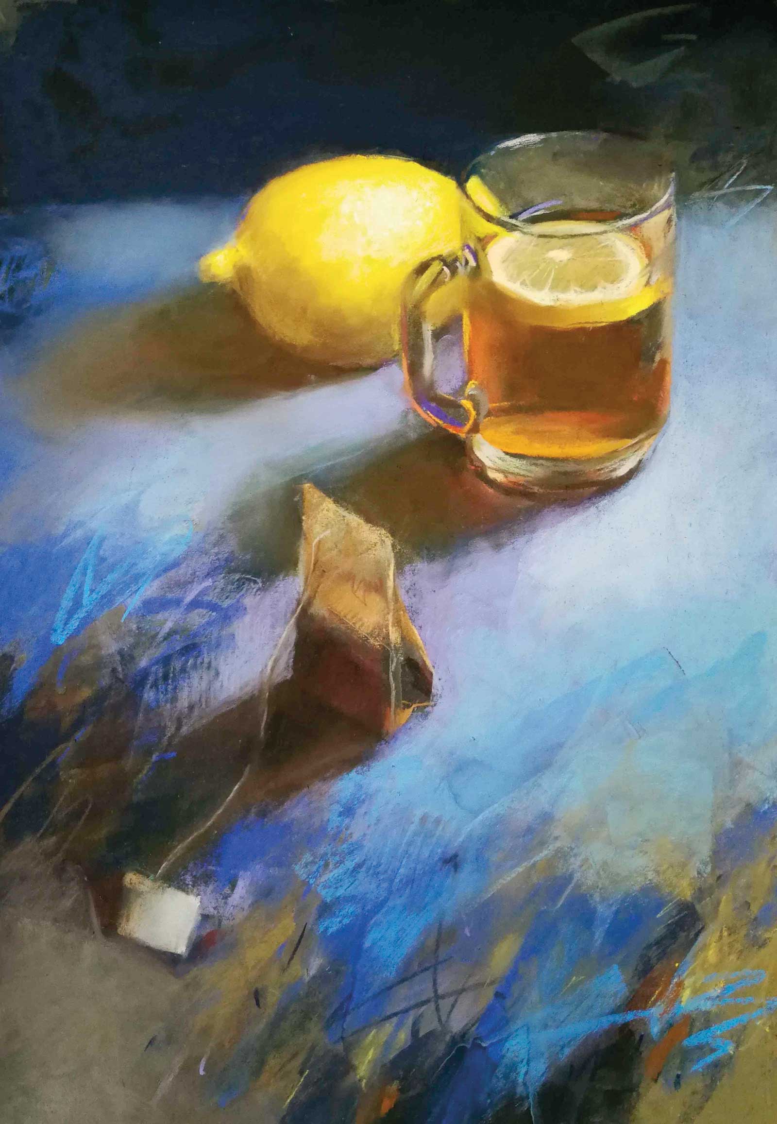
Lemon Tea, soft pastel on paper, 18 x 12” (45 x 30 cm)
My painting process is like a backward-and-forward dance of both the intuitive and the analytical approach, adding and removing pigments, making marks, then softening them by blending with sponges, brushing or washing off if not satisfied. The choice of subject reflects my identity, state of mind, mood and energy level. I have loads of ideas in my head as well as clutters of props on my shelves. The man-made objects are picked for their color, form, size, function or for their symbolic value. And there are also fresh seasonal flowers, fruits and veggies. Low energy or limited time result in smaller florals or single-object paintings. Larger compositions demand more time and more mental energy.
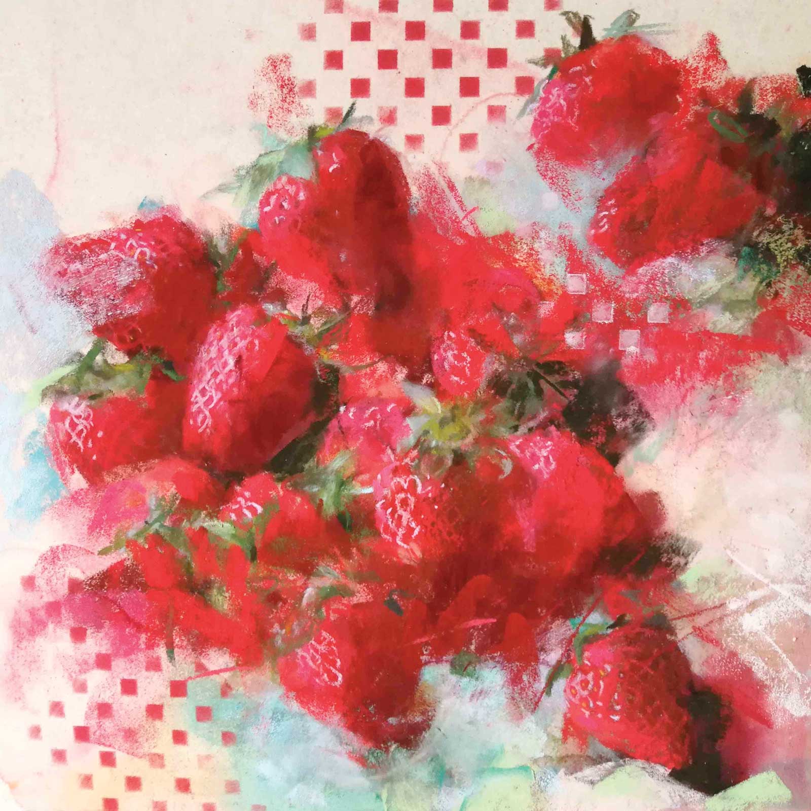
Strawberries, soft pastel on paper, 9½ x 9½” (24 x 24 cm)
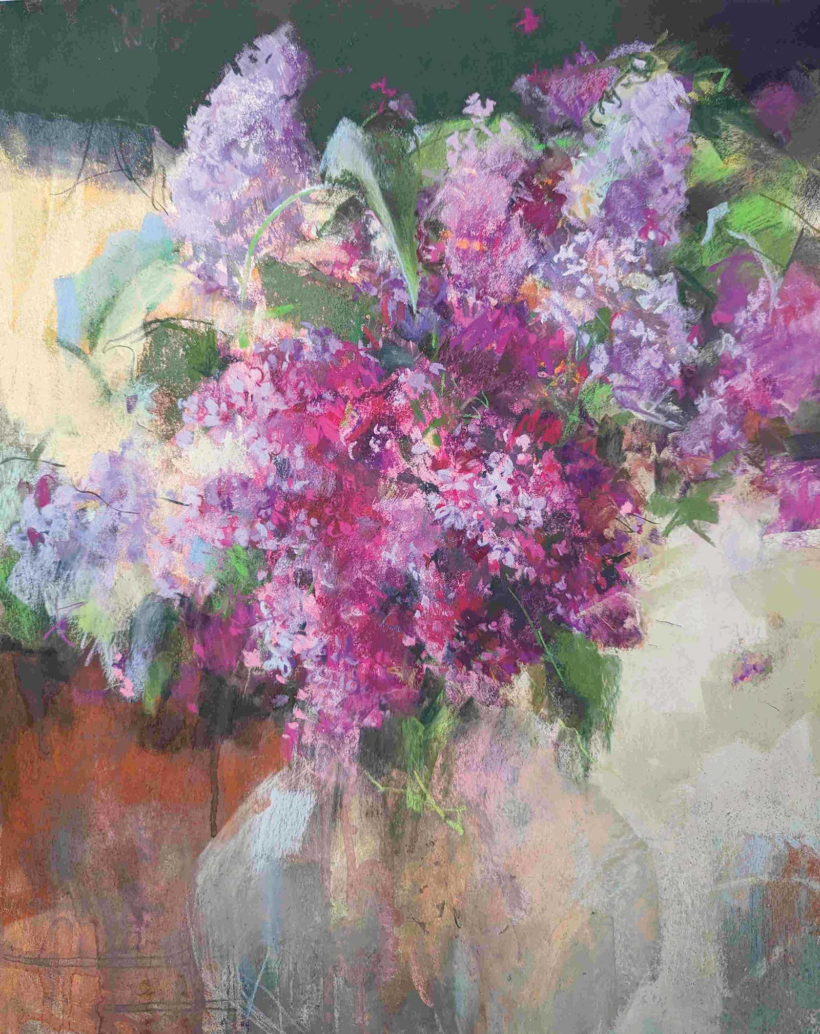
Lilacs, soft pastel on paper, 19 x 15” (48 x 38 cm)
When it comes to florals, there are certain flowers that I’m drawn to paint again and again every year when they bloom. I feel a strong emotional bond to them, no matter how decadent it may sound. They take me back to my childhood in Estonia, to my mom’s garden, or to the summer meadows. Taking them into my studio and painting them feels like having a good time with old friends, recalling the past and catching up with the present. Peonies are one of those returning subjects, the majestic queens of the gardens in our Nordic midsummer.
My Art in the Making Trapped by the Decadent Beauty
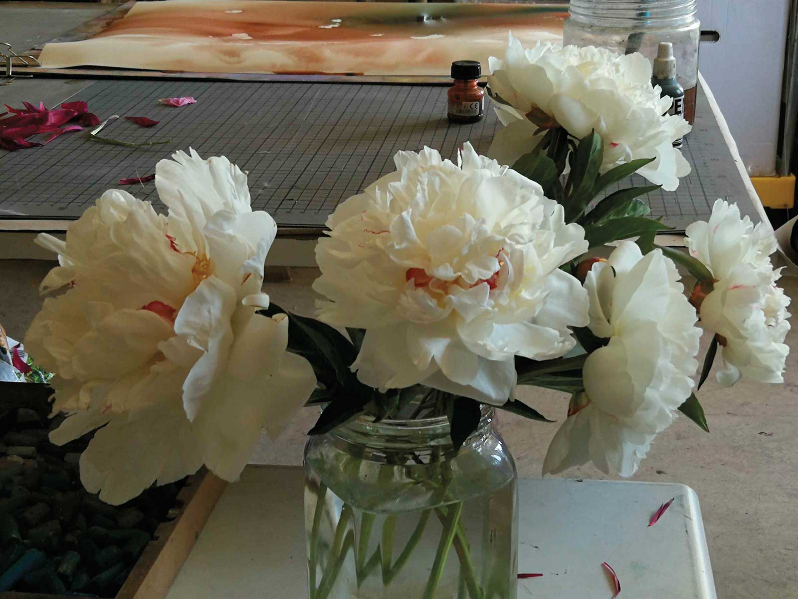
I started by arranging the peonies in a simple glass jar with natural daylight. When painting from life, there is only a limited period of time before the fresh flowers wilt, so I need to focus on their appearance prior to anything else.
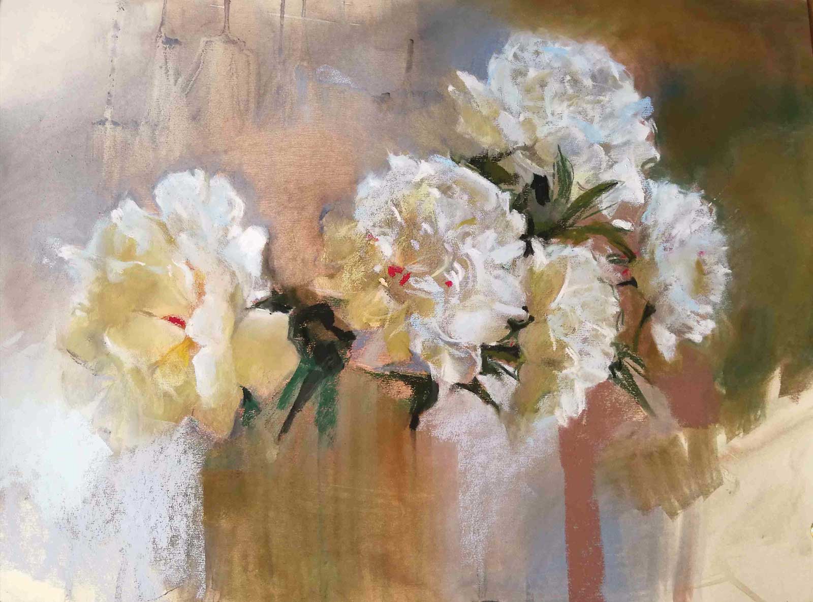
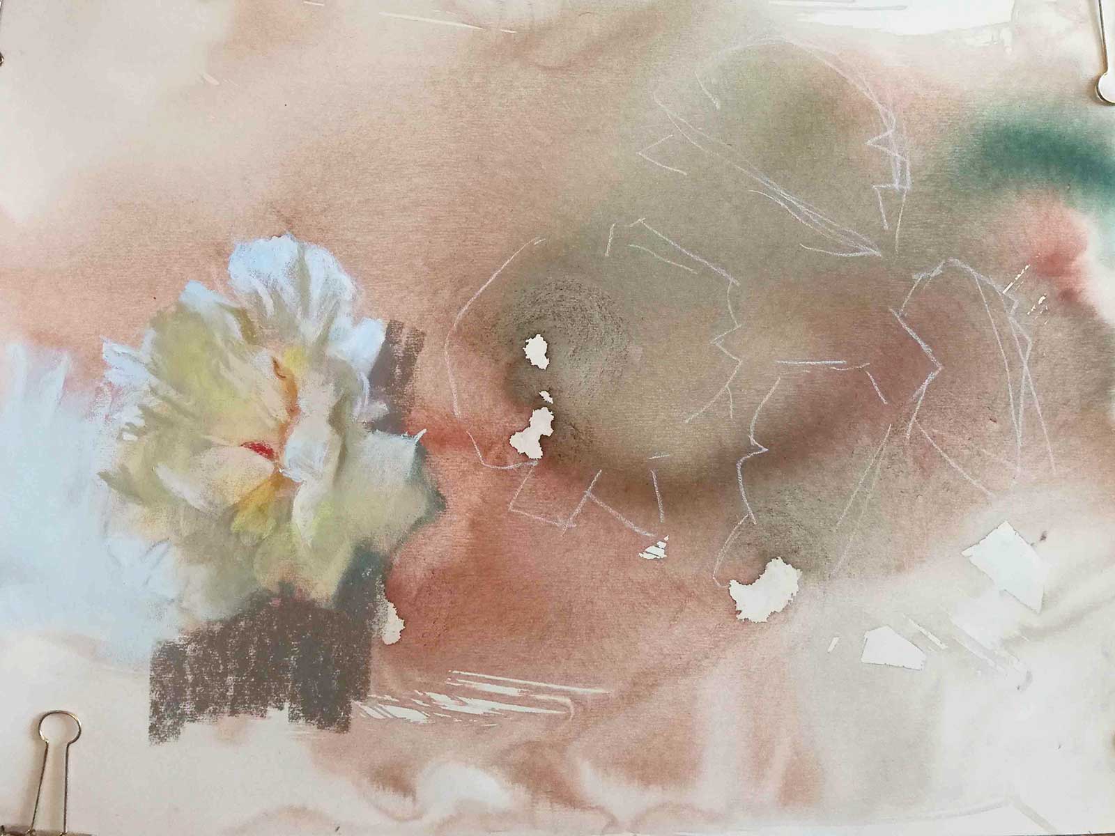 Stage 1
Stage 1 Initial Wash
I start with a wash of burnt sienna and dark olive green acrylic inks just to activate the empty picture plane. I use water and rubbing alcohol both for the initial wash and throughout the painting process, often simultaneously. When the surface has dried, I map/sketch the position of flowers with a few quick strokes with a hard pastel. I decide to focus primarily on the flowers and not worry about depicting the jar and the interior. I also opt to leave the background open to allow myself some abstract improvisation later on.
WHAT THE ARTIST USED
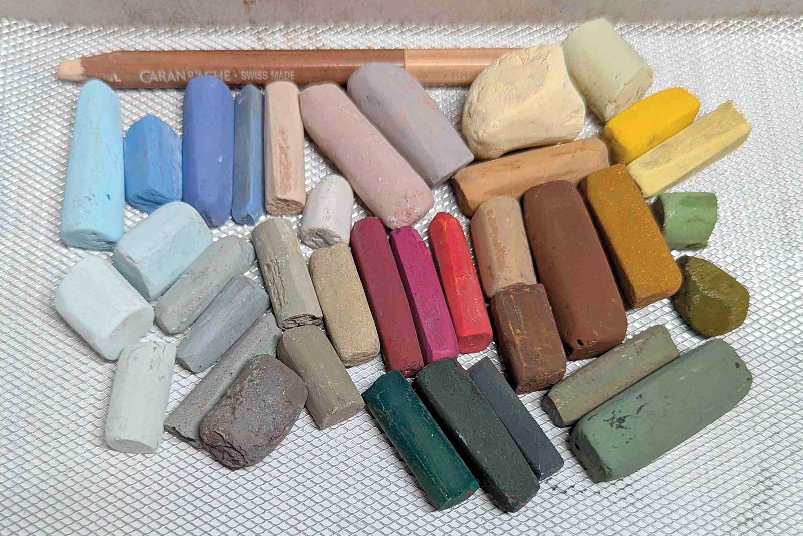
UArt 400 sanded pastel paper, Soft and hard pastels in various brands, Inclusive self-made pastels, Caran d’Ache pastel pencil, Winsor & Newton and Renesans acrylic inks, PanPastel Sofft sponge, Kneaded eraser, Fan brush, Water, Rubbing alcohol
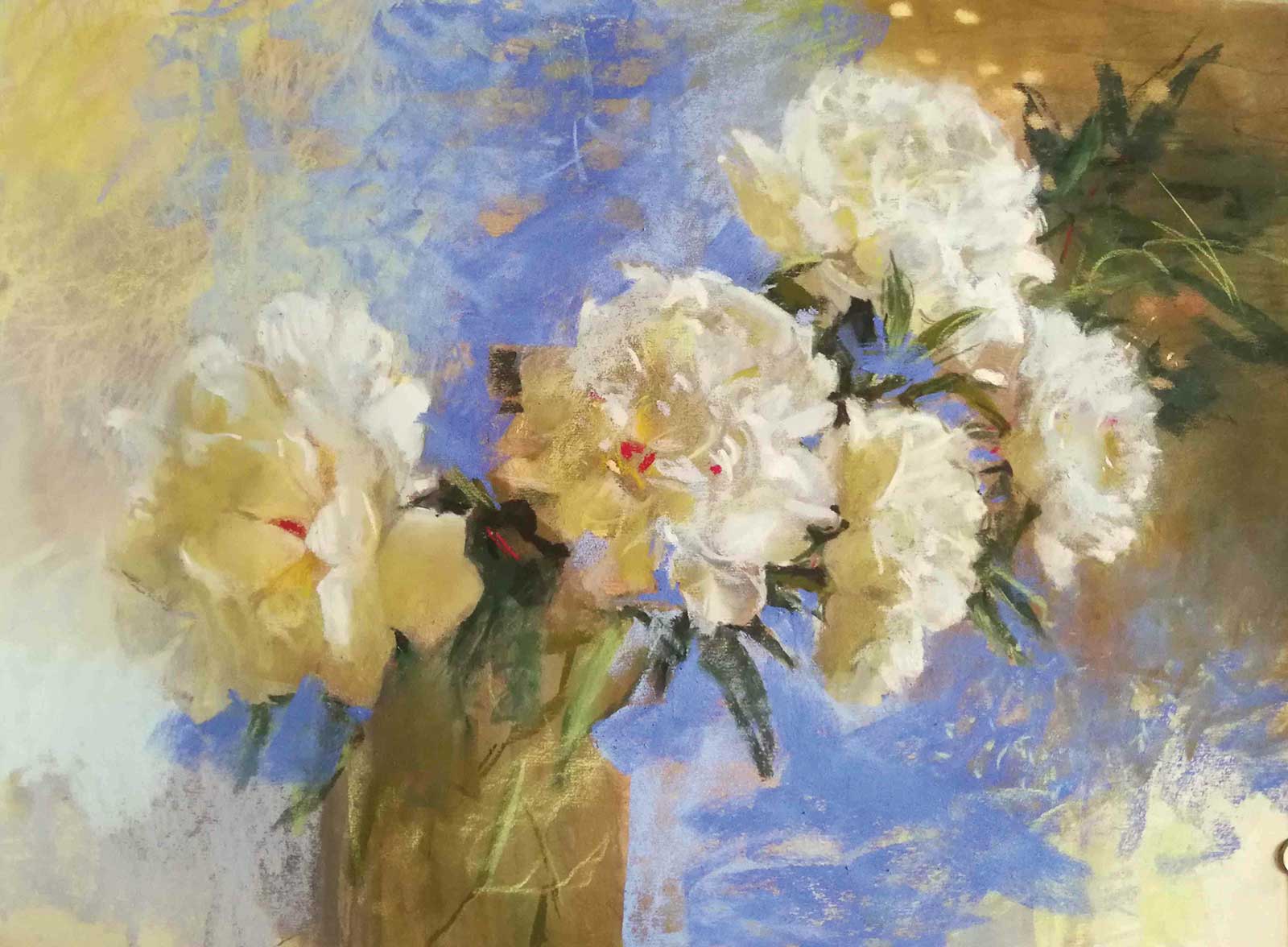
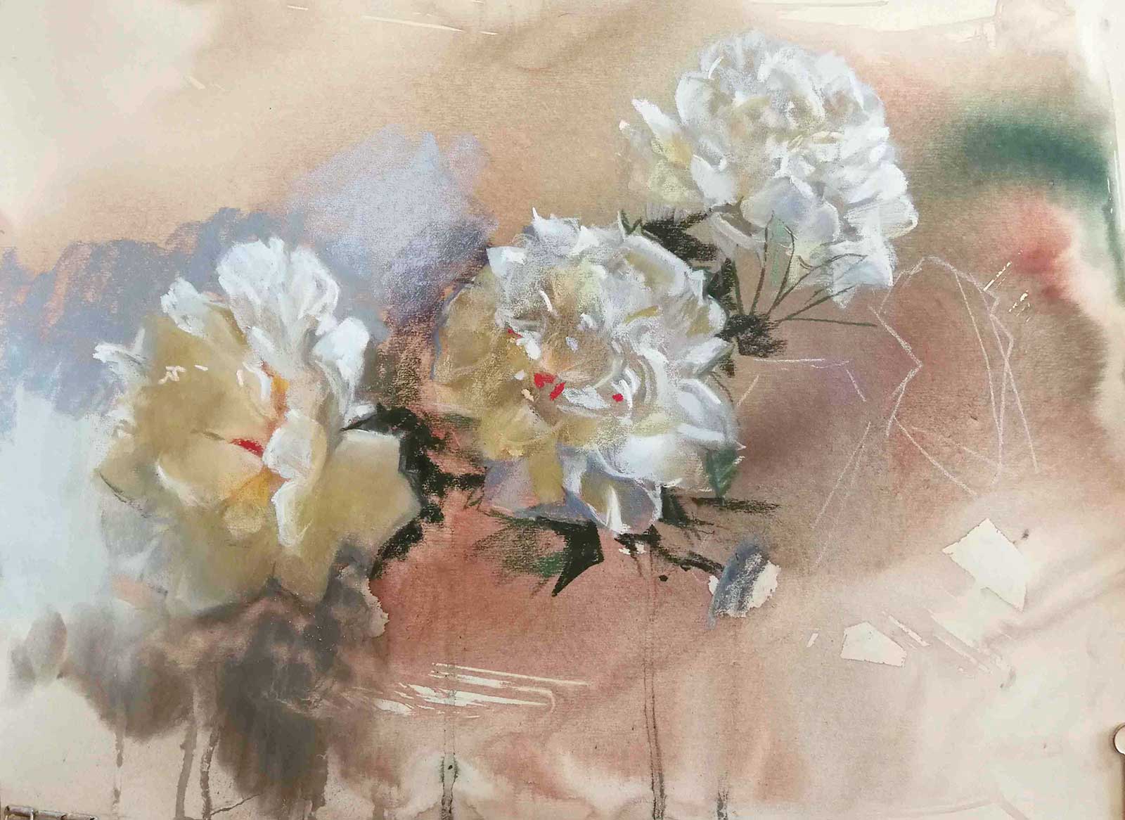 Stage 2
Stage 2 Starting the Peonies
By close observation of color nuances, shapes, values and temperature, and by a lot of squinting, I aim to capture the character of the peony without messing with too many details. I mostly use the sides of the pastel sticks, which imitate the strokes of a wide brush. I scumble and selectively redefine the edges. I also introduce some cool grays to the background to complement the dominant warm underpainting.
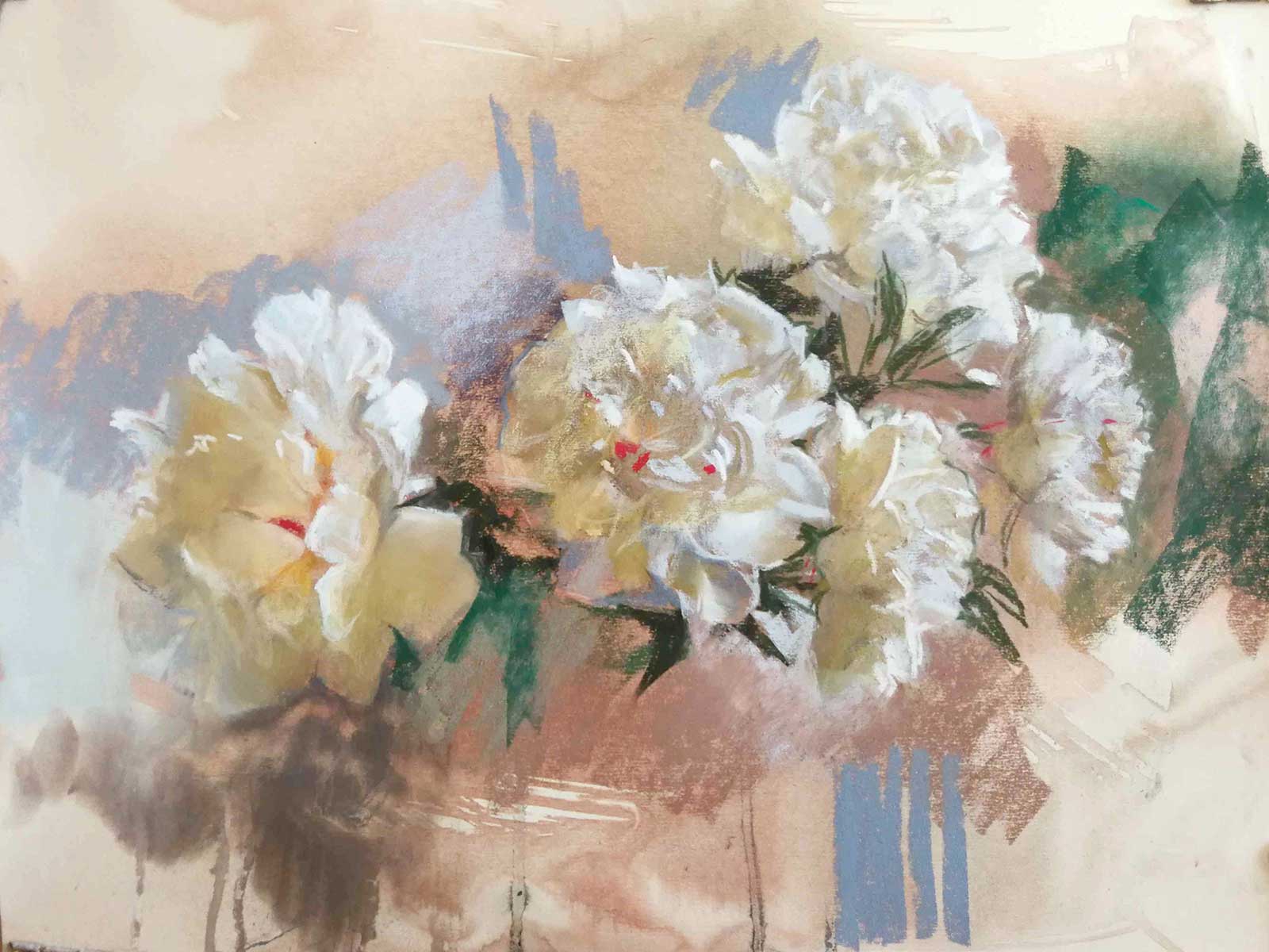 Stage 3
Stage 3 Background
Once the flowers are more or less established, I start playing with the background. I want it to have an active role in my compositions, interacting with my subject, helping to bring mood, movement and life into the scene.
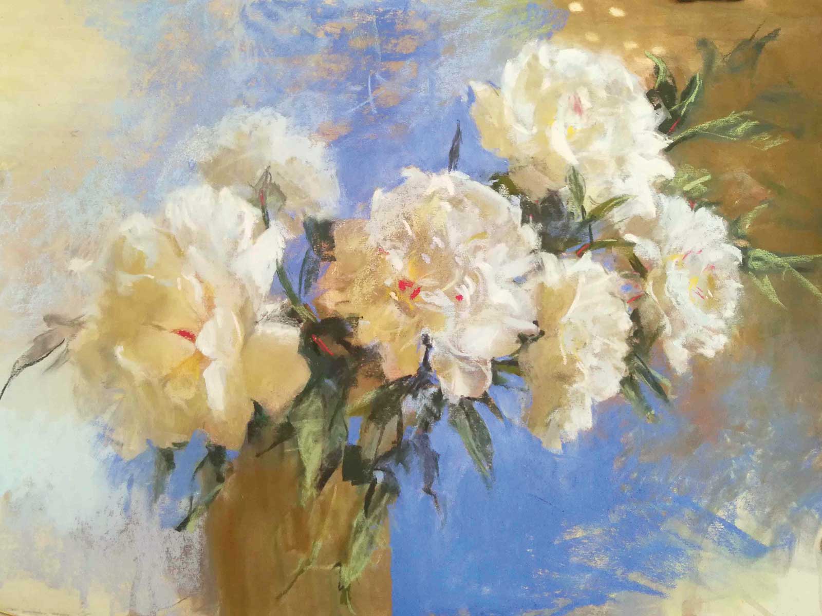
 Stage 4
Stage 4 Introducing More Color and Texture
I keep the same cool light and warm dark division as I used for the flowers. I vary the colors, temperature and textures, searching for the right key for the painting to make it sing. I stay open for an inspirational spark.
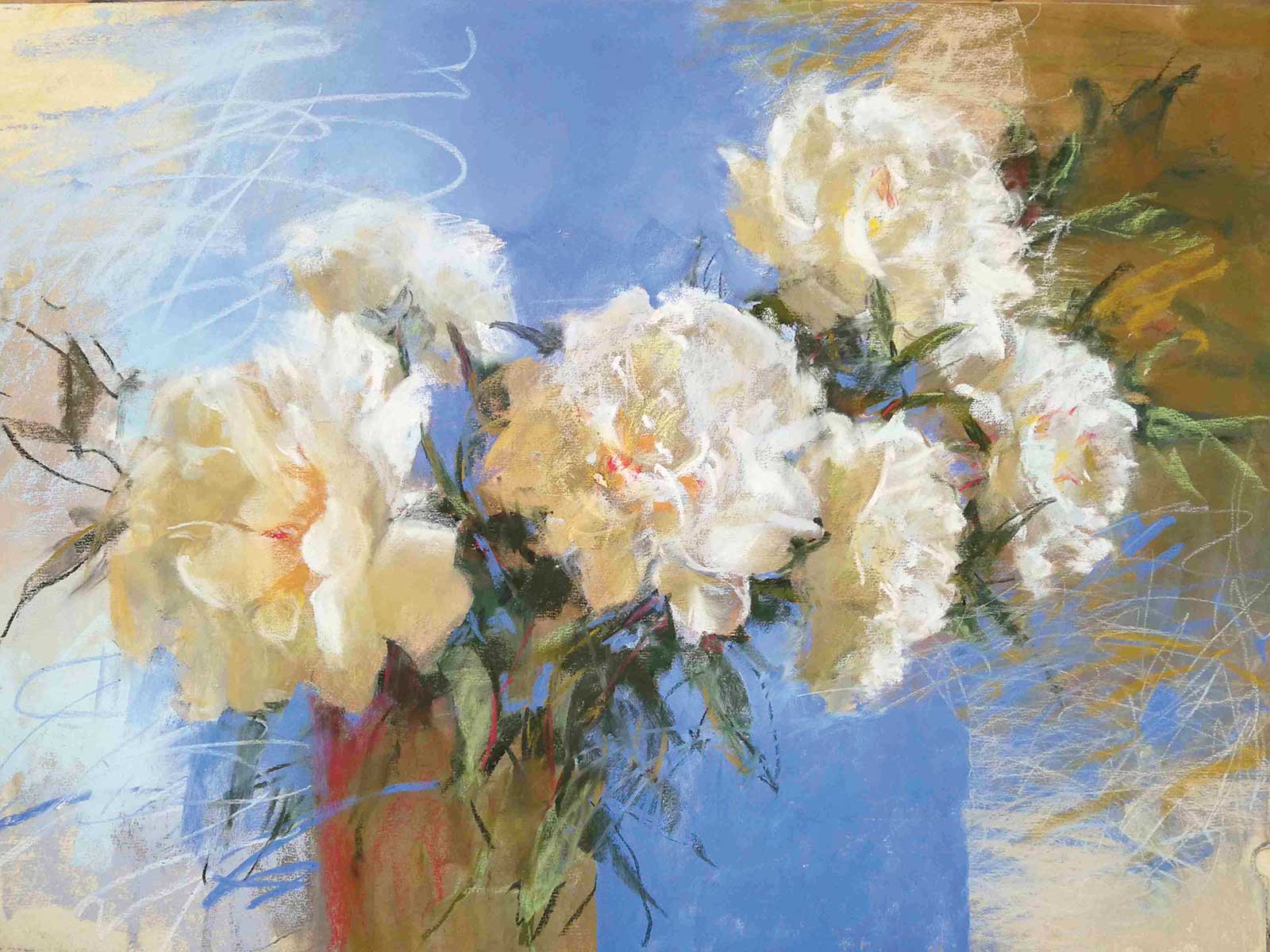
 Stage 5
Stage 5 Bright Energy
That spark I’m searching for is eventually triggered by the blueish gray in the background amidst all those dominating warm, nearly neutrals. I decide to bring a high chroma sky blue onto my palette. That move rapidly changes the mood and energy of the painting. Now I know this piece is not going to be a subdued melancholy in minor, but a happy tune instead—a celebration of Nordic midsummer!
 Stage 6
Stage 6 Expanding the Blues
I expand the blue area vertically, turn up for the yellowish reflections inside the flowers and repeat the yellow in the background.
 Stage 7
Stage 7 Refinements
I brush off the excess yellow pigment, as its residue is enough for the overall color harmony. I invent an extra backwards facing flower and reduce the value contrasts at the periphery. I work on some leaves in the focal area, giving them harder edges and clearer definition to enhance the illusion of depth.
 Stage 8
Stage 8 Continuing to Make Adjustments
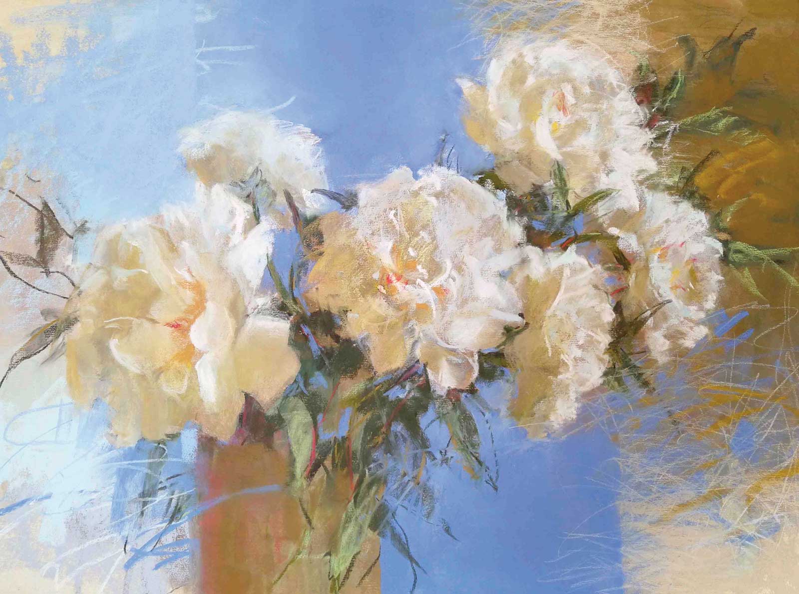
I enliven the background with vigorous marks to indicate a summer breeze. I want to place the scene on an imaginary doorstep between the outdoors and the indoors, so I cut into the organic chaos with a few more vertical straight edges.
 Stage 9
Stage 9 Finishing Touches
I soften a bit of those expressive marks so they won’t “speak” too loud, but I leave the glory to the majestic beautiful flowers.
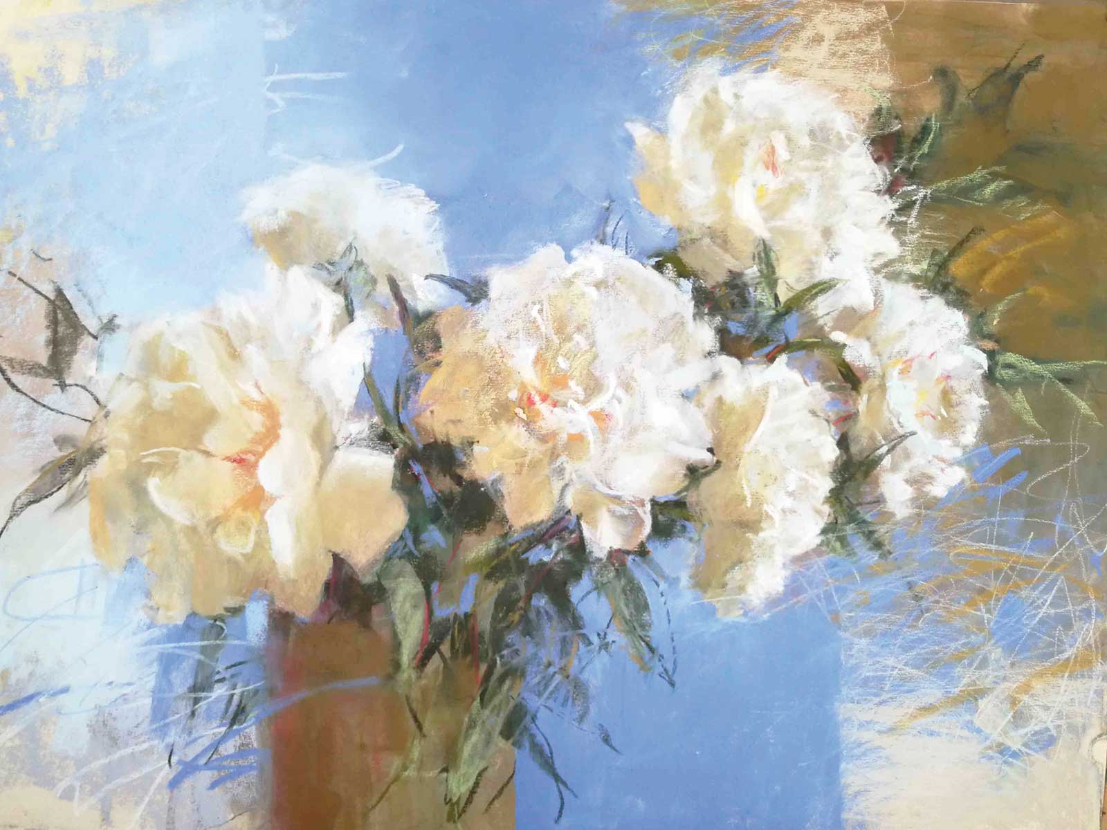
 Stage 10
Stage 10 Finished Artwork
Trapped by the Decadent Beauty, pastel, 18 x 24” (45 x 60 cm)
About the artist
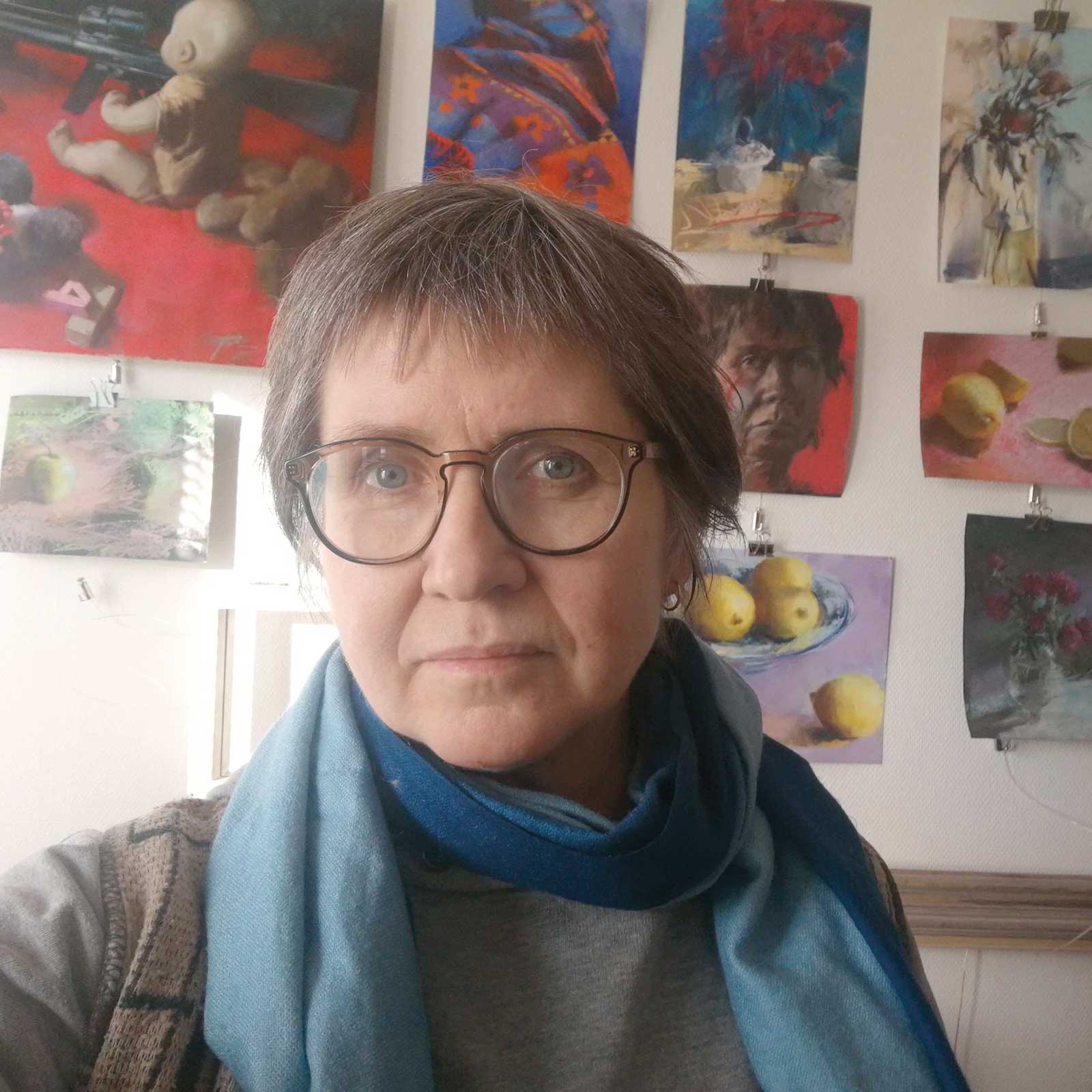 Silja Salmistu
Denmark-based Silja Salmistu is an award-winning Estonian artist known for her floral and still life paintings. She graduated from Tartu Art School and earned a MFA equivalent in painting at the University of Tartu in 1994. She has exhibited in a number of juried, curated, group and solo shows in Estonia, Finland, Denmark, England, France, Canada, China and the United States, and her work has received numerous awards.
Since 2016, Salmistu’s medium of choice is soft pastel. She is a member in the Pastel Guild of Europe and a Signature Member in the Pastel Society of America. Since 2021, she holds Master Circle membership with the International Association of Pastel Societies. She teaches pastel workshops in person on demand. Currently, her artwork is represented at Galleri Art Compaz (Denmark) and E-Kunstisalong (Estonia).
Contact at
siljasalmistu.art