



I was an 18-year-old biology student when I took a scuba diving course that opened a fascinating world for me. From that very first dive I wanted to paint underwater scenes. The blue-green colors and the limited aerial perspective have inspired dozens of paintings in my attempts to relive the visual richness of this world. The biologist in me is interested in the many forms of marine life that inhabit these cold North Pacific waters. Telling the stories of their interactions and especially portraying the various species at the correct depths is always a significant aspect of my work. Colorful sunlight only penetrates within the top 30 to 40 feet, and it is in this zone that kelp forests abound. Kelp provides the backdrops to almost all of my underwater scenes. These waters are characteristically green with columns of kelp, giving an aerial perspective that is similar to a foggy day in a normal forest; foregrounds stand out against the less defined misty backgrounds. Add a touch of sunlight to this world and it is like a whole wall of stained glass windows wavering in the currents. It is this overlapping of faded green backgrounds with strands of golden highlights that make underwater images irresistible.
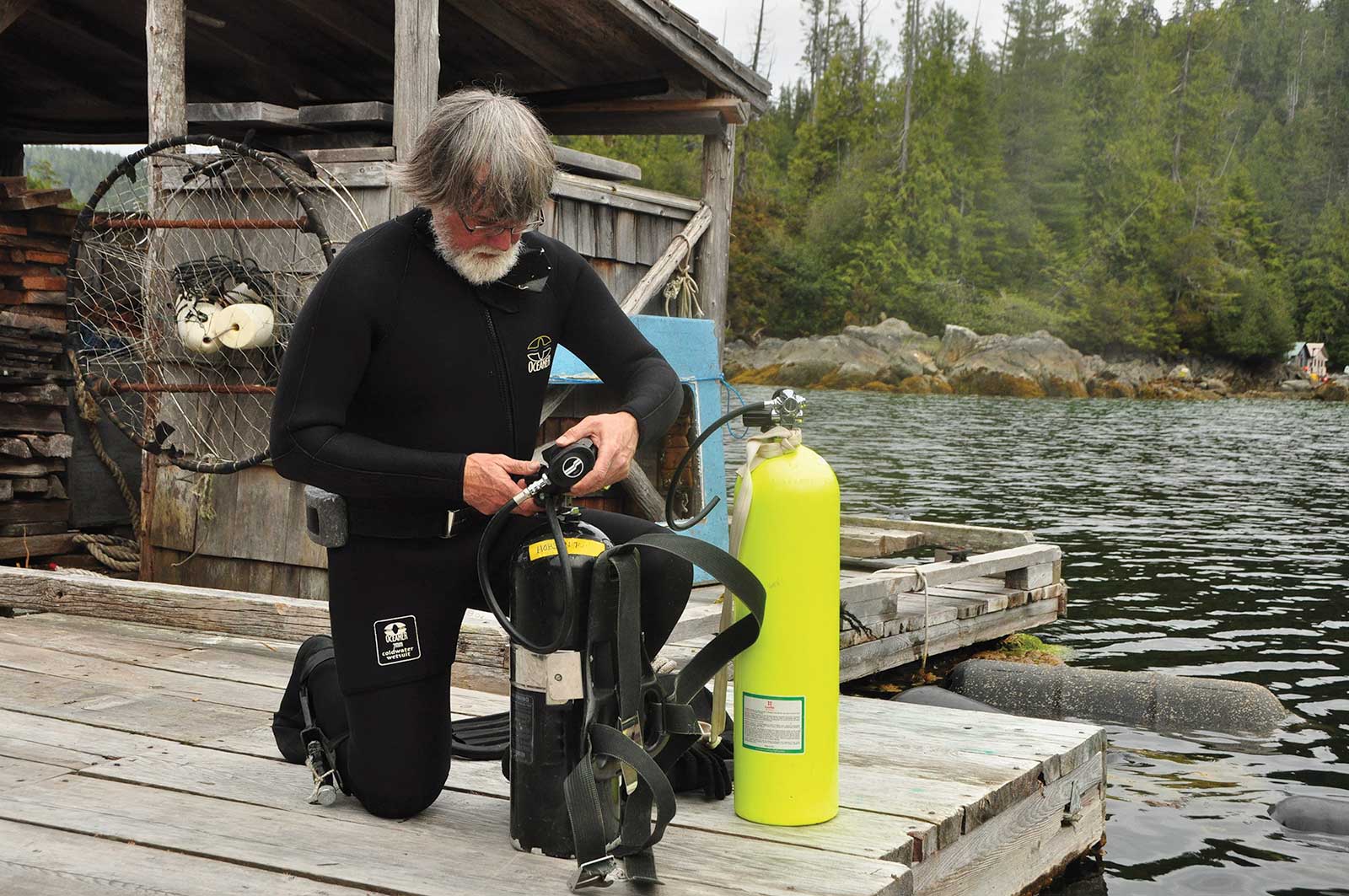 Mark prepares to dive below his floathouse studio. While no kelp forests grow in this sheltered bay, refreshing the visual reference prior to starting a painting is very useful, especially observing the way light works underwater.
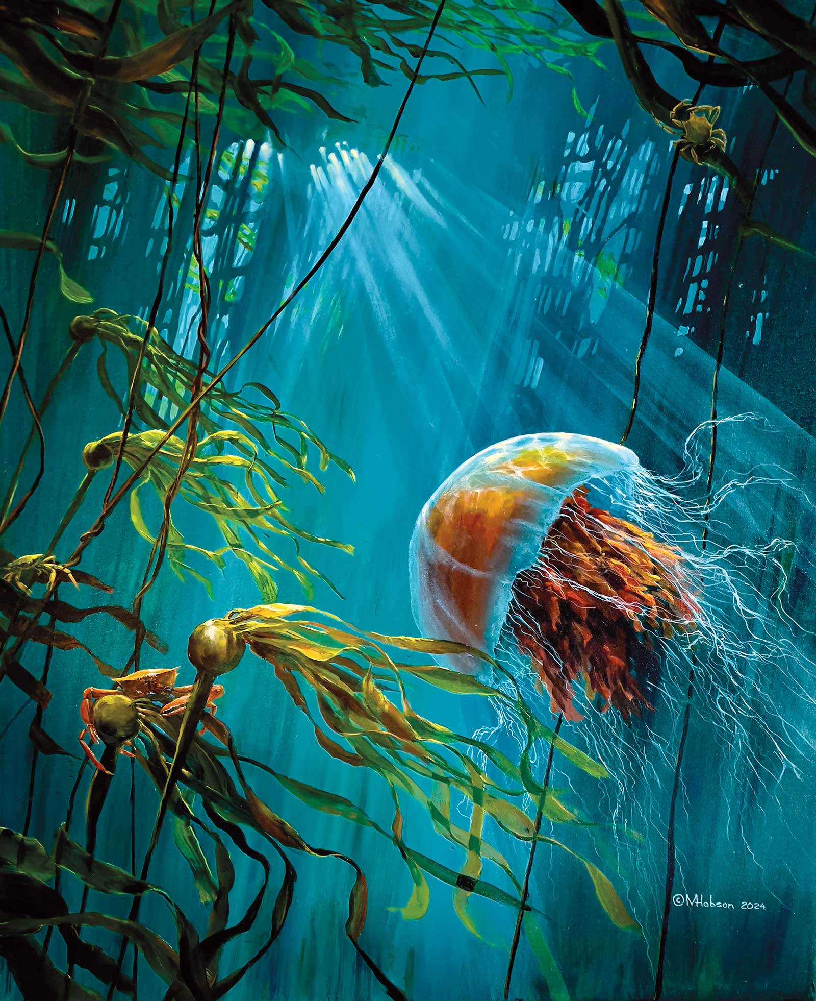
Lion’s Mane Jellyfish: Tangled In the Kelp, acrylic, 36 x 30" (91 x 76 cm)
My reference material comes from a wide variety of sources. Memory is hugely helpful, and I rely on my previous works to a very large degree. My studio is too remote to pick up online signals so I rely on files of collected photos from magazines, textbooks, calendars, etc., including many of my own. I don’t have an underwater housing, but some fabulous underwater photos can be taken by placing a camera in a small aquarium. Keeping the camera dry, press the shutter while pushing the tank partially into a tide pool and “voila,” you will be amazed by the results. The patterns of flickering light generated by surface waves are an integral part of making underwater scenes come to life. In my earlier works I painted these patterns much like a net stocking, but being able to go into the water off the deck of my studio was hugely helpful in seeing these more accurately. Concentrating closely, I realized that the cross points are brighter than the rest of the patterns, and this greatly increased their authenticity when painted.
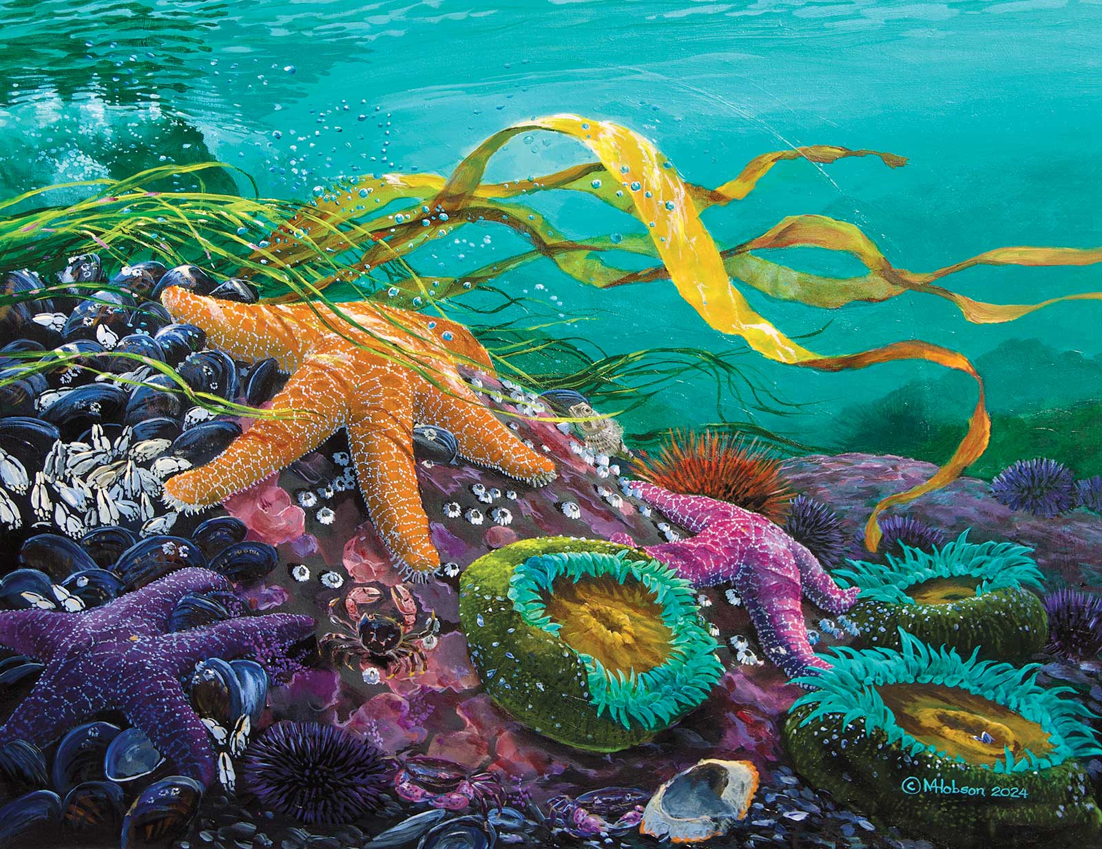
Sea Star: As the Tide Comes In, acrylic, 24 x 30" (60 x 76 cm)
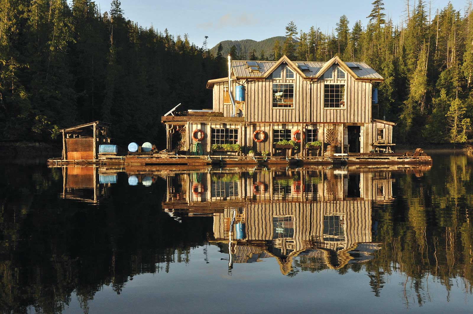
Mark’s floathouse studio in the heart of Clayoquot Sound on Vancouver Island.
Underwater landscapes occupy about five percent of the subjects I paint, but they offer some intriguing challenges. Fish and marine life are interesting to depict, but striving to achieve the true feeling of being underwater with light and depth is a lifelong goal.
Inside the Making of Octopus: Flowing Through the Kelp Bed
 Stage 1
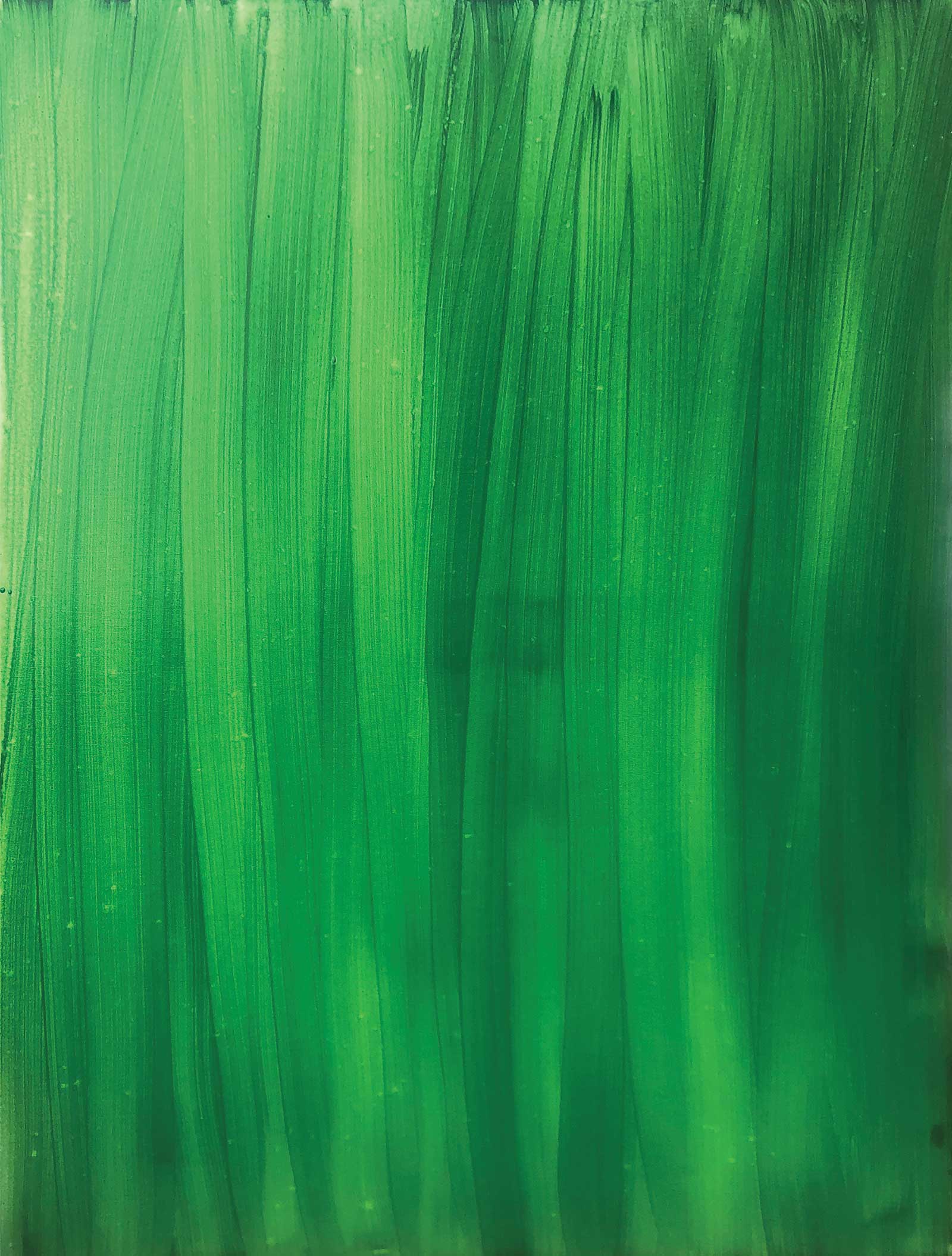
Stage 1 Preparing the Background
I begin by knocking out the white of the canvas with a layer of hooker’s green.
 Stage 2
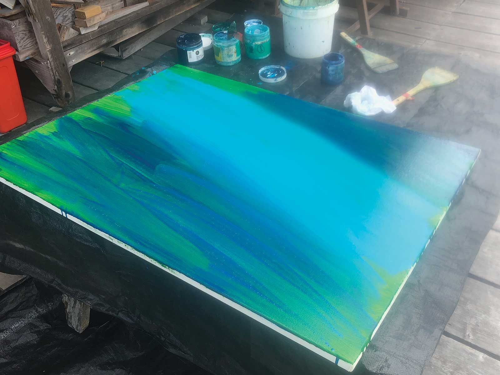
Stage 2 Continuing to Prep the Background
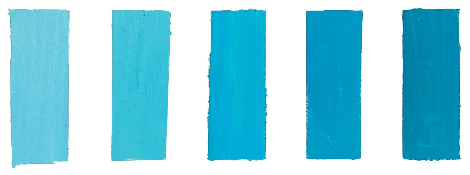
Using jars of premixed acrylic paint and soft hake brushes, a streaky blended background is created. Phthalo green (yellow or blue shade), phthalo turquoise and phthalo cerulean blue are mixed with varying amounts of titanium white to create at least three tones for the background kelp forest. These are stored in plastic jars.
 Stage 3
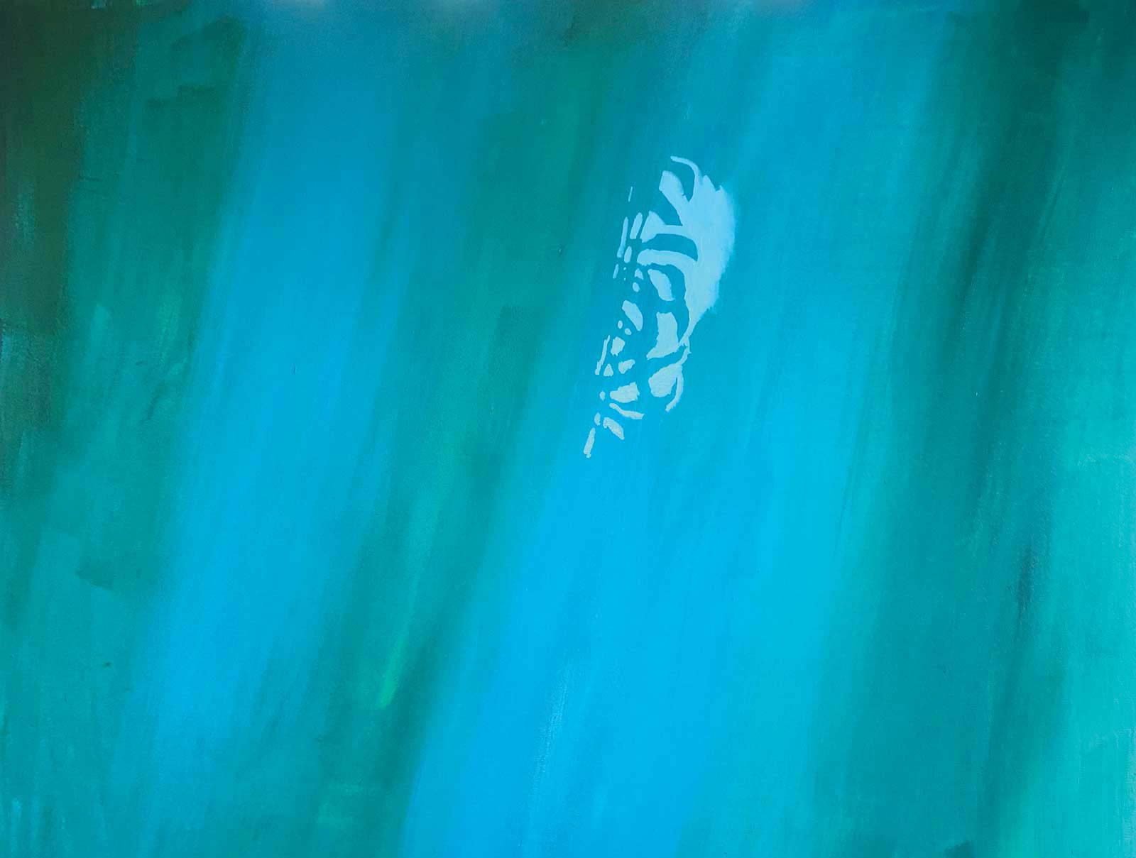
Stage 3 Negative Spaces in the Kelp Forest
The phase seen in the next three steps is crucial in setting the mood and sense of depth. Using a bit more white and phthalo cerulean blue, a lighter mixture of the same background color is applied, painting the negative shapes of the kelp fronds. This approach was a major breakthrough for me. Attempts to paint the distant kelp as positive shapes using phthalo greens were not very convincing, mostly because these acrylic colors are very transparent and when they dry they shift much darker than expected, making it impossible to create a sense of accurate aerial perspective. Adding white and painting the negative spaces means that the paint becomes much more opaque and distant layers are easy to establish. Mixing up batches of the distant colors and storing them in sealed containers is extremely useful when later adjustments might be required.
 Stage 4
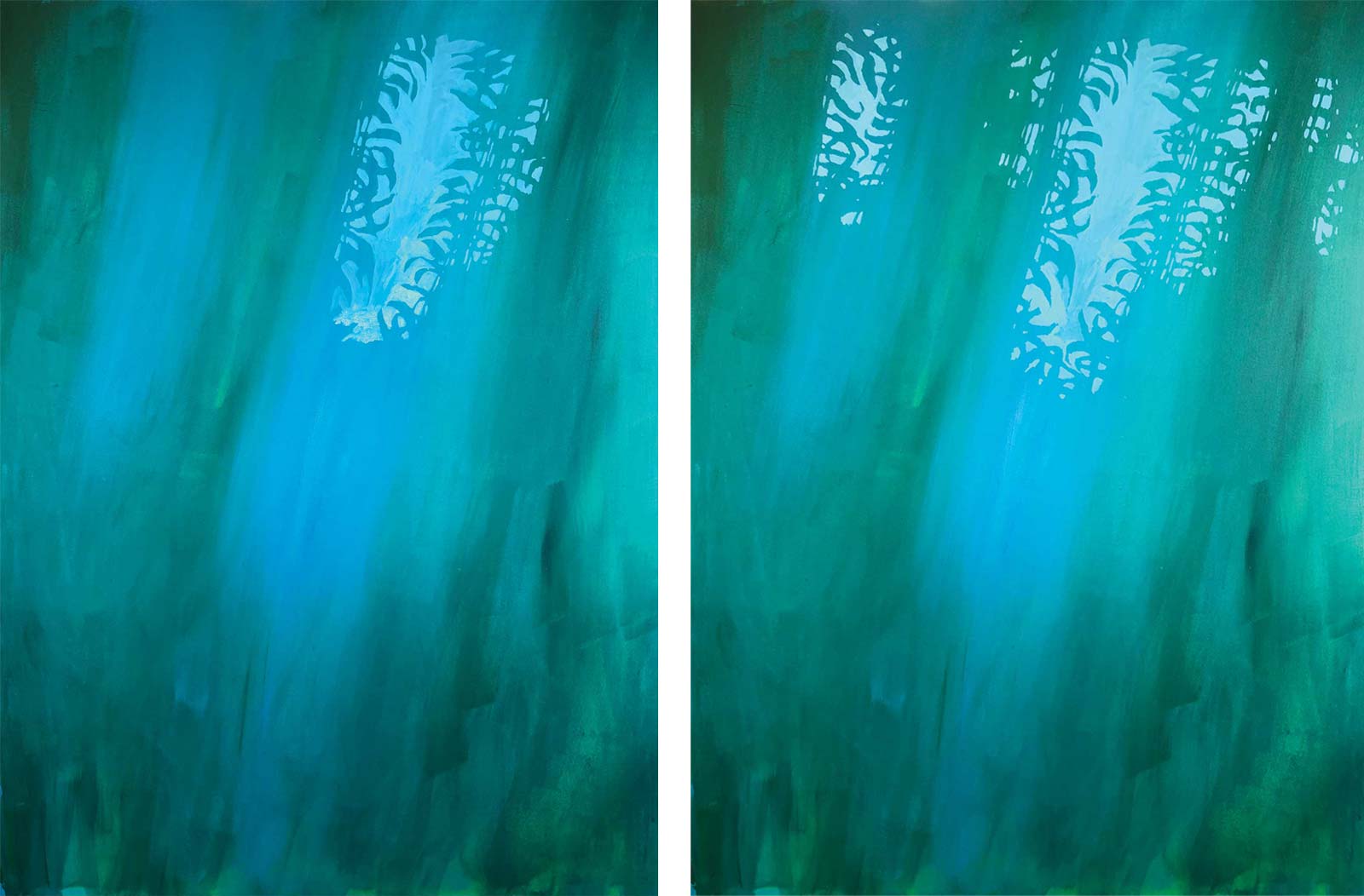
Stage 4 Negative Spaces Continued
Painting the holes between the kelp leaves can be a bit tricky at first. I have done dozens of similar paintings and now work comfortably from memory, but in the early days a few good photo references were very handy to accurately establish this layer.
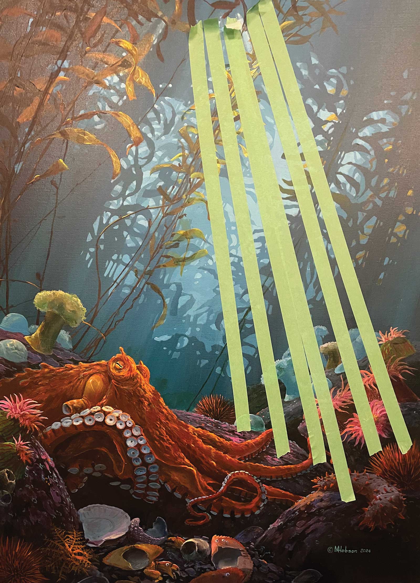
Here is a different but similar work showing the radiating strips of masking tape set in place prior to the sponge application.
 Stage 5
Stage 5 Setting Up the Light Rays
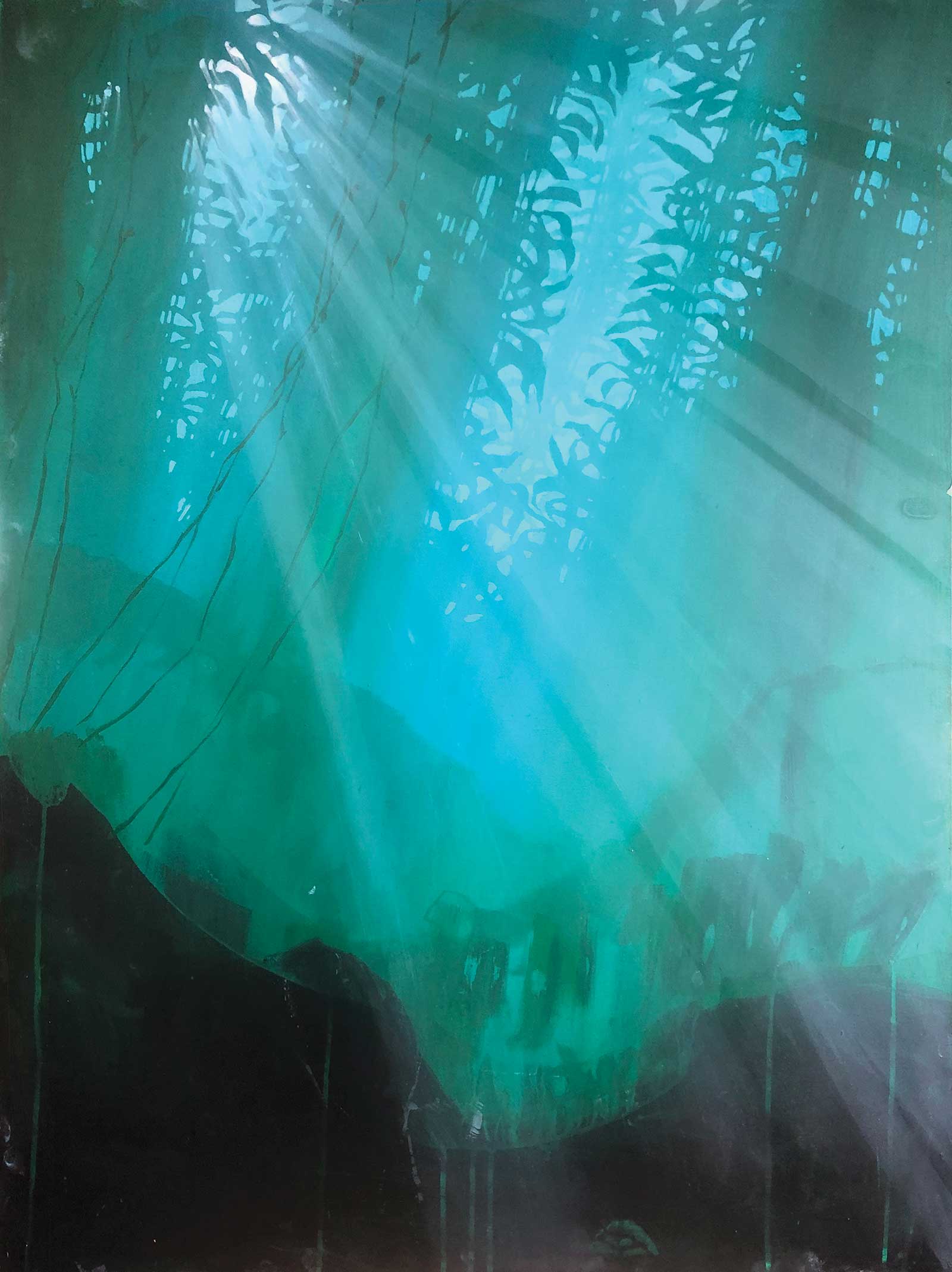
Even in winter when the northern ocean is at its clearest there is particulate matter in the water column. On a sunny day there are always light rays streaming down from the surface. The rays give the underwater scene a sense of authenticity. I use multiple strips of masking tape to set up the pattern since the slightest deviation from a straight line makes the rays instantly look off. Once the tape is in place, I lay the canvas flat and with a sponge loaded with a dilute mixture of the lightest of my background colors I quickly run the sponge over the radiating tape. While the paint is still tacky, I remove the tape and run my finger gently along the edge of each ray to soften the sharp edge and bleeding left by the tape. When the rays are dry the sunlight source through the kelp in the top left corner is carefully painted using progressively more white close to the surface opening.
 stage 6
Stage 6 Blocking In
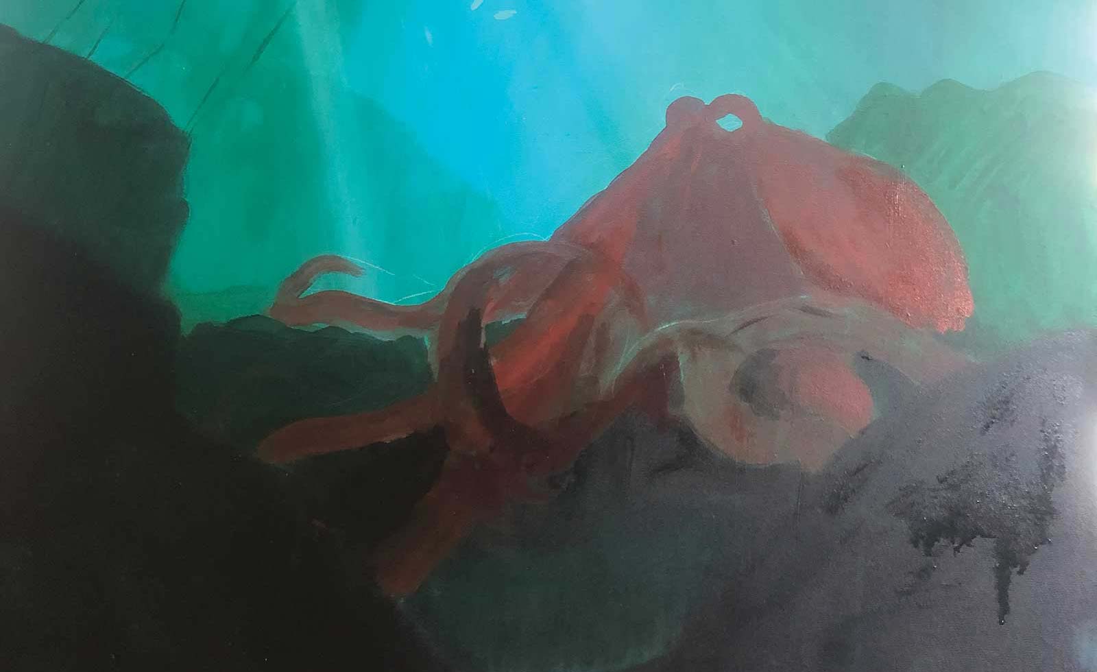
Starting with the most distant shapes, the background layers of rocks are roughed in using greens that are progressively darker as they come forward with the immediate foreground being painted in black. The octopus is also roughed in. I have numerous reference photos from many sources, but for the most part, I work from memory at this stage. The shapes of the tentacles against the black rocks will be easy to adjust if required. I am much more careful with the shapes that cross over the pale green background. Acrylic paint is notorious for shifting color as it dries, and patching a mistake in the blended background will be very tricky to accomplish.
Color Swatches
Varying values of phthalo turquoise, phthalo cerulean blue, and phthalo green mixed with white.
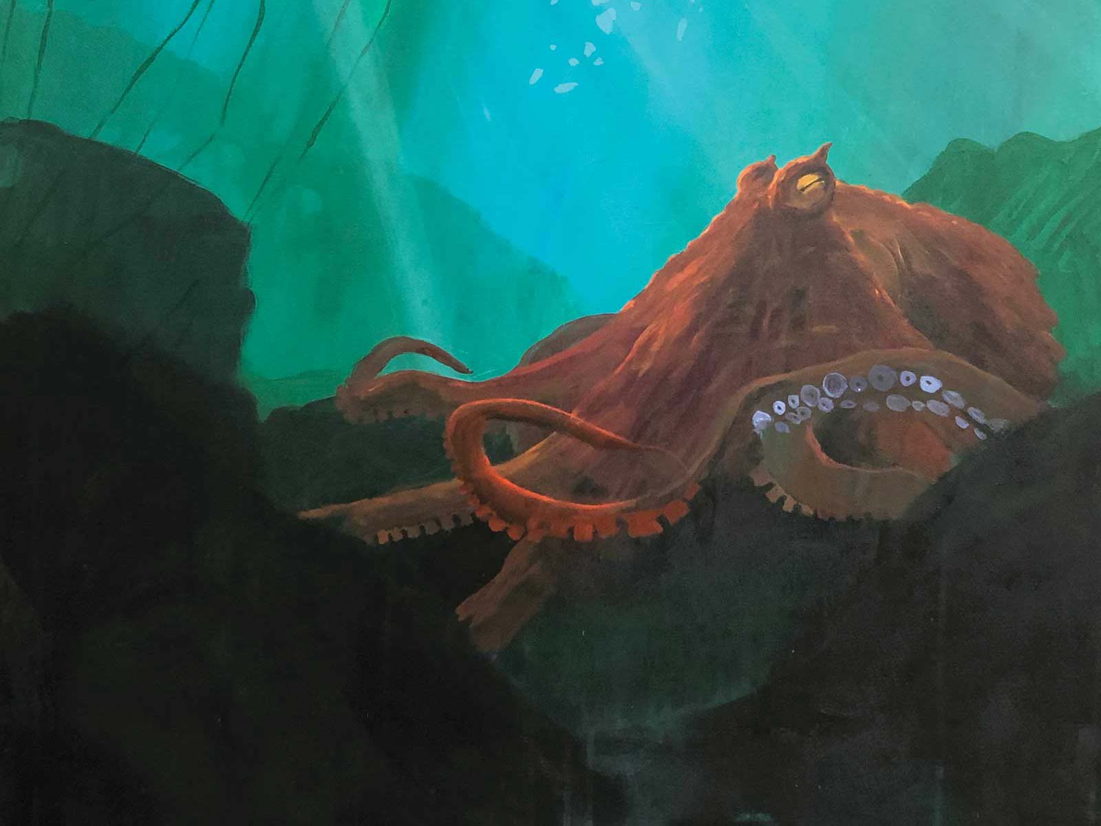 Stage 7
Stage 7 The Octopus
I am taking some liberties in painting the octopus red. In truth, if it were hunting crabs it would be beautifully camouflaged. When slightly disturbed Pacific octopus turn red, and they are most often photographed like this. The red color makes for a much more interesting painting, complementing the blues and greens of the kelp forest.
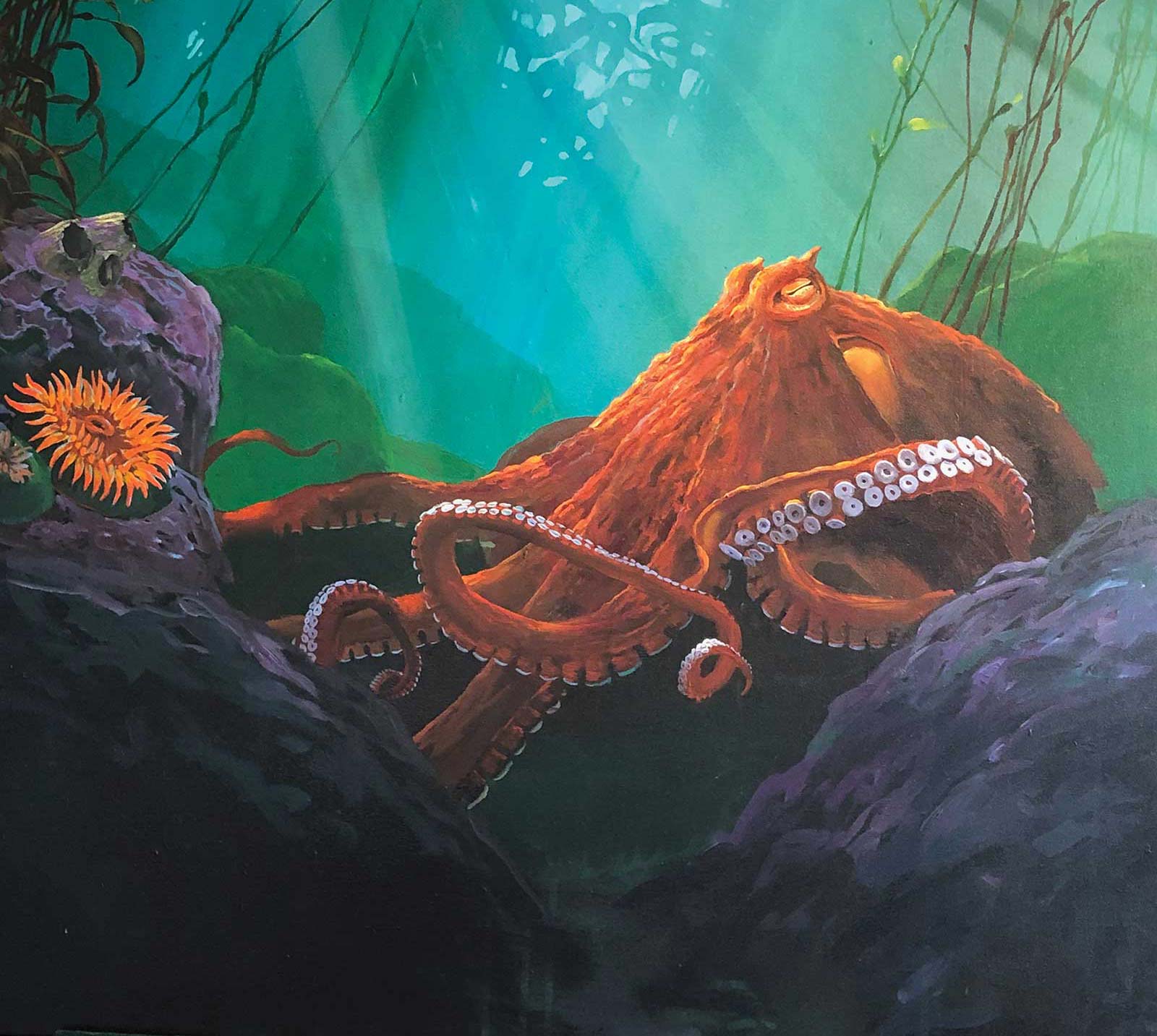 Stage 8
Stage 8 Painting the Details
The suckers of the octopus are the brightest white in the scene and thus become a point of interest along with the octopus’ eye. Arranging these two points of interest fairly close together is a crucial step in the composition. The dominant tentacle was thus moved slightly closer to the eye before I started filling in the details of the suckers. Another layer of kelp fronds was added, golden brown for those in the sun and darker for those in the shadows, adding a bit more depth to the overall scene.
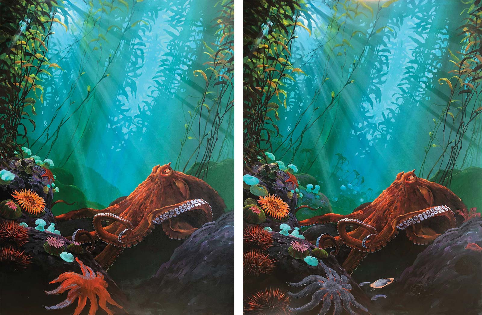 Stage 9
Stage 9 Further Refining the Details
Being righthanded, I started the slow addition of marine organisms on the left and worked across to the right. References for these are from a wide source including marine textbooks, postcards, magazine articles, calendars and actual specimens, but to a large extent I am working from previous experience and memory. The planning at this stage is done rather haphazardly based on color and shape, but there is always the voice of the marine biologist making sure that each creature is located in the correct habitat and at the correct depth.
In addition to the foreground creatures, an intermediate distant layer was created to give a feeling of depth. Getting the correct colors for this is always challenging. The tiniest variation can throw off the aerial perspective, and trying not to disturb the light ray traveling across this little section takes caution.
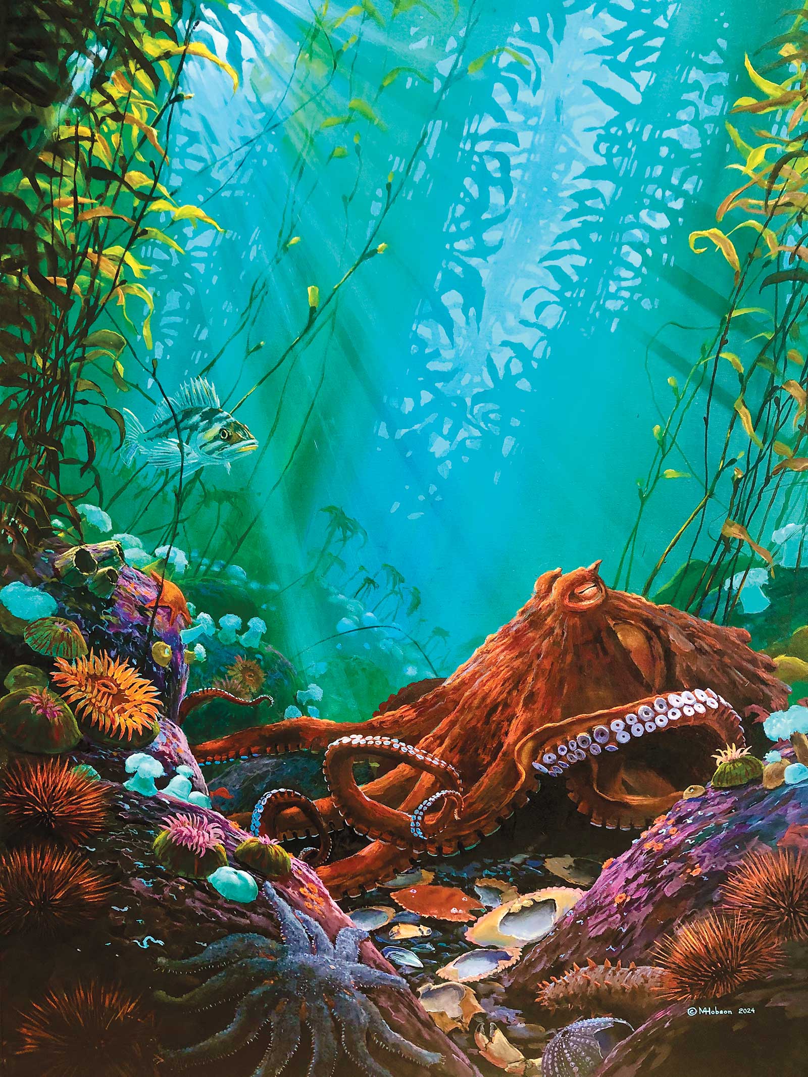 Stage 10
Stage 10 Finished Artwork
Octopus: Flowing Through the Kelp Bed, acrylic on canvas, 48 x 36" (121 x 91 cm) I added the copper rockfish for interest, but the most important step now was to adjust the lighting. The rippling light patterns that come through water at this depth are not very strong, but even so, the octopus got a few touch-ups—a darkening here and lightening there. Vital to the overall scheme is now to add and subtract light to make sure the viewer’s eye travels in a coherent way through the composition. Using a dilute glaze of transparent burnt orange and phthalo blue, I created shadows over much of the foreground, trying to keep the viewer’s eye from being distracted by bright contrasts near the edges of the frame.