


Gouache is an ancient medium that has recently regained popularity. It appeals to many because of its versatility and ease of setup. I love its simplicity as a water-based medium, and it allows me to paint much like I do with oils. It also has a beautiful, velvety matte finish when dry. One of the key advantages is the ability to paint in opaque layers and reactivate dry paint with water for blending. I use gouache for my daily painting practice and to break through creative blocks. Shaking up my routine with gouache helps me avoid falling into a stagnant, repetitive process.
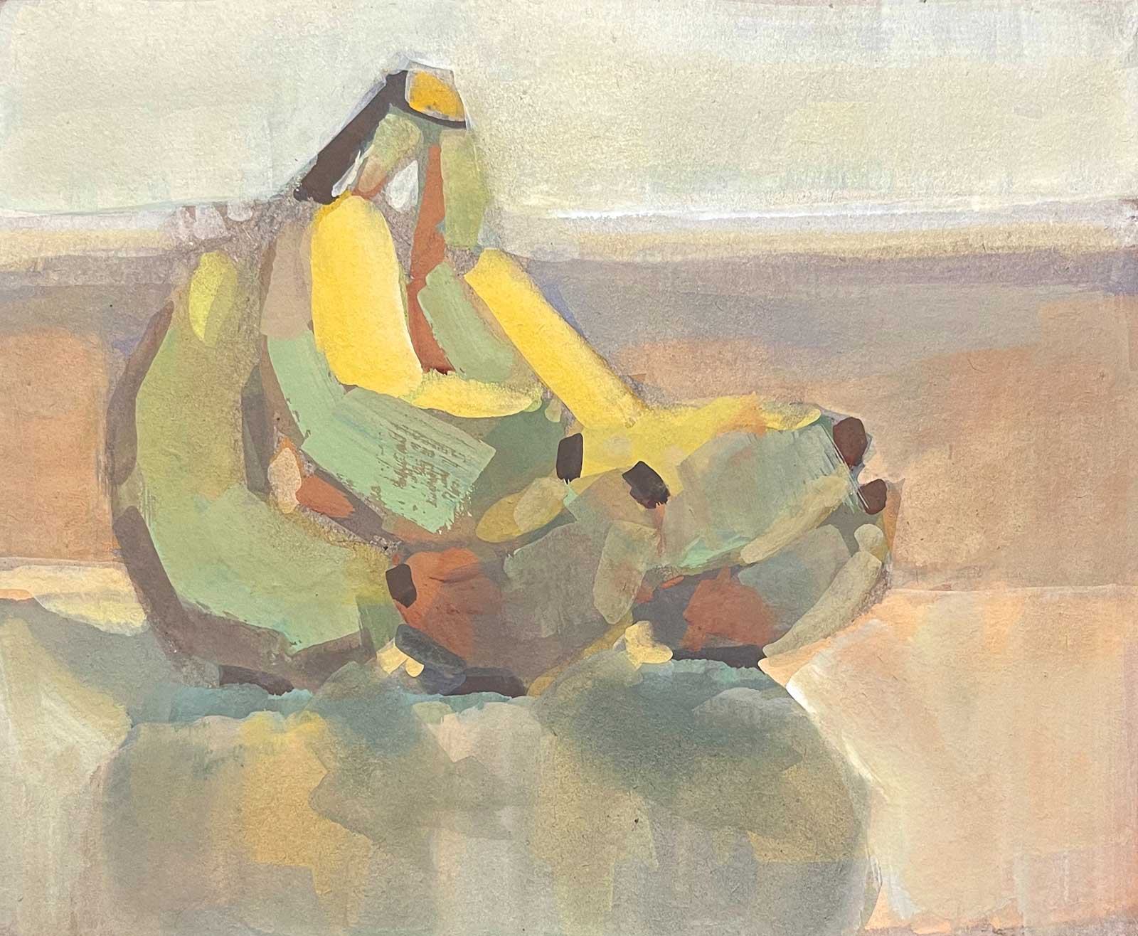
Colorful Bananas, gouache, 4 x 5” (10 x 12 cm)
When painting with gouache my main focus is always on composition and design. For me, design refers to the value structure: the pattern of light and dark I see when I squint at my subject. This always takes priority over color and detail because it’s the value structure that first captures a viewer’s attention. I constantly remind myself that I’m a “shape maker,” not a “subject painter.”
Once I’ve established a strong composition, I begin by painting flat layers of basic shapes, focusing on their color while maintaining the value structure. From there, I think in layers. This is where gouache really shines—nothing is permanent! If the color or value isn’t right, I can simply paint over it. There’s no pressure to get it perfect on the first pass, which keeps the process loose and enjoyable. I am able to play with the paint knowing that I can change anything at any time.
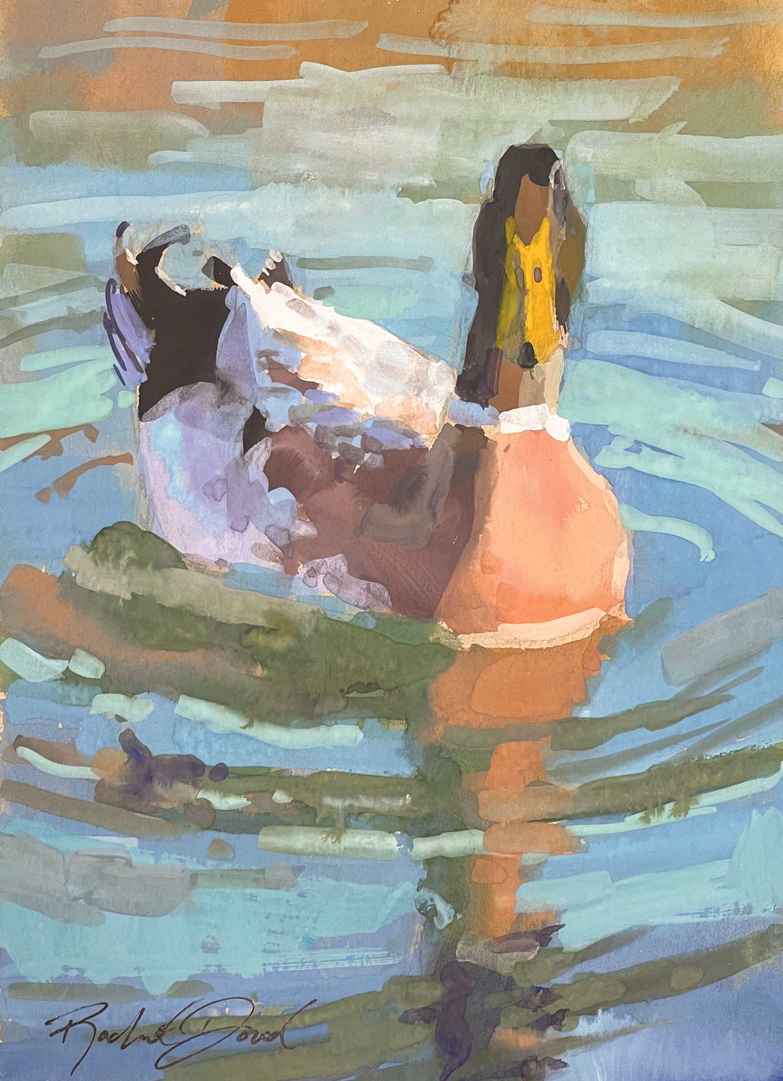
Commader, gouache, 7 x 5” (17 x 12 cm)
As I build up layers, the overlapping shapes create a sense of movement and vibrancy in the painting. I work from large shapes down to smaller ones, saving tiny details for the focal point—the area I want to draw the viewer’s eye to. The rest of the painting is left more ambiguous because I want to invite the viewer to fill in the details with their own imagination.
I encourage every artist to give gouache a try. It can help you break through creative blocks, ignite new inspiration, challenge your techniques and introduce you to a medium you might fall in love with.
My Art in the Making Summer’s Supersweets
 Stage 1
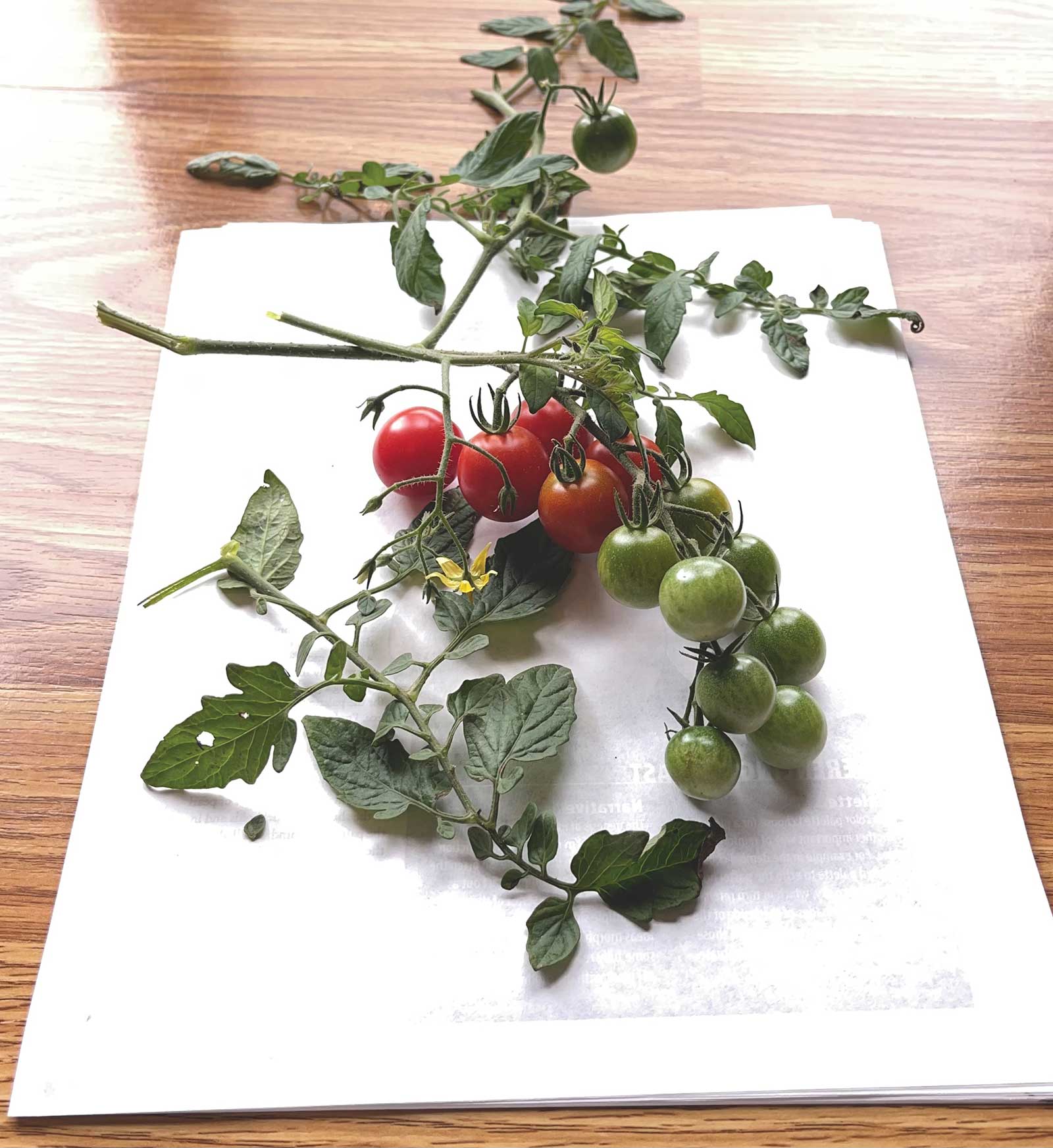
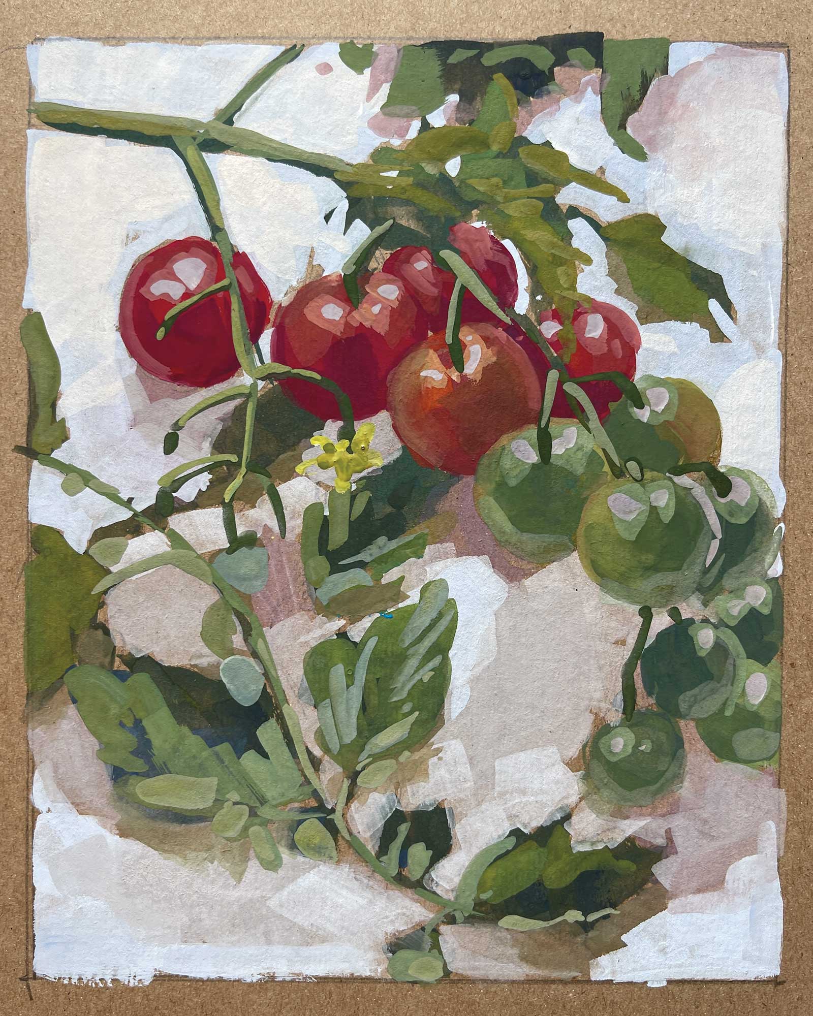
Stage 1 Painting from Life
I nearly always paint from life, often setting up my own still life or heading outdoors for a plein air session. I’m drawn to the richness of values and colors that only real life offers. I do work from photos occasionally though, especially during the colder months of the year. In this case I clipped off a branch of tomatoes that were growing in my garden and placed them on a white piece of paper to accentuate the graphic design the leaves were making. I considered their shape and movement and tried to arrange them in a natural and balanced way.
WHAT THE ARTIST USED
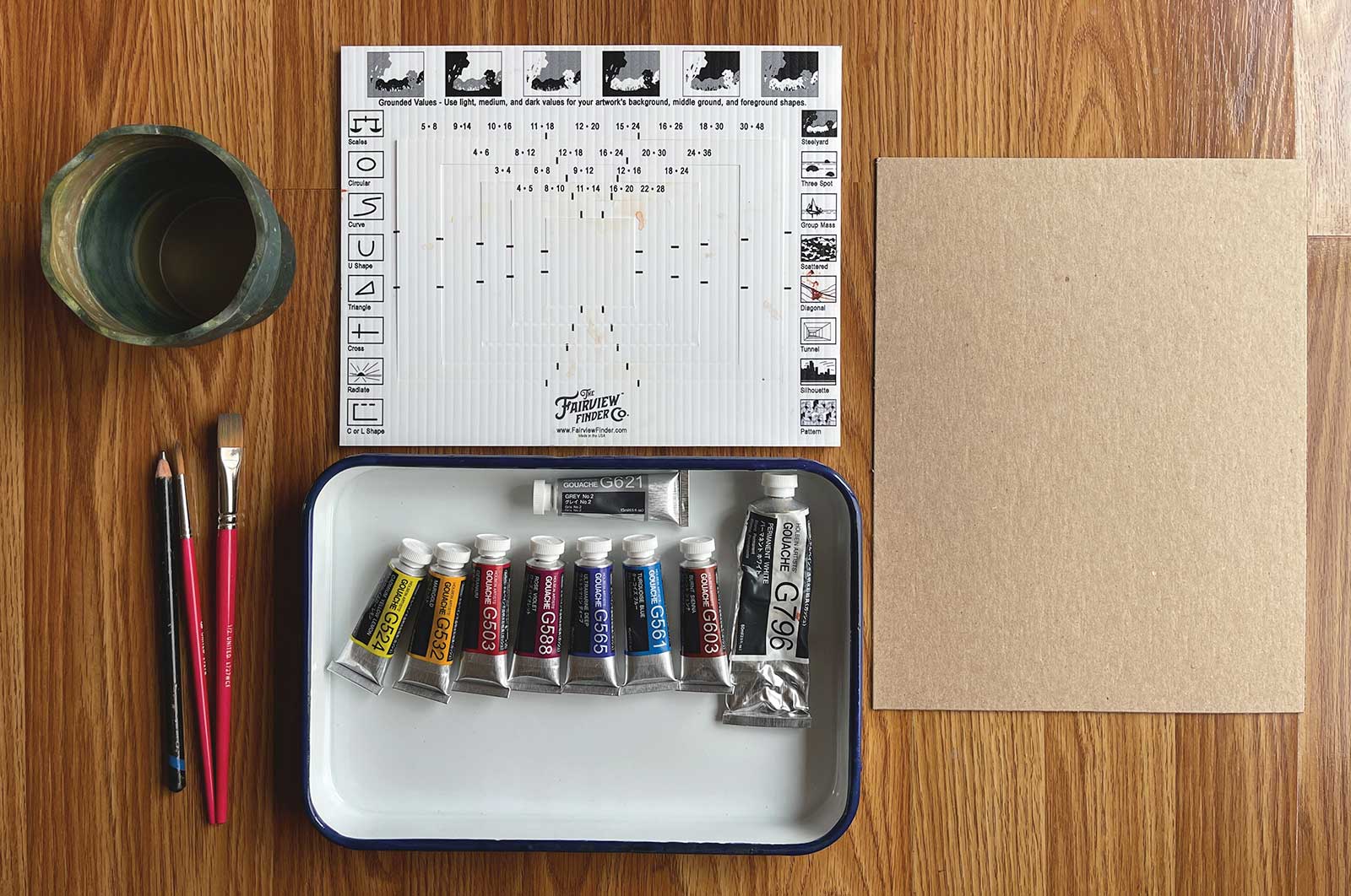
Holbein Artists’ Gouache
Cadmium yellow lemon, Marigold, Geranium, Rose violet, Ultramarine deep, Turquoise blue, Burnt sienna, Grey no. 2, Permanent white
Additional Materials
Heavy-weight chipboard 50pt, Enamel butcher tray palette, The Fairview Finder viewfinder, Collapsible water cup, 2B pencil, ½” flat synthetic sable brush, Round synthetic sable brush, size 6, Paper towel, Ruler
 Stage 2
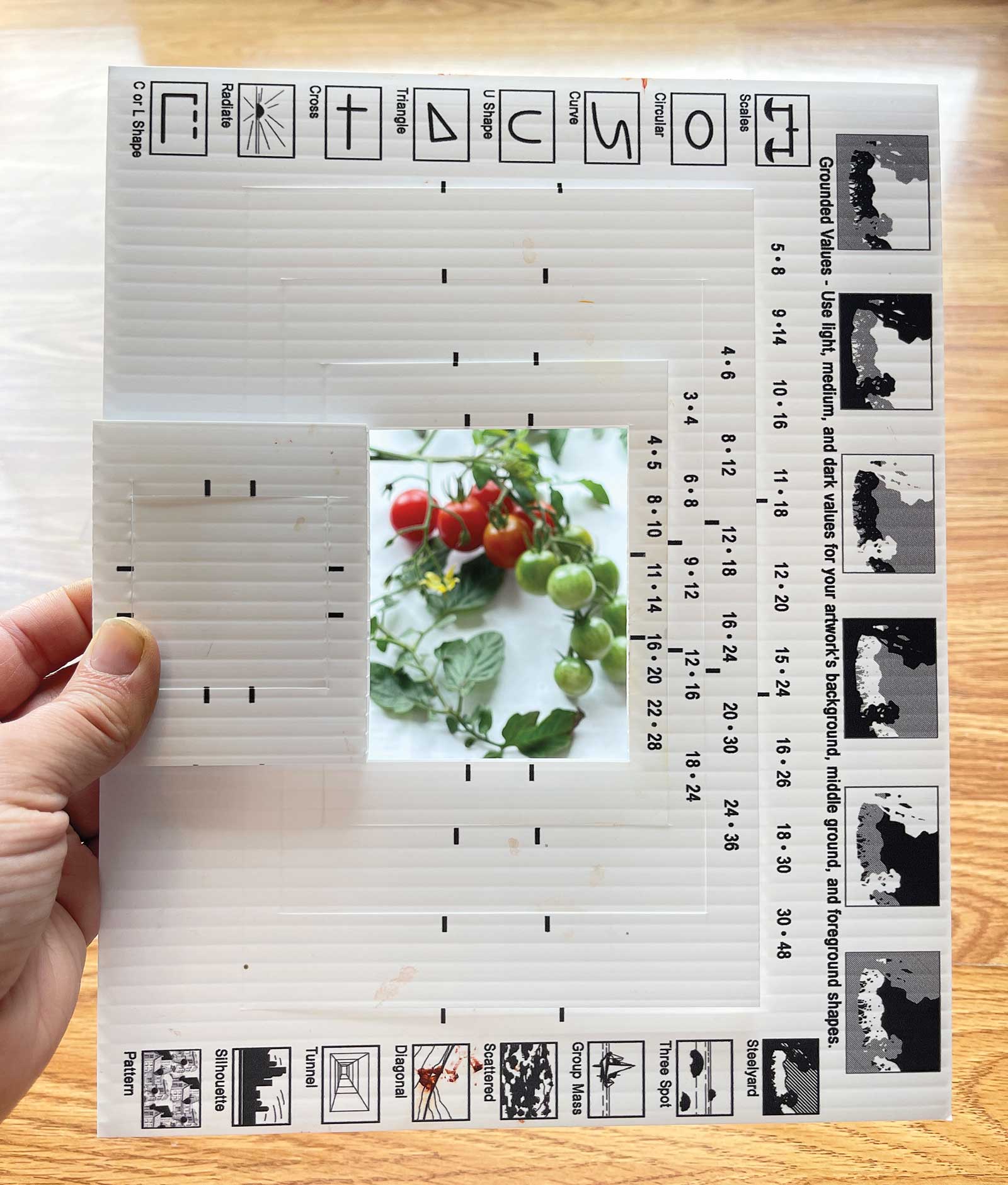
Stage 2 Viewfinder
Using a viewfinder, I moved my subject and finder around until I settled on a pleasing composition. I was squinting my eyes a lot at this step to keep me from focusing on the details and only seeing the shapes.
 Stage 3
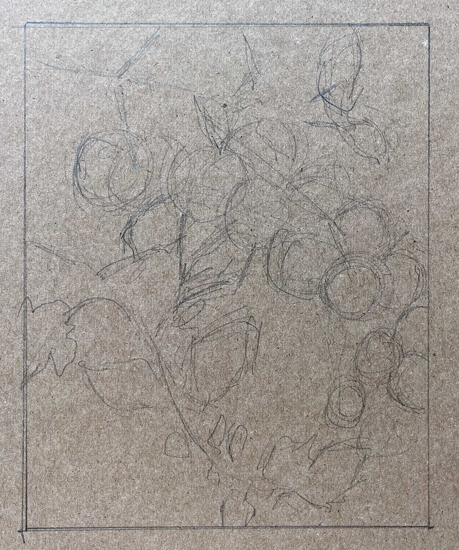
Stage 3 Loose Sketch
I drew the edges of my format. In this case it was 6 by 8”. Then I loosely sketched out the very basic placement of my subject in pencil. No details or specifics. If I was too detailed in the sketch then I would be tempted to be detailed in my painting, and I wanted my painting to be as loose as possible.
 Stage 4
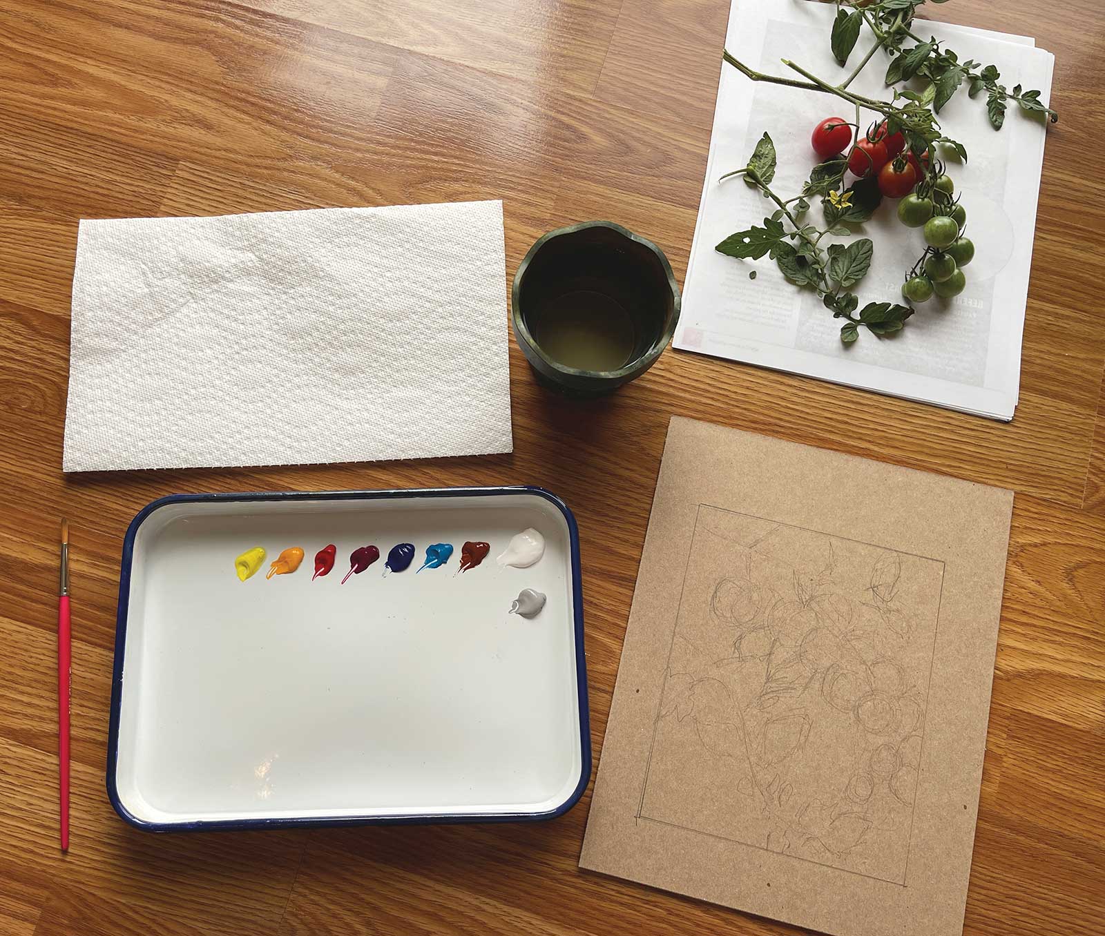
Stage 4 Preparing the Paint
I squeezed out my gouache paint onto my palette. I always do this right before I start so the paint is as fresh as possible and hasn’t dried out at all. For professional quality gouache, a little goes a long way so only a small amount is necessary, but I’m not afraid of squeezing out more paint if I need it. I also brought some clean water and a paper towel to my work area. I was painting this sitting on the floor because the light coming in from my back door was so beautiful.
 Stage 5
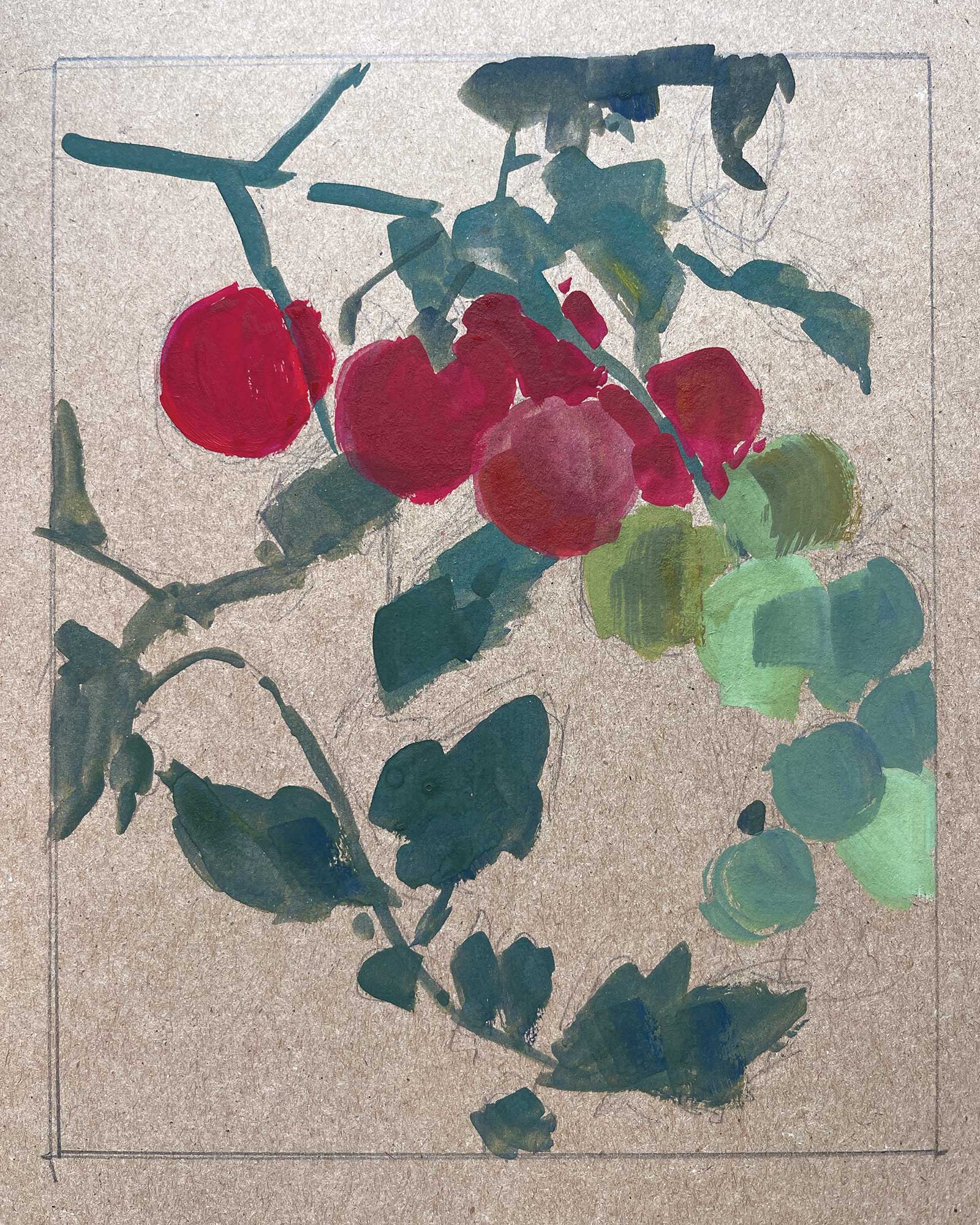
Stage 5 Basic Shapes
By squinting to reduce the light and detail, I concentrated on the large shapes. I asked myself, “What is the color and value of that shape?” and compared it to the surrounding shapes. Is it warmer or cooler, lighter or darker in relation to the one next to it? I scooped up thick paint and used as little water as I could get away with. If you water down gouache too much it can look more like watercolor. (And sometimes that’s exactly what you are looking for.) At this point though, I wanted opaque paint and if I did need to make the paint flow better then I would dip just the tip of my brush into the water.
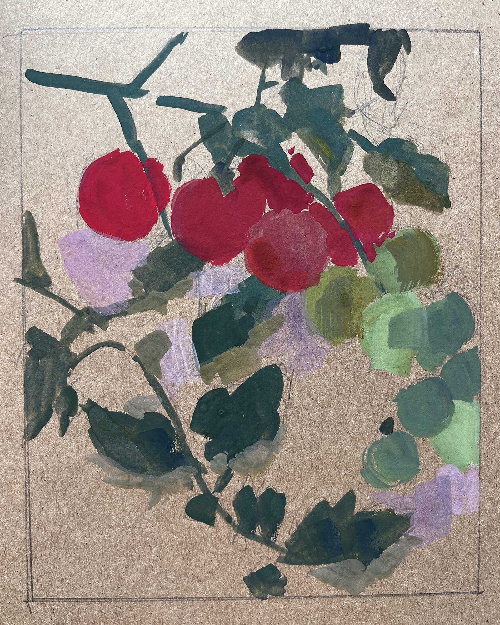 Stage 6
Stage 6 Starting on the Background
I then turned my attention to the background and kept the shapes simple. I wanted to lay in the shadow shapes and the light shapes. Here, I’ve blocked in the strong shadow shapes very loosely. I wasn’t worried at all about their exact placement because I could always paint over them.
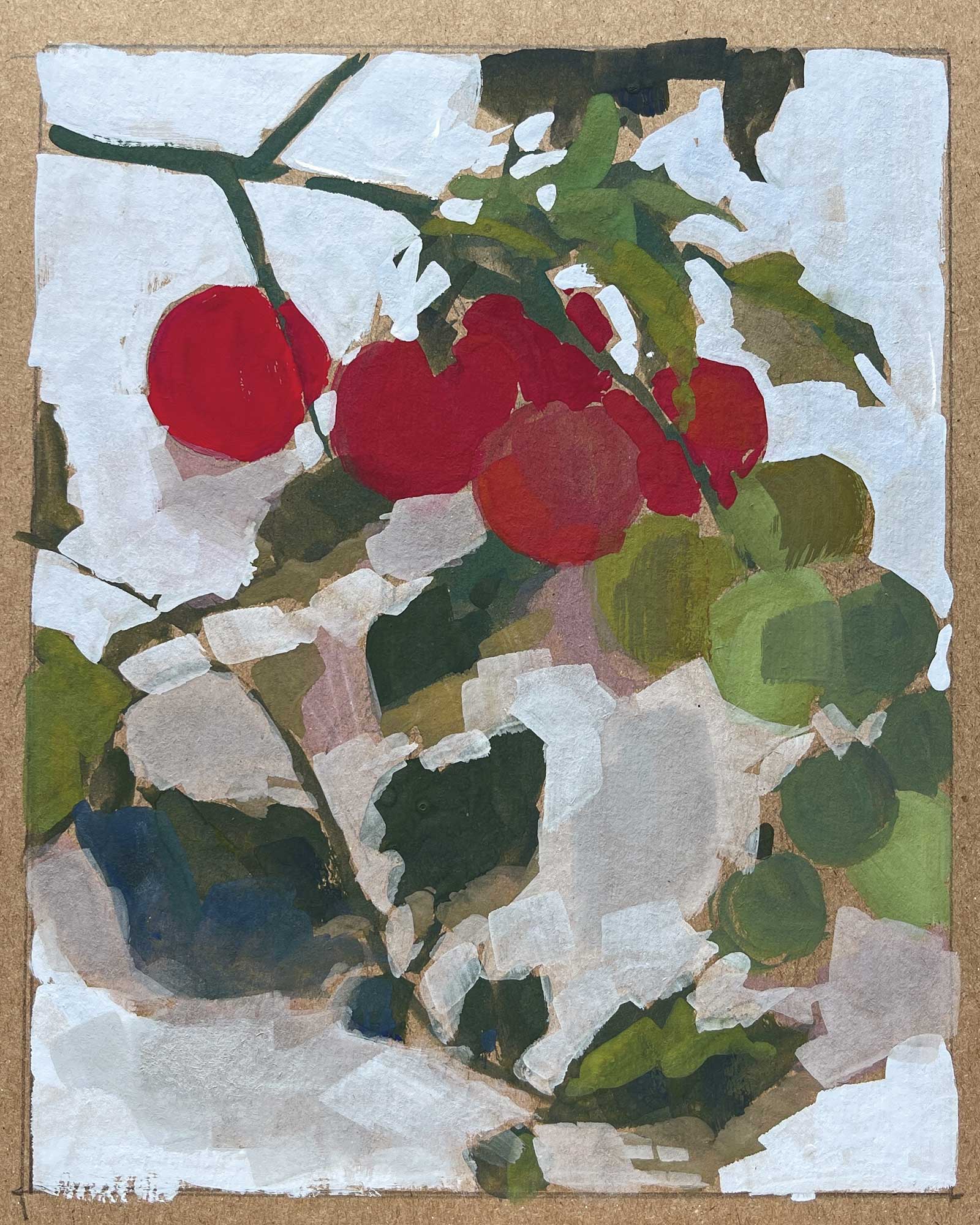 Stage 7
Stage 7 Light Shapes and Temperature Shifts
This looks like a big jump but it really isn’t that much work. I laid in the light shapes in the background, and I varied my brushstrokes and the temperature of the white color slightly to interject some movement and variety. I also suggested some of the lighter shadow shapes. There were a lot of these subtle shadows because of the diffused light from the cloudy day coming in through the window. Remember to squint, squint, squint!
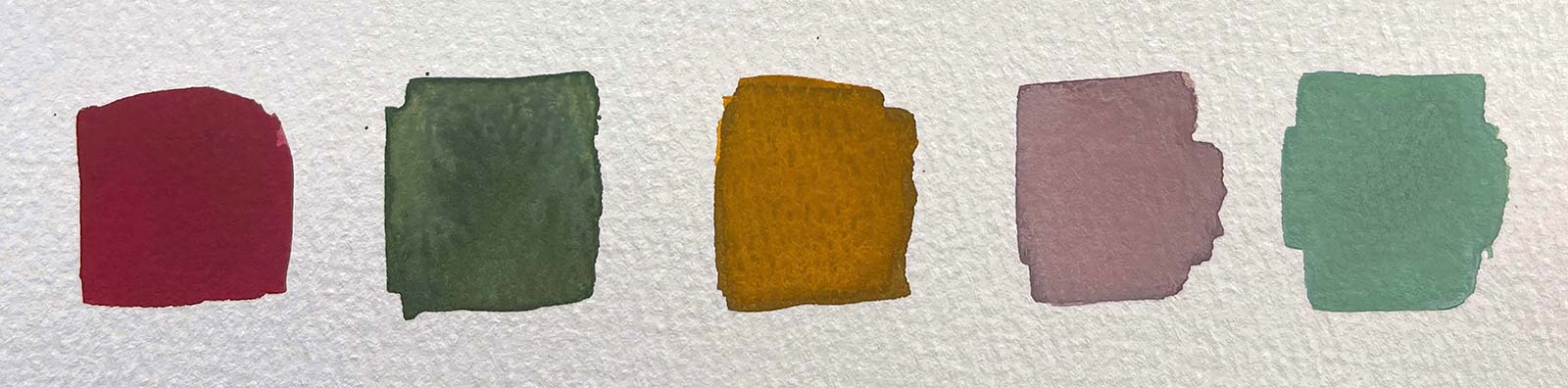
Color swatches (from top down)
Shadow side of tomatoes
Geranium, Burnt sienna, Ultramarine blue deep
Shadow side of green tomatoes
Ultramarine blue deep, Turquoise blue, Burnt sienna, Geranium, Cadmium yellow lemon
Yellow-green on tomato leaves
Ultramarine blue deep, Marigold
Yellow-green on tomato leaves
Ultramarine blue deep, Marigold
Shadow shapes in background
Ultramarine blue deep, Burnt sienna, White
Light side of green tomatoes
Turquoise blue, Cadmium lemon yellow, Burnt sienna White
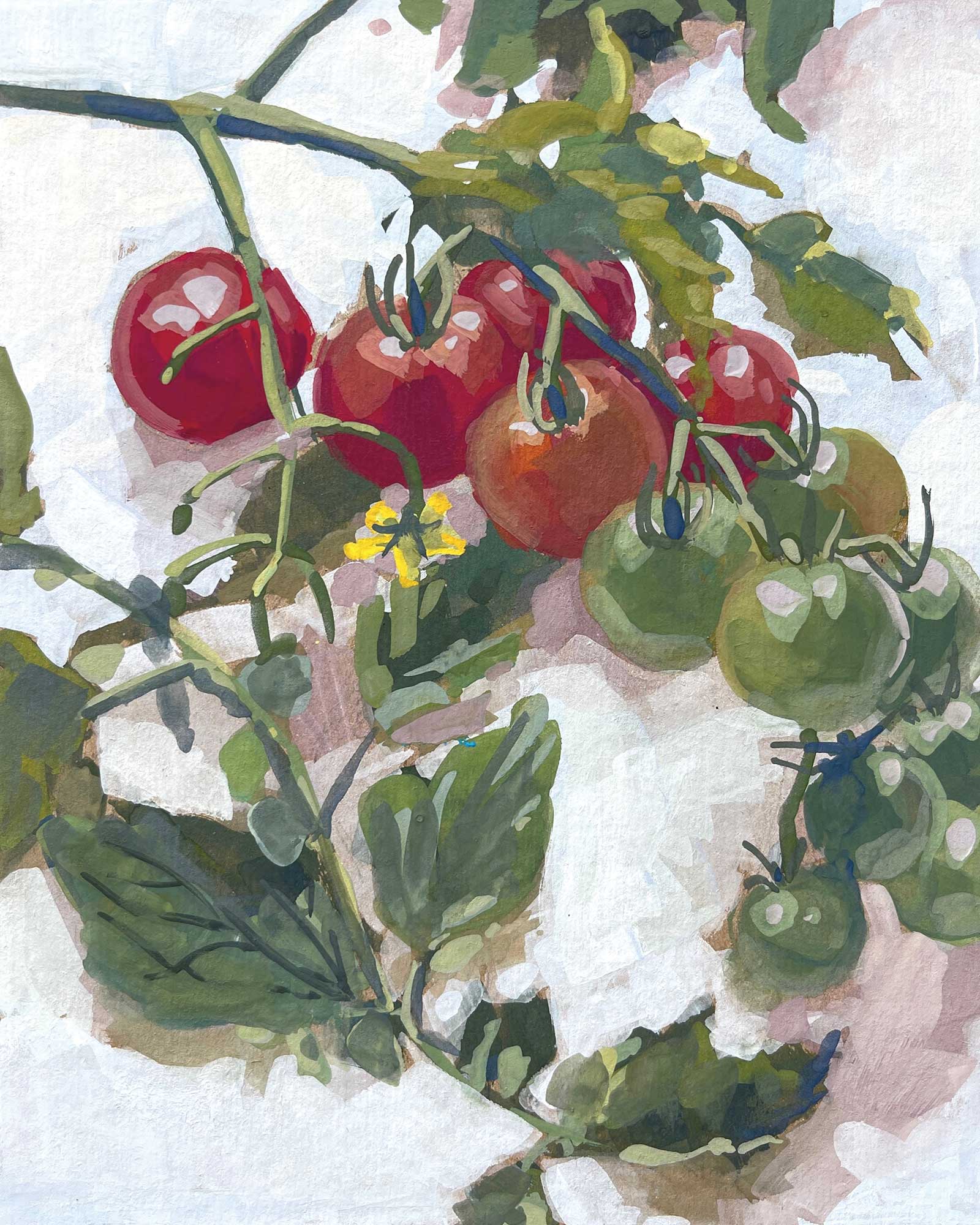
 Stage 8
Stage 8 smaller Shapes
Moving on to smaller shapes, I added more information to the leaves and stems. I was trying to be as loose as possible to capture their movement and character. I was not a slave to the scene and I didn’t paint every little thing. I also incorporated some warmer whites into areas of the background because I felt like the painting needed to be warmed up a little even though it wasn’t warm at all in real life. This is an example of where you can change something in the scene even if it’s not there to make a better painting. I moved on to the tomatoes and added shadow shapes, the lighter shapes, color temperature shifts and reflected light.
 Stage 9
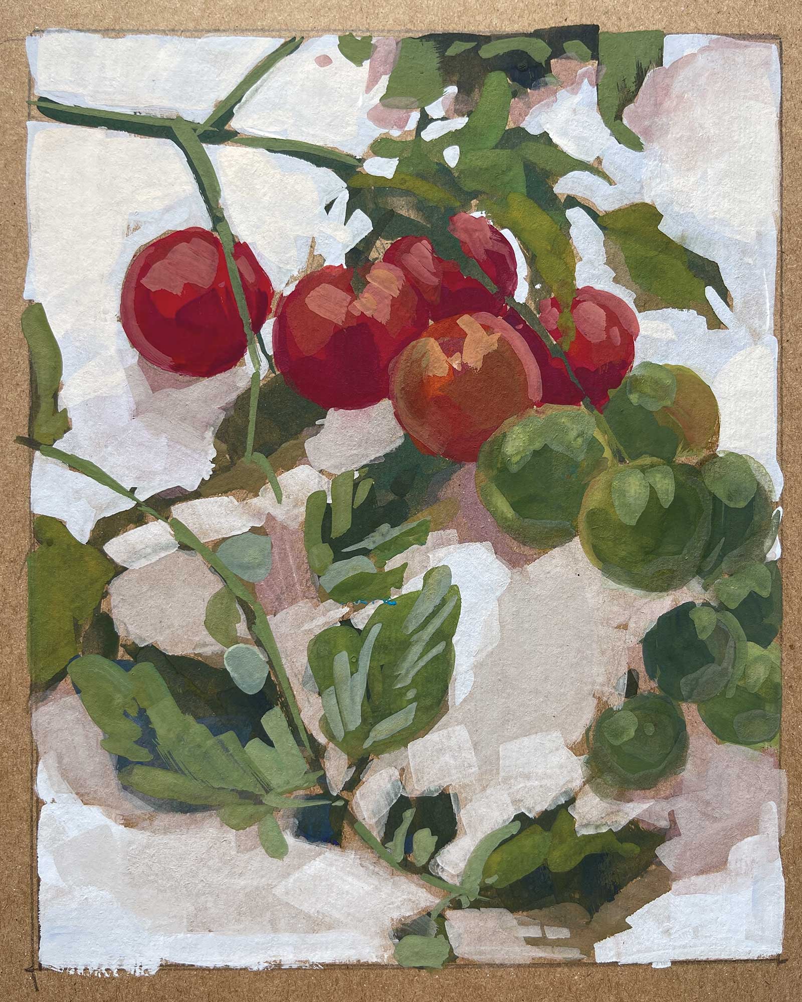
Stage 9 The Details
My attention shifted to the details and I started placing tiny highlights, finer stems and flowers into the painting. Paint the details sparingly, the viewer doesn’t need everything spelled out for them.
 Stage 10
Stage 10 Finished Artwork
Summer’s Supersweets, gouache, 6 x 8” (15 x 20 cm) The final step in my painting revolved around the smallest of the details like the little leaves coming out the top of the tomatoes. It’s in this step that I’ll often use some thin, watercolor-like washes to push the color, temperature or value in a couple spots. I also step back from my work, try not to look at the reference, and ask myself what else the painting needs. I may add or take away something, even if it’s not in the scene, to make the painting better.
About the artist
 Rachel Dowd
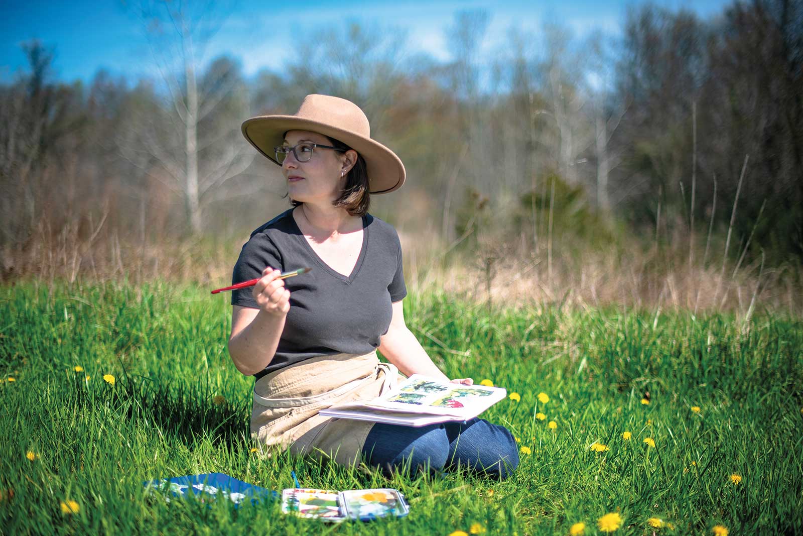
Rachel Dowd is an impressionist painter based in Indiana who celebrates the beauty of daily life through her work. Her oil and gouache paintings are characterized by minimal brushstrokes and a “less is more” approach, focusing on light and the emotional textures of everyday life. She is inspired by Russian impressionism, contemporary impressionism and the simple joys of home and nature. Her paintings invite viewers to appreciate the beauty of the ordinary and encourage them to take a moment to savor life’s quiet moments. Dowd also shares her passion through teaching and hopes to inspire others to cultivate their own creativity.
Represented by
Gallery 02, Indiana, USA, fwgallery02.com