



Rainy Paris Evening, which I will be demonstrating in the following pages, is part of a recent series of memory travel paintings. Years ago I might not have tried to paint from such a blurry, “bad” photo, but I’ve learned that evoking the feelings and memories of places are even more important than the details in my photo references. So sometimes having incomplete information can work to my advantage.
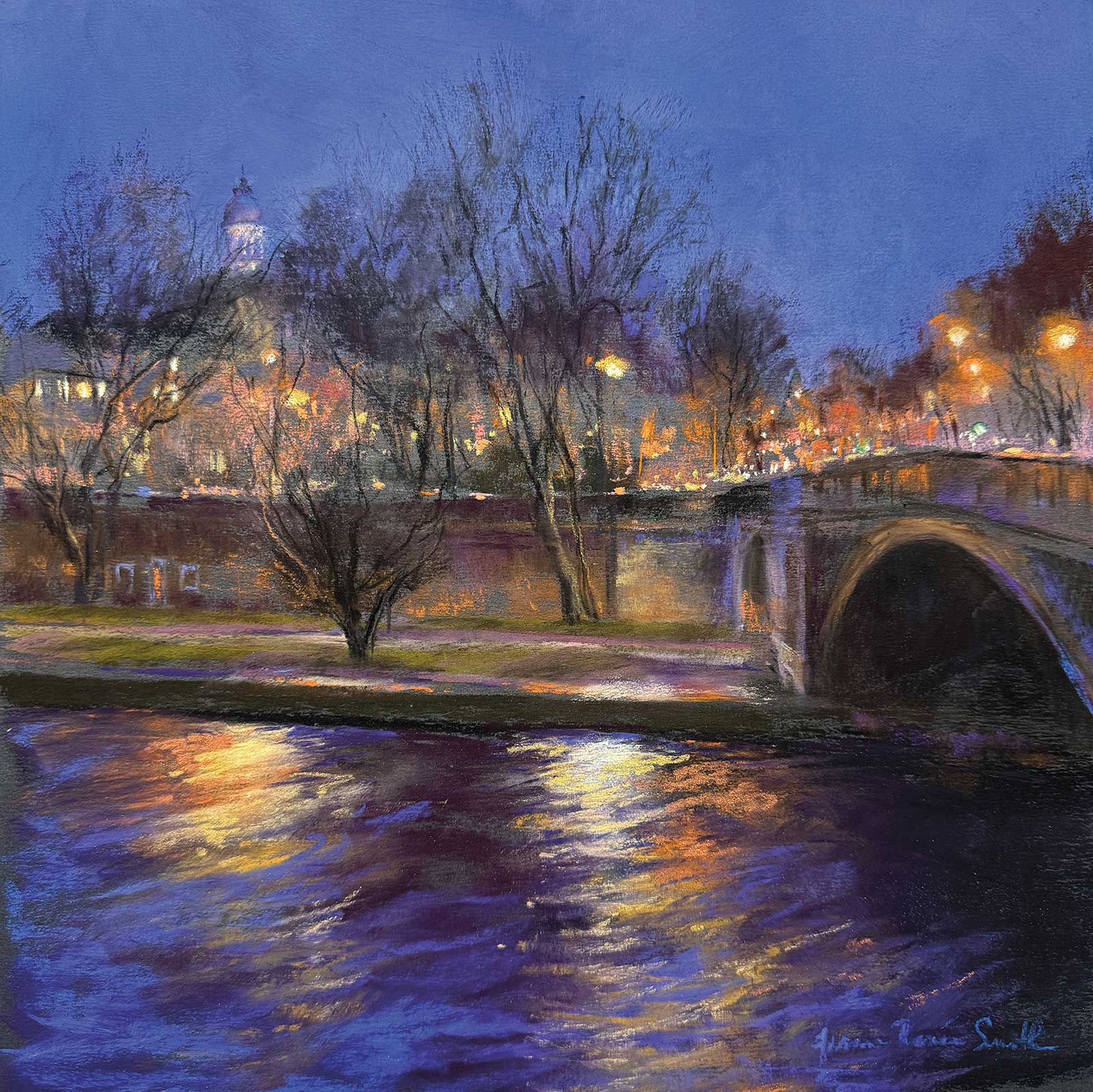
Pont de Sully from Ile St Louis, pastel, 12 x 12" (30 x 30 cm)
I visited Paris in January a few years ago. The city was at its most beautiful during the long dark evening hours when the street lights glowed along the damp streets. Three basic approaches helped contribute to this painting coming together. First is my clarity of intention, which is to engage the senses. Even though a painting is a visual object, my aim is always to create a full sensory experience, an impression of the surrounding city sounds, the feel of breezy ocean air or even the bright taste of champagne on the tongue to engage all the viewer’s senses. In Rainy Evening, the suggestion of distant traffic, the scrape of a woman’s boots on the damp pavement, the blinking lights and cold mist in the air all come into play and are more important than exact details.
Second, my strategic goal is always to make things as simple for myself as possible. This includes choosing the best surface for each painting, in this case, a sheet of Pastelmat in wine. I also aim to simplify shapes where possible and include detail only where necessary. Since I often work from photos, it’s vital to reframe the photo as just one contributing tool, along with my sketch, my memory and my intention, rather than let it direct my choices.
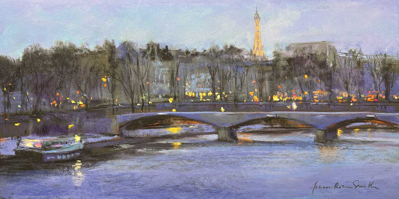
Glitter on the Seine, pastel, 8 x 16" (20 x 40 cm)
Third, during the painting process I let the painting talk back and I listen. This means that when something’s not quite working, I step back, reconsider, and in some cases, dare to make changes. Pastel is a flexible and forgiving medium, allowing changes when needed. Continue reading to see how this painting taught me something new.
My Art in the Making Rainy Paris Evening
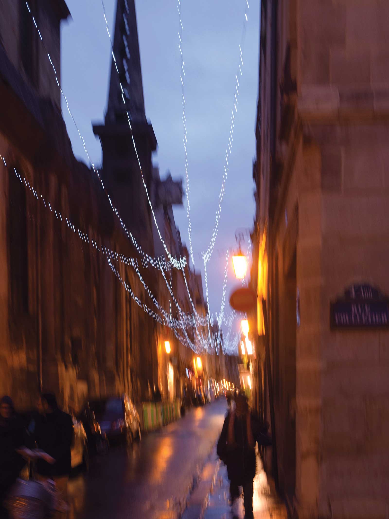 Reference photo
Reference photos are great, but they usually tell us both too much and not enough. I appreciate how photos can bring me back to a place and time— but remembering and including other sensory information, such as how I felt, what I heard, what the air was like, is essential. This is why I insist on using my own photos. The visual is only part of the story. Most photos also contain too many details and too much information. (This one is an exception; it was so blurry I nearly overlooked it). Knowing what we want to express when choosing a reference makes the job easier. Eliminating detail gets easier when your reason for painting is clear.
 Stage 1
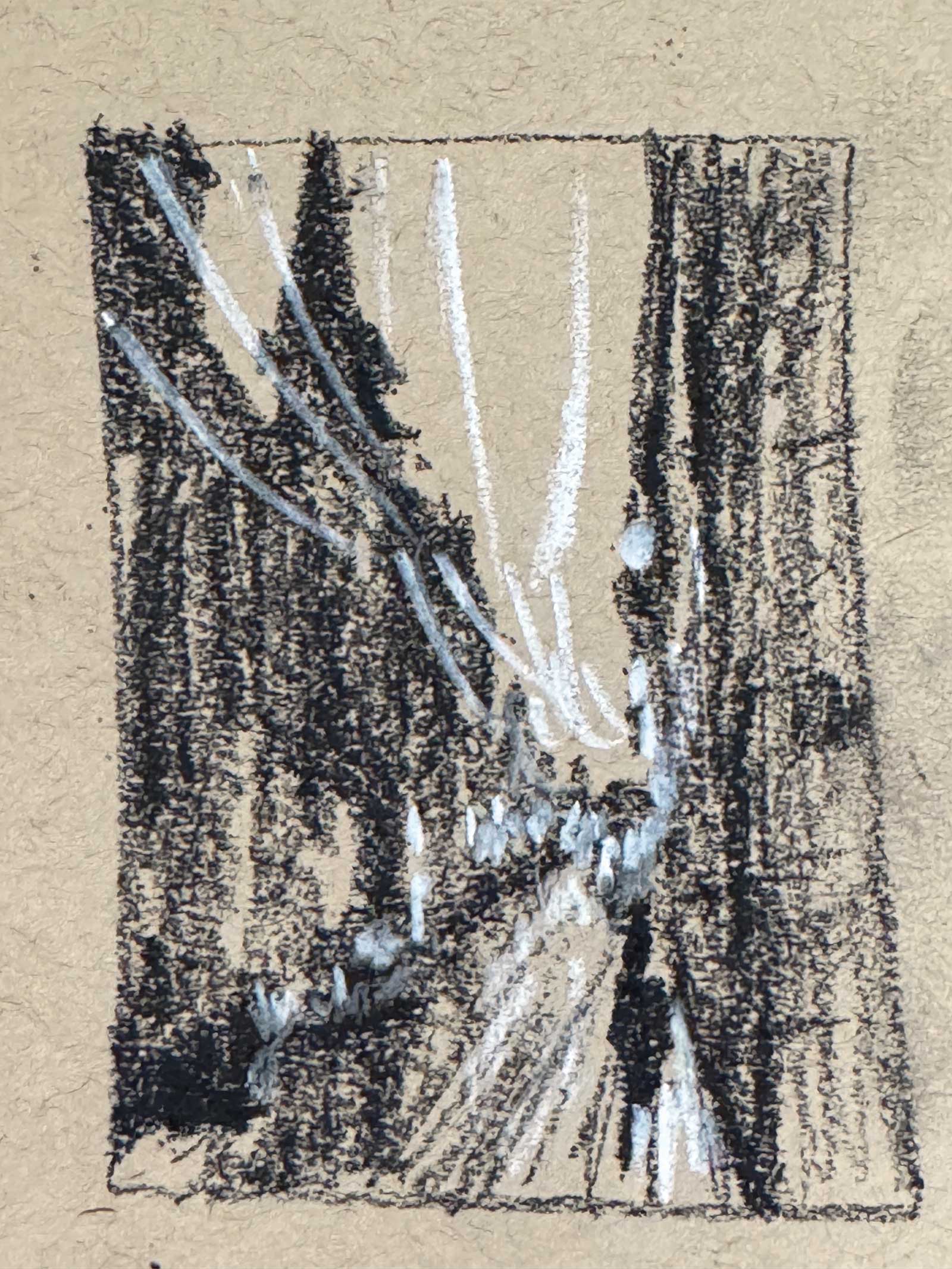
Stage 1 Thumbnail Sketch
With black and white General’s charcoal pencils on Strathmore toned paper, I sketch a small abstracted value design based on my reference photo. Even though I am not changing anything significant from my photo, this sketch step is essential, forcing me to clarify the value relationships among the large shapes.
WHAT THE ARTIST USED
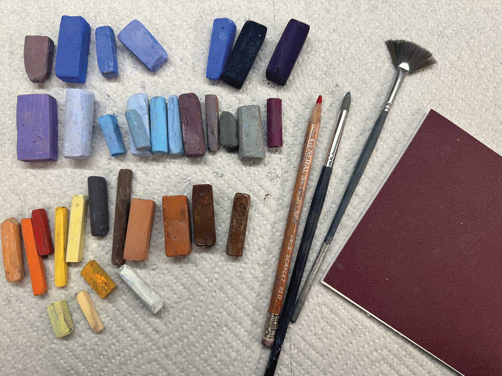
Pastels in Assorted Colors and Brands
Terry Ludwig, Roché, Pastels Girault, Rembrandt, Earthberry, Richeson Handrolled, Pastel pencil in scarlet red
Additional Materials
Pastelmat by Clairfontaine in wine, 8 x 6", Color shaper blending tool, Fan brush, size 4
 Stage 2
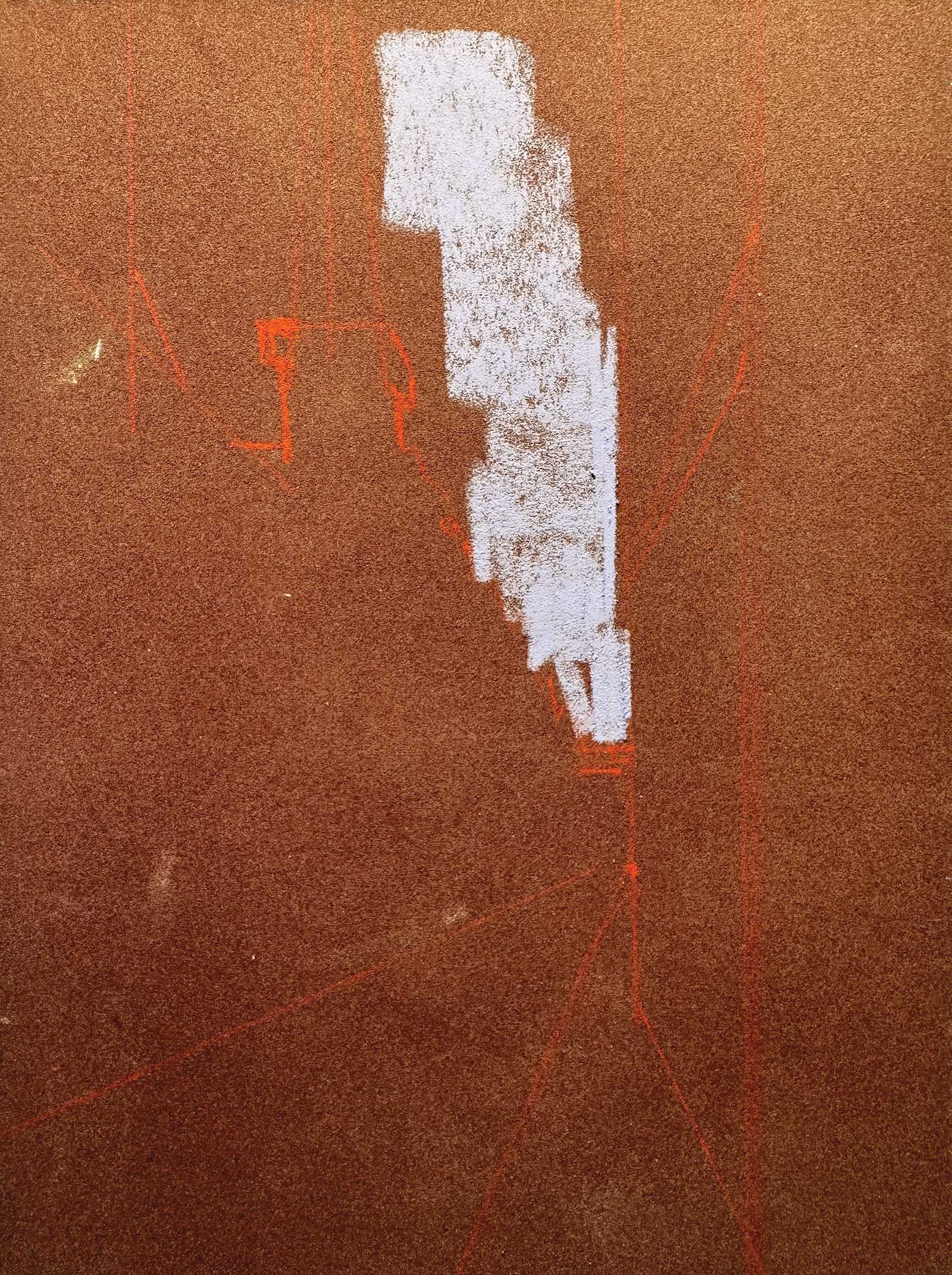
Stage 2 Drawing
I chose Pastelmat in wine as my surface because the warm tone and value matched the predominant shape of the buildings so well, which reduced the amount of pastel I needed to add on top. Using my thumbnail sketch as a guide, I drew the major perspective lines and shapes just visible in red pastel pencil, then began blocking in the negative space of the sky in blue to create the building shape using the tone of the paper.
 Stage 3
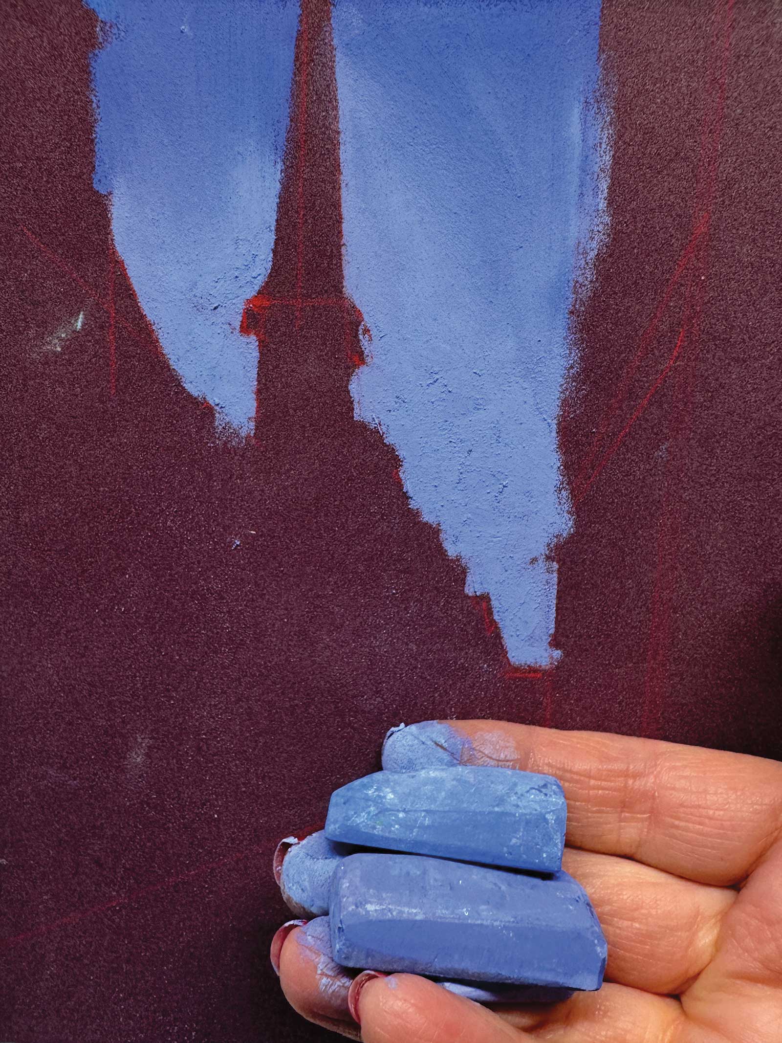
Stage 3 Sky Block-in
At deep twilight, the sky is a rich blue, slightly lighter closer to the horizon where the sun has set. I use a string of three values of soft Terry Ludwig pastels shown here, scumbled into one another to create the gradation, overlapped and blended very lightly with a finger.
 Stage 4
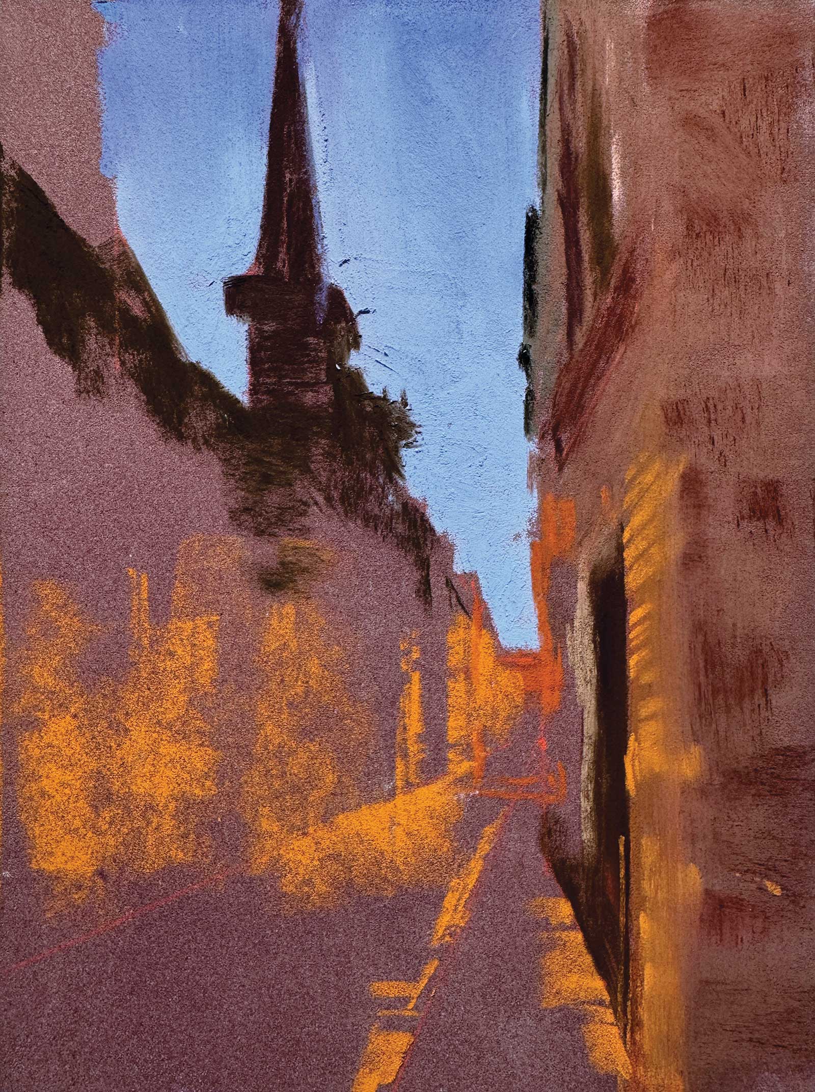
Stage 4 Finding Values
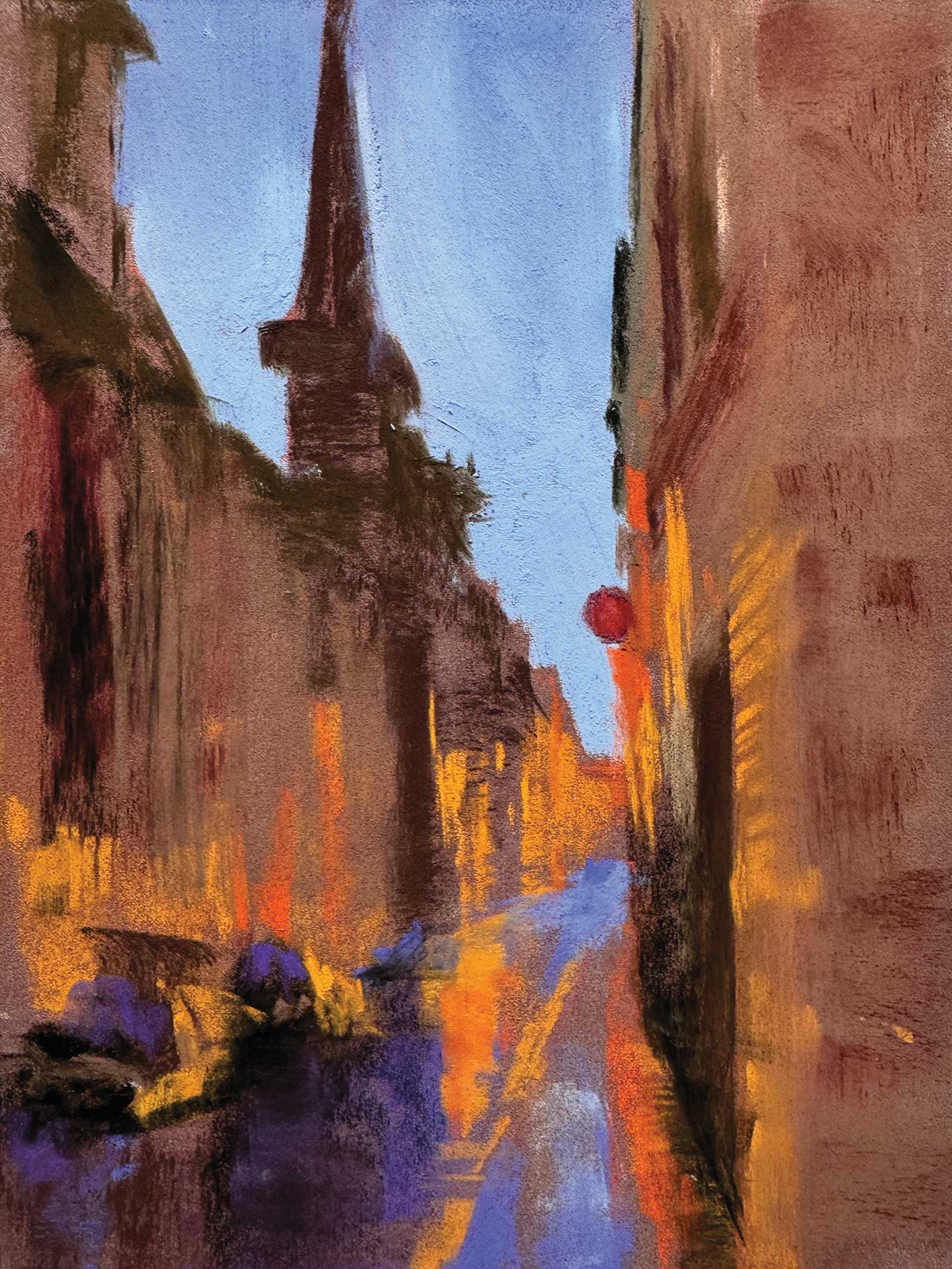
While the paper color supplies the predominant tone of the building, I next find both slightly lighter/warmer and darker/cooler areas of the building, layering to give dimension and create a sense of light. Note that each mark is sized and angled to help enhance the sense of perspective.
 Stage 5
Stage 5 Shape Without Detail
It’s easy to get lost in too much information in a city scene, counting windows, defining edges or drawing car wheels. If I find myself tempted to overdefine, I remind myself to look for shapes, not things. When I can begin to see the abstract shapes of light and the patterns of color and texture, rather than thinking, “street,” “car,” “lights,” I can paint with more objectivity, accuracy and boldness.
 Stage 6
Stage 6 Finding Focus
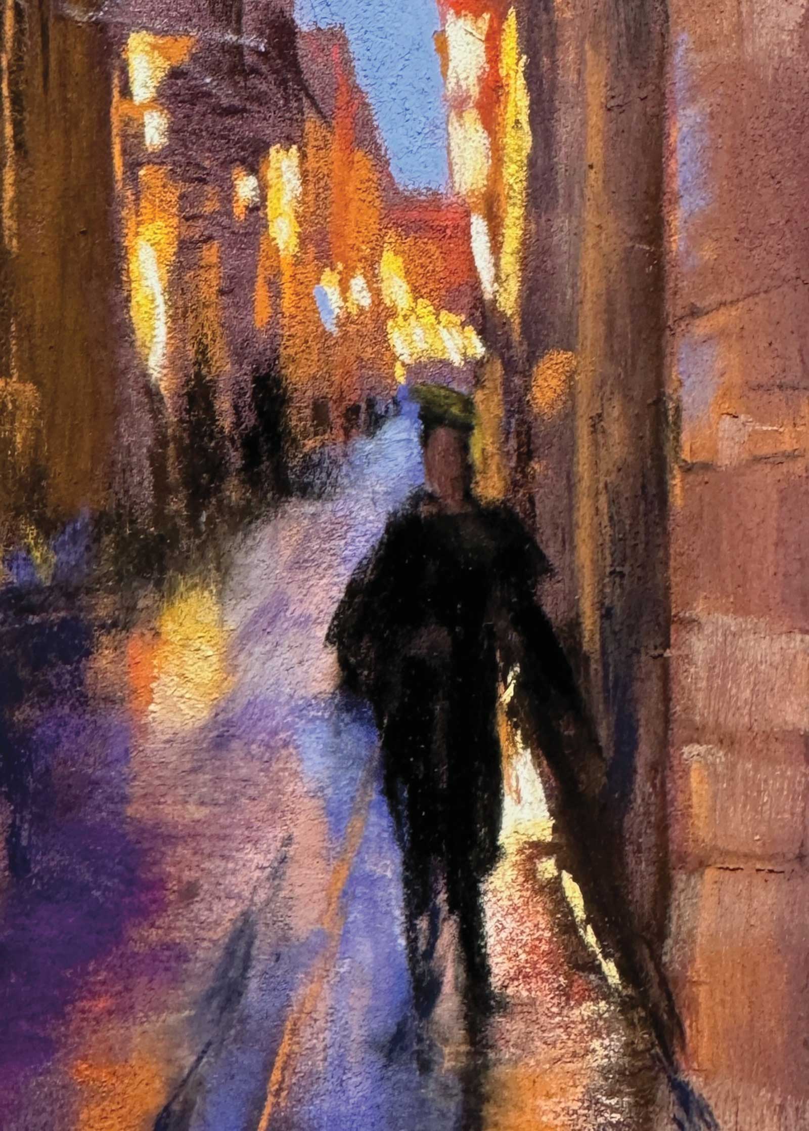
Figures almost always take center stage, and the composition here with lights receding to the distance also draw the eye to the shopper’s head, then down her figure to her strolling legs. Note that the highest contrasts occur in this focal area, with sharp edges, lightest and darkest values, and most intense colors.
 Stage 7
Stage 7 Sketching Light Lines
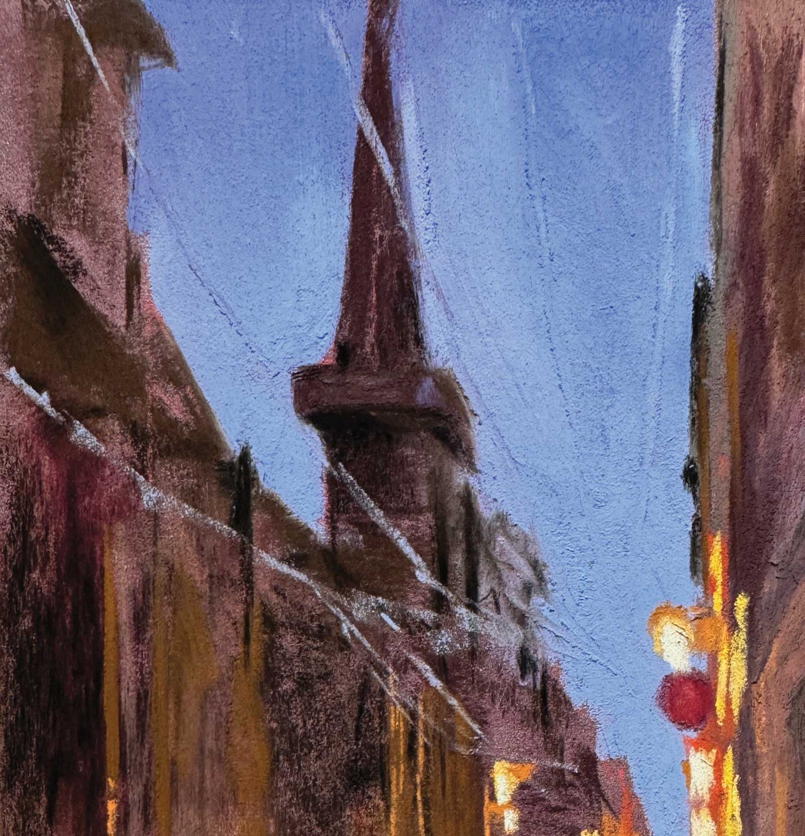
My initial inspiration for this painting included the wonderful holiday lights strung overhead, which stretch above and lead the eye into the painting. I sketch them in with light blue to get them in at the correct angles.
 Stage 8
Stage 8 Detail vs. Suggestion
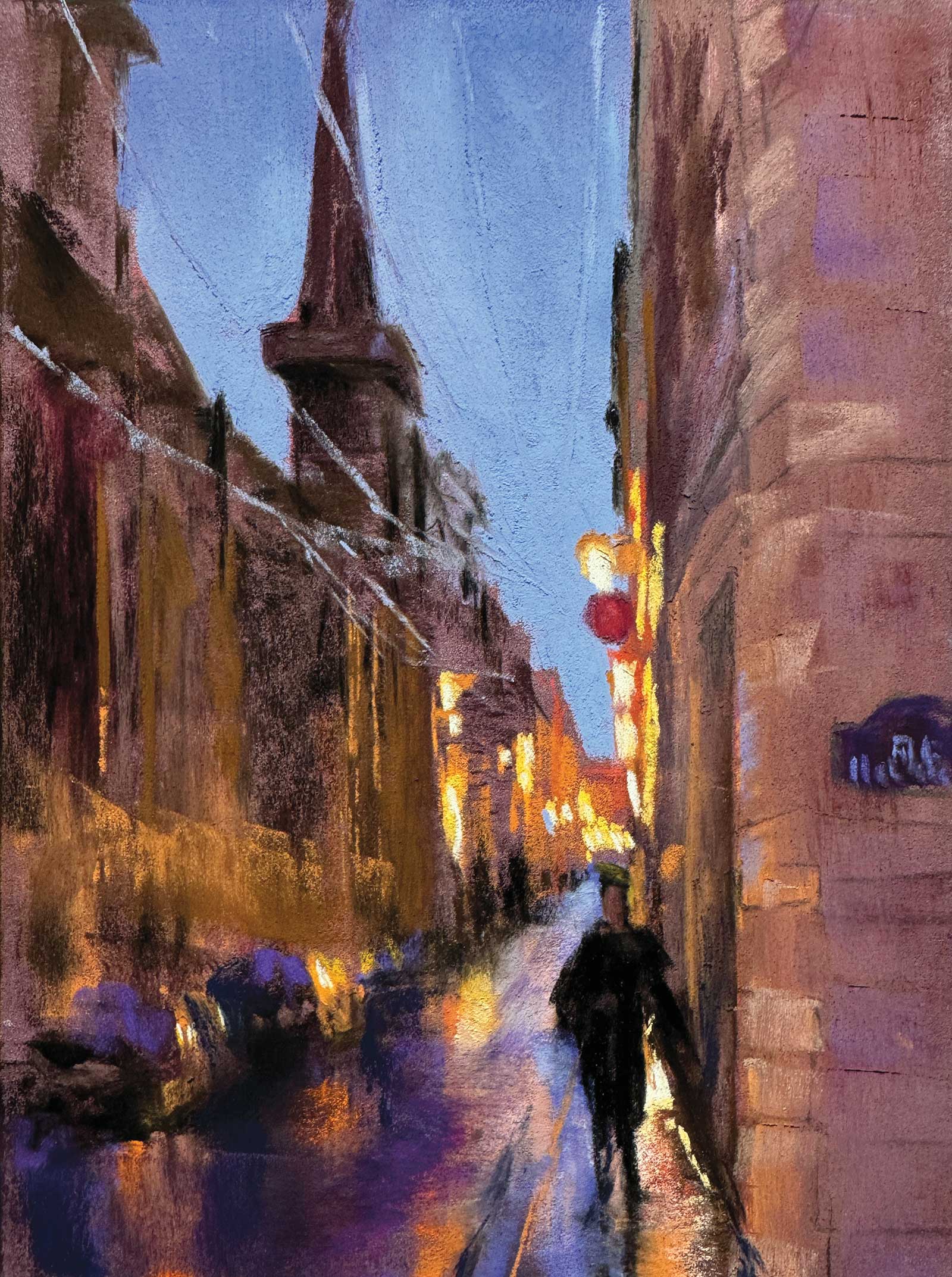
At this stage, the painting has developed a good balance of suggestion and detail. We register the cars on the left and the street of tall buildings without being able to focus on any one car or distinguish between any single building or window. In contrast, the figure is more distinct, as are the reflections on the street below her feet and the stones of the wall to her right.
Turning on the Light
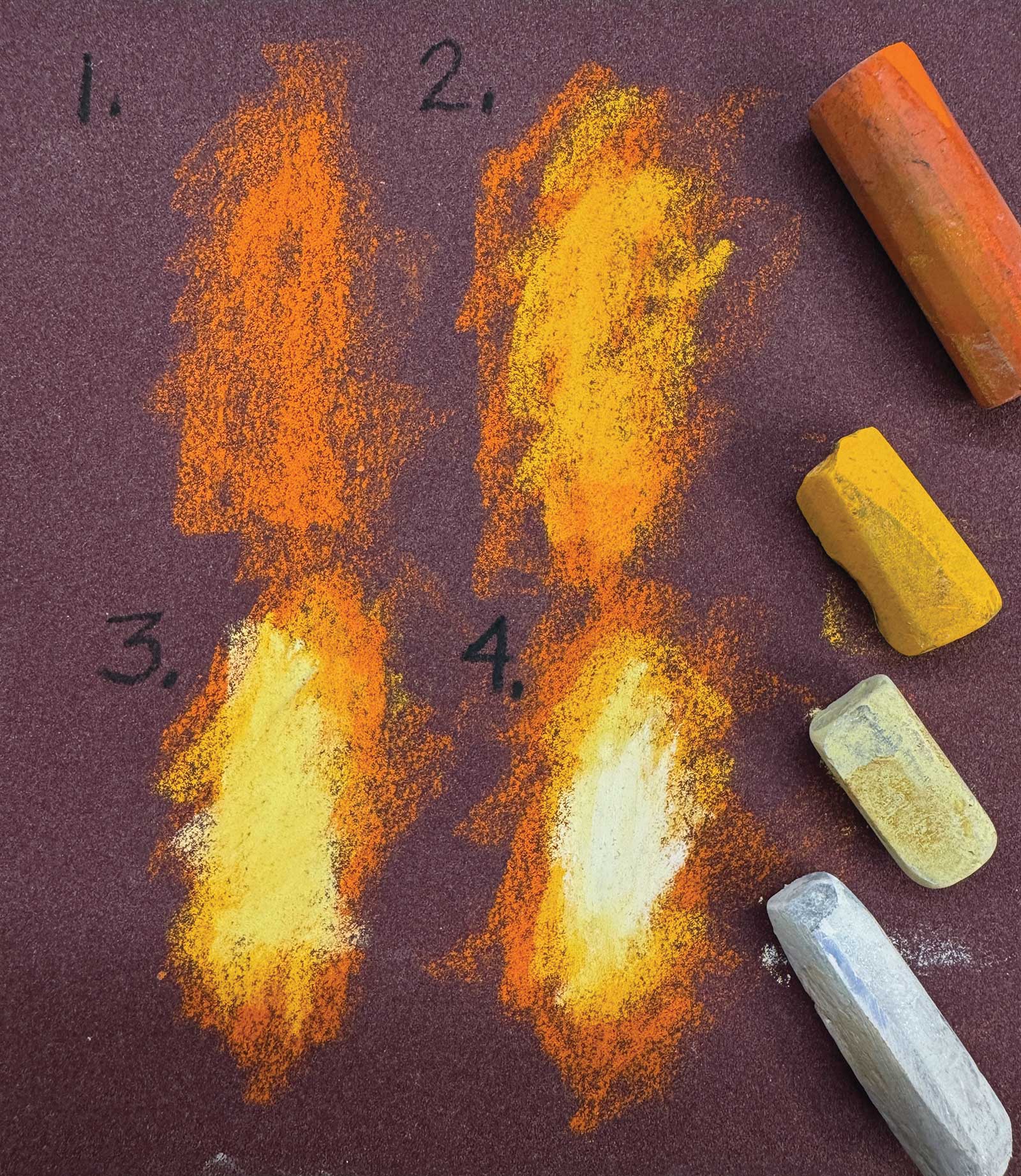
To get lights to glow, work from the outside in. Against the cool deep blues of a night sky, street lights glow warm. Avoid hard edges and sharp contrasts by starting with a relatively darker value warm orange against the night sky or building, then move to a lighter, warmer orange, then yellow, then lemon yellow and perhaps all the way to a nearly pure white in the center.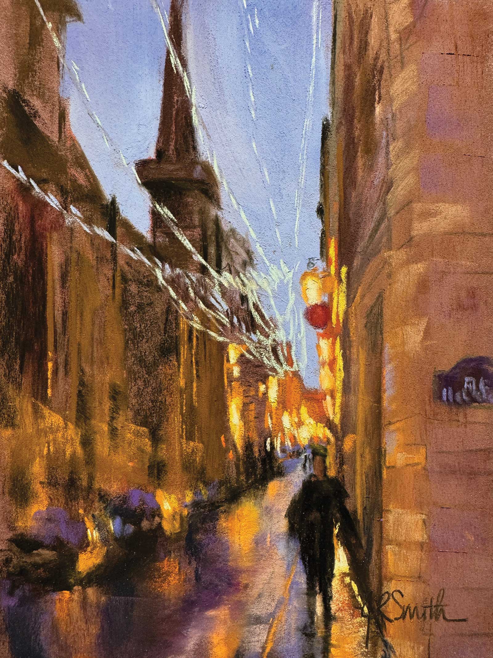 Stage 9
Stage 9 Assessing the Holiday Lights
Following the guidelines, I place the light strings with light turquoise. While I liked the gesture of these lights and how they work compositionally (and I have fond memories of the festive lights), I decide they are too distracting and disrupt the overall effect I’m going for in the painting. Sadly, they have to go.
 Stage 10
Stage 10 The Brush Off
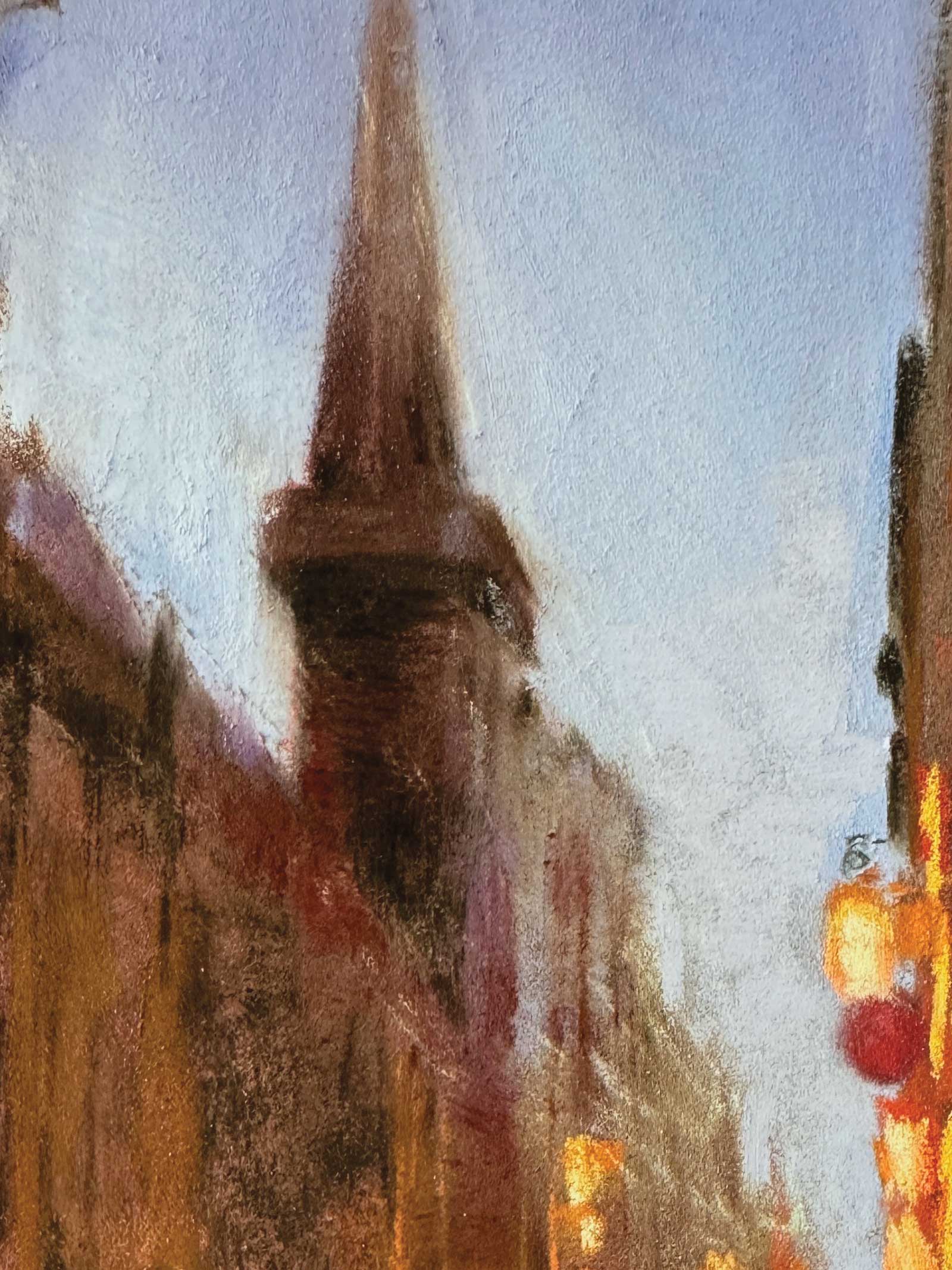
With a small, delicate fan brush, I gently brush away the string lights I’ve just added. To keep a pastel painting fresh it’s important to remove unwanted pastel rather than just covering over what doesn’t work. This keeps the tooth of the paper workable and allows subsequent layers to remain fresh. I then layer a bit more pigment on the buildings and sky. A ghost of string lights remains, but I like the effect so I leave it rather than completely covering it.
 Stage 11
Stage 11 Finished Artwork
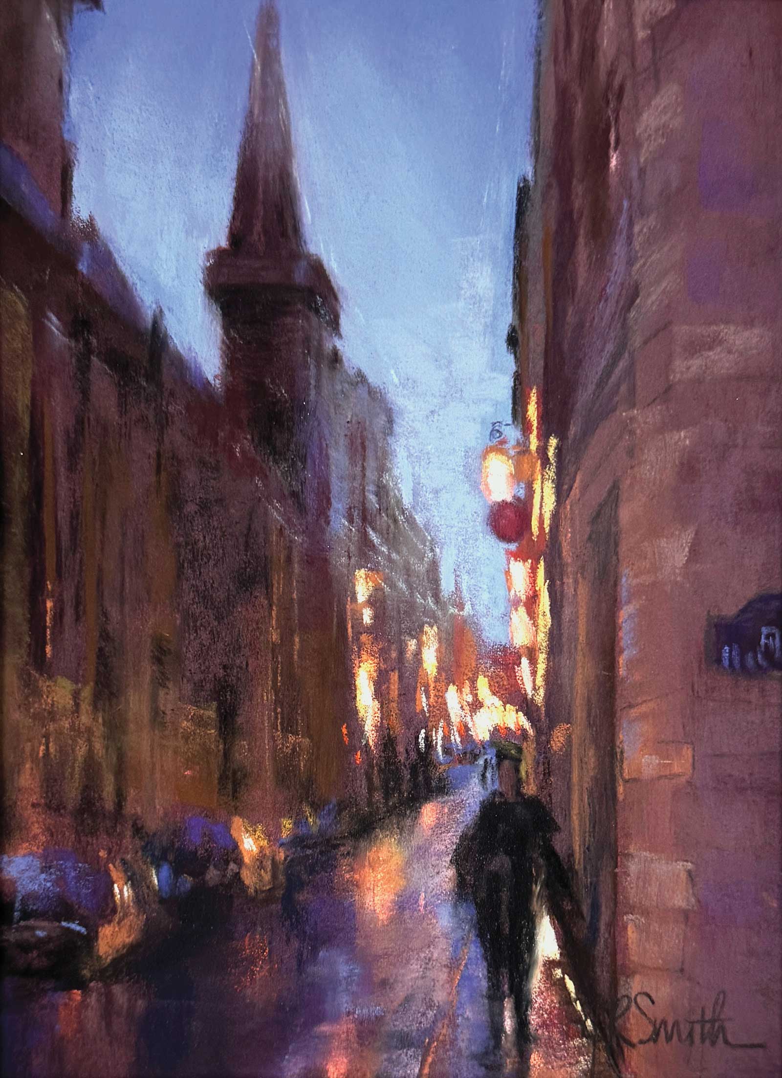
Rainy Paris Evening, pastel, 8 x 6" (20 x 15 cm) I am happy with my decision to simplify my sky. With less distraction we can focus on the city lights and their reflections on the wet pavement as the evening shoppers hurry home.
About the artist
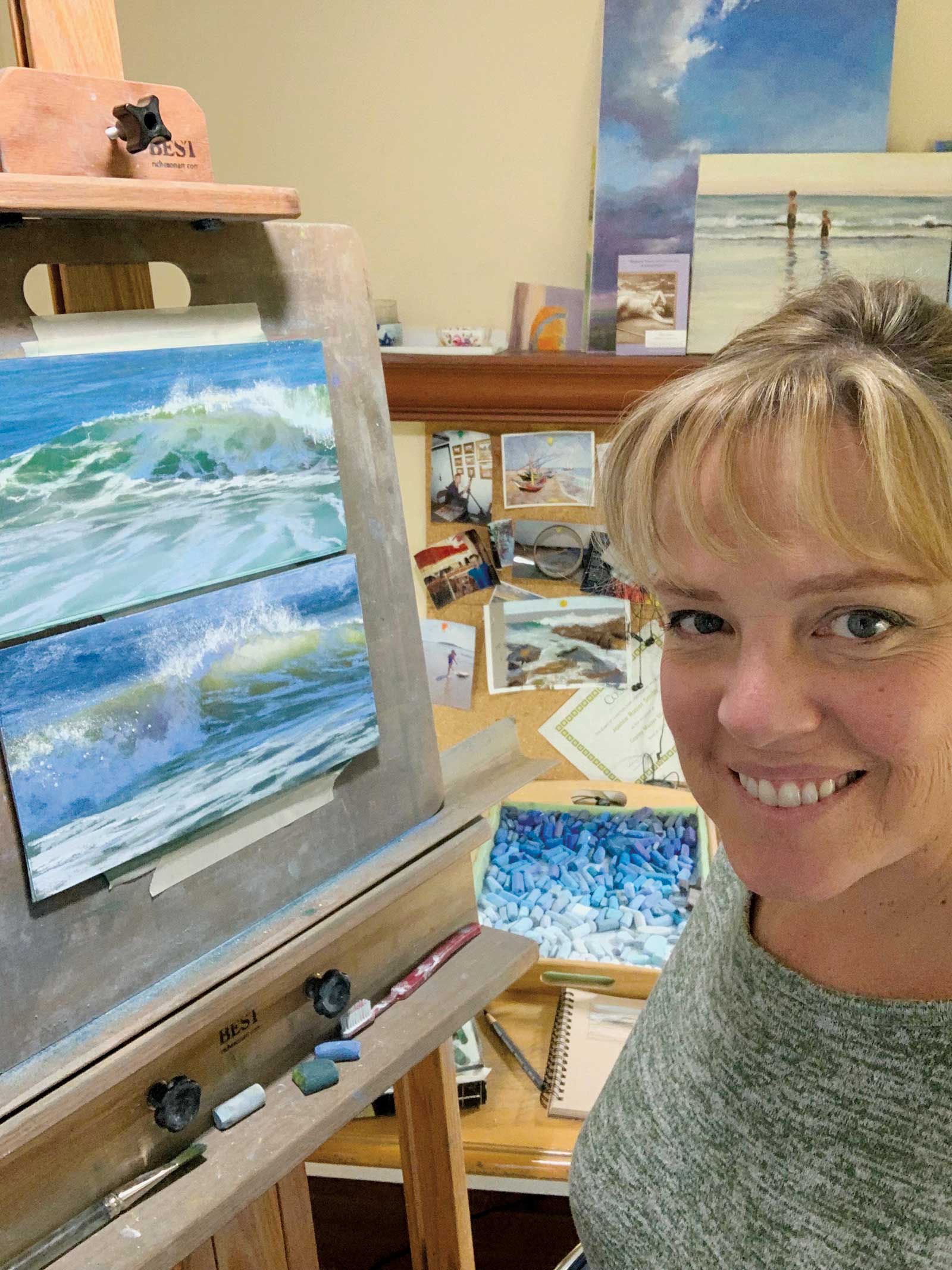 Jeanne Rosier Smith
As a small child, Jeanne Rosier Smith once imagined a dream career would be inventing and naming new colors in her aunt’s cosmetic sales catalogs. When she discovered pastels decades later, they surpassed her wildest dreams of those little color swatches. Smith’s enduring love is the coastal and New England landscape where she lives in Sudbury, Massachusetts. She finds inspiration and beauty everywhere, in her travels as well as in seascapes and snowy landscapes.
Smith is a Pastel Society of America Master Pastelist and IAPS Eminent Pastelist, and a signature member of the American Impressionist Society and the American Society of Marine Artists. Her work has shown in museums around the United States and is in collections worldwide. She has taught the pastel medium in classes and workshops for over 20 years and now offers an ongoing online video instruction program through epiphanyfineart.com.
Smith is represented by galleries across the United States including Susan Powell Fine Art, Black River Gallery, the Copley Society, Dare Gallery, Sandpiper Gallery, Lily Pad Gallery and Powers Gallery.