



My curiosity about color began at an early age. As a young child, I would walk through the fields between home and my grandma’s house, eyes wide open, viewing the world in vivid color. I spotted pinks in the grasses and purples in the sky and wondered how I could paint what I was seeing. This fascination developed into my life’s passion: studying the properties of color and teaching what I’ve learned. Throughout my years of teaching, I realized that one of my students’ biggest struggles was in making clean color.
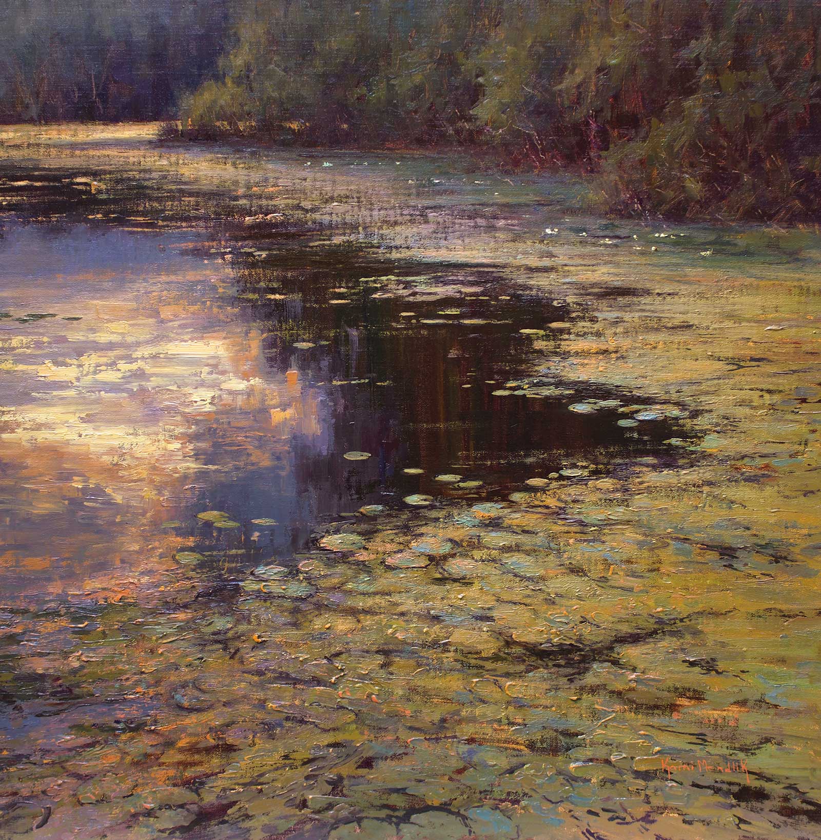
Devotions, oil on linen, 24 x 24” (60 x 60 cm)
They seemed fine with identifying and making secondary colors, but when it came to adding the tertiary to neutralize or gray a color, they often ended up with mud. So, I began having them eliminate the tertiaries from their early color-strategizing work, and their paintings came alive with light and clean color. Why? Because this process made them choose which primary was predominant in the color and which was secondary. Doing this forced them to see and paint the difference between the colors, not a literal interpretation of each color on its own. This is color relativity.
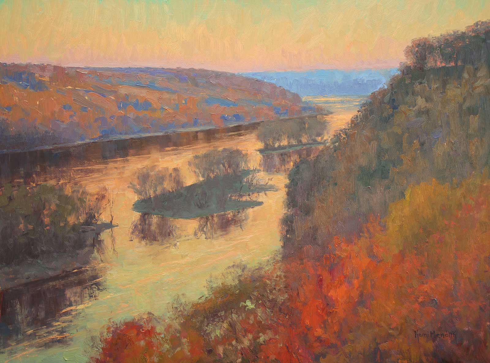
St. Croix Afterglow, oil on panel, 18 x 24” (45 x 60 cm)
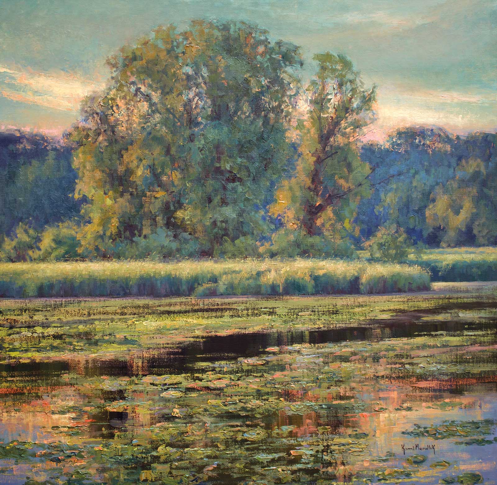
The Pond, oil on linen, 30 x 30” (76 x 76 cm)
The process of creating the illusion of light is more strategic than one may think. Using a primary palette, I’m going to share with you my two-color strategy to both see and paint color relativity, creating the illusion of light with paint in the landscape. More than simply a process of painting, this is a way of seeing and strategizing one shape of color compared to another, simplifying the scene before you. In this phase of strategizing, we eliminate the tertiary to be later worked in. The strategy I’m sharing with you here is in my book, Color Relativity: Creating the Illusion of Light with Paint. When color is relative, the painting is harmonious.
My Art in the Making Stimmung – Brule River
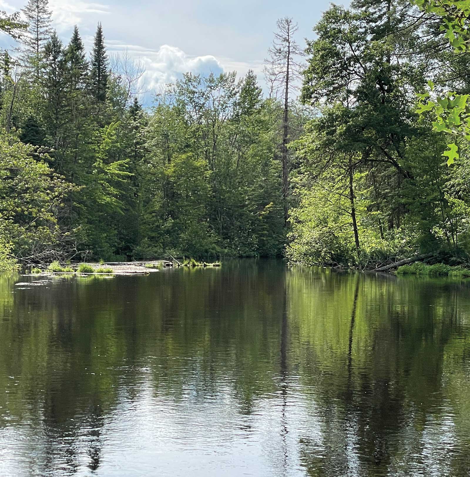
Reference Photo
Nature is so beautiful yet can be very overwhelming. What to put in? What to leave out? How to get our impression on canvas? Learning what to put in is not as important as what not to put in.
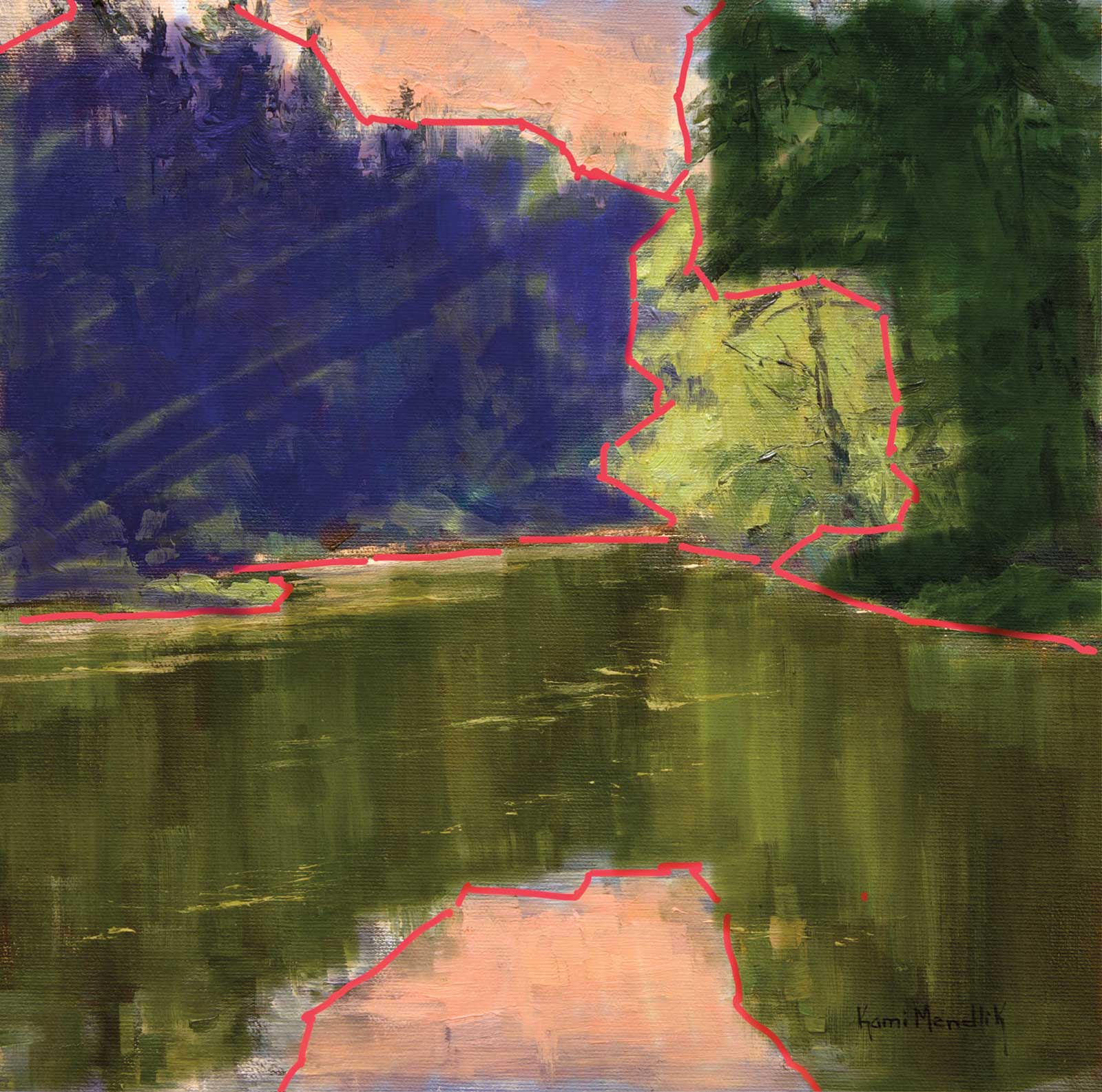 Stage 1
Stage 1 How I See
Here I used my iPad and colored in shapes to amplify the color averages to show you how I see. Abstracting from the landscape is simple but not easy! I try to find anywhere from three to five simplified shapes to start. These simplified shapes are what I call “averages.” A color average is the color that most consumes the shape when you squint at it, like mixing it all up and editing out the details.
WHAT THE ARTIST USED
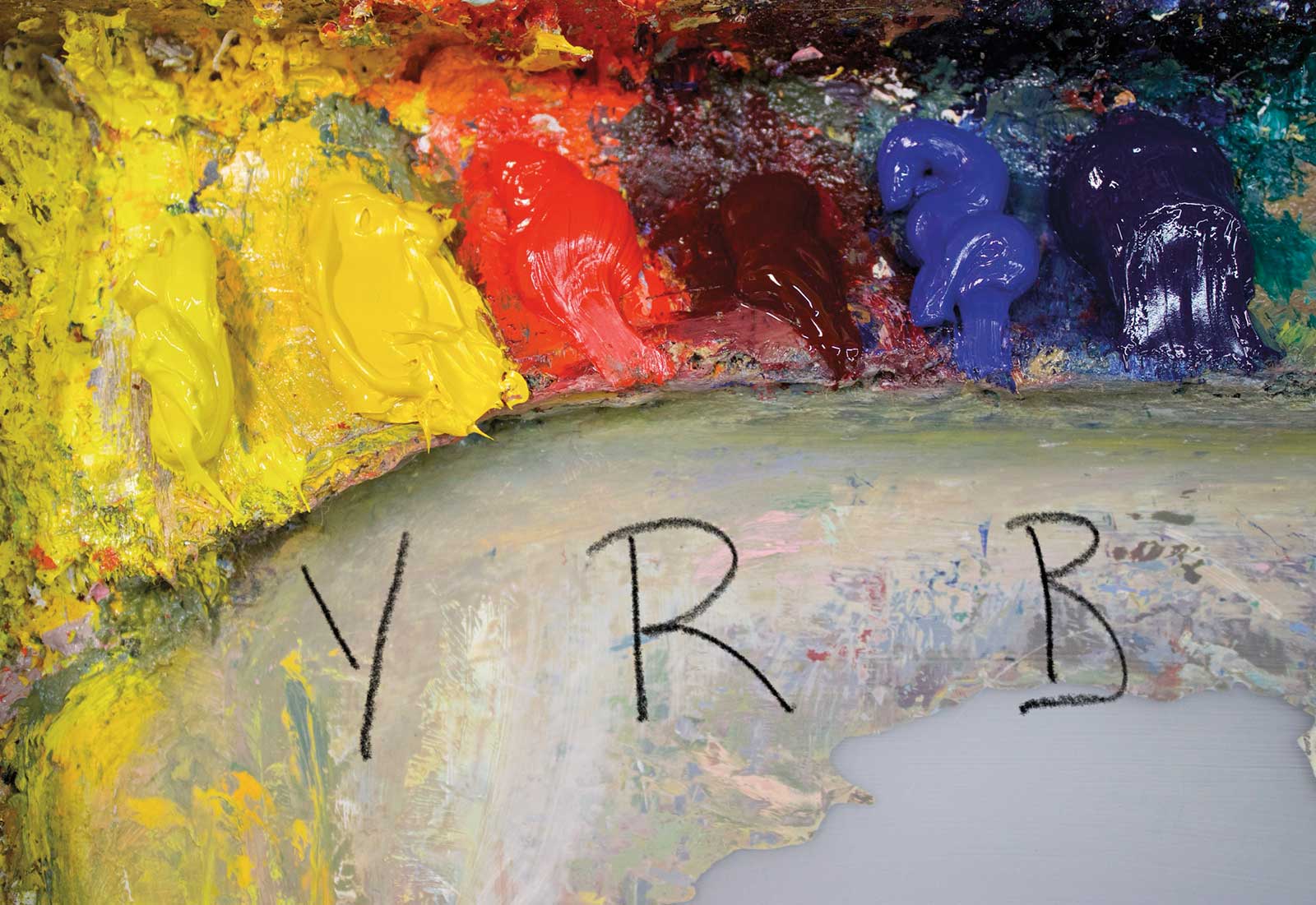
Primary Color Palette
Cadmium yellow light, Cadmium yellow, Cadmium red, Alizarin crimson, Cobalt blue, Ultramarine blue, Titanium white
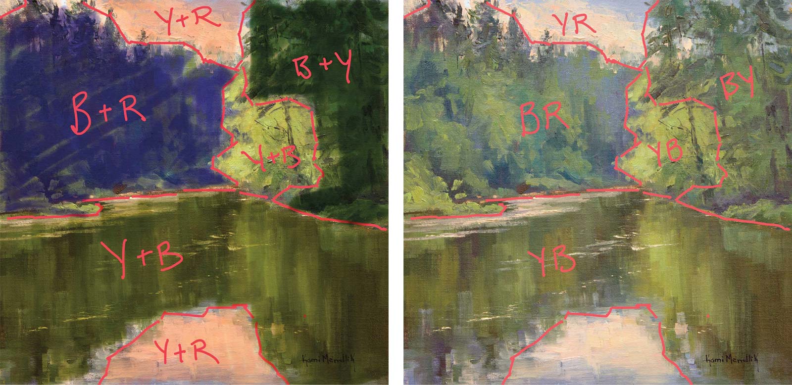 Stage 2
Stage 2 Strategizing Each Color Average
Time to strategize using letter codes. Using a primary limited palette plus white, I decide what the secondary color of each average is. Is it greenish, purplish, or orangish, relative to one another? To choose which letter goes first, determine which primary color is the predominant, Y, R or B, and put that one first. That means there will be more of that color in the equation to create the secondary. For instance, a greenish shadow most likely has more blue in it than yellow to make the shadow dark and cool enough compared to the light. In that case your letter code would be BY.
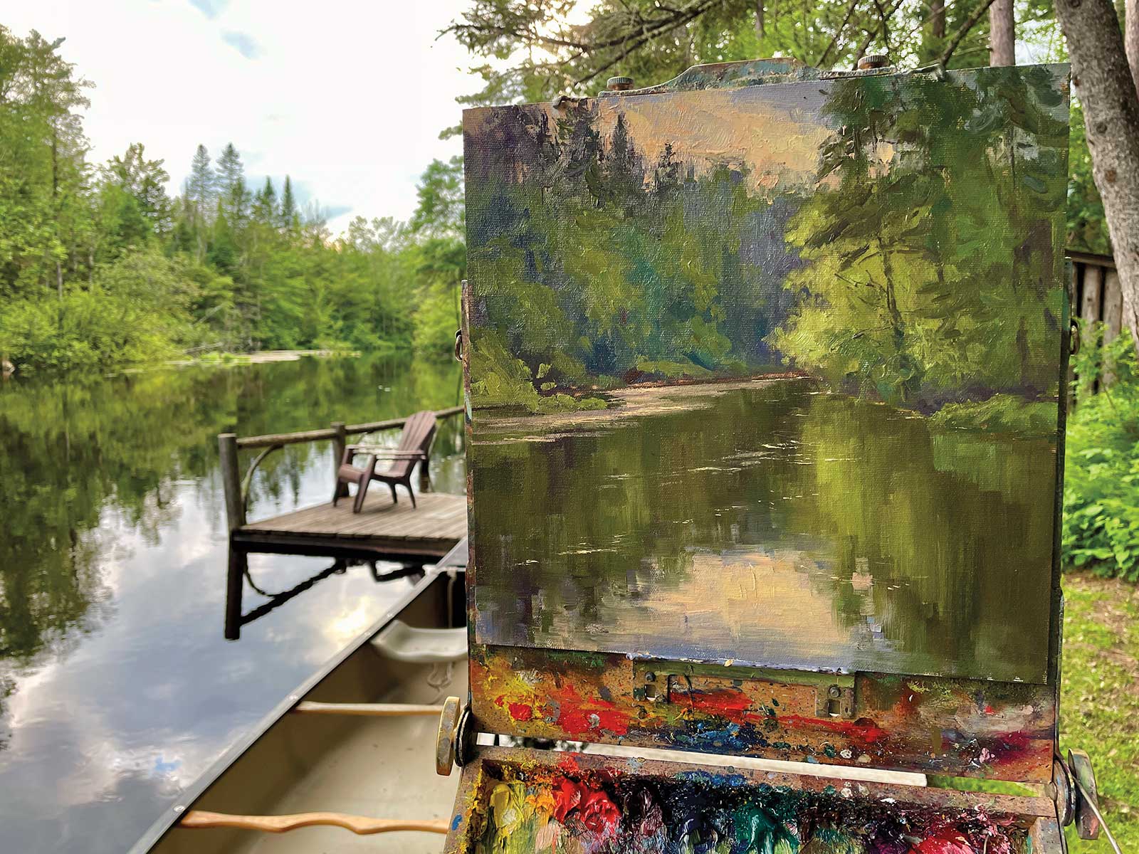 Stage 3
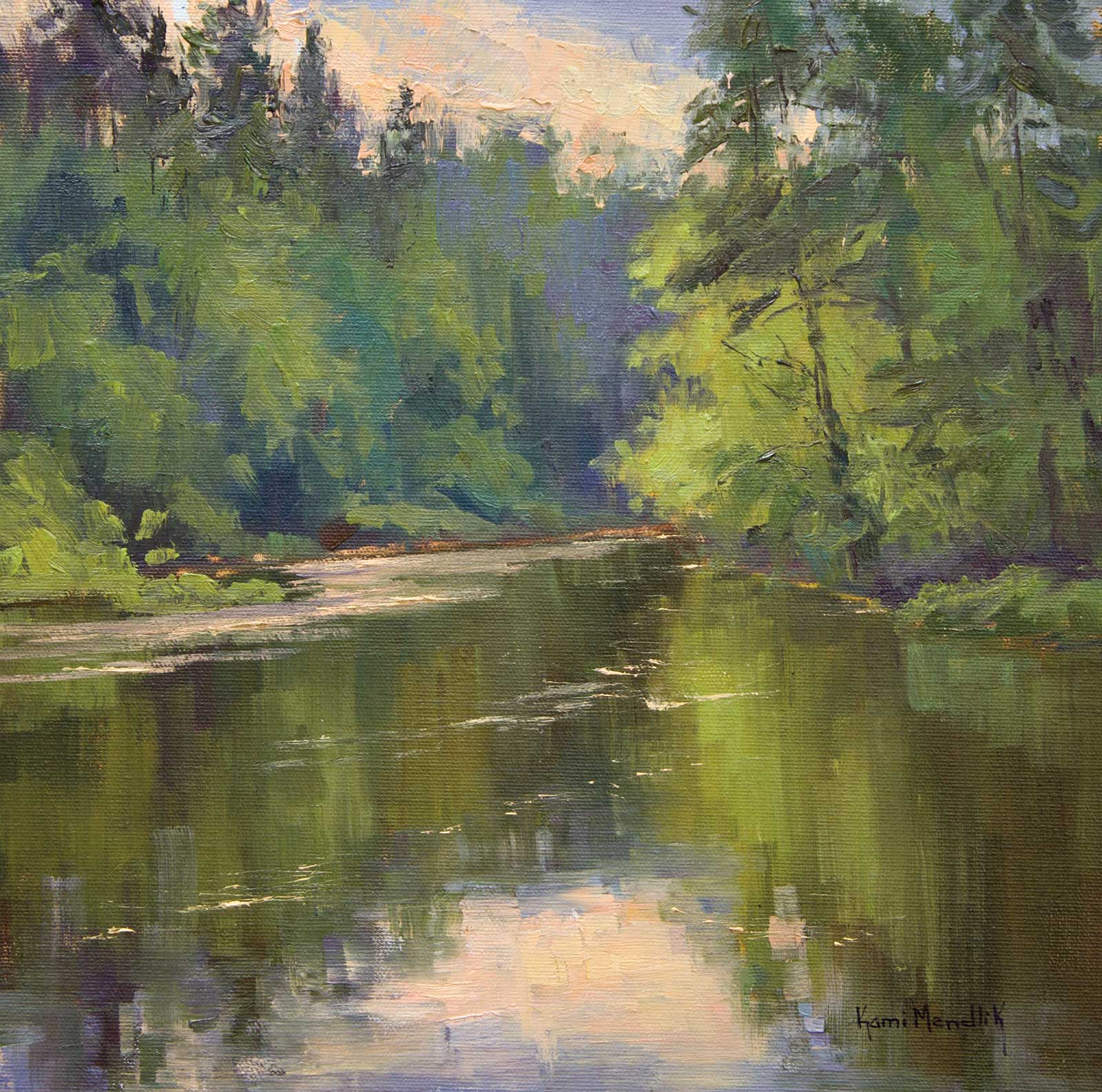
Stage 3 Plein Air Color Study
Working from life is crucial to study color. I love being immersed in the natural world, and my being there is simply because it’s where I want to be. Simply put, I do it for myself and my soul. I try not to concern myself with a plein air painting becoming anything special, I’m there studying how one shape of color compares to another.
 Stage 4
Stage 4 Completed Plein Air Study
Once I have strategized my color averages and simplified my shapes, I then begin to work the tertiaries into the larger averages. I continue to squint at my scene throughout the entire painting so as to not overdo it with the details. The more mature my work becomes, the less I desire to put in to make a stronger statement. Just because you see it doesn’t mean it needs to be in the painting. What is the essence you are after?
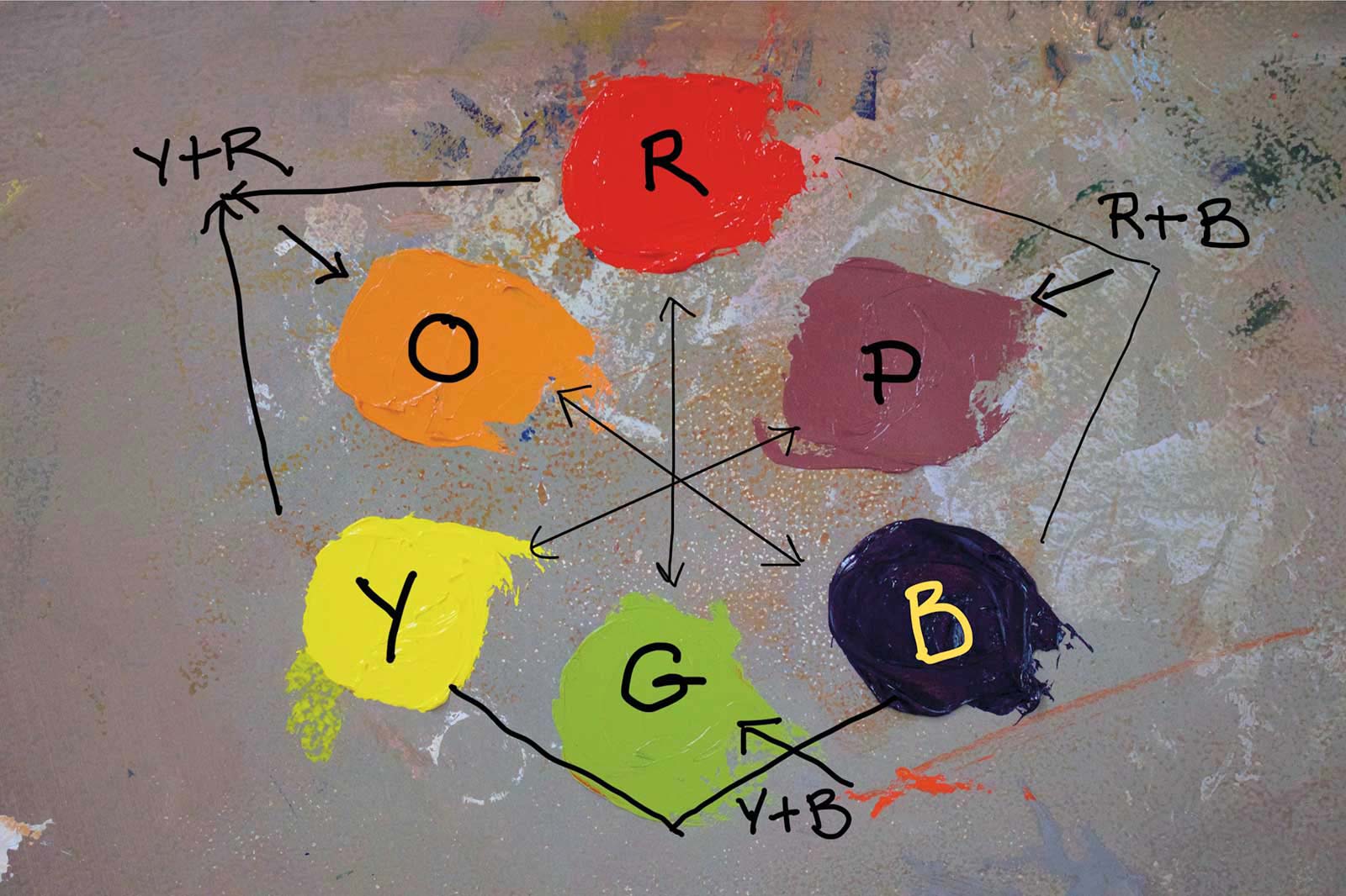
Primaries and Secondaries to Create Letter Codes
Y = Yellow
R = Red
B = Blue
YB or BY = Green
YR or RY = Orange
RB or BR = Purple
 Stage 5
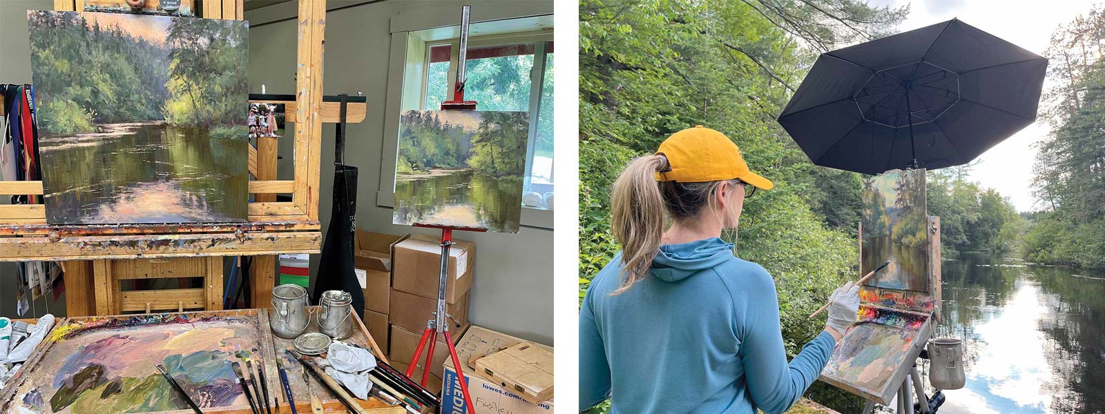
Stage 5 Plein Air Inspiration in the Studio
Sometimes these studies end up as great concepts in the studio. The key is to not copy your plein air piece but to use it as information and inspiration for the studio piece, allowing the studio painting to become its own.
 Stage 6
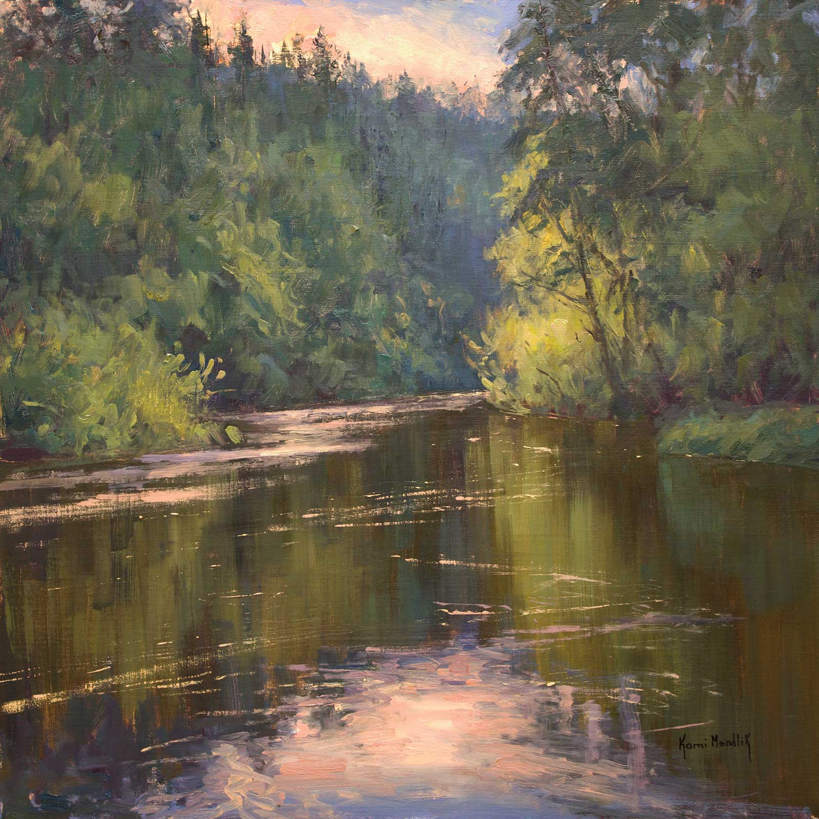
Stage 6 Finished Artwork
Stimmung – Brule River, oil on linen panel, 20 x 20” (50 x 50 cm)
About the artist
 Kami Mendlik
Kami Mendlik is an internationally recognized painter, instructor and author of Color Relativity, as well as the creator of hand-crafted plaster sculptures “Planal Fruit.” Mendlik’s poetic ability to translate the illusion of light with paint has made her work highly sought-after by collectors and patrons. In 2023, the Minnesota Marine Art Museum honored her work in an exhibition titled Creating the Illusion of Light: Contemporary Landscape Painter: Kami Mendlik, alongside Poetry in Nature: Hudson River School Landscapes from the New York Historical Society.
In 2008, Mendlik started and founded the St. Croix River School of Painting in Stillwater, Minnesota, where she teaches the fundamentals of representational painting with a special emphasis on color. In January of 2014, she purchased a 16-acre farm just North of Stillwater, where she converted a 100-year-old hip roof barn into her studio and the St. Croix River School of Painting’s new location. The property is a landscape painters’ dream.
Mendlik is a Signature Member of Oil Painters of America, American Impressionist Society, American Society of Marine Artists and American Woman Artists, and an active member of the Outdoor Painters of Minnesota.
Contact at
kamimendlik.com
colorrelativity.com