


When I came across this scene of a row of quince trees by a pond, I was immediately captivated and knew I had to paint it. In moments like these, I ask myself a crucial question: Why do I want to paint this? Whether it’s the interplay of light, an intriguing mood, contrasting forms or something else, the answer becomes the core idea of the painting. For this piece, it was the stark contrast between the vibrant yellow strip of reeds and the luminous reflection of the sky in the water. This central idea guided me throughout the process, helping me amplify its impact while eliminating distractions by thoughtfully adjusting the key elements of the painting: shapes, values, colors, edges and textures.
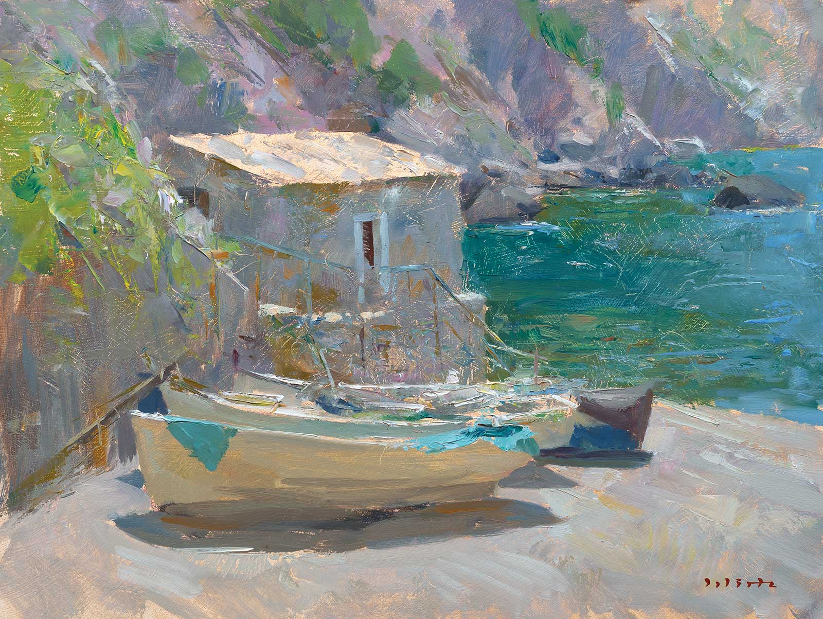
A Glimpse of the Past, oil, 15¾ x 11¾" (40 x 30 cm)
Design lies at the heart of my painting process. Without a clear structure, a composition can feel disjointed, making it difficult for the viewer to connect with the work. Nature often provides an excellent foundation—in this demonstration, the sweeping curves of the tree branches, the grass in the foreground and the shoreline created natural rhythms. However, these elements needed to be simplified and adapted to bring the scene together cohesively. I relied on these lines as guides to organize the elements of the painting, ensuring everything felt intentional and harmonious.
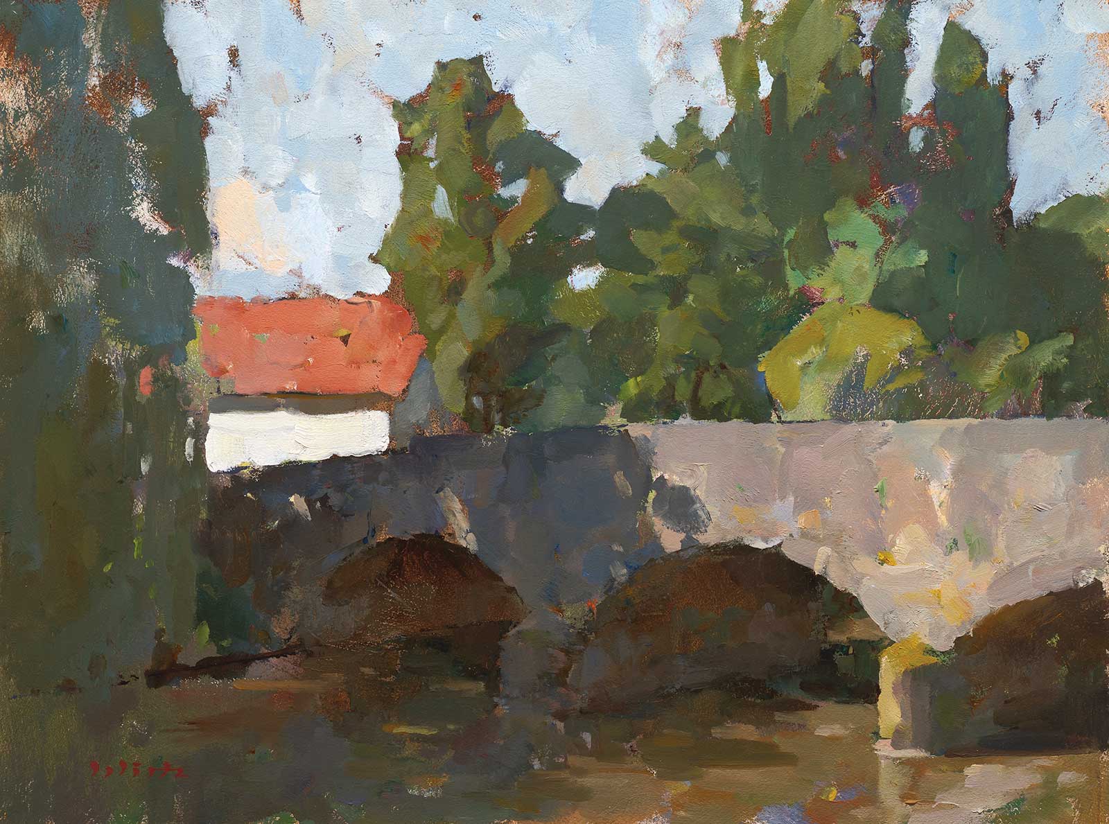
Kingfisher’s Crossing, oil, 15¾ x 11¾" (40 x 30 cm)
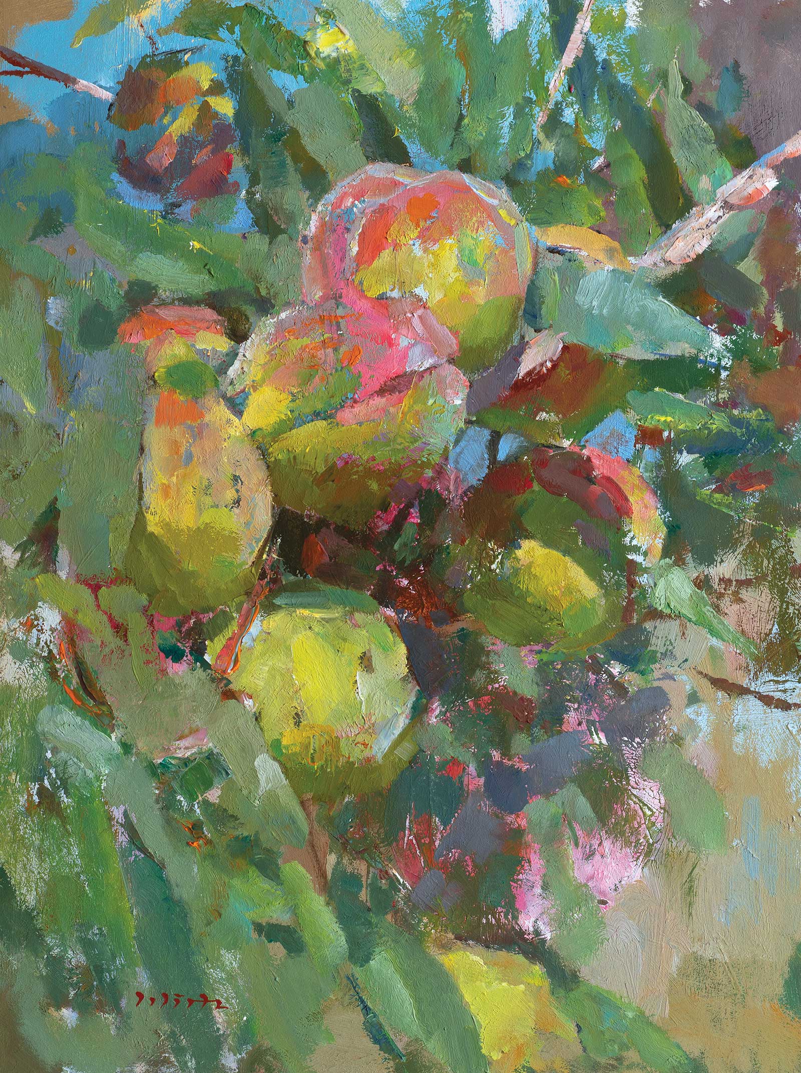
Peaches, oil, 15¾ x 11¾" (40 x 30 cm)
These foundational lines also helped me direct the viewer’s eye through the painting in a spiral-like motion to the glowing reeds as the focal point, then to secondary areas like the tree canopy or the textured foreground grass, before returning to the main focus. Every decision I made was designed to reinforce this visual flow.
For me, this painting is about more than just a quince tree and a pond. It captures the harmony of shapes and colors and the quiet beauty that nature offers when we pause to observe it closely.
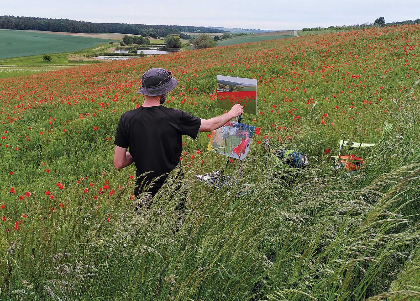
My Art in the Making Quince by the Pond
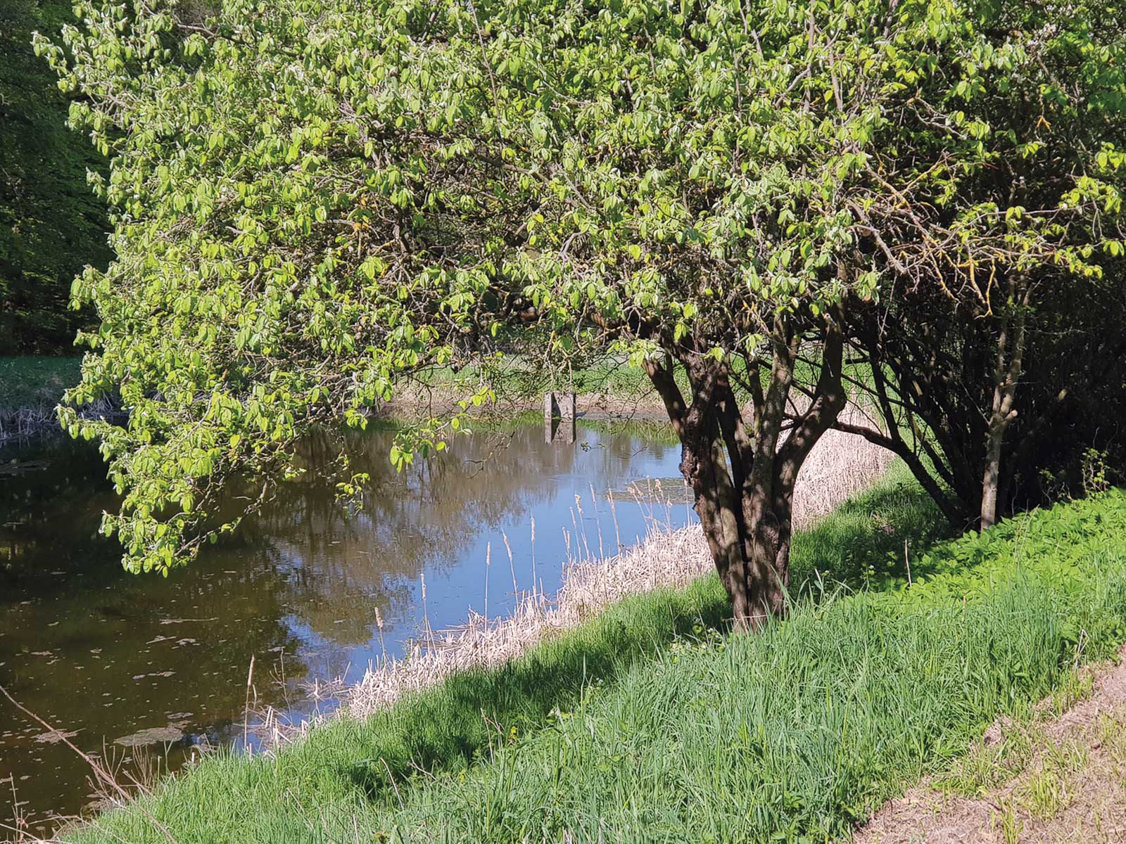
Reference Photo
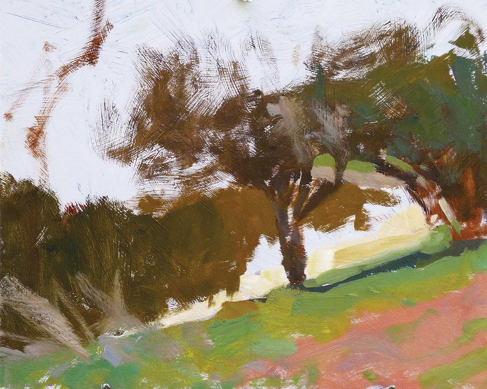
 Stage 1
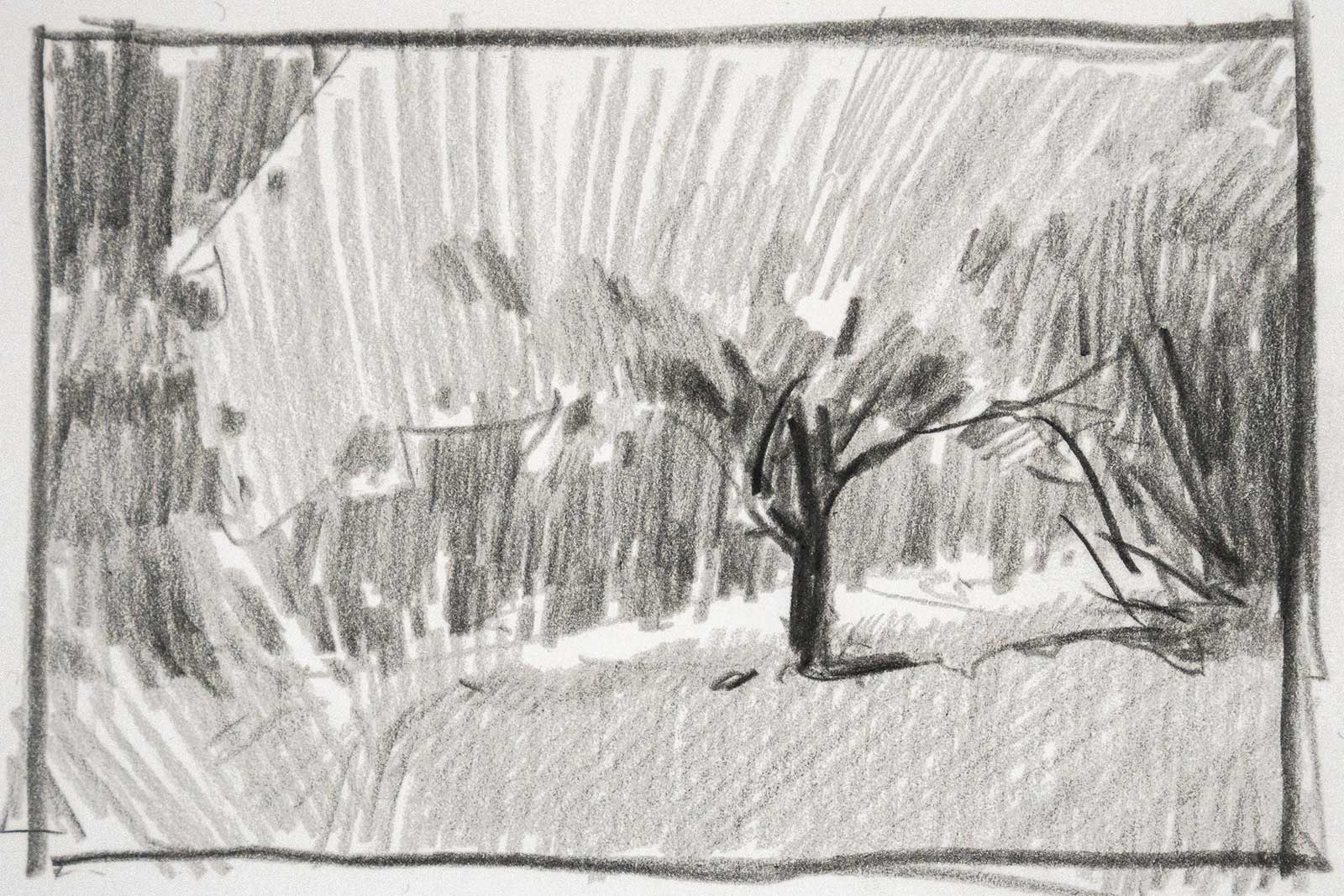
Stage 1 Thumbnail Sketches
Most often I start by creating a few thumbnail sketches that help me to flesh out the composition and identify the main big shapes and their corresponding values.
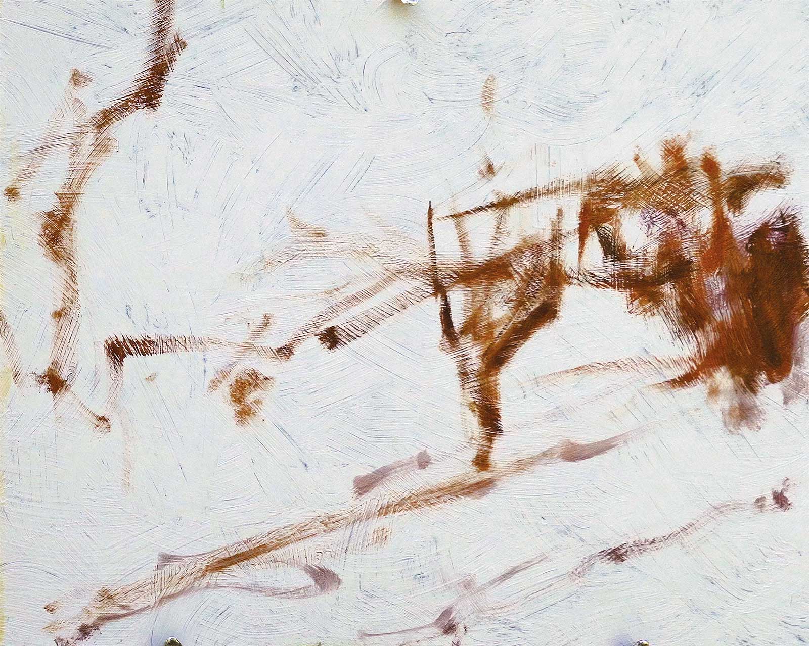 Stage 2
Stage 2 Major Shapes
When I am satisfied with the sketch I start to map out the major shapes of the scene on my panel using thinned paint on a dry brush with a light touch, keeping it loose.
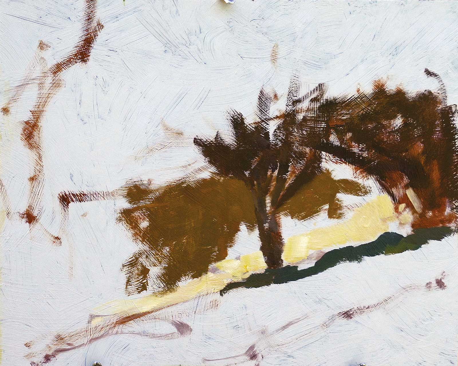
 Stage 3
Stage 3 Defining the Values
One of the first things I have to define is the value range. I do that by putting down a note for the darkest dark and the lightest light in the corresponding place. These now serve as my extremes to compare the following values against.
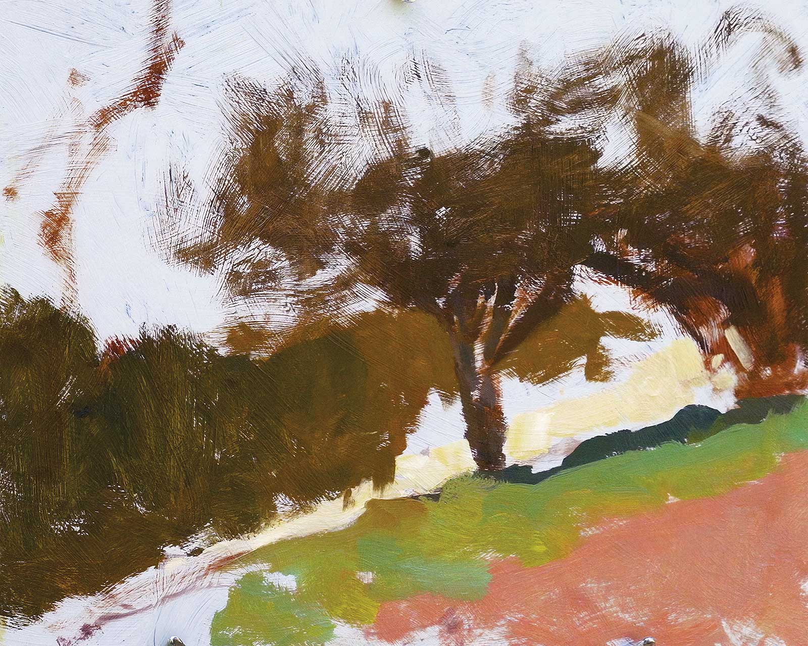
 Stage 4
Stage 4 Working Outward
From my focal point outward I now start to work from shape to adjacent shape, as comparing values is much easier when they are seen directly next to one another.
Keeping It Simple

To get the overall impression, I always start by squinting. This simplifies the values of the scene, eliminates unnecessary detail and helps me identify the main big shapes more easily. I typically aim to reduce the scene to four to five large shapes with just three or four general values. This approach establishes a solid foundation while leaving room for detail and subtle value variations to be added later. It’s essential, however, to ensure these additions don’t disrupt the integrity of the big shapes. By maintaining this focus, I can keep the overall structure of the painting unified and visually compelling.
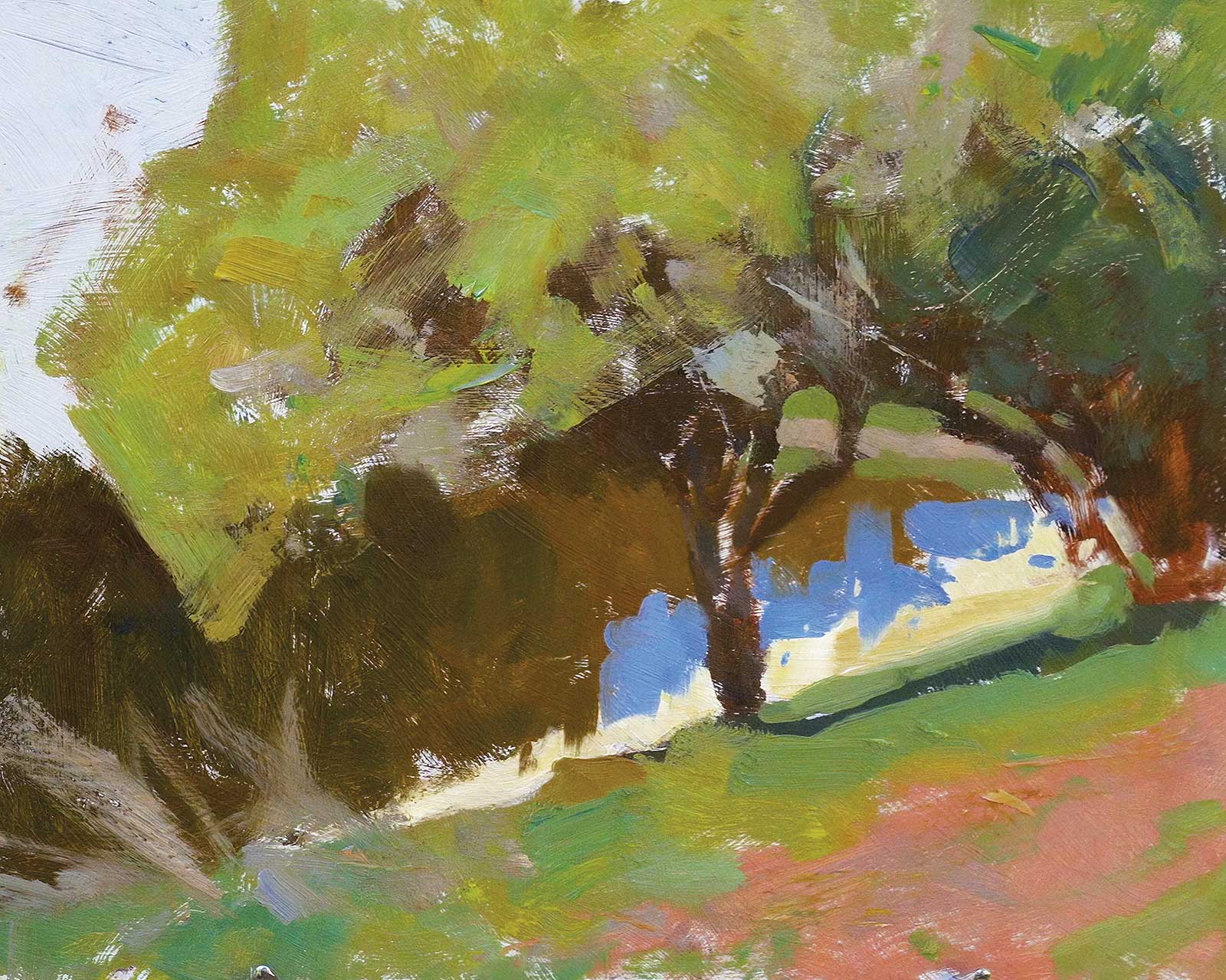
 Stage 5
Stage 5 Continuing to Block In
Continuing blocking in the shapes with thin paint, I am also keeping in mind working from background to foreground as much as possible. This will result in better looking overlap and edges in the end.
 Stage 6
Stage 6 Design and Flow
Altering or emphasizing certain elements, such as the dry grass in the left foreground, is essential for creating a more purposeful painting that prioritizes design and visual flow over literal representation.
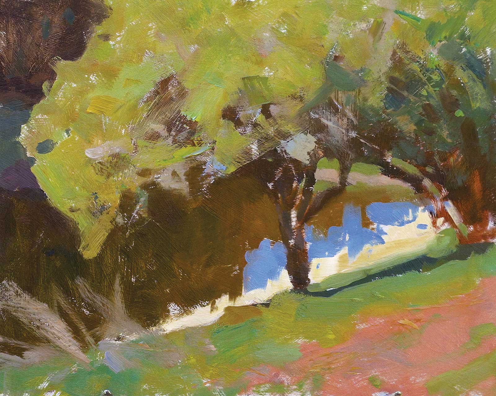
 Stage 7
Stage 7 Palette Knifework
Striving for variety in mark-making, I begin using the palette knife for the first time in this stage. By building up texture with thicker paint in the lighter areas, I aimed to enhance depth and create a more dynamic surface.
 Stage 8
Stage 8 Refinements
With the painting fully blocked in, I started refining shapes and edges. The focus here was on breaking up larger shapes and adding color variation while still keeping the values close.
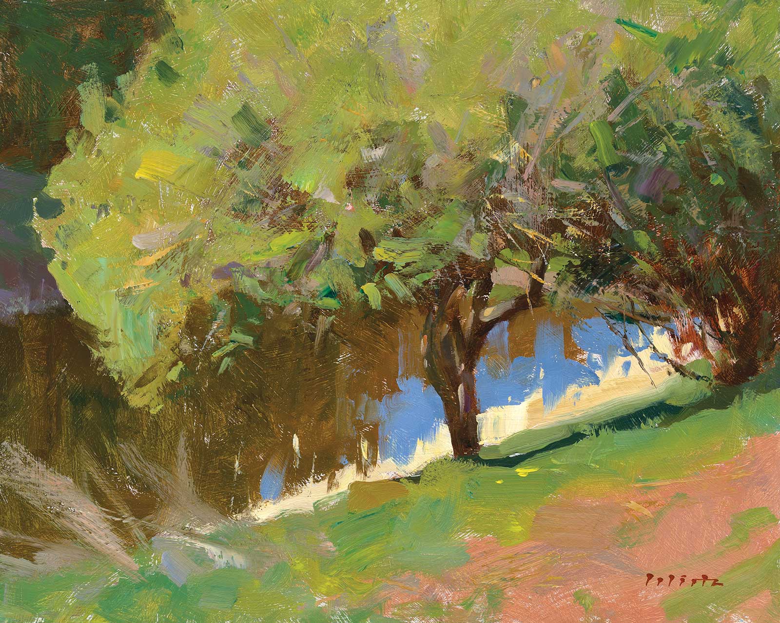 Stage 9
Stage 9 Finished Artwork
Quince by the Pond, oil on ACM panel, 9½ x 11¾" (24 x 30 cm) Adding detail where necessary, particularly around the focal point, I used subtle hints along the outer edges of shapes to suggest their makeup. Warm and cool tones were introduced to the tree mass to enhance depth and interest, while small shapes were added to complement the existing big and medium ones.
About the artist
 Björn Wirtz
Björn Wirtz is renowned for his ability to capture the essence of the places he explores, reflecting his deep connection with nature. A graduate of visual communication from the University of Krefeld, he initially worked as an illustrator and art director before gradually dedicating himself to traditional painting. His oil paintings have garnered international recognition, including at the Art Renewal Center International Salon, and have received awards in the BoldBrush Competition, among others. In 2024, he was accepted into the North German Realists, a renowned group of plein air painters.
Wirtz creates his works through direct engagement with the subject, drawing inspiration from the visible world. To him, the subject is merely a spark—a starting point for an in depth conversation. By editing and simplifying, he transforms his observations into compositions that go beyond literal representation, inviting viewers to experience the harmony and beauty of nature.
Represented by
Galerie Halbach, Celle, Germany, galerie-halbach.de
Galerie Göldner, Bordesholm, Germany, galerie-goeldner.de
Galerie Wehr, Pulheim, Germany, galerie-wehr.de
Contact at
bjoern@bjoernwirtz.com
bjoernwirtz.com