



Of all of the wonderful views of Wales, the coastline of Pembrokeshire has to be my favorite, especially the spectacular cliffs and shoreline of St. David’s peninsula. The St. David’s coastline seems to be in a perpetual state of flux: ripping clouds and simmering casts of color. The light shifts dramatically, and the evening illumination of the sun (golden hour) is particularly enchanting along the spectacular line of shattered rock cliffs, which have been both sculpted by the sea and distorted, over eons, by geological movements in the earth. It’s totally inspiring.
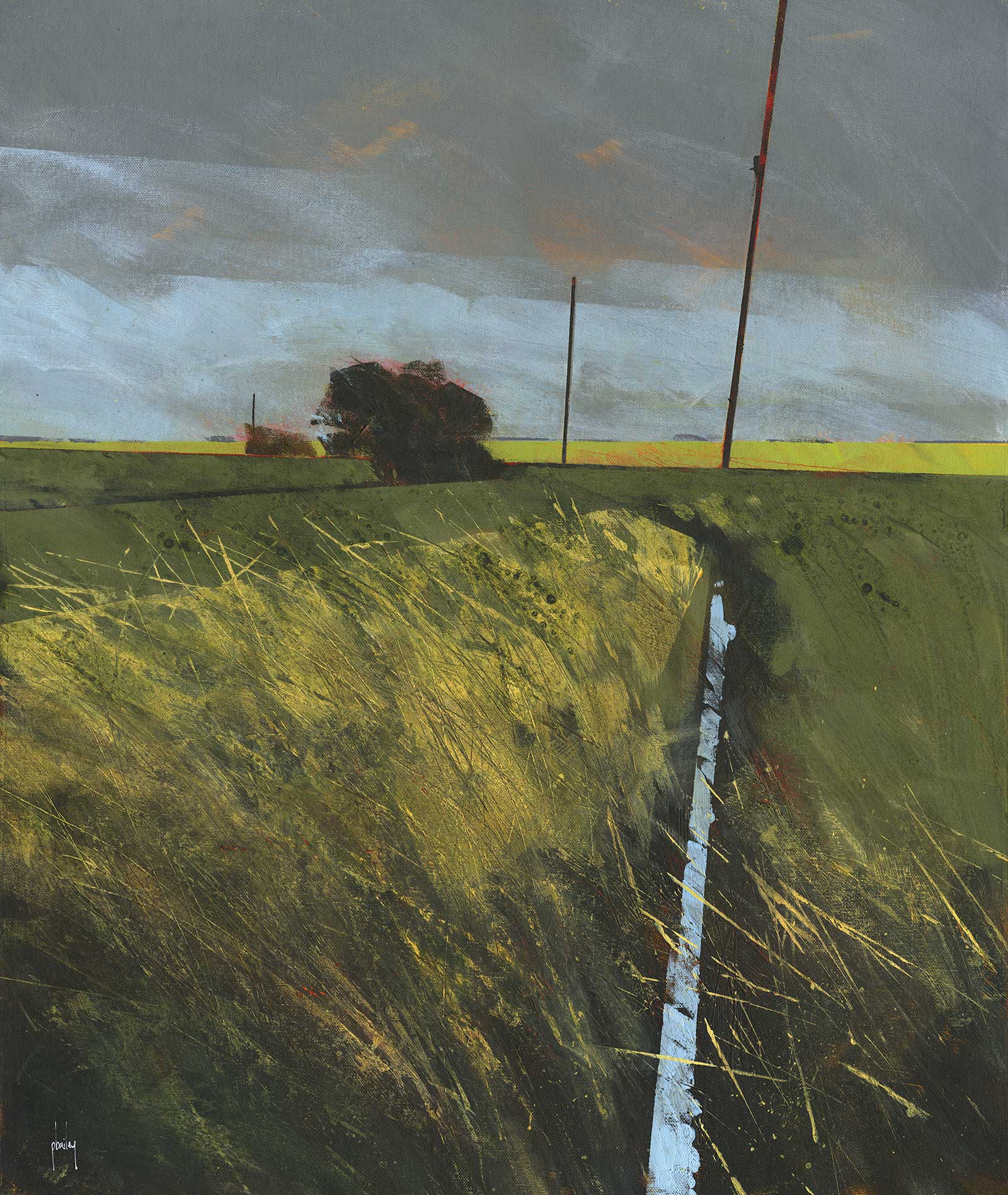
Low clouds over Twizzle Foot, acrylic on canvas board, 20 x 16" (50 x 40 cm)
I make no secret of my use of a phone camera to capture my reference in preference to sketching or painting plein air. Using my camera gives me more time to walk and explore. I augment the compositions with either memory or imagination, or perhaps both, and sometimes amalgamate photographic reference together. The photo is only the starting point. It’s not my intention to accurately capture the scene, but rather express its nature in paint. I find joy and excitement in painting this way without constraint. Yes, my paintings do reflect my slightly cavalier attitude, especially when some of my paint choices can occasionally be what is actually close to hand.
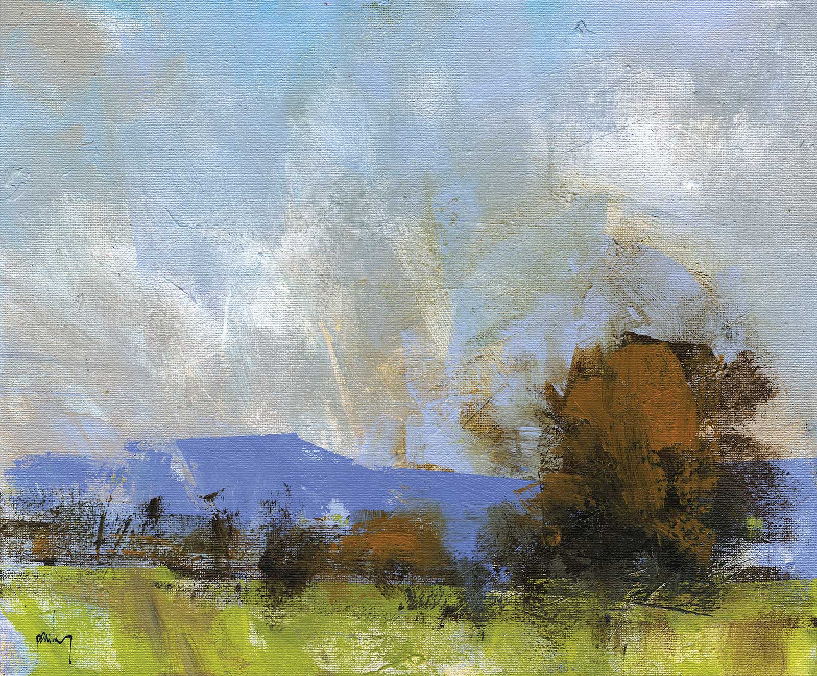
Severn Valley autumn, acrylic on canvas board, 10 x 12" (25 x 30 cm
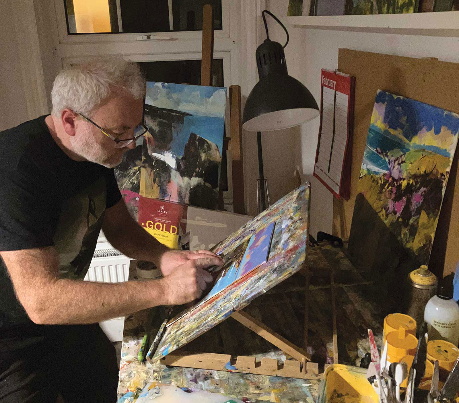
Paul Bailey in his studio.
One analogy of my process is that I consider the progression of a painting like a game of chess. I start with a plan, or opening, but I am willing to respond as the painting develops. My mark making, be it brushwork or paint flicking, is dynamic and occasionally unpredictable, but I have learned to get myself in the right ballpark so the results are controlled and pretty much as I intended.
My Art in the Making Porthclais dusk
In this demo I wanted to capture the late evening light before sunset—low contrast light with strong shadows and suggested textures. This is why I started with the orange base, which will set me on the right path at the outset.
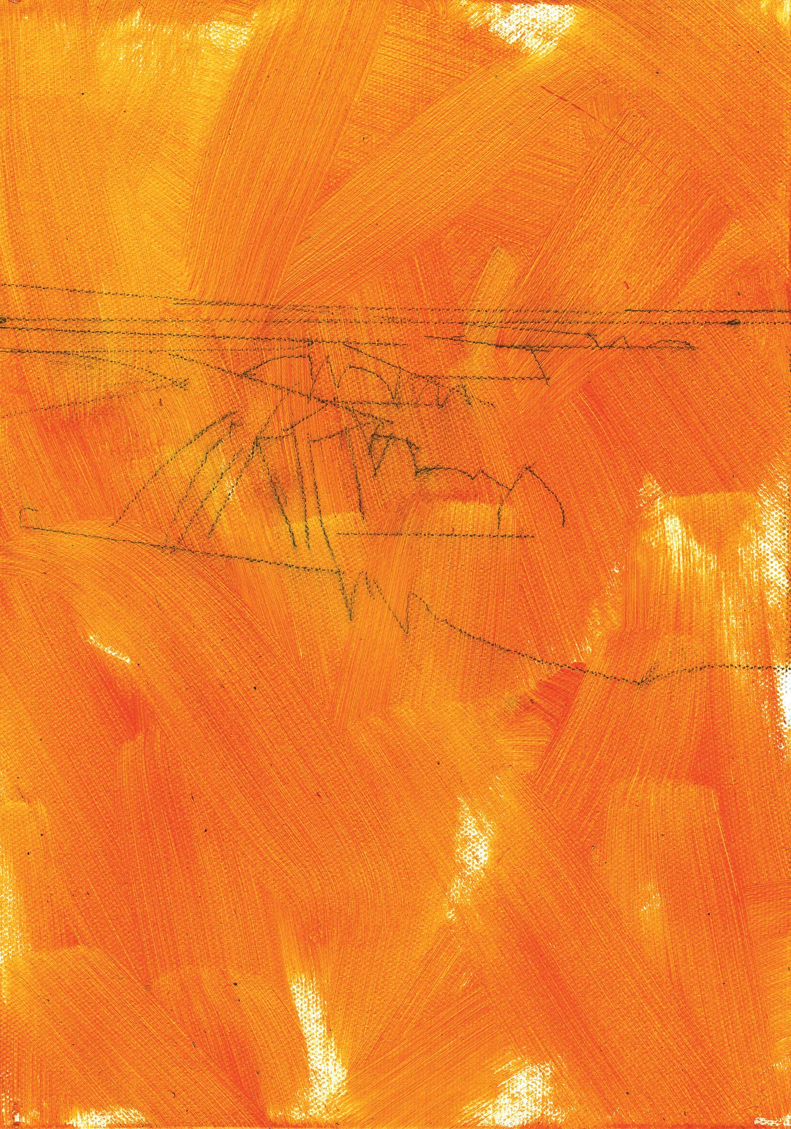 Stage 1
Stage 1 Initial Layer
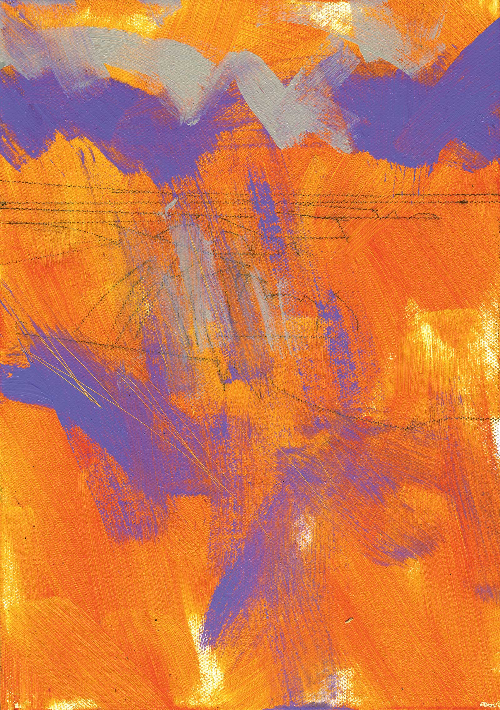
I began this painting with an initial covering of vivid red orange using a 1" Liquitex mural brush (something akin to a decorator’s brush). Even though most of this layer would be obscured by later layers of paint, I set my intention on expressing the angles of the cliff’s rock strata via the direction of my brushstrokes. This layer was applied over a simple sketch (a little heavier than my normal practice to help illustrate). At this sketching stage I am not too bothered with accuracy or detail, as I know some of the lines will be covered by paint while I build up the layers.
 Stage 2
Stage 2 Building Underlying Layers
These early stages are about building underlying layers of alternating colors. The shapes and brushwork are free and relatively unanalysed. The bright purple was applied with a size 12 bright brush and the pale umber with a size 6 bright. I scratched in some lines with the edge of a small palette knife in the direction of the wind-bent grasses. Most of my skies begin in this way (a couple of loosely painted colors), but I am conscious of echoing the serrated, sawtooth lines that are present in the cliff faces below. I feel my compositions benefit from echoed motifs.
The Power of Grounds
My process usually begins with a colored ground. I experimented with different colors over the years, but I have settled on using yellows, ochres or oranges in recent times. I prefer warm colors for these initial layers, even for winter scenes, as they are more versatile and allow for palette changes as I respond to the painting as it progresses. Cool and dark colors lock you into certain palettes from the outset, but I do use purple grounds for nocturnes. I think of this initial process somewhat similar to how a pastel artist would choose a paper color stock to begin a painting. It’s my intention to allow some of this base color to be left uncovered in the final painting, as I perceive that this color will resonate and glow against the surrounding opaque layers.
 Stage 3
Stage 3 Planning the Darker Shapes
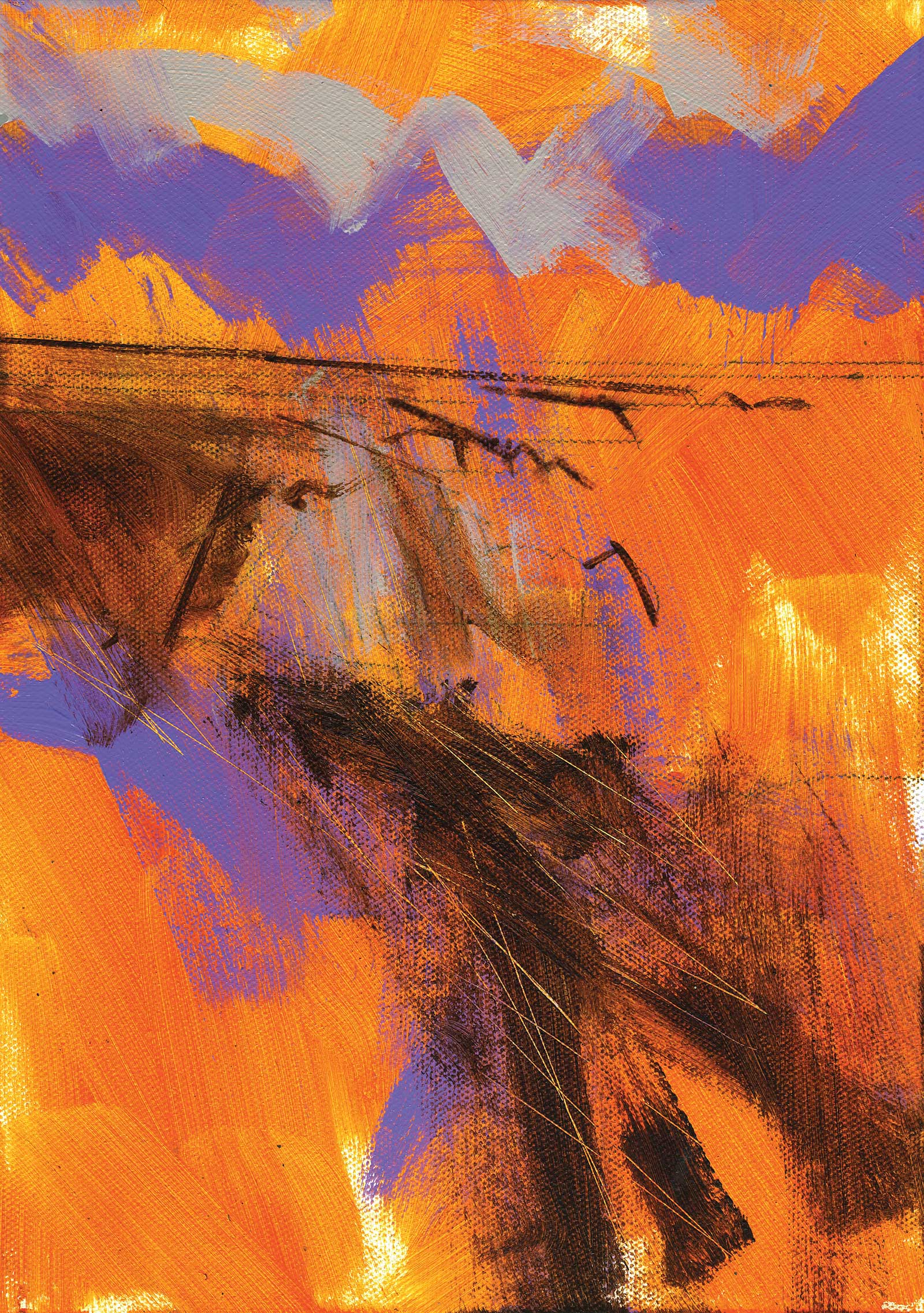
While the purple and umber from the previous layer are opaque, I now want to start mapping out some darker shapes and lines. Burnt umber was used, and its slight transparent property allowed the orange to shine through and warm the umber tone. The line work, rendered with a synthetic size 0 rigger brush, helped me identify the extent of the headlines as the layers are beginning to obscure my initial sketch.
 Stage 4
Stage 4 Bringing in the Greens
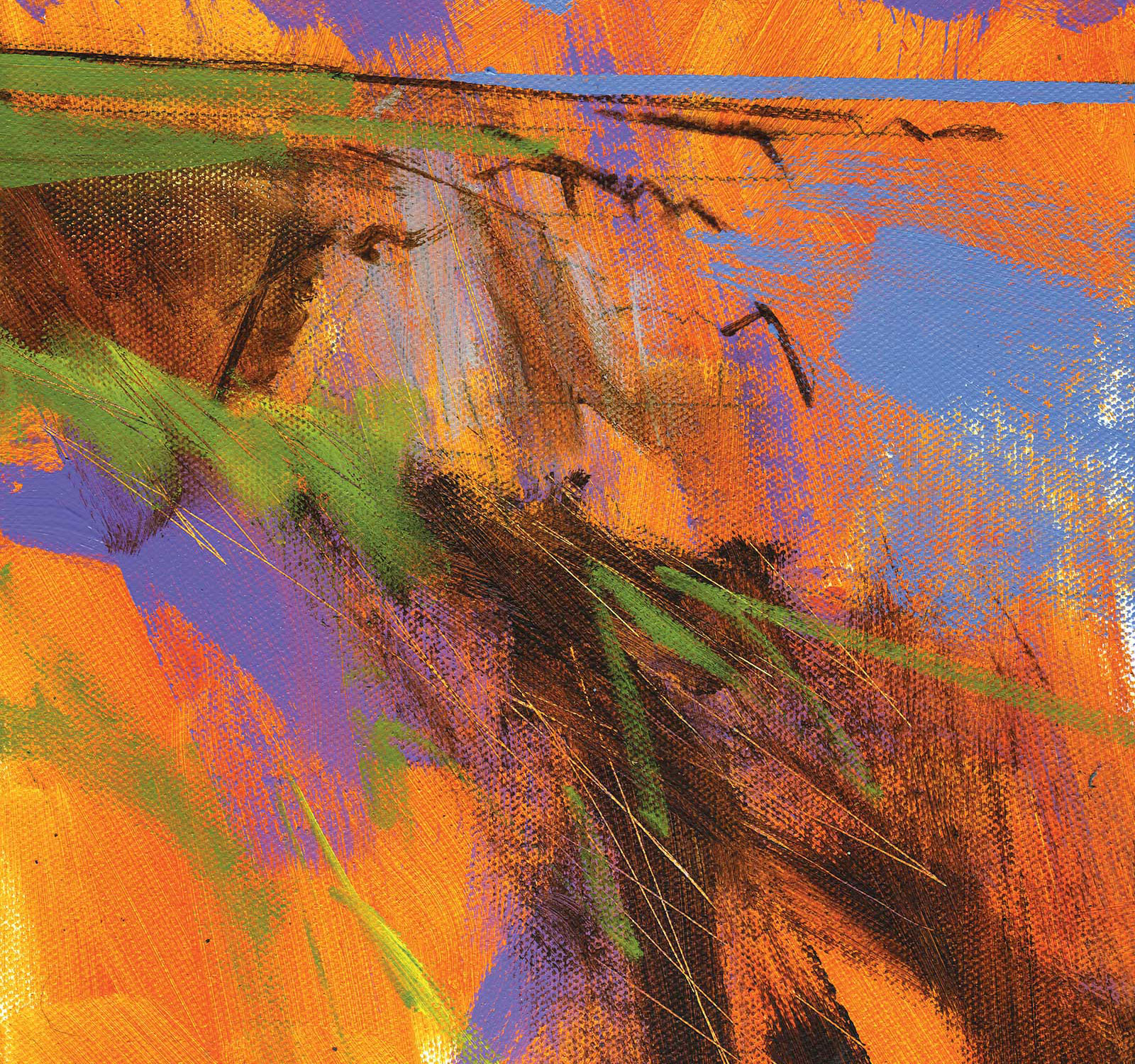
It was my plan to introduce some green on the distant headland tops and in the foreground. This green was a mix of mainly cadmium-free yellow medium and a touch of Payne’s gray. This combination produces a subtle, subdued green that will sit nicely amongst the other hues. I used light blue violet for the upper part of the sky, using it to shape the cumulus clouds below. A little of the same color was underpainted in the sea to augment the later upper layer of paint.
Greens
I have found that it’s better to mix my greens. In practice they are essentially dark yellows. I usually use a combination of either lamp black or Payne’s gray and a yellow (lemon, cadmium). I feel this combination produces a more grounded green, and adjusting the ratio of black and yellow will produce different shades. If I want to produce a more tropical, lively green, I will replace the black with a turquoise, or use a bright green straight from the tube for maximum effect.
 Stage 5
Stage 5 More Definition
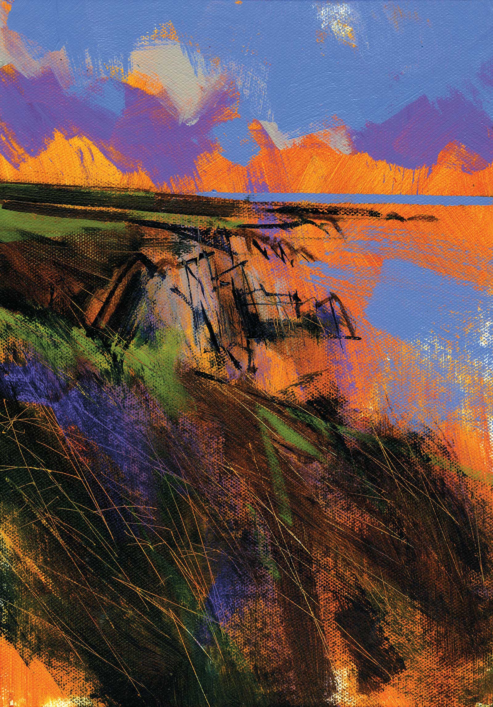
This is a point where I sort further definitions. It may seem odd to add what are normally considered “final marks” at this mid point, but they do indicate the cliff’s outlines. Remember, I want to preserve some of the initial orange base and prevent accidental coverage when I paint the sea (we will come to that in the next stage). The outlines were mainly painted by a size 0 rigger brush and a small palette knife (a wet mix of color on the side of the knife akin to a drip pen) using indigo. The large areas of dark tone were applied with a 1” bright brush using an equal mix of indigo and burnt umber. I scratched this dark layer almost immediately after its application to produce an indication of bracken. Note: the underlying orange is exposed.
Scratch Marks
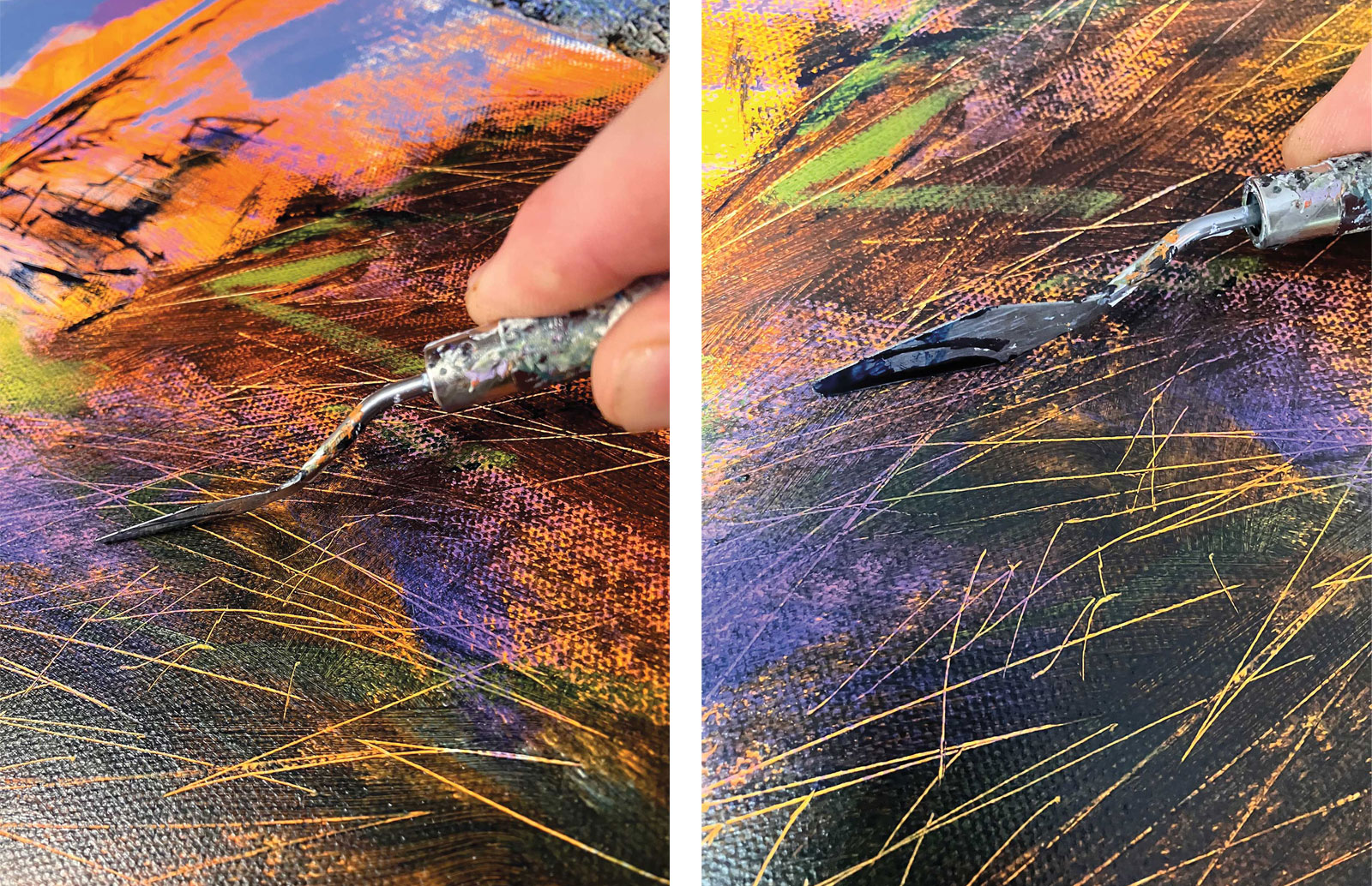
These are important marks, for me, that appear in all my subjects (portraits, landscapes, etc). Using a knife or blade, I scratch the fresh paint, revealing the underlying color. I particularly like the incredibly straight or slightly arched marks this technique can produce and the fine nature of the line, which is impossible to replicate using a rigger brush. This subtractive mark does rely on planning and ensuring the underlying layer has enough contrast against the overlying layer of paint to make these marks visible. However, a base of mottled hues and values produces marks with more interest, as this demo illustrates.
 Stage 6
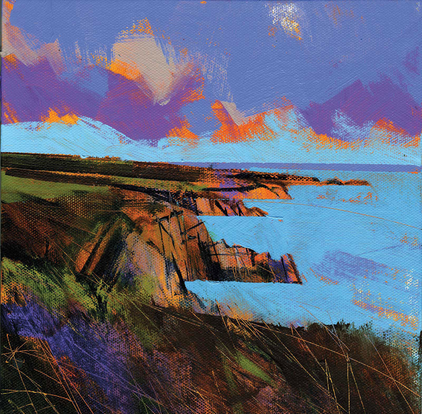
Stage 6 Sky and Sea
I now painted the lower part of the sky and the sea. I like to shape foreground shapes with a background element (the sea in this instance) especially if the background is lighter and brighter than the foreground object. This process is especially useful when depicting silhouettes like trees. The color of the sea was light blue permanent, used straight from the tube. I added approximately the same amount of titanium white to lighten the lower sky. Masking tape was employed to protect the orange base glow of the cliffs. I also felt the need to “correct” the angle of the foreground cliff edge, which I did with burnt umber, and quickly scratched some structure in it while the paint was malleable and wet.
Straight from the Tube
I am a fan of the unadulterated power of hue that comes with using unmixed color. I suppose it’s because I was a big fan of graffiti when I was in my teens. Dissonant color choices, as you get with graffiti, excite me, and it is fascinating to apply this color method to traditional landscapes and seascapes. However, I prefer to maintain some balance in my final compositions, so it helps to introduce darker and less vibrant sections for counterpoint. This increases the intensity of the bold color even further.
 Stage 7
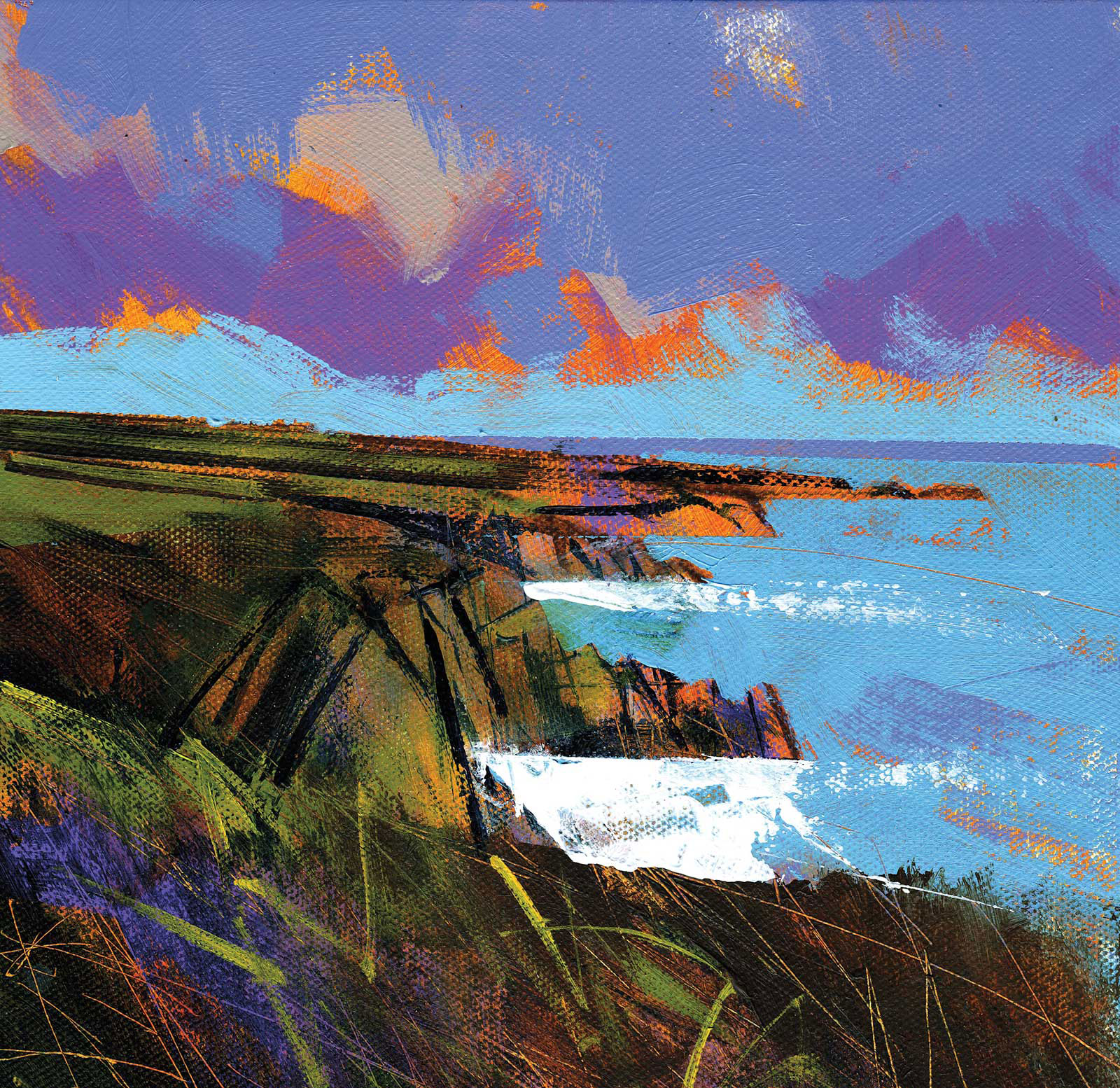
Stage 7 Ocean Waves
In this step I rendered the waves in pure titanium white. Firstly, I masked the cliffs with masking tape in preparation. The white was spread with a small palette knife, allowing the paint to run dry as I smeared the paint away from the cliffs, thus producing a sparkle effect. Unfortunately, some of the white paint “escaped,” and while wiping away the excess I accidentally affected the cliffs, so I re-emphasised their structures with a little bit of indigo again. Further indications of structure were applied to the foreground using a rigger and cadmium yellow medium paint—not too much detail, mind.
 Stage 8
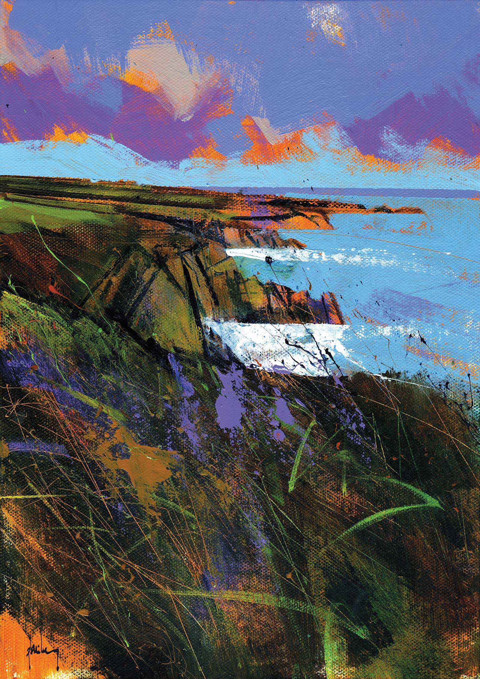
Stage 8 Finished Artwork
Porthclais dusk, acrylic, 12 x 8½" (30 x 21 cm)
Here, we see the final flourishes of dynamic marks—but first, something more subtle. I rubbed a tint of phthalocyanine green into the bottom right foreground to augment the tones. Next, a succession of dynamic flicks of color in vivid lime green, brilliant purple, raw sienna opaque and indigo. The flick marks were produced with a generously loaded small brush. I chose brushes with enough movement in the shaft, as this is where the “whip” of the recoiling handle produces the force necessary for the paint to be flung from the brush. I must also launch the paint in the intended direction. This method produces a wonderfully organic mark that’s ideal for capturing wind agitated vegetation. The break in the foreground cliff’s edge was slightly enhanced with indigo, after which a couple of final thin applications of color, brilliant purple and raw sienna opaque, were applied with a small palette knife.