


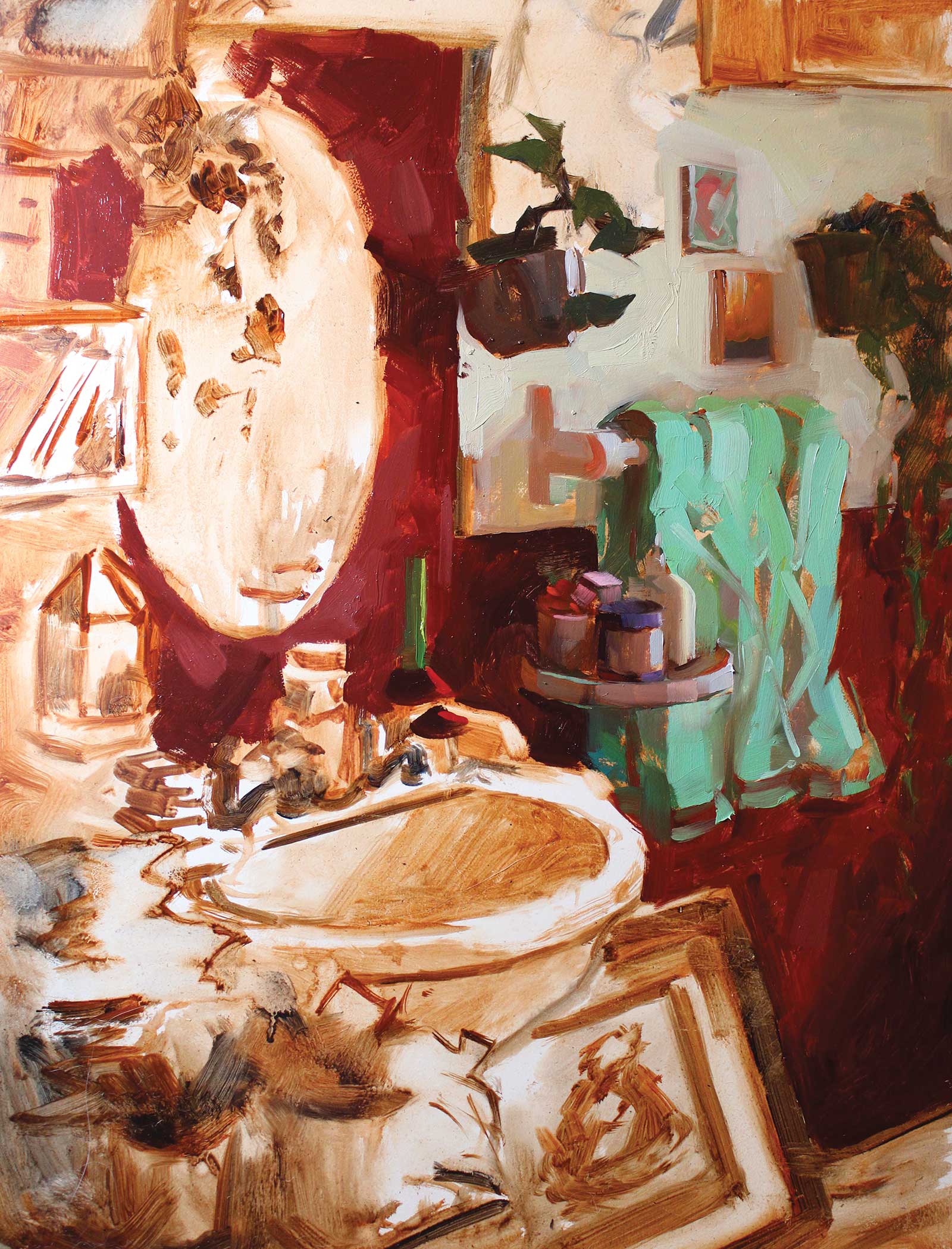
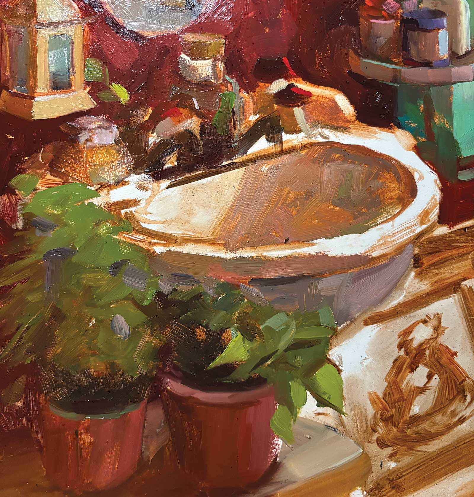
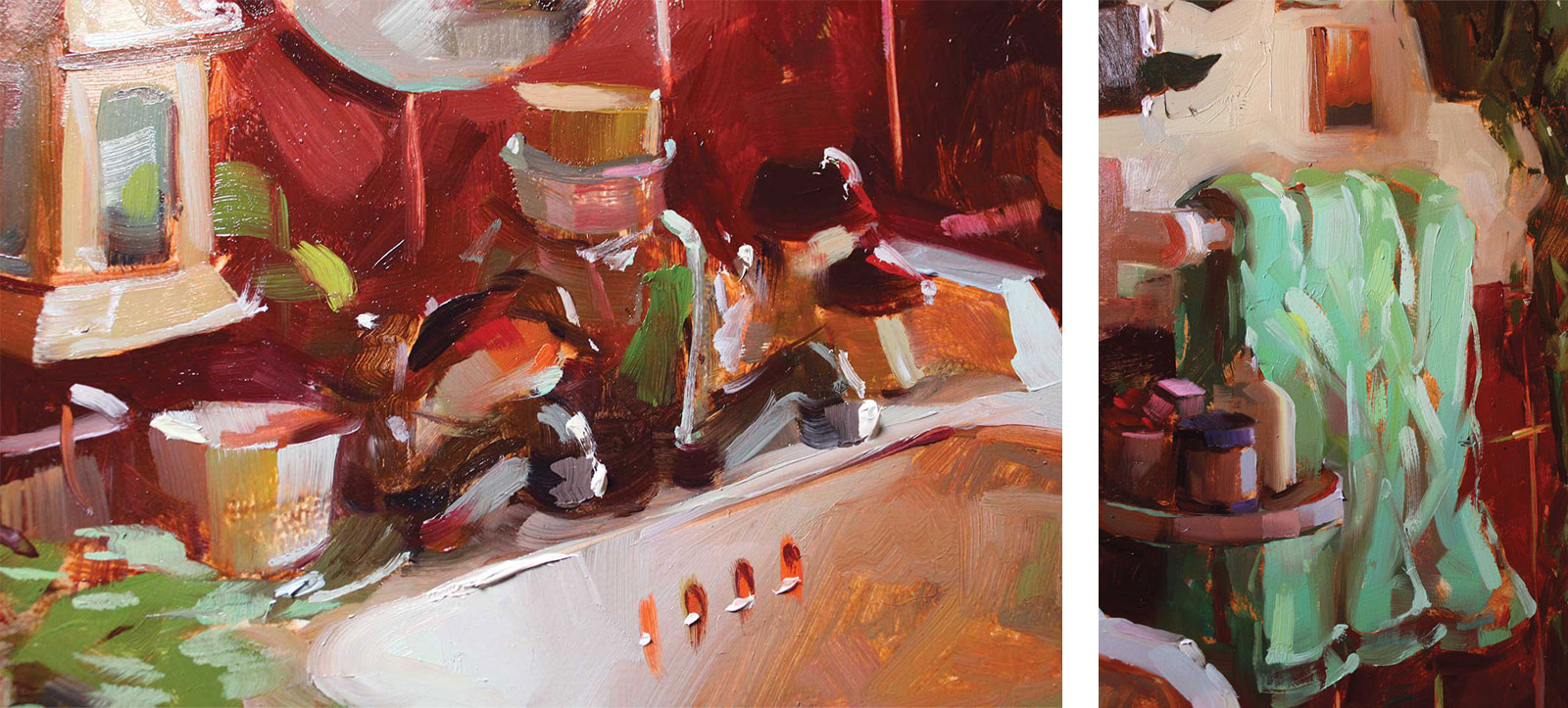
My piece, Bird Bath, is a scene from my own washroom, which I kept passing and thinking “that light is gorgeous!” Once I spot an area that I’m inspired by, my sink in this case, I start to organize a composition around it to suit the painting.
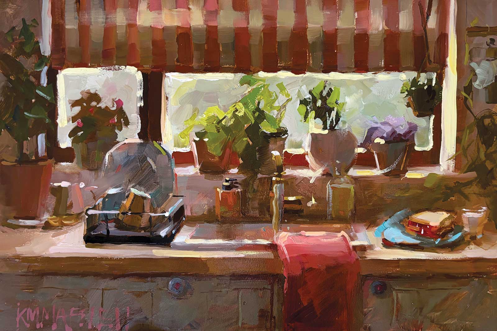
Your kitchen or mine?, oil on canvas, 8 x 12" (20 x 30 cm)
As I paint from life, I don’t always have the luxury or time to rearrange a setting how I’d like it (my friends would likely not enjoy me redecorating their places). But since this was my house, I took the liberty of adding a few plants and even a tiny bird on my tap, much to the delight of my husband, because this is the only time I clean.
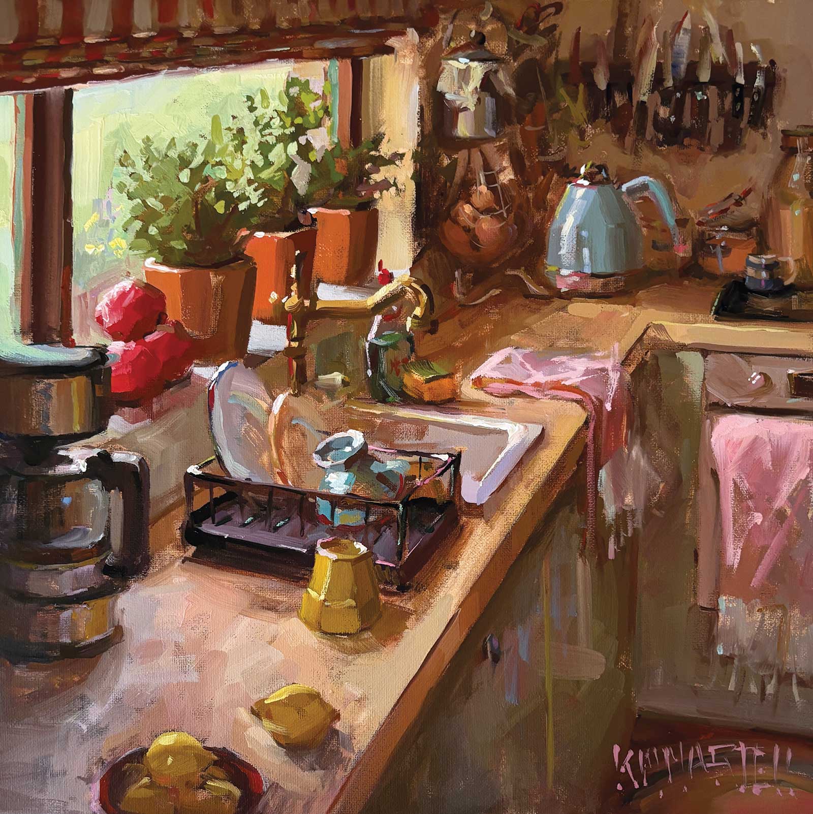
New Kitchen, oil on canvas, 12 x 12" (30 x 30 cm)
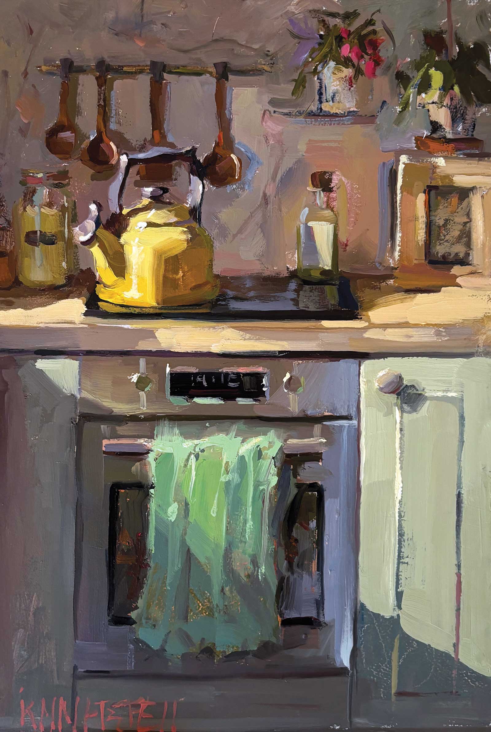
When the day is over, oil on canvas, 12 x 8" (30 x 20 cm)
Once I had spruced up the bathroom, I set up my easel in the hallway. I have everything I need attached to my tripod: brushes, solvent cups, etc. And what doesn’t fit there I store in my backpack that I can easily carry from room to room or back to the studio. I want to always be able to set up at a moment’s notice.
My Art in the Making Bird Bath
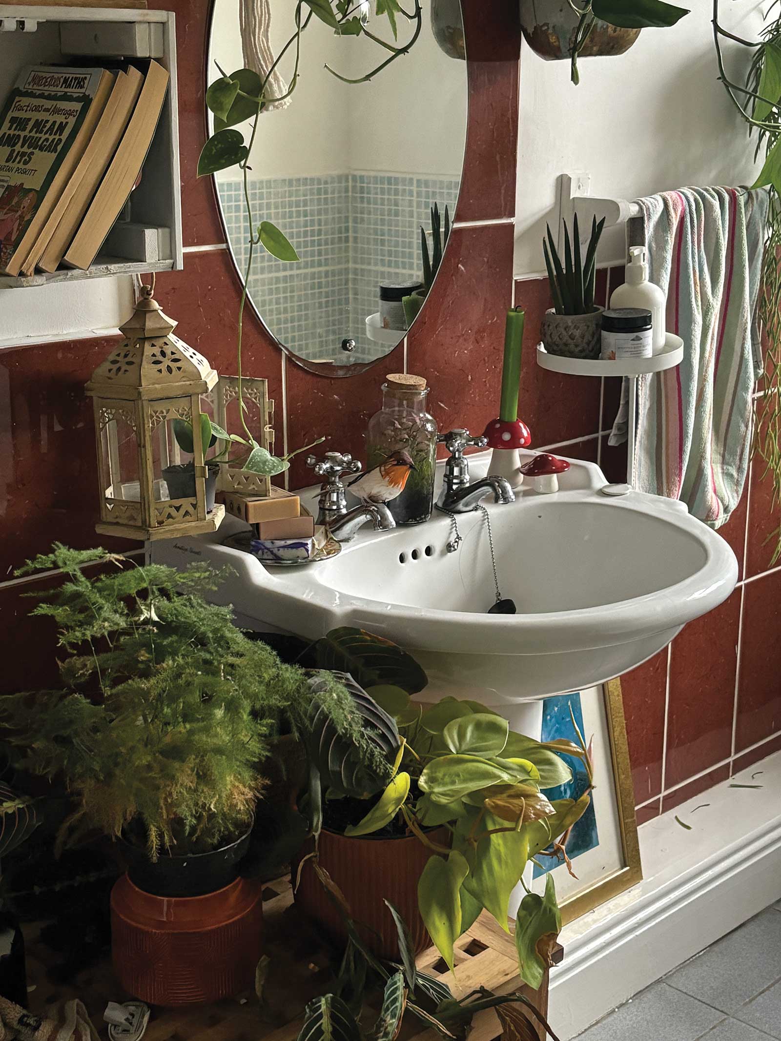
Reference Photo
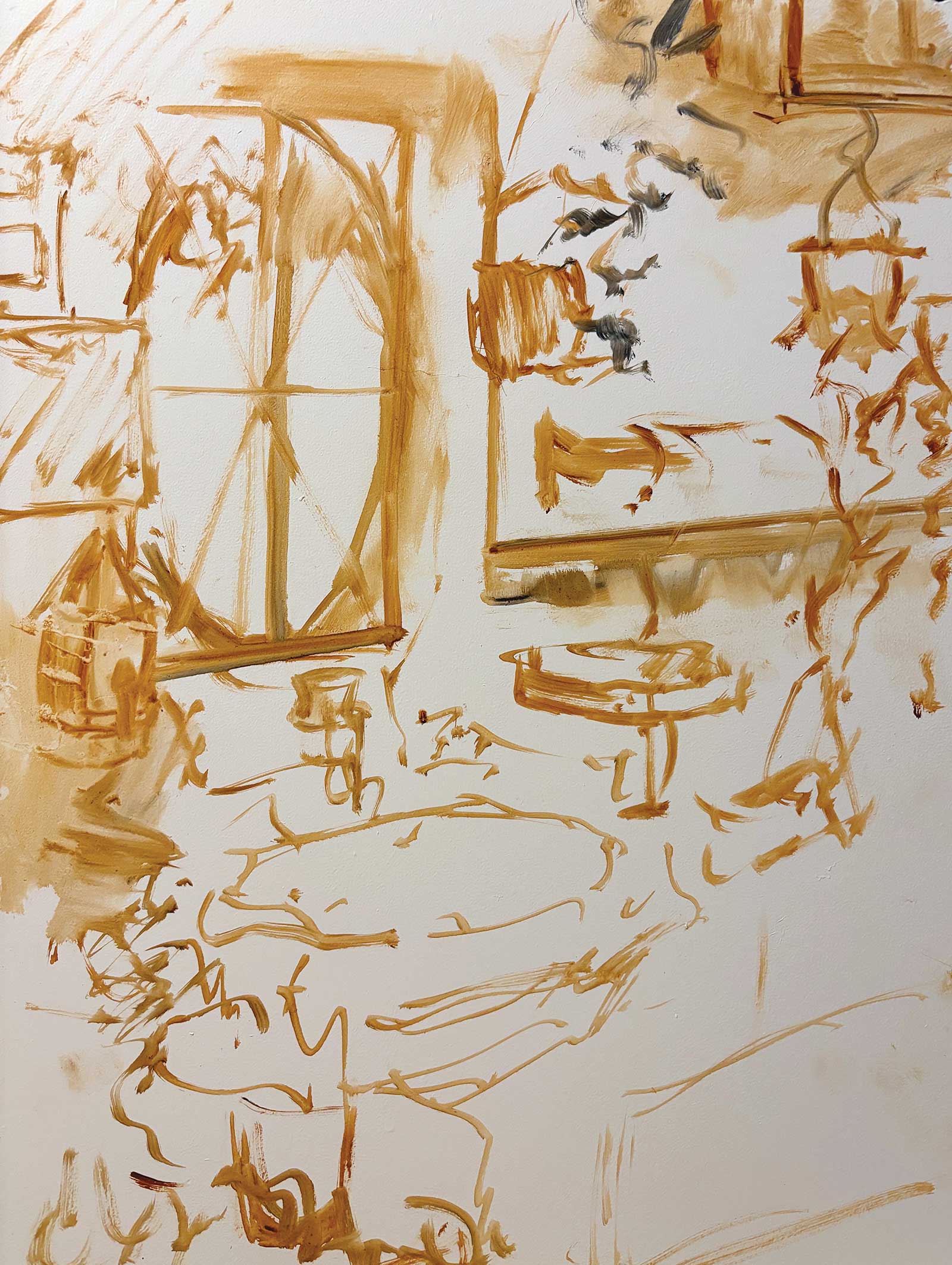 Stage 1
Stage 1 Composition
Composition—the big, big secret! If I don’t have a good composition, I won’t have a good painting. This means I need to use my viewfinder to ensure the cropping of the scene will give me a good mix of light and darks, and ensure my focal point is in the right place. I will adjust the size through my view finder while squinting to figure out if I want a portrait or landscape, as well as what canvas size.
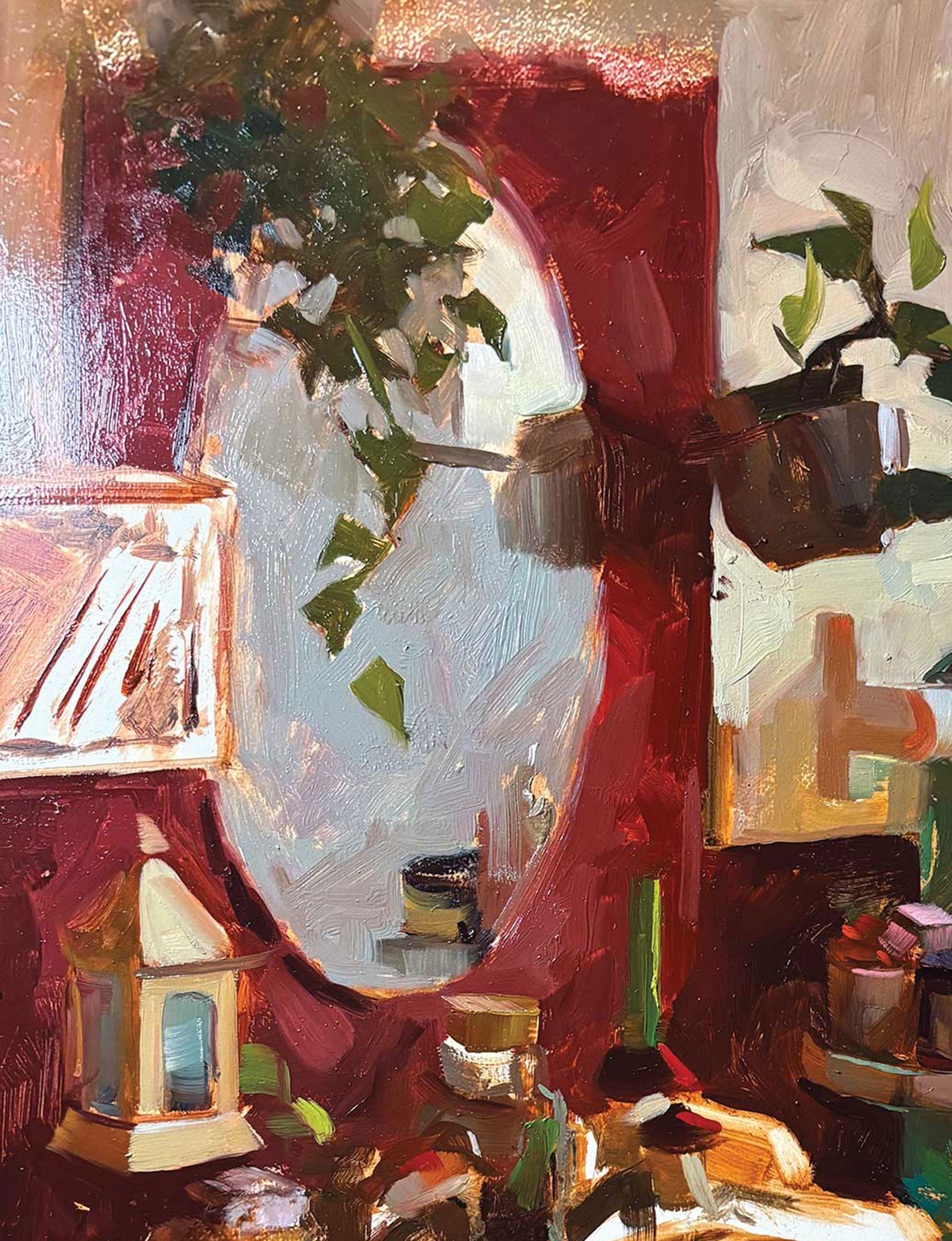
For this painting, I selected a portrait because I liked the notan view (the groupings of light and dark) in a vertical setting. It also helped position the sink as the focal point and accentuated the length of the mirror. It was extremely overcast in Ireland that week, so my bathroom painting is darker than usual. Because I never do thumbnail sketches, I loosely sketch out the position of the items on my canvas panel using burnt sienna I thinned with Zest-it—a friendly solvent in Europe—and using a Rosemary & Co. size 2 ivory flat brush. My sketch should be really loose, because if I drew the most perfect sink I could ever do, I might really not want to move it around, and I need to be able to shift the objects to suit the composition.
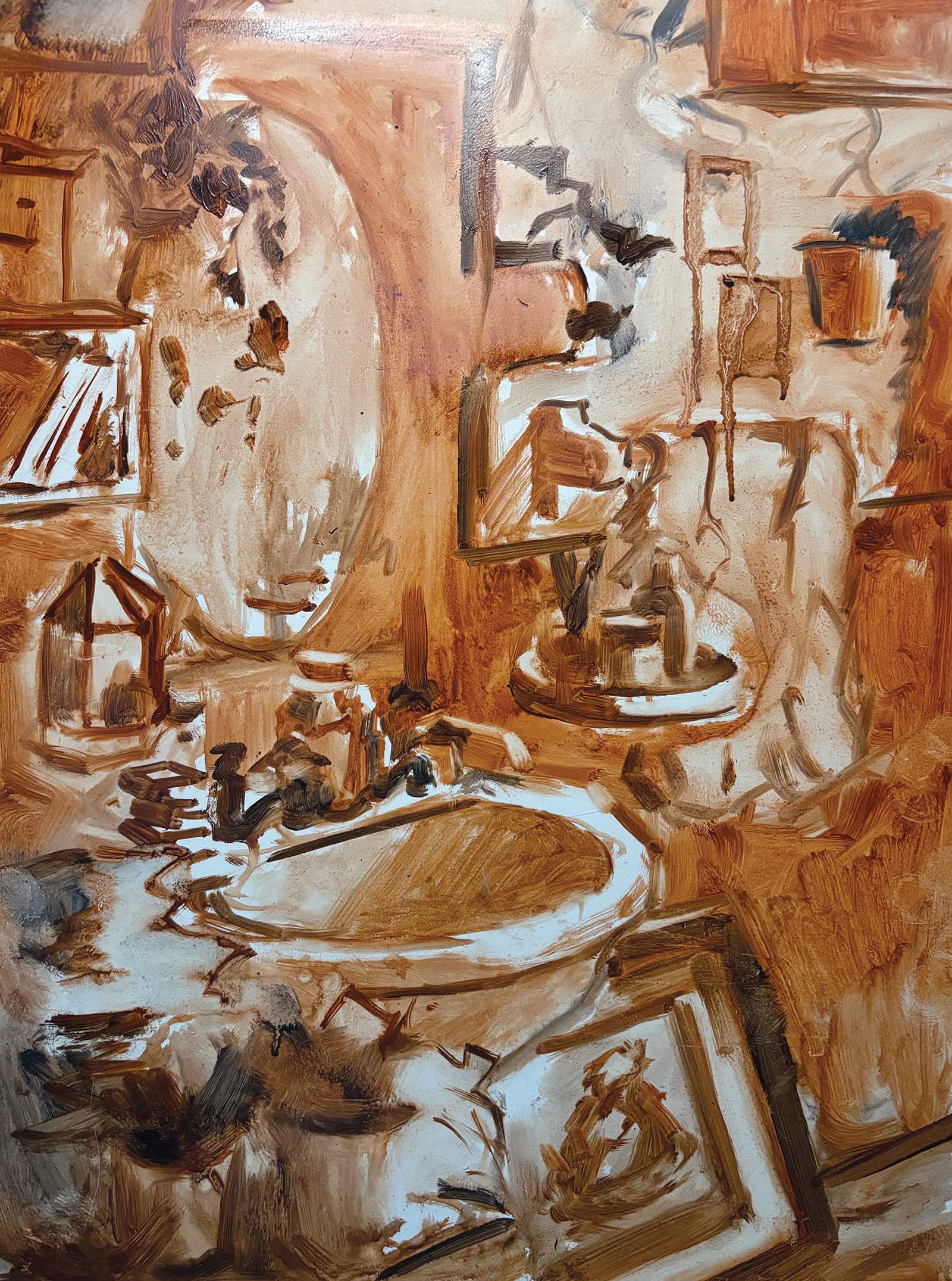 Stage 2
Stage 2 Drawing and Underpainting
Now that I’ve decided I like everything roughly placed like this on the canvas, I’m ready to start my underpainting. This is where I will really start to properly draw all the elements I want to include in the final painting, ensuring the groupings of lights/darks complement my focal point, and I’ve made all the big decisions on how I’m going to tackle light traveling across the surface.
For instance, are the tiles getting darker or lighter as the window light moves right to left across the wall? Is the mirror brighter than the sink, or darker? Essentially, this step should result in a clear value study, as well as a warm undertone, and confidence in my drawing and perspective. If I’m not happy now, I won’t be happy later.
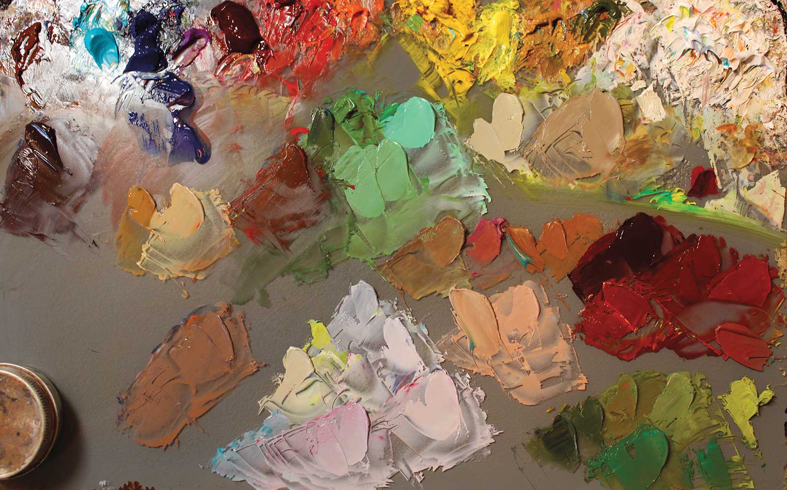 Stage 3
Stage 3 Color Mixing
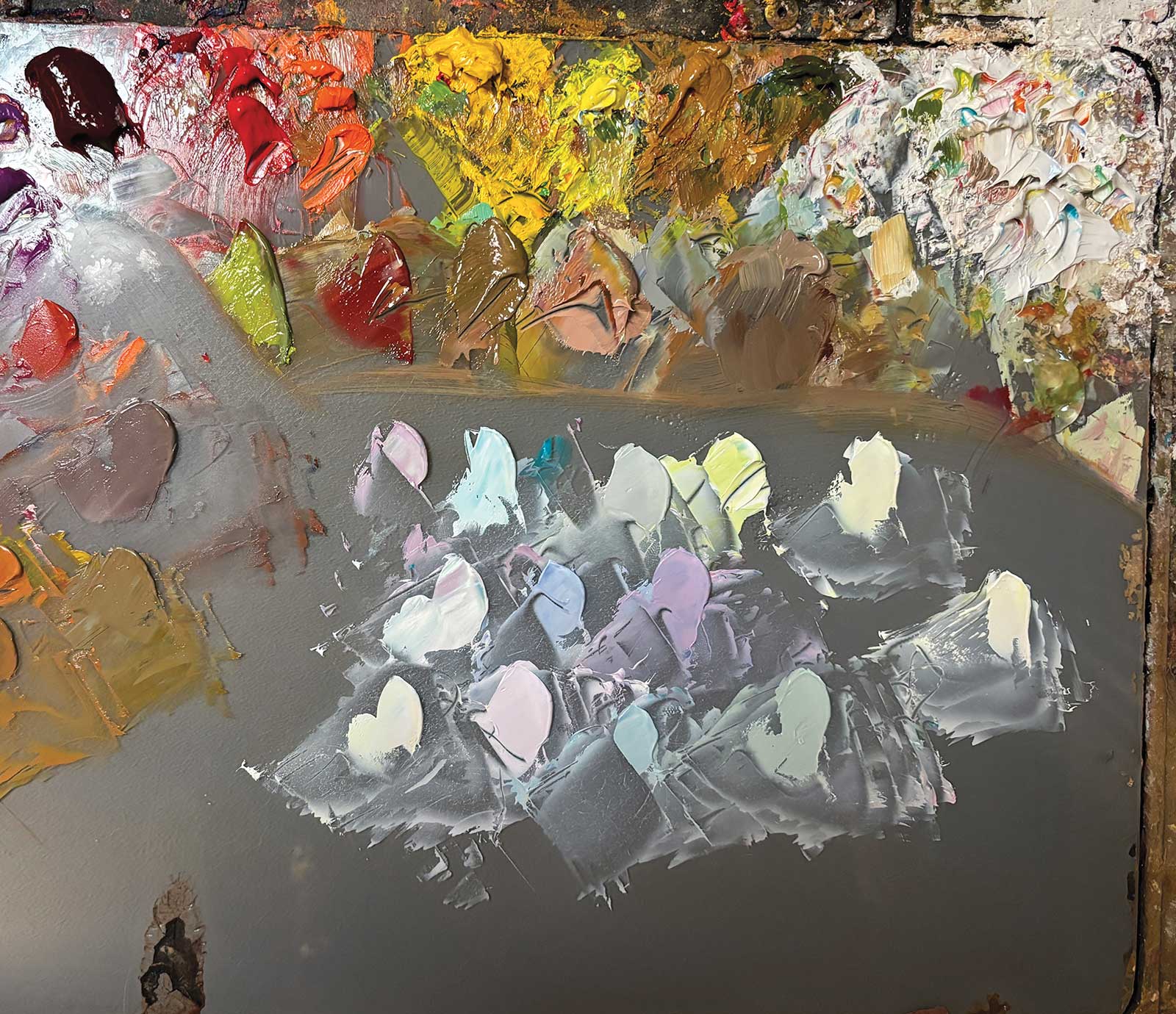
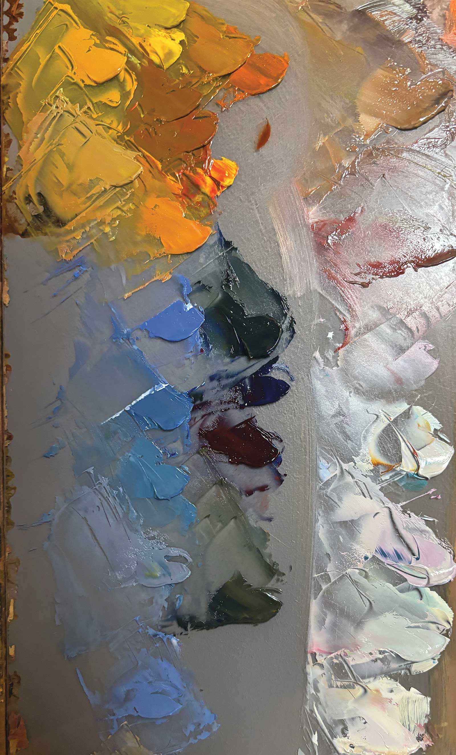
Now I will premix all the major color areas for my painting. Once I start painting, each pile will be adjusted, but it gives me a lot of confidence to start and helps break down the overall problem. It also helps me identify any issues early on because I can see on my palette if I’ve mixed two colors that are the same for objects that I saw as different.
As I’m painting with a cool light source, I’m focusing on mixing my light-facing side objects with cooler lights, such as using my lemon yellow plus turquoise to mix the towel’s light side.
As I color mix, I’m not mixing the actual color, I’m mixing how the color looks against something else. For example, what is the “white” wall compared to the green towel in terms of the following properties: hue, value and chroma? Is it more yellow? Less saturated? Darker?
 Stage 4
Stage 4 First Brushstrokes
The first color I put down in a painting is really important for me because all my colors are relative to one another. So the first color is going to be the “key” to which I now judge all other color choices. This means I usually pick a color that “can’t really be much else”—or, that’s how I like to think of it. For instance, the dark red tile in shadow is very dark, very desaturated and slightly red. With my limited palette, there aren’t many combinations of colors to achieve this, which means it’s a good start to lay down first to then judge the next colors off of. Particularly, you can see how I have moved from the dark red tile in shadow to the shadow side of the towel. This is because I can now reference the towel to the tile, then the light side of the towel to the dark side, then the light side of the towel to the wall, and so on. But it all starts from that dark, desaturated red I put down first.
 Stage 5
Stage 5 Mapping Out the Painting
Now, I’m just following the colors I’ve put down around the canvas. Since I have the wall, I have a reference to paint the pots against, and the same with the green. I’m squinting a lot, checking the average color of the greenery because I’m going to keep the plants very simple and add the highlights later. For the tray, I have all the colors around it so I can start to paint the objects in the tray. At this stage, I’ll never completely finish anything, usually preferring to leave off the highlights, or those final spots of chrome.
Mixing Whites
An easy way to mix beautiful neutral colors is to take the complementary colors purple and yellow and mix a line of color from purple to yellow, and in the middle, you’ll find you have a neutral gray. Add a bit of white, and you can have a purple gray, a yellow gray, a cool gray, a warm gray. Try it again for red and green, and blue and orange.
 Stage 6
Stage 6 Keep Going!
I’m just continuing to move around the painting, always squinting at the setting in front of me and comparing those color relationships to what I’m putting down in my painting. Those tiles by the mirror are going to get lots of fun reflections later, but like with the other objects, I’m leaving most of these at 80 percent completion. This is because I have a little roadmap in my head of where I’m going. I always say, it’s a lot easier to get somewhere when you have a map. So don’t be too put out if you’re new to painting and things aren’t working out—you might not have the map yet!
 Stage 7
Stage 7 Painting the Mirror
I’m ready to add the mirror in, which is mostly ultramarine blue, yellow ochre and cadmium orange. The tile wall it is reflecting is a warm blue but much less saturated than the towel. It is also lower in value than the light side of the towel.
 Stage 8
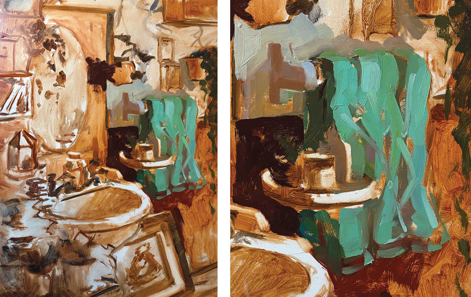
Stage 8 Mixing Colors for the Sink
The sink is my favorite part! When mixing whites, I try to mix every color but white, and while we might think of white objects as “gray,” gray is not on the hue color wheel. So is it a yellow white? Orange white? Blue white? Purple white? White objects (like porcelain) are usually cooler, even in warm light, so I’m really looking to push my cool mixtures in the light, while making sure they’re dark enough next to my highlight so the highlight stands out.
 Stage 9
Stage 9 Form Shadow of Sink
The form shadows of white objects are usually darker than you think. I want to mix a warmer, more desaturated color for the dark side of the sink than its light facing surface. I can use the value of the plants to compare how much darker they are with the shadow side of the sink, then capture that value relationship.
 Stage 10
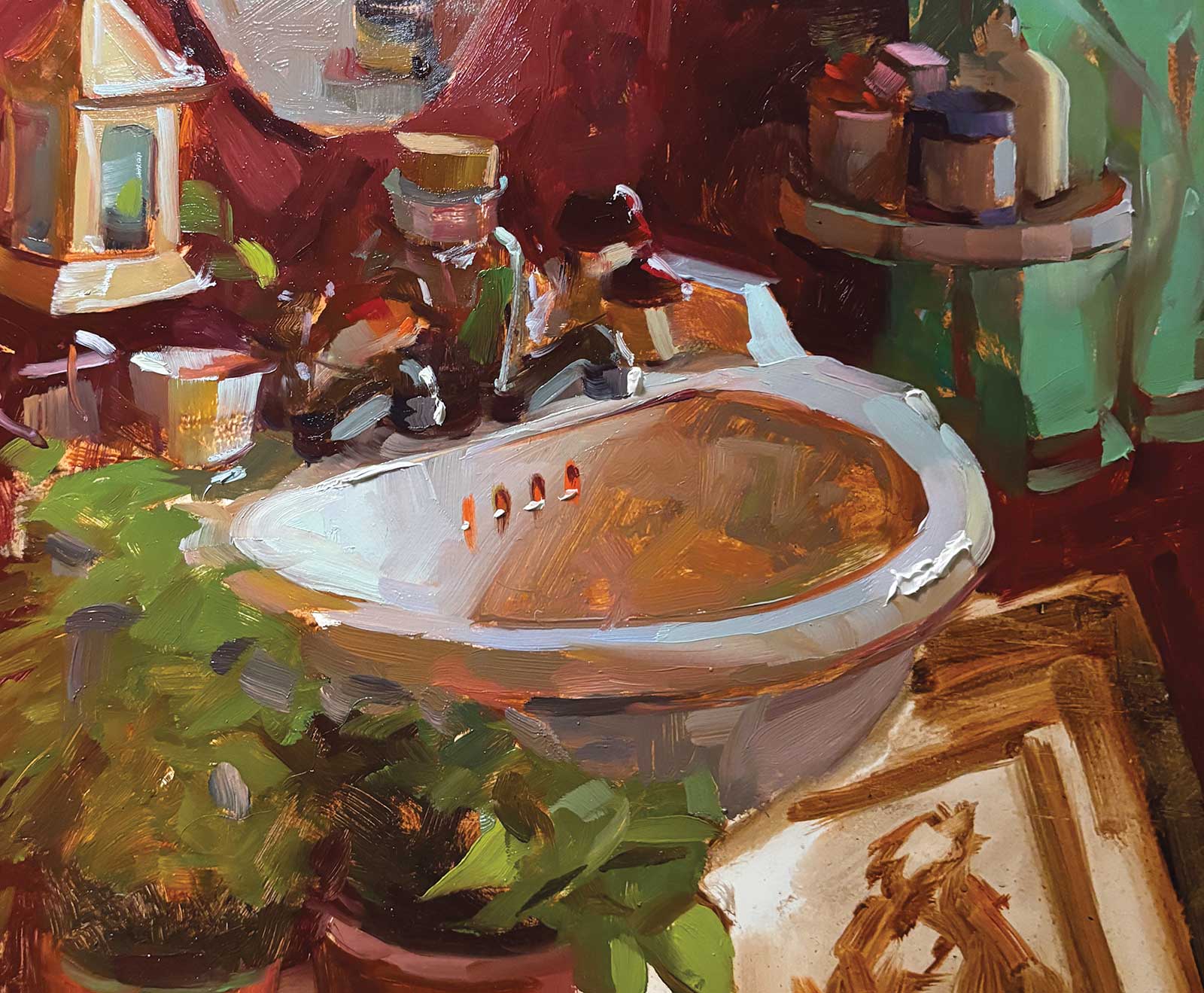
Stage 10 Finishing the Sink
I’ve finished applying the light-side color mixtures I prepared earlier. Inside the sink, we have a cast shadow from the side. It is almost as dark as the form shadow, but it gets a lot of reflected light from the wall, so I keep my application of paint thinner and allow the underpainting to show through for a glowy effect.
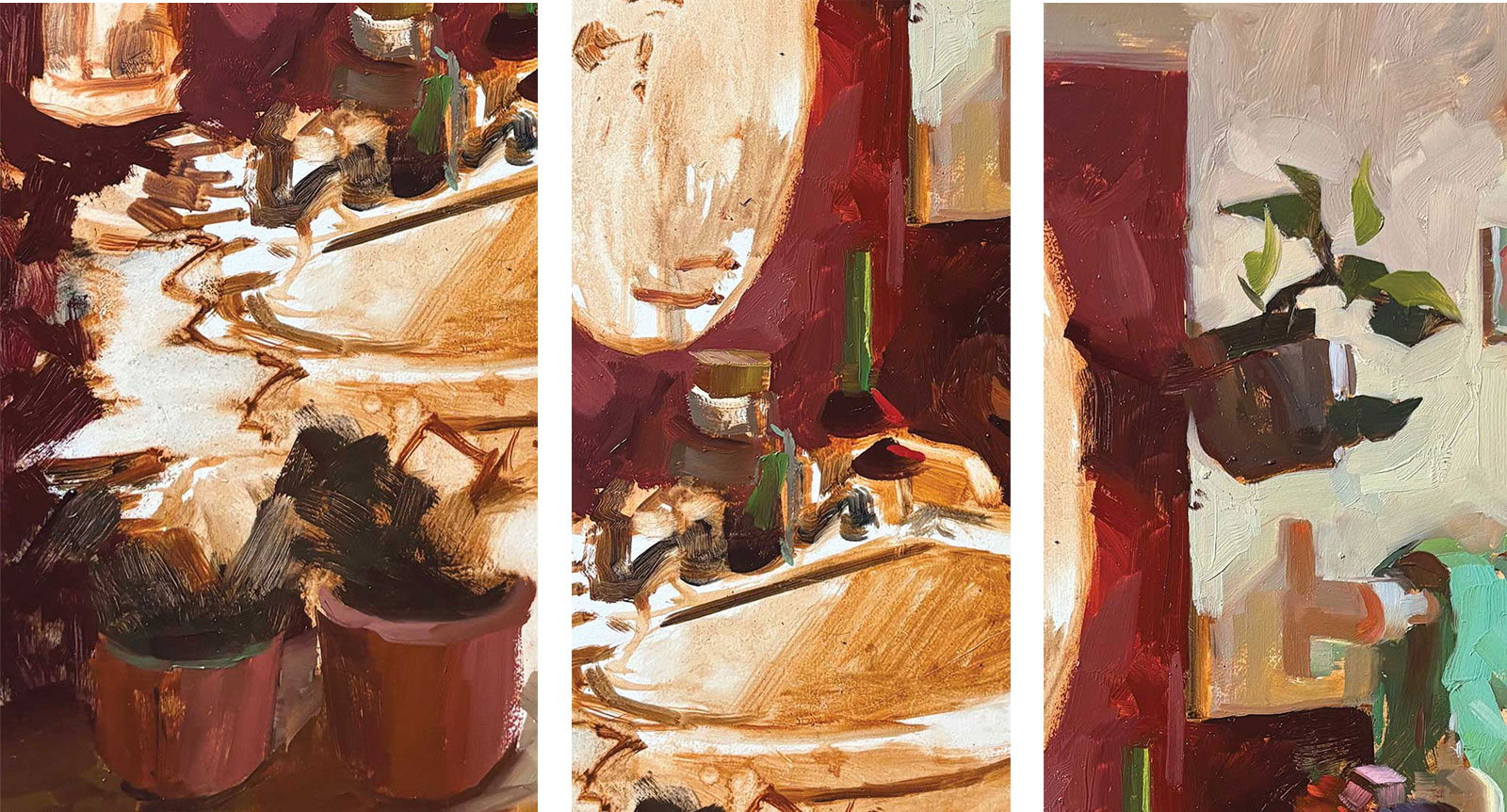
At this time, I also painted my taps. For sink taps, less is more. When I squint, they are mostly dark shapes with a reflected belly and very bright highlights. It’s important to keep them dark and to make sure they are in alignment in the perspective of the sink. If they are out of alignment it will be very obvious. I also switched out the bars of soap I had in the corner and replaced it with a little teacup because I didn’t think soap was adding enough. I’ve made a few other adjustments, like painting only two of the three plants and removing the candlestick I thought was a distraction. At this stage, I have not yet added the highlights on my taps (most of my highlights are at the end) but I have painted in this super cute little bird. I’m delighted; she’s got such a big belly!
Highlights on Porcelain
Highlights are important for showing the texture of objects. But how to get a highlight on a light object like porcelain? Lower the value of the light facing surface around the highlight to a two or three value so the highlight appears more dramatically. This will mean you drop the local value of the formshadow as well.
 Stage 11
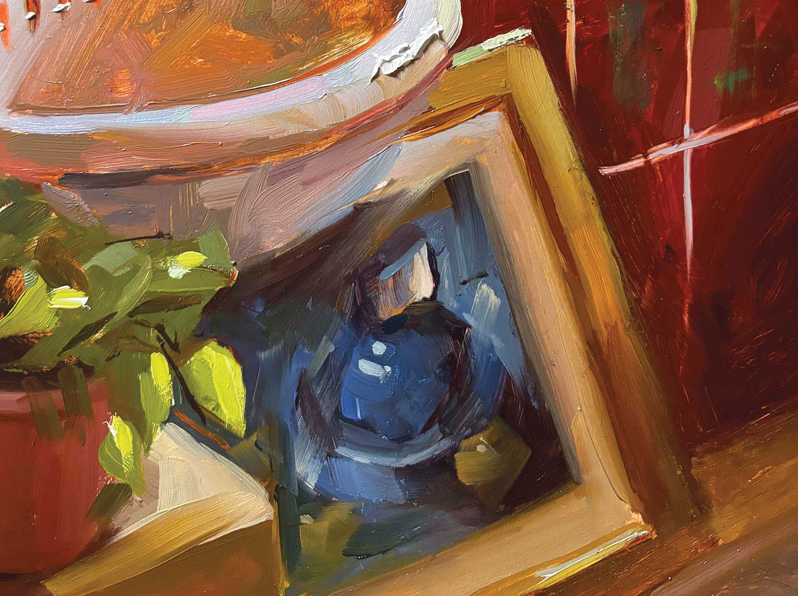
Stage 11 Mixing Blues for the “Painting in a Painting”
I’m ready to start painting the picture of the blue pitcher in the frame below the sink. I mix up some very dark blues, mostly with ultramarine blue and a little cadmium orange to neutralize it very slightly. For the lighter blues of the pitcher, it is mostly ultramarine blue plus white, then either alizarin crimson to make it more purple, or yellow ochre to make it more green. While this picture is definitely “blue,” if I were to paint the entire thing with ultramarine and white, it wouldn’t look great, as it would lack subtlety. So even in the blues, look for those nuances, where it shifts to warmer, greener, purply-er, etc. All those colors are in there but perhaps easier to see in real life.
 Stage 12
Stage 12 Painting the Pitcher
Using the blues I mixed up, I squint and try to paint the main color areas I see in the painting. When I squint at the blue pitcher, most of it resolves into the same color, so I don’t want to have any high contrast areas. The inside of the pitcher’s mouth might be brighter when I look at it, but if I make it too bright, it’s going to jump out at the viewer, so I tone down the mouth even though my brain is yelling “white! white! white!”. I’ll also usually add some brushstrokes across the top at the end to make it feel like glass, like there’s another surface happening over the top of everything I painted.
 Stage 13
Stage 13 Details
Now it’s time to fill in all the end bits I missed that make the objects go from 80 percent complete to 100 percent. The highlights on the taps, more bright spots on the towel, little details or drawing corrections.
 Stage 14
Stage 14 Finished Artwork
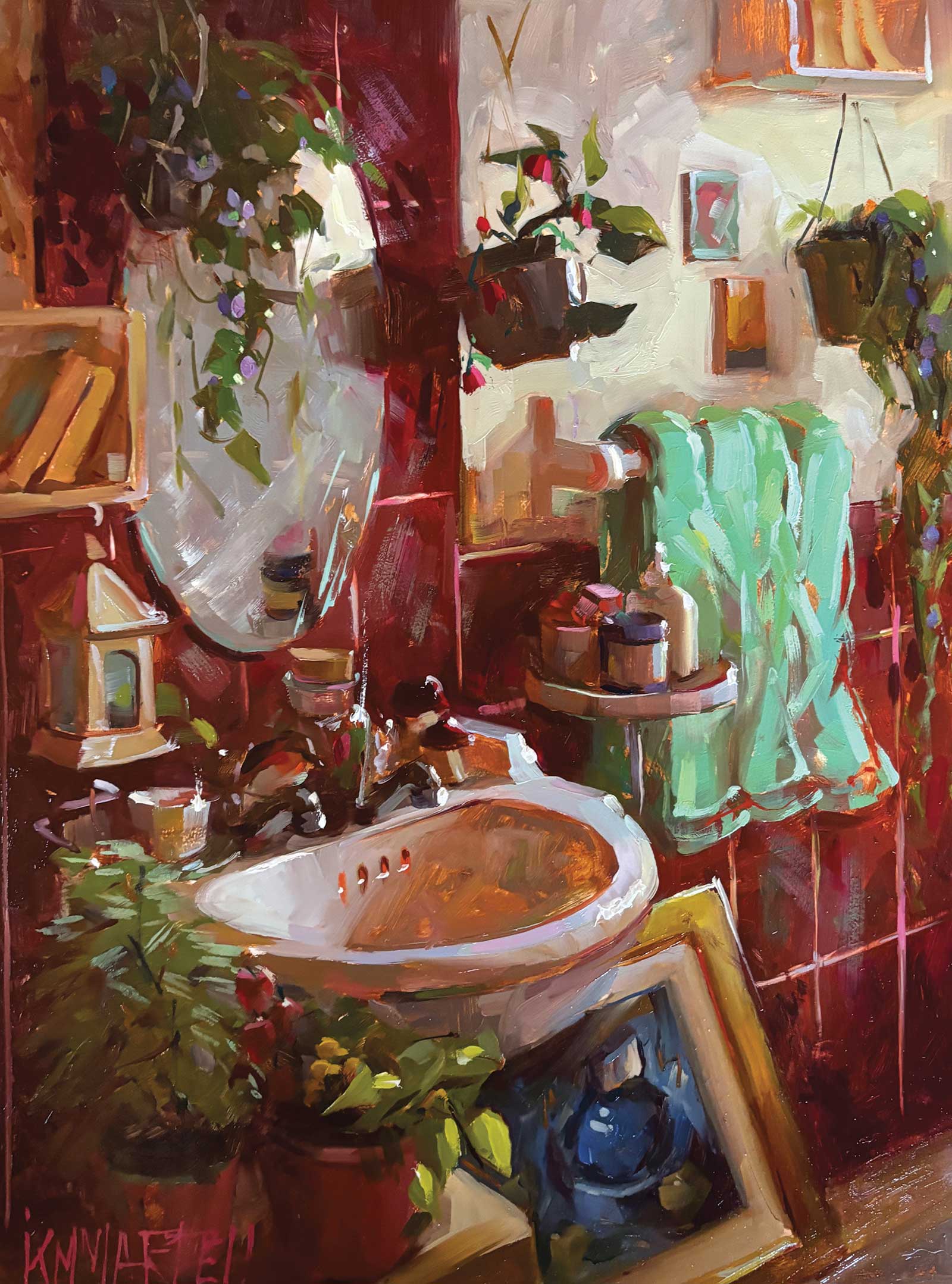
Bird Bath, oil, 12 x 15¾" (30 x 40 cm)
If possible, I take a break and have a cup of tea, then come back to the painting and realize I’ve forgotten to put paint on some areas. But really, it’s time to look at what is missing, what is going to make this sparkle, where some areas feel too cool, or too warm, or could do with a sparkle of chroma. I’ve got to tie it all together and make sure I’ve said what I wanted to say. If I’ve had that break, usually an area will jump out at me that my brain wants to be lighter or more chromatic. These are entirely a physical reaction I have, and often they may contradict what I know is technically right, but I go with them. That being said, I won’t spend hours “finishing” a painting if it’s not a good painting. All the foundational structure should be good—no lipstick on pigs!
About the artist
 Kayla Martell
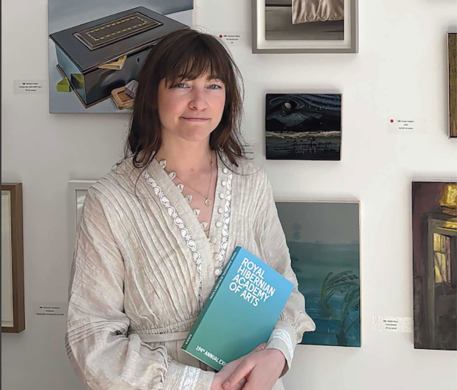
Kayla Martell lives and paints in the beautiful countryside of Wicklow, Ireland. She loves bringing to life the spirit and beauty of everyday things on the canvas with a focus on manipulating oil paint to be the most expressive and beautiful it can be.
Martell’s paintings have been shown in exhibitions including the Royal Society of Oil Painters, Royal Society of Marine Artists, Royal Hibernian Academy, Society of Women Artists, Dublin Painting & Sketching Club, Southwest Academy of Fine Art, Graphic Society of Fine Art and more. She is a member of the Society of Women Artists and the Dublin Painting & Sketching Club, and has recently won the Royal Society of Marine Artists New Generation Award, the Royal Society of Oil Painters-themed painting prize, and the Society of Women Artists Editor’s Choice Award. Her paintings are in the Doorway Gallery in Dublin, Killarney Art Gallery in Killarney, and the Rosslare Gallery in Rosslare, Ireland.
Contact at
kmmartellart.com