


A little planning can go a long way. This is why I do a value study before every painting, whether I am in the studio or painting in plein air. Sometimes my students complain when I make them do a value study because they are in a hurry to paint. I totally understand being excited to paint, but taking the time to plan is never time wasted. In fact, I find it especially necessary when painting in watercolor because I can only make limited adjustments during the painting process and the medium is spontaneous enough. Therefore, taking the time to plan out my composition and value shape arrangement can be the difference between composing a painting with impact and having a final product you are frustrated with.
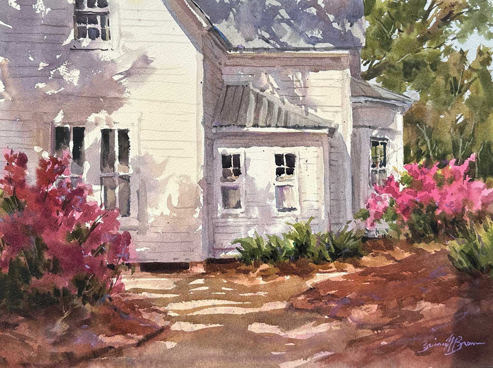
Dappled Azaleas, watercolor, 12 x 16" (30 x 40 cm)
To understand why value studies are beneficial, we must ask two questions: how can a good value study help the painting process and what makes a good value study?
How can a good value study help the painting process? The most obvious benefit of a value study is planning a strong composition. Taking the time to arrange value shapes and spot possible design issues is helpful to do before you begin painting. There is only so much adjusting you can do, so it is best to start out with a general plan. Before painting, you also need to decide on the aspect ratio and division of the 2D surface. One or more quick thumbnails can help you see the possibilities quickly. Artists are visual after all. Value studies also help you edit. It is like taking notes before a test. Decide on the most important shapes and which shapes could be adjusted or eliminated. I am always editing my source photo or scene in front of me. Doing several small thumbnails can help me make these decisions before painting.
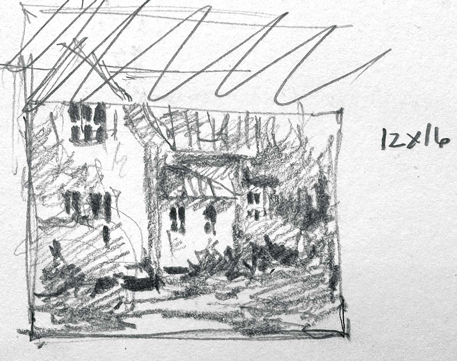
Dappled Azaleas Study, 2B pencil, 1½ x 2" (3 x 5 cm) This small value study was helpful in deciding on the breakup of my 2D surface. I needed to decide on the pattern of the sunlit and the shadow shapes. This may not be a beautiful study, but it was useful.
Another important benefit is planning which shapes can be connected, and therefore, painted together. As you will see in my demonstration, I paint the big middle value shapes in one go, keeping the values similar while changing the colors. I do this by loading up two to three brushes with the desired colors and paint consistency. This way I can paint the shapes together while the paper is still wet, allowing the colors to bleed and blend. This helps me easily achieve soft edges and even some lost edges. To me, that this is one of the beautiful aspects of painting with watercolor.
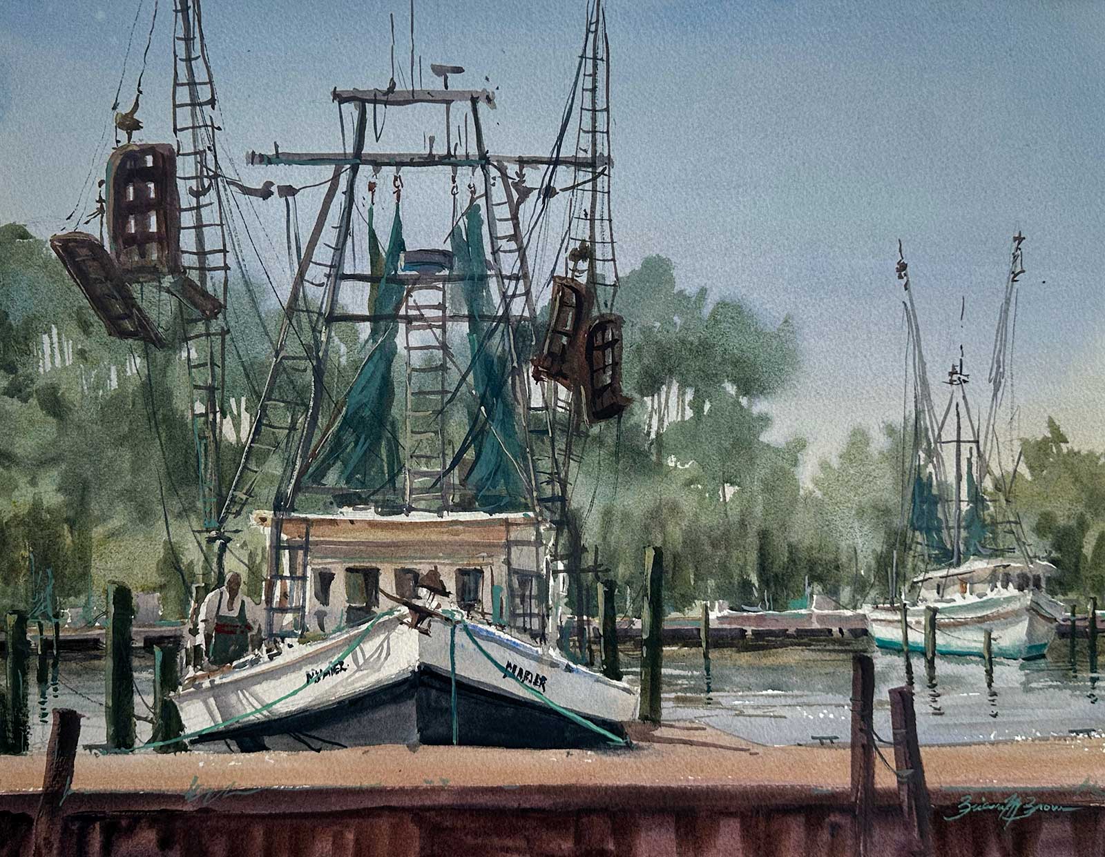
The Mariner, watercolor, 14 x 18" (35 x 45 cm)
What makes a good value study? A good value study does not take long and should be small. My value studies take anywhere between two and 10 minutes. Sometimes I just do several small thumbnails, no larger than 2" on the longest side, just to decide on the big shape arrangement, horizon line placement, aspect ratio, etc. Or I do a slightly larger value study to decide on the value/shape relationships more thoughtfully.
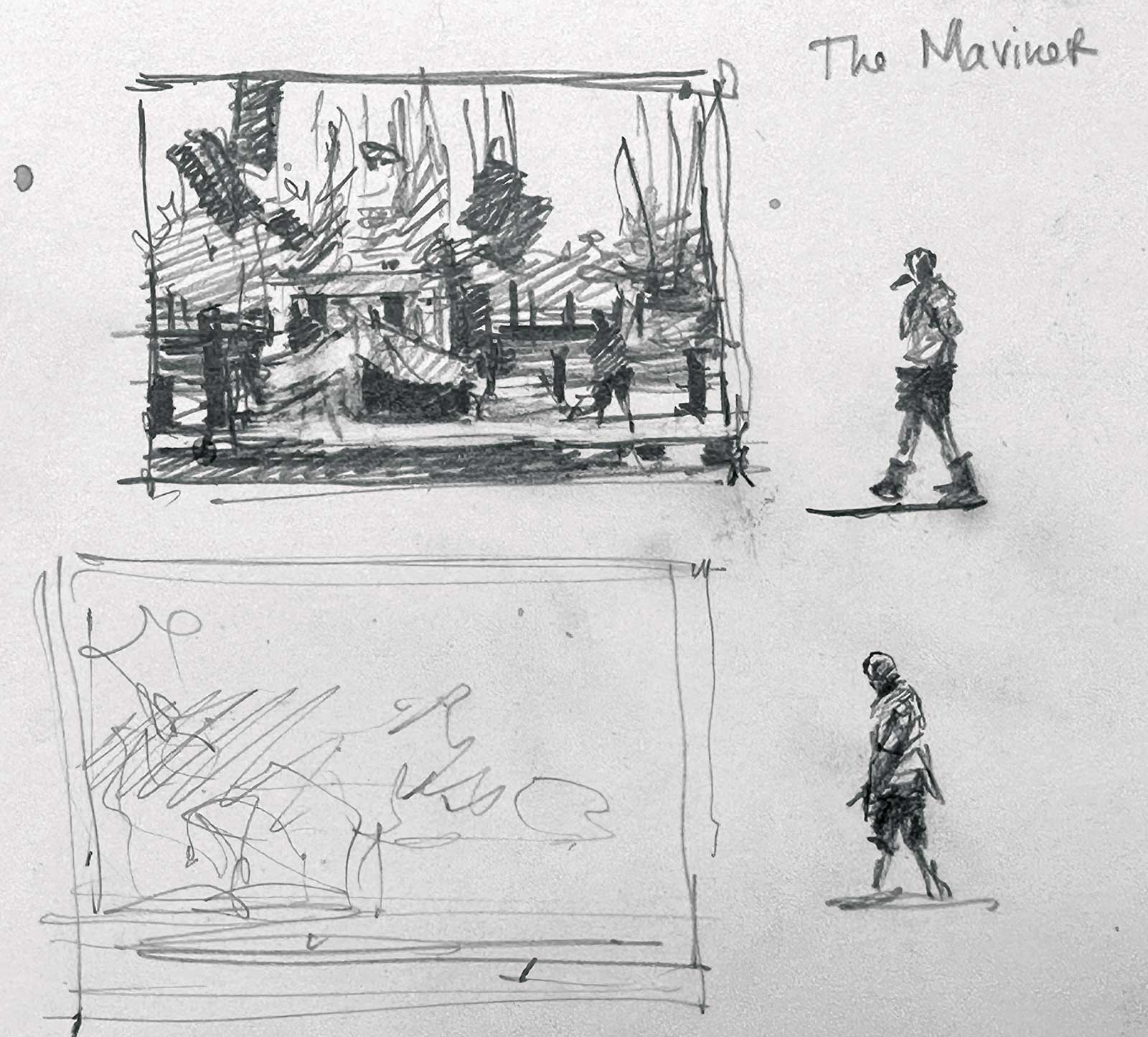
The Mariner Study, 2B pencil, 1½ x 2" (3 x 5 cm) This small study helped to determine the composition of the value shapes. I also did a few quick studies of a figure that was working on the boat. However, I changed the placement of the figure towards the end of the painting process. My value studies are good guides, but I am always willing to adjust as I paint.
In addition, a study with a line drawing and a few scribbles that does not have deliberately shaded value shapes will not be helpful. I create studies using three to five values with either a 2B pencil or value markers. Value markers are great because they are quick, and you can’t help but deliberately shade the shapes. This helps me determine the pattern of light, middle and dark values shapes and how they are related. Remember that I want to discover which value shapes can be connected and painted together. You can’t do this if your shapes aren’t deliberately shaded. Keep in mind that the power of a good value study is being able to see the overall value pattern in one glance.
The arrangement of value shapes is just as important in a representational painting as in an abstract painting. Understanding this key concept clarifies why planning before painting is necessary. We want to create dynamic paintings with interesting designs, not just blindly paint what we see in the hopes a masterpiece will emerge.
My Art in the Making Nurturing the Land
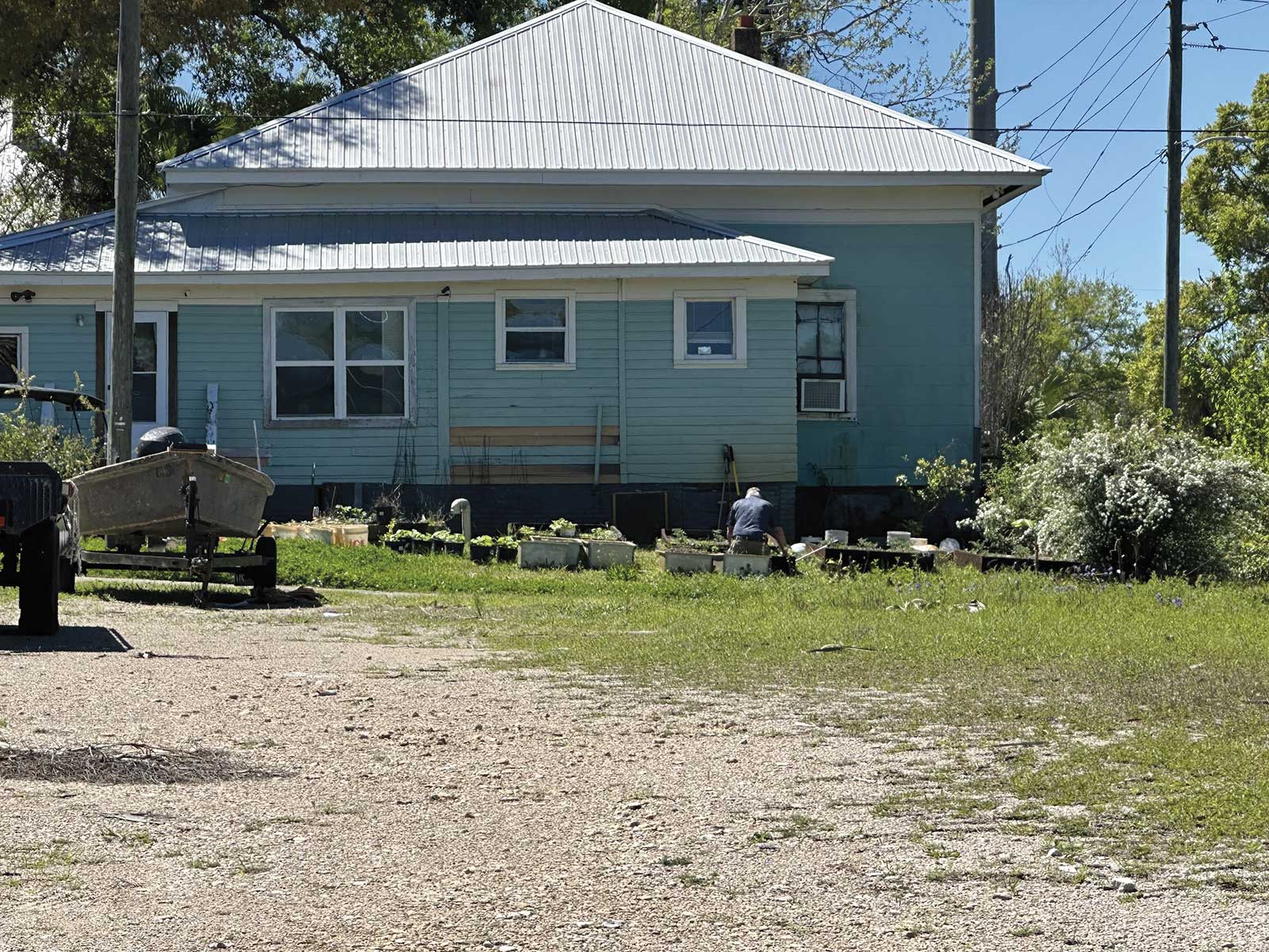
Reference Photo
 Stage 1
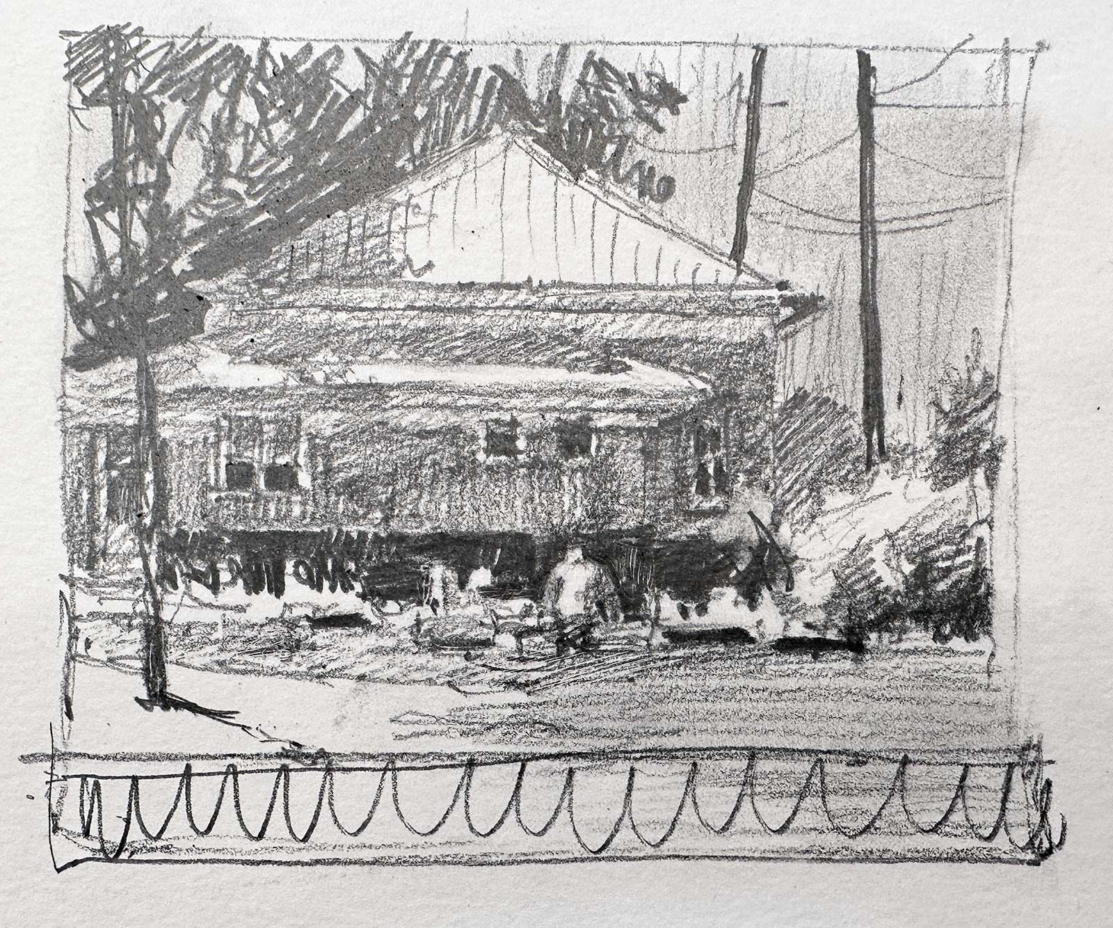
Stage 1 Value Study
This is my value study (3 x 4"). I used a mechanical pencil with 2B lead. The shapes didn’t need to be accurate or to scale, but I decided on the value/shape relationships and composition of my painting. I decided on the important shapes, which to change, and which to leave out. Notice that I eliminated the bottom of the study to change the aspect ratio, so it matched my paper size better (11 x 14").
 Stage 2
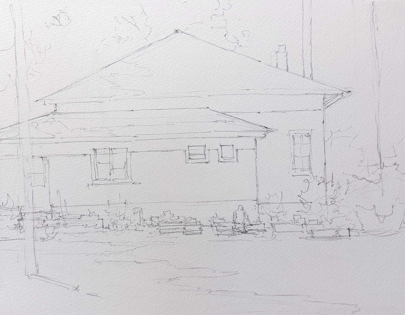
Stage 2 Drawing
I carefully drew out my composition onto the watercolor paper using my 2B mechanical pencil. During the drawing stage, I took more time to measure the angles and positions of the shapes. Before painting, I used a kneaded eraser to take off any excess graphite by lightly rubbing it over the entire drawing.
 Stage 3
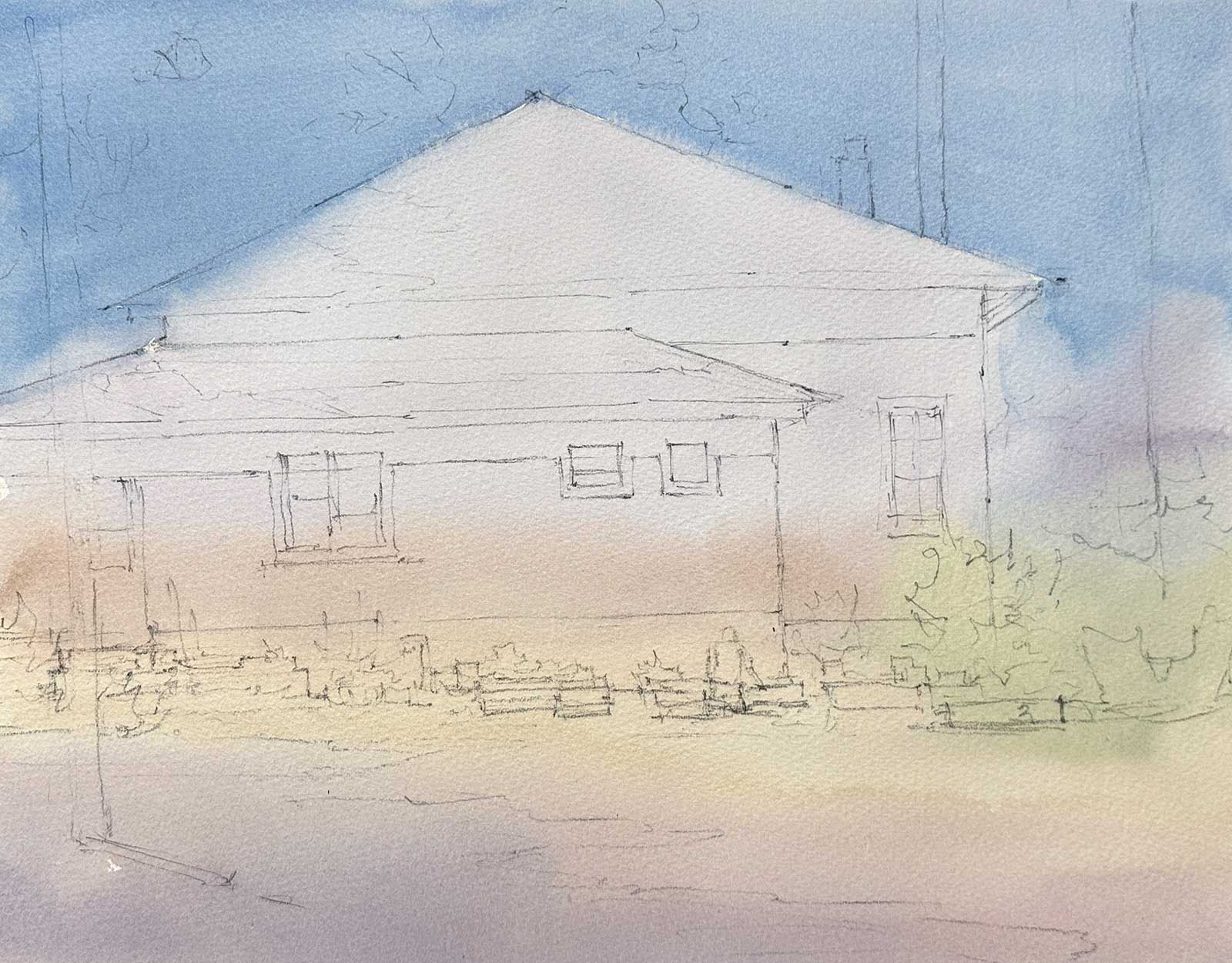
Stage 3 First Wash
This was my first wash stage. I mixed large pools of cobalt blue, quinacridone rose and French yellow ochre, my basic primary colors. Using a lot of water and a small amount of pigment, I started at the top and painted my way down the paper. During the first wash, I tinted the white paper with the colors of my “light-valued shapes.” The entire paper was tinted with no white paper showing.
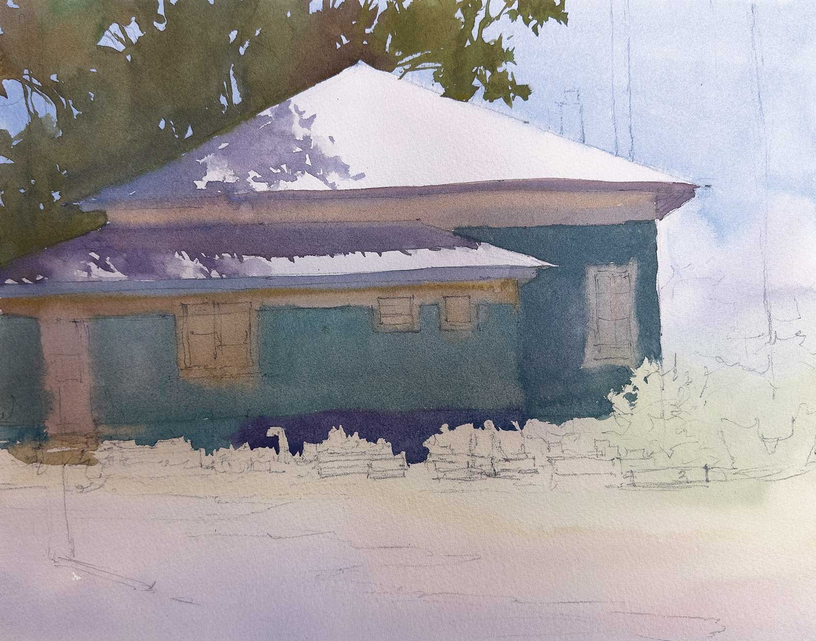 Stage 4
Stage 4 Mid Value A
This middle value wash was the hardest stage but also the most important. Using two brushes, I loaded one with the green colors of the tree and one with the grayish blue colors of the shadows on the roof. Starting at the top of the tree shape, I painted right into the shadow shape, and then the shadowed side of the house. I changed colors as I painted and let the colors bleed. I painted around the light shapes of the sunlit roof and sky holes.
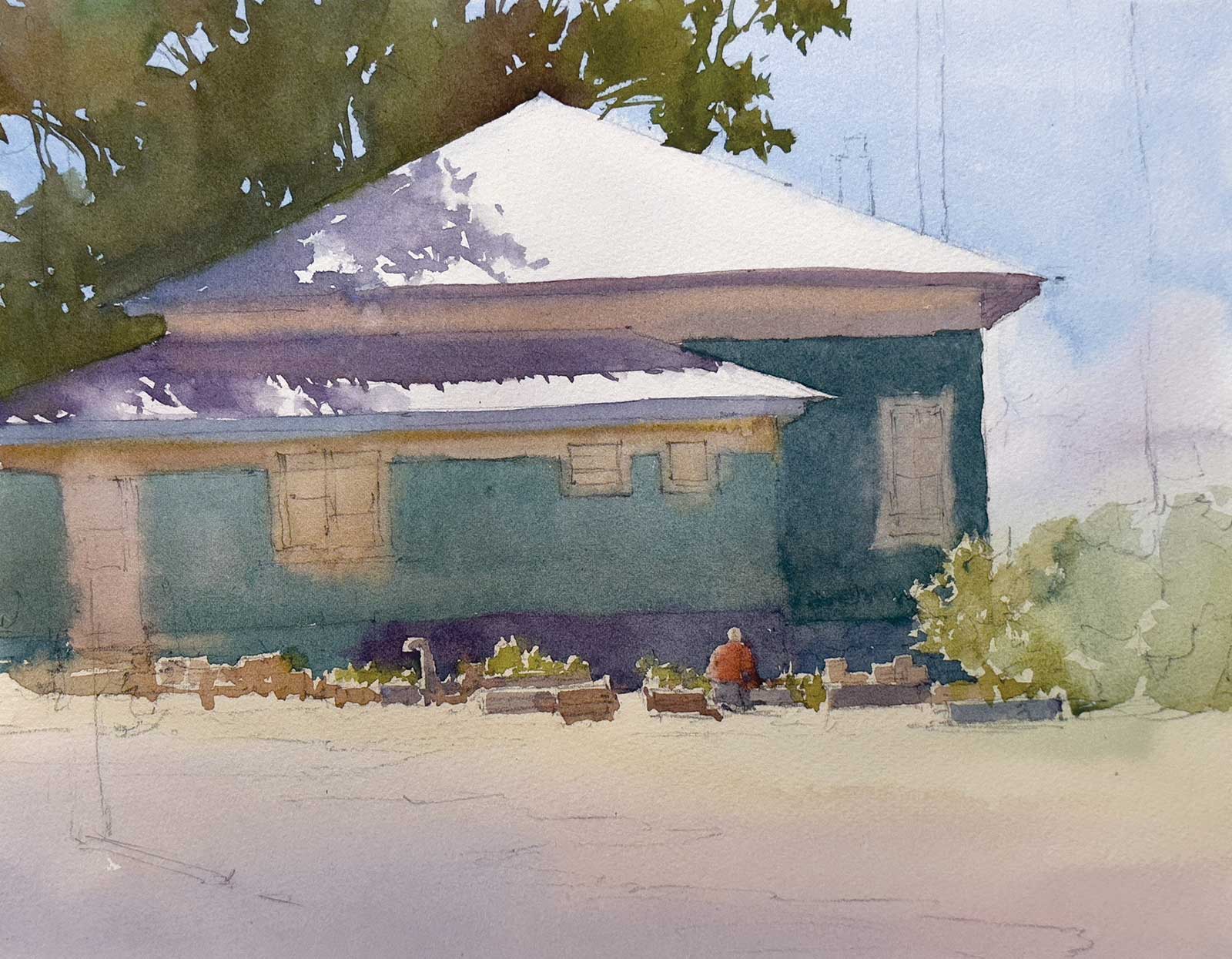 Stage 5
Stage 5 Mid Value B
Then with various colors, I used the two brushes to carefully paint around the highlights of the plants, bushes, person and other shapes. I kept in mind the direction of the sun, which is mostly overhead and slightly to the left-hand side.
 Stage 6
Stage 6 Mid Value C
I painted the middle value shape of the foreground grass and then softened the edges of the grass with a light wash on the gravel road. I also added the background tree shape on the right-hand side of the house. Notice how the value of the house and that of the tree shape are close. So, even though that side of the house was dry, because the values are similar, this creates a nice lost edge.
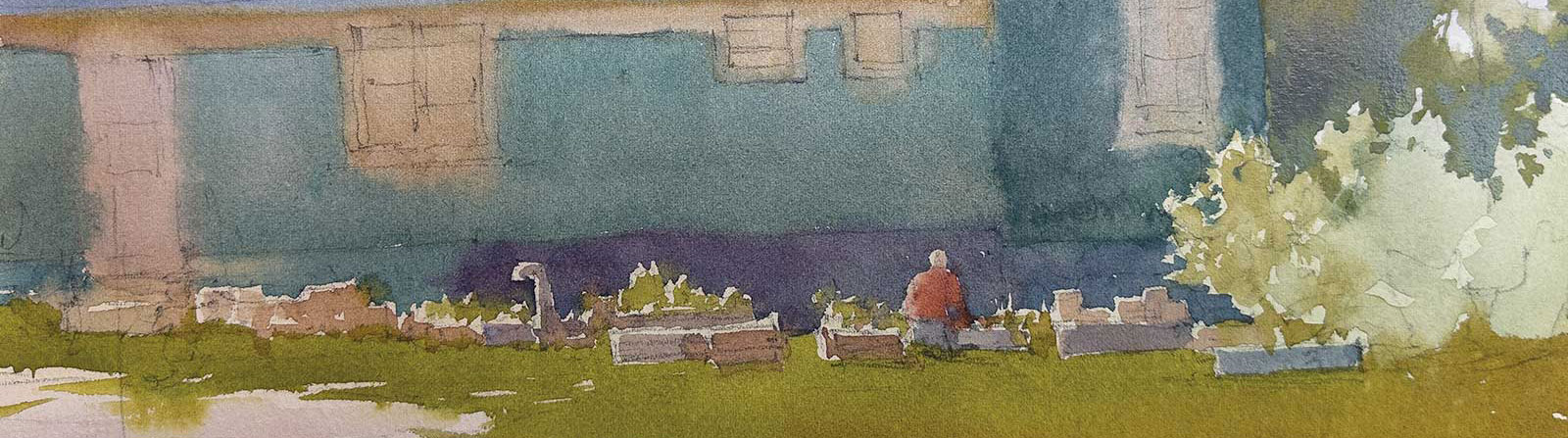
 Stage 7
Stage 7 Dark Value A
I added more details in the bushes and then darkened the background tree on the left-hand side of the painting. I also added the dark blue foundation of the house, which helps to emphasize the backlit shapes of the plants and gardener. I added the ridgelines of the roof for texture.
 Stage 8
Stage 8 Dark Value B
I added the details on the house with the window shapes and texture on the side of the building.
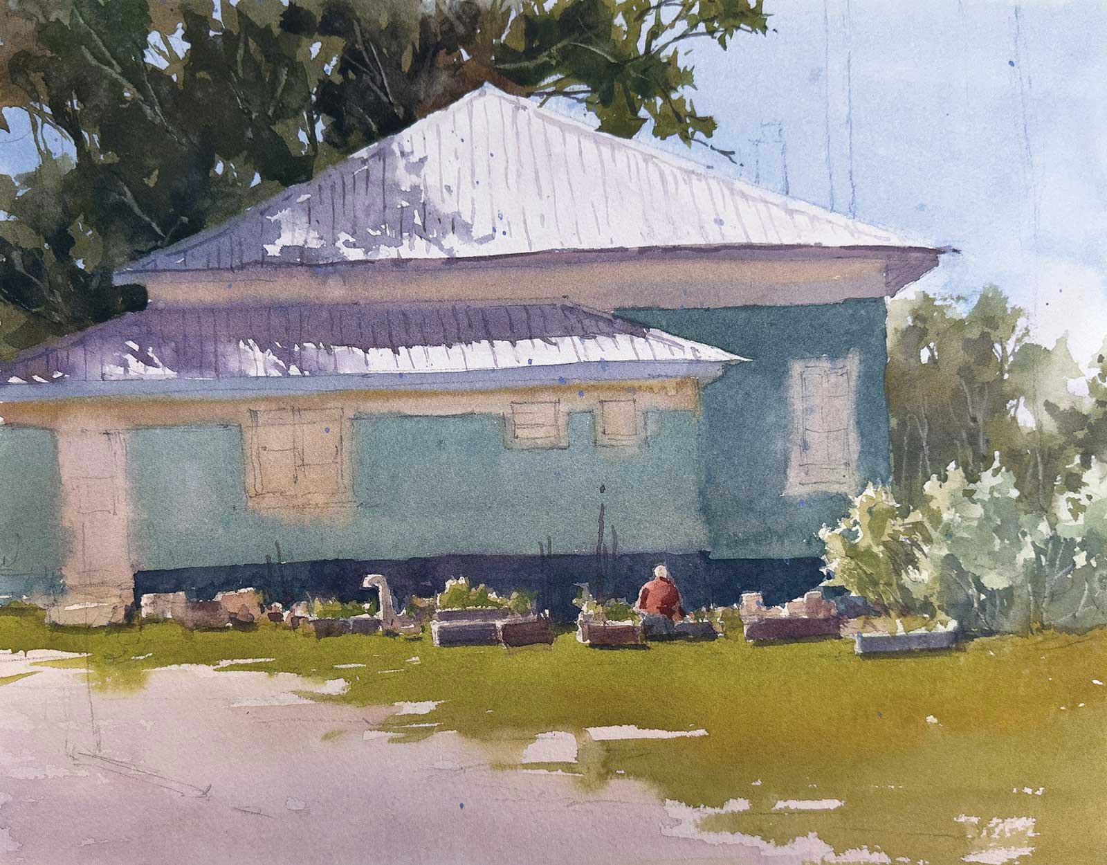
 Stage 9
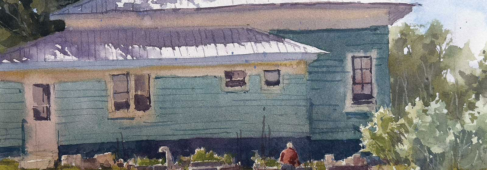
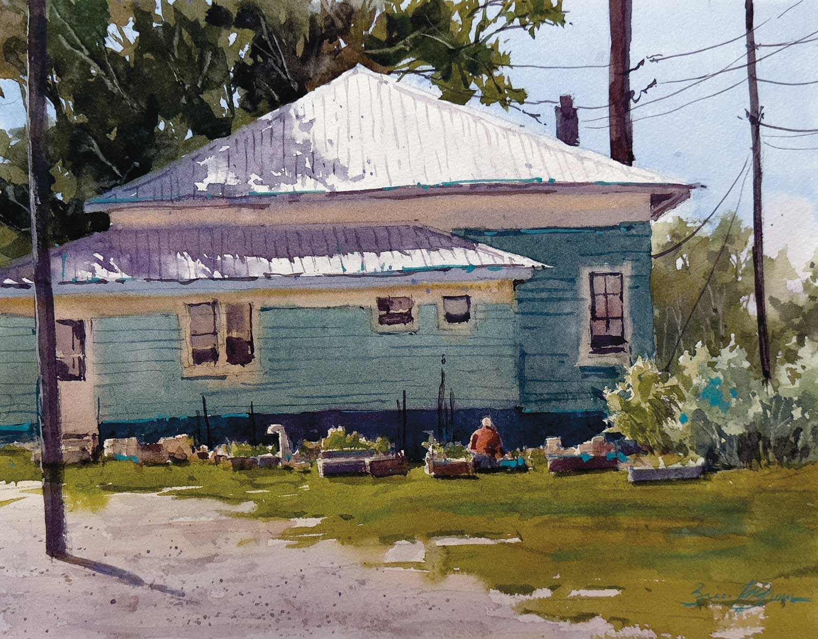
Stage 9 Finished Artwork
Nurturing the Land, watercolor, 11 x 14" (27 x 35 cm)
The final details of the painting were added. The telephone poles and lines were painted as well as more texture in the foreground. I also added a few accent lines with one of my favorite accent colors, horizon blue. This just helps to bring the neutral colors of the painting to life. The only gouache used was a small highlight on the telephone pole located on the left-hand side of the painting.
About the artist
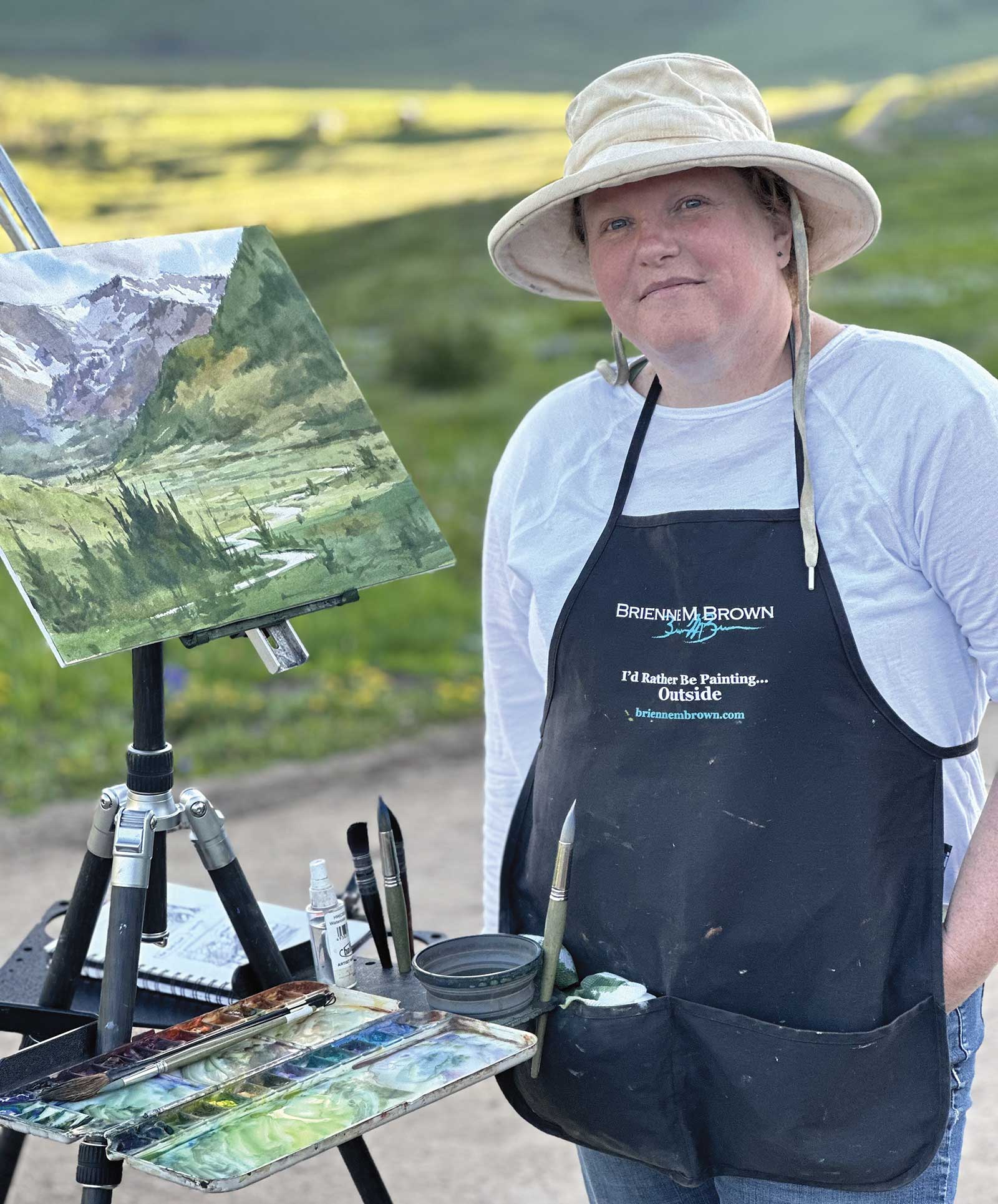 Brienne M. Brown
Brienne M. Brown’s passion is watercolor and plein air. She loves using the slightly controlled chaotic nature of watercolor in bringing the everyday to life. Her work has been published in Splash 17: Inspired Subjects and numerous other publications. Brown has earned signature status in several art societies, including the National Watercolor Society and the American Impressionist Society. Every year, she participates in several national juried and invitational plein air events across the country. Brown is a popular instructor and teaches workshops in-person and online. Learn with her at travelingcolorsstudio.com.