


There are hundreds of adjectives to describe texture: rough, bushy, glassy, woven, velvety, slick, sharp, etc. This shows how important it is in our language and how important it is to us visually. Everything has texture; no scene is without it. A world without texture would still be colorful but would look like a cartoon.
There are aesthetic aspects to texture, both tactile and visual. We enjoy the feel of silk, so we visually associate “silky” with “pleasant.” Things that are bristly are painful to touch, so we visually associate “bristly” with “unpleasant.” Food that is “furry” gets thrown in the garbage. In this way, textures contribute to the feeling of a scene almost as powerfully as lighting does.
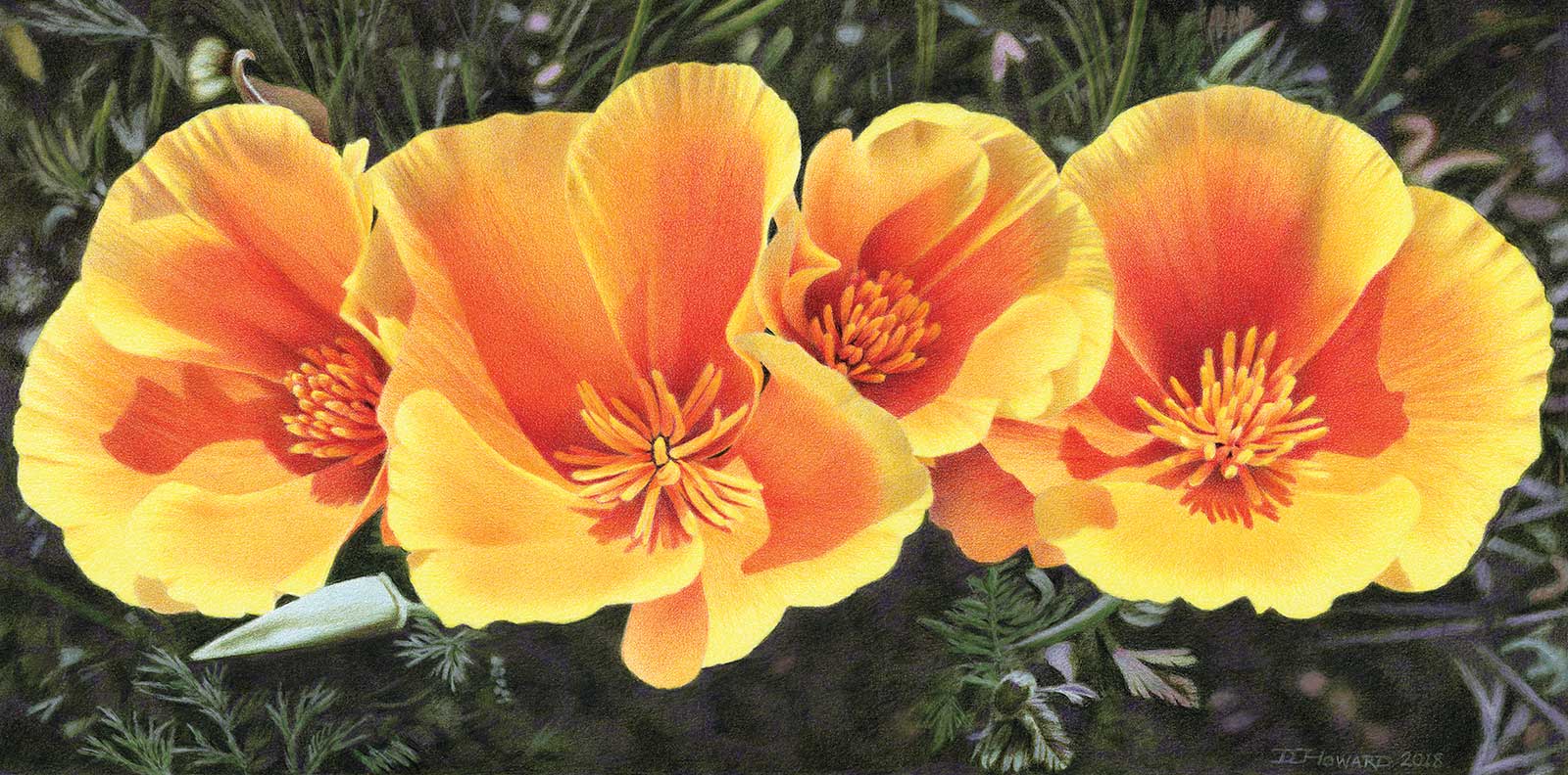
California Poppy Quartet, colored pencil on Stonehenge paper, 9 x 18" (22 x 45 cm) It’s impossible to be unhappy while beholding the exuberance of California poppies. Using watercolor pencils with water to create a very dark background preserved the tooth of the paper and allowed me to work light over dark to create the leaves, something one usually can’t do with colored pencil.
Once you understand the visual elements of line, value, shape, form, space and color, texture is the final element that breathes realism into a composition. Even if you’re not a realist, texture has a place in impressionist, abstract and even experimental art. It’s also true regardless of your preferred medium.
It’s worth taking the time to learn how to create convincing textures. But no matter how many textures you’ve rendered, there will always be thousands more that you haven’t. So how can you approach a new one, and another, and another?
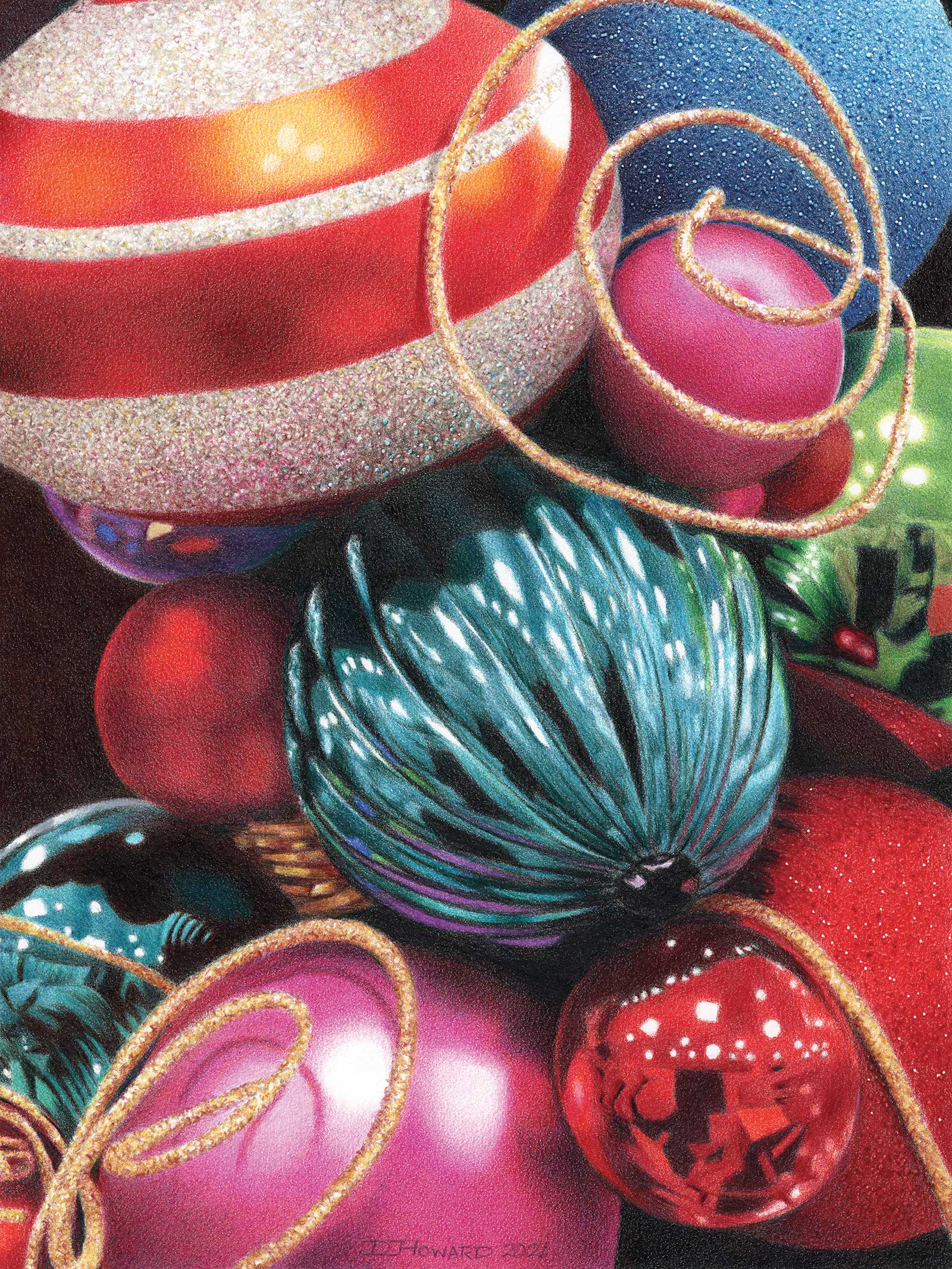
Ornaments, colored pencil on Stonehenge paper, 9 x 12" (22 x 30 cm) Not every subject has to have a deeper meaning. I enjoyed the bright, festive colors and the variety of textures in these Christmas ornaments. Reflective, satiny and glittery.
Part of my practice is to analyze each texture in a scene to understand what makes it look that way, then break that down into colors, shapes and techniques that I can use to build it up in steps in my drawing. Once I’ve done this successfully, in the future I can draw on that knowledge to confidently tackle similar textures and save time. For example, grasses and fur can be created in the same way, with different colors, as can sand and sugar. This is true in any medium.
I chose colored pencil as my primary medium after gaining competence in several other media in art school. It provides all the control of pencil with all the color of paint. It’s non-toxic, there’s no mess, no clean-up, no waiting for paint to dry or hurrying before it dries, pencils can be taken through airports, and they never go bad. Colors are created layer by layer directly on the drawing surface, values are built from light to dark, and the lightest highlights are accomplished by reserving bare paper, similar to working with watercolor. In the right hands, colored pencil is capable of any style from hyperrealism to abstract expressionism. There are a variety of tools and techniques to augment what it can do, and it can be combined with other media. To sum up, I think it’s nearly a perfect medium. Its biggest drawback is that it’s slow. But there are ways to help with that, like using sanded paper, solvent or a heated drawing board.
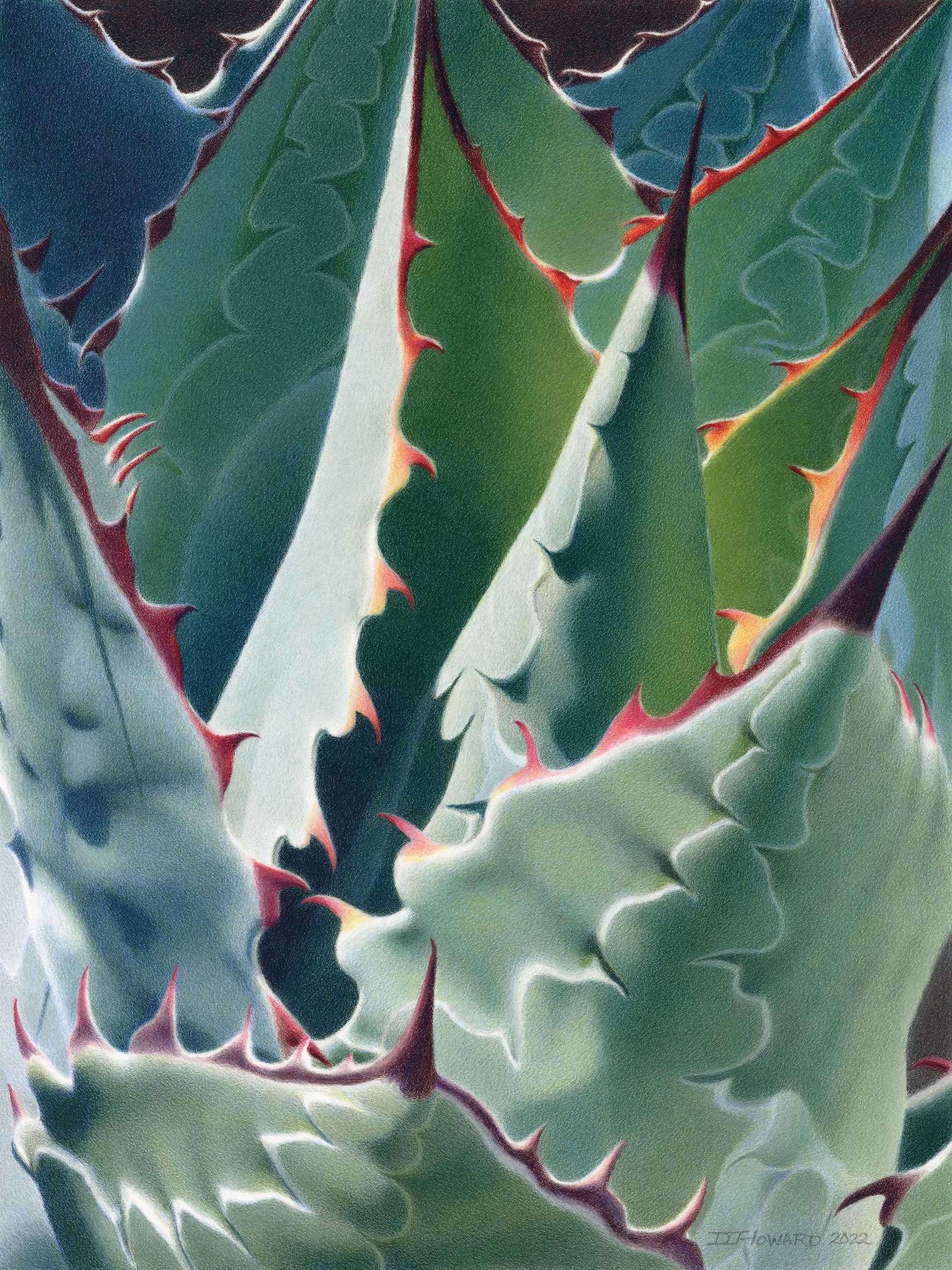
Dangerous Beauty, colored pencil on Pastelmat, 14 x 10½" (35 x 26 cm) “Look, but don’t touch” is the clear message sent by a healthy agave. I was fascinated by how the light bounced between its leaves and how that shifted the colors between greens, blues and yellows. It gave me the opportunity to use some colors in my set that I’d never used before.
My membership in the Colored Pencil Society of America has connected me with many incredible artists who are happy to share their knowledge of surfaces, tools and techniques, which helps us all improve. I’ve become known for my skill at creating textures, and I even wrote a book, 101 Textures in Colored Pencil, which has been a bestseller in the colored pencil world. So I’m happy to share what I’ve learned, too.
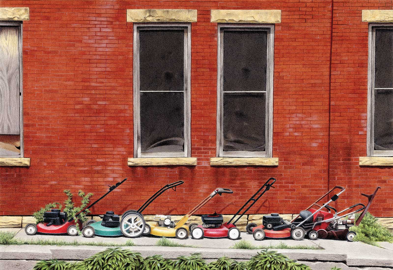
My Art in the Making The Retirement Line
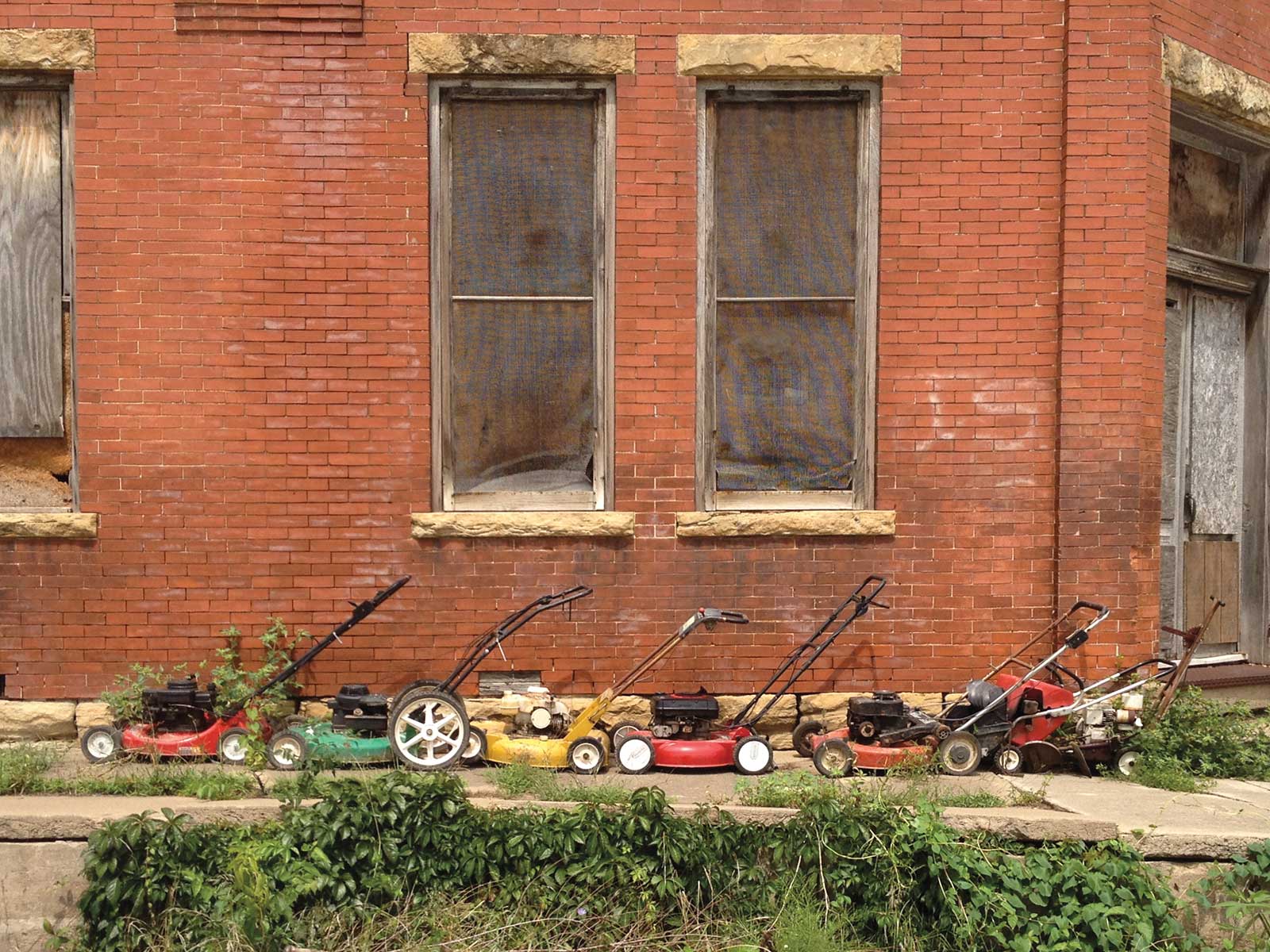
Reference Photo
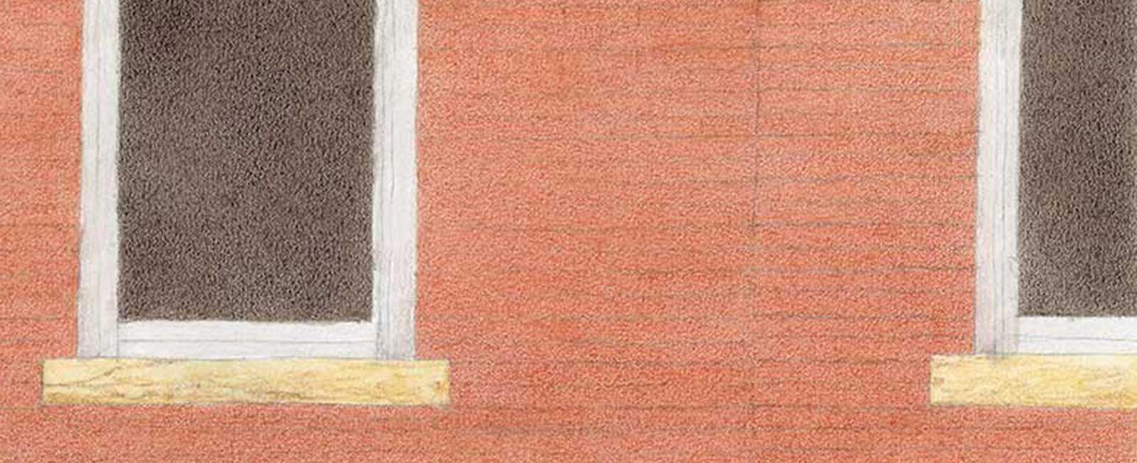
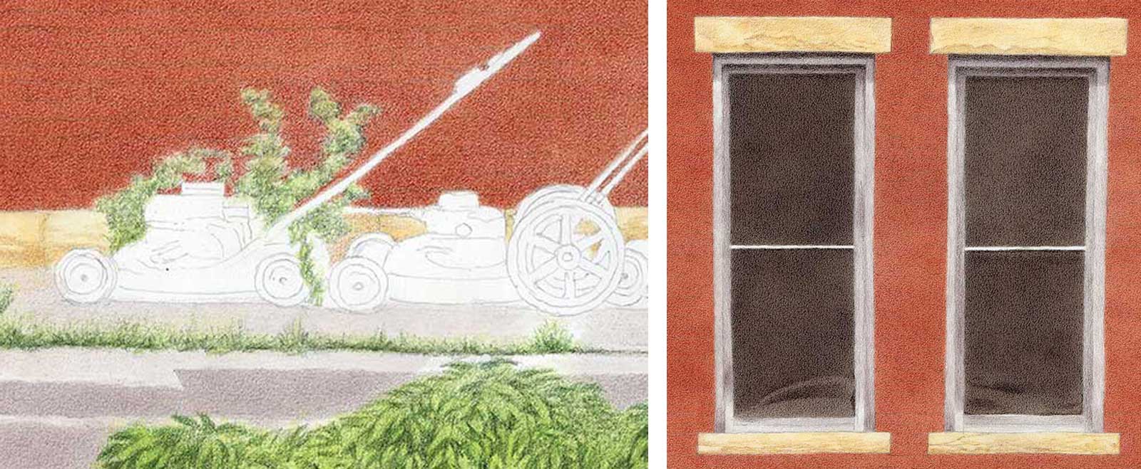
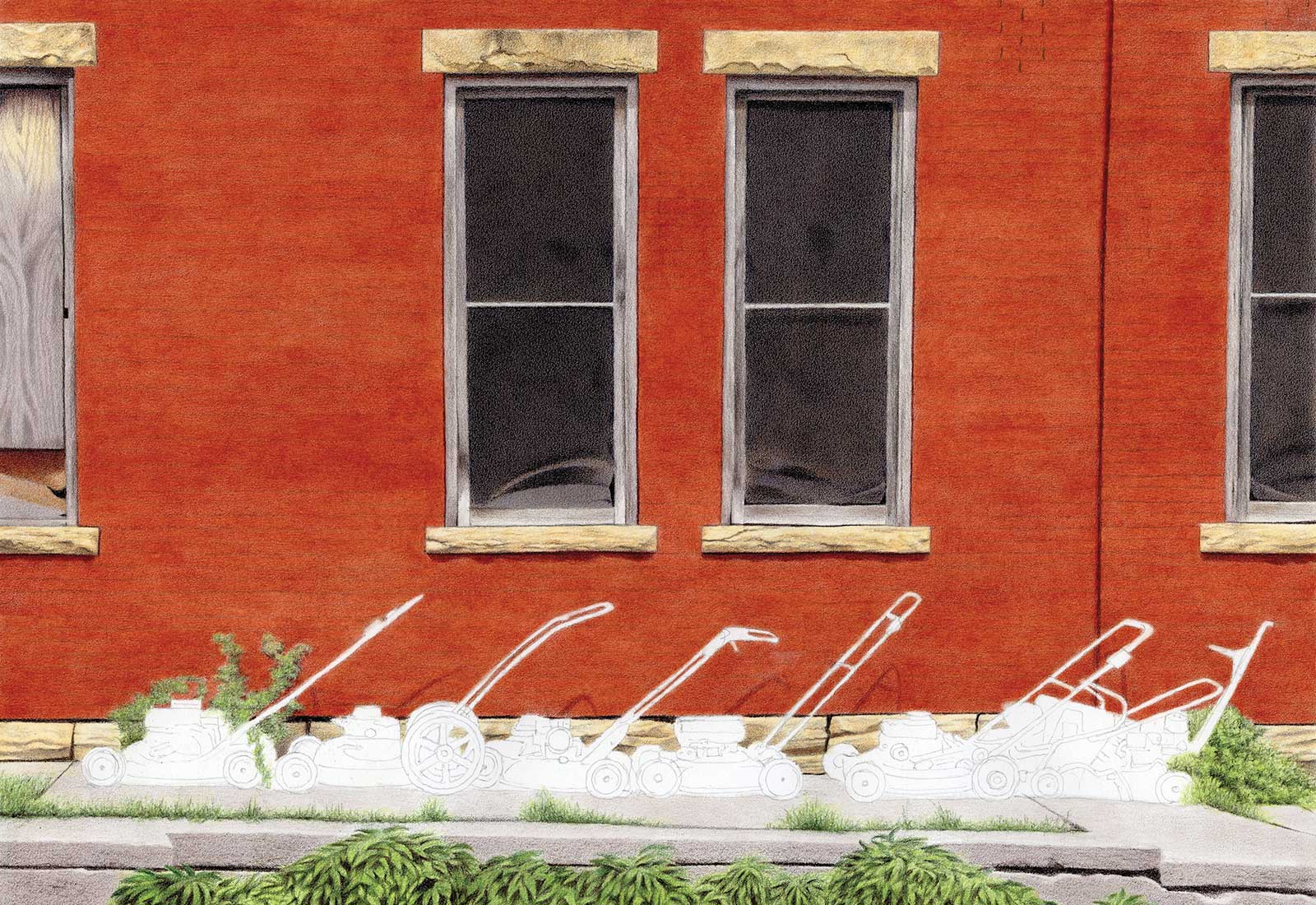
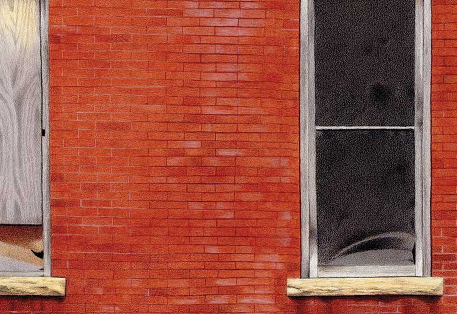
I found this scene on a hot summer day in a rural town in Missouri. The midday sunlight is hazy and bright, the shadows sharp and deep, and every surface seems to radiate heat. There are many textures: old bricks with subtle color variations, rough-hewn stonework, weathered plywood, damaged window screens, concrete, overgrown grasses and vines, shiny lawnmower bodies and rusty handles. All together, they embody a slow decay and neglect that is both beautiful and melancholy. I used Photoshop to improve the composition by cropping out most of the foliage and replacing the old door with another window.
 Stage 1
Stage 1 Watercolor Pencils, Dry
For this particular scene, I want to minimize speckles of white paper showing through, so I use watercolor pencils for the base color of the bricks, window screens and concrete, evenly applied the same as regular colored pencils.
WHAT THE ARTIST USED
Caran d’Ache Museum Aquarelle Watercolor Pencils
Terracotta, French gray, Sepia 10%, Apricot, Light olive 40%
Caran d’Ache Luminance Colored Pencils
Bricks
Terracotta, Raw russet, Burnt sienna 10%, Burnt sienna, Perylene brown, Sepia, Dark indigo, Buff titanium, White
Stonework
Brown ochre 10%, Brown ochre, Raw umber 50%, Sepia
Concrete
Sepia 10%, French gray 10%, Payne’s gray 30%, Black
Windows
Sepia 10%, Sepia, Dark indigo, French gray 30%
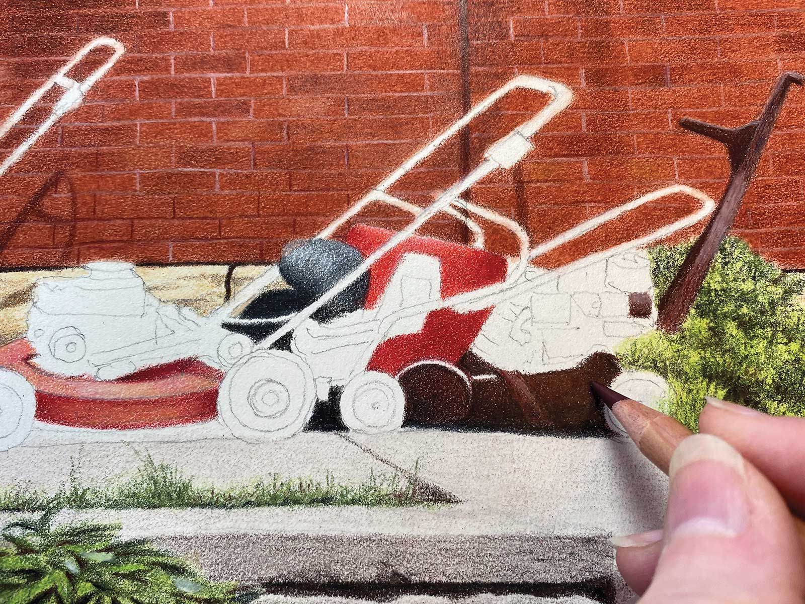
Wheels, Engines, Handles
White, Black, French gray 10%, French gray 30%, French gray, Payne’s gray 30%, Payne’s gray 60%
Mower Bodies
Anthraquinone carmine red, Permanent red, Perylene brown, Beryl green, Dark indigo, Bismuth yellow, Apricot, Yellow ochre, Brown ochre
Foliage/Grass
Moss green, Spring green, Dark phthalo green, Dark indigo, Perylene brown, Black
Additional Supplies
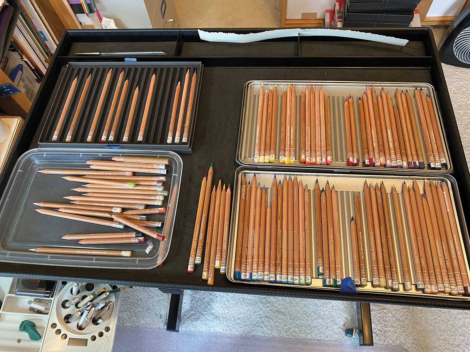
15 x 21" sheet of Stonehenge paper, Helical hand-crank sharpener, HB graphite pencil for outlining, Poster putty, Artist tape, Water, Odorless mineral spirits (solvent), 1/4" flat brushes (one each for water and mineral spirits), Lascaux final fixative
 Stage 2
Stage 2 Watercolor Pencils, Wet
With a little water and a small, flat brush, I dissolve the watercolor pencil pigment in place. This is printmaking paper, not watercolor paper, so I use only enough water to do the job. To avoid color bleed between neighboring areas, I wait until dry before using watercolor pencils for the base color of the stonework, window frames, and foliage.
 Stage 3
Stage 3 More Watercolor Pencils
With a little water I dissolve the watercolor pencil pigment in place. It’s okay that the areas are blotchy at this stage.
 Stage 4
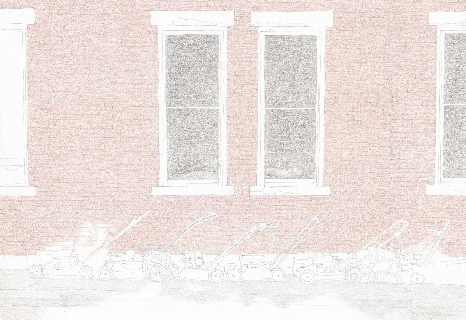
Stage 4 First Layer of Color
Switching to colored pencils of the same colors, I even out all the base colors and start defining the rough-hewn texture of the stonework. By using a very dark color with light pressure, the screens will remain grainy and a little blotchy, suggesting old wire mesh at a distance.
My Design and Composition Tactics
- Disregard Standard Aspect Ratios: If you limit yourself to standard sizes like 8 x 10, 11 x 14 or 18 x 24, you limit your ability to strengthen compositions. A good crop is a must. It’s emotionally easier to choose a crop in advance than to cut down your finished drawing.
- Your Computer is an Art Tool: If you work from photos, learn basic Photoshop or other image-editing application skills. Play with saturation, contrast, masking and cropping to create more impactful references.
- Use Your “Artistic License”: Don’t include things from photos just because they were there. It’s your artwork, you’re free to alter or omit anything that weakens the composition or detracts or differs from your idea. Power lines are usually best omitted.
- Don’t Trust Your Phone Camera: Phone camera lenses distort shapes worse than DSLR camera lenses. This results in off-perpendicular walls and grossly exaggerated noses in closeups of people and pets.
- Turn Your Work Upside Down Occasionally: Working upside down forces your brain to see shapes and colors instead of familiar objects for which it wrongly thinks it knows shortcuts. This can also alert you to problems you’ve overlooked before it’s too late.
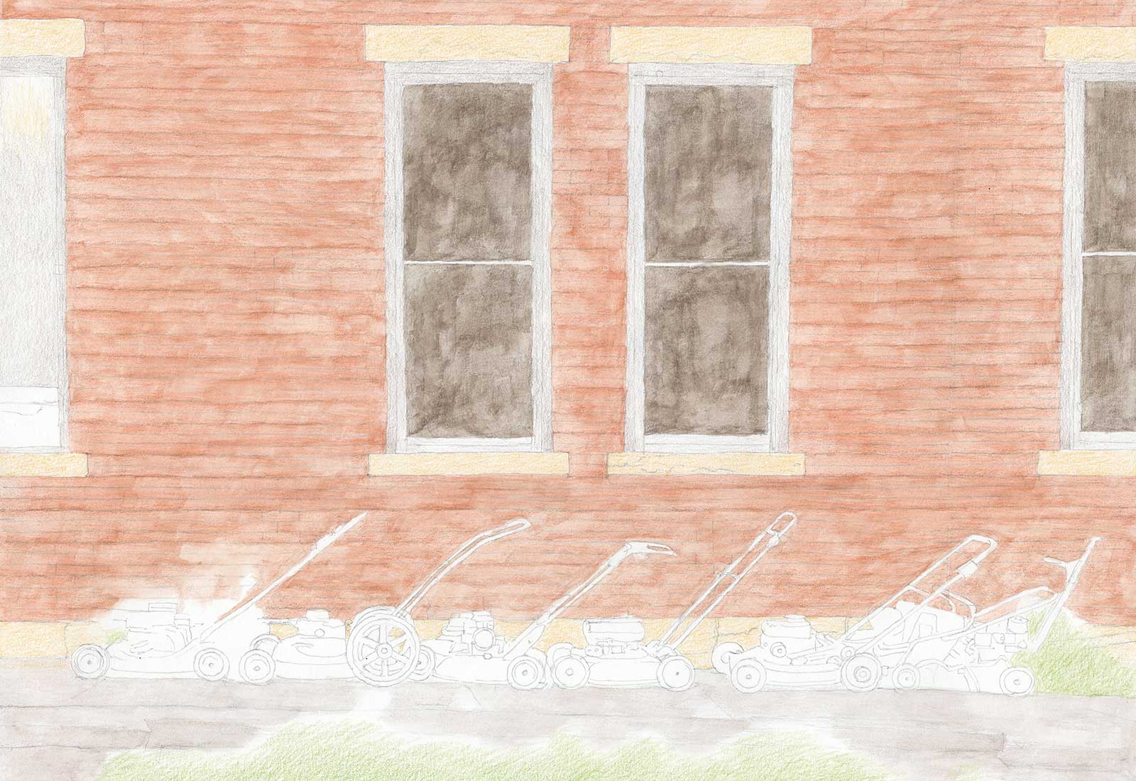
 Stage 5
Stage 5 Second Layer
I apply a second layer of the base colors and begin defining the foliage, the grain of the plywood, the window frames and the screen damage.
 Stage 6
Stage 6 Odorless Mineral Spirits
With a little solvent and a small, flat brush, I dissolve the pencil pigment in place to make the brick color pop while preserving paper tooth. The resulting roughness and unevenness is welcome, as it suggests bricks with varying colors. I define all the darkest edges, finish the stonework and plywood, and refine the foliage. To suggest the rough concrete, I skim the surface with the side of the point of a dark pencil.
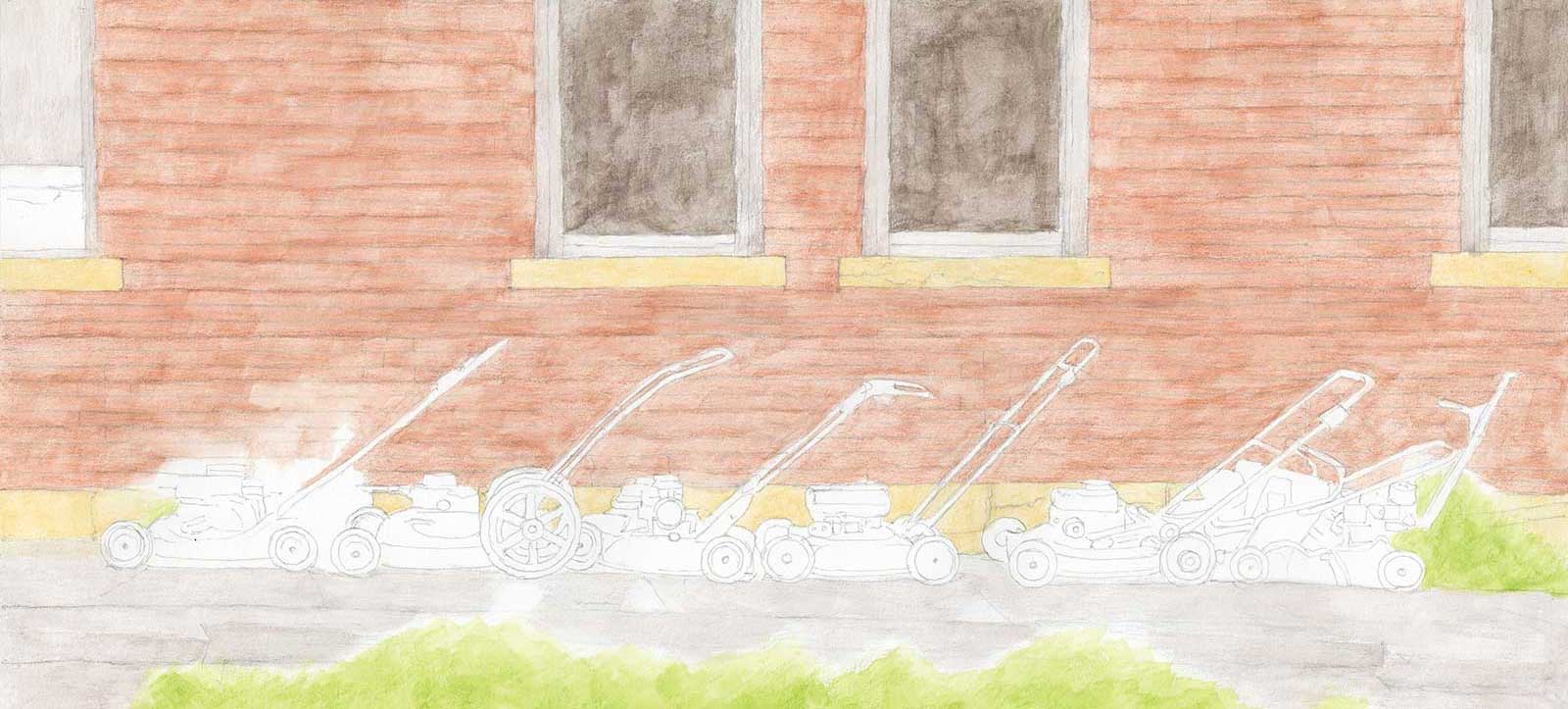
 Stage 7
Stage 7 Adding Details and Texture
I define the individual bricks with very sharp light and dark pencils, then add several lighter and darker colors to suggest variation and erosion. I add subtle damage details to the window screens and deepen the foliage shadows.
 Stage 8
Stage 8 The Mowers
With the background complete, I render the lawnmowers last so their colors and values will be saturated and correct relative to their environment and their edges will stay very crisp.
 Stage 9
Stage 9 Finished Artwork
The Retirement Line, colored pencil on Stonehenge paper, 13¾ x 20" (34 x 50 cm)
In the final version, I clean up any edges that have softened during the process, enhance wall shadows and cracks, and tweak a few brick colors.
About the artist
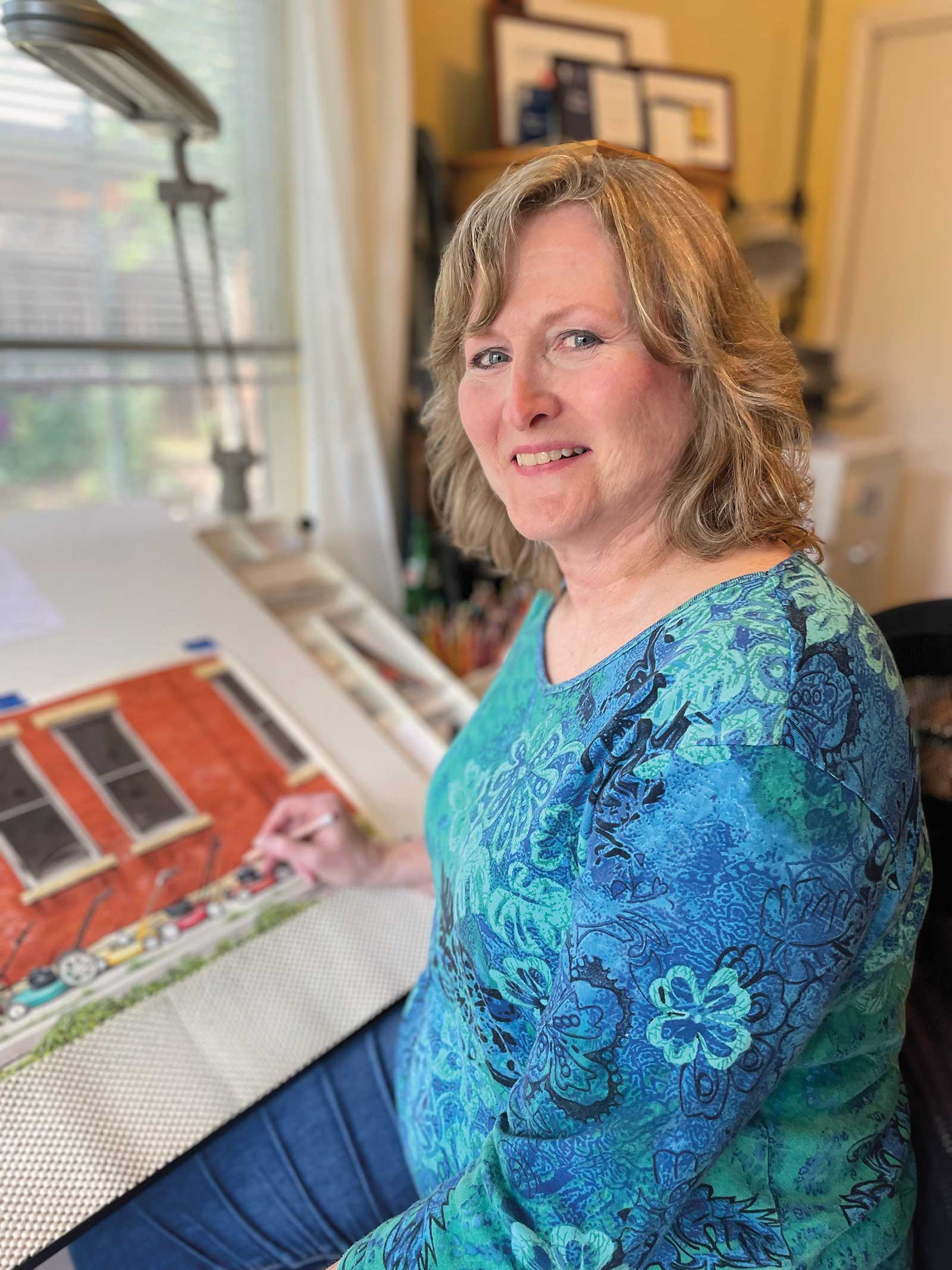 Denise Howard
President of the Colored Pencil Society of America, Denise Howard began drawing as a toddler on a small Missouri farm and grew up connecting with animals and nature. She earned a BA in art and a BS in math/computer science from Truman State University in 1982, and an MS in computer science from Ohio State University in 1991. At her parents’ urging, she set aside art for over 25 years to focus on software engineering. She worked for several Silicon Valley companies, was one of the original developers of iPhoto at Apple and earned movie credits on Antz and the Academy Award-winning Shrek at DreamWorks.
Once she committed to pursuing art as an additional career in 2010, she quickly earned regional, national and international recognition and awards for her realistic colored pencil and graphite work, including 3rd Place in the Strokes of Genius 13 competition, Honorable Mention in Artists Magazine’s 38th Annual Art Competition, and the Dixon Ticonderoga Award for Exceptional Merit in the Colored Pencil Society of America International Exhibition.
Howard is the author of 101 Textures in Colored Pencil from Quarto Publishing. She has been a Merit Signature Member of the Colored Pencil Society of America for over ten years, and a Silver Signature Member of the UK Colour Pencil Society.
Represented by
Cheryl Watts Pottery & Gallery, California, USA