


If you wait with nature, she always rewards you. The weather was gray and drizzly, and we’d come a long way and waited all day for the low tide to make our pilgrimage. We walked out with the tide along the slippery estuary, around the corner to this iconic New Zealand spot, the Three Sisters. What greeted us was a smorgasbord of striated cliffs and towering rock columns.
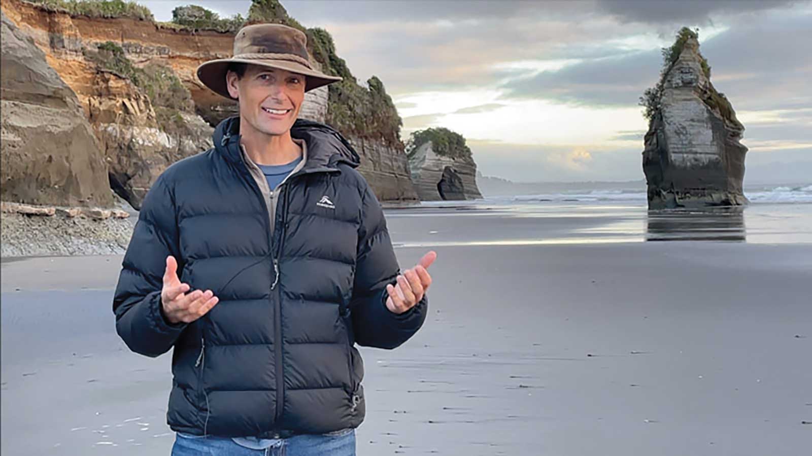
Richard Robinson at the Three Sisters in New Zealand
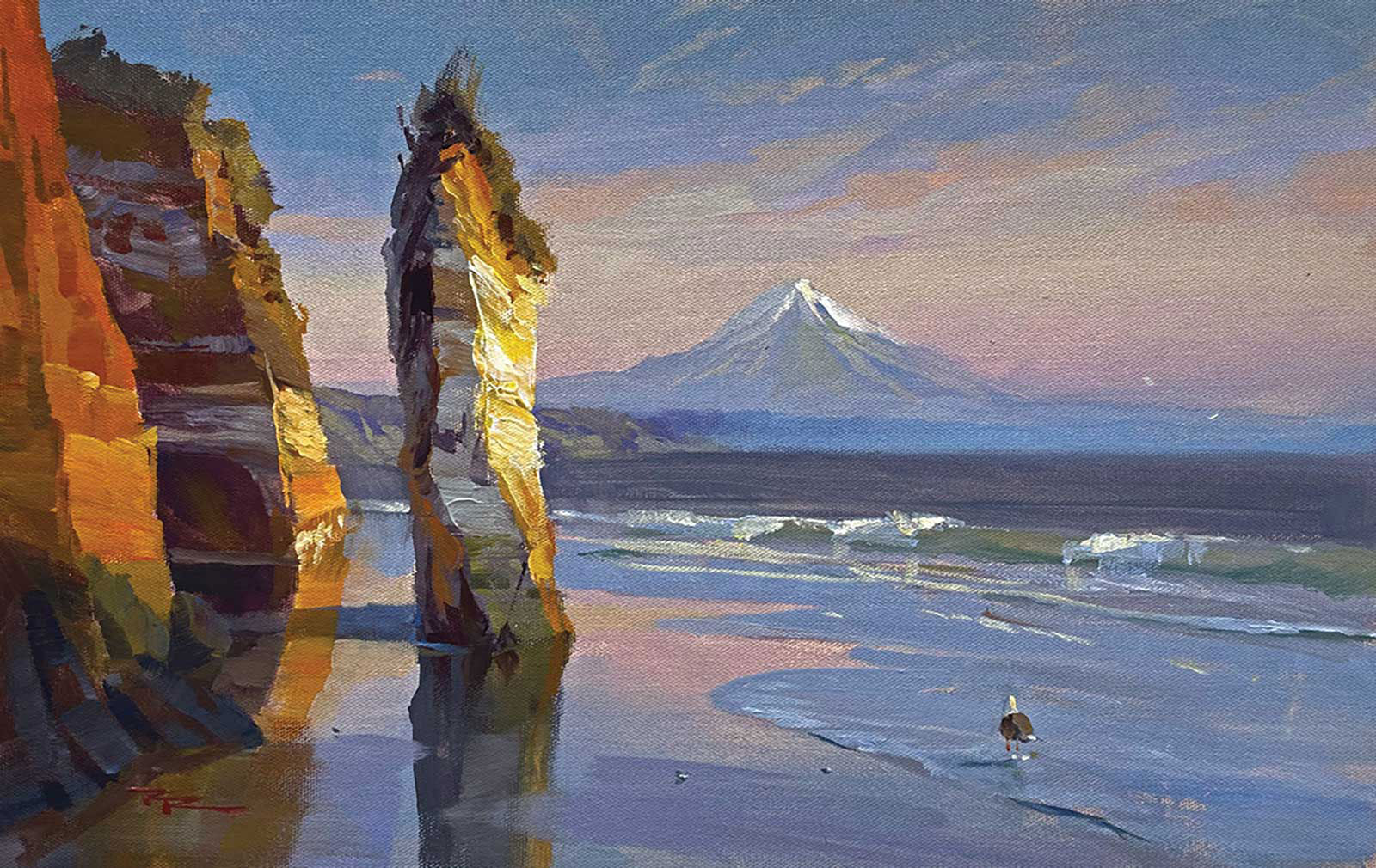
Richard Robinson, The Three Sisters, acrylic on canvas, 13 x 20” (33 x 50 cm)
Then, just minutes before the sun gave up on us, there was a gap in the clouds. Golden God light poured through onto our scene, profound against the backdrop of dark gray. As if it were the last drops from the bottle, the light seemed more concentrated and richer than I’d ever seen it.
I’ve found time and time again that the wait, though sometimes long, is always rewarded. Even if it’s purely with the time spent at one with your surroundings. Stay a while!
That moment of light leads you here, now.
Student critiques
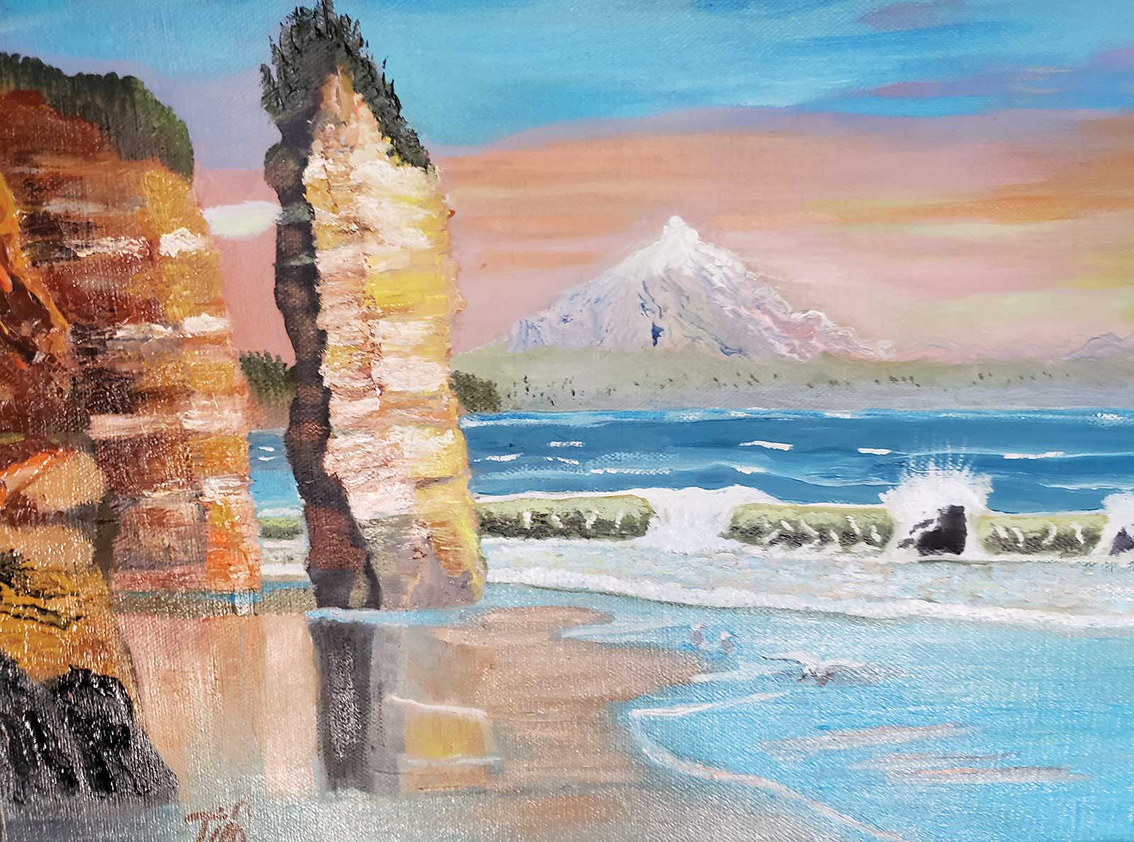
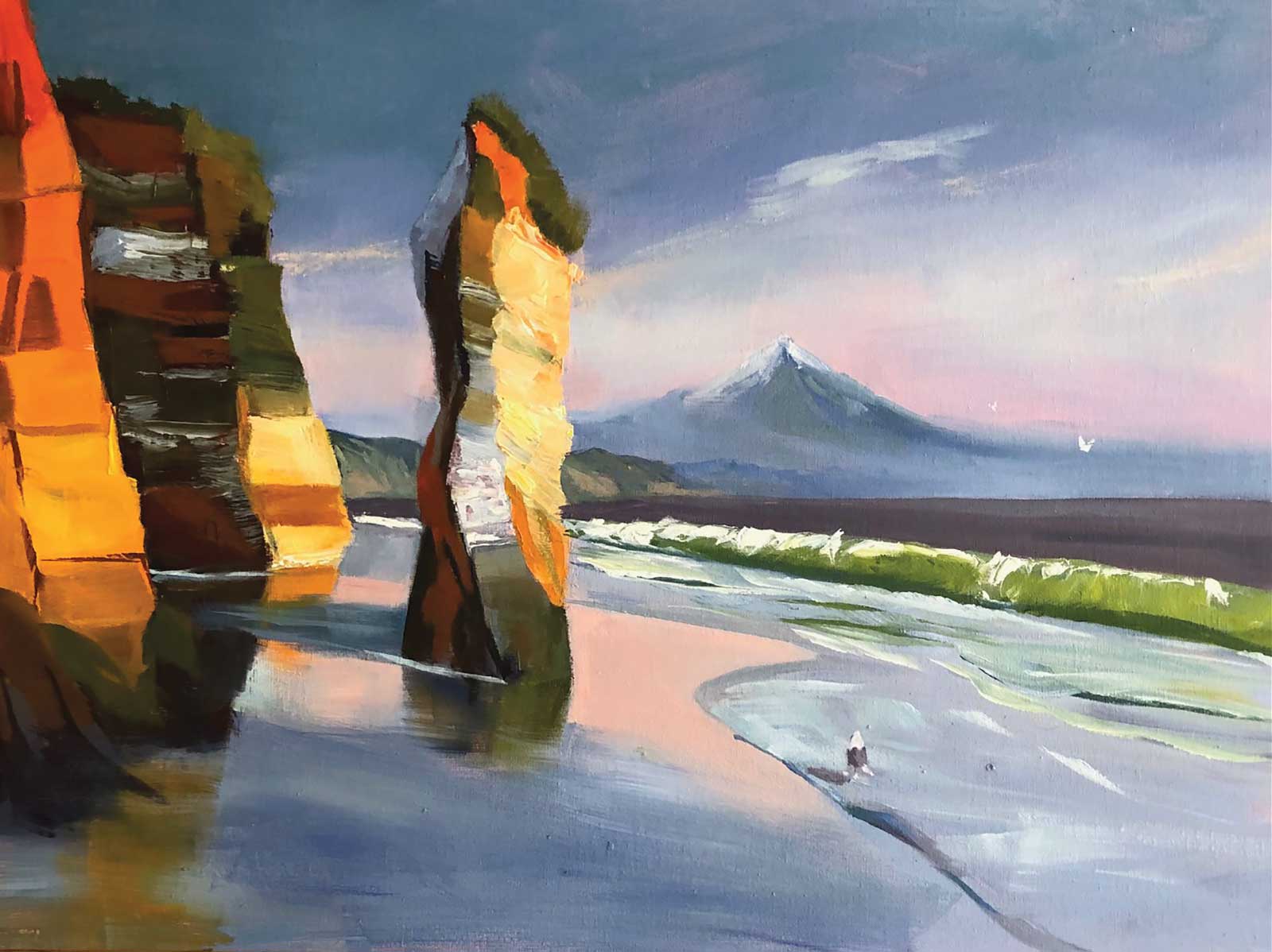
Tim Crawford
Hi Tim, looks like you had fun with this one. I can see you’ve put in a lot of work—fantastic! With every painting we hopefully learn a thing or two that’ll help with the next painting. If there’s one thing I’d like you to take away from this one it’s the importance of values in making a believable scene. “Value” is the darkness or lightness of a color, as if seeing it through a black-and-white camera. How all the values in your scene relate to each other will largely determine the success of your painting. The easiest way to see the value relationships in a scene or painting is to convert the photo to grayscale. All smartphone cameras can do this nowadays. Simply edit the photo and choose a grayscale filter. If you do that to both your painting and my painting you will suddenly see the difference between the two. You’ll see for instance that the mountain in yours is the same value as the sky, and the center stripe of the main rock is too light as well. Switching quickly between grayscale and normal view, back and forth, will help you understand the relationship between color and value. Painting a cube or simple object will also help you to see value relationships more easily.
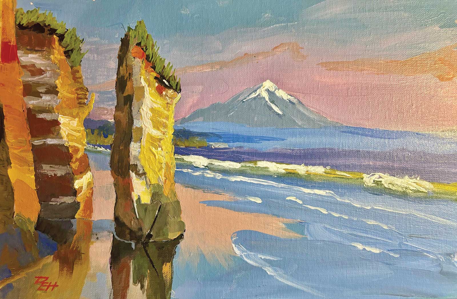
Eric Hillmer
Colorful painterly work, Eric. Great to see all that fluid brushwork. Just two things I’d caution you on, and that is making sure that when light objects are in the shade or half shade that they are dark enough, and to always endeavor to make your shapes organic, something the two rocks on the left have struggled with.
Nancy Newton
Wow, this one’s very dynamic, Nancy. I love the sharp edged crispness of the blocky rocks against the soft and lost edges in the grayed sky, which allows the vibrant rocks to sing spotlit on a subdued stage. One thing I would have liked to see you do better is joining the rocks’ colored bands from the light into the shade, which is important to create a solid sense of form.
Elena Sokolova
Great job, Elena. I like that you’ve included both really thin paint and heavy impasto; that degree of variety makes for an interesting painting. You’ve managed to turn the faces of the rocks convincingly from light to half light to shadow. I love the purplish gray you’ve used in the half tone of the rocks and wish that I’d used that in my own. I suppose I could glaze it. Really nice organic shapes you’ve made in the rocks too—it’s very easy to make them too regular.
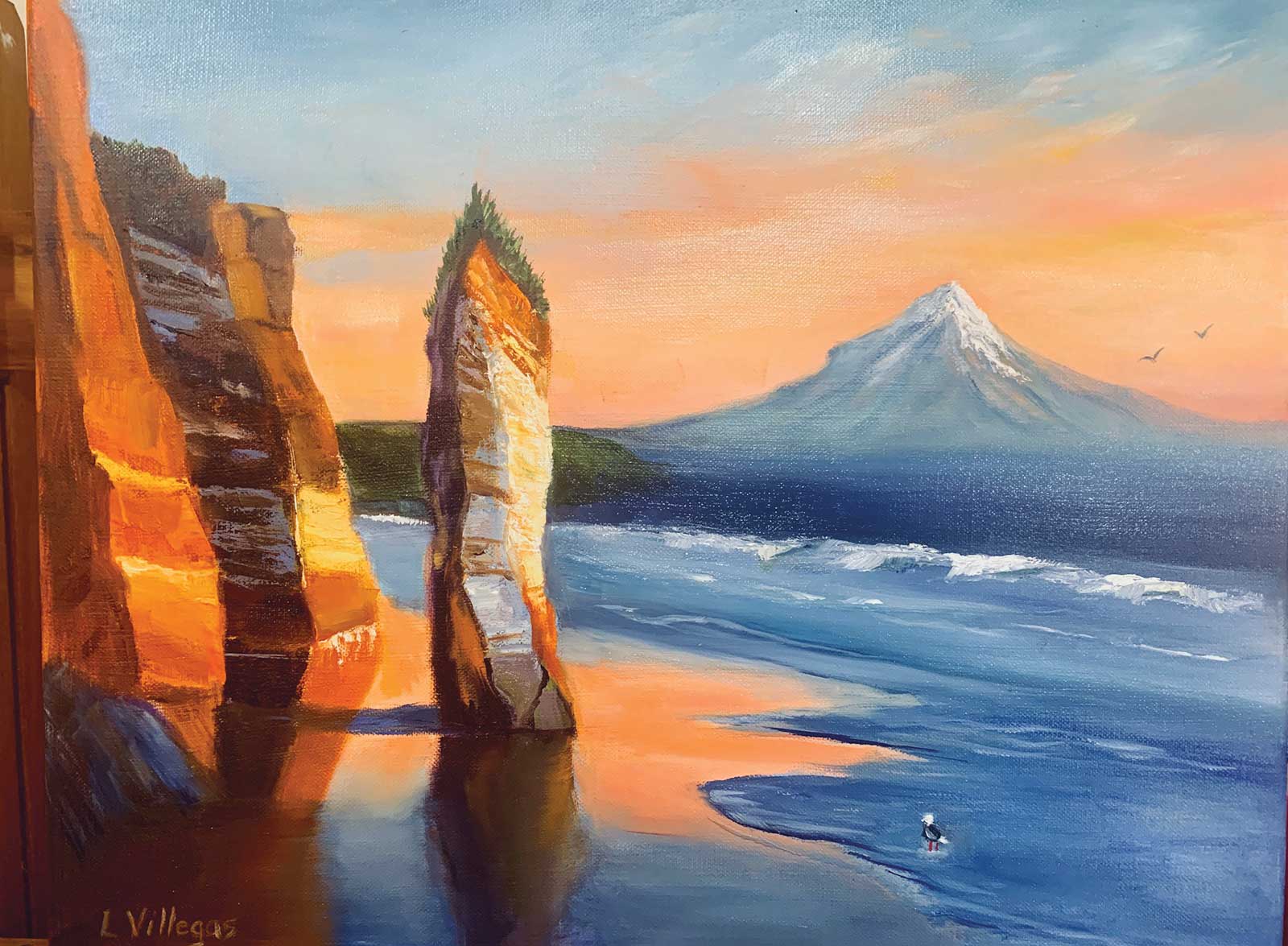
Louise Villegas
Nice work, Louise. Strong color with great warm/cool contrast, good contrast between smooth and impasto paint texture, and good drawing, except for that little bump on the left-hand side of the mountain. Well done! Watch that you make your horizon horizontal and flat. Also, it may just be the photo, but you’ve gone to black in the rock shadows and that’s a lost opportunity for including more color (albeit dark color) in the painting.—