


People seem to like my work for its loose and fresh feeling. Up close I like my paintings to look like they are abstract, just a bunch of jumbled up brushstrokes of color, but when they step back the painting comes into focus. That’s the magic I go for in my work.
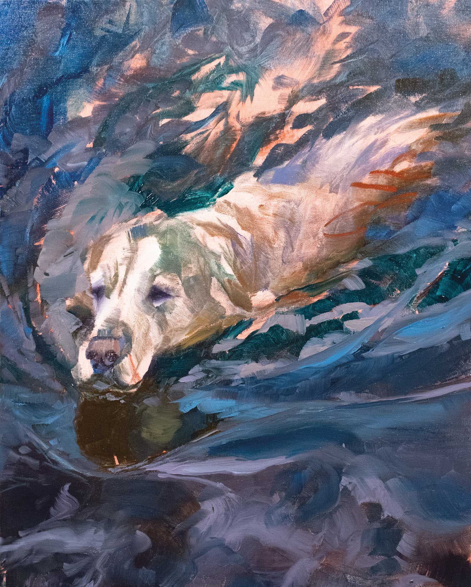
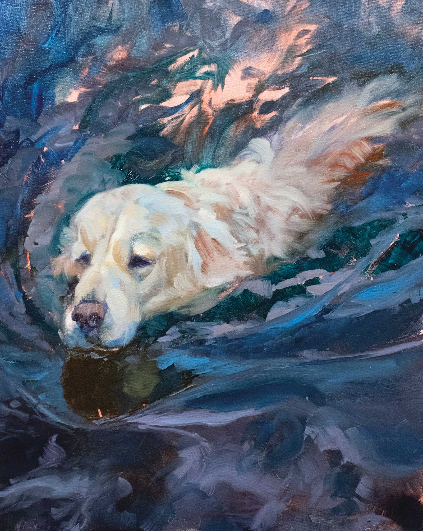
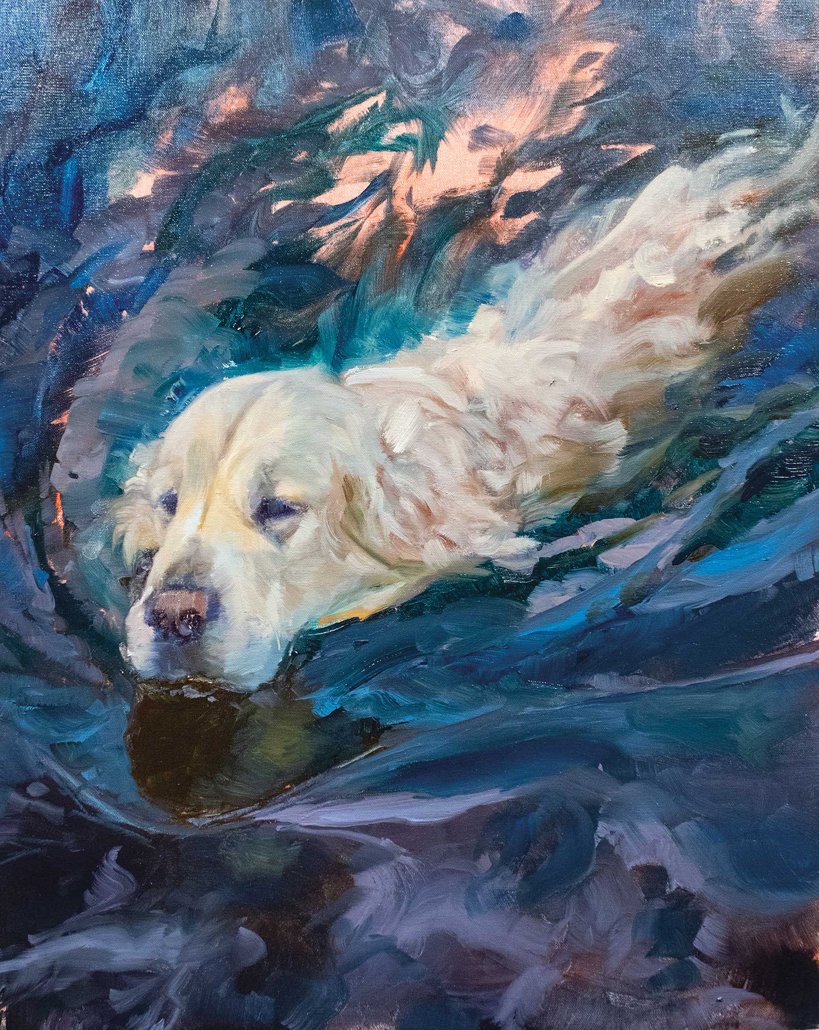
Ramming Speed, oil, 48 x 36" (121 x 91 cm)
Being able to paint loosely has been my goal since I left my illustration career. Tight product renderings are difficult to do and feel like work to me, so in my fine art career I try to stay away from anything that feels like work. I paint freely and let everything just go. I paint with confidence with my drawing, design and painting skills that I have honed for 30 years as an artist. My paintings are always evolving and moving, and I think that’s why the subject of swimming dogs fit so well. Everything just works with my skill set.
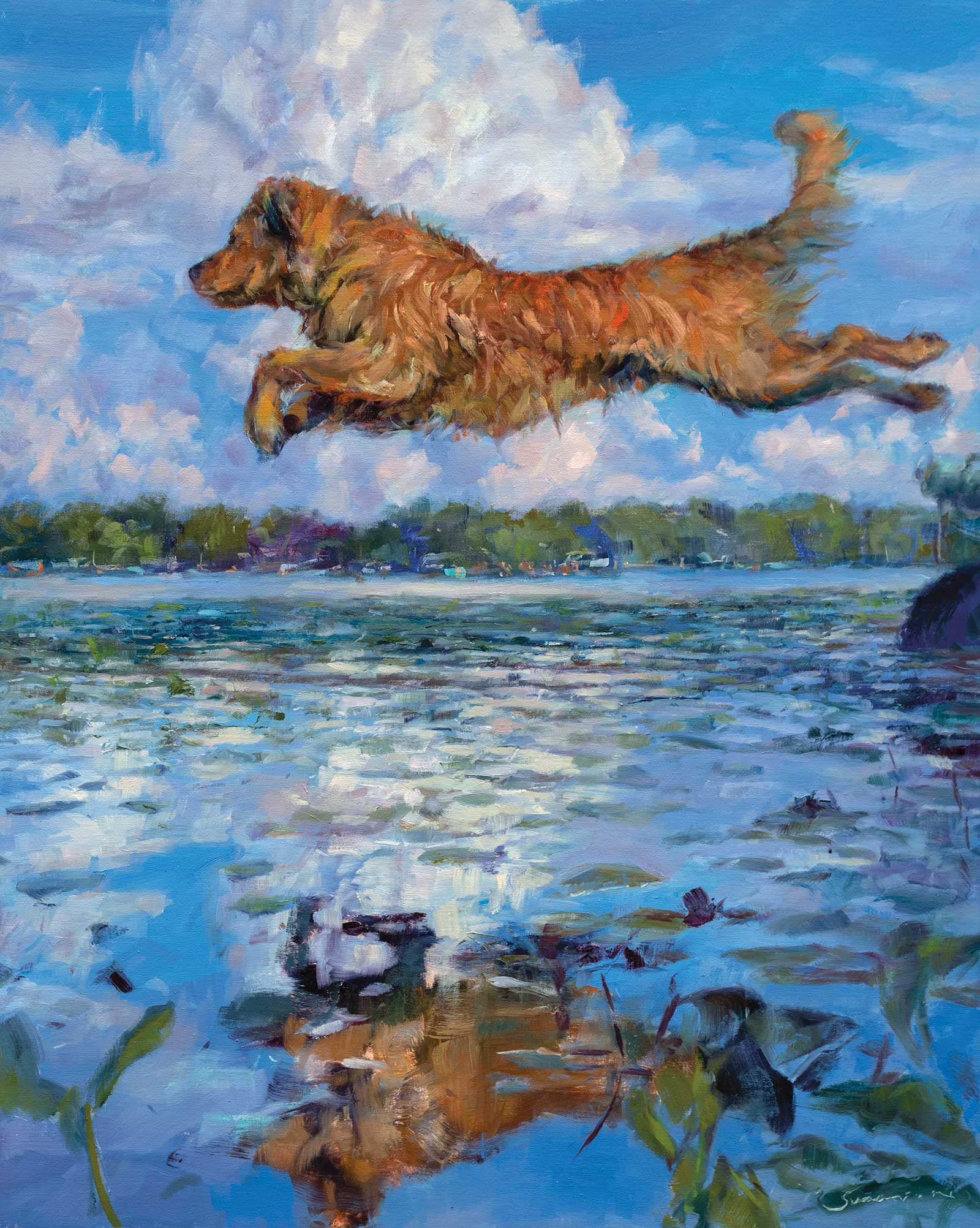
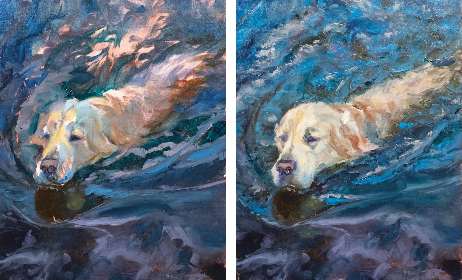
When Dogs Fly, oil, 30 x 24" (76 x 60 cm)
Golden in Blue and Gray, oil, 24 x 20" (60 x 50 cm)
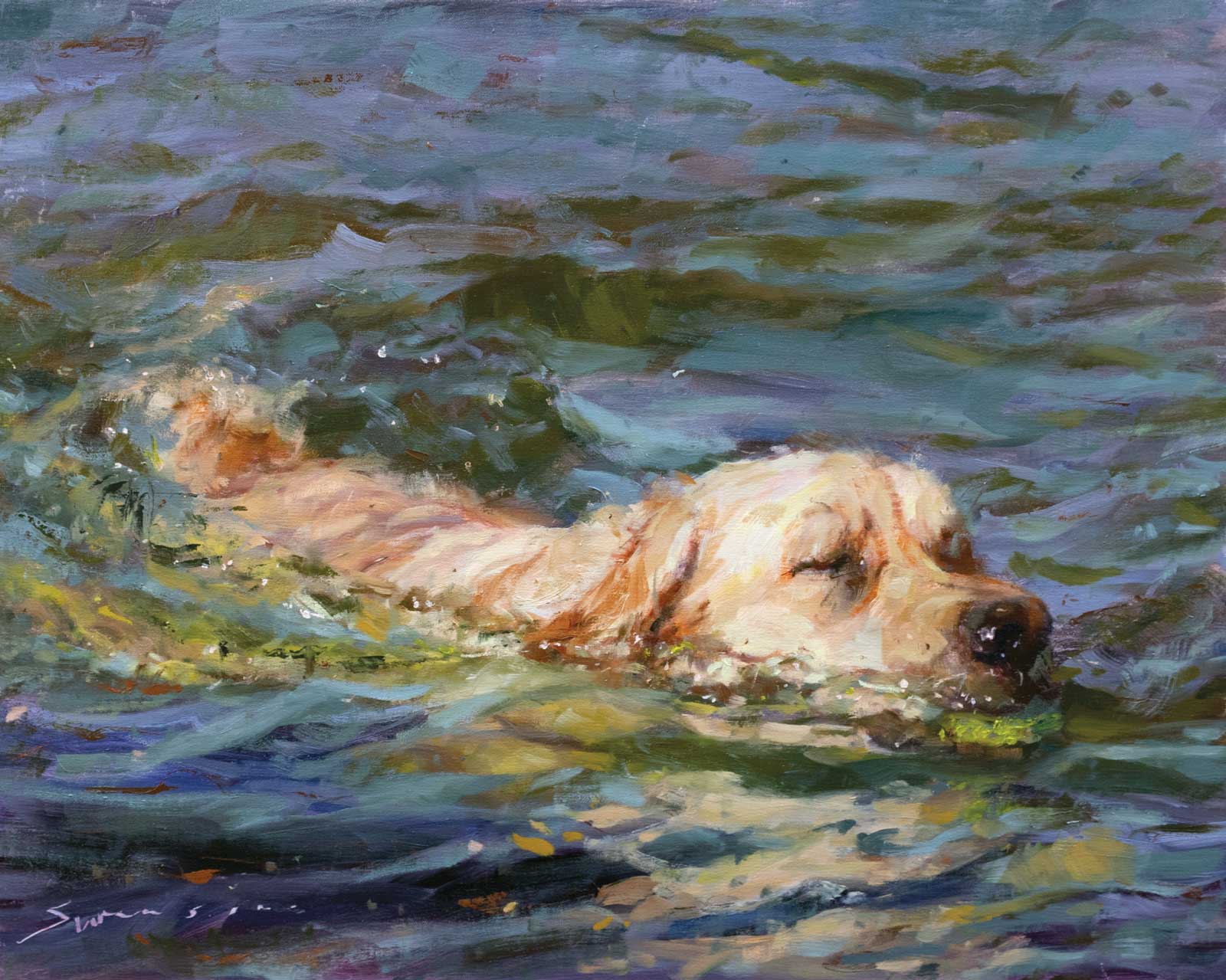
My Water Dog series is pretty simple, which is the way I like things. It’s just me and my dogs out playing in the water. I throw the ball or stick, and Bjorn (our English cream golden) will go get it if he can beat out our other golden Fenrir (his name comes from the giant wolf who eats Odin during Ragnarök in Norse mythology). We all have the saying, “paint what you know.” Well, this is it for me; painting my best friends is what I know. They are there at my feet in the studio and are at the door greeting me when I get home. So, creating paintings that people want is really satisfying to me. Like my pups, it makes me happy.
My Art in the Making Blue Water Dog
Get It Right Before You Start
My process is a tried-and-true method; you get everything ready before you paint. Take the time to make sure your design is good. I start with the image and play with it until it works and I feel it could be a good painting. I’ve worked with photos my whole art career, so I know my way around Photoshop and Procreate to get an image that is paint-worthy. It takes a bit of time to design things out, but if you don’t you will have that little voice in your head saying you should have done something different. Settle on an image and have it color corrected in Photoshop, then crop the image to the canvas size and add a grayscale strip. It makes the values in the image easier to mix up and paint.
Mixing the Paint
It might not look like it, but I have a very simple palette of colors. I use mostly Rembrandt oil paints. I find them fabulous to work with, and their cadmiums are some of the brightest and strongest on the market. I feel they have brightened up my whole palette, and they even made me a Rembrandt oil paint ambassador. At my heart, I am a traditionalist painter. I paint dark to light, fat over lean, so that’s how I mix my colors. The first colors are my darks. The top row of my palette is all the dark colors I see in the painting. There are no whites in these colors. In this painting the darkest objects are the water, the dog’s nose and eyes and a few shadows. I’ll mix up all the dark colors I can see into piles of paint.
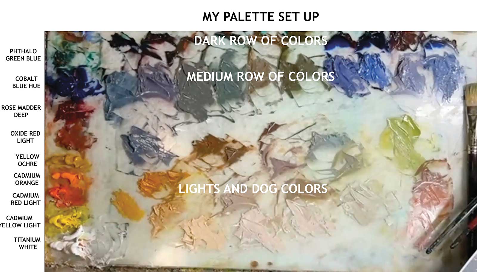
Having all my darks figured out, I will split each pile in two. I then figure out the basic value of the mid-tones of the painting using the grayscale on the image. I add a little titanium white to the new split piles until they reach a value of 8, which is pretty dark. Almost all the water’s color should start showing themselves at this point.
I will then split all the mid tone piles that I just made and add white until they reach the main light color value range, which is about a 3 on the grayscale. When I get to this point, the dog colors will start to show. I will have to mix up the major dog colors, but I usually find a lot of great colors to start with in these mixes and they will all work together. The dog colors are warmer, and I will start off with pure colors just like the dark ones. Oxide red light and greens and cadmium red light and green will get the dog colors going.
I’ll cut the dog’s color piles in half and add white to the bottom pile until it reaches a 3. At this point my palette is full and all I need to decide on is the canvas toning color. I went with oxide red light, because it won’t turn the added colors warm and will stay on the cooler side. It might seem a little overkill to make most of my colors and lay them out the way I do, but when I paint, I am just focusing on painting. I don’t need to stop and mix paint or judge colors. This way I can concentrate on my painting, drawing, shape design and brushstrokes. It’s really an efficient way of painting and lets me be loose and free in my mark making.
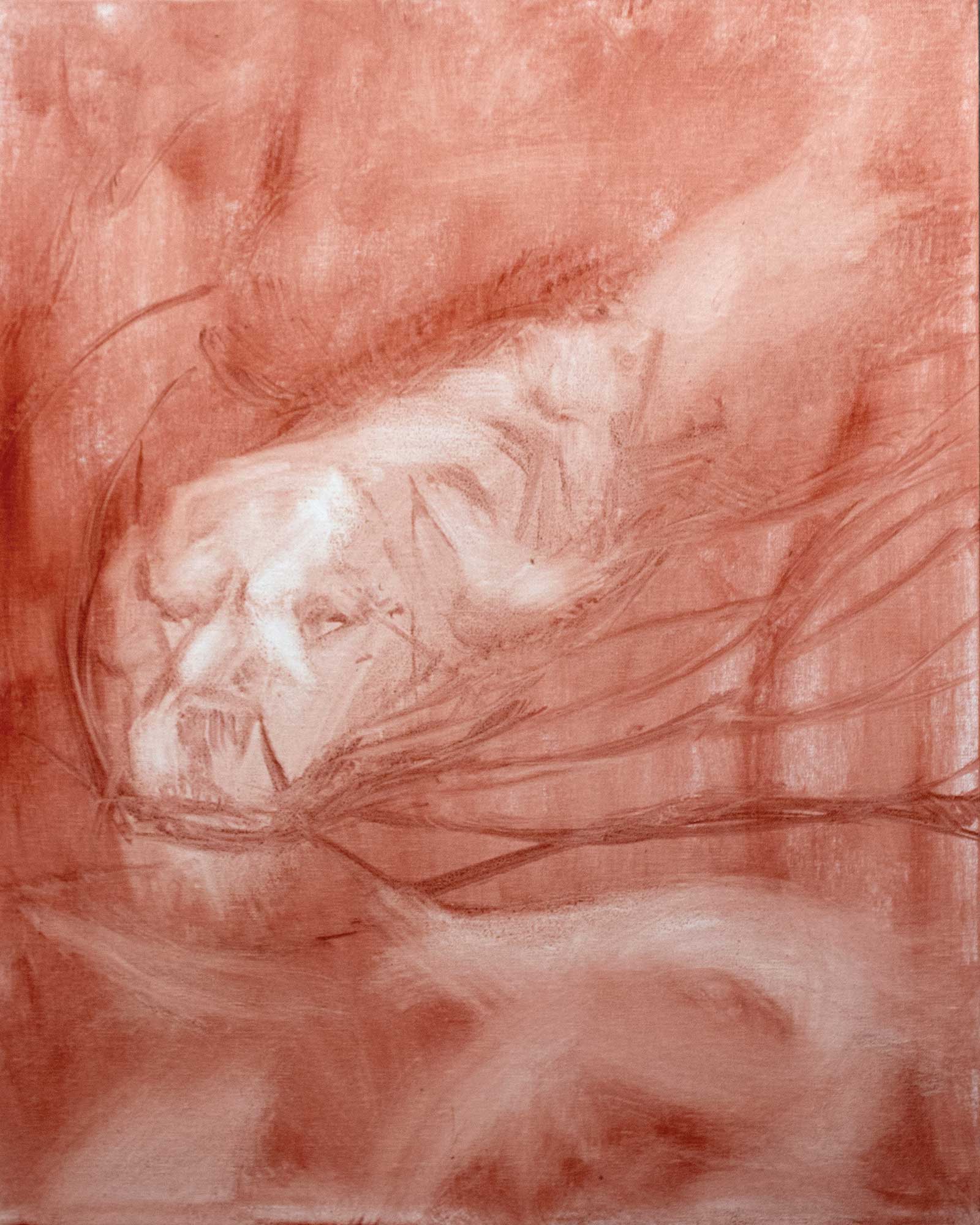 Stage 1
Stage 1 Time to Paint
I tone the canvas with a color that will work with the painting and sketch in the image on the canvas. There are a few reasons I tone the canvas:
- Judging color against white isn’t a good way to see color. Colors don’t look the same against white as they do next to other colors.
- It helps the canvas to accept paint easier. I work on linen canvas and paint sticks to it well, almost too well. By toning the canvas, the paint glides on easier and speeds things up.
- If the canvas is toned, white will not peek out of spots in the paint and need to be covered up later.
- It helps with color harmony, just that little bit of color on the canvas will mix with all the other colors and will make a color relationship.
- Lastly with paint covering the entire canvas I can be done at any time during the process. It doesn’t matter if it was a great sketch or a fully realized painting, the canvas has paint covering the entire canvas and it can be considered finished.
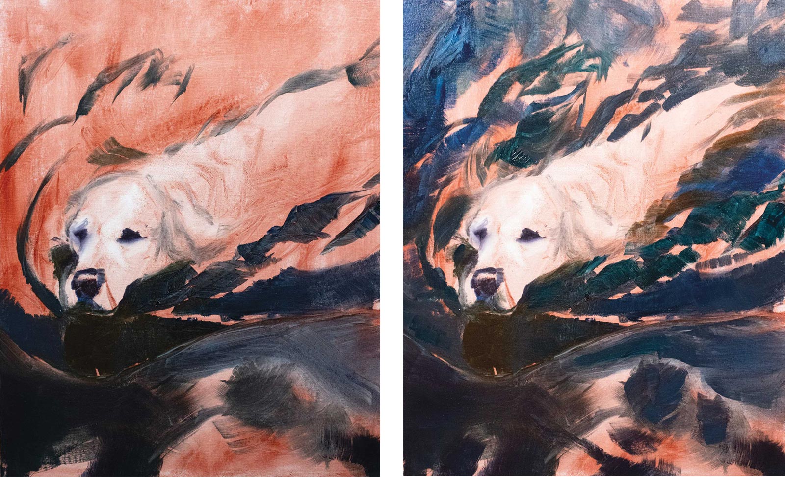 Stage 2
Stage 2 Paint It Black
I start with my darkest of dark colors. I find starting with these helps me create a base structure so I more easily know where I am in the painting. When I start painting the dark colors I try and figure out what shapes come forward in the painting and which ones recede. If it comes forward it probably has more warmth or contrast in it, so I will think about how much red is in the shape and if it is warm or cool. The dark colors that are farther back in the image will have more blue in them. I work pretty thin at this stage of the painting, using the canvas as my color lightener. I also work the whole canvas, not just areas. That way it blocks in quicker.
 Stage 3
Stage 3 Working the Mid Tones
Next, I paint the water’s mid tone colors from the second row of colors on my palette, as they are the guts of the painting. These colors fall in between the dark and the lights. There will be more mid tones on the palette and will take the most time to paint.
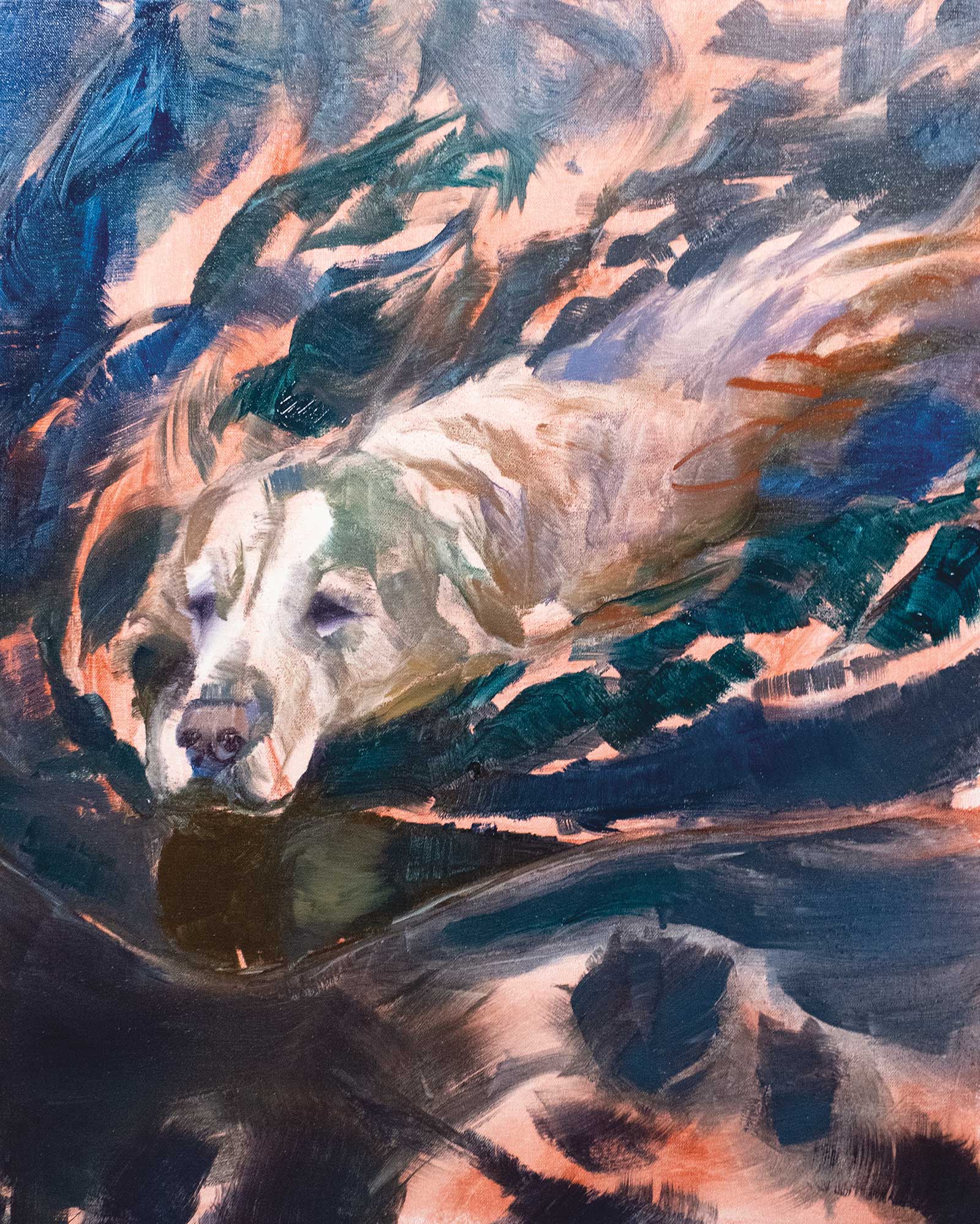
 Stage 4
Stage 4 Layering in the Dog’s Mid Tones
The water is the darkest part of the painting, the dog’s shadows are in the mid tone value range. I put in rich colors underneath knowing the fur coming over the top will pull it all together in the end.
 Stage 5
Stage 5 Light-Colored Mid Tones
What I try and do at this stage is get everything ready for the fur. I work the warms and the cools and make sure they are working in their depth space correctly.
 Stage 6
Stage 6 Fully Blocked In
The lights colors go in last. This is the point where the painting really takes shape. The painting is now fully blocked in.
 Stage 7
Stage 7 Take a Break and Return with Fresh Eyes
Figure out what needs to be fixed and adjusted. Things should jump out at you with your fresh eyes. Make a plan on what changes you need to make and go through it one step at a time. In this painting I saw a few things that needed to be changed on the dog’s head and pulled the paint off for corrections.
 Stage 8
Stage 8 Little Adjustments
Here, I am refining the eyes and nose. The eyes are the most important thing to get right. The nose is right behind; take your time and find the warms and the cools. The painting should be close to being done after you have completed your changes and let it rest for a few days. After that time if you look at the painting and something jumps out at you as still wrong, try flipping the painting upside down. Something that needs to be addressed might stand out better.
 Stage 9
Stage 9 The Final Critique
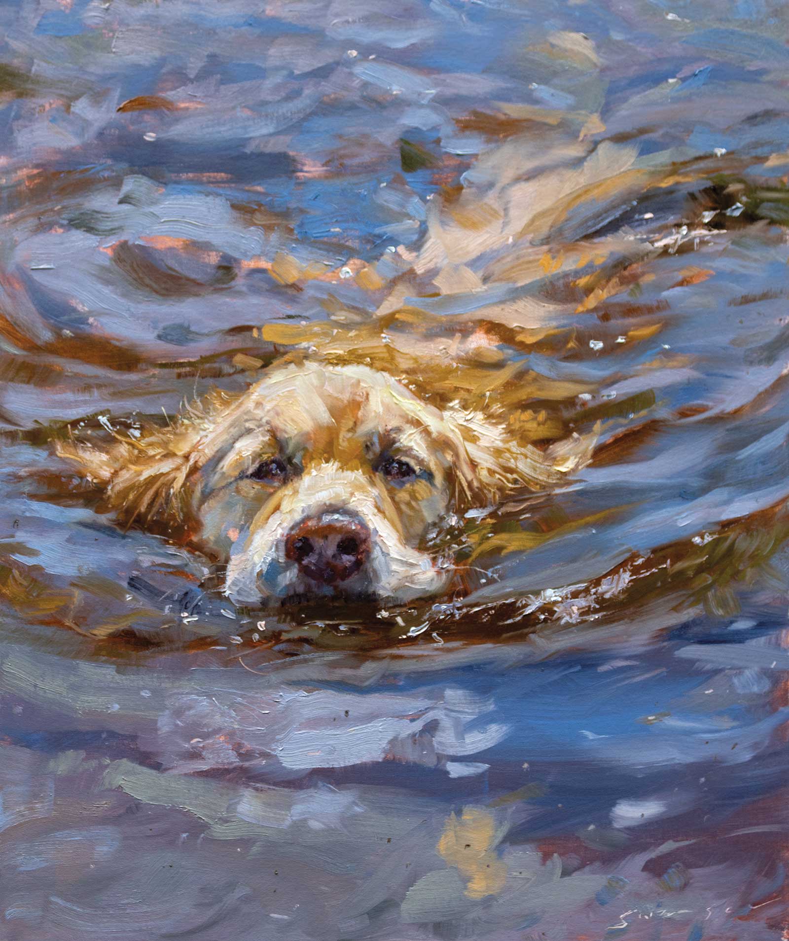
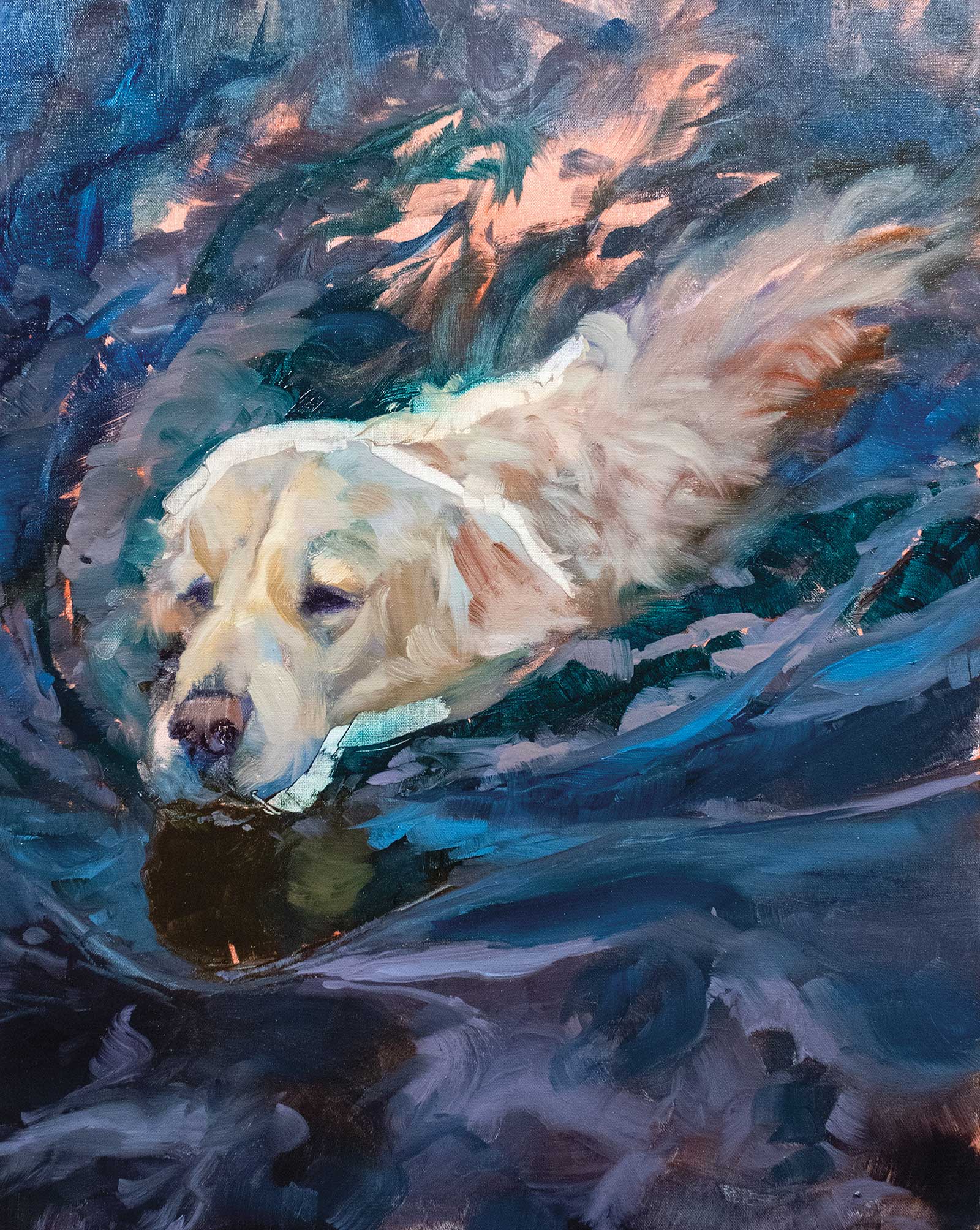
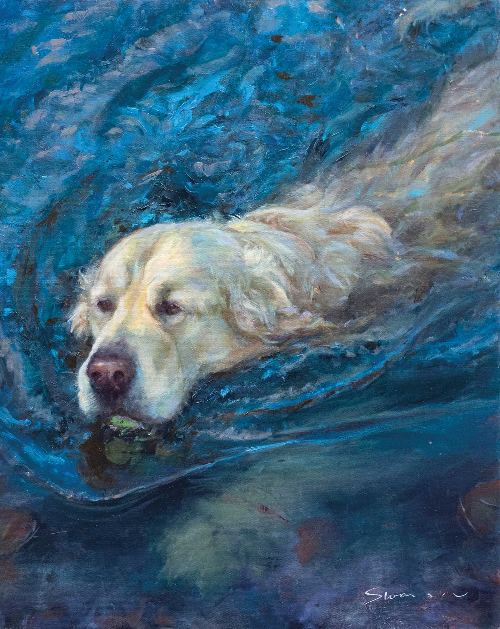
Blue Water Dog, oil, 20 x 16" (50 x 40 cm)
In my final revisions, a few more things jumped out at me. The sky reflections didn’t work. I tried to tone them way down, but in the end they didn’t work, so I replaced it with his paw underwater. I also worked on highlights on the dog and the water. And that’s about it.
About the artist
 James Swanson
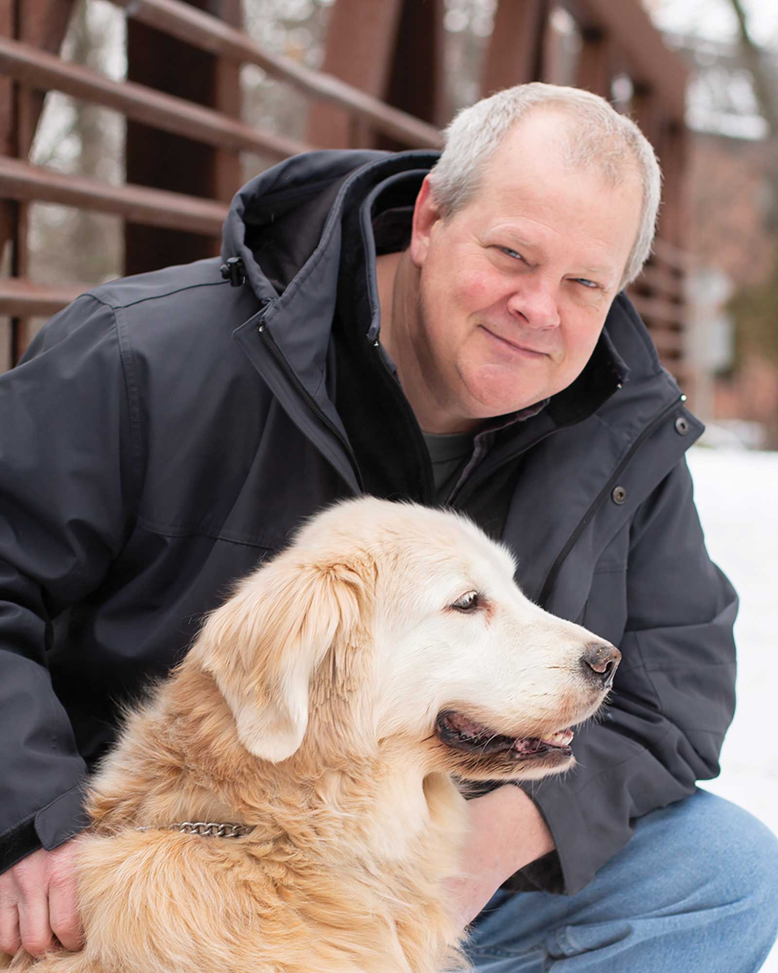
Originally from Wisconsin, James Swanson went to college to be a forest ranger but soon discovered that his real talent was painting trees rather than identifying them. That realization prompted him to transfer to the Columbus College of Art and Design where he found his passion for illustration.
After years in the illustration business, Swanson shifted his focus to fine art and is now represented by galleries around the United States, including Wilde Meyer Galleries in Arizona, Reinert Gallery in South Carolina, the Dutch Art Gallery in Texas, Little Mackinac Gallery in Michigan, All About Art Gallery in North Carolina, Marine Arts Gallery in Florida and Cole Gallery in Washington.
He is a Signature Member of the American Impressionist Society, Oil Painters of America and National Oil & Acrylic Painters’ Society, and a member of The Portrait Society of America, Society of Animal Artists and American Artists Professional League. Swanson has also won numerous painting awards, including the Dorothy Driehaus Mellin Fellowship Award and the Most Original Award at the Oil Painters of America’s 2023 National Exhibition. He offers weekly online painting classes, and his oil painting workshops have now spread to Europe.
Contact at
james@jamesswansonfineart.com
jamesswansonfineart.com