



In my experience, the key to a successful hyperrealist painting is the understanding of tones and values, rather than an abundance of details. Simplifying the complexity of nature in a few abstract shapes that have the correct color and value will allow you to paint very lifelike subjects with a straightforward and easy-to-replicate method. At the root of this process is color matching: if you are able to precisely replicate the color you see, you will only need a few carefully placed brushstrokes to make the subject feel alive.
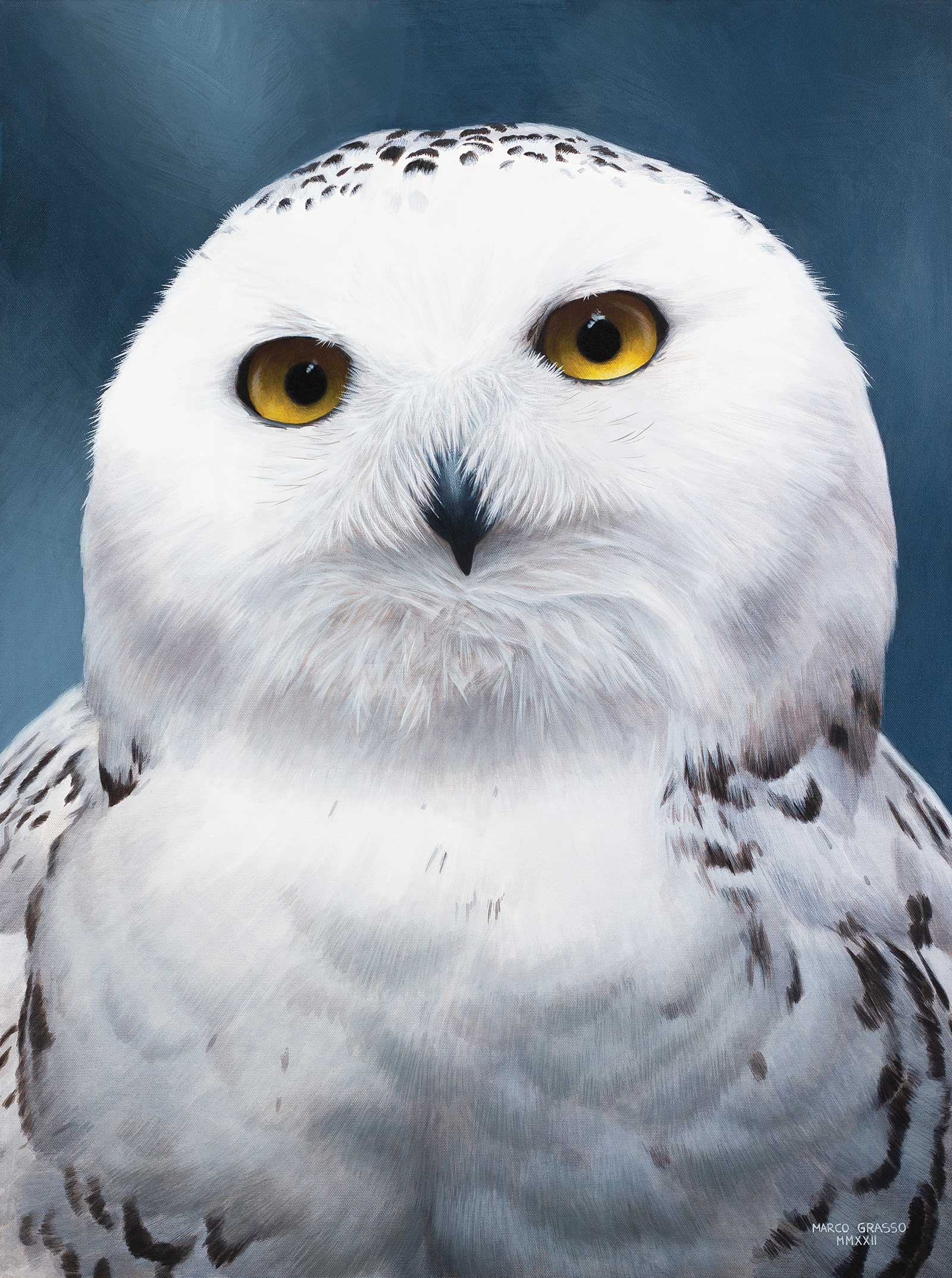
Ghost, acrylic on canvas, 32 x 24" (81 x 60 cm) Painting snowy owls is always a fun challenge because you have to play with very subtle shades of blues to give three-dimensionality to the white feathers. The only warm colors in this piece are reserved for the eyes, the focal point of the painting.
In this tutorial I will share a few tips that can make color matching easier. First of all, I like to start with a warm undertone in my paintings. I usually go for burnt sienna if I am painting a tiger or a darker subject, and raw sienna or yellow ochre if I am painting a lion, leopard, cheetah, etc. This mid tone is a great starting point and allows you to match colors much easier than if you had started with a very bright white canvas. When painting the values, I like to start from the middle and slowly increase the contrast by adding more extreme lights and darks as this allows me to control the contrast and sharpness of the image with great precision. Once the entire canvas is covered and everything is blocked in, I take a smaller brush and start adding details in a few spots. I don’t want the entire painting to have the same amount of details, rather, I am creating a focal point (usually around the eyes of the subject) that captures the attention of the viewer.
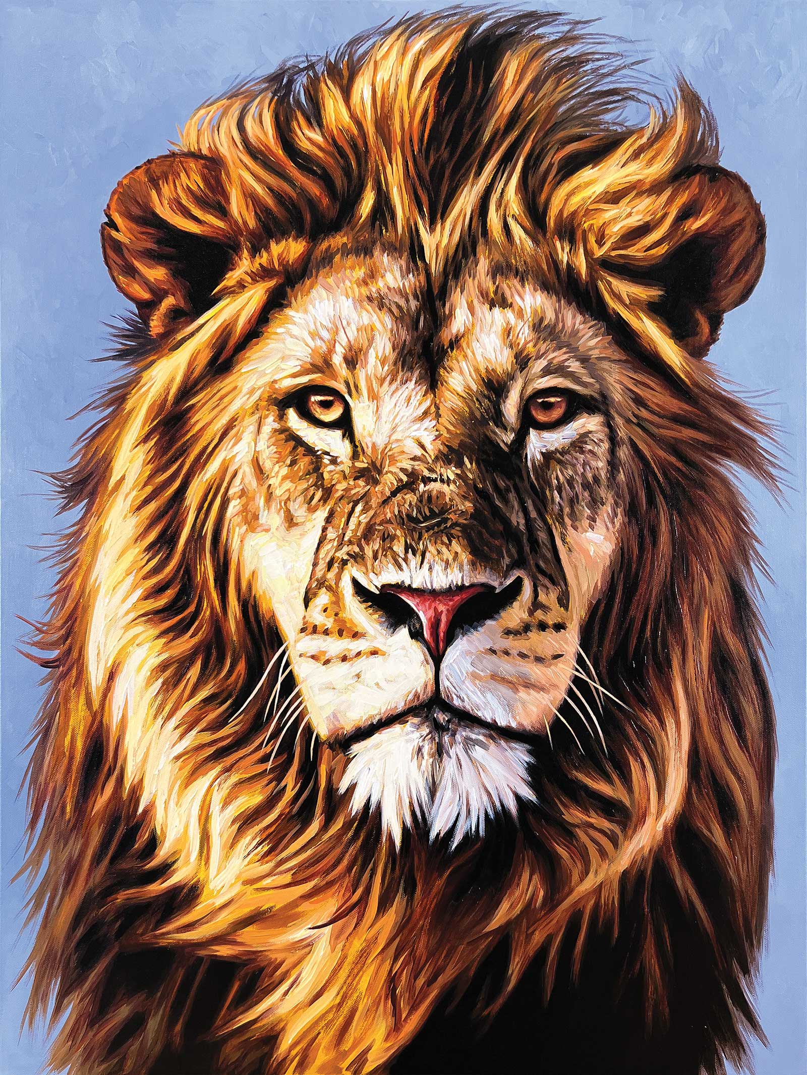
: Rising, acrylic on canvas, 32 x 24" (81 x 60 cm) In this painting I wanted to give movement to the mane of this lion using a lot of dark shades and contrast. I used a purplish blue background to create contrast with the lion mane and add drama to the image.
One of the biggest challenges when working with acrylics is color shifting. This happens because the binder in the paint changes from white to transparent as it dries. I have found that artist-grade acrylics with higher pigment load show less color shifting than cheaper options, but every acrylic paint has this issue to some extent. It is important to keep this in mind when mixing colors. Always mix a slightly lighter shade than the desired result to compensate for this shift.
When trying to color match, it is always easier to work with a printed reference under the same light of your canvas rather than working with a bright and oversaturated digital screen. Studio lighting is also extremely important: I use an LED light positioned 7 feet above the floor at a 45-degree angle to my easel. I set it to 5000 Kelvin (neutral light) because painting under warm or cold light will cause you to compensate by mixing colors shifted to the opposite temperature.
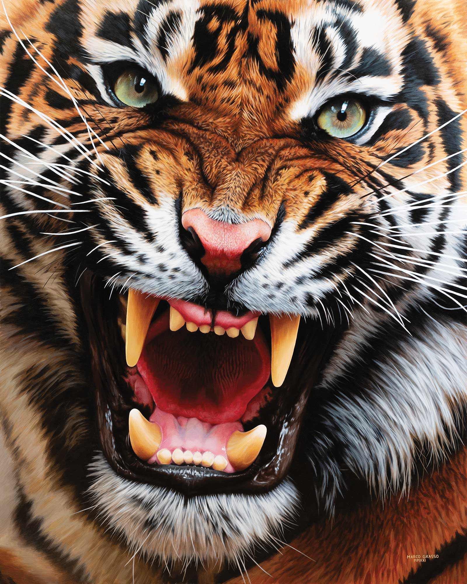
Ouverture III, acrylic on canvas, 60 x 48" (152 x 121 cm) In this large closeup of a roaring tiger I wanted to convey the energy and power of this majestic animal. By opting for a big canvas, my goal was to accentuate all of the little details of the fur and the teeth and play with the textures. It is my largest painting to date!
For all of my work I use a limited palette composed of titanium white, ultramarine blue, alizarin crimson hue, cadmium yellow light hue and burnt umber. For very bright oranges I occasionally use cadmium red hue. This is really everything you need; adding more paints will only serve as a distraction and will stop you from learning how to properly mix colors. Some people like to use zinc white instead of titanium, raw umber instead of burnt umber or a different yellow pigment, but the core concept remains the same: you need a white, a yellow, a red, a brown and a blue.
This demonstration aims to show how to look at a reference image, then simplify and translate the elements you see into abstract shapes. This, in my opinion, is the true challenge of photorealism. Let’s get started!
My Art in the Making Golden Hour
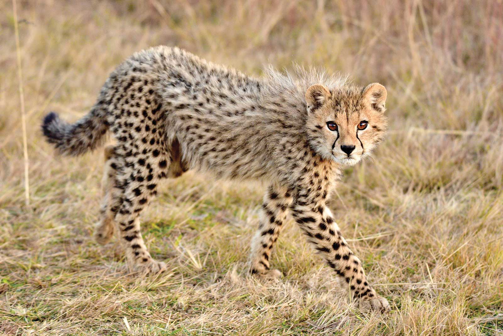
Reference Photo
In this demonstration I will take you through the process of creating Golden Hour, a 16-by-20" acrylic painting of a young cheetah. Departing from my reference, I decided to paint a purplish blue background characteristic of African sunsets, which also contrasts nicely with the warm tones of the subject. The focus will be on the eyes: this is where I will push the contrast and accentuate the sharpness of the brushstrokes. The reference photo is by Gareth Webb.
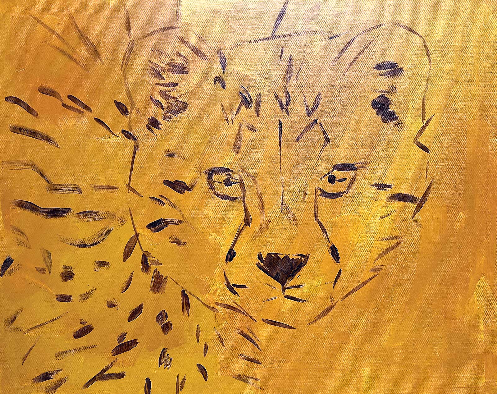 Stage 1
Stage 1 Undertones
I start with a warm undertone painted with raw sienna. I sketch a few lines for the important elements: the shape of the head, the eyes, the nose and where the bigger spots will be.
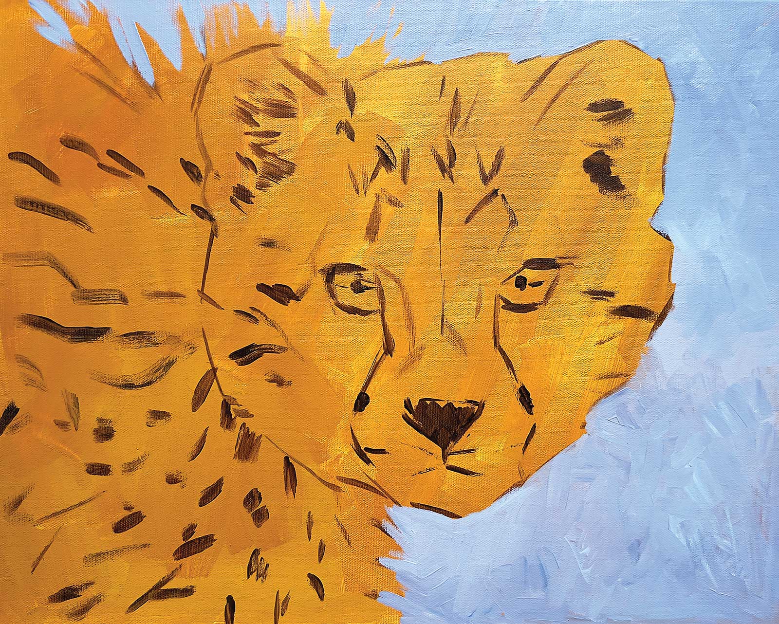 Stage 2
Stage 2 Background
For the background I use ultramarine blue and alizarin crimson to create a purplish blue sky that contrasts with the warm tones of the cheetah.
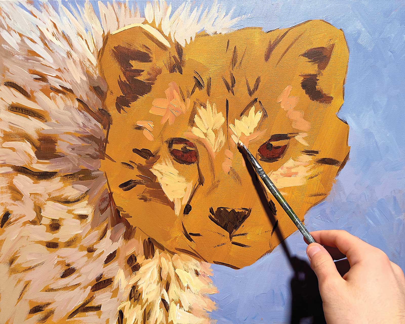 Stage 3
Stage 3 Blocking in Shades of Fur
With a few large brushstrokes I block all the most important shades of the fur. This will be the base layer from where I start adding details.
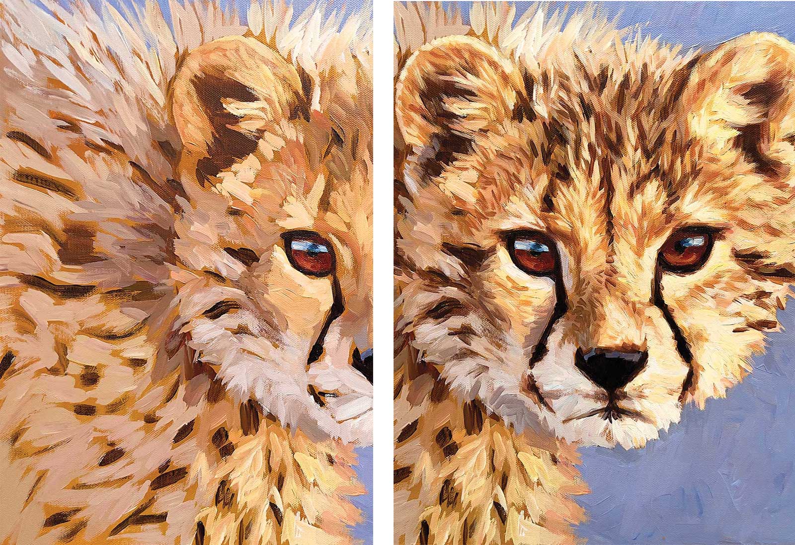 Stage 4
Stage 4 Details in the Fur
With a smaller brush I add details, always painting in the direction of the fur. It’s important not to overdo it, otherwise you will lose the overall three-dimensional effect.
My Design and Composition Tactics
Controlling the Focal Point When studying a composition, I’m always aware of what the focal point will be and every other element in the painting serves to channel the attention to that element. The focus of my paintings is usually the eyes as they can be a window to the soul of the animal portrayed.
Chromatic Contrast I look for animals and backgrounds that have a strong chromatic contrast. As you can see in this demonstration, the purplish blue of the sky makes the feline stand out. I also often purposely exaggerate this contrast.
Atmospheric Lighting In many of my works I use and accentuate dramatic lighting effects that can convey powerful emotions and bring out the three-dimensionality of the subject. Understanding light and shadows is a powerful tool for a realist painter.
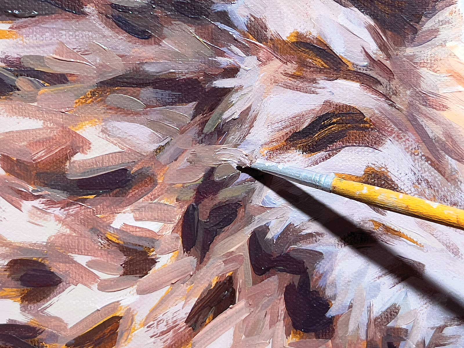 Stage 5
Stage 5 Creating Randomness
I am not focusing on painting hair. Rather, with an old frayed brush, I let the tool create the randomness of the fur. As long as the color is correct, the result will be realistic.
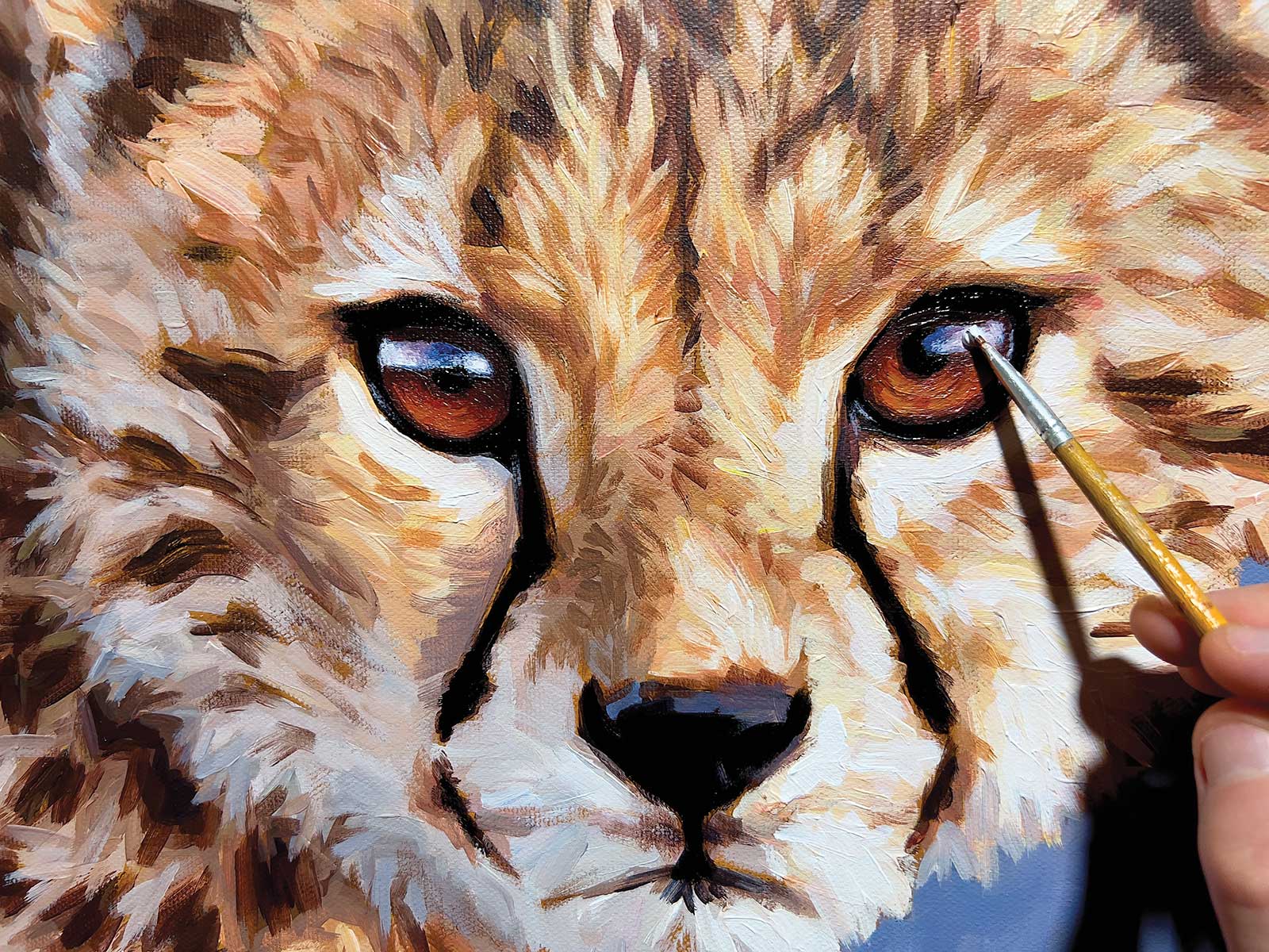 Stage 6
Stage 6 Details in the Eyes
Finally I add details to the eyes: white and blue for the reflection and a lighter warm shade in the lower part to add depth.
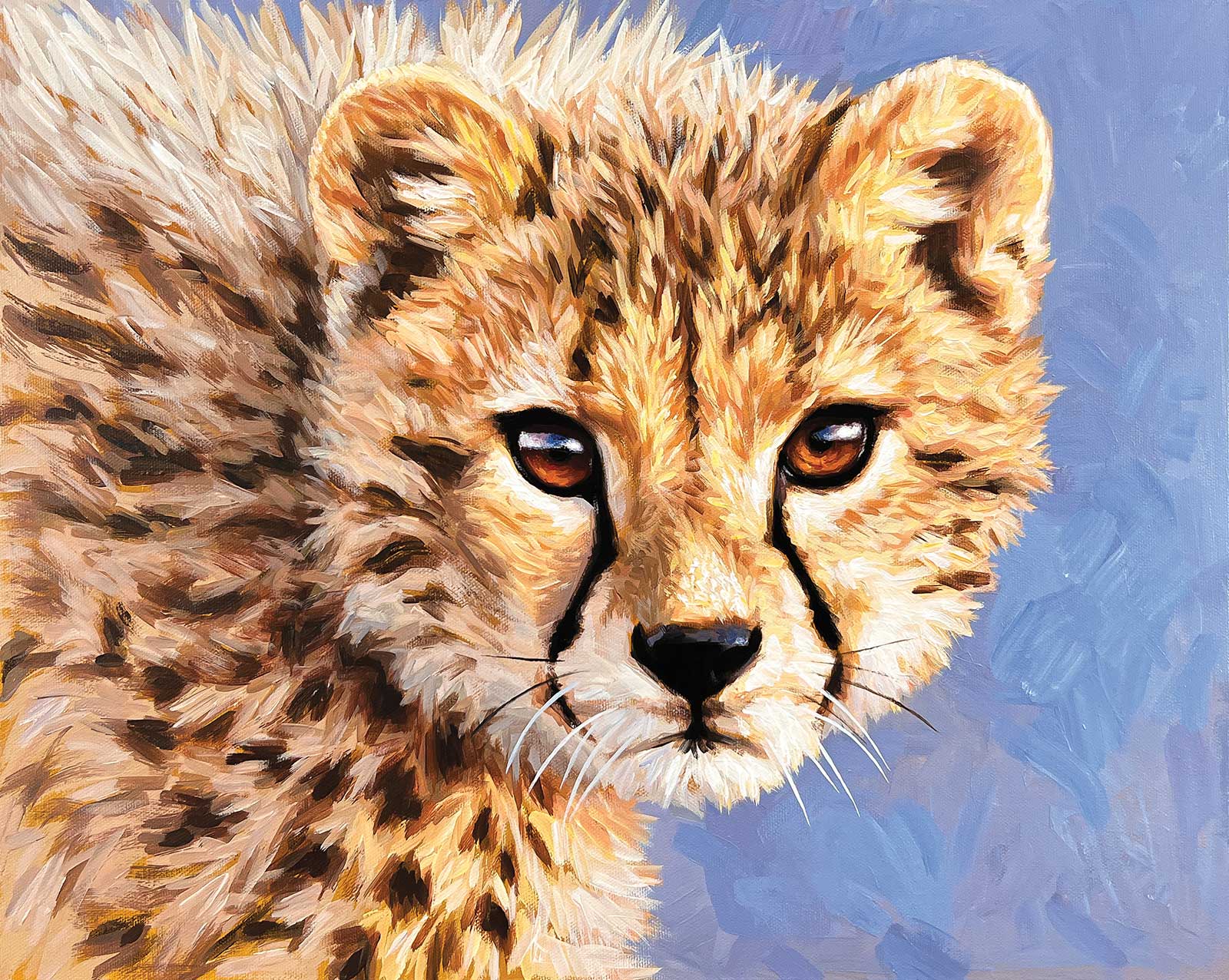 Stage 7
Stage 7 Finished Artwork
Golden Hour, acrylic, 16 x 20" (40 x 50 cm)
Finally, I add the whiskers. I let the painting dry completely for a couple of days before adding the varnish. I use a gloss varnish in two thin layers applied at least three hours apart.
About the artist
 Marco Grasso
Marco Grasso is an Italian wildlife painter. Numerous trips to the most majestic natural places in the world have driven him to paint the animal kingdom, trying to convey its charm and diversity.
He has exhibited in Canada, the United States, the United Kingdom and Italy. He is a Signature Member of Artists for Conservation and a member of the Society for Animal Artists, the most important international organizations for wildlife art.
Represented by
Clarendon Fine Art, Lichfield, UK, clarendonfineart.com
Art Space & Design, Alberta, Canada, artspaceanddesign.com
Contact at
marcograssoart.com