



Pastel was love at first sight. Seeing and feeling the lush colors available in suede matte board was a sensuous experience indeed. Putting the first strokes on it with extra soft pastels had me hooked.
This was not a medium I came to early in my lifelong pursuit of art. I was a watercolor painter from an early age and continued to perfect my craft until I was in my middle years. At that point I was looking for a medium that had more punch. I took on acrylics, and later on oils, all of which I love for their particular qualities and still practice. However, none of these mediums are as direct and immediate as pastels. It is just so much fun having all these bits of pure pigment at your fingertips. A little dab of this or that is just so easy without having to mix colors. It is an ideal beginner’s medium as well as being ever so practical when on location out of doors. However, excitement for pure color only takes you so far. Naturally, one must deal with those essential ingredients like composition and design, values and temperature to achieve a successful painting.
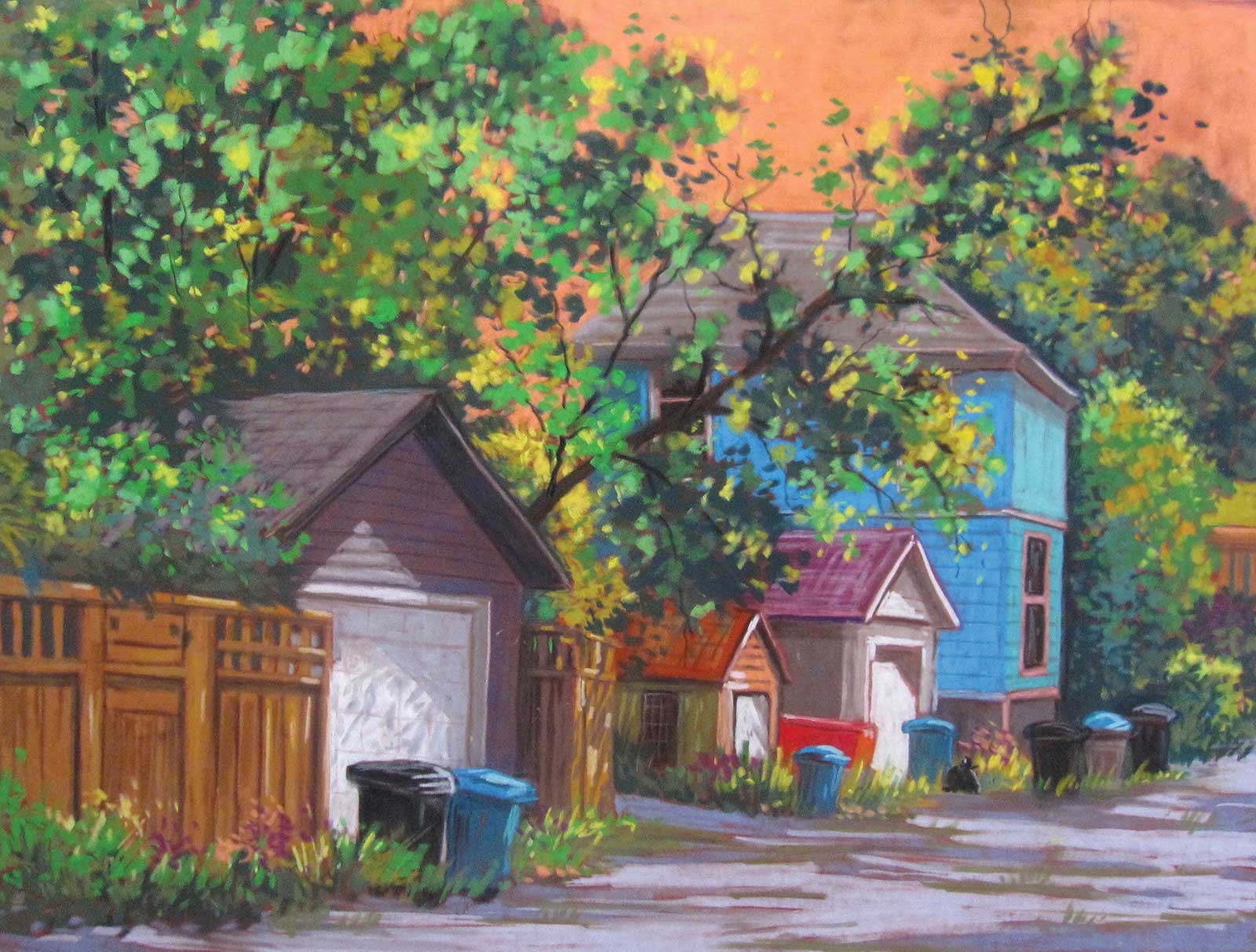
Sunset Alley Stroll, pastel, 18 x 24" (45 x 60 cm)
I use extra soft pastels almost exclusively for their buttery consistency. As suede boards are my favorite support to work on, they make a perfect combination as the pastel particles are held down beautifully by the velvety surface. There is very little dust to deal with. I usually start with a value sketch and plan my design. I choose the color of the suede board to complement the color scheme of my subject matter. My methods are quite direct without much layering. By not covering the surface completely, I use the little bits of ground showing to unify my painting. I love negative space. I have also found that the lush colors of the suede board have an effect on me in that it frees up those preconceived ideas of local color. I let the ground color talk to me while working on it. I make color choices not according to what I see but according to what the painting needs or my response to the colors already on the painting. I think of complementaries, triads and analogous colors. I am not afraid to choose a sky that is red or green if that is what the other colors dictate. Nobody will say to you that reality is not so. Your painting will have that “wow” factor because it works!
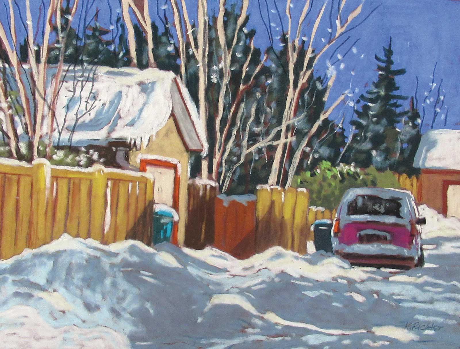
After the Snowfall, pastel
Of course, my own style is a product of who I am, where I came from and what I have done. My directness of style is due to my many years of watercolor painting in a loose, direct way. I work with a lot of different subject matter, but my city upbringing in Europe does influence my choices and I am known for my back alley paintings and street scenes.
My Art in the Making Canyon Road
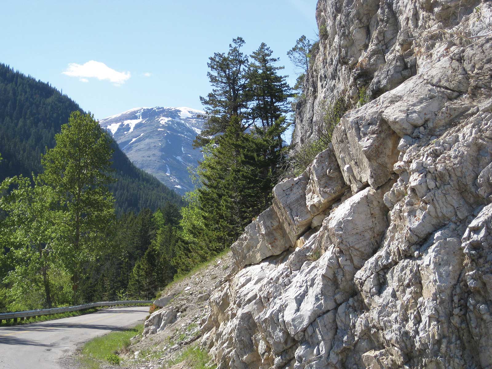
Reference Photo
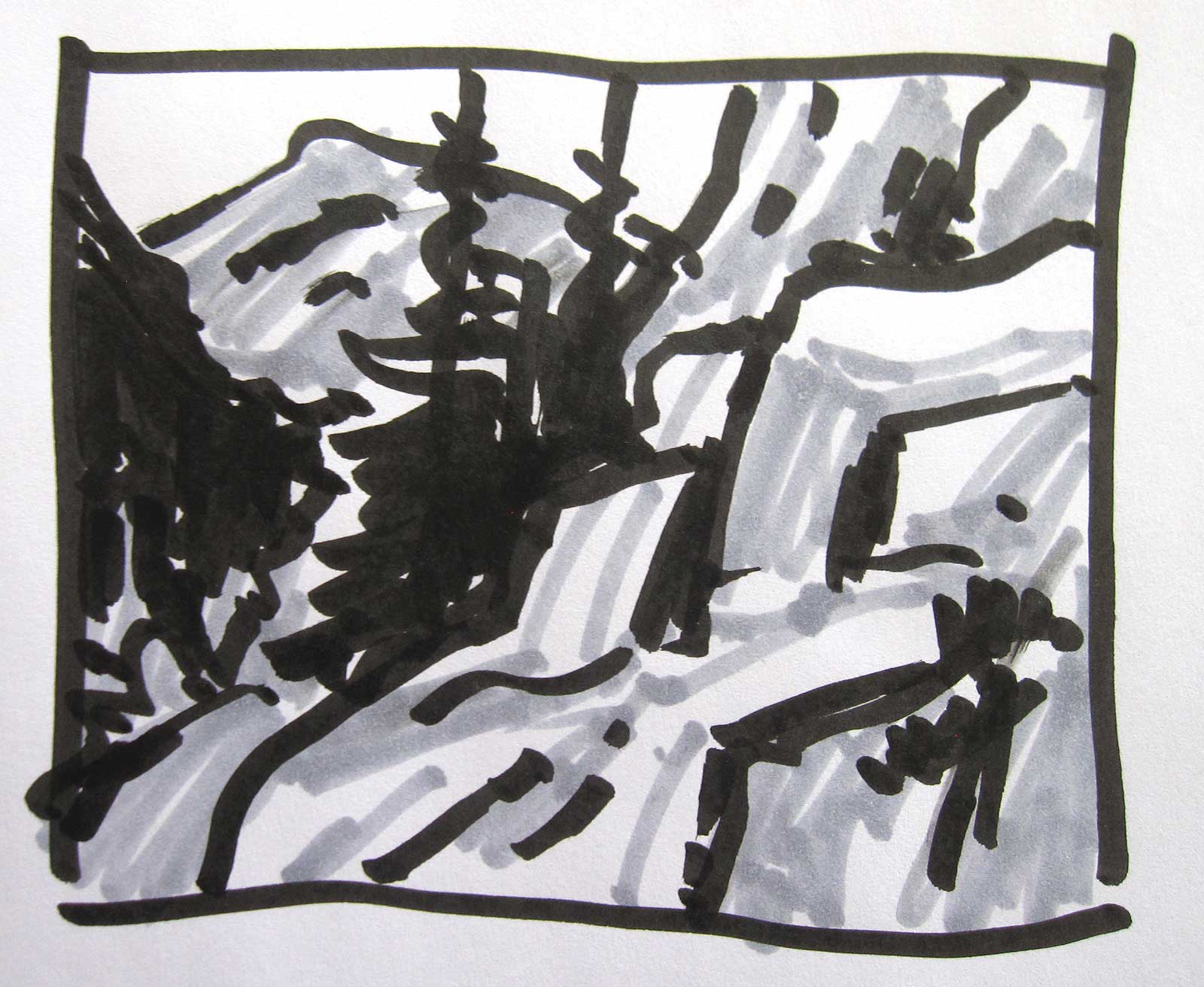
Thumbnail Sketch
This scene depicts the curvy road going up to Red Rock Canyon in Waterton National Park in Alberta, Canada, one of my favorite places to be. This is a diagonal design, and I have to be mindful of not dividing the picture into two halves. The rocks are certainly my major feature. My picture is about the rocks, but the focus will be the upper left where most of the darks are hugging the distant mountain. Canyon Road is not very colorful, but that won’t stop me from taking liberties with color!
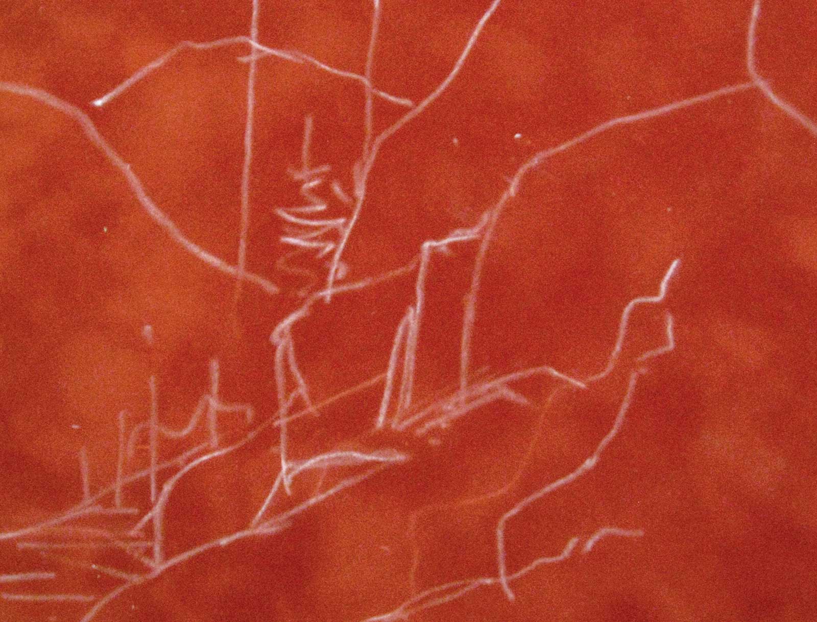 Stage 1
Stage 1 Initial Drawing
I felt such warmth radiating from the rocks in my photograph that I chose a warm persimmon red suede board for my support to keep my mountain scene warm. With a harder white pastel stick, I draw in the major shapes. That is really all I need at this point. I don’t spend much time on drawing. I typically make sure I have my major shapes in place with a dominant feature, which I call my “leading actor” followed by a secondary shape, the “supporting actor,” and several minor shapes called a “cast of interesting characters.”
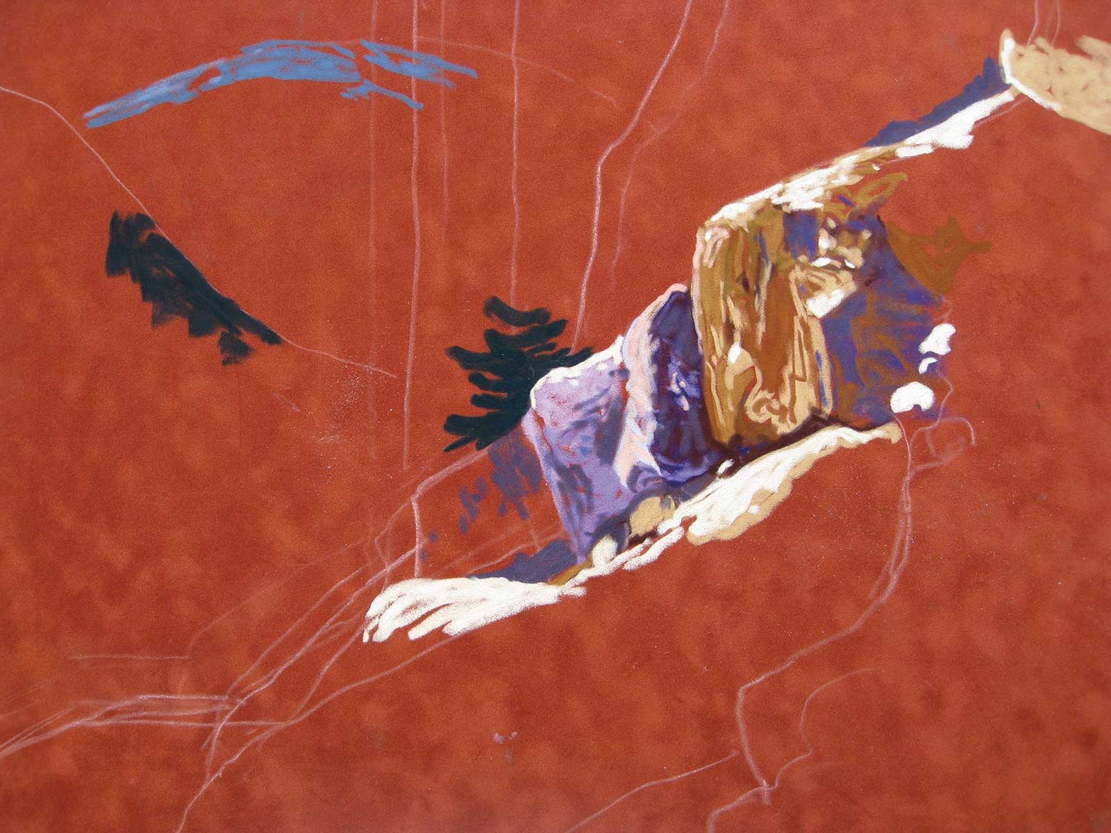 Stage 2
Stage 2 Trying on Color
This is the step where I determine if I am going to like painting this scene. Being excited and motivated is important. I think some vibrant triadic color scheme of orange, purple and green are in order to make the rocks pop. I try on some patches of light and dark to give me a sense of where I am going. This gets my creative juices flowing!
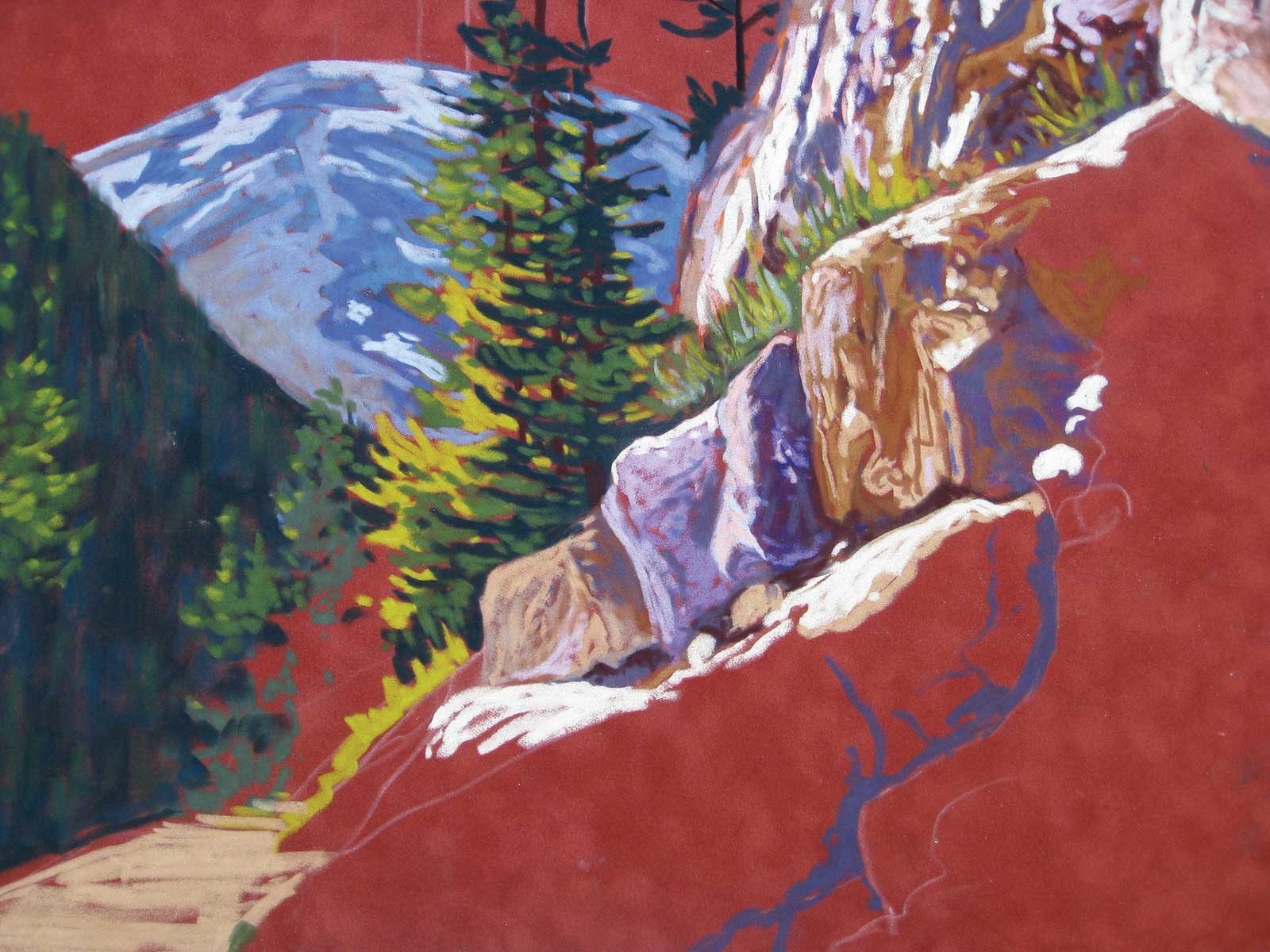 Stage 3
Stage 3 Development
The development stage means that I work on all aspects of the painting, bringing it to a semi-finished stage. As I work along, I constantly evaluate what I do by rotating the picture, looking at it from different angles to give myself a chance to catch oversights and mistakes.
In this case, I work on the rocks and lay in the trees, an important feature in this painting, followed by blocking in the dark slope, my middle ground. Being careful to choose softer values and edges to push back that part of the painting, I put in the mountains. I work more on the left slope, creating texture and using different greens to create the appearance of a treed slope in shadow. I decide the composition needs a bush where the slope meets the big trees to interrupt the long diagonal line, but I leave that item to be decided on later.
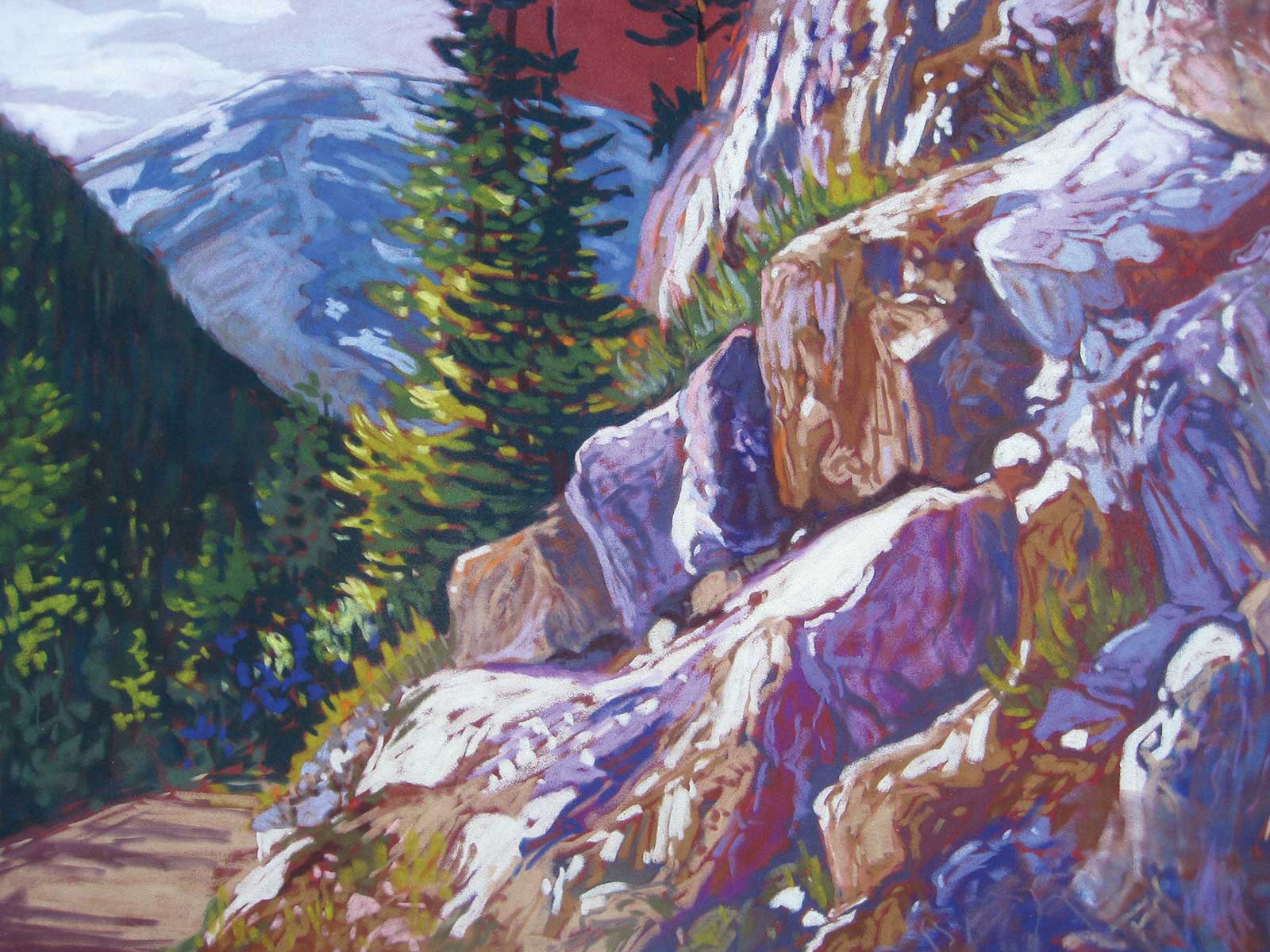 Stage 4
Stage 4 Homestretch
The homestretch requires that every element is in place and that all areas are well developed. I keep working on the rocks, having fun with the luscious colors, shadows and highlights. I try on some sky color, being tempted to go for an orange glow but decide to keep it muted with only some lighter clouds to keep the strongest lights on the rocks. I create more interest to the left slope bridging the distance and foreground with some muted greens and a purple bush. I highlight the big tree where the sun hits, reinforcing the focal point by placing yellow/oranges next to muted mountain blues.
 Stage 5
Stage 5 Final Adjustments
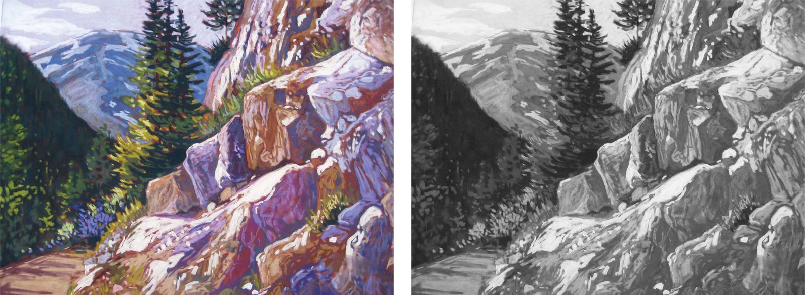
I have a good look at my painting, turning it upside down for evaluation. I adjust some highlights and make sure that whatever colors I used throughout the painting appear in small amounts all over. I take a photograph, turn it into a black-and-white version on my computer and go down my checklist. Do I have enough darks to lead my eye through the picture? Is my light source correct and are objects lit on the correct side? Do I have an interesting variety of shapes?
 Stage 6
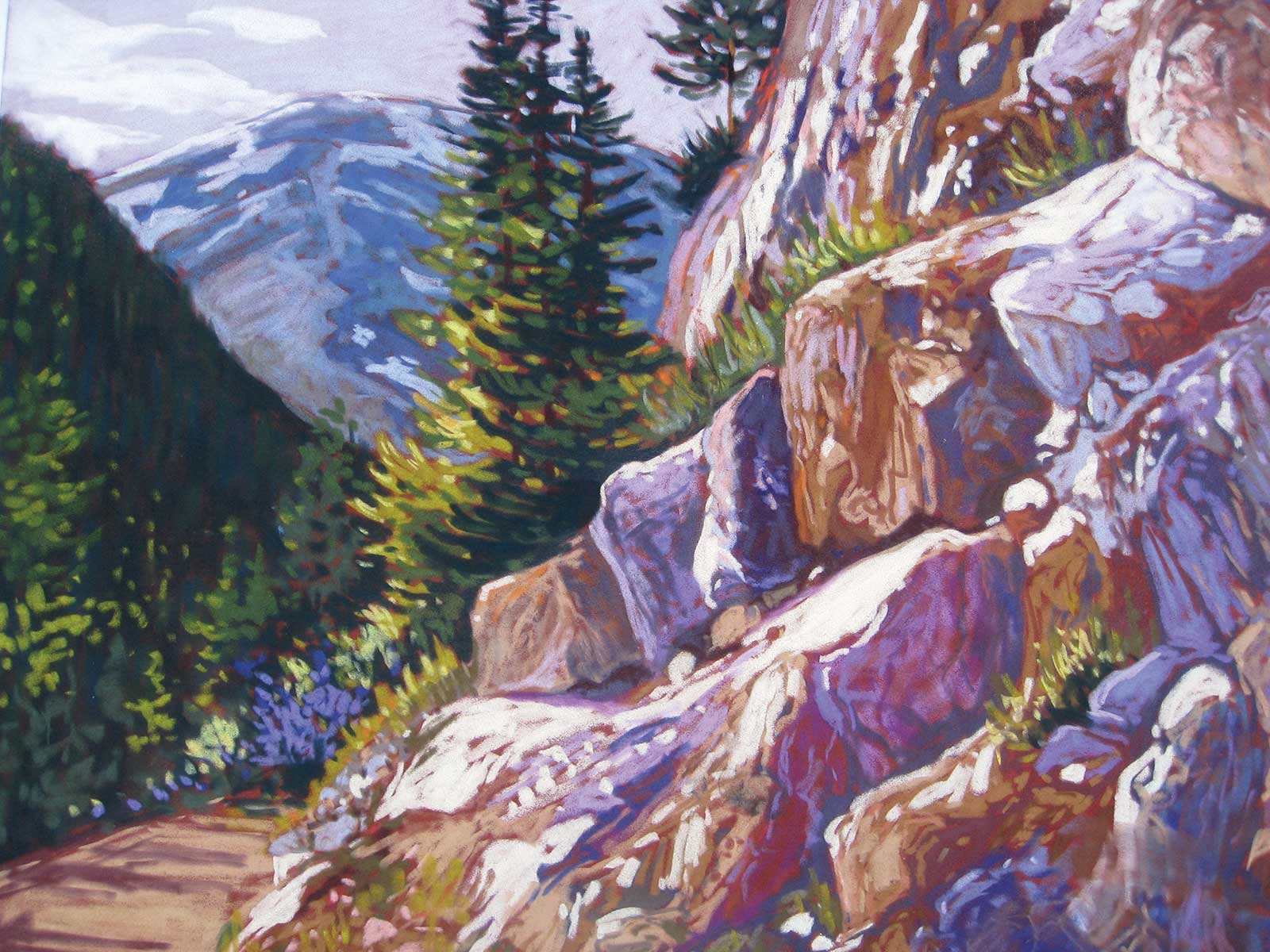
Stage 6 Finished Artwork
Canyon Road, pastel, 12 x 16" (30 x 40 cm)
About the artist
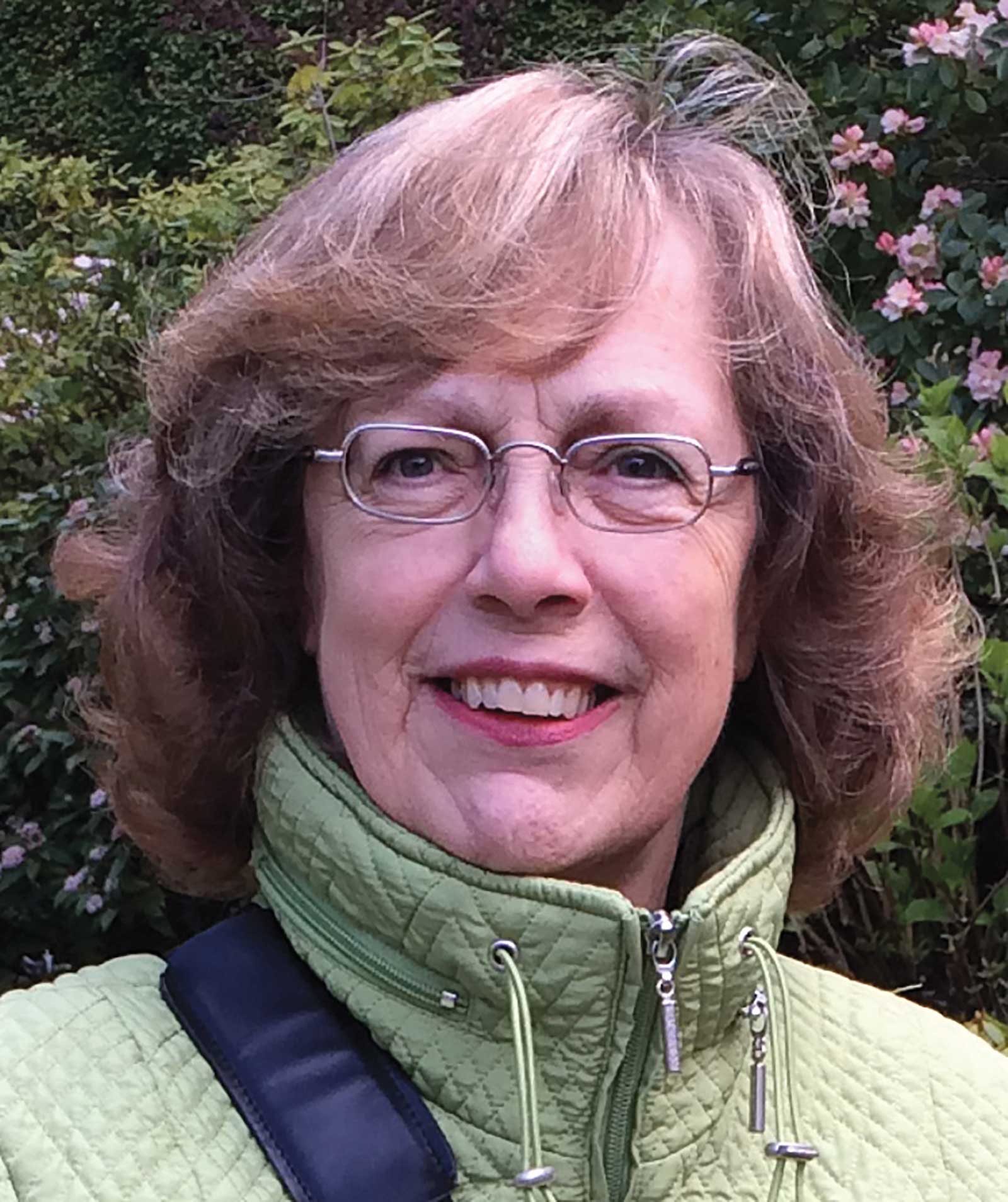 Karin Richter
A professional artist for 30 years, Karin Richter’s work has been featured in exhibitions locally, nationally and internationally. She is an enthusiastic art instructor to many aspiring artists in classes and workshops across Canada and leads groups on painting holidays on land and at sea in Canada, Europe and Africa. She is a sought-after juror, critic and organizer of art events.
An elected member of the Canadian Society of Painters in Watercolor, the Alberta Society of Artists, the Society of Canadian Artists and Pastel Artists Canada, with a Master and Eminent Pastelist designation, Karin has received many awards including the Immigrant of Distinction Award in 2010 for her contributions to the arts community. She is the author of two instructional books: Make Your Mark in Pastels and Success Every Time in Acrylics.
Represented by
Candler Art Gallery, Alberta, Canada, candlerartgallery.ca
Leighton Art Centre, Alberta, Canada, leightoncentre.org
Gust Gallery at Waterton Nat’l Park, Alberta, Canada, gustgallery.com
Paintbrush Gallery, Lodge at Bow Lake, Alberta, Canada
Contact at
karinrichter.com