


In the nearly 20 years that I have been teaching watercolor, the biggest struggle for students has been working effectively with color. As artists, we look for ways to simulate light. The subject will be influenced by sunlight, clouds, reflected light or whatever is nearby. Too often students neglect the influence of the object’s environment, and that can lead to a painting that is devoid of emotion. The job of an artist is to tell a story or express an emotion. Using color to help tell that story will engage the viewer and create connections. If there is sunlight present, there will be areas of pure hue color that attract our attention and transform a painting from boring to exciting. We need to train our eyes to see this reflected color. To make a painting that draws the viewer in or creates a mood, we can change the color to be more expressive. We can mix blue and orange together and get gray. But mix those two unequally and colors range from a dark gray-blue to a warm brown or orange. The color is a continuum from blue to orange and the selections are many. Using these color continuums allows us a nearly unlimited choice of harmonious color. In the demo, I use contrasting color to set up pleasing variations with limited pigments, which all become closely related as the painting progresses.
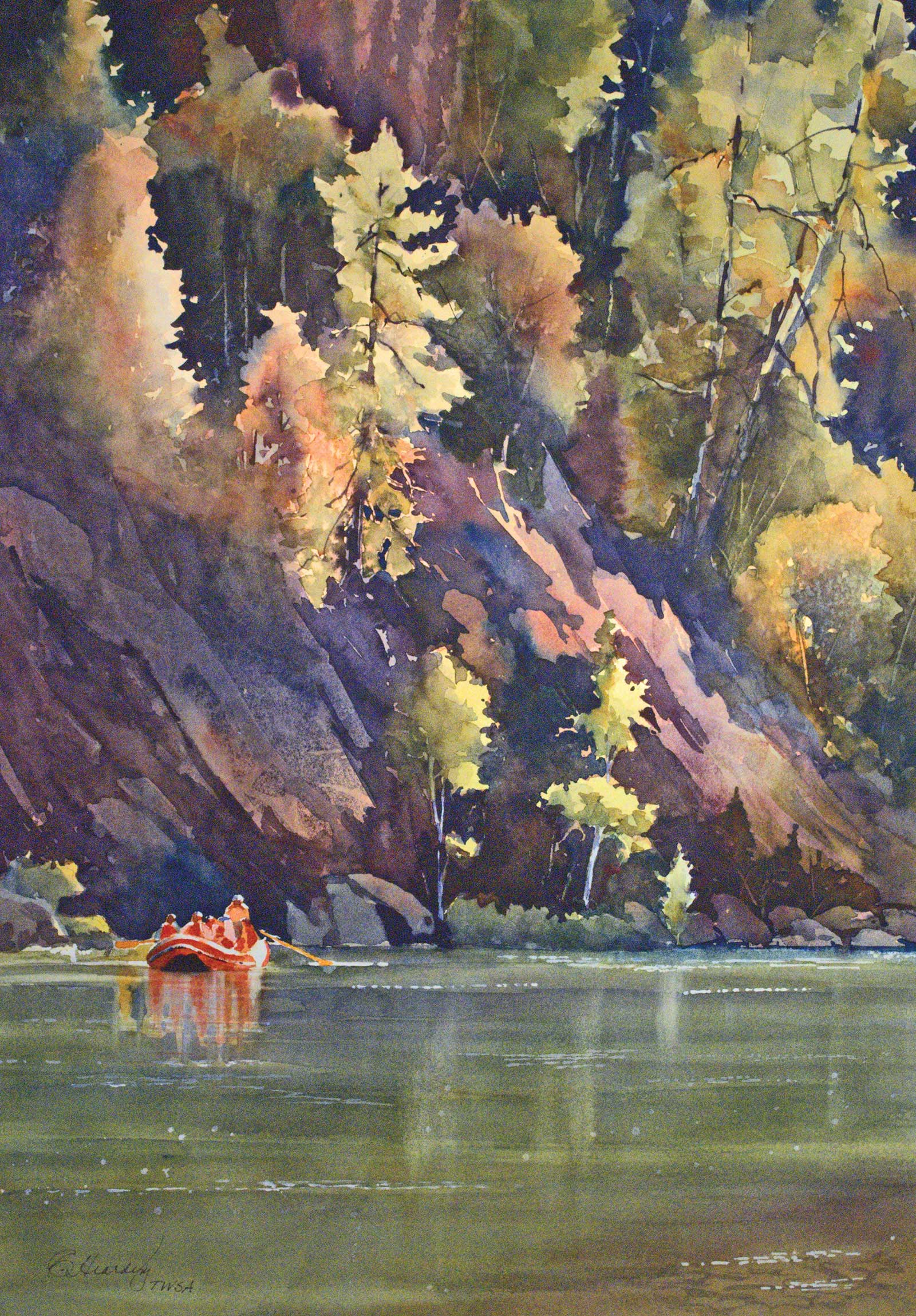
Rogue River Float, watercolor, 21 x 15" (53 x 38 cm) This painting is about the bright trees lit up by the sun, contrasting against the deep violets of the rock face. To capture the light values of the trees, the entire background was painted a light yellow/orange color. Using negative painting, the trees were carved out by the deep violets and red of the rock. The strong value contrast pulls the trees forward and creates the mood.
I work with intentional color, picking out my colors for the painting before I begin. I have 14 pigments on my palette and choose three to six of those colors to use in each painting. It is part of my process to conceptualize the value patterns and colors for each painting. I carefully think through and decide which colors will support my vision for the painting. This is my palette for the duration of the painting. The green might not match my reference photo, or I may enhance the violet in the shadows, but I can create a more emotional connection by pushing the color. Working with a limited palette helps maintain color harmony and simplifies my painting process. I choose colors for their value, spreading ability, mixing characteristics, textural qualities, transparency and tinting strength.
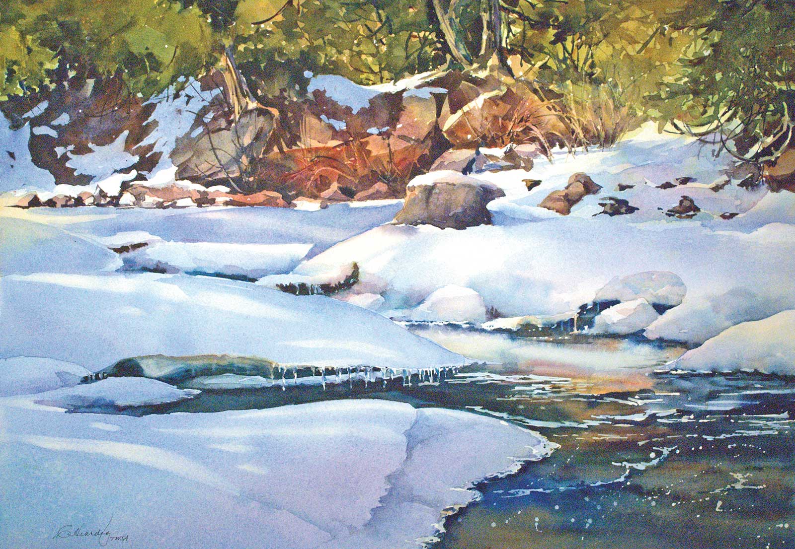
Peace Like a River, watercolor, 16 x 23" (40 x 58 cm) This painting balances the warmth of a sunny winter afternoon against the cool tones of the snow-covered river. I used yellow greens and oranges to make the painting dominantly warm. The deep colors of the water balance the warmth. Colors chosen were cobalt blue, Winsor blue, new gamboge, phthalo turquoise and permanent rose.
One of my favorite color schemes is a tertiary triad of blue-green, red-violet and yellow-orange. I choose one color to be dominant, one secondary, and the third as an accent color. This combination of colors will give me both warm and cool tones that will work in contrast to each other. By using these colors, I can “push” the color to create a specific mood. If I want a sunlit area, I work toward the warmest color, yellow-orange. If I want a cooler temperature I work towards a dominant cool tone, blue-green. I can paint the same scene but end up with different moods. The resulting paintings are much more interesting.
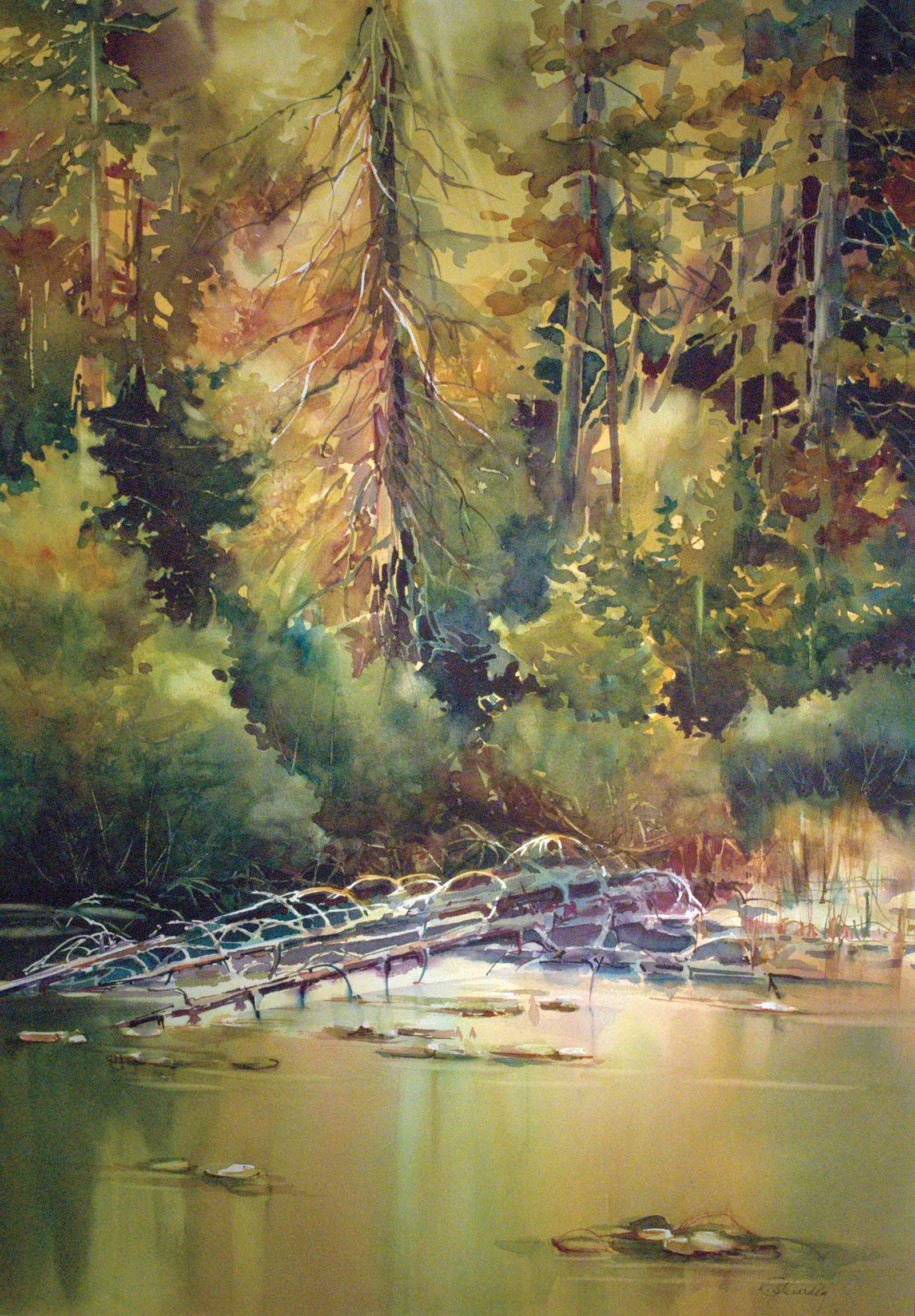
Golden Pond, watercolor, 28 x 20" (71 x 50 cm) Three colors were chosen for this painting: quinacridone gold, permanent magenta and phthalo turquoise. They were selected for the beautiful darks they create and the warm tones for the sun on the trees. The cool accents of the blue greens balance out the warmth.
Color plays an important role in developing the painting. Beyond producing color harmony, we use properties of color to create depth in the painting. Three color tools that we use include value, intensity and color temperature. Value is the lightness or darkness of the color, which is most important in creating contrast. Light values advance in space and dark values recede. Putting a dark value behind a light value creates space in the painting by bringing the light forward. Intensity is the brightness or dullness of a color. The brighter the color the higher it is in intensity. A brown is a dull orange and a low intensity color. Low intensity color recedes, while high intensity color advances in space. Putting a brown behind an orange will pull the orange forward. Finally, color temperature is a property that should not be overlooked. A balanced temperature of warm vs cool can really enhance and create distinct moods and excitement in a painting. Warm colors advance and cool colors recede, so this allows us to pull warm tones forward by contrasting them against the cooler background tones.
Many students ask why I use a limited palette. The answer is usually exciting color, simplicity and color harmony. By using only a small number of pigments, I simplify my painting process and mix color in different ways to create what I need. My goal is to use color in a way that increases the emotional appeal of the painting and connection with the viewer. Leave your reference photos behind and try using creative color to add excitement to your paintings. —
My Art in the Making Boundary Waters
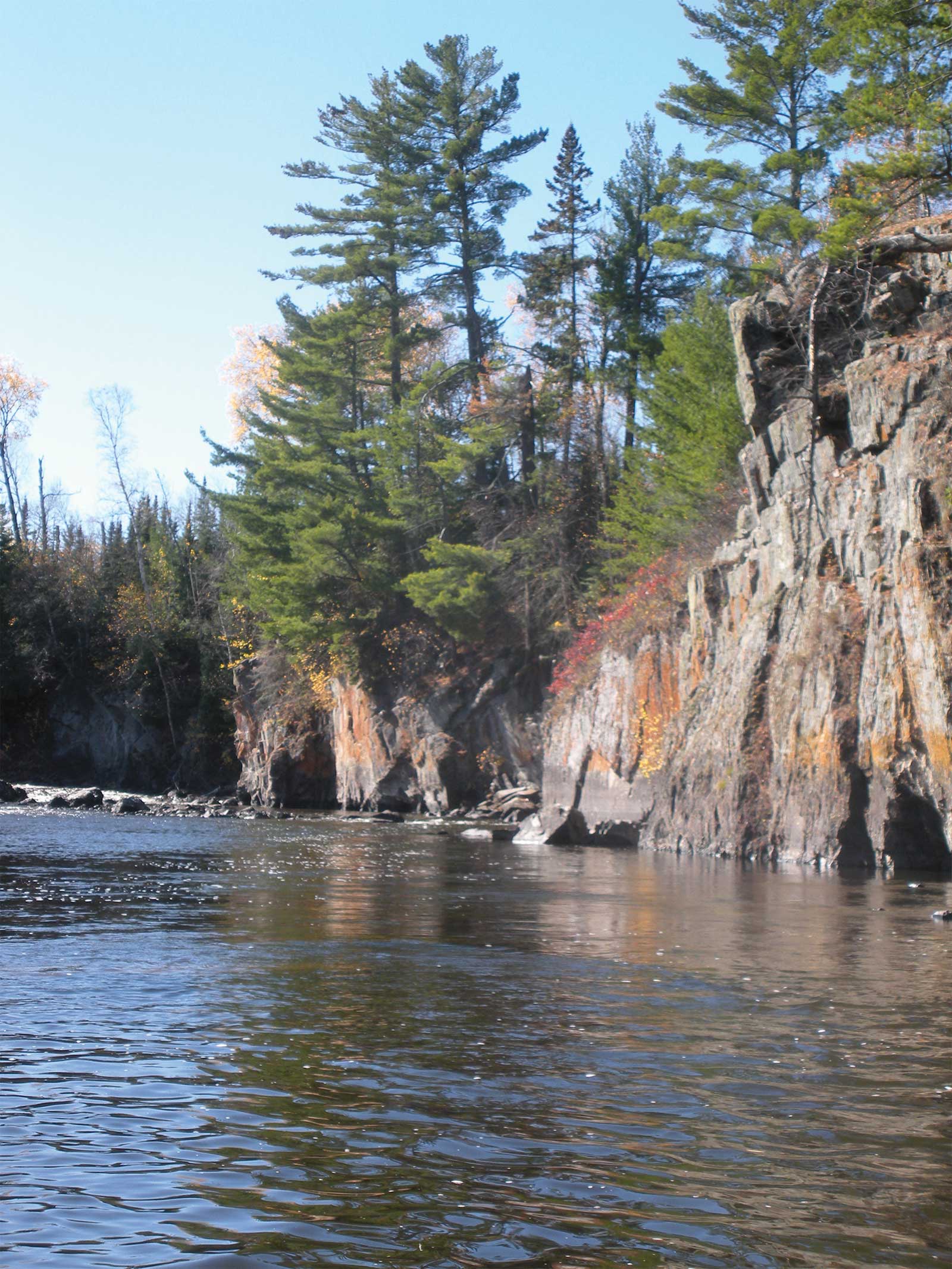
Reference Photo
 Stage 1
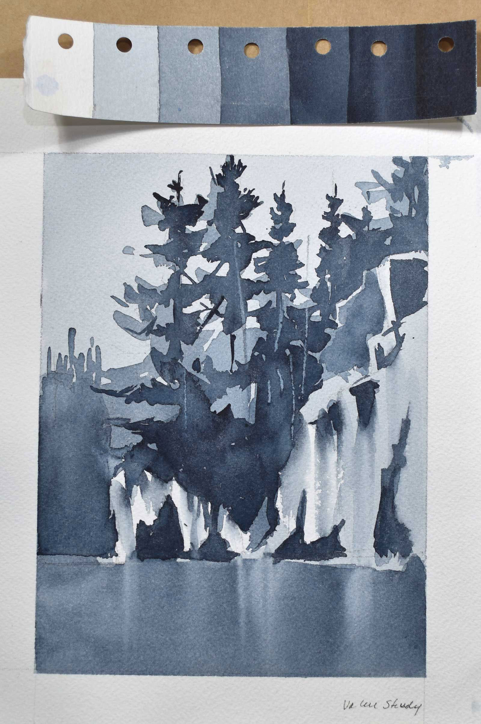
Stage 1 Value Study
I start with a value study to understand shapes and associated values and to understand if there are any compositional problems.
WHAT THE ARTIST USED
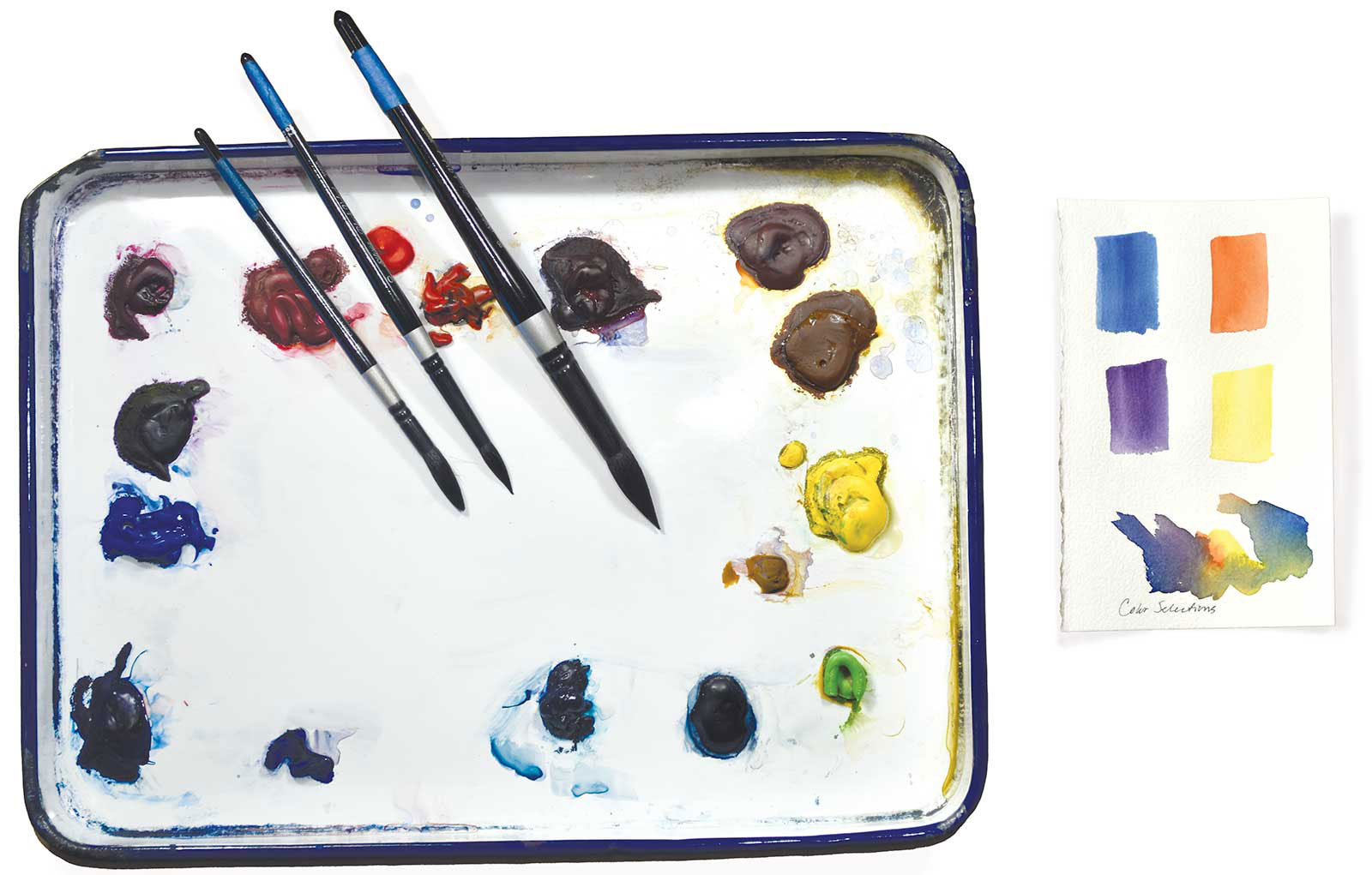
Winsor & Newton Watercolors
Winsor blue red shade, Winsor violet, Winsor yellow
Daniel Smith Watercolors
Transparent pyrrol orange
Additional Colors on my Palette
Cobalt blue, Permanent magenta, Permanent rose, Winsor red, Brown madder, Quinacridone gold, Nw gamboge, Permanent green light, Phthalo turquoise, Payne’s gray
Brushes
Silver black velvet rounds, sizes 10 and 16, Silver black velvet jumbo rounds, small and medium, 1½" black velvet flat, Rigger, size 2
Additional Materials
Arches #140 cold press, cut to 12 x 16" and stretched on Gatorboard support, Butcher tray enamel palette, Value scale, Pebeo drawing gum and nib applicator, Palette knife, Artist’s tape, 2", Water buckets, Paper towels, 2B pencil, Small pump spray bottle
 Stage 2
Stage 2 Contour Drawing of Large Shapes
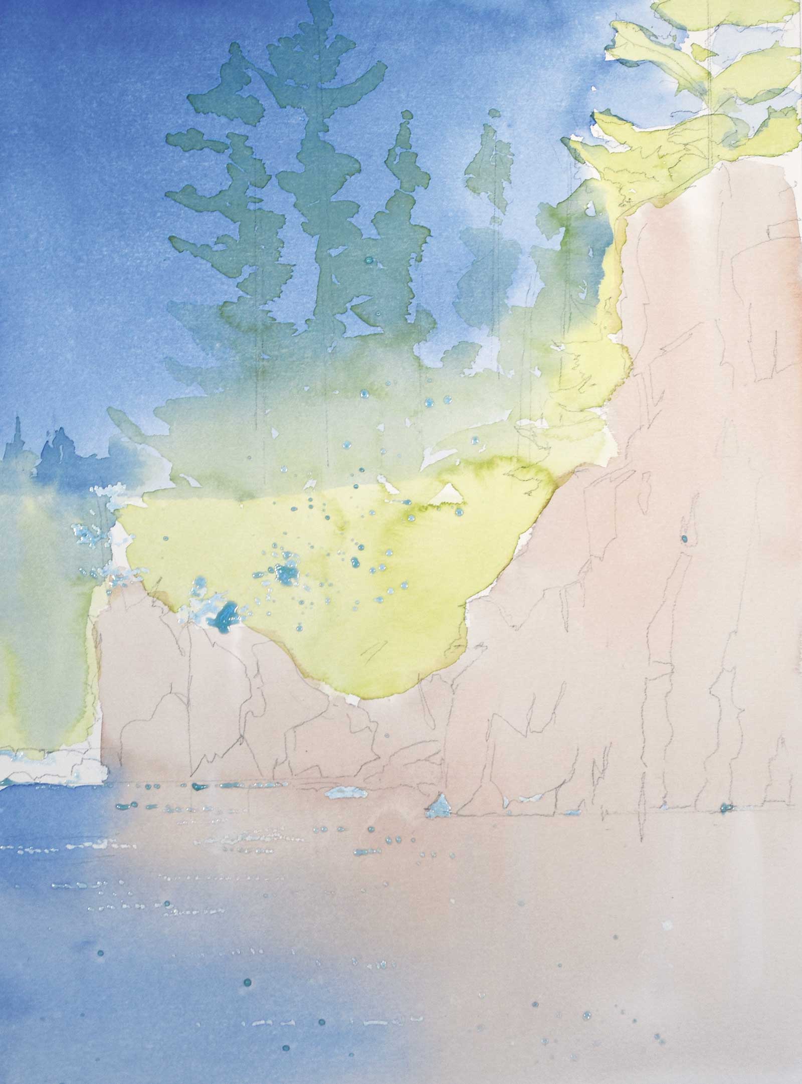
Masking fluid is applied to save the lights of the small yellow trees and the sparkle on the water. An underpainting is applied wet into wet, letting edges merge. I then use light values to establish large color areas.
 Stage 3
Stage 3 Blocking in Large Shapes
I’m now blocking in the larger shapes to divide up the space, breaking up some of the primary shapes with smaller, darker shapes.
 Stage 4
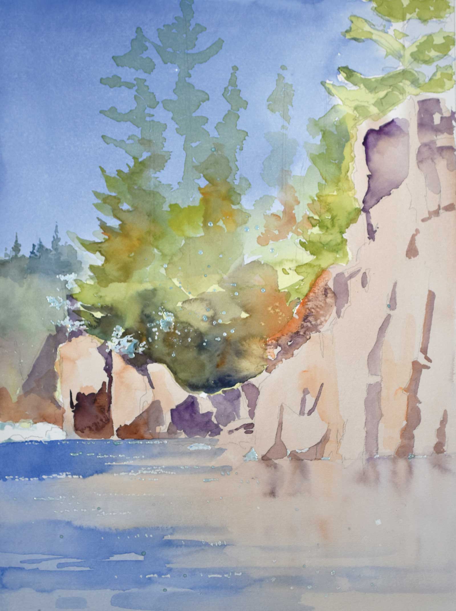
Stage 4 Darks at Tree Bases
Here I am establishing dark connected shapes at the bases of the trees. The darks unite the trees into one shape. I’m adding more brushwork to fill out the trees and push the rocks forward on the left side, as well as working medium values into the water.
 Stage 5
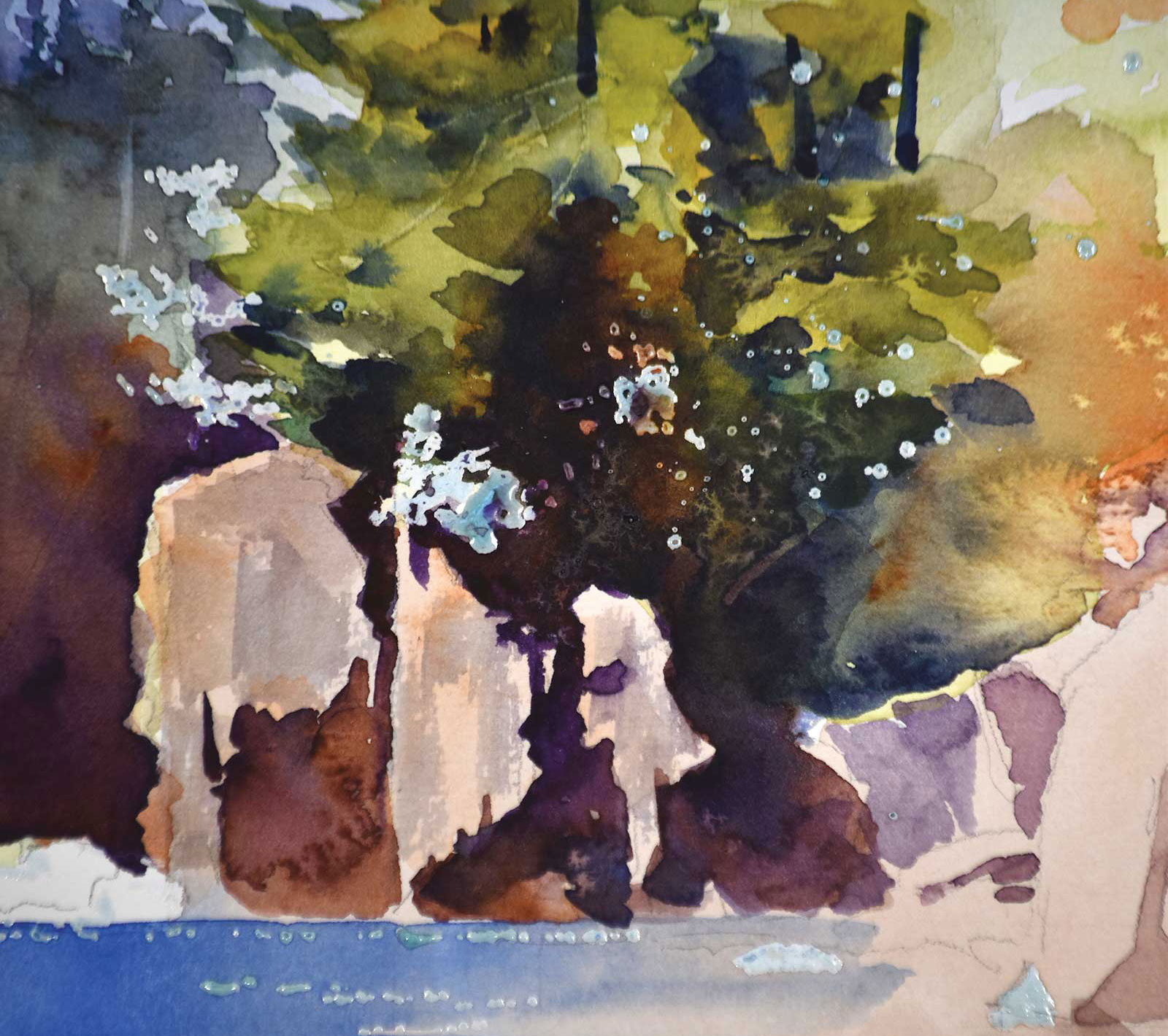
Stage 5 Detail
This is a detail shot of the dark connected areas beneath the trees and rocks, which was done wet into wet, blending colors on paper to connect the trees to the rock area.
 Stage 6
Stage 6 Adding Additional Shapes to Cliffs
More shapes are added to the cliffs on the right. I added more branches to the trees wet into wet, letting brush loads of yellow and orange drip into the greens and merge. Darker values were also added into the water reflections.
 Stage 7
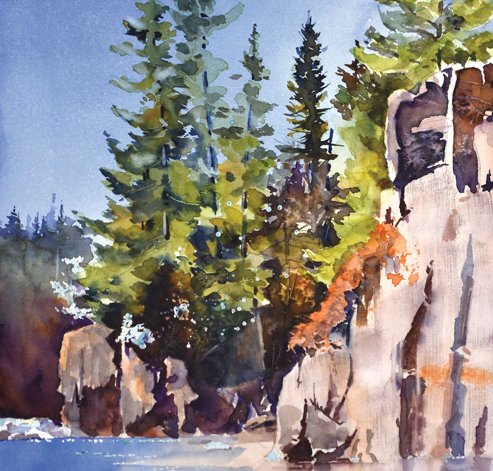
Stage 7 Dry Brush Textures
In this stage, I am developing dry brush texture on the rocks, as well as adding salt into the foliage for additional texture. I also removed the masking from the tree area.
 Stage 8
Stage 8 Tinting the Small Trees Yellow
I tinted the small trees yellow and used a rigger brush for line texture on the cliff.
 Stage 9
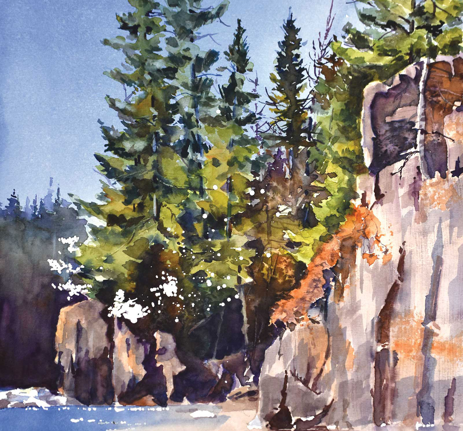
Stage 9 Final Details
The last details were added in the trees. I also finished the water reflections by lifting out verticals with a damp brush. I removed the masking from the water for more sparkle. The complementary colors create harmonious color balance.
 Stage 10
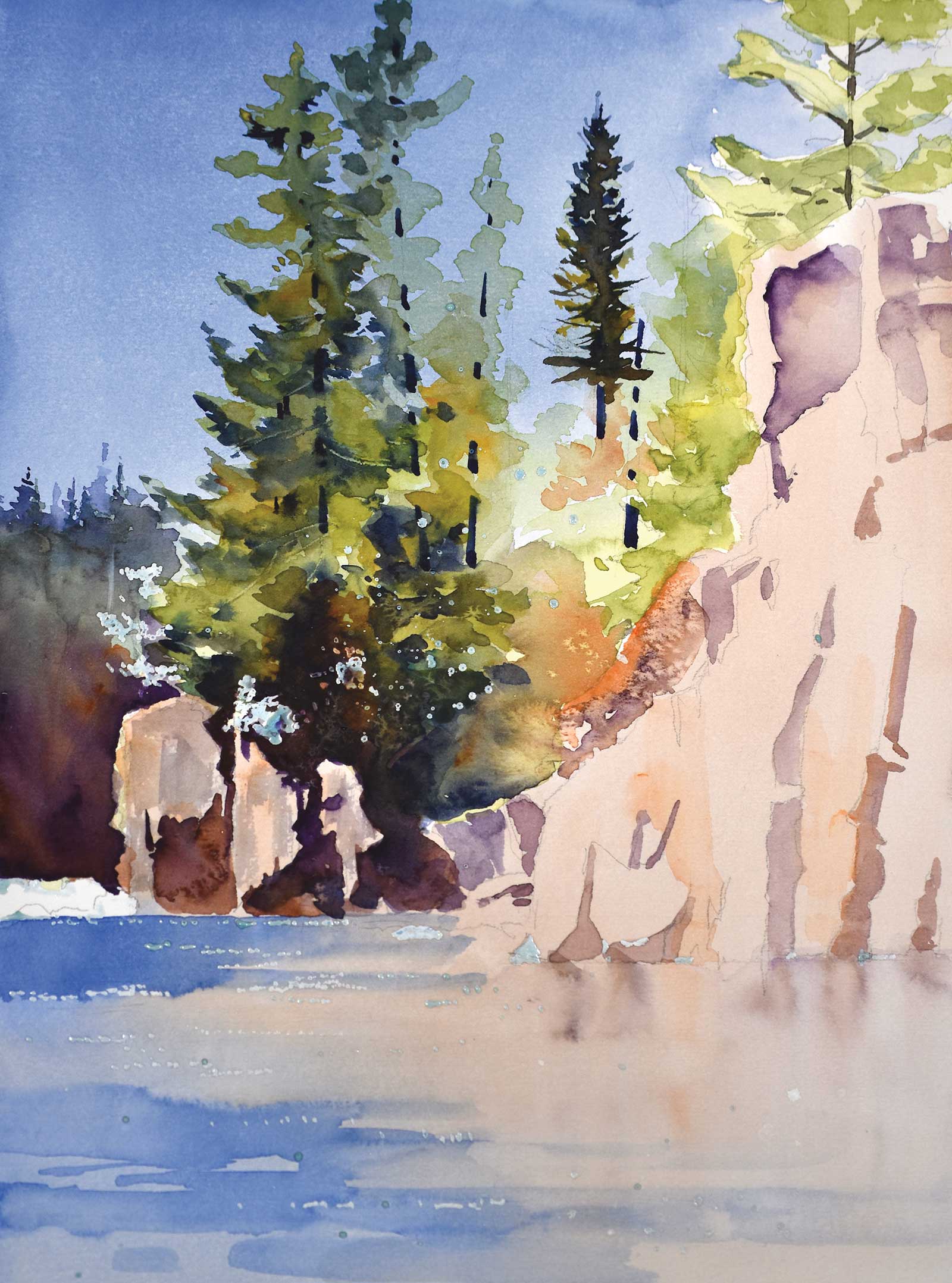
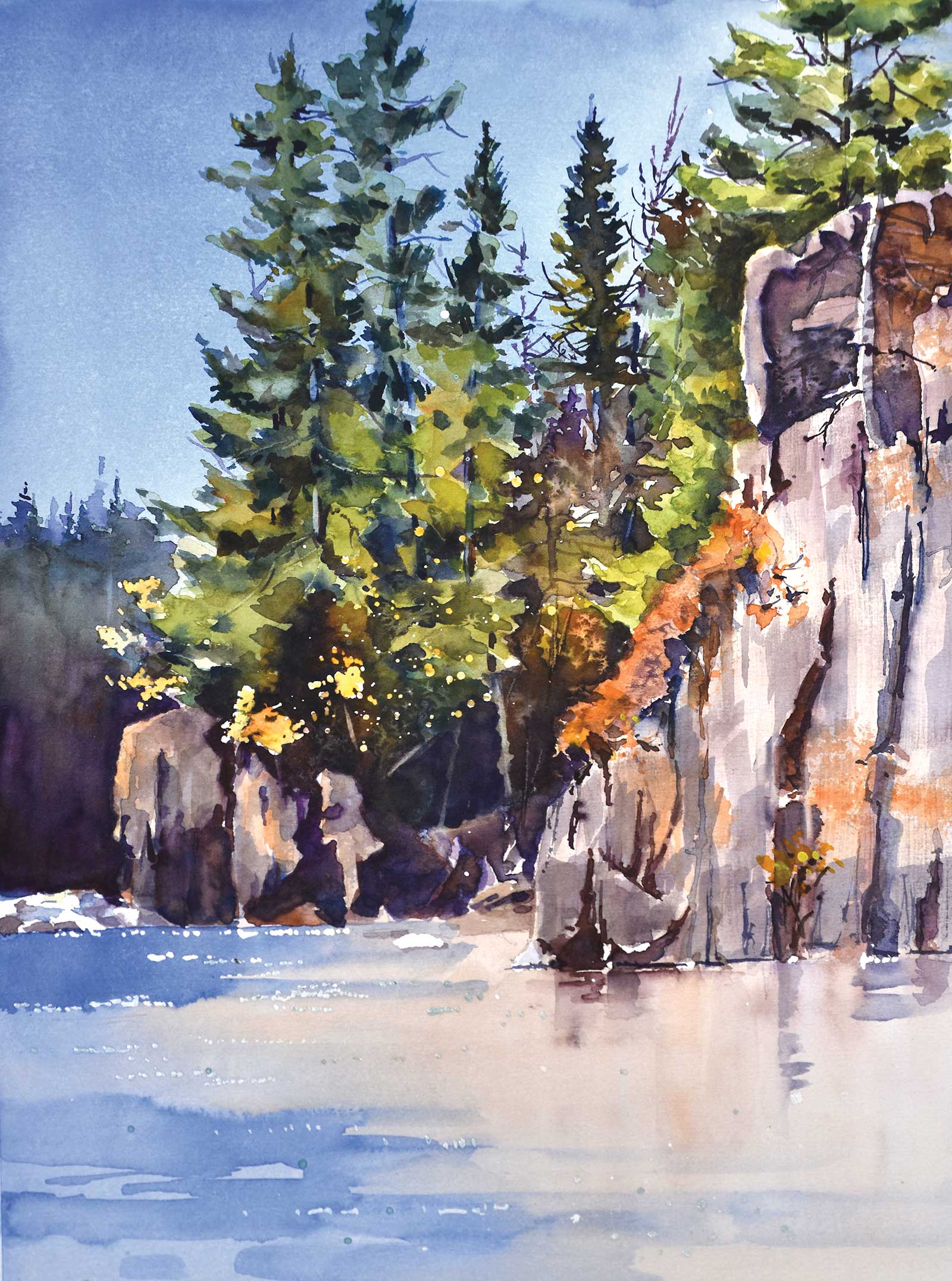
Stage 10 Finished Artwork
Boundary Waters, watercolor, 16 x 12" (40 x 30 cm)
About the artist
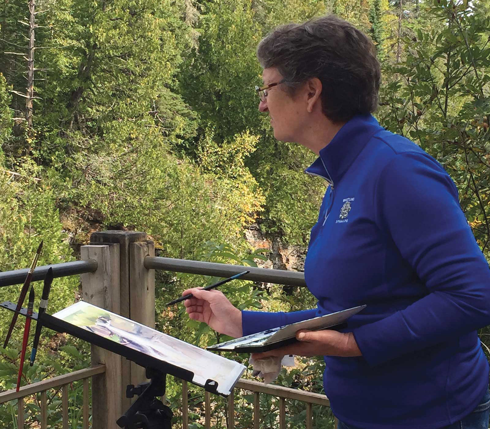 Catherine Hearding
Catherine Hearding has more than 45 years of experience painting in watercolor. She earned a Bachelor of Arts in zoology and botany from the University of Montana in 1974. Hearding then designed and marketed a line of note cards featuring her watercolor designs from 1974 until 1990. In the 1990s, her focus shifted to landscape painting and she began exhibiting her paintings locally in 2001. In 2006, she began entering her work in national and international exhibitions.
Hearding is a signature member of the American Watercolor Society, Transparent Watercolor Society of America and Watercolor USA Honor Society. She has received many local and national awards, including the High Winds Medal (AWS). Her work is found in many private and public collections. She has been teaching courses in watercolor since 2004 and is a sought-after watercolor workshop instructor. She offers classes and workshops on landscape painting, basic watercolor technique, plein air painting, composition and color theory. Hearding leads a yearly plein air workshop in Europe sponsored by WalkEurope.com
She works from her home studio in Lake Elmo, Minnesota. Her work is available on her website at chearding.com.
Represented by
Lanesboro Arts, Minnesota, USA, lanesboroarts.org
Woodland Studios, Wisconsin, USA, woodland-studios.com
Contact at
chearding.com